
Produce a series of illustrations for packaging to be used for a new range of organic biscuits for children. There are three varieties in the range Raisin, Choc Chip and Ginger biscuits. The client specifically wants three illustrations featuring extinct animals interacting in some fun way with a biscuit to be used on the boxes. The drawings should be in full colour, and the client would like the colours to reflect the ‘flavour’ of the biscuit.
Go to the shops and research the market. How will you stand out amongst the others?
As it will probably be an adult who makes the purchase, you need to decide whether you will exploit ‘pester power’ or appeal to both adult and child. You may want to develop characters suitable for young children or employ a style of drawing to appeal to your all your audiences. You also need to decide whether you will have hand-drawn or ‘straight’ typography.
You need to submit all stages of the development process – thumbnails, visuals for all three designs and a mock-up for at least one.
OCA Key Steps in Illustration
In this exercise I will need to create 3 illustrations of extinct animals to be used on the packaging of organic biscuits that are aimed at children. The colour needs to represent the flavouring of the 3 different kinds of biscuits; raisin, choc chip and ginger.
Initial research
First off I wanted to do some research into food packaging and how illustrations are used in a contemporary way to sell food items.
I started by collating lots of interesting examples on a Pinterest board. I was looking out for the style and also interesting applications of illustration in innovative ways. I think I decided at this point that I would like to include a cutout window in the packaging design and incorporate this in the illustration in some way. I think this would make it fun for both children and their parents.
I found this very interesting article: https://www.designerpeople.com/blog/product-shape-design-influence-sales/ It basically explores all the different aspects of product packaging that can influnce the consumer to pick up the product. I will refer to this article throughout my design process to ensure that I come up with something innovative.
Next I wanted to look into extinct animals to find something that I feel might be suitable as the vehicle to sell these biscuits. I was thinking dinosaurs first, but then I was thinking that animals that gone extinct due to human interventions would be much better suited to promote organic biscuits.
https://www.natgeokids.com/uk/discover/animals/general-animals/extinct-animals/
I used the above article aimed at kids as a basis for my research to try to explore some more recently extinct animals and found a few that I thought might work. I found the Dodo, Thylacine and Steller’s Sea Cow most interesting and I wanted to base my illustrations on these species.
First, I needed to gather some visual references to make my illustration of these animals somewhat accurate.
After doing my research on each of the animals, I was wondering which one I should use for which flavour of biscuit. I was thinking that the Thylacine must be the ginger because of the colour of the animal which is a reddish brown, that left me with the Dodo and the Sea Cow for the other 2 flavours. Neither of the animals had a particularly chocolaty colour-way, but I thought that I can make a more thematic connection between the dodo and raisins. I was thinking because the dodo is a bird it may have been feeding on berries and raisins are just dried grapes, so I think this will make some sort of sense. This left me with the sea cow and chocolate. I think this could work, I can create a brown coloured sea cow to fit the theme.
I wanted to move on to sketching some packaging ideas that I had in mind for the biscuits and some sort of placement of the animals of the packagings so I can decide how to depict the animals.
As I started drawing I realised that I really needed to figure out what format I wanted my packaging to be and to do this I wanted to do some more research on food packaging and specifically packaging that is used for biscuits and cookies.
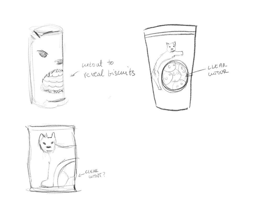
I had some sustainability questions in mind while looking at the packaging. I know that the clear cutouts are meant to show the product inside the packaging to let customers decide, but I was also thinking that you probably cannot do this without introducing plastics into the materials used.
I was thinking that I would like to avoid plastics at almost any cost at this stage. I know that this would probably not be down to the illustrator in a project brief similar to this, but I was thinking about this project not just as an illustrator, but as a graphic designer. I think if I look at the brief closely enough it is clear to see that this client would value sustainable materials over showing the product inside the packaging.
With this in mind, I will probably scrap the cutout window idea and go with a more traditional box, perhaps a tin? I was thinking that a tin might be a good idea, since this would be something that is less likely discarded when empty. I know that I would certainly keep biscuit tins once they are empty because they can be used as storage containers afterwards. I think a tin might fit the brief best, it could appeal to the child and also the parents while being more sustainable.
What immediately came to mind was the Fortnum Mason cookie tins, so I wanted to look at some of these to see how they achieve a design that is nice enough to keep after the tin is empty.
I found the idea quite exciting. I think this would resonate well with a brand that creates organic products, it would be different enough to pique the interest of kids and also sustainable because the tin could be reused after the biscuits are gone.
Dimensions
I will need to come up with the dimensions for the tin so I can make the artwork precise enough to wrap around the tin. I went ahead and did a bit of research on tin sizes. 7cm tall and 14 cm diameter seems to be the standard for the smallest size so I will try to work out the length for this circle. I learned that this is called circumference and it can be calculated using the π (Pi). I should have pay more attention to my maths teacher…
To get the circumference of a circle you just need to multiply the diameter (in my case 14) with the π (3.14) to get the number. The circumference of this tin is 43.96 cm. This will be the width of my artwork (for the side of the tin) and the length will be 7 cm as this is how tall the tin is.
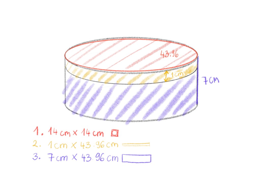
I had my sizes planned out. I wanted to make sure the tin looks finished with nice decorations all over so I wanted to make sure I am thinking of every visible inch. I made the side panel 7×43.96 because even though the lid is going to cover a small portion of the top, I would still like to decorate this area so when the lid is off it still looks nice.
Style
I recently watched a tutorial with Liz Kohler Brown that was teaching cool ink illustration techniques, and I thought that these kind of hatched illustrations would be quite well suited for my biscuit tin. I would like to make these playful and interesting but beautiful at the same time.
Sketching
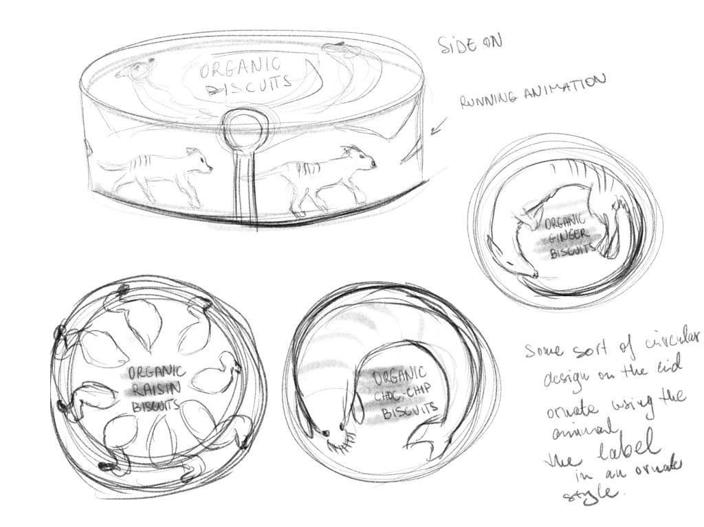
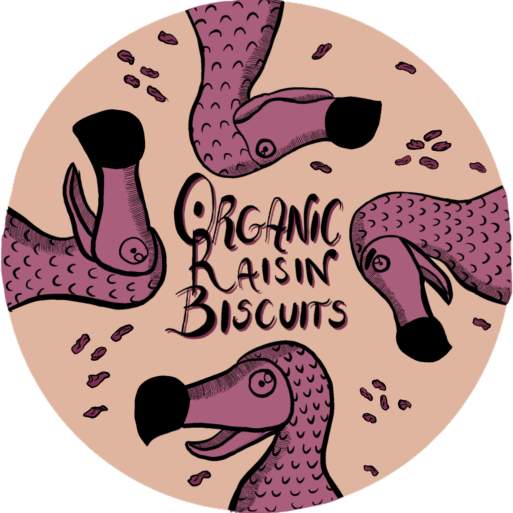
With all the above in mind, I started working on my first lid art. I wanted these to be fairly symmetrical but didn’t want the same elements to repeat too many times so they have more of that hand drawn quality.
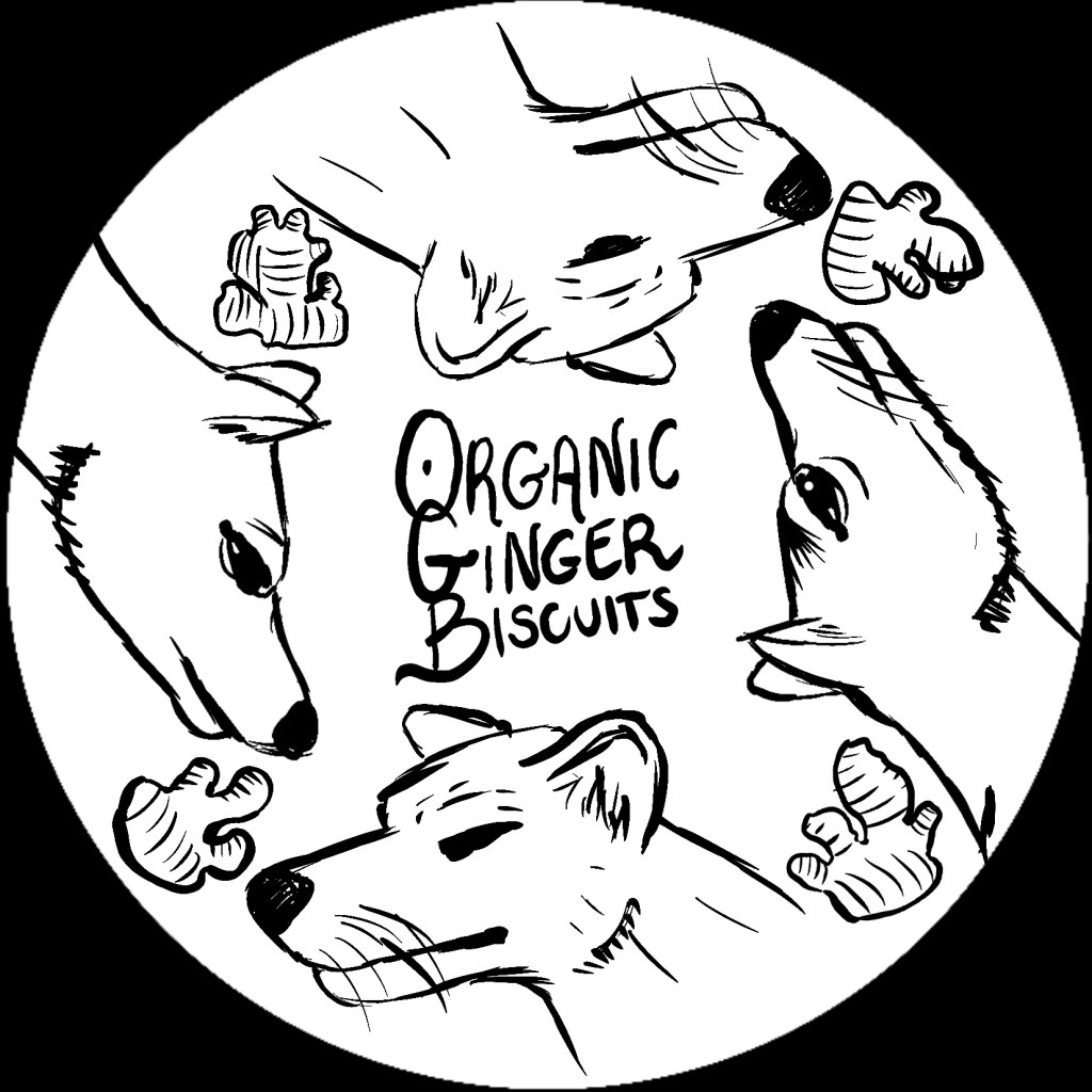
I was quite happy with how this started to turn out. I was wondering if I should maybe make things a bit more ornate, but I think with the hatched style I want to go for this will be plenty interesting.
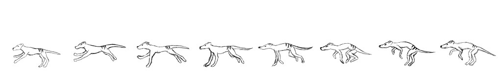
For the side of the tin, I had big plans. I wanted to create an animation like, sequential illustration that would wrap all the way around the tin seamlessly. This idea was inspired by the zoetrope. I imagined how this would bring the extinct animal to life in a way, and I thought this idea was quite endearing.

I first created an animation with the animation assist function in Procreate, then took the frames apart completely to cover the length of the side panel. I ended up with the below sequential sketch.
I thought this was quite cool but I wanted to see how this would look on the tin so far, so I created a mockup of sorts in Adobe Dimensions. I had to create the tin 3D model myself, so it took a little while, but got something that I could work with in the end.
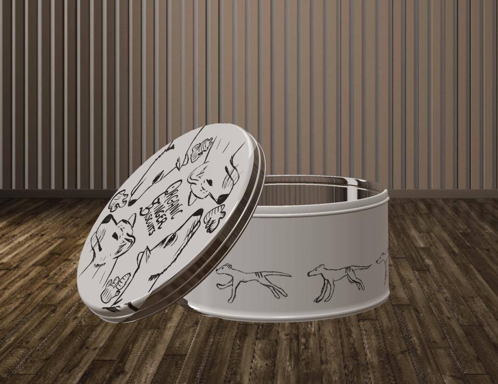
This gave me a glimpse of how. the idea worked in practice and I quite liked what I seen. I needed to make the side panel a lot more detailed, but I think I was on the right path.
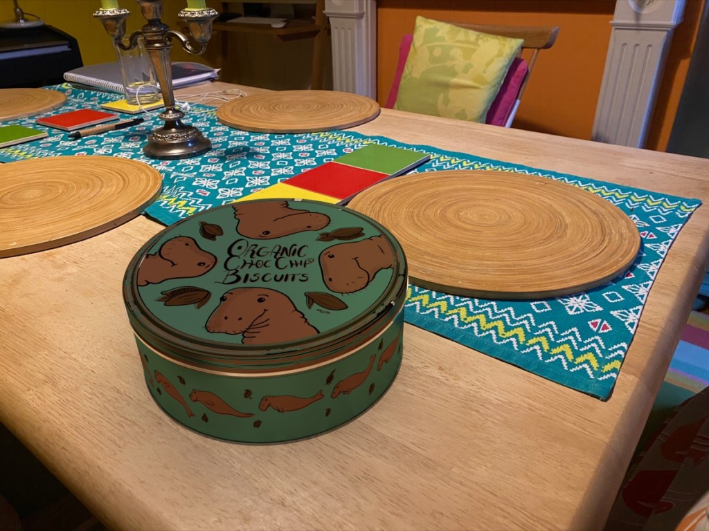
I went ahead and started finalising my sketch. I wanted to add some ginger pieces and choose a colour that is both fun and also work with the idea of ginger biscuits. I chose a off yellow/brown colour to mimic the colour of gingerbread, for the background I chose a blue to contrast with the graphical elements.
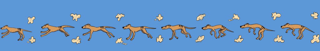
When I looked at this again, I think the blue was not the right choice for the colour of the tin. It just doesn’t really scream ginger, so I went back and tried a few more colours.
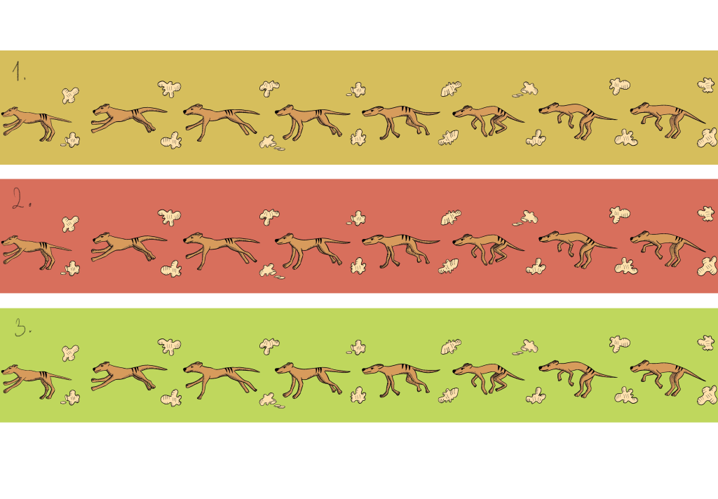
I was quite set on the idea of the colour of the subject but the background colour was giving me a little headache. I wanted something that said ginger but also wanted it to be visually appealing for children. After careful consideration, I decided to go with the green background. I think this worked best because it was eyecatching and playful but still worked with the flavour of the biscuits.

The lid design came together surprisingly quickly. I think once I had a clear direction and had my colours picked out it was very easy to complete it based on my sketch. One thing that I really wanted to change was the friendliness of the characters on the lid, as they looked quite angry on my initial sketch. I think I managed to soften them enough.
I challenged myself to make a better mockup for my biscuit tin. I had to quickly learn how to create a very simple 3D model. I found a great application called Shapr for the iPad and I managed to create a much more intricate model than what I initially created in photoshop and I was pretty happy with this.
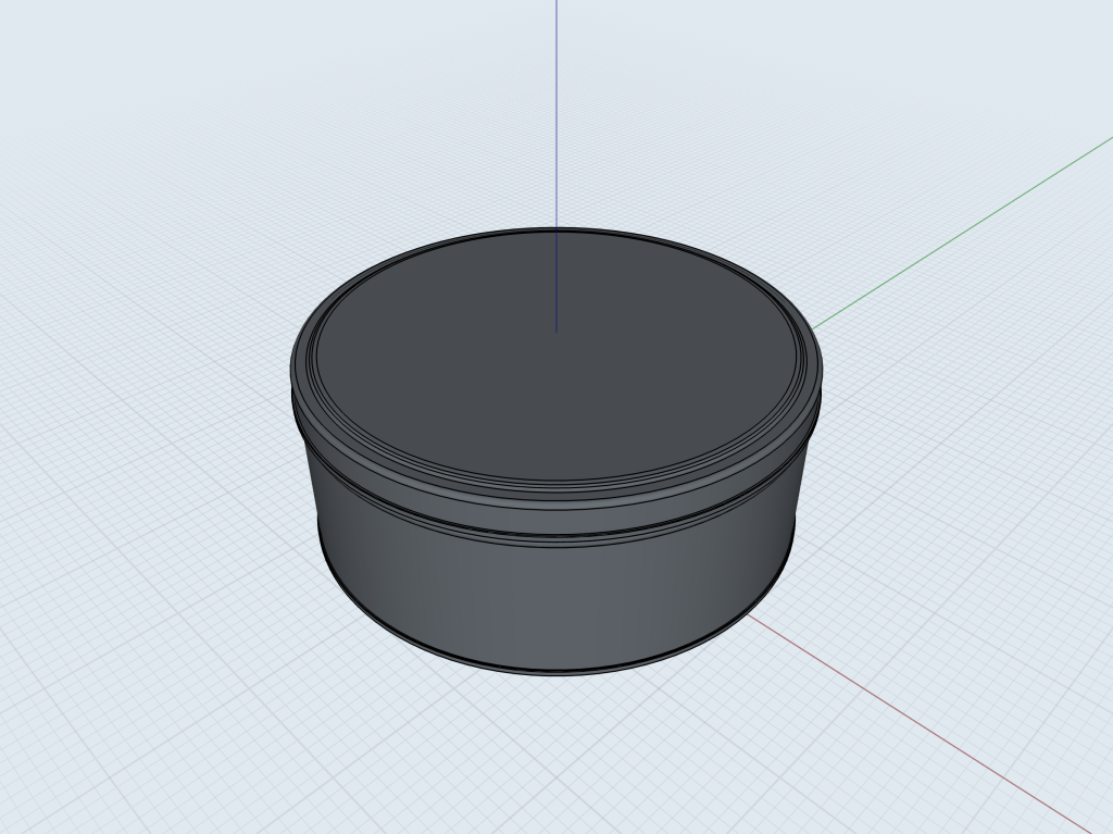
After a few hours of battling with the software I managed to put together a mockup which I was pretty proud of! I really want to master Adobe Dimension as I think this could serve as an invaluable tool when mocking up my products in the future.
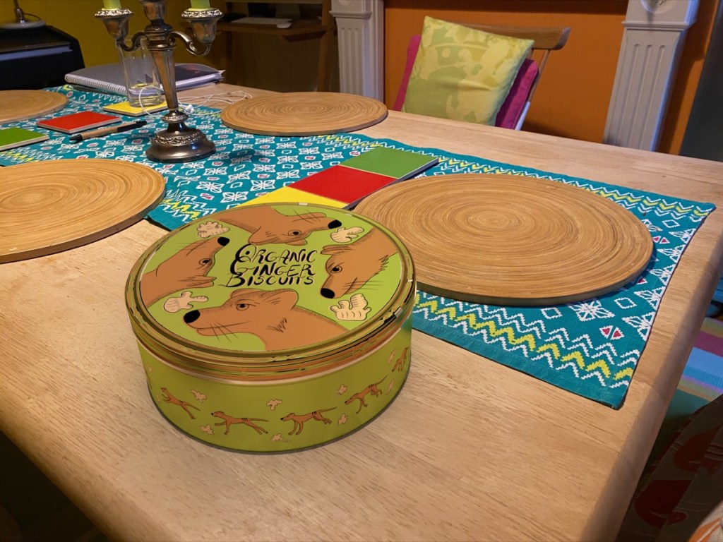
I was really pleased with the results. I think the zoetrope like effect is obvious and I liked how the colours came together. I was also quite pleased with my hand lettering, I think it fits with the style of the illustration pretty well.
Now that I had a pretty solid way to do this, I think I can get the other 2 illustrations done quickly.

I was looking at images of dodos while drawing to capture that not-quite-there expression. I tried to make my 4 birds individuals but all facing the same way like in my previous tin lid illustration.
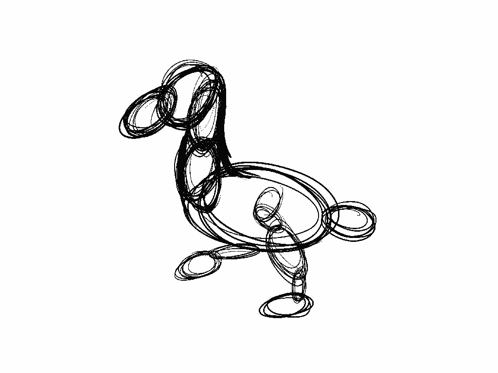
this was a lot more challenging because of the bounce the neck gets. Luckily for this project I don’t have to make this perfect so I was satisfied with the framework that I created for my illustrations.
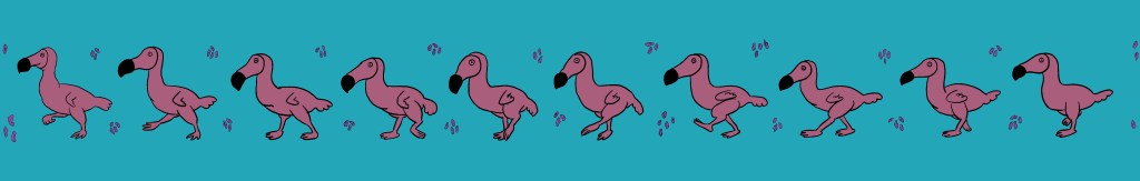
I had some struggle when it came to colouring the elements. I did want to follow the pattern my previous piece where I use the a colour from the same family for the animal and the food item, in this case the raisin and the dodo, but the dodo started to look a lot like a flamingo. I think this was perhaps further emphasised by the turquoise background that lifted the pink tones in the purple.
I decided to go the same route as before and colour the piece on a white background and only decide the background colour afterwards.
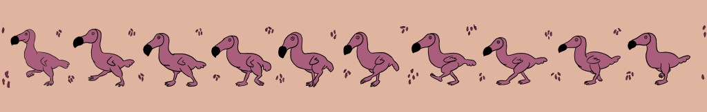
I decided to change the purple of the raisin to be the same more pinkish hue and put everything on a pale orange background. I think this works for the flavour of biscuits too. I will apply the same colour to my lid and see how all this comes together in a mockup before I decide if I like this colouring or not. I also just realised that I have not added the hatching lines as in the previous piece so I will go back to complete this as well.
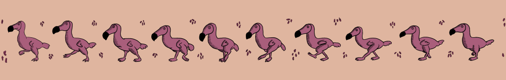
This turned out pretty great! I think the colours really work too. I must say it was so much easier to complete the second tin because I had a clear direction and I didn’t have to create the mockup from scratch.
I needed to get on with creating the 3rd and final tin then I would like to put all of these side by side to see how they work as a set.
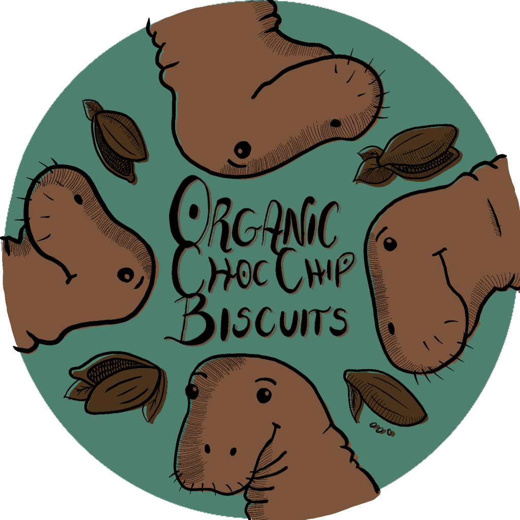
I started with the lid as before. I got some feedback that said. that the brown colour and the Sea Cow has a strong resemblence of poop. I could see this somewhat, but I was feeling confident that once I completed the entire tin, it will read better as an animal and less as a poo-monster.
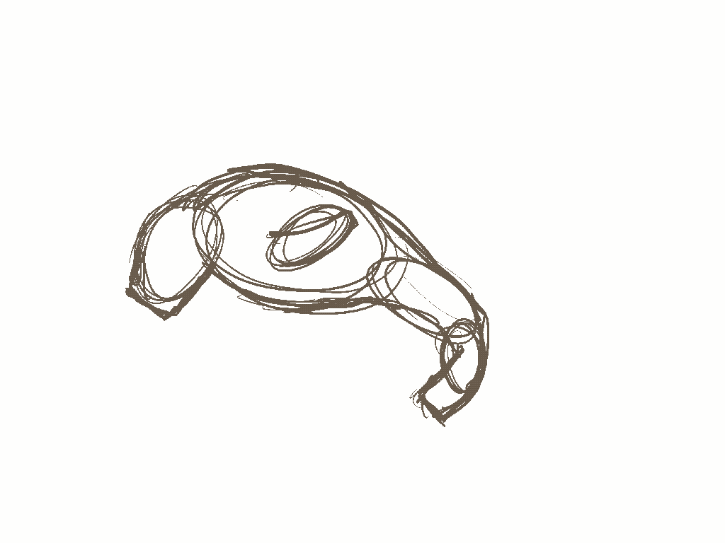
I wanted to capture movement in the same way as before, though I found this particularly challenging. It was just not really working for some reason. To be absolutely honest I couldn’t find footage of this animal at all or any recreation that I could have copied the movement from so I tried to find some manatee that should have the closest resemblance to this animal’s movement.
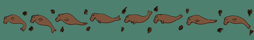
Even though I wasn’t the happiest with my animation sequence I managed to draw the sea cow in a nice playful way adhering to my self-imposed rules. It was time to see how the colours work in a mockup.
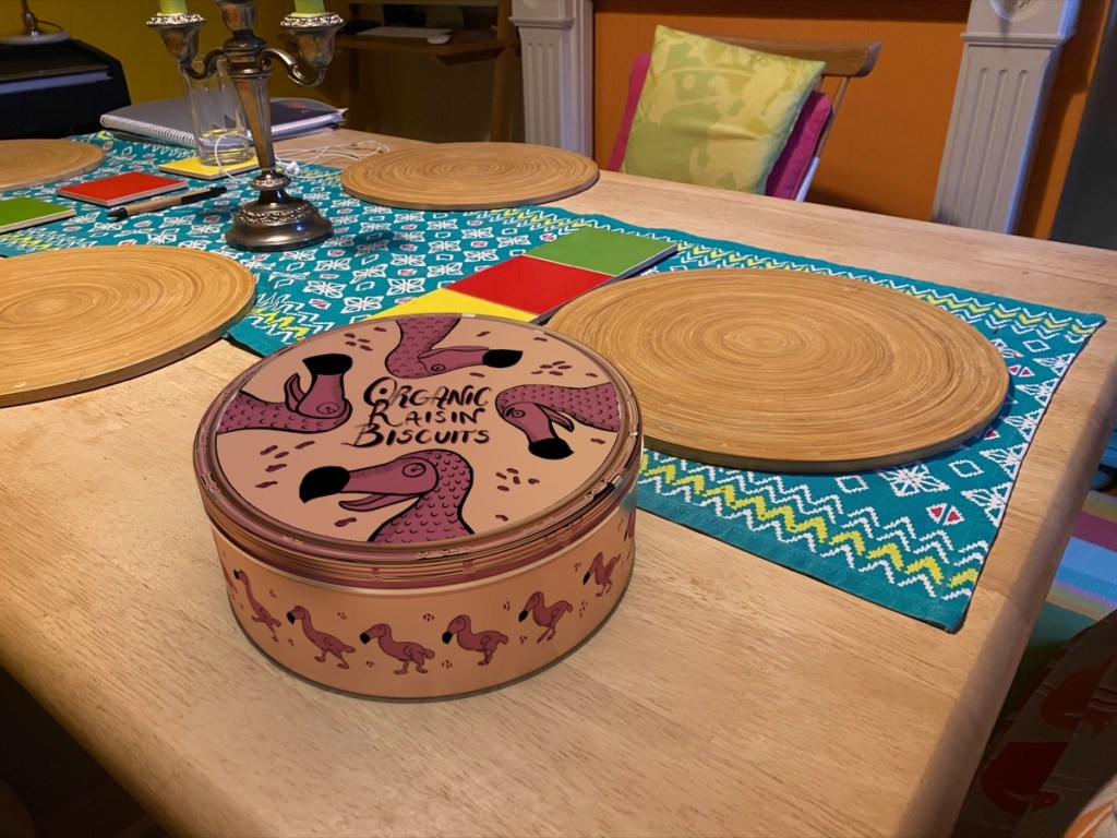
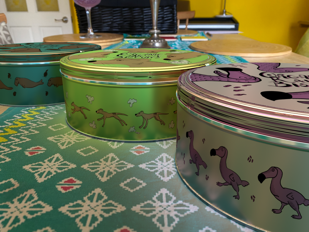
I also wanted to create another mockup where all 3 tins are in the same scene to see how they work as a set. For this I wanted to take a nice photo as a background where I could imagine my tins being set up for their product shot. I was also contemplating to add some actual biscuits to the scene but I didn’t have any to hand so I had to make do without.
Reflection
Overall, I really enjoyed this exercise. I now realise that I feel really inspired when it comes to creating some physical product designs and I think this shines through in the end results. Although I feel like I have made this exercise uneccesarily difficult for myself, I dont feel that the time spent on creating my designs was wasted. I have picked up a few new skills along the way; learnt how to create sequential illustrations, also deepened my knowledge when it comes to creating mockups using 3D techniques. I think these things will come handy when working on other projects.
I think my designs are pretty successful I believe and I think they would definitely appeal to children as well as their parents enough to give the product a try.

One Comment Add yours