
Begin by taking each pair of words in turn from the list below and writing them in your own handwriting.
Big Small | Fat Thin | Fast Slow | Fun Boring | Calm Mad
Now write each pair of opposites in a way that is descriptive – use the shape and size of the word and the relative position of the letters to express the meaning of the word. A fat ‘F’ may look different to a thin ‘F’. Write the words in both upper case and lower case.
Turning to your computer software, scroll through the fonts and select one that suits your word. Reflect the qualities you were seeking to express when hand-drawing the word. Be conscious of the roundness or pointedness of a letter form. Note whether it’s serif or sans serif. It may help to type the word several times in different fonts and make a direct comparison between them.
Print off the words in the typefaces you’ve selected in a size that reflects the meaning of each word. Your ‘fat’ word may be much larger than your ‘thin’ word, for example, and each may be in a different font. Trace the typeface in pencil using the colour that best communicates its meaning.
Use a moodboard to explore other media qualities which communicate the meaning of your word – consider texture, line quality and colour combinations.
Draw your typed words freehand using a pencil and then render them using materials, media and colour appropriate to their meaning.
OCA Key Steps in Illustration
As a Graphic Design student who has completed the Graphic Design: Core Concepts module already, the use of typography is not as foreign to me as it once was, but I feel like it is not an area of particular strength for me either. This exercise seemed very similar to the one in GDCC, Playing with Words. That exercise didn’t turn. out particularly well, so I wanted to make this exercise really good this time around, hoping to learn something new about the use of typograpy.
Started on paper, first writing the words simply in my handwriting, then moved on to trying to write them in a way that I felt represented the meaning of the words.
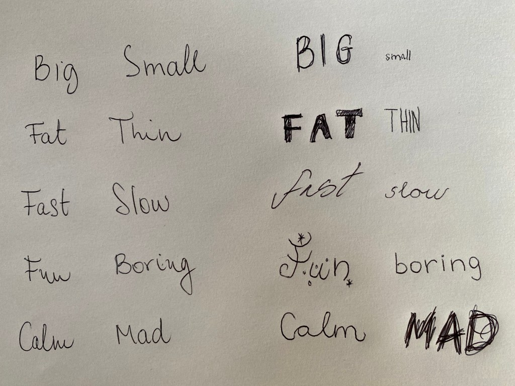
I felt that this was quite a good way to think about the words and try to think more about their meaning and try to get into the mindset of the exercise. I didn’t do anything earth shattering here, but I think it fulfils the point the exercise wanted to get across.
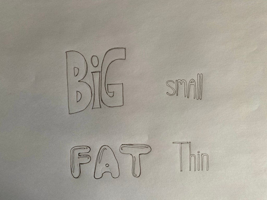
The next part asked to do something similar on the computer. I decided to do this in InDesign.


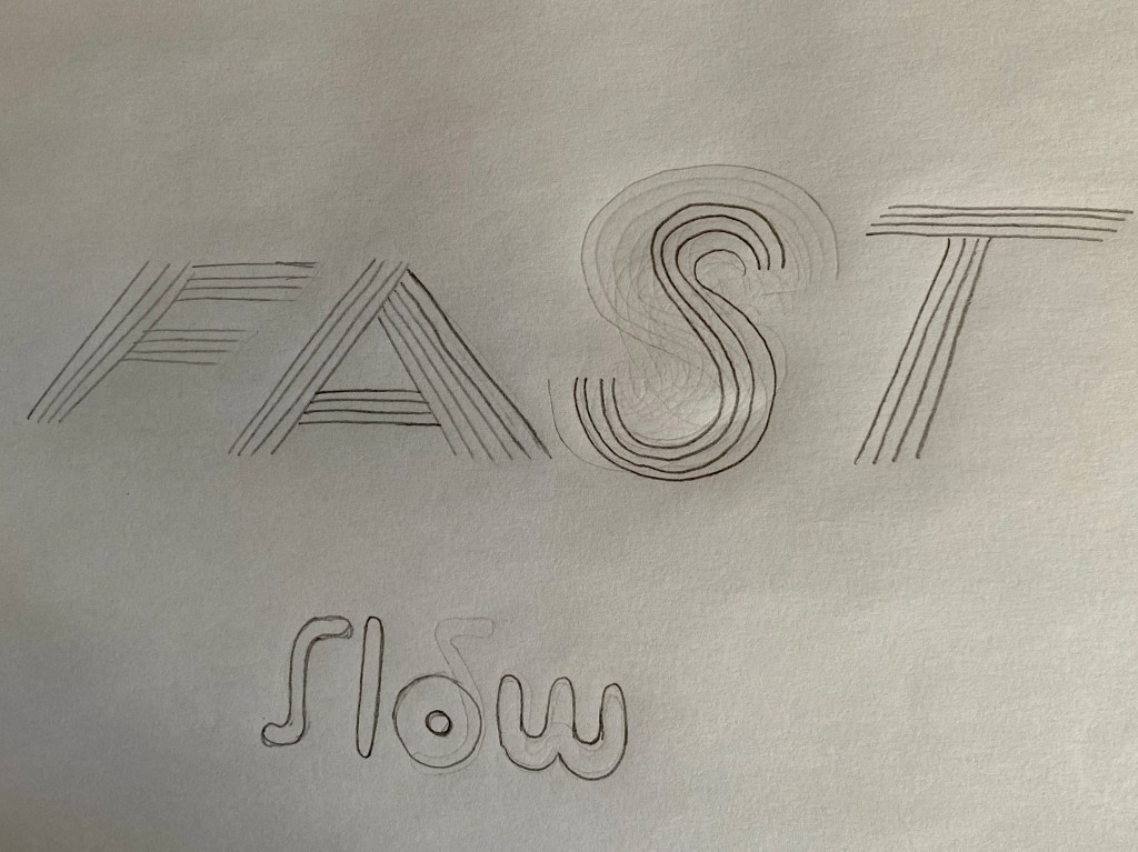
I found some of them more difficult than others. For example “slow” was a pretty hard concept to convey by using fonts I think. What I had in mind when selecting these fonts is what kinds of qualities a slower character would have for example. I thought they would be slightly out of shape, hence I guess there are some similarities with the “Fat” and “Big” groups of fonts.
After this was done, I went through each page and picked out the font that described the word best in my opinion. I think I managed to pick out the right ones, especially when placed next to their counterparts, they really started to communicate the meaning of the words.

I printed this page to work from. I wanted to make a point of doing this. with traditional medium as I could very easily trace these digitally, but I wanted to see how well I can do if I use paper and pencil as suggested by the exercise.
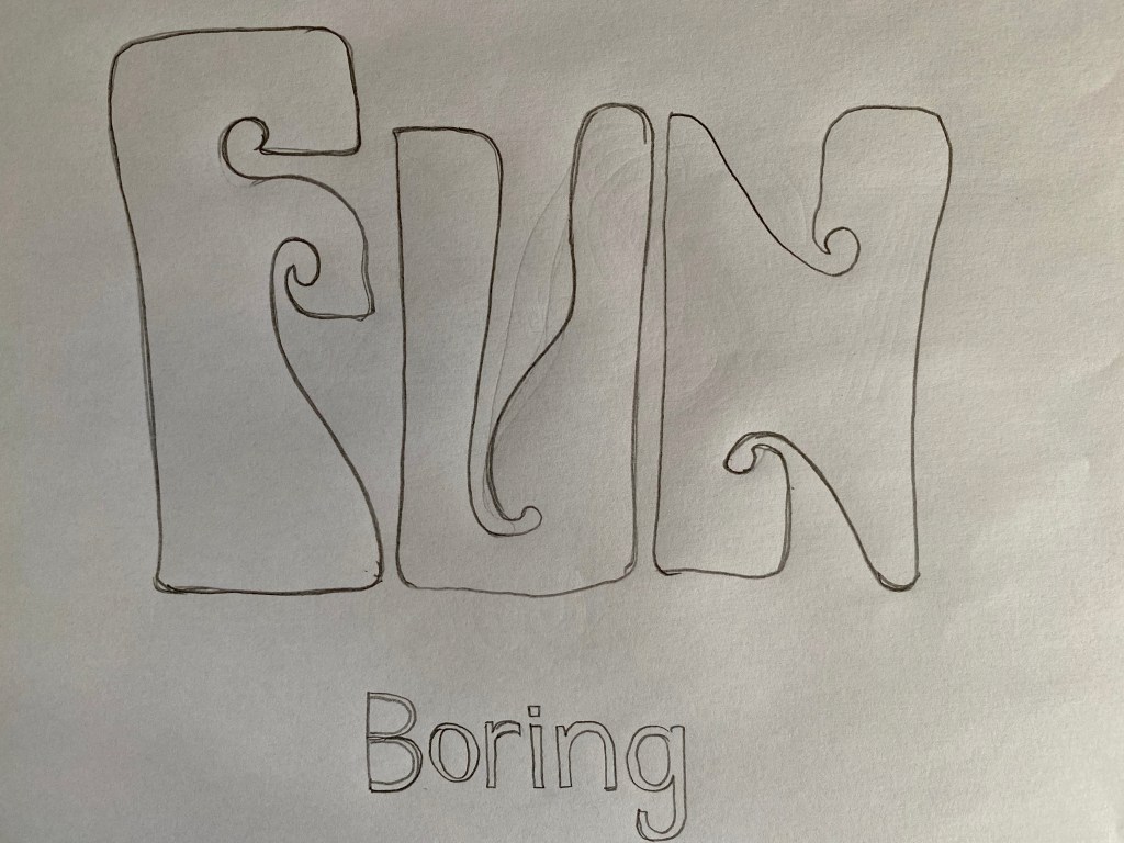
I started by trying to draw each of the words by pencil. I found this somewhat challenging, I didn’t want to trace but wanted to make these pretty similar to the originals. Some were easier than others, but the font I selected for “Fast” was so difficult to draw it made me want to cry. Especially the letter S.
Here is how my pencil drawings have turned out.

I re-read the exercise after this and realised that it specifically asked to trace the letterforms, so I went back and traced the letters in colours that I found best suited for the meaning of each word.
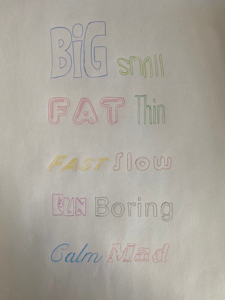
Let me go through the reasoning behind each colour chosen;
- Big – blue because of the colour of the Sky or ocean,
- Small – Yellow-green, because this is the colour of new shoots on plants which are tiny,
- Fat – I was thinking of how pigs are usually depicted in pink
- Thin – I was thinking about the diet of thin people, lots of vegetables and greens
- Fast – yellow like lightning
- Slow – I was thinking of a tree, how it grows very slowly,
- Fun – I wanted to do something girly, girls just wanna have fun!,
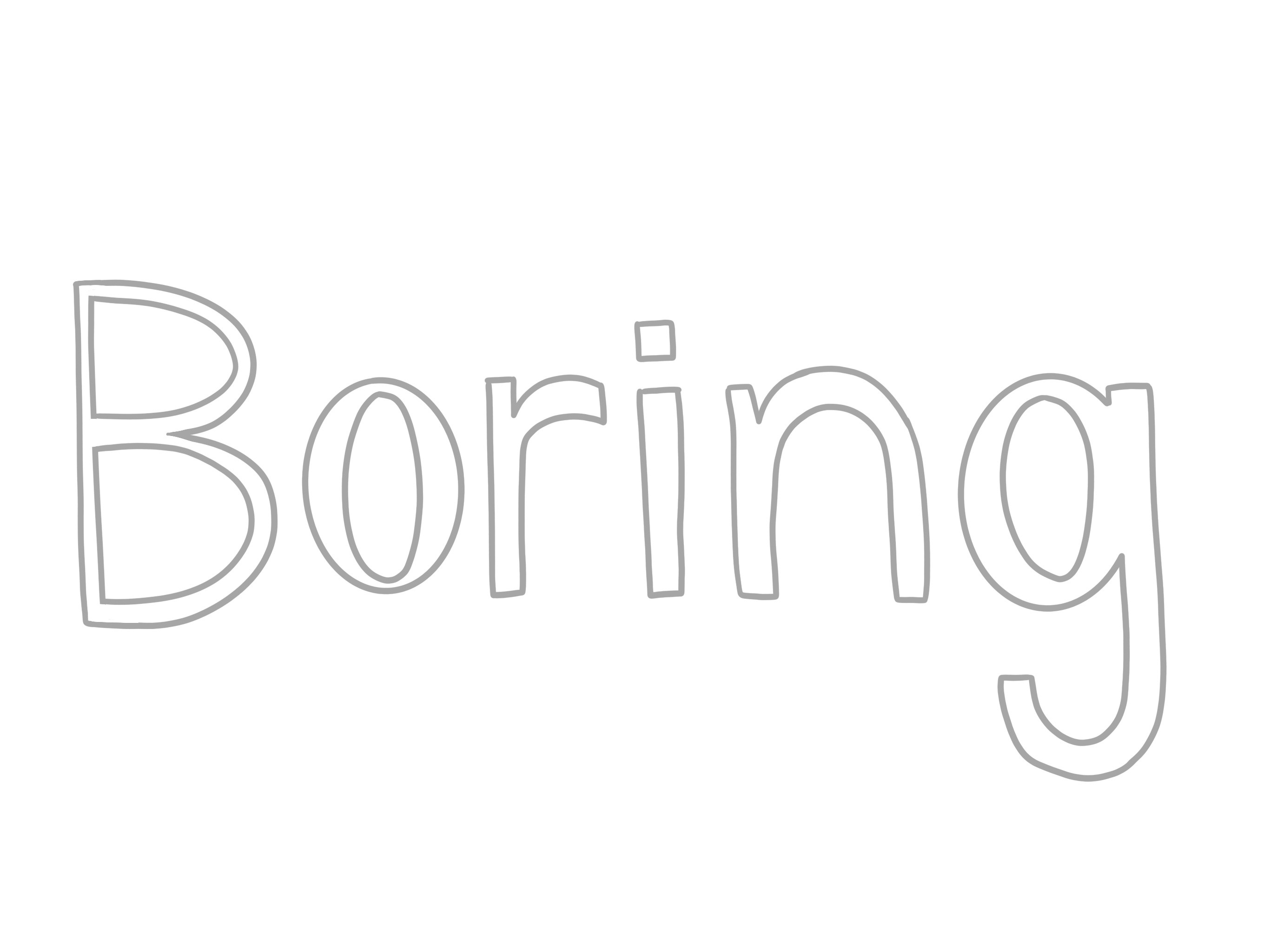
- Boring – Grey, this was a very obvious one, nothing is more boring than grey
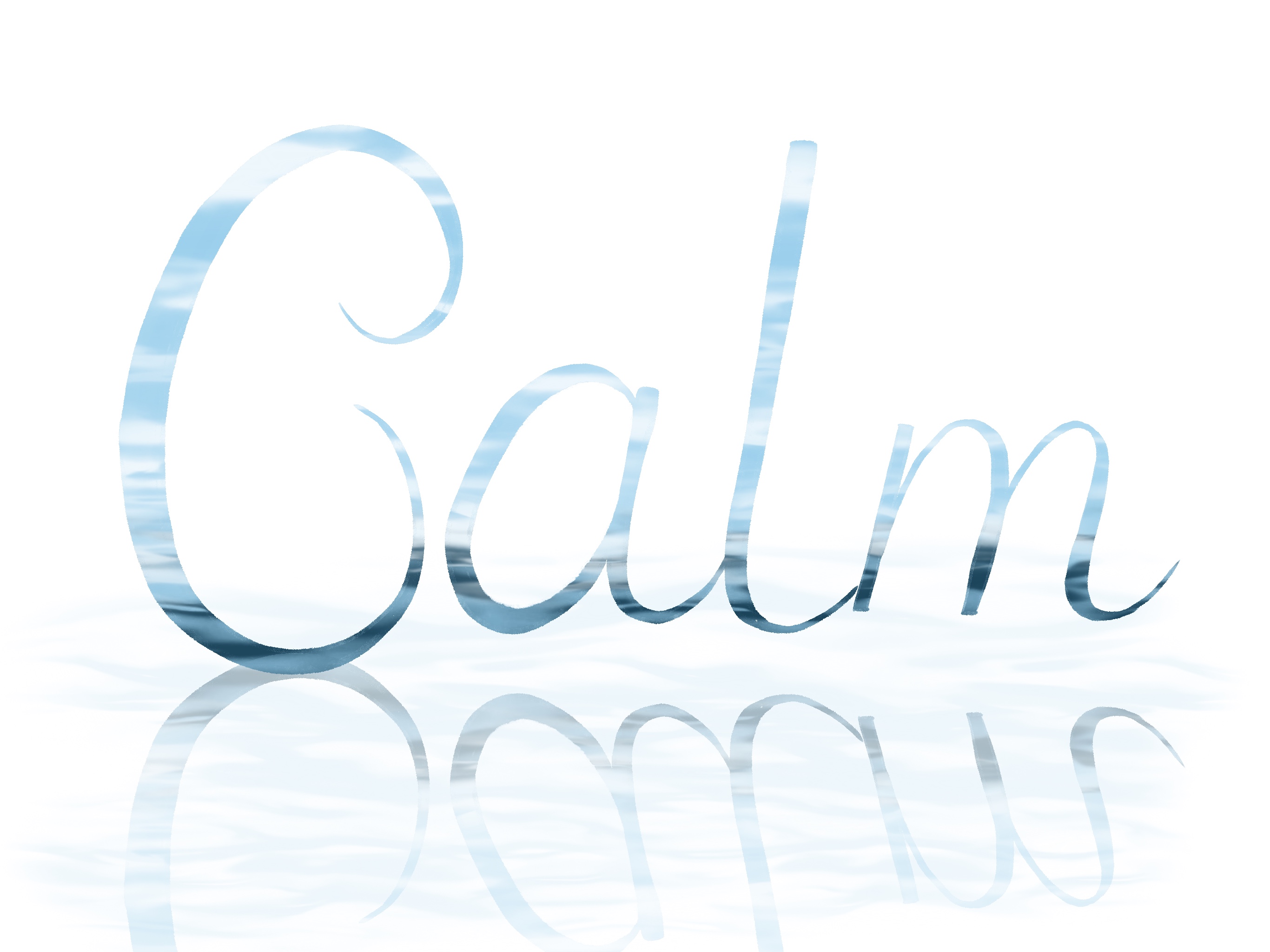
- Calm – Again I was thinking of calming waves of the sea, hence the blue
- Mad – A raging red
Some of the above are a little bit of a stretch I think, but I think, but most of them work well to convey the meaning in my opinion.
For the rendering part of the exercise I wanted to move back to the digital medium, because I feel like I was going to achieve better results this way. I am going to be using the drawings I made free hand earlier in the exercise and will be rendering them digitally.
I went ahead and created a moodboard to give me some ideas how to illustrate each of the words.
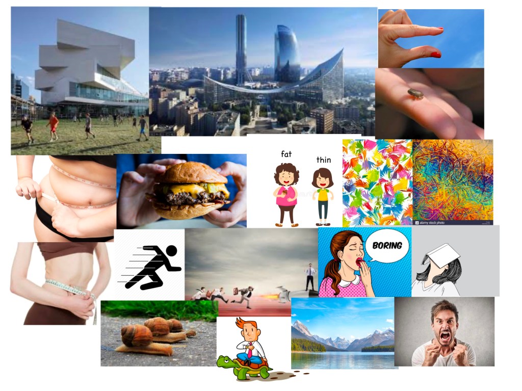
I tried to include things that first came to mind associated to that word, and things that I could find when doing a google image search. I am not sure if it makes sense all on one board, but I had some ideas how to proceed with some of my fonts, so I wanted to jump in.
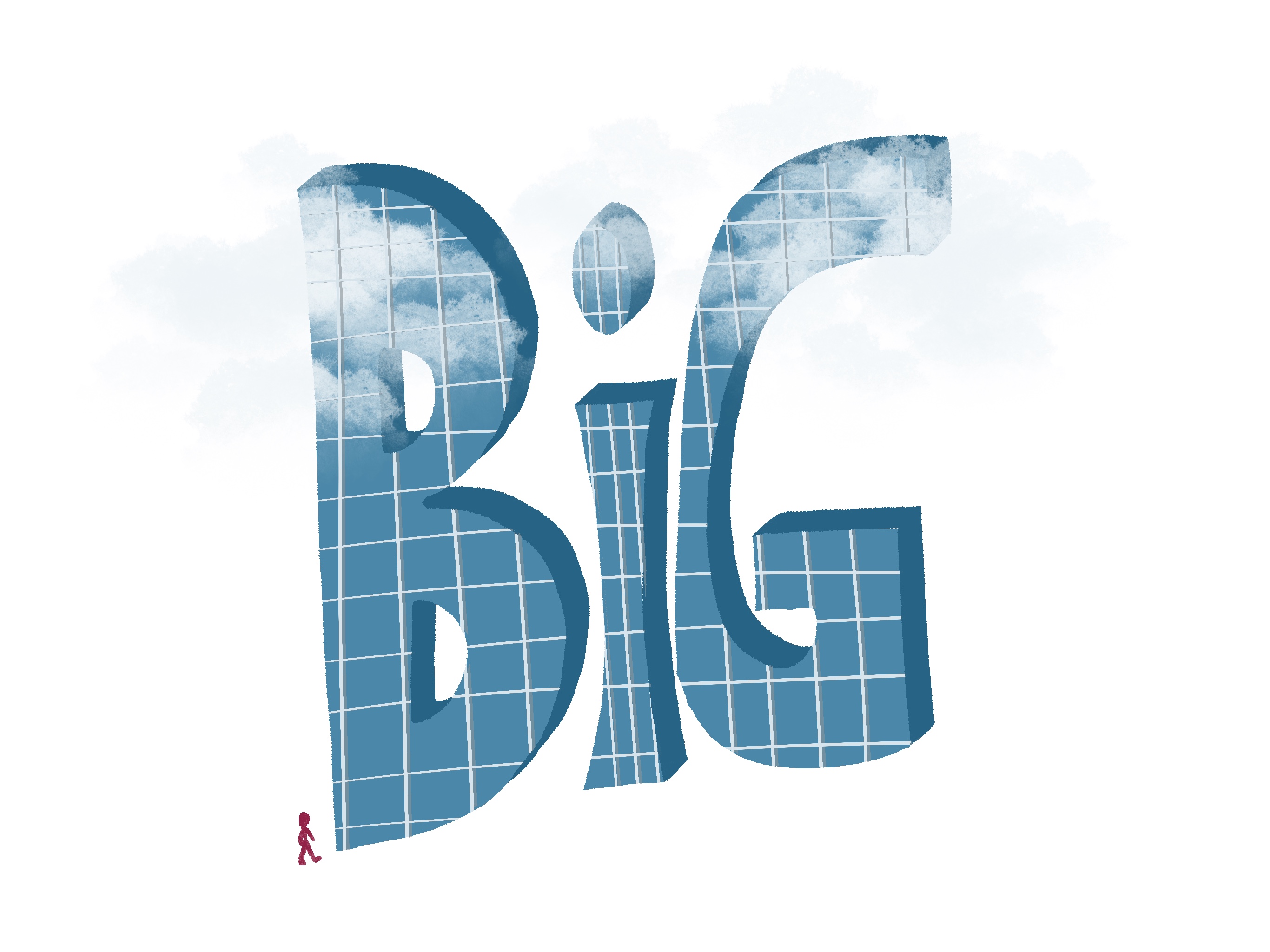
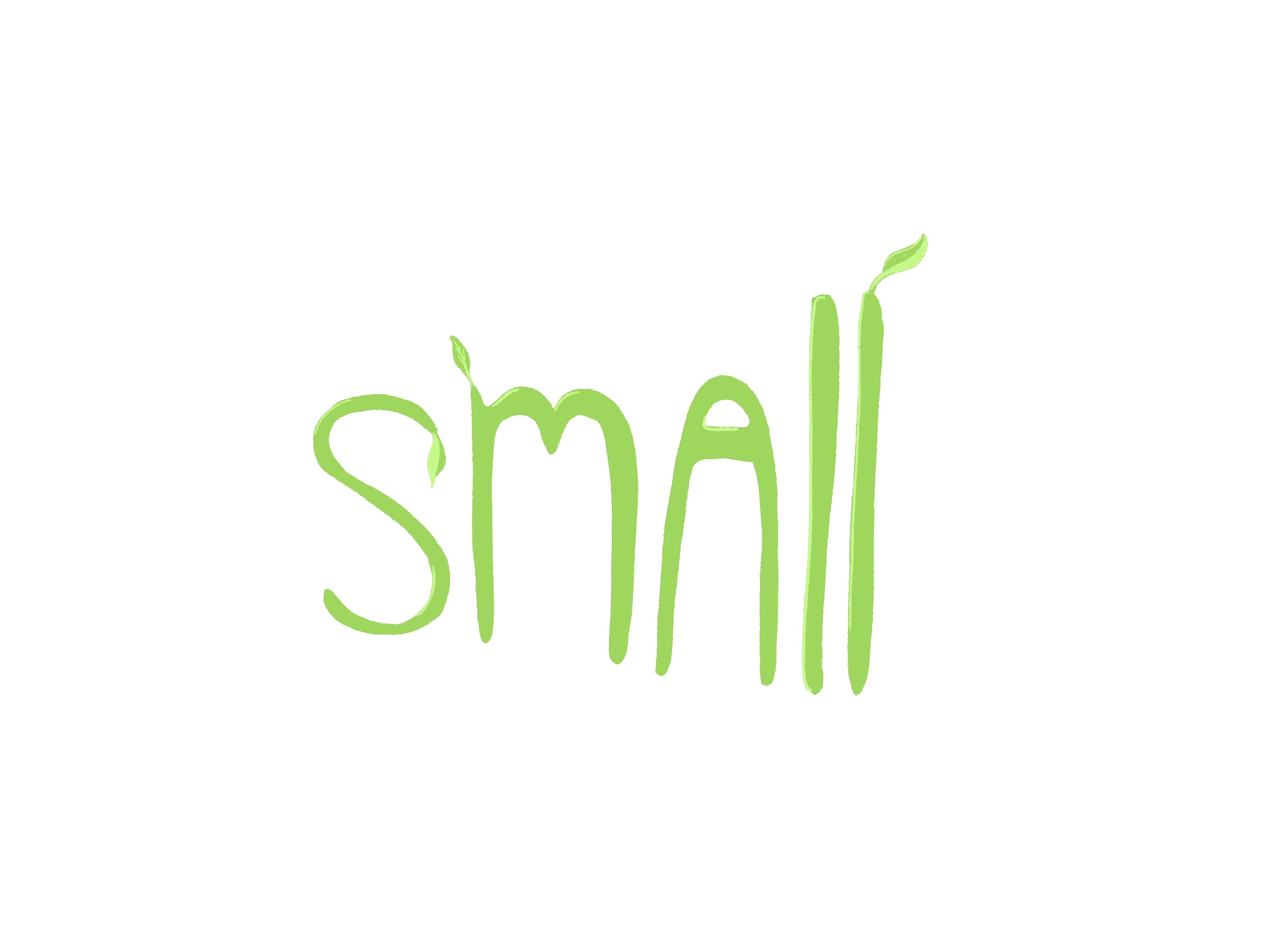
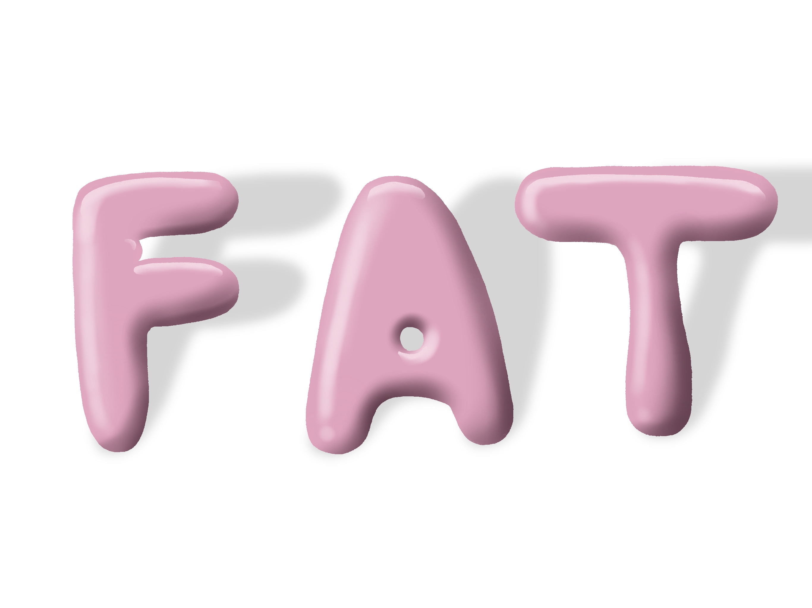
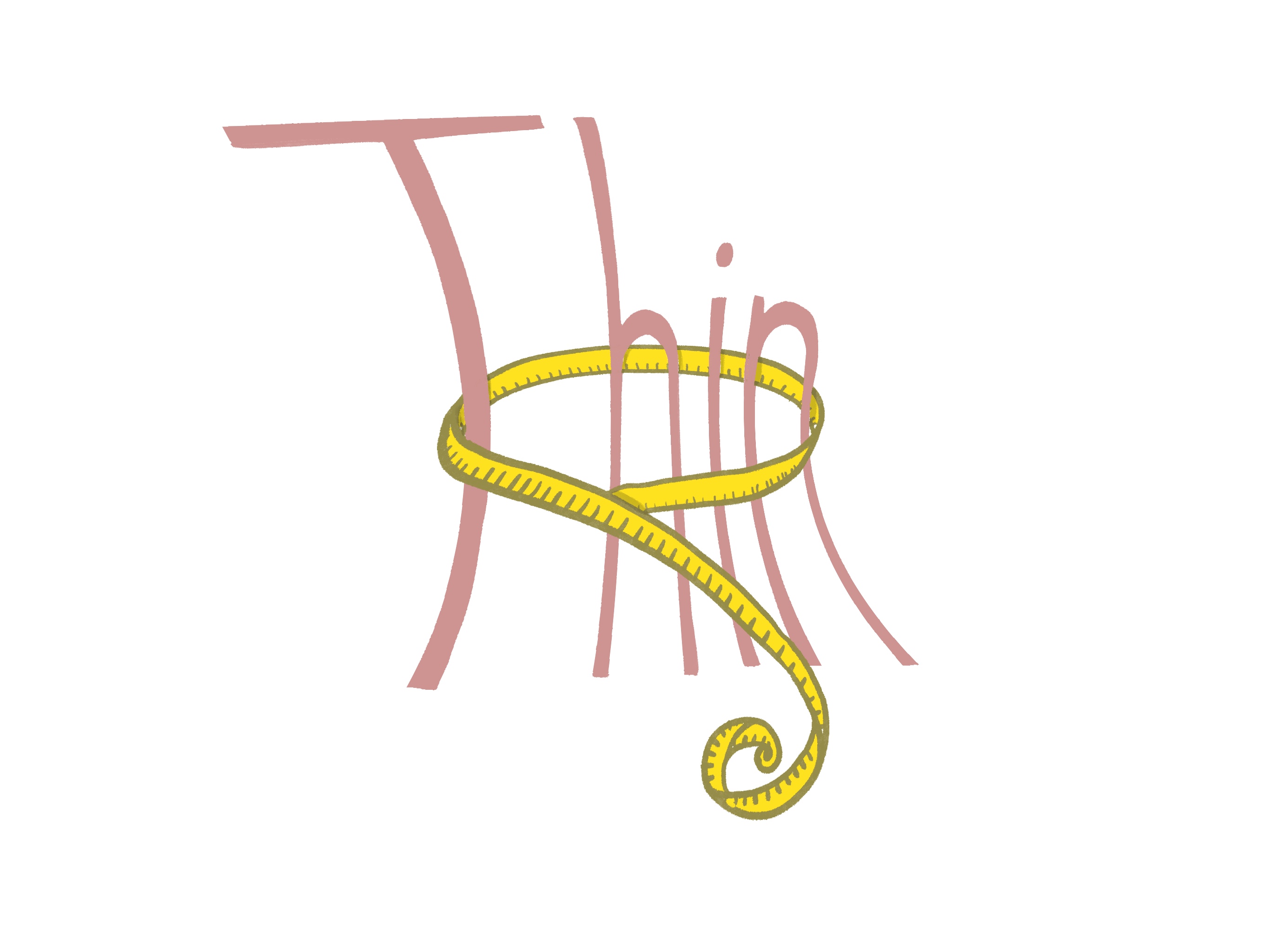
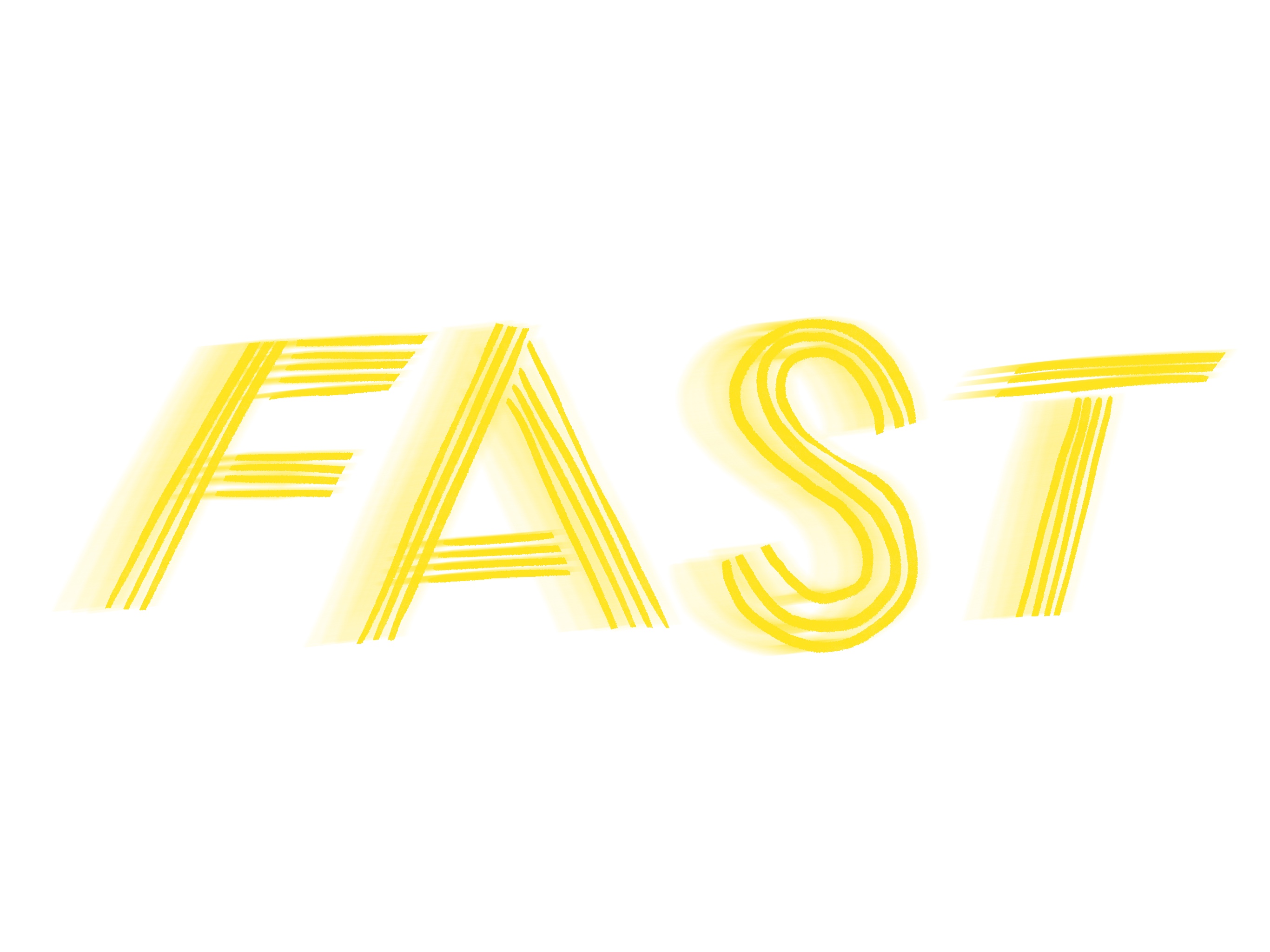
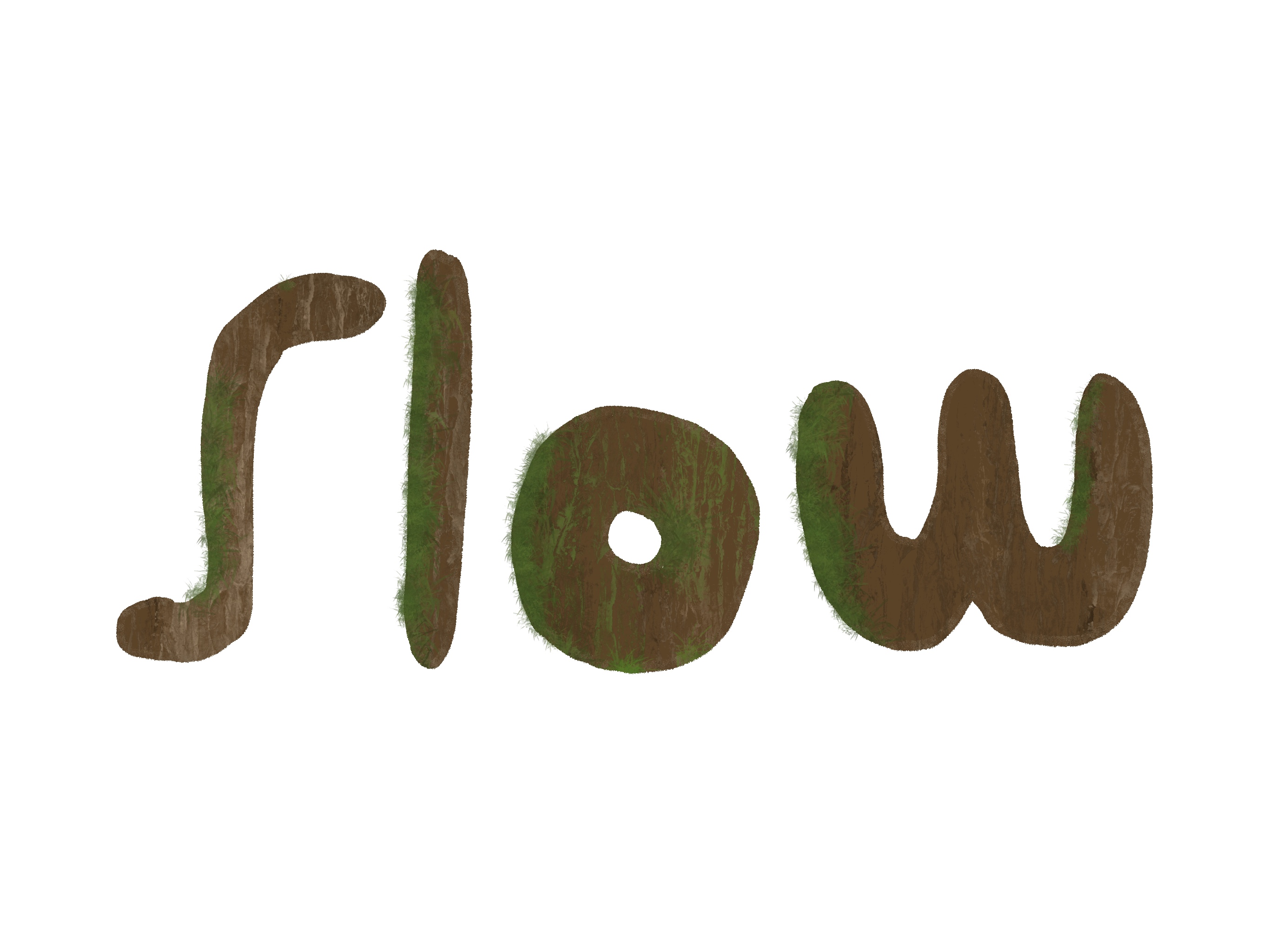
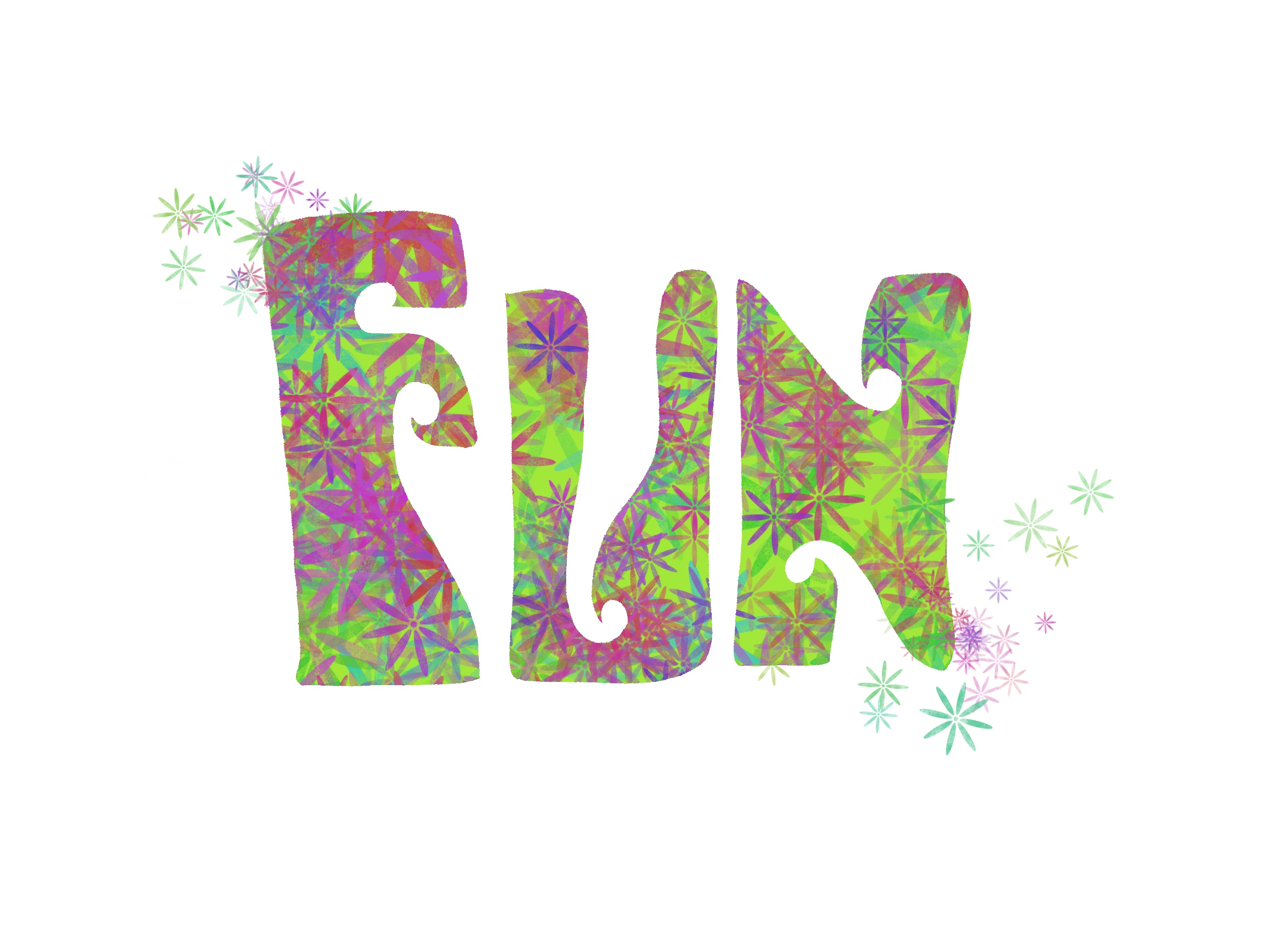
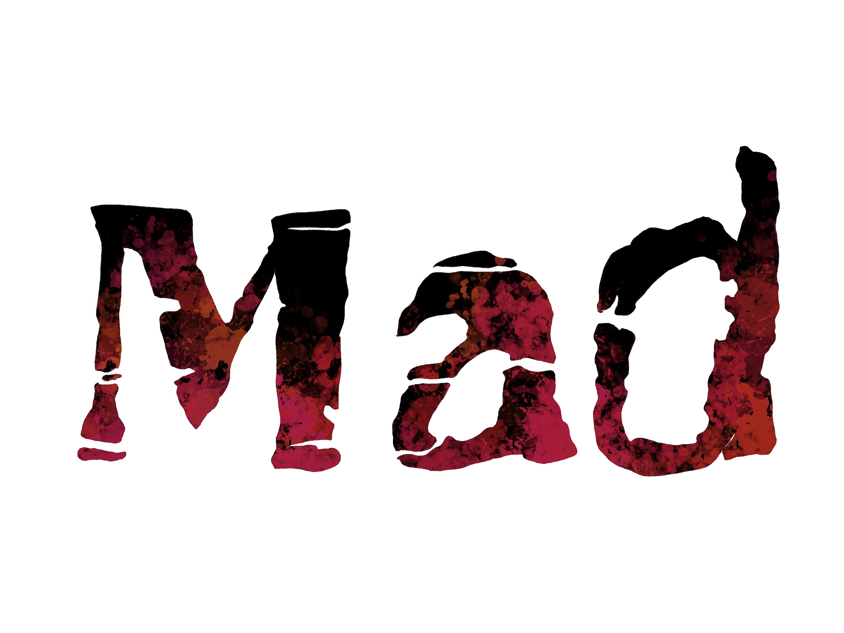
I think I managed to create some interesting illustrations. Some of the words that I thought were quite difficult to illustrate actually turned out pretty great. I am especially happy with “Big” and “Mad”. I think this was a useful exercise to investigate some fonts more thoroughly and analyse them in terms of the feeling/meaning they may invoke.
Reflections
This exercise was very helpful in letting me explore typography from a different angle. Not as a device that is used simply to communicate, but to force me to think about type as an illustrative entity. These are quite extreme examples of how type can be modified to fit your needs that I think I don’t normally explore when creating my work. I will try and incorporate this more in depth analysis of type in my methodology going forward to see if it will yield better results.
