
Your brief is to produce three illustrations for a series of books jackets, at the size of an existing travel guide, for the locations Istanbul, Helsinki and Milan.
The client would like you to create illustrations in which many elements are brought together in a diagrammatic way. They would also like the type to be hand-drawn in an appropriate style.
There are an infinite number of permutations available within this brief and therefore a high degree of flexibility. Write yourself a brief that is challenging but manageable. Be aware of the processes which have so far led to your development in ideas generation, visual research, image construction, understanding contexts and media usage. Use worksheets and sketchbooks to explore the problem you set yourself and refer to examples of work which solves similar types of problems.
Provide client visuals for all three covers and a mock-up for one.
OCA Key Steps in Illustration
This exercise is very similar to the Abstract Cities exercise in Graphic Design Core Concepts in its topic but quite different in its approach. I need to create client visuals for 3 travel book jackets in a diagrammatic style.
To start this exercise I need to do some research into the cities that these books are about. This is something I was critiqued on for my Abstract Cities in GDCC, so it is important to me that I show improvement in my approach. I have been to MIlan so I have somee firt hand xperience, but I have not been to the other 2 cities so those will be a little bit more difficult.
Istambul – Research
I thought it would be a good way to start by looking up those 10 things to do in … guides that I always turn to when visiting a new city.
I found a helpful guide on the Telegraph: https://www.telegraph.co.uk/travel/destinations/europe/turkey/istanbul/articles/istanbul-travel-guide/
I highlighted the below landmarks
- Basilica Cistern
- Hagia Sophia
- Blue Mosque
- Tarihi Sultanahmet Köftecisi (restaurant with traditonal turkish meatballs)
- Topkapı Palace (Topkapı Dagger, hair from the Prophet Mohammed)
- Panorama 1453 History Museum
- Galata Tower
- Kariye Museum
- Süleymaniye Mosque
- Dolmabahçe Palace
- Arter (contemporary art gallery)
- Palace of the Porphyrogenitus
- Galata Bridge
- Hasırlıcar Sokak
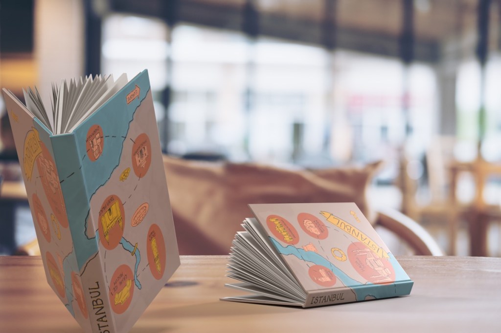
I had some ideas on how I imagine this laid out on a book jacket, my main idea was to create a illustrative map that would show the different landmarks of the city and create a sketchbook style illustration that I think would make for a lovely book jacket. I would also need to include some handwritten type, which works perfectly with this idea I think. I wanted to research some traditional Turkish art style so I can find something that allows me to relate all of this to the local culture. I found that the below pictured caligraphy style is quite popular in Turkey so I think this might be something I could work into my hand written font:

I think I had enough source material, and I really wanted to test out how all these elements would come together in a diagrammatic illustration that is based on the map of the city.
Another thing I wanted to check quickly is the size before I start, as the exercise is calling to create this in the size of an existing travel guide. Luckily we have a number of travel guides at home, so I will be using the form factor of one of these.
I measured a timeout guide book, the measurements for the cover were 13cm x 19.9cm the spine width was 1.3cm. This is a prefect size that I can make a mockup for at home with my A4 printer, so that should be useful.
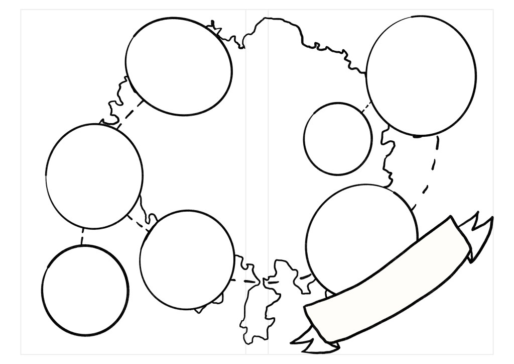
I created a template for the book cover, that I will used as a guide for the proportions of my designs for this exercise. I think this is a simple way to ensure things fall into areas where they should. Using this template I decided to create a couple quick sketches to test my idea and figure out a layout.
the first issue I encountered was that the shape of Istanbul is quite wide with 2 distinct sides to the city.
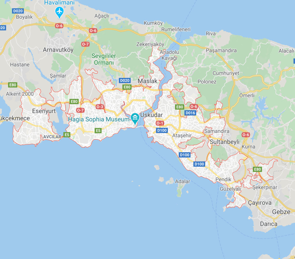
One side seems to be packed with attractions, (see below image from google) but the other side of the river seems to be pretty quiet when in comes to sightseeing spots. I originally wanted to include the whole city map, but now I am thinking that this may make things look a little unbalanced, so I will focus my cover spread to the area where there is more going on.

I think this approach will enable me to create a cover with better balance and more interest. This might actually work out in my favour, as the side that is going to be at the front of the cover, might be a little less busy and allow me to place my hand written font without too much trouble.
So after a bit of consideration I decided to do this in a way where I don’t think about the layout of the map so much before I start my map, but rather I will create my map, and see how I can fit this on my book jacket. I think this approach will allow me to be a little looser with the placement of things and create something fun.
as I started drawing my landmarks on the map I realised that I really needed to focus my map on the old town the rest of the town that is still considered Istanbul must be more residential and doesn’t seem to have an awful lot to offer for tourists.
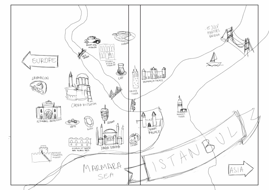
After about 6-7 hours of research and note taking I have ended up with the below sketch.

I tried to keep things in their general areas on the map and tried to make them as recognisable as possible. I found it hard not to only focus on the main tourist area, as the rest of Istanbul seems to have so little to. offer. I think this is going to make it somewhat hard to make my map very interesting on the right hand side, but I was adamant to make this work as I believe this is a good idea for the book jacket. I must say though, so far I found this exercise to be the most taxing in terms of the planning that was required.
I decided to lay this over a template I created and then see if my idea works as a book jacket at all.

I was a little bit frustrated because the idea that I had in mind didn’t seem to come to life the way I expected it to. I think the fact that one side of Istanbul and generally the outskirts were so barren, made it really difficult to fill the page. On the other hand, this was creating some nice breathing space which might be a good thing, but I didn’t want my cover to be boring. At the moment there is not a lot there and I think this means that unless someone picked up the book wouldn’t see all the detail on the back of it.
So I think, I may have started this work slightly wrong by disregarding the book layout, but it was a quick fix really. I need to be able to analyse the map first and make these types of decisions upfront so I don’t go down a rabbit hole and draw everything before it is too late. I think now I have the right level of “zoom” and I can try to fully populate the map to make it more interesting then redraw all the elements. I think in the next map, I will just add the names of places and a placeholder block for each so I can plot out my map first and worry about creating the drawings after. That way I can move through these initial stages quicker.
I felt like I have been stuck with this idea and neglected to try out some others that may work better for a book jacket. I came up with a different idea that is still fulfils the diagrammatic brief, but will be much easier to balance in terms of creating something that is pleasing to look at and not too Busi on one side and very empty on the other. Whilst I was really set on the map idea, I recognise that this might not be a suitable approach for the cover.
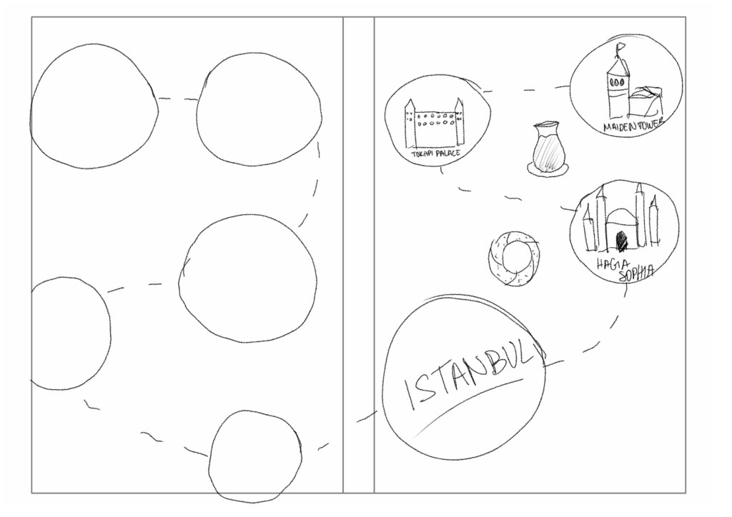
While I think this approach is less interesting to look at, it will definitely be more organised and repeatable for the other covers. I feel like this would be an approach that would allow me to create a cohesive series with any cities in mind. I was thinking maybe I could add a map to the background and then pointing the bubbles to the right areas.
I think this is the right approach and I feel much more positive about the layout and the balance of distribution of elements on the initial sketch, so I decided to tidy up this sketch and colour it so I can see if this works in colour. I might play around with where each of the icons go, so that they are closer to their actual location on the map.
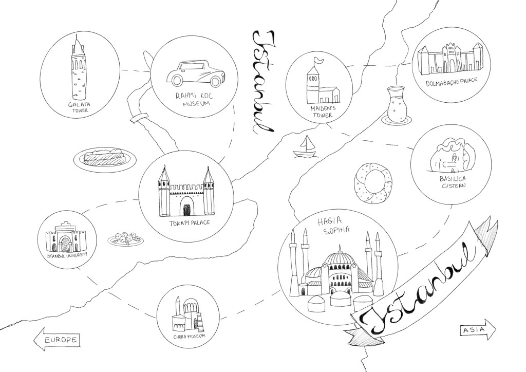
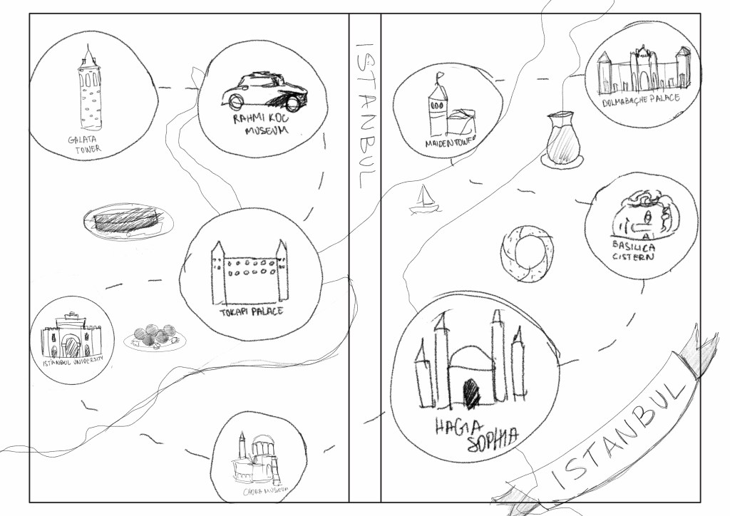
Refined the sketch to see if my thinking was working well enough, I also wanted to lay down some colour to see how it comes together once the different elements stand out more. I wanted to work. with a very limited palette. 3-4 colours maximum, as I think this would nicely deliver that vintage map feel I was after.

I picked a few colours from a photo of Istanbul and just started to colour in the map and the water to separate them, I purposefully went with kind of muted powdery colours as I think they help to give that vintage hand drawn map feel. I changed the font from the caligraphy like font to something more legible as I thought it looked a little messy and I wasn’t a fan of it.
Initially I thought to remove the circles that I originally drawn to separate the front layer of illustrations from the map somewhat because I felt that this would maybe create too much visual clutter, but on closer inspection I realised that the Chora Museum now looked like it is actually situated in the middle of the sea. I decided to add the circles back in to see if this would crearte the degree of separation I was after.

I wanted them to look more like stages in an itinerary rather than actual geographical locations. I think adding the circles achieves this quite well.
I felt like I learnt a lot from this first city and wanted to move onto the next one to see if I can repeat this process and create something that is similar in style.
Milan
Milan is a city that I have personally been to, but I can’t say I explored it too well. I visited friends at the time and have been shown around but don’t remember an awful lot so I should refresh my memory with some travel guides.
Things that I knew I wanted to include:
- Duomo di Milano
- Columns of St. Laurence
- Arco della Pace
- Castello Sforzesco
- Mudec Museum
- Cavallo di Leonardo
- Cimitero Monumentale
- Royal Palace
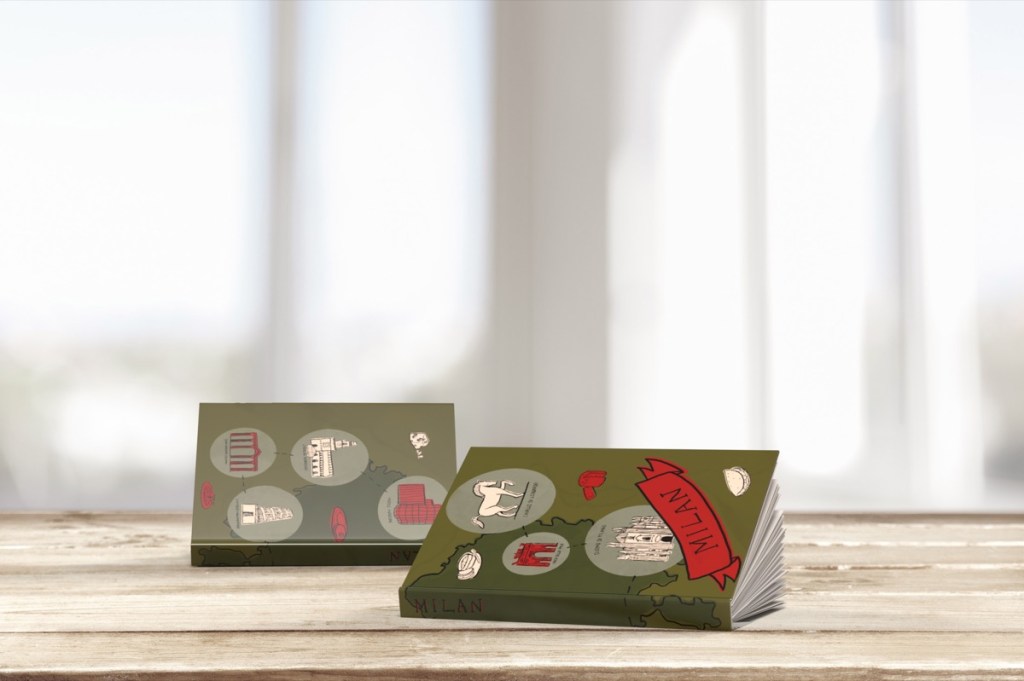
As I was looking at the map, I realised that this will have the opposite issue to Istanbul; everything is in the centre of the city and also realises that there are not really any large bodies of water to make my map look similar to my previous cover. I guess I should have researched all 3 cities before actually going into the design phase. I think this may not be a massive issue because I will still be able to signify where the city starts and ends with colours.
Learning from the previous drawing I have decided to draw up the layout of the most important elements first, and then fill in the landmarks after this. This will allow me to get them closer yo the actual location while keeping in mind the layout so I can progress this quicker without too many missteps.
Once I had this in place it was relatively simple to complete the next visual. I just had to draw the buildings and place them into the circles. It was actually really refreshing that I didn’t have to think about it too much just follow the process. I laid out in the previous step.
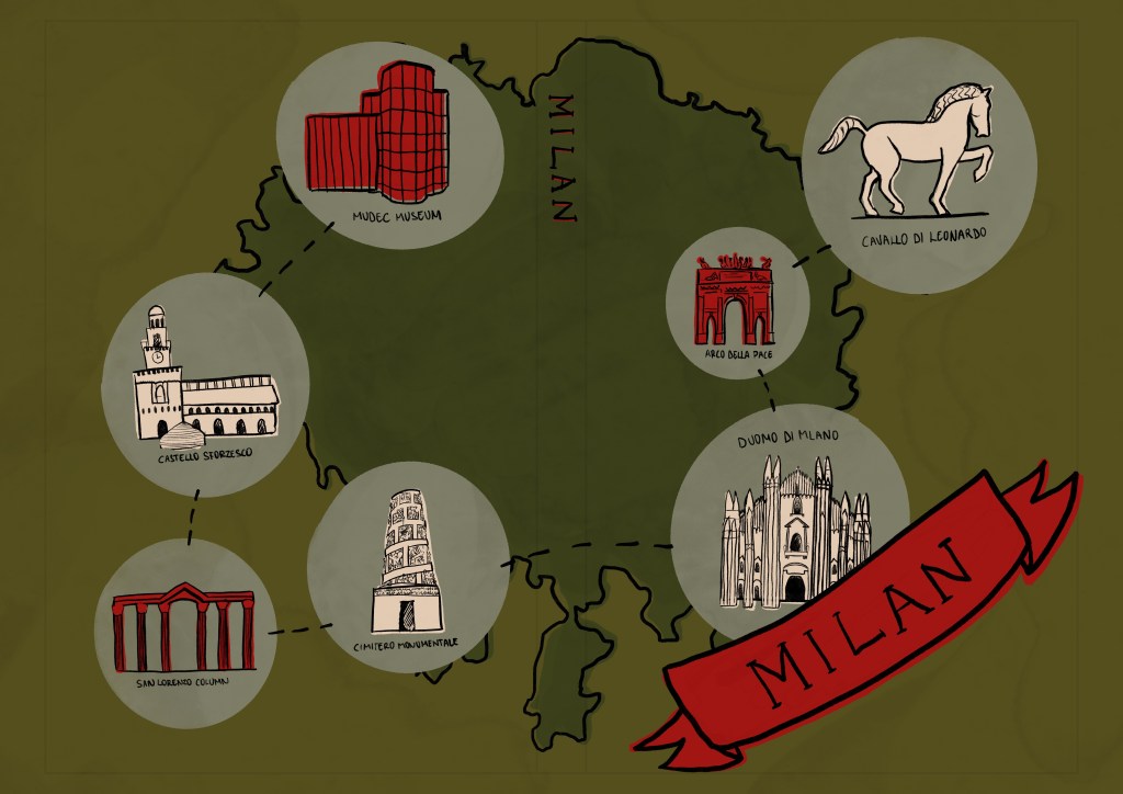
I thought this turned our pretty crisp, and I was mostly happy with it, though I was wondering if I chosen the right colours. I decided to move forward and start designing the last piece of the trio and see how they all come together.
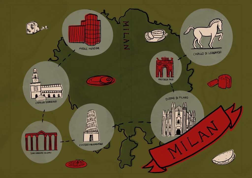
After posting this I realised that something was missing. I forgot to draw the food items in between the bubbles with the building like in the visual for Istanbul. Looking at the image; I identified 4 spots where I could place these, so I just needed to find 4 dishes that were worth trying in Milan.
https://www.timeout.com/milan/restaurants/how-to-eat-like-a-local-in-milan
Found the above article. very useful to aid with coming up with a few ideas.
Helsinki
Helsinki is aI city I know very little about. I started my research online like with the other two cities before.
Started by watching a couple videos on YouTube which I found. quite helpful and made me actually want to go and visit. A few things that stood out to me from the video as. something that might work as icons for my cover:
- Finlandia Hall
- Sibelius Monument
- Kampin Kapelli
- Kiasma (museum)
Since this was not quite enough to put on my book jacket, I went ahead and did a bit more research. Further sights I found that I wanted to include:
- Amos Rex
- Helsinki Cathedral
- SkyWheel Helsinki
- Havis Amanda
I think this will be enough for primary icons and will just need to add my less primary foodie icons now.
I found this article a useful resource when deciding what food icons to represent: https://theculturetrip.com/europe/finland/articles/10-local-foods-you-need-to-try-in-helsinki/
With this one, since I done the whole process twice I found I was able to complete the visual much much quicker. I think it turned out pretty good:

I was pretty happy with how the 3 covers turned out, all I had left is creating the mockups to show what these you’d look like on a book jacket.
I used a software I never used before called Adobe Dimension. It is a simple 3D software that allows you to create composite images using 3D and 2D assets. I really enjoyed playing around with the composition and creating my mockups, I think the end results are great!
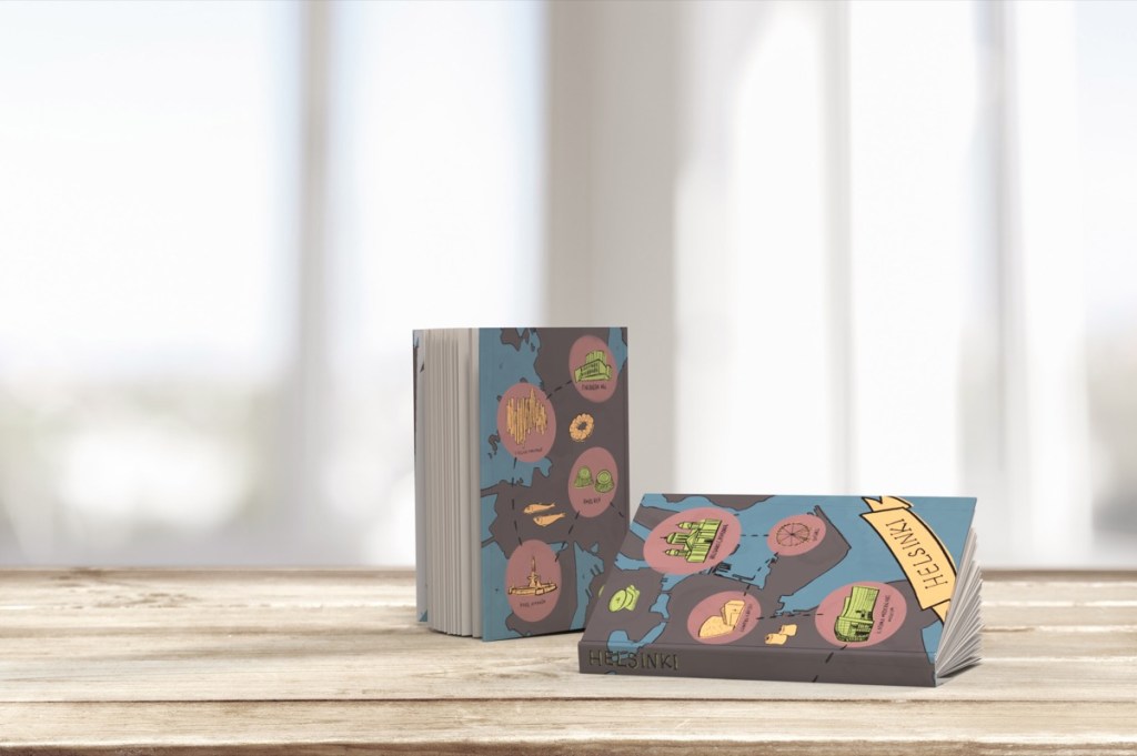
I had some slight concerns regarding the placement of the type in certain places on my illustration as it made it quite difficult to read, but overall I was happy with how the visuals turned out. I think if I was to take these covers to completion, I would rearrange some of the elements to make the covers more balanced and also would make sure to measure where the type is on the spine to make them consistent in placement when they are stacked against each other on a bookshelf.
Reflection
As I was researching, I had a lightbulb moment and kind of understood what the point of this exercise is. I think I started to recognise some patterns in the process that made the research and the development of the image much easier. I think the whole point of this exercise was that if you are creating a series of some sort, you need to work out a methodology that works for you and is repeatable. I feel like by the 3rd piece things started to fall into place. I had a clear method and I was able to work quite rapidly.
I found this exercise very daunting at the beginning especially because I have never experienced 2 of these cities before so the research had to be really in depth, but at the end I managed to have fun with the exercise and I think the results speak of this.
One of my shortfalls for this I think was the typography, I didn’t do an awful lot of research to decide what kind of type I would like to have on the covers, but I think the type I created is legible and playful so I am happy with it. The other area I should have spent a little more time on perhaps is the choices of colour for each of the cities. I picked my colours quite instinctively and haven’t really based them on research.
Overall I am very pleased with my outcomes.

One Comment Add yours