
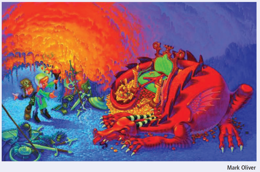
Look carefully at this image.
Then in your learning log list the content of the picture – breaking the image into its constituent parts and answer the following questions:
• What the image is about. What is it saying?
• Work out the narrative and identify the story.
• Describe the palette and tonal range which has been used. Note if the colours are hot or cold, whether the elements are detailed or textural, and where these approaches are used.
• Is there any connection between hot colour and the importance of the element in telling the story?
Begin to identify the hierarchy within the image. Which are the most important elements in terms of carrying the narrative or conveying the ideas and how have these been treated?
OCA Key Steps in Illustration
First I started to analyse the image to see what elements it is made up of, and to see in what order I notice things.
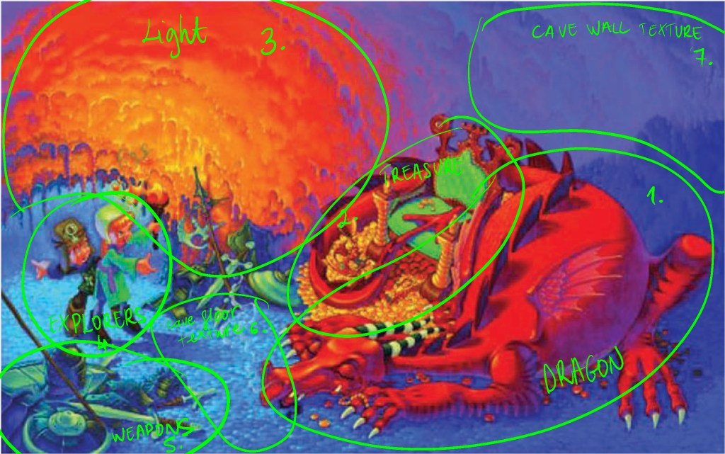
- Dragon
- Treasure
- Light on the cave wall
- Explorers
- Weapons/ other less important treasure
- Floor texture
- Cave wall texture
- Dragon texture
I think the above was the order in which I noticed the different elements in the image.
The hot areas have definitely attracted my attention first and then moved around the image noticing the areas that were lighter and in the immediate vicinity of the aforementioned hot areas.
Looking at the wall for example where the light reflects, I believe this is deliberately looks like a big arrow head pointing at the protagonists in the image. This enables the viewer to go around the image in a circular way and notice more and more details each time.
I think this story conflict is pretty obvious, one of the hero characters in the image would like to have some of the treasure the dragon is sleeping upon, but the other cautions him and trying to pull away from danger.
I think this image is very effective because it cleverly balances the strong hot hues with the calmer blue ones. I think if we were to split the image by colour, it is roughly 50/50 split between the warm and cool tones, which makes it very balanced.
I found the dragon’s face a very interesting contrast to the whole image. While the dragon represents the threat in the story, if we look at the face, this is very calm and serene. I think this is mainly because the dragon is asleep, implying the calm before the storm.
The textures are really nice in the image, clearly delineating objects and creating atmosphere. You can almost feel the roughness of the floor and walls; implying this is the dragon’s lair.
Reflection
This is an interesting exercise, because I almost never take the time to sit down and look at somebody else’s work for such a long period of time. I think I should repeat this with images that I really like to decipher what makes them so successful in my eyes. I guess all of the above is pretty subjective, however I can see the t there are certain techniques that the Artis applies to the image to make it more pleasing to look at and tell the story more effectively. I should try to apply these practices to my own work to see if this can improve the overall quality.
