
Using internet searches or your own visual references select an image of: each of these
A tree
A child running or walking
A building
Photocopy them in black and white at different scales and sizes so that you have several versions of each image. Cut them into individual items with which to work.
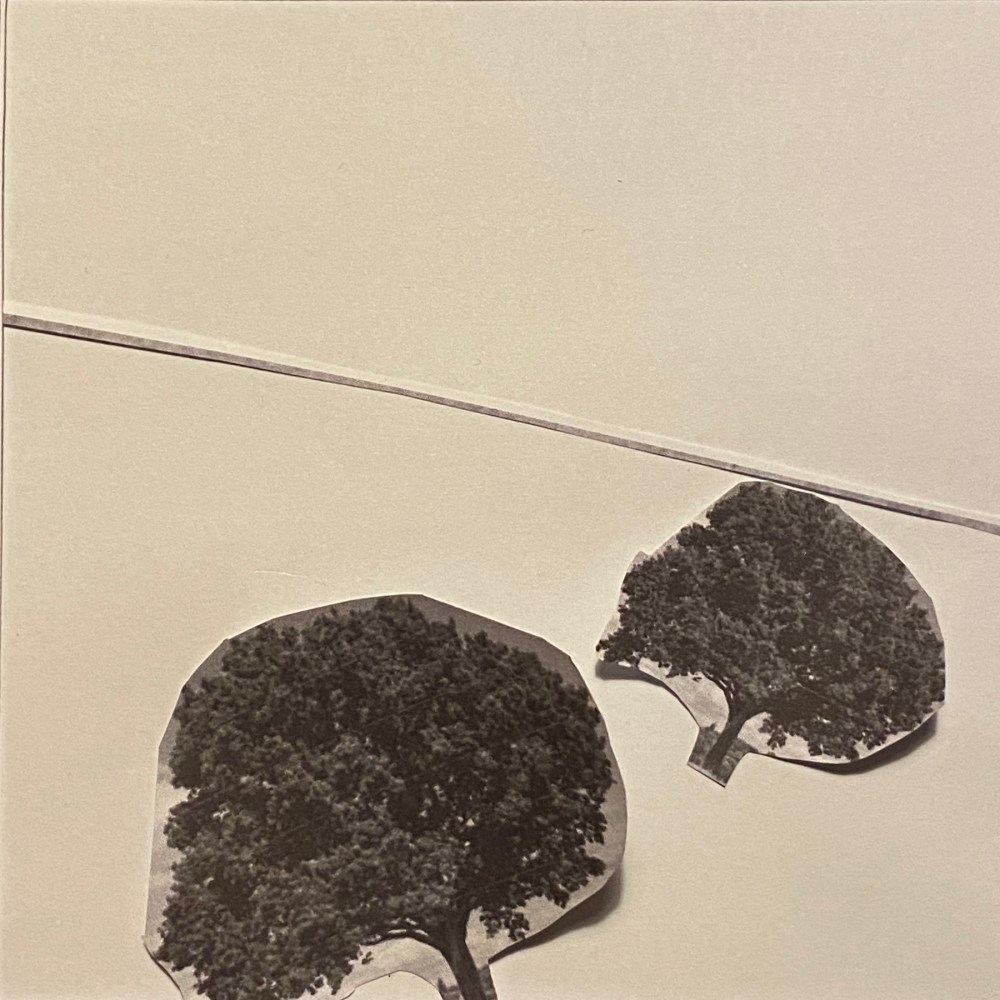
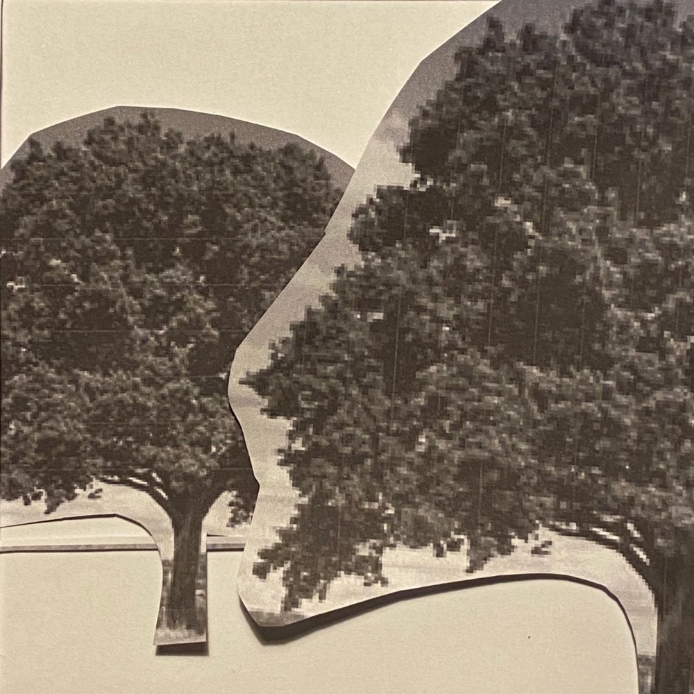
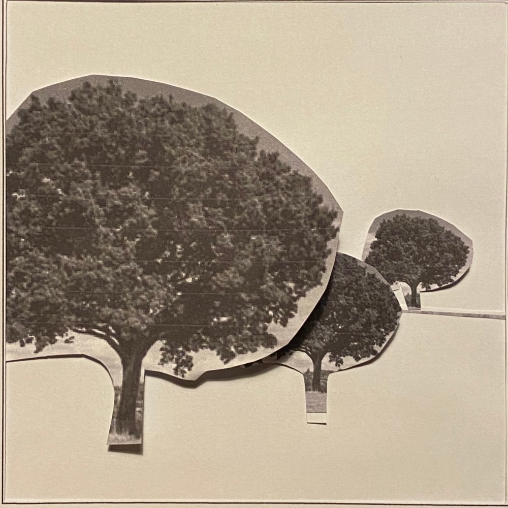
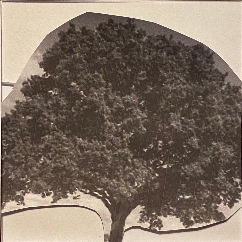
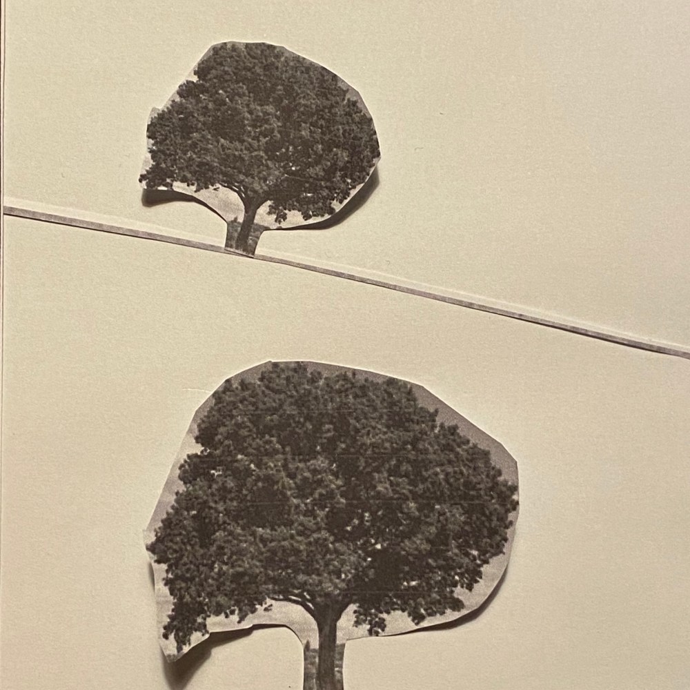
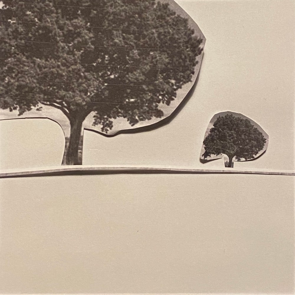
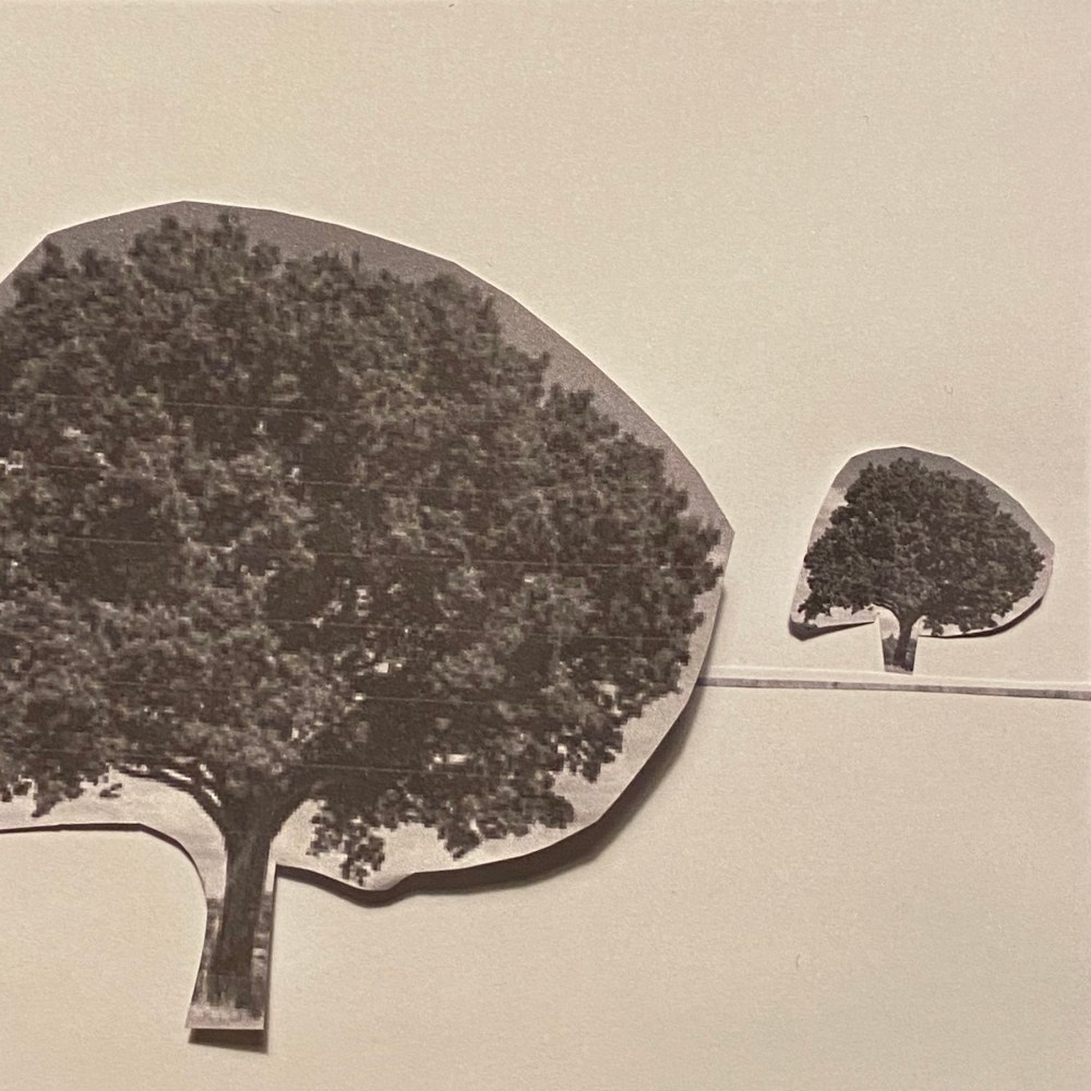
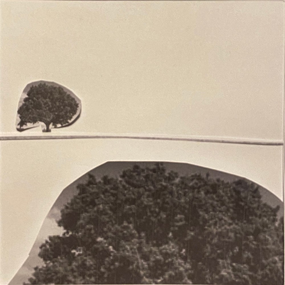
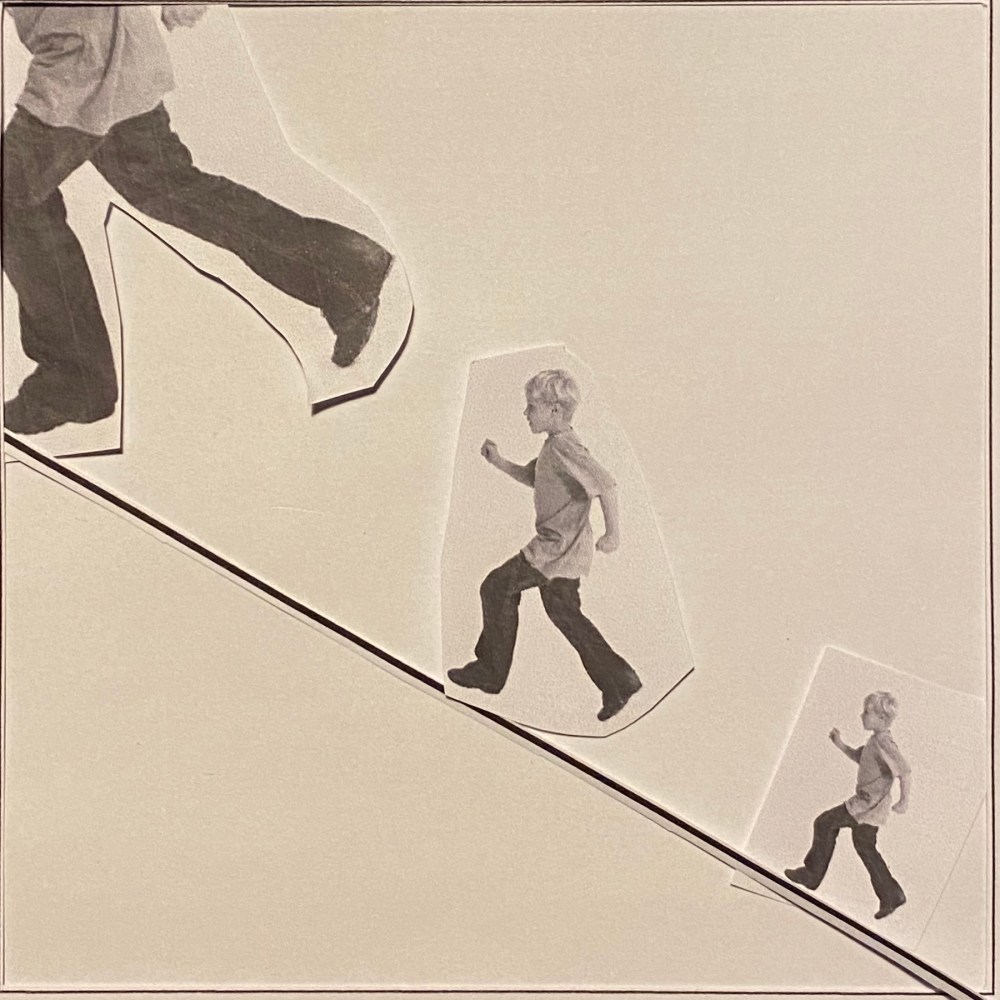
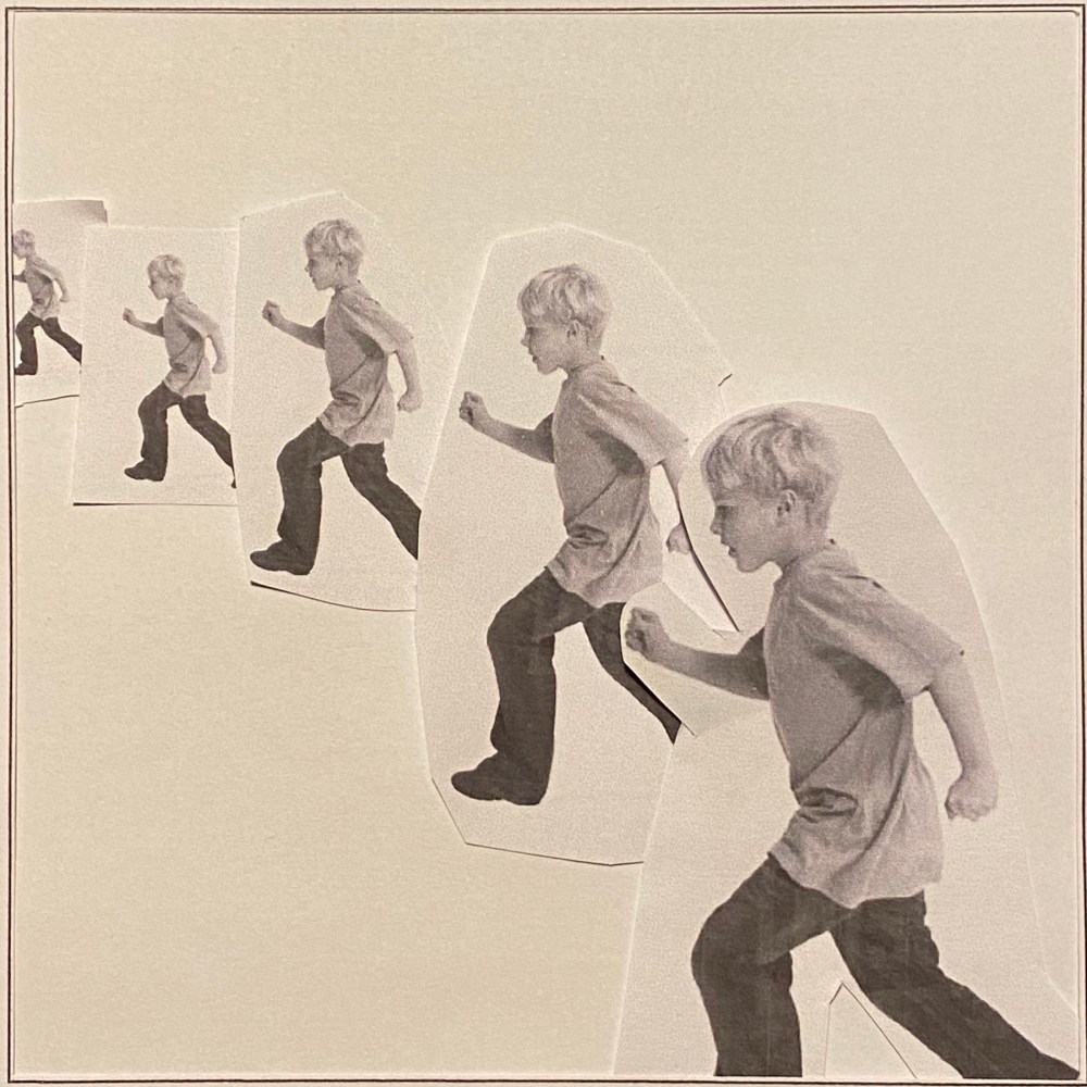
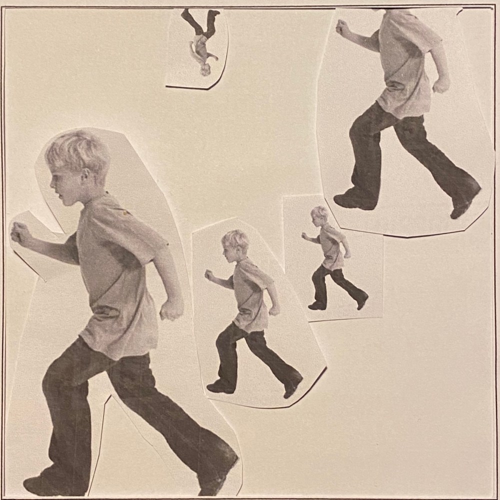
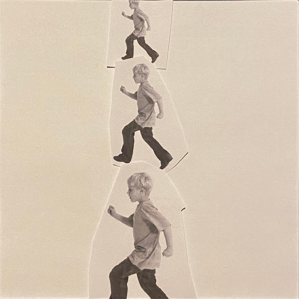
Working with a square format, arrange some of the cut-outs to create a representational image. You may use the distortion of scale of one element compared to another to create an image which is interesting visually. It is not important that the image is ‘real’ as a photograph would be. Move the fragments so they are not always vertical or horizontal to the frame.
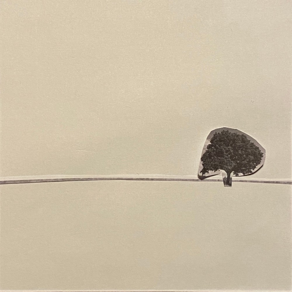
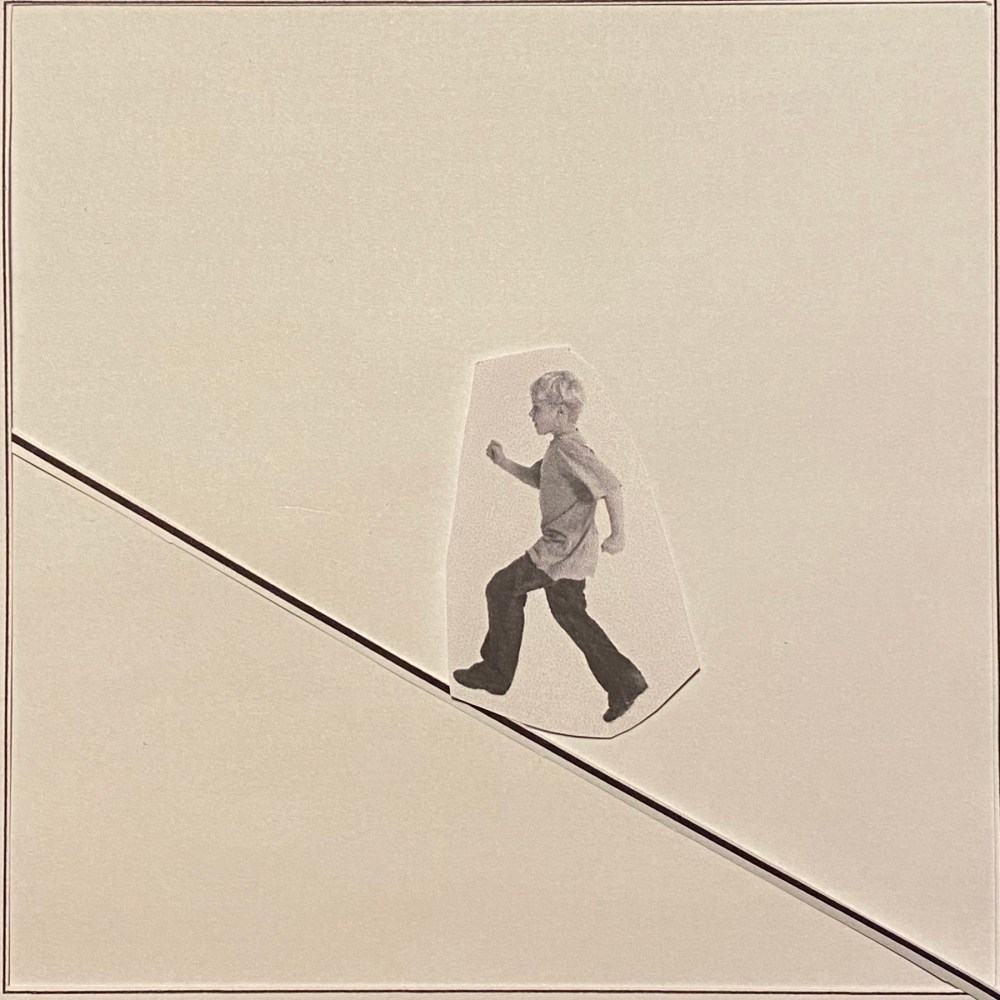
You may need to add a drawn line to suggest a horizon to separate the ground from the sky and to create an illusion of space or distance. Experiment with the position of the horizon relative to the visual fragments.
Scan and print or photocopy these designs or do a quick trace of each design so that you can compare the visual impact of one with another. Then in your learning log make notes in answer to these questions:
• How does your sense of the image and its meaning change when the figure is smaller than the other elements?
• If the elements are at differing angles to each other and at an angle to the frame, what dynamic is suggested?
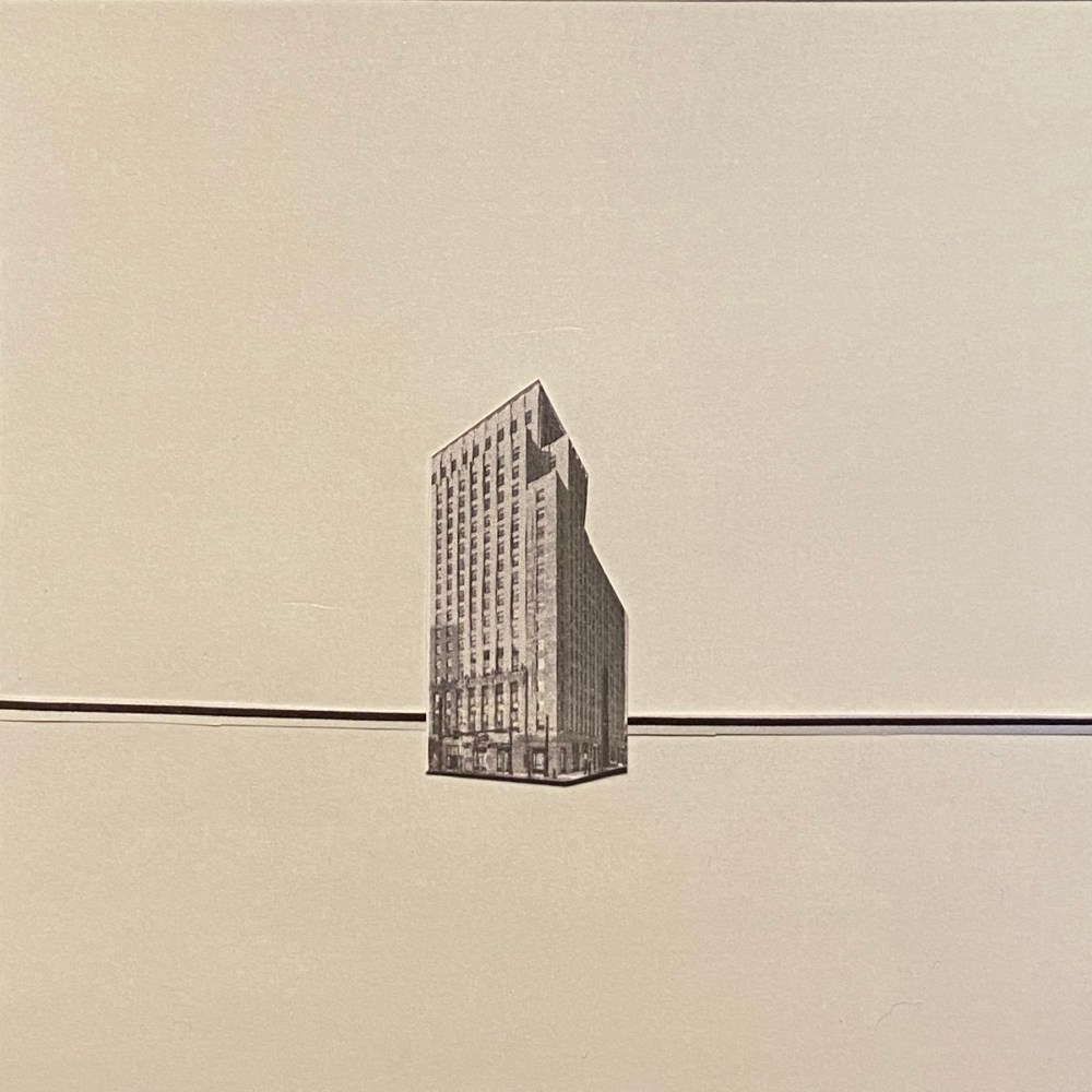
• If all the elements are completely horizontal and vertical in relation to the frame what dynamic is suggested? What is your opinion about this image and what sensation does it communicate?
• Which is your favourite composition? Explain why you feel it is most successful.
OCA Key Steps in Illustration
In this exercise I need to print some images in black and white at different sizes and then using the same size square layout look at how changing the position and scale of the objects within the image affect the overall feeling the image conveys.
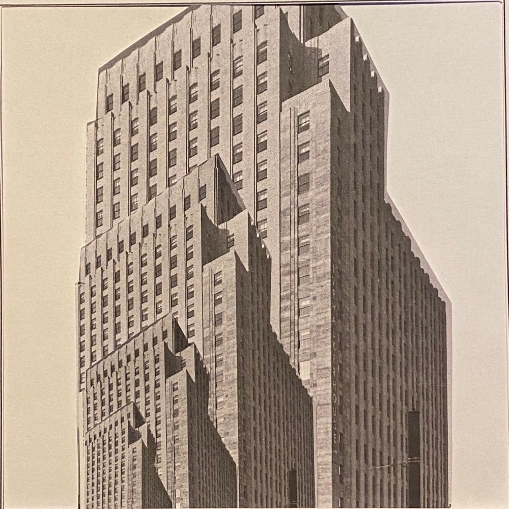
I started by images that are mostly generic, selected ones that I thought would be easy to cut. out once I printed these.
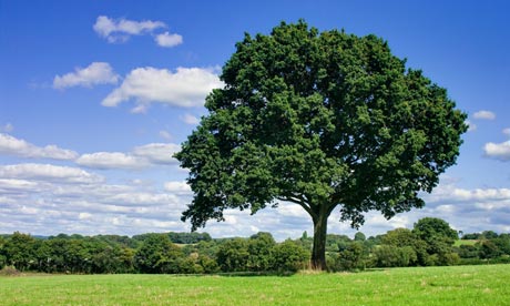
from Clipart-library.com (See sources) 
From Dissolve.com (see sources) 
From 6sqft.com (see sources)
I had my 3 images selected, and I was ready to begin. I can only print A4 at home, so I will first convert these images into black and white and add them in varying scales to an A4 layout. I will also print a few pages with a couple of squares on, to serve as my frame for the composition.

I started the physical part by creating a paper cutout for my template. I cut out the square with a craft knife to create a sort of window. I thought this will enable me to try out various compositions within the same frame without having to discard all my cutouts all the time so would ultimately save me a lot of time.
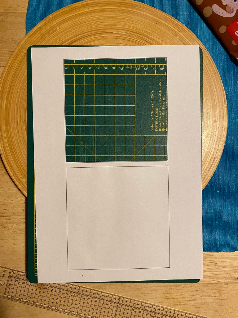
I put this over another white sheet of paper to be able to have a background. I was adding the various paper cutouts between these sheets to create my compositions.
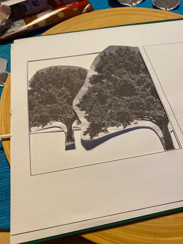
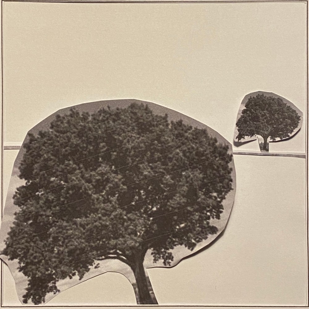
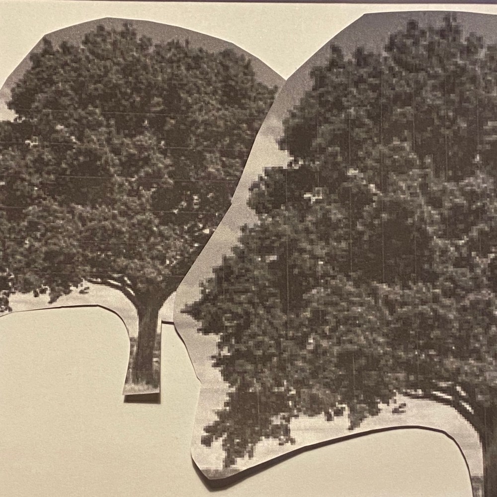
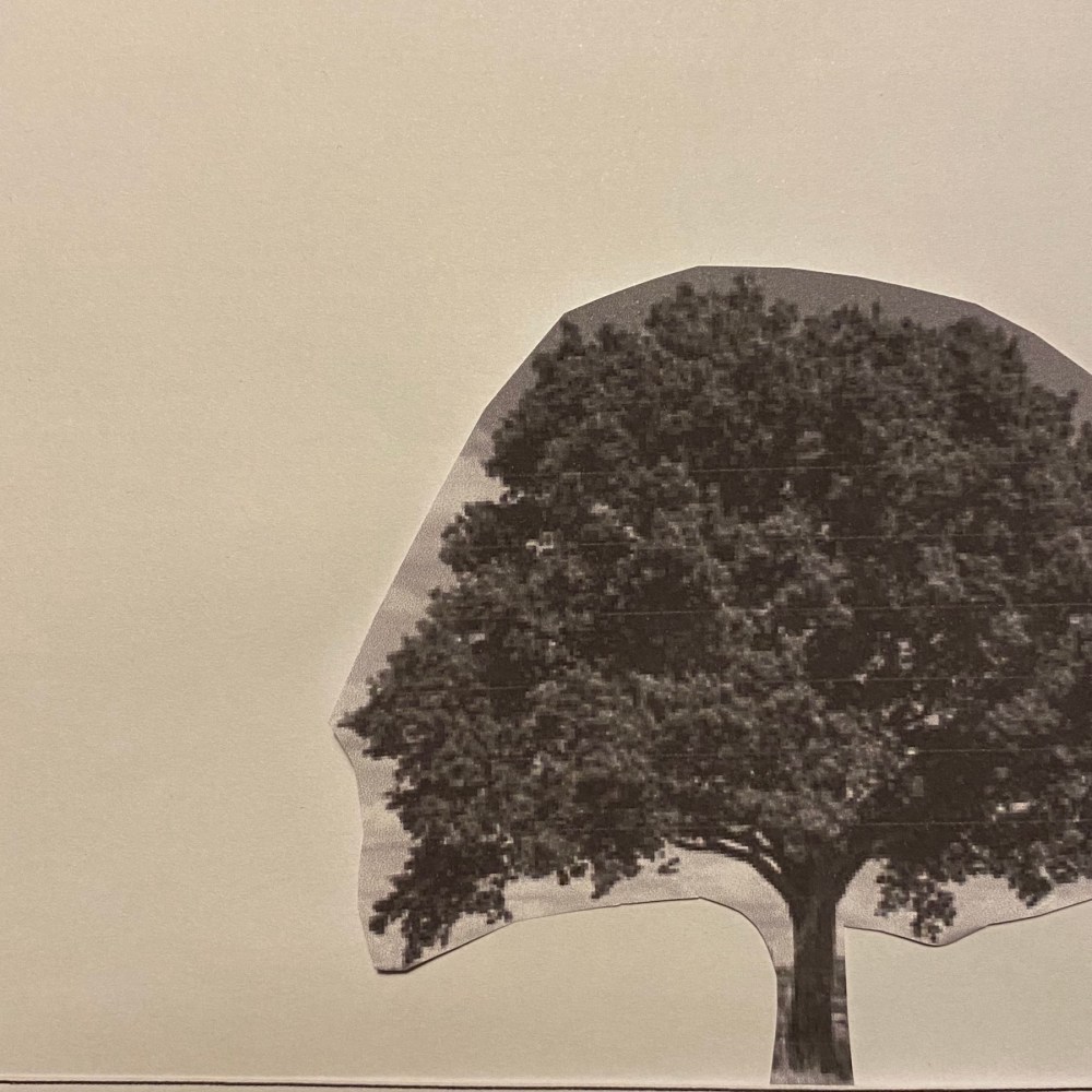
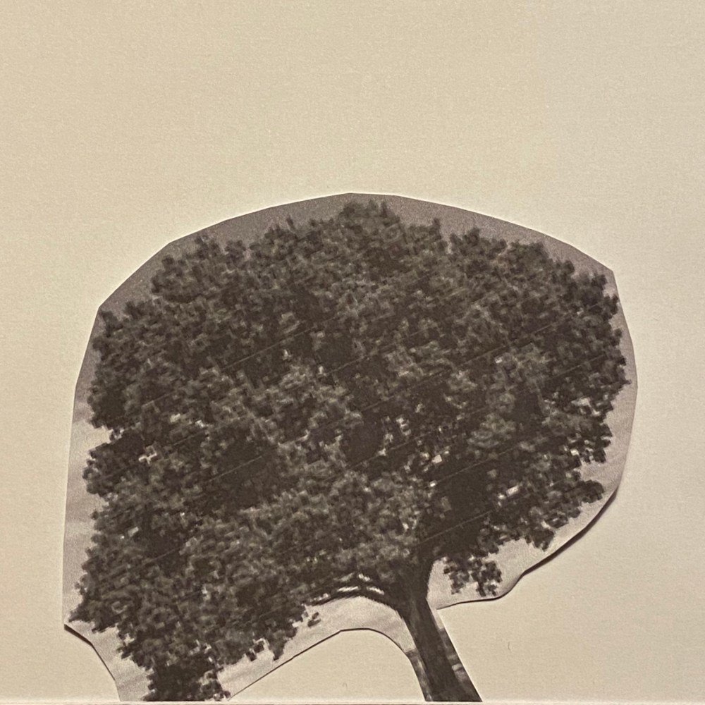
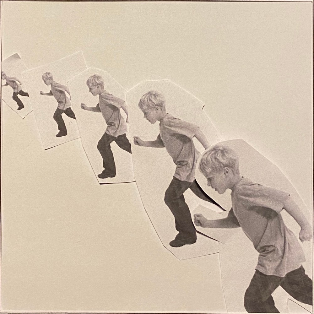
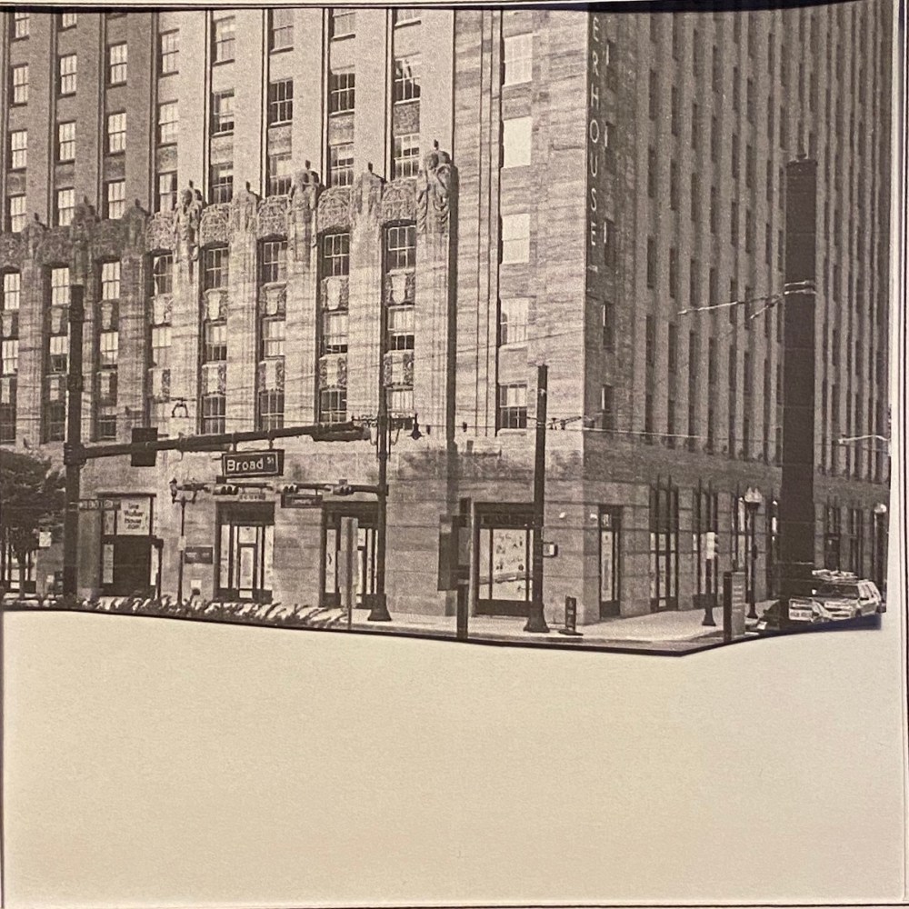
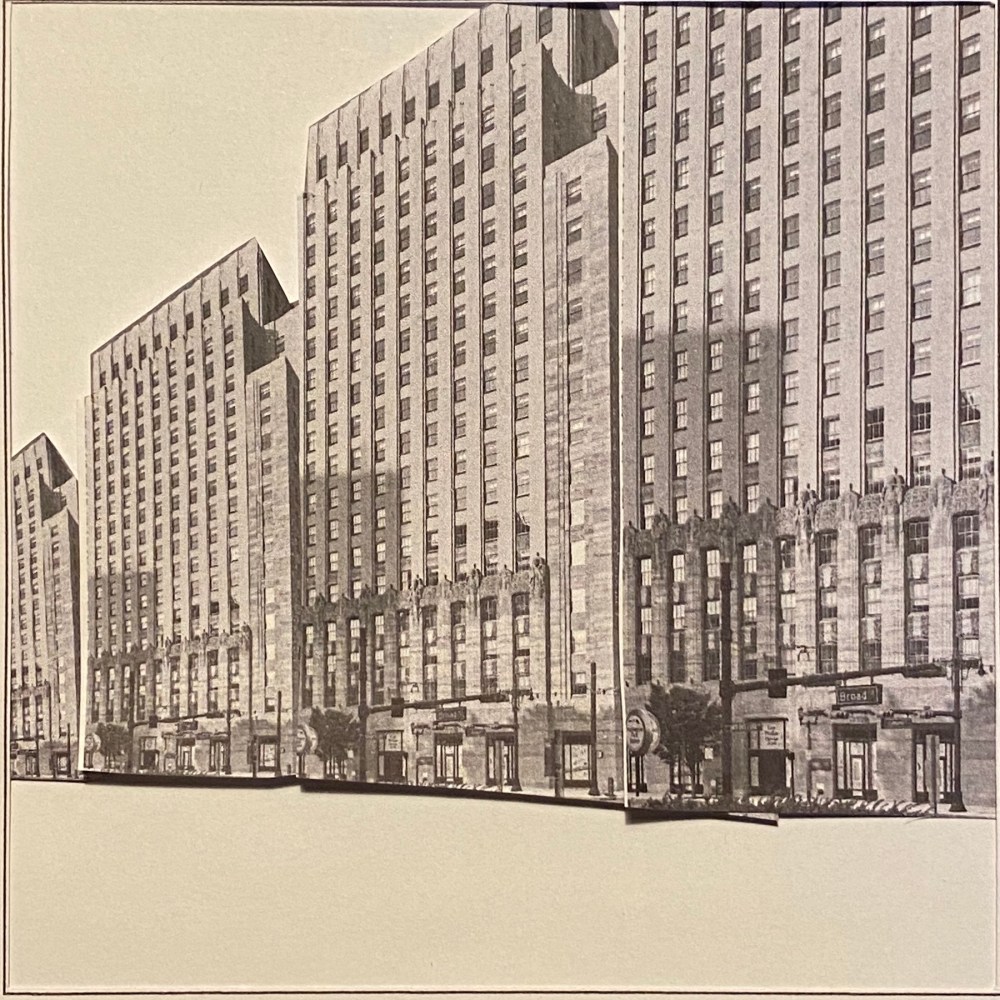
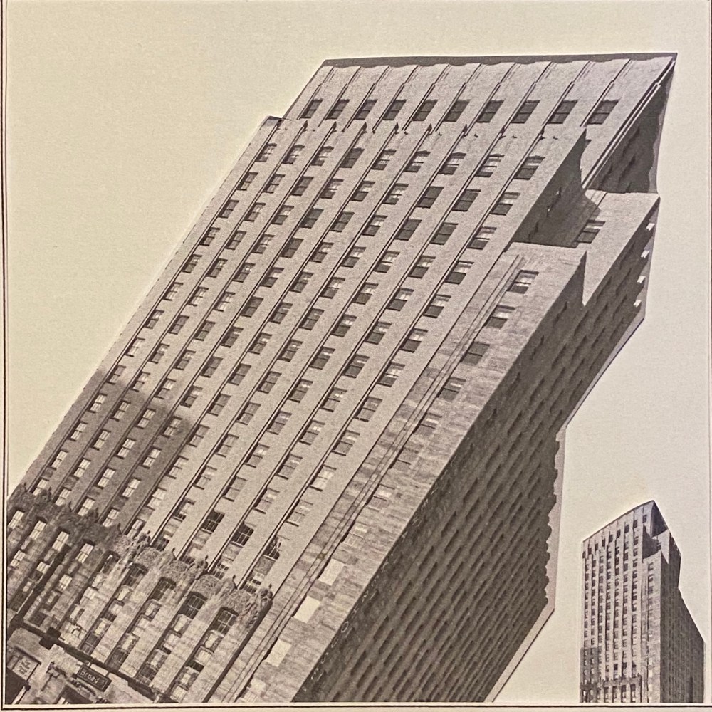
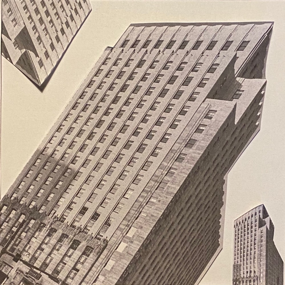
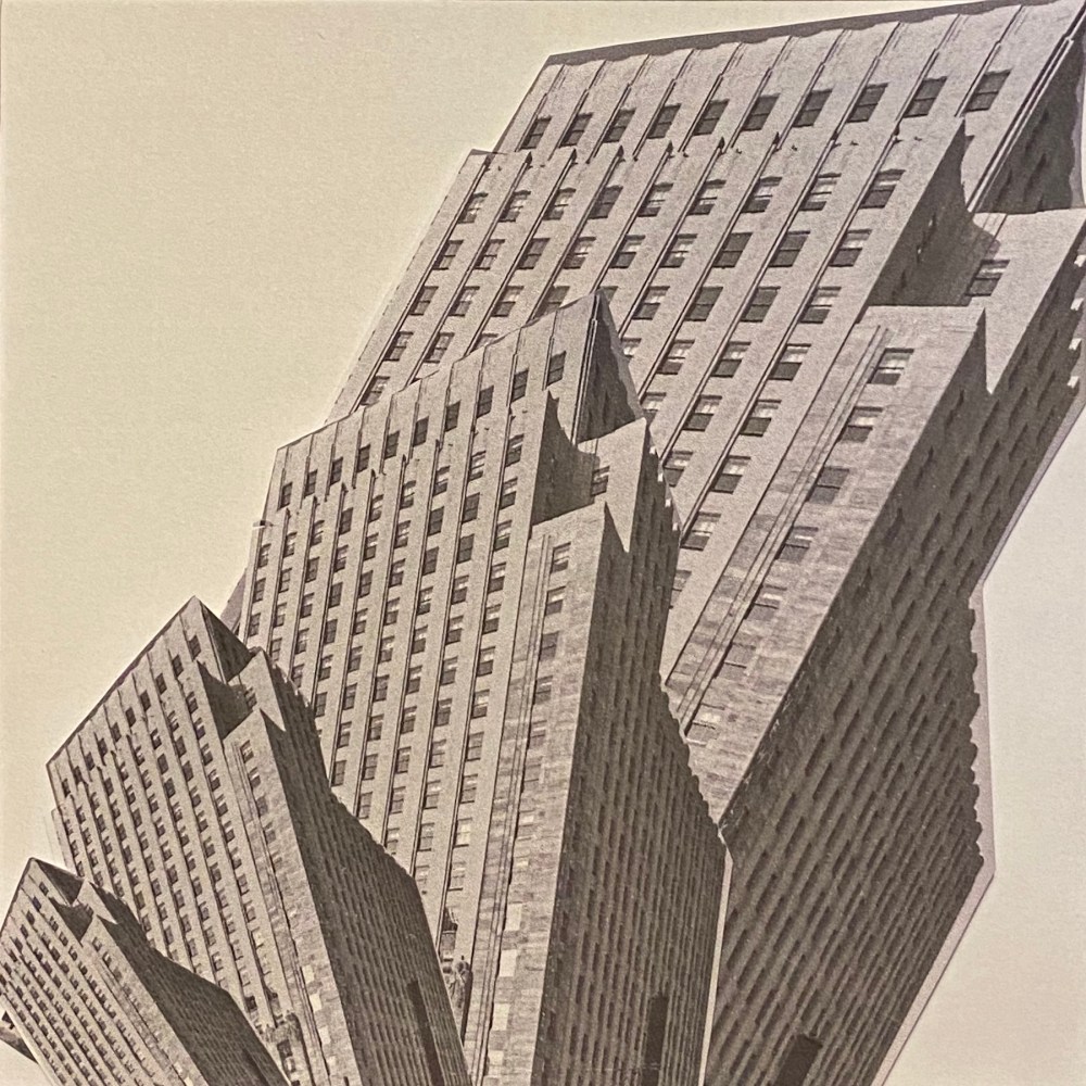
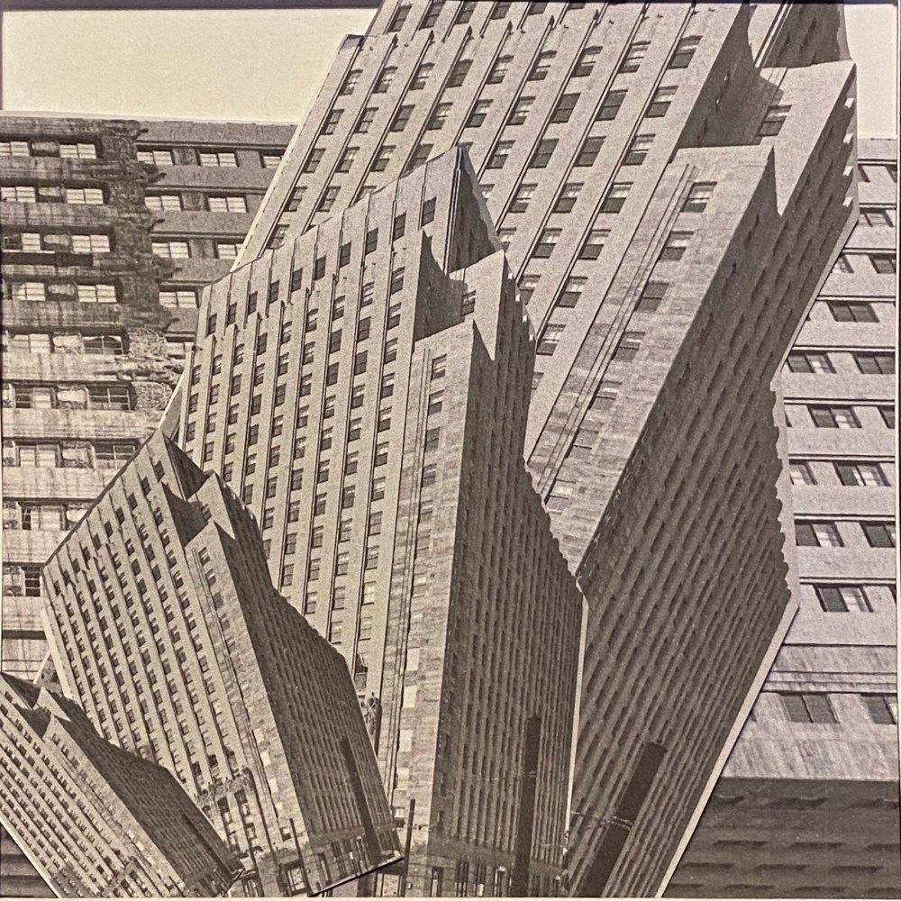
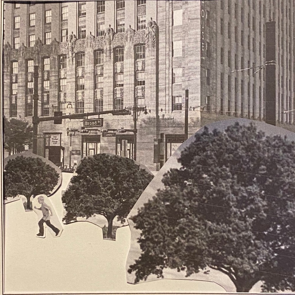
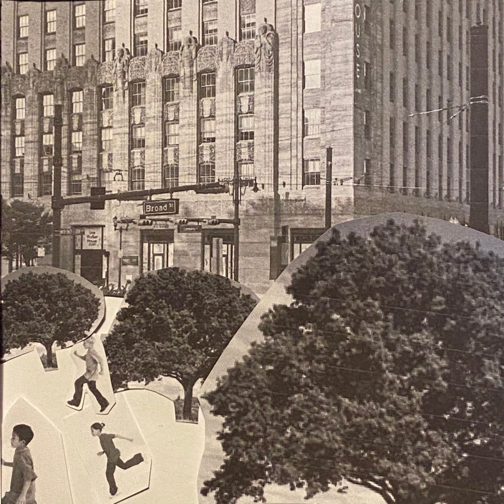
After the initial setup, I was able to work pretty swiftly capturing ideas as they came to me. At first I always tried to just use multiple of the sam object at different scales, but later I realised that the brief didn’t explicitly state that you cannot mix the different topics, so I started doing that. I photographed my pieces as I was going along with the exercise and then cropped them to only keep the square format. Some worked better than others.
I noticed how having items at t slightly off angles just creates a messy look that isn’t very pleasing at all, but if I am more deliberate with my angles it can create a dynamism in the image. Thing that are larger and closer to the bottom of the image appear to be closer, while smaller items towards the top of the image farther away.
When everything is horizontal and vertical, oy creates a very still image that is somber and calm. While if items placed at an angle they see more dynamic and imply movement.

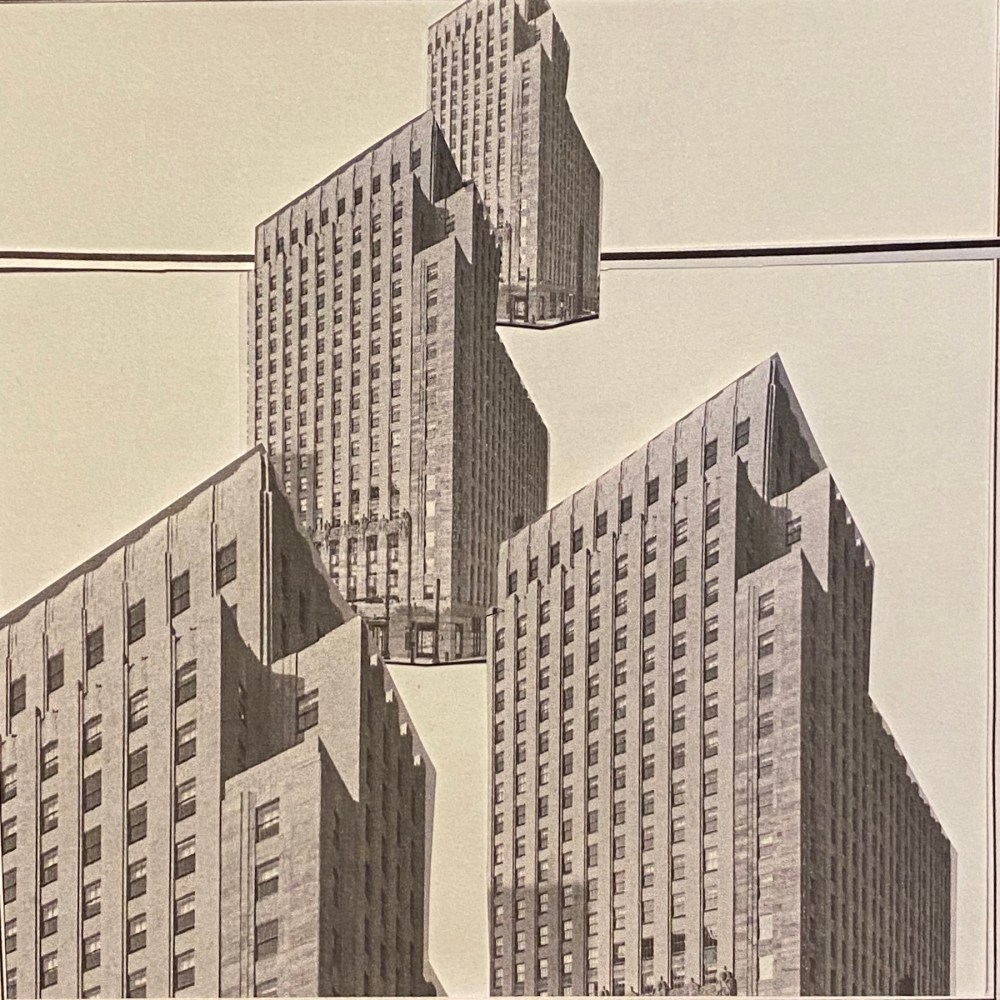
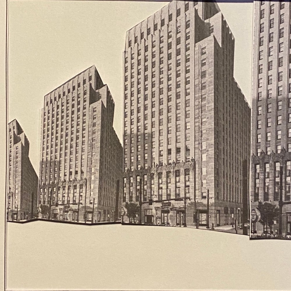
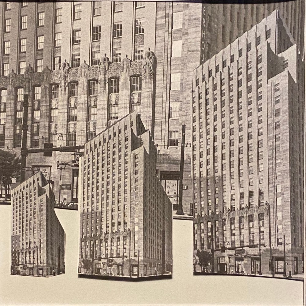
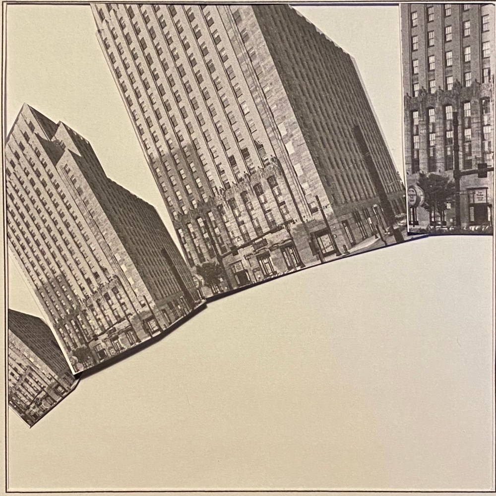
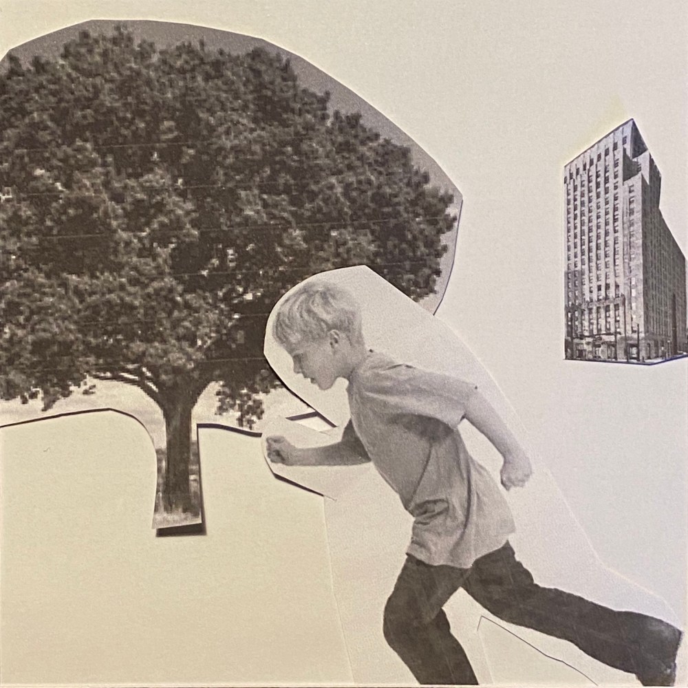
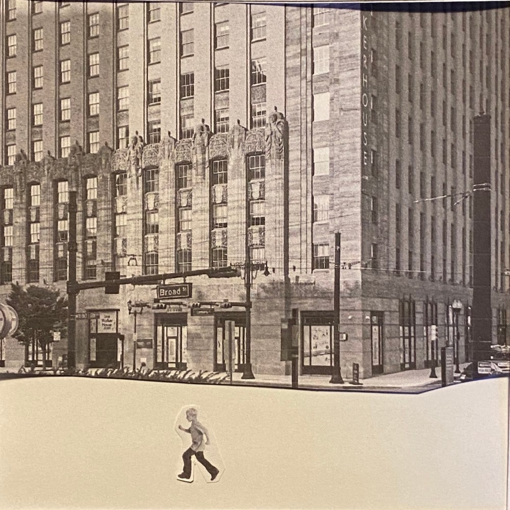
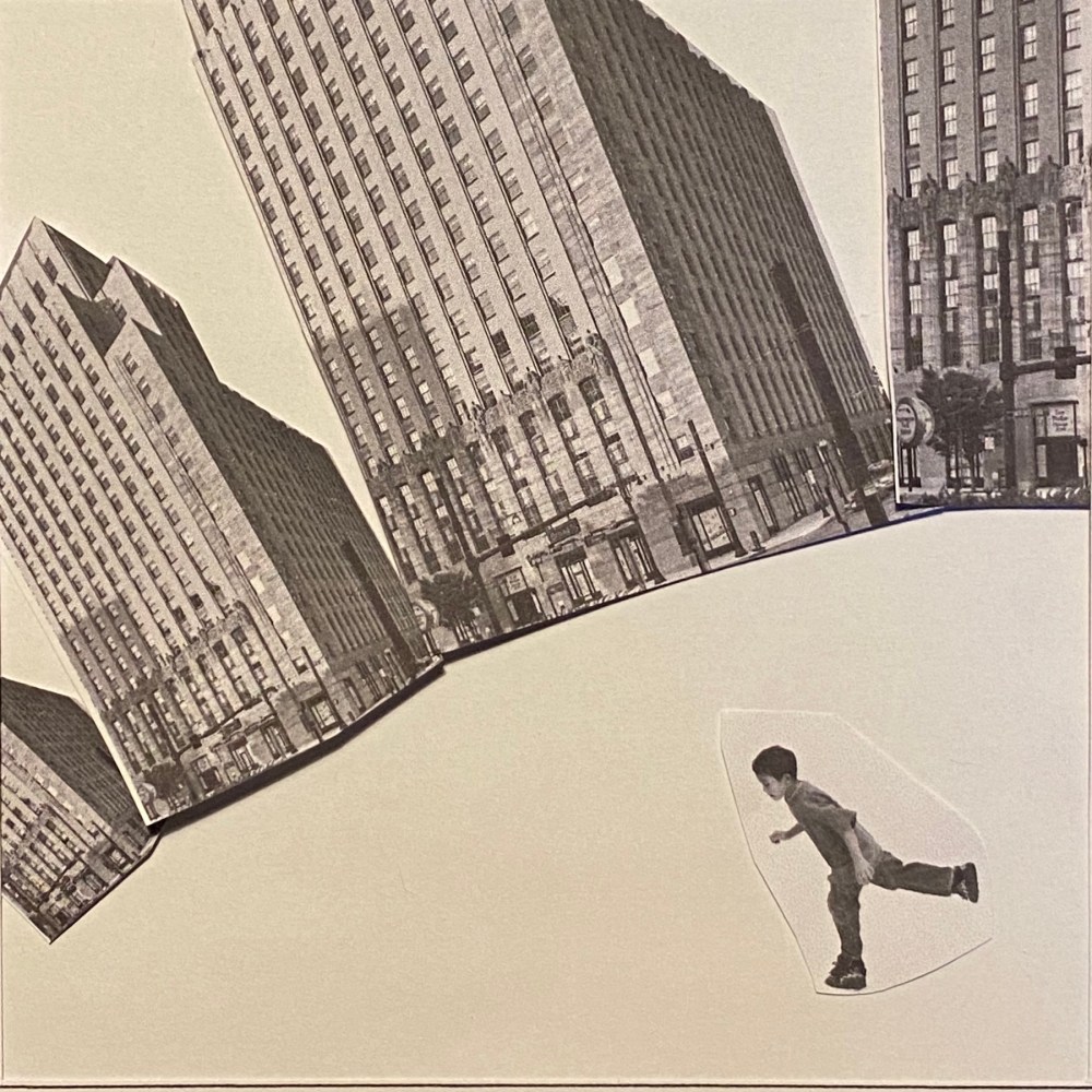
My absolute favourite is just at the bottom of the gallery in a slightly larger size. I loved how the buildings arranged in a half circle create a sort of distorted space that looks like a globe and how the walking figure enforces this movement. This really excited me when I got to it, I think the exercise was really worth it for just this image alone. This was by far my most dynamic composition and I believe it is more effective than all the others due to the story it tells. It really evokes that sense of exploration in the city.
Sources
- http://clipart-library.com/clipart/8TEbeKgqc.htm
- https://dissolve.com/stock-photo/Children-royalty-free-image/101-D1028-65-727
- https://www.6sqft.com/a-first-look-at-walker-house-newarks-historic-bell-telephone-building-conversion/
Reflection
I think this exercise really opened my eyes that I should be playing more with composition. The first idea are almost never the right one. I really enjoyed the freedom of creating images without worrying about my technical ability, which was quite refreshing. A really enjoyable exercise!
