
For this exercise you are going to make up a poster list for yourself. It is intended that you keep it pinned to a noticeboard or wall to remind you of the dates and, as it will be there a long time, it needs to look good.
OCA Graphic Design: Core Concepts
Start by collecting all the birthdays of your friends and family. You’ll need their name and birth date, to decide whether or not you buy them presents or just send a card, text message or email.
When you have all this design a page to include all this information for example:
May
2 Caroline 3 Lois
4 Rea
4 Javad
28 Juan
29 Katherine
Now you design your own ordering the information that best suits you and including as much additional information as you would find useful.
In this exercise I was asked to create a birthday list that can be displayed. The purpose of this is to remind me of upcoming birthdays and be able to plan what action to take when the day comes.
I had some ideas going into this exercise on how to create this. I feel that perhaps a form wouldn’t be appropriate to do this as I would normally know at the time of designing something like this what sort of action I would take to greet the person in mind on their birthday.
Sketching
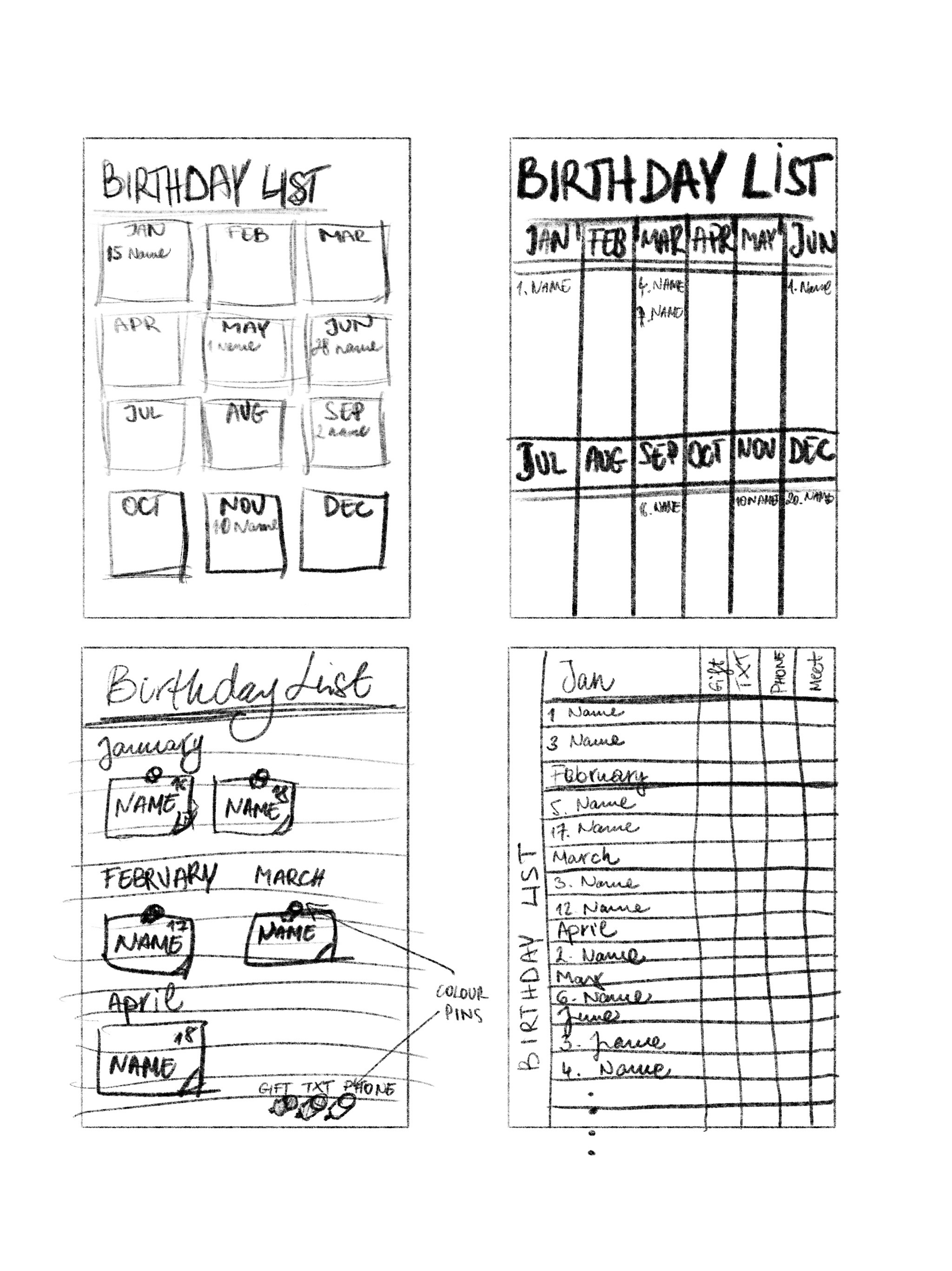
At first I wanted to create something relatively flat and see how this looks on a page.
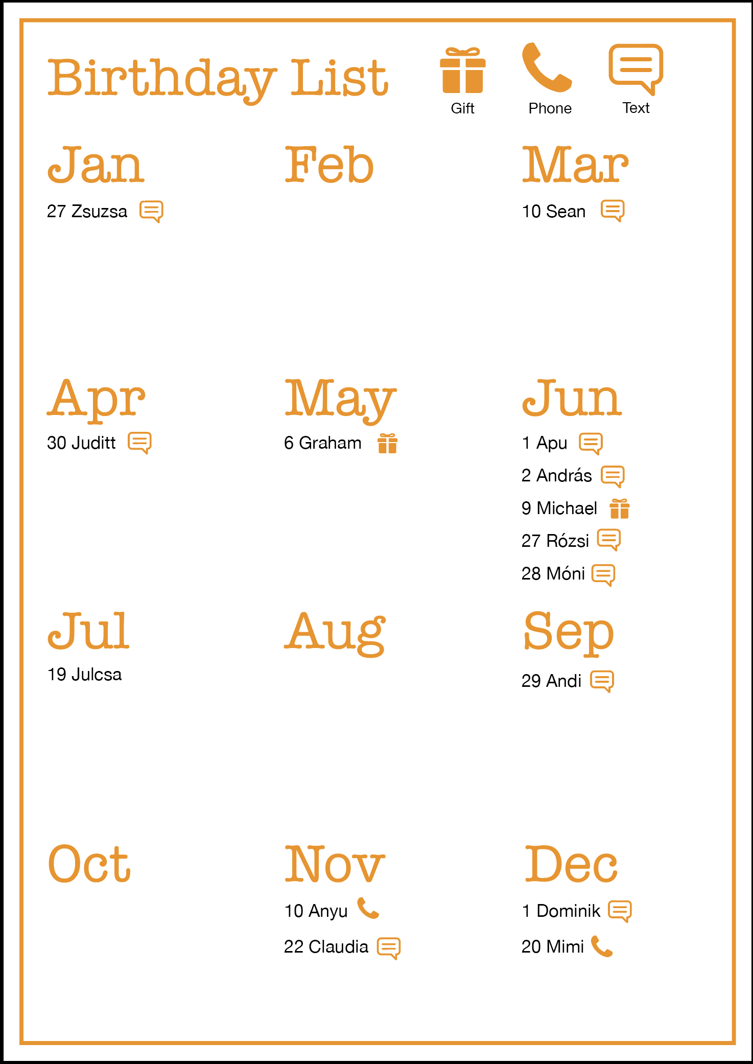
I thought that this is quit successful, as things are in a chronological order, I would always see what action to take for each person and when their birthday is coming up. I could produce this in any colour variation, but I liked the simplicity of this as it is. What I did notice is that some of the months are a complete waste of space, since none of my friends/family have birthdays. I could perhaps lose these? This would shorten the list, but probably make it harder to edit if I wanted to add something to it as time goes by. I liked the small icons, as they are very clear, and understandable. I think this design is pretty effective to keep the dates in mind, but not very inspired.
I decided to play with a different idea.
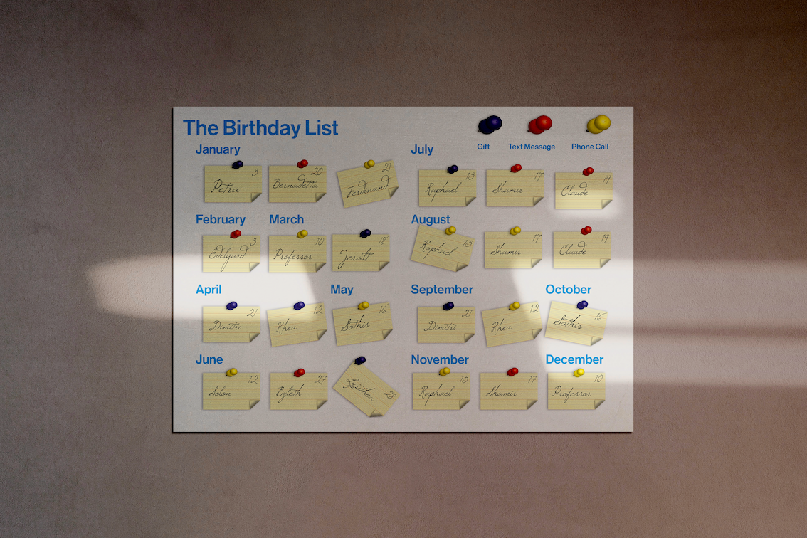
In my second design I wanted to create an effect where each individual has their own little note card with the name and date, and this is pinned to a notice board with a colour pin. The pin colour signifies what action I would need to take for that person.
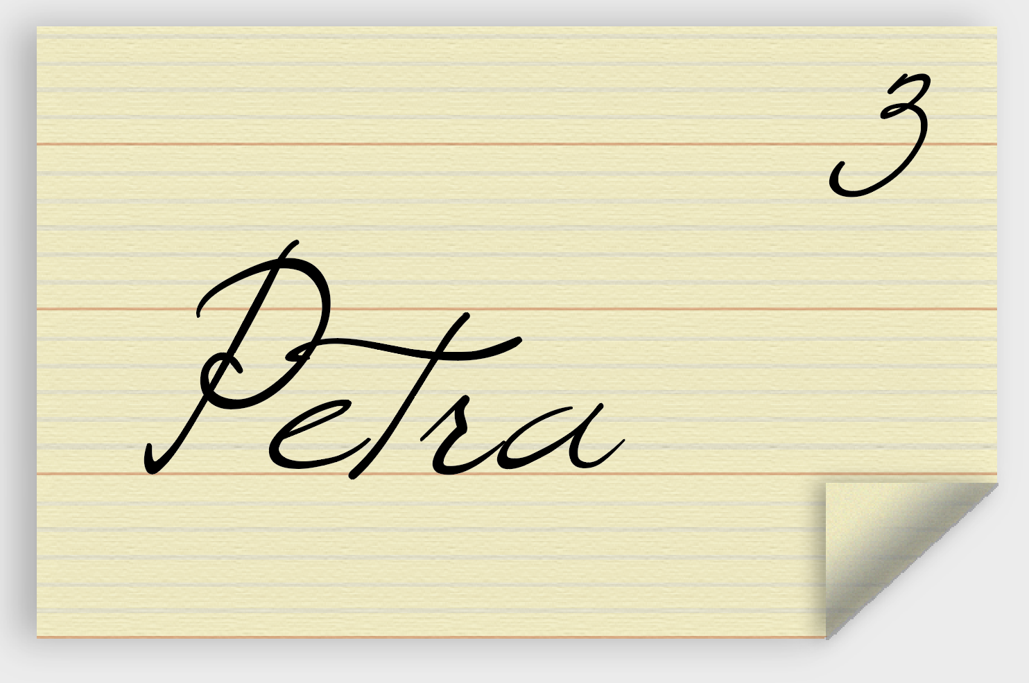
I made the cards by combining a simple textured colour block and a pattern that I created. I decided to use a script font for these cards, so they look like that have been hand scribbled. I managed to make this quite convincing I believe and I was pleased with the results.
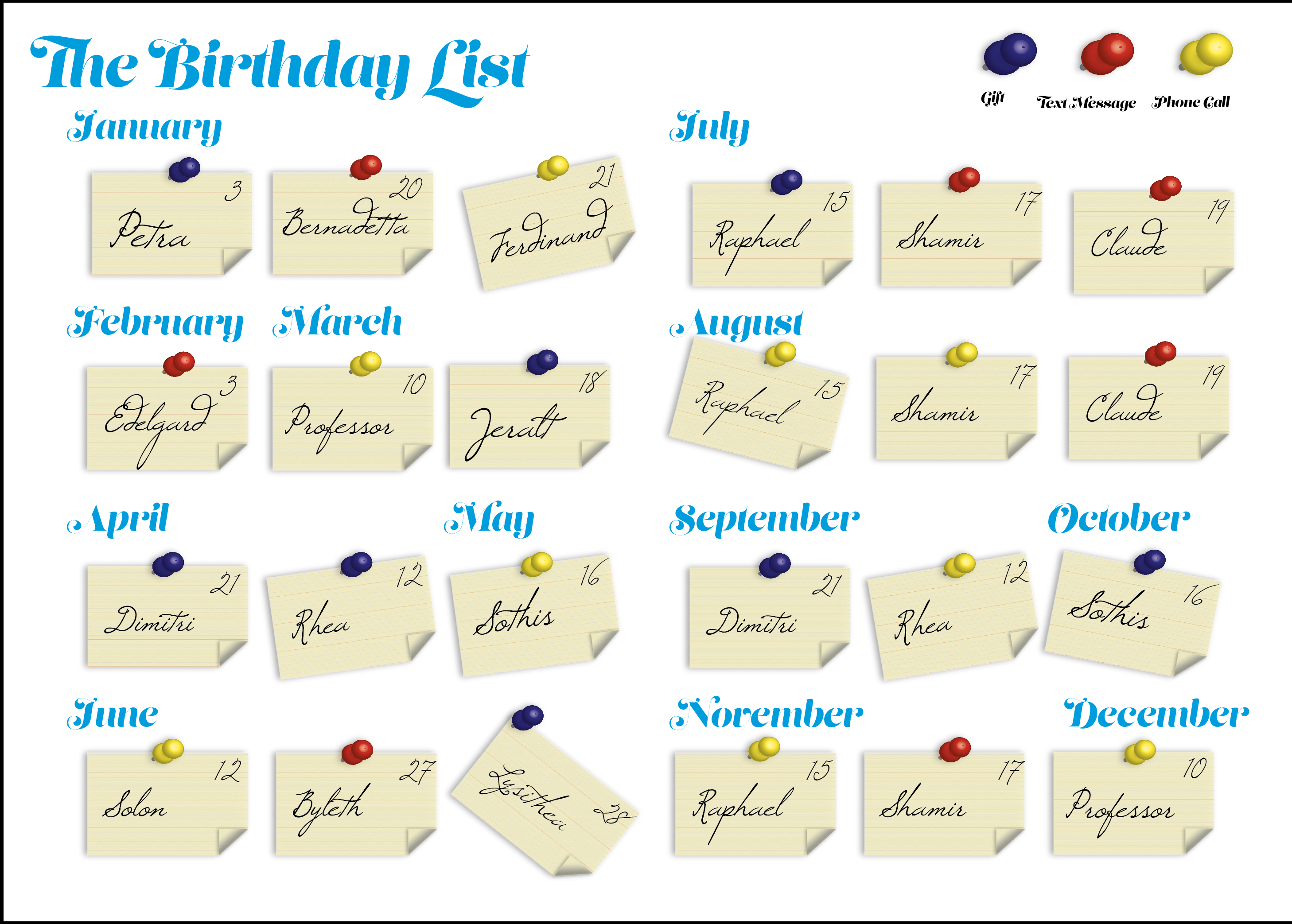
I think it is quite clear, however the fonts used perhaps not the right ones. I wanted to see what other fonts may work for this.
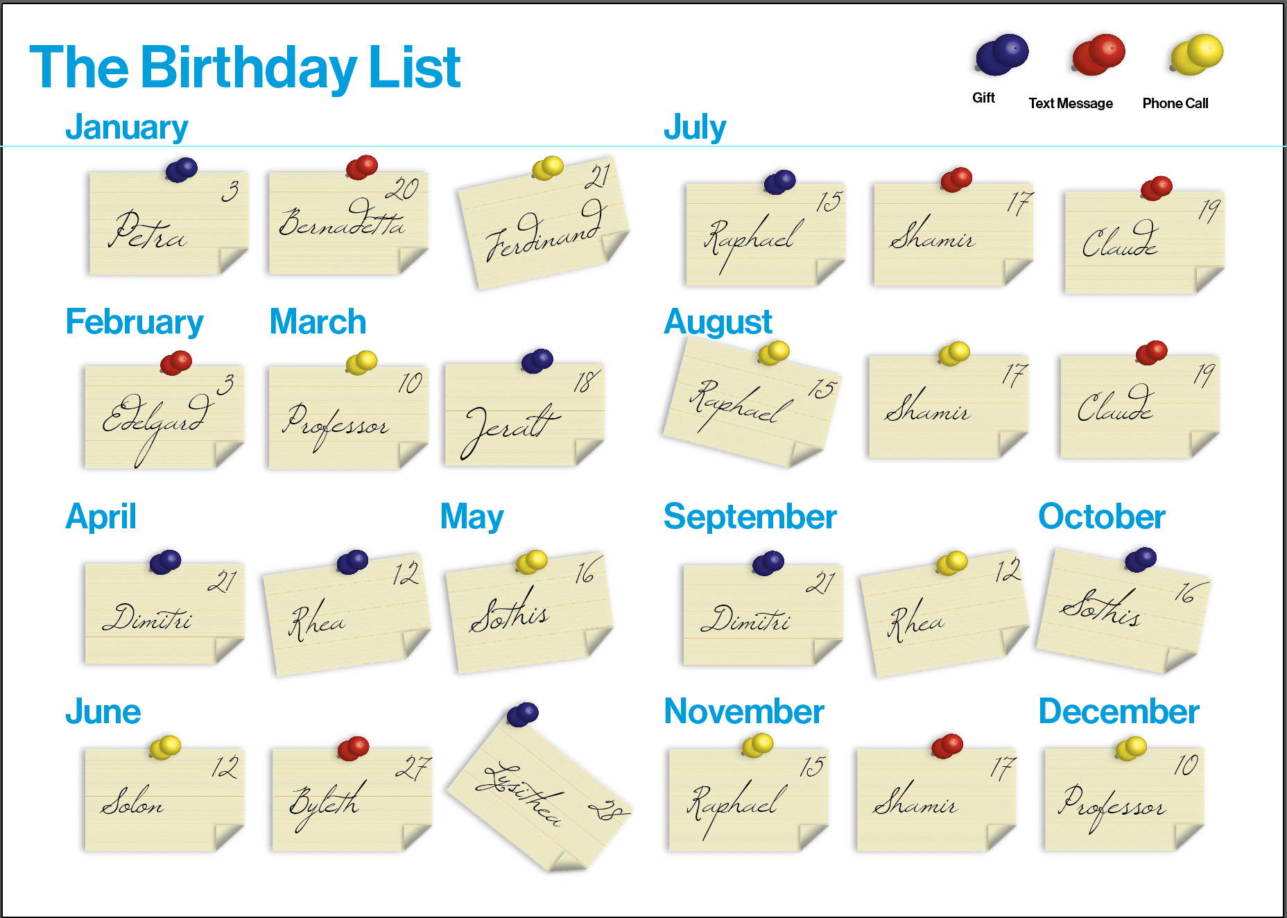
Still find amazing how changing one font can have such a profound effect on the entire design. I think this second iteration worked much better. The font makes everything a little more orderly and the hand-written font pops a lot more in contrast as well.
I also decided to try a cork board background as that was the inspiration behind the whole idea.
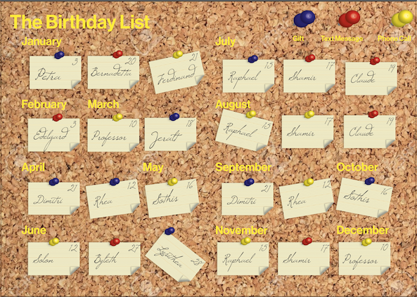
I did play around with different font colours, but I found it really difficult to make this work, and decided that the simple colour background is better for this design overall. Also the cork background didn’t seem to add anything to the design but had a very distracting effect.
Reflection
I think for this exercise I had a clear idea in my head of what I wanted to create, so I managed to get my design to a place where I am happy with it quite rapidly. I believe this would be an effective way to keep track of birthdays, and I might actually finish this with the actual details and print it to put it on the wall above my desk. I think I approached this exercise differently than I would have a little while ago, because of the previous exercise on infographics. The part that I am perhaps not so pleased with at the moment is my development of ideas. I need to do more research and get to final designs from a more informed standpoint. I like my final design all the same.
