
In this research point I was asked to collect some magazines to see what works and what doesn’t in terms of layout.
I don’t have access to many paper magazines and I didn’t want to buy any for the sake of this experiment, so I begun by looking at magazines online to see what I can find. Issuu is a great online resource when it comes to magazines, I also went through my inbox to find newsletters that I find good readability and some that I find difficult to read.
The bad.
I found this first example pretty hard to read. It is probably due to a combination of things, the use of sans-serif font as body of the text, also the wide column widths mean that the eye can easily get lost on the page. This isn’t helped by the relatively low contrast between the background colour and the text.
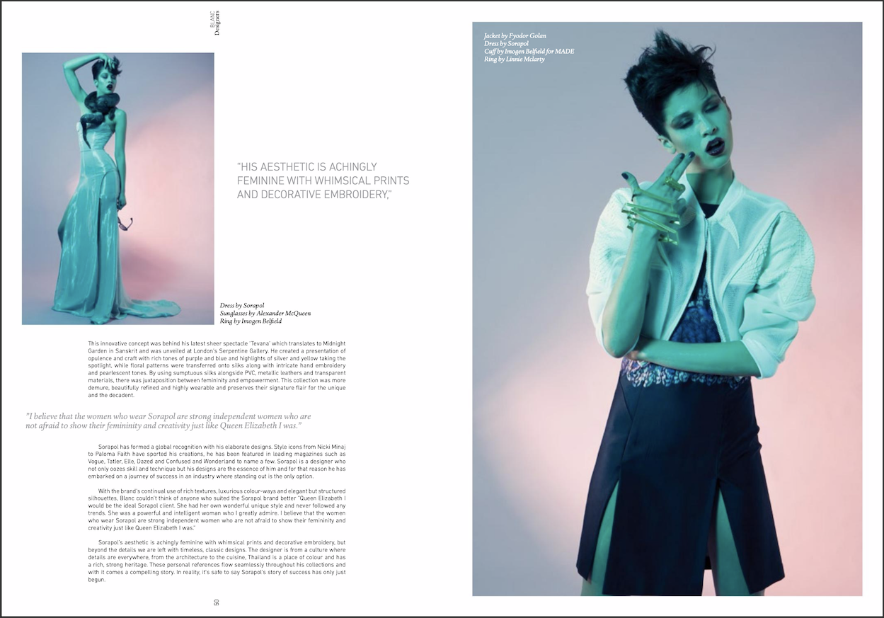
Even though the contrast is good here, I still find myself struggling to read this article, as the lines are an almost full page width and a sans serif font is used for the body.
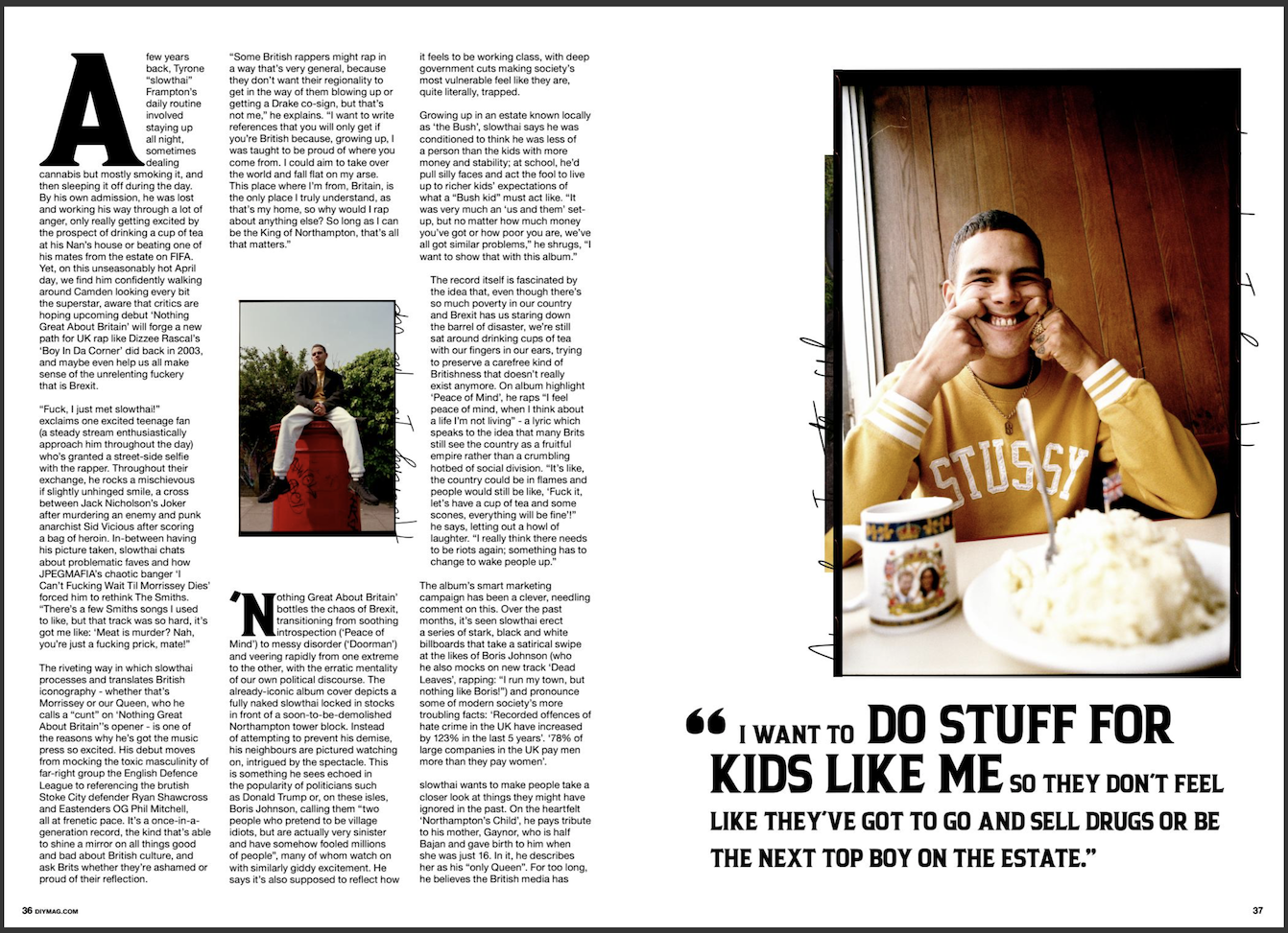
In this last example, although the text is light, and the magazine uses a serif font for the body text, the text is still pretty hard to read. The leading between lines is probably too large, which makes your eyes wander on the page and makes it hard to focus.
The good.
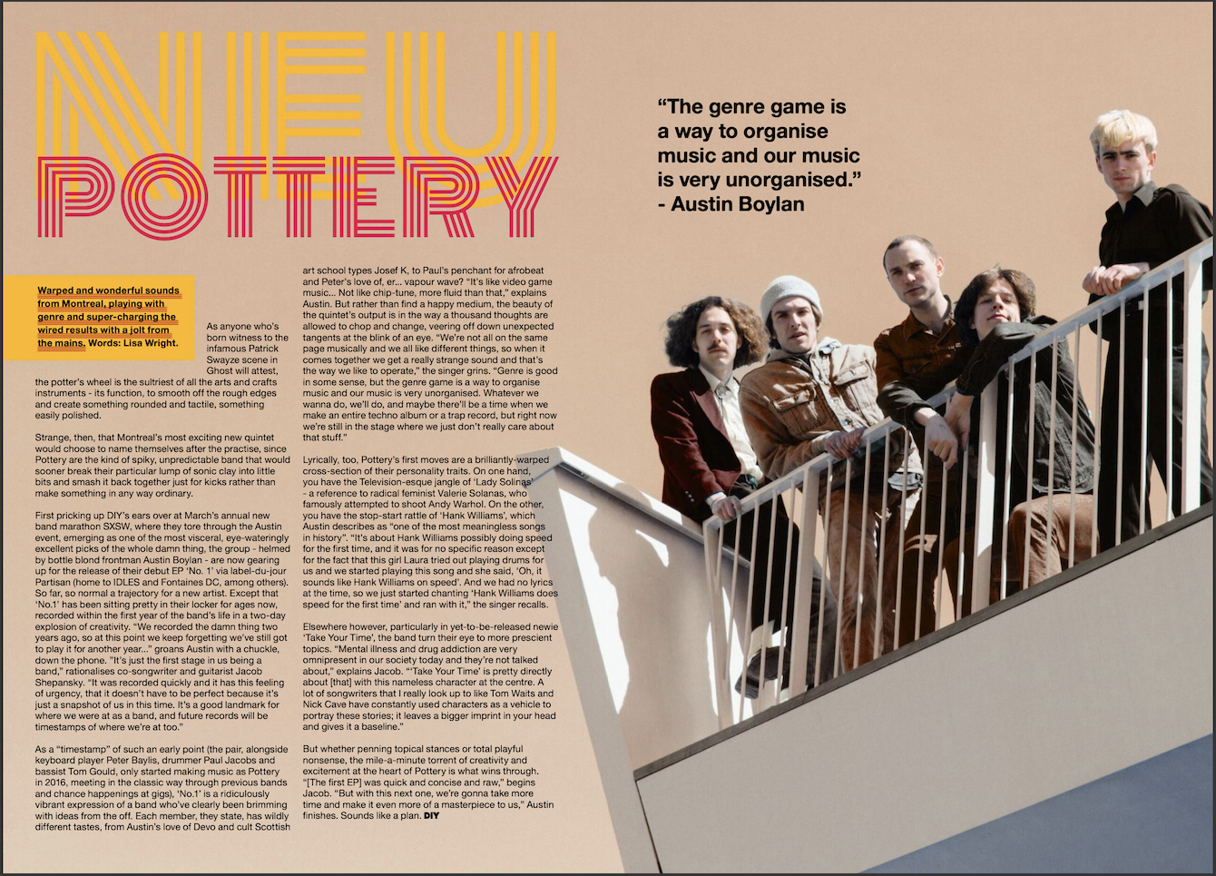
This example funnily enough is from the same magazine that my first example was taken from. I found this a lot more readable due to the short line lengths, and the good contrast between the background and the text. It is still using the same sans-serif font, but somehow this didn’t bother me as much when reading this article.
I found that magazines that use the same principle, with short line lengths and good density of text, are quite easy to read. the article also nicely broken up to shorter sections so it is easy to scan.
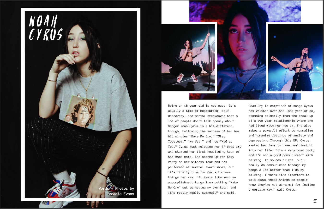
Even though this magazine uses wider column widths, the article is still readable in my opinion due to the font and good amount of contrast. The text is justified, but isn’t creating rivers, so this is an example of when justified text is used correctly, however some words are hyphenated to create this balanced text layout.
Conclusion
I feel like I previously underestimated how many things a designer needs to consider when laying out articles in a magazine. It’s not enough to choose the right font and the right column width. You need at least 3 things that support good readability present in advance to create a page that is readable. Contrast in both terms of the colour of the text and the density of it is very important too. If the text is too thick or too thin it makes things hard to concentrate on. Serif fonts work best for body text; the serifs are like a well-walked path that leads the eyes when reading.
