
Lorem Ipsum is dummy text with more-or-less normal distribution of letters that makes it look like readable English. It has been used for many years and some desktop publishing packages now use it as their default model text.
If you don’t have it already, go to http://www.lipsum.com and generate as much as you need.
Now select one of the designs from your research that you like and think works. Using the dummy text, try and copy the layout and design as closely as possible. You will need to measure the margins and column widths. If you don’t have the exact typeface get as near as you can. If you are copying a page that includes photographs just leave 10% tinted boxes to indicate their position.
Is the type serif or sans serif? Is the text set ragged or justified? Are there spaces after paragraphs or are new paragraphs indented? How many columns are there to a page?
What happens when you alter the fonts, change the alignment, adjust the leading or tracking?
Now try another, different publication from your collection.
OCA Graphic Design: Core Concepts
I chosen the article from DIY Magazine – May 2019 – Issue 85 from pages 36-37.
I identified the font as House of Cards by Linotype, since this is a paid for font, I had to find an alternative that is very similar.
I found a font that was really close (and based on the same font the House of Cards font was inspired by) – Tertre – this font was freely available from dafont.com.
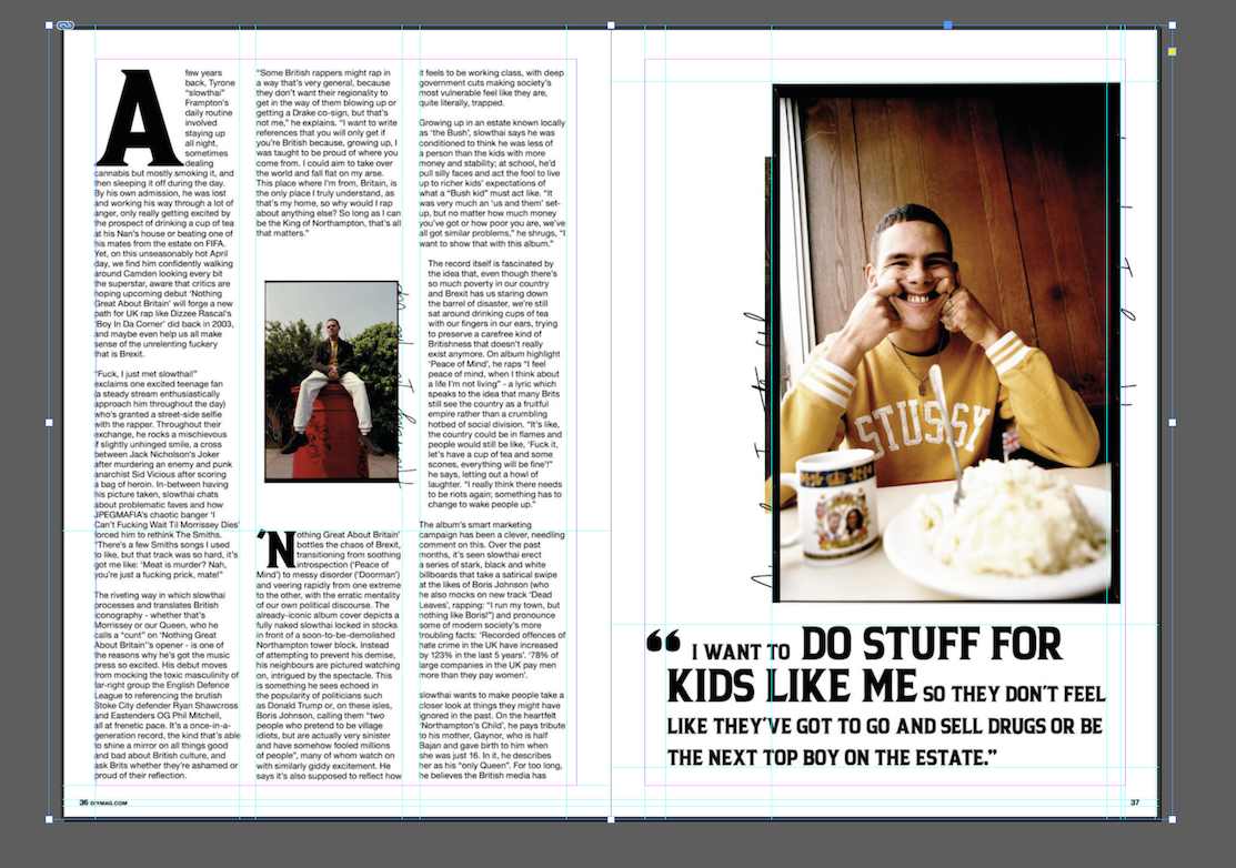
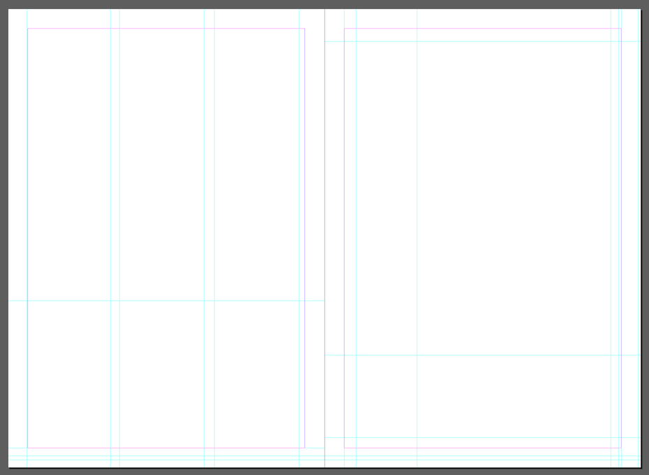
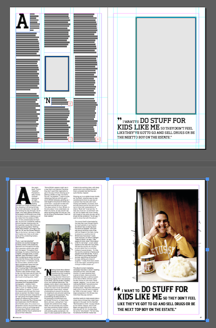
I begun by creating a grid using guides around the different sections that I wanted to capture the size for, then I removed the image and started building my mockup in the guides I have created.
I started to build out the article using Tertre and Helvetica fonts. I chose Helvetica as I thought it looks really similar to what was used in the article.
After filling my grid by measuring the pieces of text and image elements agains the grid, I managed to come up with something that was pretty close to the original layout.
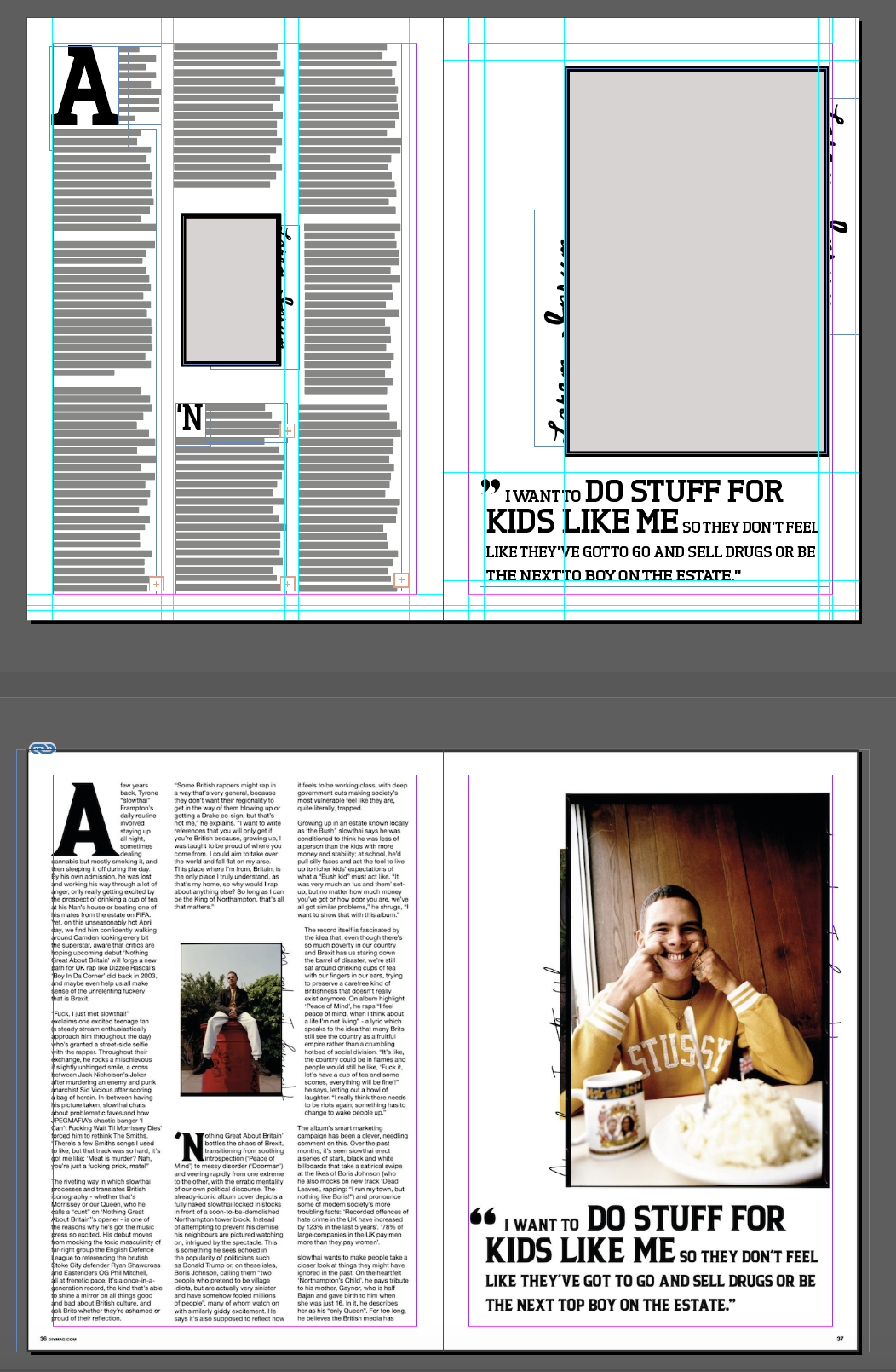
Zooming out to see the original article and the new layout I have created, I noticed a few differences. The size of the text in my mockup was slightly smaller than the original, and some of my column widths were slightly off too.
I made a copy of the original image and laid this under my new mocked up version to see where the issues were.
I noticed that the main title bit was quite a bit off, my text was overall smaller than the original, and the letter spacing was a bit different too. I managed to adjust this by increasing the horizontal scale of my text. This was also due to the differences in the font, so I couldn’t get this exactly right.
I also noticed that the image placeholders were slightly different ratio to my original, and that they weren’t sitting exactly where they should have. I adjusted these as well by dragging them into place, and altering their proportions.
The size of the drop cap was slightly different in my mockup compared to the original, so I made these the right size.
I also added some text in a script font to the edges of the picture placeholders to emulate the effect of the picture frames from the original.
After making all these changes, I believe the layout is as close to the original as it can be using different text.
Reflection
I think after using the DTP software a few times now to create some layouts and play around with the different possibilities, I have a pretty good grasp of the basics of the software. I am sure that I have hardly scratched the surface of what is possible to achieve with it, but I think I have learnt quite a bit, and this will be a good foundation to learn how to achieve more complex layouts.
