
The brief – Part 1
Create your own sample book of typefaces on your computer that you can refer to.
Graphic Design Level 1 – Core Concepts
Organise them into:
• Serif for continuous text; readable at small sizes and those suitable for headings.
• San-serif for continuous text; readable at small sizes and for headings.
• Script fonts that look handwritten with a pen or brush.
• Decorative fonts only suitable for headings or ‘fun’ uses.
• Fixed width, techno and pixel fonts for use on the web or to give a computer appearance.
Identify which typefaces have bold, italic, black or light fonts.
Create your sample book of fonts
Research
I wanted to start this exercise by looking at some type specimen books, so I have an idea of what elements these include.
I found this board on Pinterest that I found really useful as a starting point for my research.
I have also had a look through Béhance to find what other artists are doing in terms of type example designs and I found a few that I really liked.
https://www.behance.net/collection/171818619/type-specimen-books
I observed that these books usually feature the following elements:
- Type name
- The designer’s name
- Type characteristics
- They have a distinctive colour scheme (2-3 colours)
- The type at different sizes, usually represented by comparing a single letter on a scale
This basic research served me with enough information to be able to start some planning regarding my very own specimen book.
I have gathered the following ideas:
Have a visual identity per font group, use different colours and layouts for each, but keep the overall feeling of the pages similar by keeping at least 2 elements on each page fixed. Maybe using a big letter that would represent each categories could work.
I would like to create a 2 page layout for each of my selected fonts to be able to fit all the elements listed above but still have some space on the page to be able to create an appealing layout. I would like to add some block colours in geometric shapes to add further visual interest to my designs.
My chosen typefaces
Serif
Sans-serif
Script
Decorative
Techno
I begun by sketching out the first few page layouts that I had in mind after my research, to figure out what I wanted to do in terms of layout. I knew that I wanted to keep in mind all the things that I mentioned above, so add the title, the description of the characteristics of the font, the font at various sizes and some example texts.
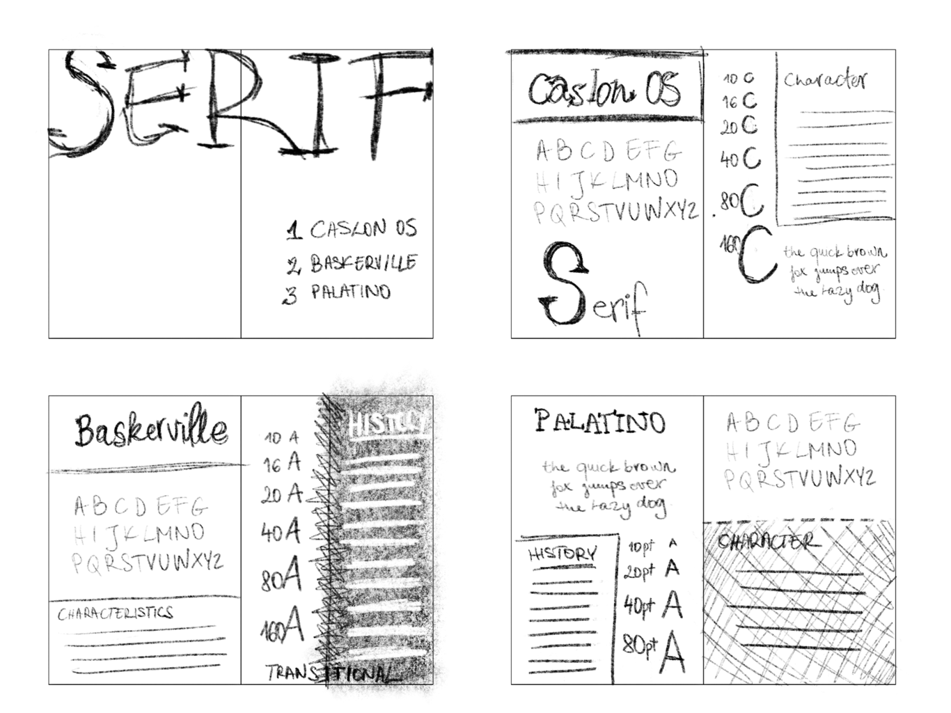
Once I had this worked out, I began to work on Adobe InDesign to lay out my pages.I started with the title page for the Serif section leaving the main cover of the document unfinished as I didn’t really know at this stage how to approach this.
Once I started to lay out the document, I figured that all the sections should have their own colour identity so the reader always knows what section they are browsing by the visual cues.
I begun to work through this section by section, making decisions on how to lay out each of the pages/spreads, that looks good for the font, but still keeps in mind the principles I laid out earlier. This process took me about 10 hours total. This taken so long due to a few factors I think;
– my inexperienced with the software,
– not having the fonts at my disposal, and also
– not having a fully realised idea about how I wanted to the pages to look exactly.
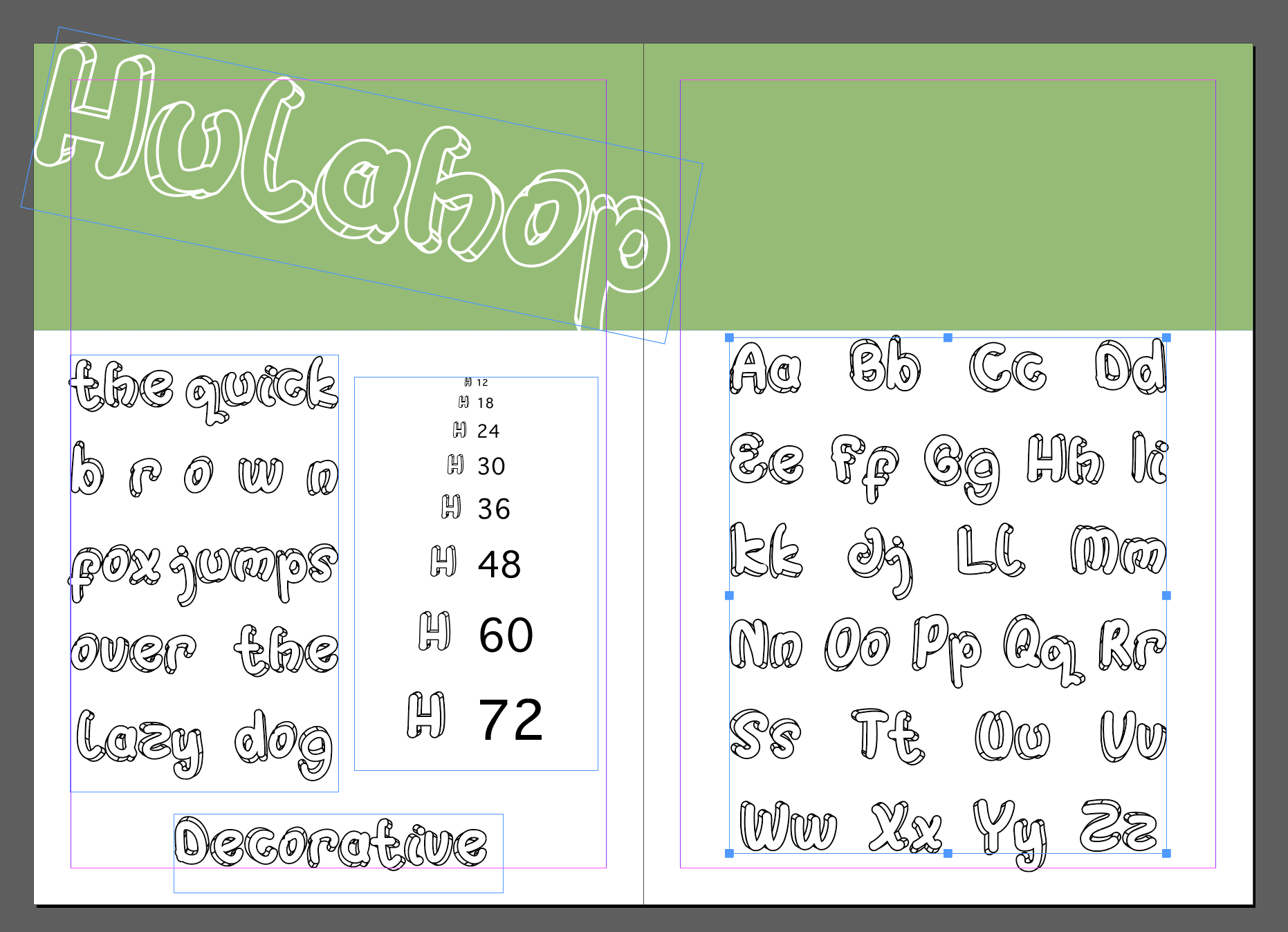
Serif section header
I kept the layout fairly simple by just filling the page with a background colour. I picked yellow, not for any particular reason, but because I like the colour and I thought it will contrast nicely with other colours that I will add to other sections of the document. I kept some very basic rules in mind for this page, I wanted it to be clearly recognisable as the beginning of the section, I only wanted to use one font from the font family and wanted to highlight the fonts discussed within the section in order, like a mini table of contents page.
When looking at the first page I was slightly overwhelmed by the fact that I never made a type example book before and that I haven’t really used InDesign all that much.
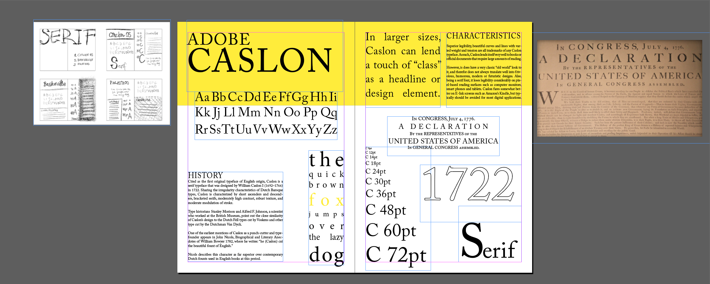
I begun by adding my sketch to my workspace to aid me with ideas for laying out my page. I added the main title Adobe Caslon first. I felt like this really nicely set the tone for the whole of the page and aided me in finding a layout that is pleasing to the eye.
I wanted to add some of the history of the font and some text that was describing its characteristics too. I found some text online that did that well, so I borrowed this.
I added a scale to show what the font looks like at different sizes, with a capital C front of the point size of the font and set this right to create a nice slope that I thought added a nice visual element to my page.
From my research I found out that the US declaration of independence was laid out in this font too, so I added this as an example text to my design. I also added the numbers “1722” as this is when the font was created, but also to show more of the numerical symbols of the font.
For the first 2 sections, (Serif and Sans-serif) I managed to find plenty of material on the fonts and thus filling the page wasn’t an issue, however when it came to laying out the pages for some of the more obscure fonts, I found myself struggling to find things to fill the pages with.
For the next few fonts I couldn’t really find out the origin or history, so the pages look a little unfinished. In retrospect, these pages may actually look better in comparison as the pages have more white space to let the text breathe.
I also found that some of these more “indie” fonts have a lesser support when it comes to special characters, some of them didn’t even support numbers. I was really struggling to fill the page for these, as one of the elements that I definitely wanted to include was the scale, showing what the font looks like at different sizes.
Reflection
This was an exciting project, but in retrospective I can see where I could have done a better job. Some of these come from inexperience with the software, and some of them are simply just an oversight or lack of proper planning on my part.
- Should have chosen colours more consciously.
- I should have gathered and tested my fonts before starting the project
- I crammed too much onto some of the pages. Should have been more selective on what to include.
- Should have included a written proof of each font’s use where possible, to carry through the idea I had in the first section.
Overall, I feel satisfied with the end results.
The brief – Part 2
Now identify which fonts you might use in each of the following commissions:
Graphic Design Level 1 – Core Concepts
• A short story in a woman’s magazine entitled “I thought I loved him; now I’m not so sure”. The story is 1300 words long so you will need to identify a text font and a headline font.
• An advertisement in a parish magazine asking for more helpers on the flower rota. The finished size is A6 landscape and the text reads: “Can you add that important artistic flourish to our church? We desperately need more volunteers to join the flower rota. If you can help or would like more information please contact Jennie jennie@vicarage.co.uk.”
• A poster to advertise an after-school club for boys aged 13 – 14. The poster will be A3 size and the copy reads: “Bored? Feeling got at? Nowhere to go? Then why not come and join us on Tuesdays and Wednesdays after school in the Old Gym. We’ve got football, ping pong, table soccer, computers, Karate, cooking and lots more. All free just come along.”
• Your friends’ engagement party. They want a flyer A5 size to send to their friends as if advertising a club night. The copy reads: “Mandy and Josh are finally going to do it…well almost!!!!! Come and join them on Friday 24 March from 8pm at the Golden Calf to celebrate their long awaited engagement… and yes lots of presents would be gratefully received particularly if we can drink them!!!!!
For this second part, I felt like I am now well prepared because I had my fonts to hand that I knew fairly well.
Story in a women’s magazine:
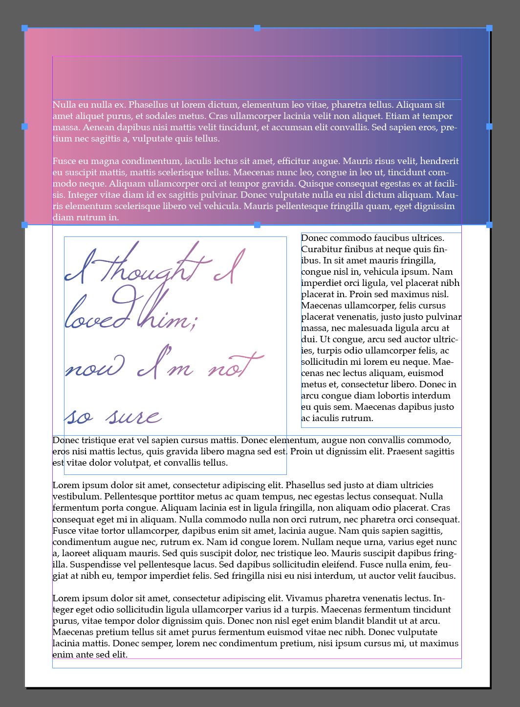

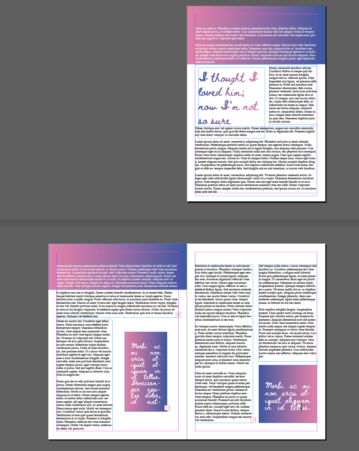
I feel like this was the hardest to achieve, The length of the text meant I needed to mock up several pages. I tried different fonts to see how they work for this type of text. I used 2 of the script fonts, to give this the feeling of a hand written letter, but soon realised that these are less legible and therefore probably wouldn’t be used in a magazine. I finally settled on Caslon for both the heading and the body of the text for consistency.
A6 advert in a parish magazine
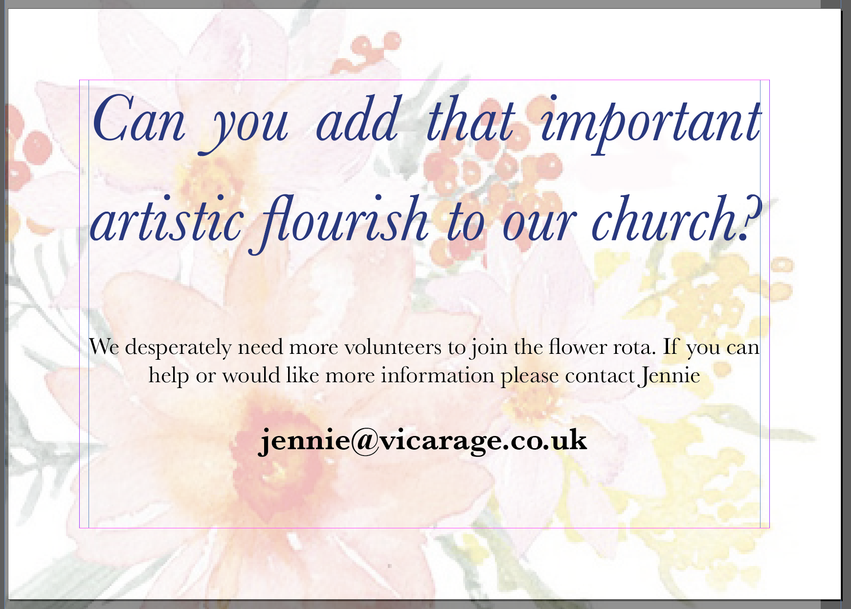
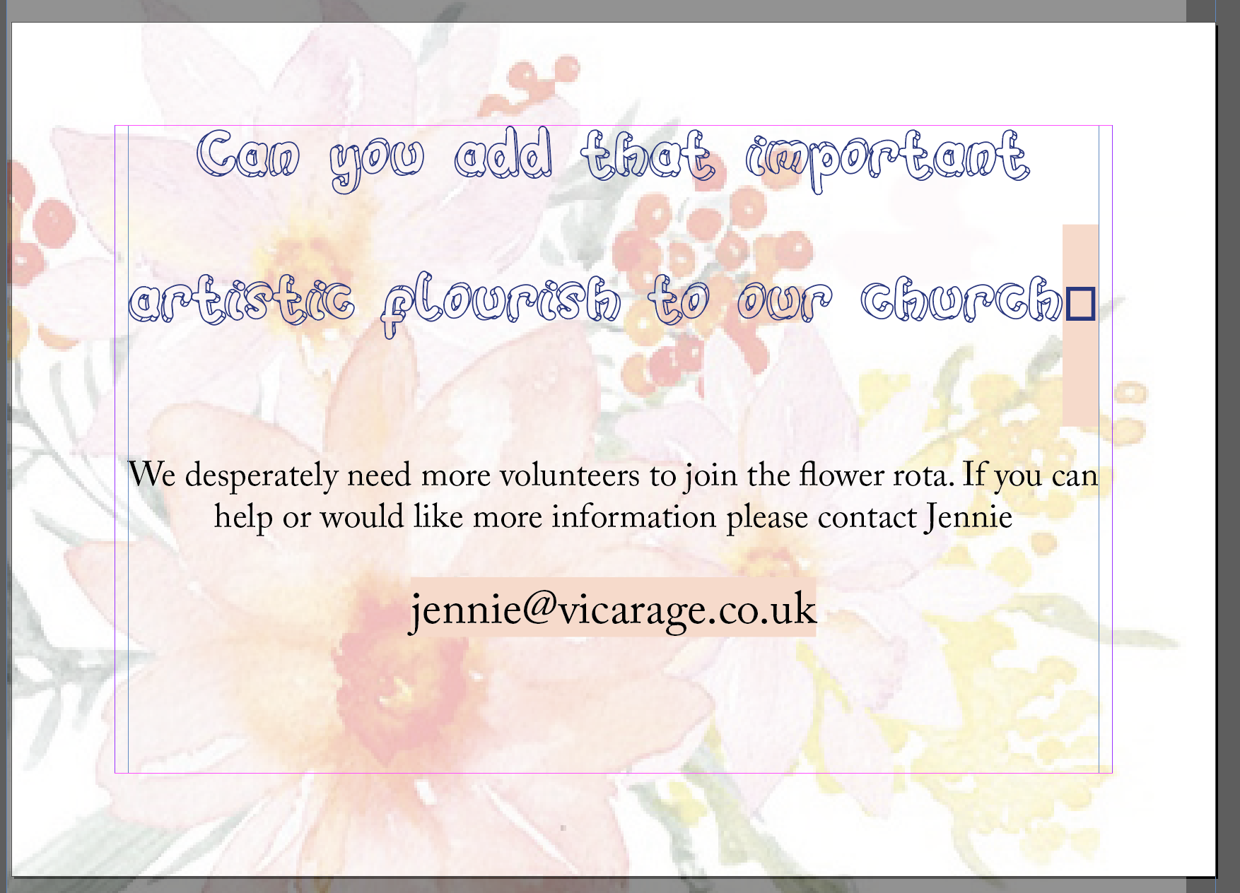
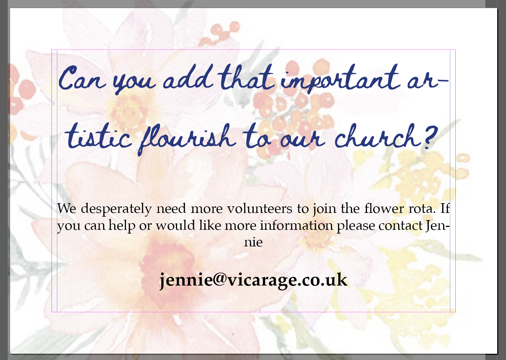
For this I thought that I need to use something a little more conservative as this would be for a church. I added the illustration of flowers in the background of the design to show what the theme of the avert is at a glance. I tried some of the decorative and some of the script fonts as I thought this would land well, however keeping legibility in mind I opted for something a bit more legible, so opted for Baskerville in bold Italic for the heading and regular for the body of the text.
After School Club
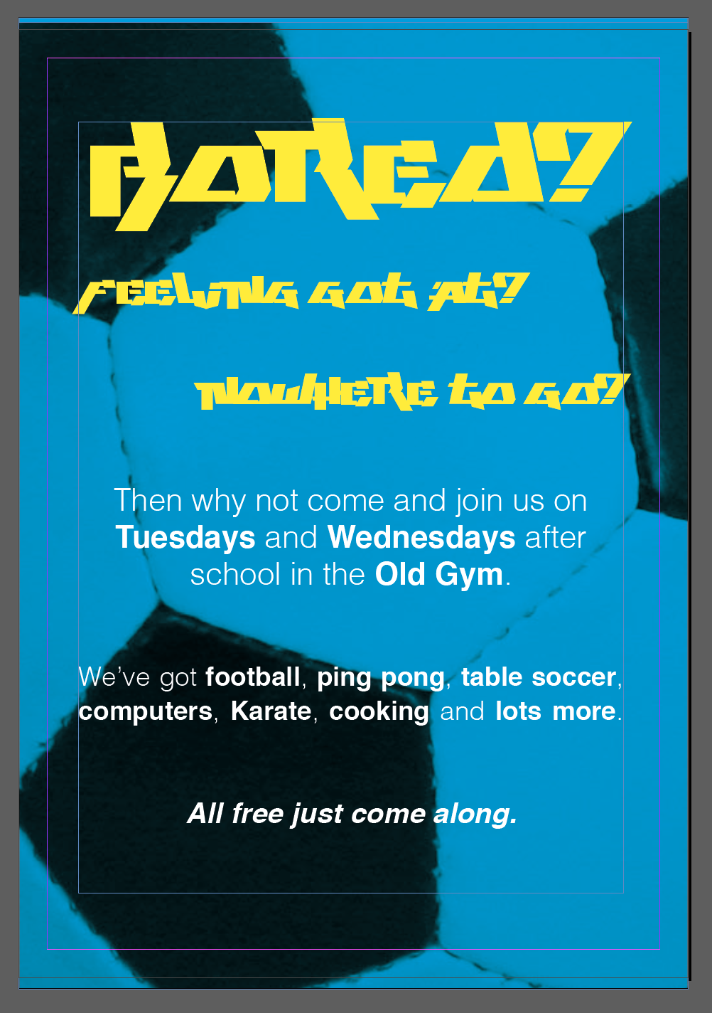
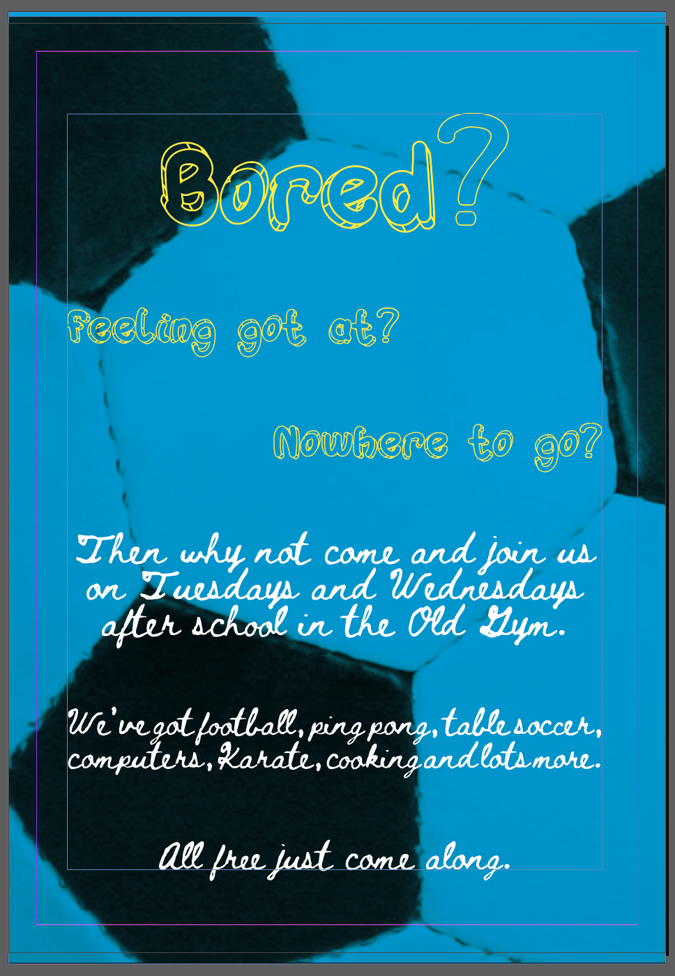

For this poster I wanted to use the Play This Game font, as I thought it had a very young graffiti like appearance, I tried this as both the headline and the body text first, but this was very hard to read, so I decided to keep it only to the headline and use the neutral Helvetica as the body font, highlighting some of the elements that I thought would be important to the readership.
I also wanted to try out the Hulahop font as part of this poster, as there is something playful and childish about this font. I faced some difficulty when I realised that there is no symbols in this font set, I had to replace the question marks in the title with some other font and outline it to give it a similar appearance. This font didn’t work as body text, so I experimented with Beth Ellen instead. It sort of worked I think. The font has a very hand crafted quality which given the poster a more hand made, home crafted look. The con of this is that the text is not very easy to read, which would make it hard to get the message across. I also thought that 13-14 year old boys probably wouldn’t like the appearance as it may give the poster a softer perhaps girly look.
In my 3rd version I opted for Black Rovers. I was surprised how well this font landed itself for this poster. I liked how it given it a modern edge whilst still legible and fun. I must say that I liked this poster the most out of the 3 I made for this mockup.
Mandy & Josh

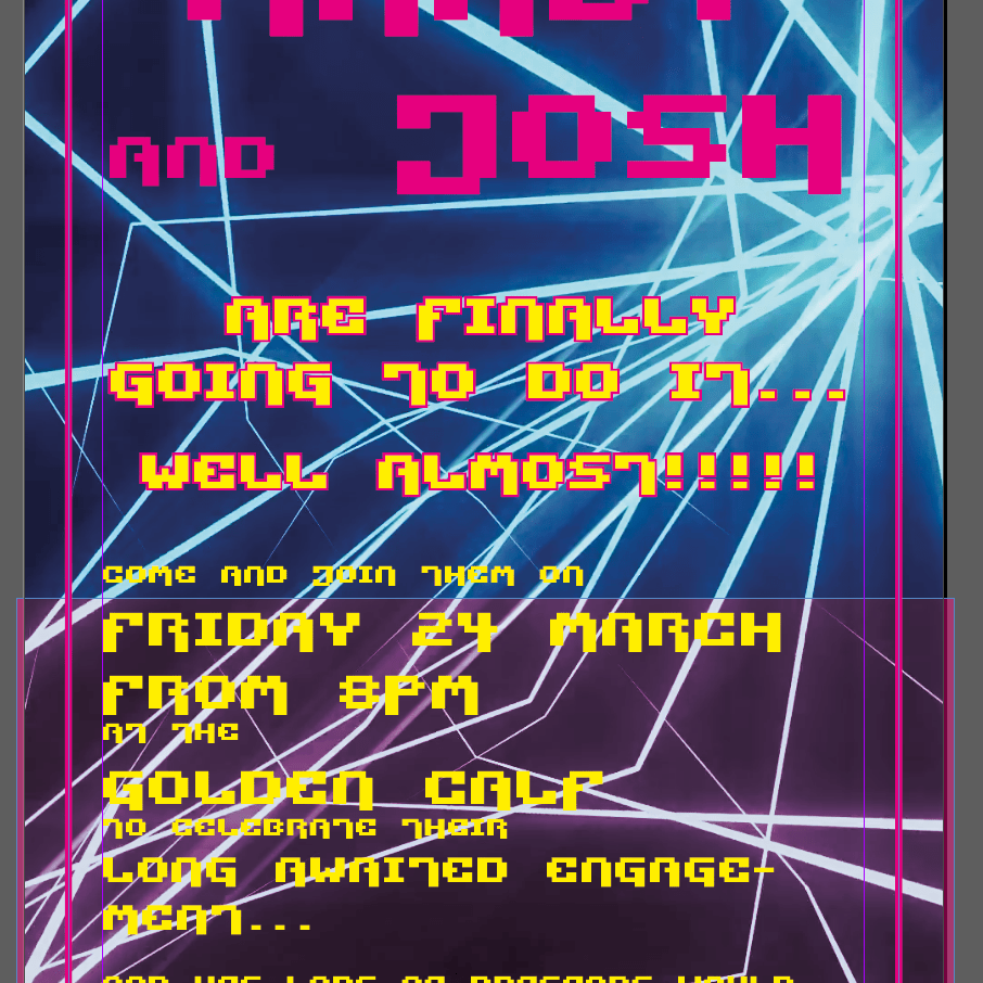
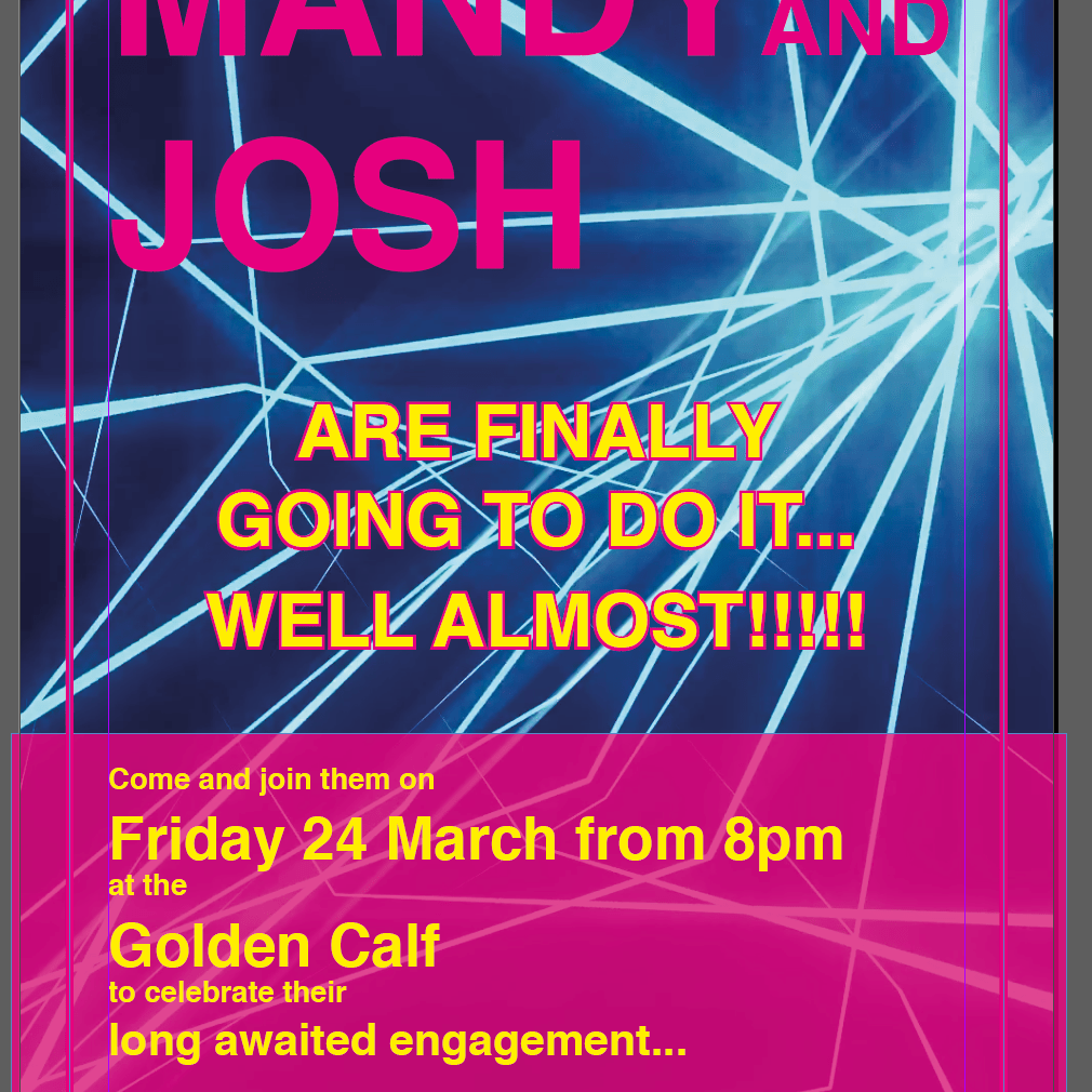
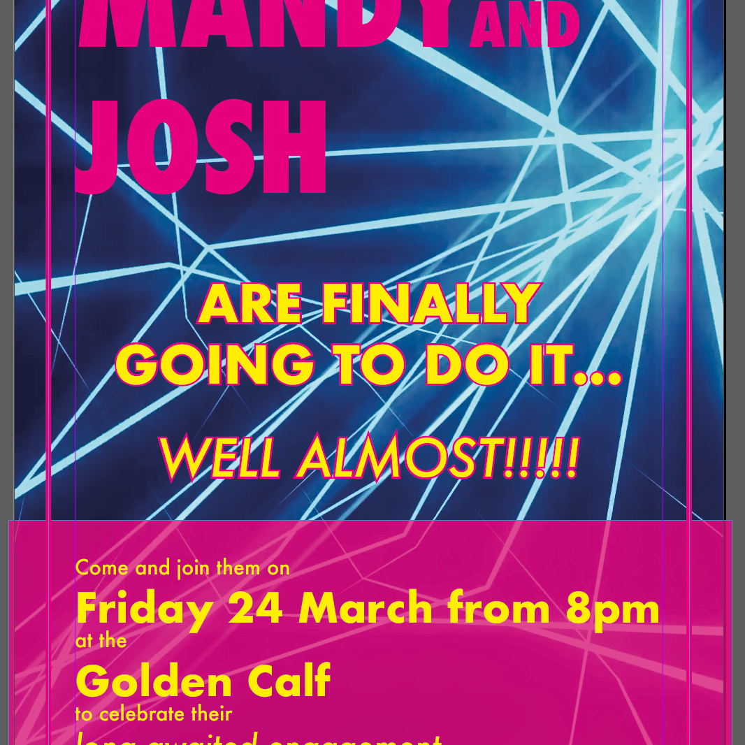
First (based on it’s success in the previous poster) I tried out Black Rovers. I really like this font. It is legible but different at the same time, it looks great at large and medium sizes, and it gives that modern feeling I wanted to convey for this club night inspired invitation.
My second choice was the Pixel Technology font. This font also lends itself as quite an edgy futuristic font, however I felt like there are problems with its legibility at lower font sizes. I could perhaps use this font as a headline, but not as body text for the poster as this isn’t readable.
I wanted to try out some of the Sans-serifs I had in my book too, so I started with Helvetica. This font is very neutral, there is no real edge or interesting features, but lends itself surprisingly well. It is legible and clean, very easy to use too, with lots of styles available.
The other sans-serif I wanted to try out for this is Futura, this font – similarly to Helvetica – is very simple. The condensed SuperBold style worked well as a heading and again, this font was very easy to use, as there are several styles of it. I liked how easy this is to read, but also feel like the sans-serifs I used are a little boring and doesn’t have much personality, so I still prefer Black Rovers.
Reflection
I feel like I managed to learn to be open to other options and experiment with different style fonts when it comes to creating my work. This really affects the feeling of the entire piece, and can help better convey the message. I will need to be cautious when selecting fonts from the versatility and character availability point of view, as I feel when a character I am trying to use is missing it can possibly break the entire piece.
