
The exercise (from the OCA training material)
Using the following words create typographical representations that present both the word and a suggestion of its meaning.
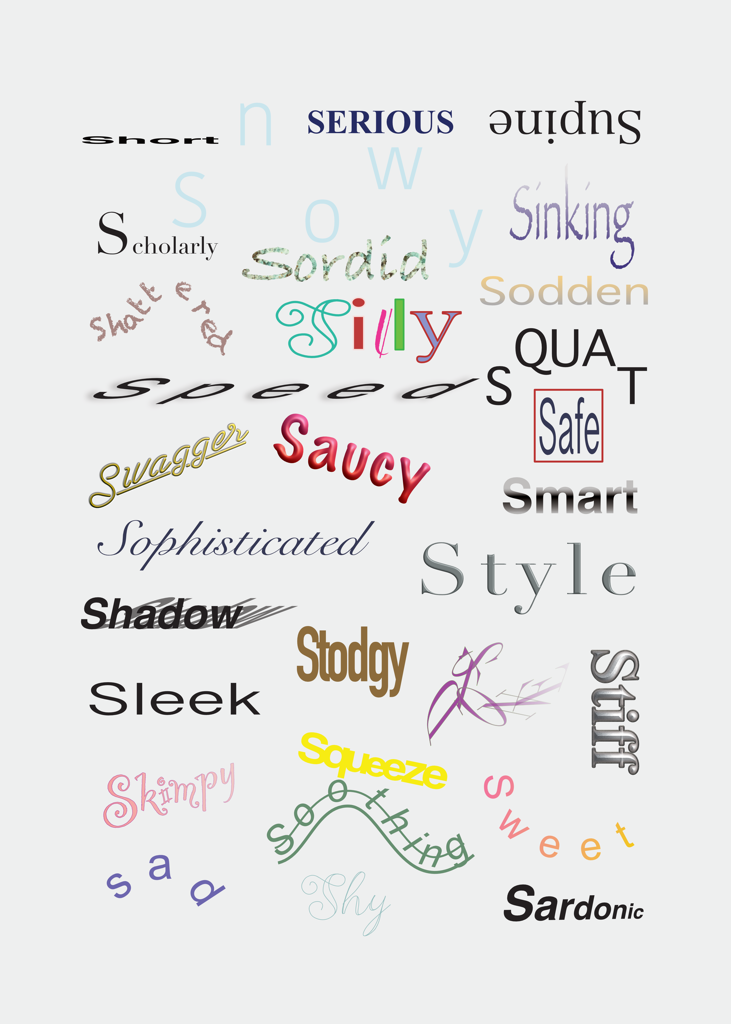
Sad Safe Sardonic Saucy Scholarly Serious Shadow Shattered Shy Short Silly Sinking Skimpy Sleek Smart Snowy Sodden Soothing Sordid Sophisticated Speed Squat Squeeze Stiff Stodgy Stoned Style Supine Swagger Sweet
Start this exercise by working on A4 sheets of paper. Set the words in 48pt Helvetica Bold, print and cut out the words and then arrange them and stick them to a sheet of paper trying to capture the meaning of the word visually. Think about the composition, using the white space of the page to help you construct your meanings.
Then work digitally using any of the software you have available. Explore how you can set text at a slant, at different sizes, in different colours and fonts. Try using filters in your software for other effects.
Make notes as you work explaining your choice of representations and which ones you feel that you were most successful with.
Paper based exercise
I begun this exercise by printing the words on an A4 piece of paper and cutting them out. I gone through the words and looked up the meaning of some I wasn’t sure of such as (supine, sodden, sordid and sardonic) to get a sense of their meaning.
After this I started playing around with the words as a whole on another sheet of paper.
At first glance – especially keeping the letters of each word intact – I found that there wasn’t much I could do to convey their meaning only using the white space and positioning of the words on the page.
Being inspired by the work of Adages of Erasmus, I decided to create an S shape of the words as they all begin with the letter S.

After this I decided to consider each word’s meaning and try to place them on the page one-by-one in a way that convey’s their meaning the most.
Some of these were quite simple; for example for the word Snowy, I just separated the letters to create the effect of falling snowflakes.
For the word squeeze I have cut up the word into letters and pasted them between 2 words that were already on the page, literally squeezing the word in between them. I think this worked quite well because the directional meaning of the word.
I have struggled with some of the others where I couldn’t really create any meaningful way of dissecting the word into smaller parts to convey their meaning. These words have become a sort of framework for others to create a better layout for some of the ones that I felt need a visual framework to convey their meaning better, such as “Safe”.
I feel like overall, I have been quite successful with this part of the exercise, however I found the limitations of it quite disorienting sometimes. The lack of use of different fonts, weights and colours, really limited my ability to convey the meaning of the words.

Digital exercise
For the digital part of the exercise, I user Affinity Designer on my iPad. This software offers a multitude of ways of manipulating font.
I started by looking at each of the words, considering their meanings, then choosing a colour and a font that represents that meaning to me the most and sometimes playing with the shape of the baseline of some of these words to reinforce their meaning even further.
For some of the words I tried to re-create the layout I have created on paper in the earlier part of the exercise and for some of them, I created entirely new ones. I had fun with the word Stoned for example. I put the letters on a spiral base line, which have resulted in a jumbled look, which I think conveys the meaning really well, however I am aware that this is quite illegible, and creates more of an abstract piece. This is something that I will need to keep in mind when using words in my designs.
The ones I was struggling with, were the ones I struggled with in the paper based exercise; for example Smart and Serious. I think this is largely, because the words are not of a strongly visual meaning and more of an abstract concept. I tried to think about them more in terms of a dress sense, for smart I used a gradient of black and white and for serious a dark almost back blue, and used fonts that are considered serious.
I found this exercise very interesting. It really taught me that the use of the multitude of ways how we can use font and colour in our work can be very liberating when it comes to adding meaning to a design using words. I probably take this for granted, and I should consider layout as much as the actual colour, weight and font when using type in my designs.
After my tutor’s feedback
Once I received the feedback from my tutor, I felt like I misunderstood this exercise and wanted to try a different approach at least for the paper based part. After re-reading the brief it occurred to me, that I don’t need to try to squeeze all the words on 1 piece of A4 sheet of paper, but rather should use the white space of the paper as the confines for this exercise but each word could get their own sheet of paper.
Reflection
Looking back, I see where I went wrong with this exercise in the first place and I think this highlights the importance of reading and analysing the brief better. Once I understood the brief I think I was much more successful with the implementation, and the results are much more pleasing to look at.

One Comment Add yours