
In this exercise I need to create a experimental typographic layout for Jules Verne’s 20,000 Leagues Under the Sea.
The text to be included was the following passage:
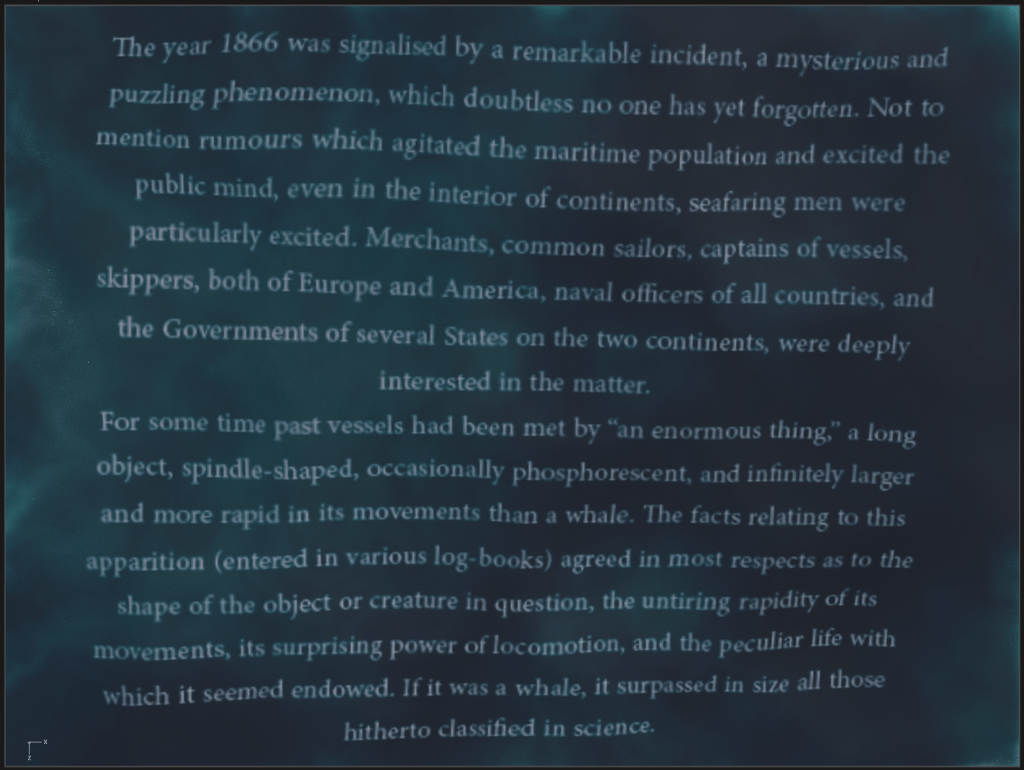
The year 1866 was signalised by a remarkable incident, a mysterious and puzzling phenomenon, which doubtless no one has yet forgotten. Not to mention rumours which agitated the maritime population and excited the public mind, even in the interior of continents, seafaring men were particularly excited. Merchants, common sailors, captains of vessels, skippers, both of Europe and America, naval officers of all countries, and the Governments of several States on the two continents, were deeply interested in the matter.
For some time past vessels had been met by “an enormous thing,” a long object, spindle-shaped, occasionally phosphorescent, and infinitely larger and more rapid in its movements than a whale. The facts relating to this apparition (entered in various log-books) agreed in most respects as to the shape of the object or creature in question, the untiring rapidity of its movements, its surprising power of locomotion, and the peculiar life with which it seemed endowed. If it was a whale, it surpassed in size all those hitherto classified in science.
20,000 Leagues Under the Sea, Jules Verne – Chapter 1, A Shifting Reef
After reading the text a couple of times, I distilled some of the thoughts that came to mind while reading.
- phenomenon
- mystery
- sea
- water
- sailors
- enormous
- sea creature
- shadow/darkness
- movement
I had some ideas swirling in my head of how to do this layout, and wanted to start, but first I wanted to research some examples or experimental typographic layouts.

I liked these pieces by Craig Ward as they had a very 3 dimensional quality.
I loved this typographic treatment that I found on Typography design 101: a guide to rules and terms – 99designs. Really liked how the type gets smaller and smaller towards the bottom to create the feeling of falling asleep perhaps.
I also found these incredible typographic portraits that I thought were really inspiring:

I wanted to start with digital, and then move onto some more physical techniques to create some interesting images.

In my very first attempt I created some shapes and laid out the text within these to create an illustration that eludes to the content.
I thought this was pretty unoriginal and uninteresting. I wanted to do better than this.
I wanted to created it a little more 3 dimensional so that the image has more of a visual appeal and feels less flat. I wanted to to create the image using the technique shown in that Bob Dylan image above. I wansn’t too sure how to approach this but had an idea. if I created a 3D model that was resembling water and then laid the text on the surface of this it could look pretty decent I think.
My first attempt at this didn’t quite have the desired effect, I wanted the text to be a lot more distorted, like it was stirred up by a sea monster. At the moment it was pretty flat. Luckily, I found a very easy way to achieve this. I just needed to stretch my water model a little more on the Y axis to make the waves more varied. The effect was a lot more interesting!
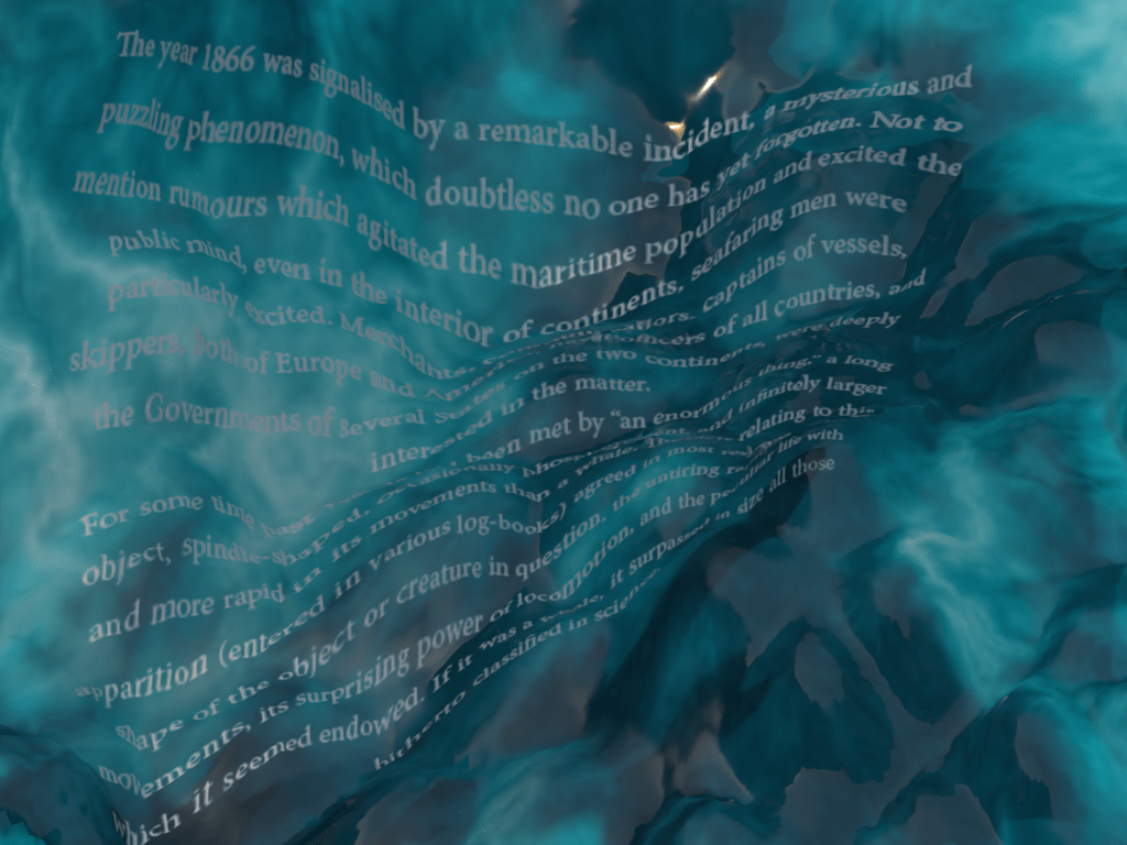
II had a lot of freedom here to easily adjust the layout, the depth of this effect by adjusting the model, or the colour and lighting as well. I think this is a really fantastic way to be able to work with text. It gives it a lot more interest. The only thing I wasn’t too sure about is how this would fulfil the point of the exercise. Is it going too far to the illustrative from the typographic layout?
Next I started experimenting with the size of the type to create a water like texture. I was not really happy with this. It has taken a very long time to be able to change the scale of certain elements to create something that would highlight the meaning of the text but also be visually interesting.
I wanted to also look at perhaps laying out the text on a water like squiggly line, maybe using a font that would have been used at the time.
After some digging online I have found a type specimen book from 1869.
I found the Pica fonts quite interesting, and decided to find something that was inspired by this. I found this font by Ignio Marini:
IM Fell Double Pica – Google Fonts
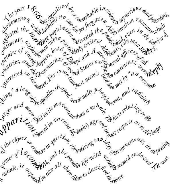
It was interesting to play with the type on path option, but I found this sort of boring… I think I need some other elements to make this more interesting. I decided to outline a squid like creature and place it under the text to illustrate the meaning a little more obviously.
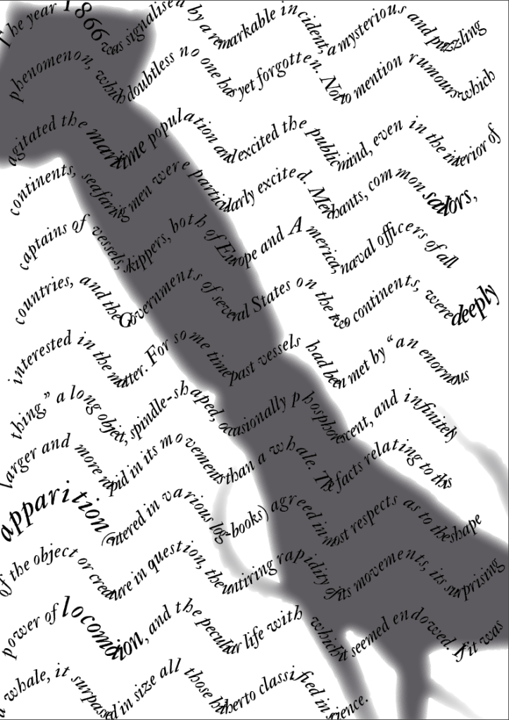
I think this made it a lot more interesting!
I had one more idea in mind that would dome something similar as the above approaches, but using actual water and a printed form of the text. After some playing around with the photo I had something that looked pretty special in my opinion, although wasn’t exactly readable.

Reflection
I think this exercise was interesting as a way to explore how words on a page can be a lot more than a simple text block. I think I was till relatively tame with what one can do in terms of text layout in advance to create something that communicates meaning of the text before the viewer even read the words, and make text into a form of art.
I am not too pleased with the outcome of the flat ones that I created using my DPT but I really enjoyed the more experimental 3D and physical play as I think these are a lot more evocative.
