
In this exercise I was asked to look at grids in more practical terms by analysing some books then recreating and further developing the grids I identify.
I have started this exercise as suggested; by using tracing paper to draw up the grid that I could see in my chosen book, but I found this really annoying as the tracing paper (I was using baking paper) was slipping around too much and I kept getting my measurements wrong.
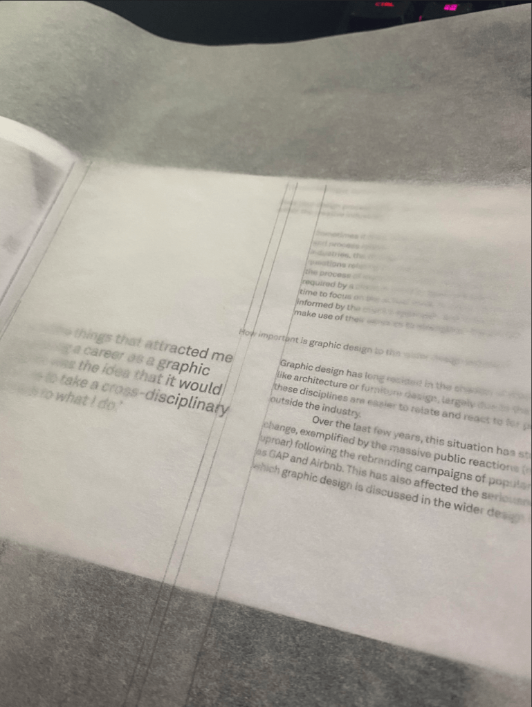
Instead I added light pencil lines to my chosen spread to identify the grid lines.
Once I was done with this, I started to create a drawing on an A4 piece of paper, where I would write up all the measurements of the different grid lines I was able to identify.
I started with my vertical grid lines first as I thought this was more complex than the horizontal ones. It was quite difficult to identify how many columns this layout was originally using. It seems that the designer often broken the grid as well to make certain elements fit better or to balance out the text.
There seem to have been some rules in terms of the way the questions above each answer were relating to the answers below; it always seems to be 1.5cm offset from the main body text.
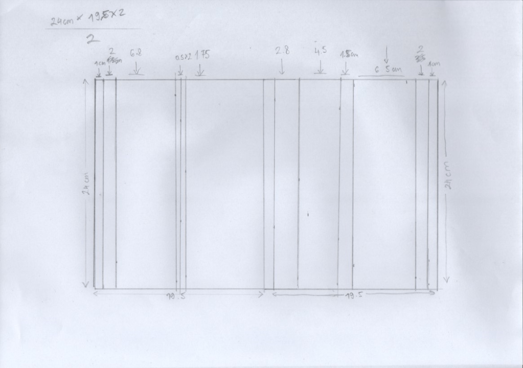
I thought it will probably be better if I create this grid right in my DPT software as I feel that not creating this to scale gives quite a bit of room for error.
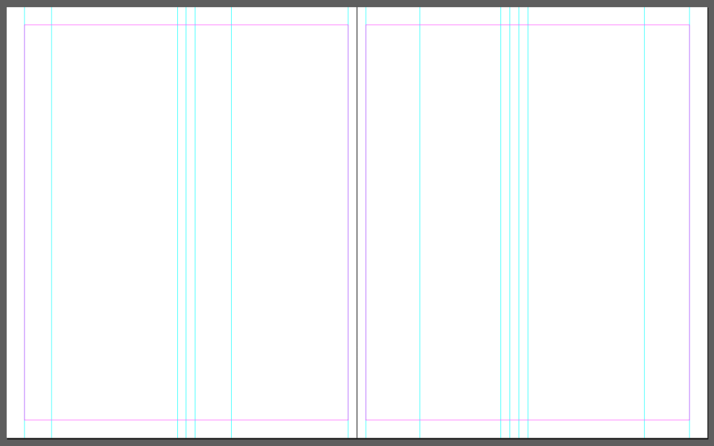
What I noticed that the relationship between grid lines is always the increments of 0.5cm. I think this helps keeping the grid nice and uniform even when it is slightly broken to accommodate content.
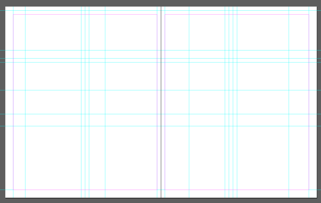
As I was adding more lines this has become more and more apparent, the grid was only following one rule (seemingly) and that was the .5cm increments. I guess this meant that every element had at least that much breathing room.
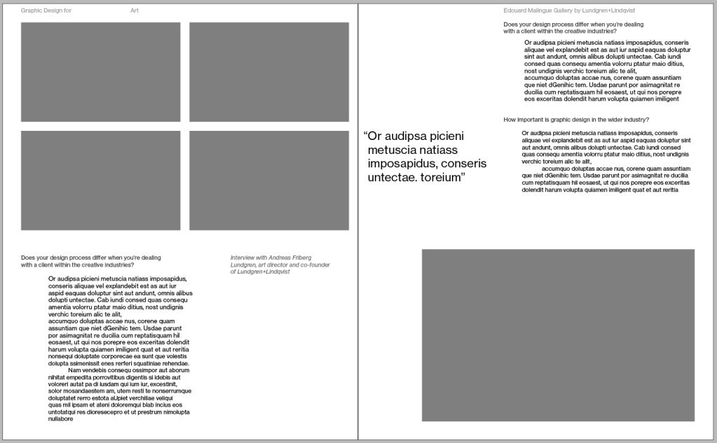
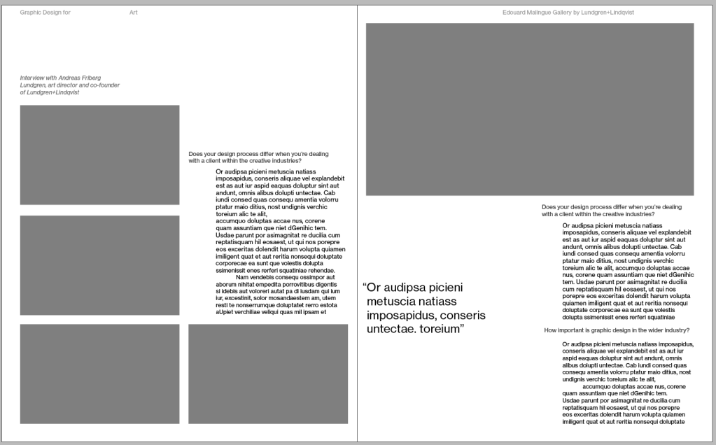
I recreated the spread as per the instructions. I was really impressed how the designer was following some simple rules to make the book feel very cohesive. I think the main rule they must have had in mind, that all padding around elements should be 0.5 cm. This simple rule made the spacing look even even when the content is really varied in size.
I noticed some small elements as well that I found really interesting; the hanging quotation mark, to keep the text nicely aligned to the left.
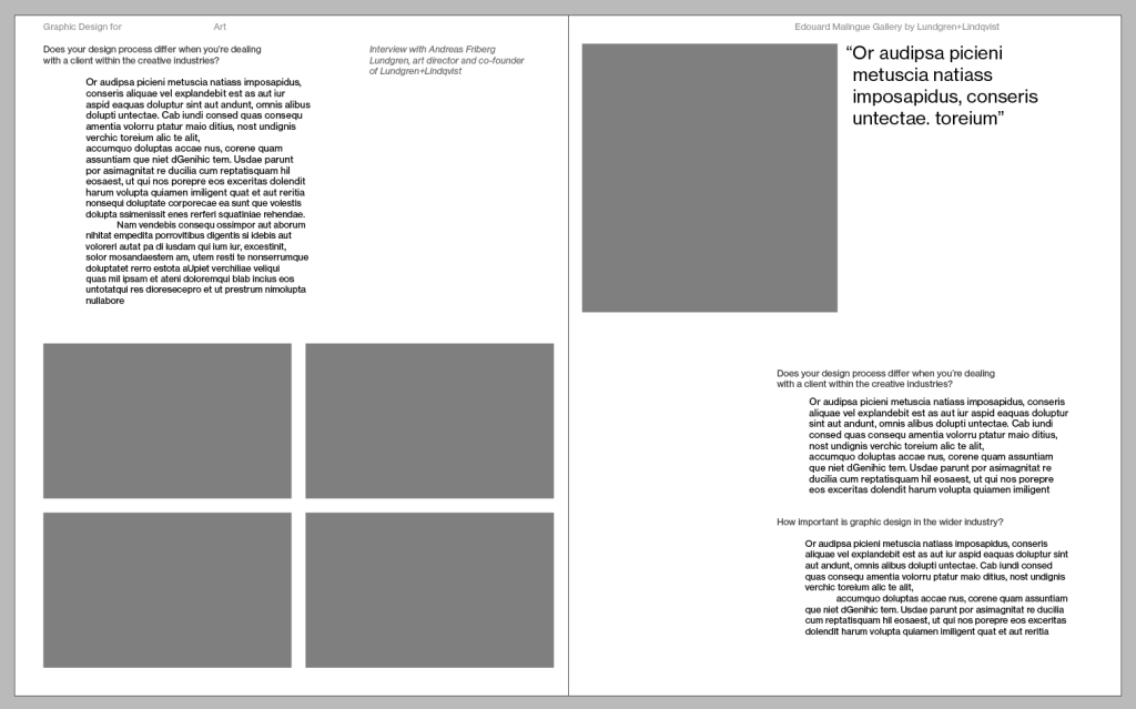
Next I needed to think how I could radically change the design, is there a way I could improve on it?
This was quite a tall order I think as the base design was a graphic design book and as a novice myself it would be silly to think I could improve someone else’s work.
That said, I tried to see if I can create some different layouts of the same content as a practice exercise and see if I could come up with something that is very different.
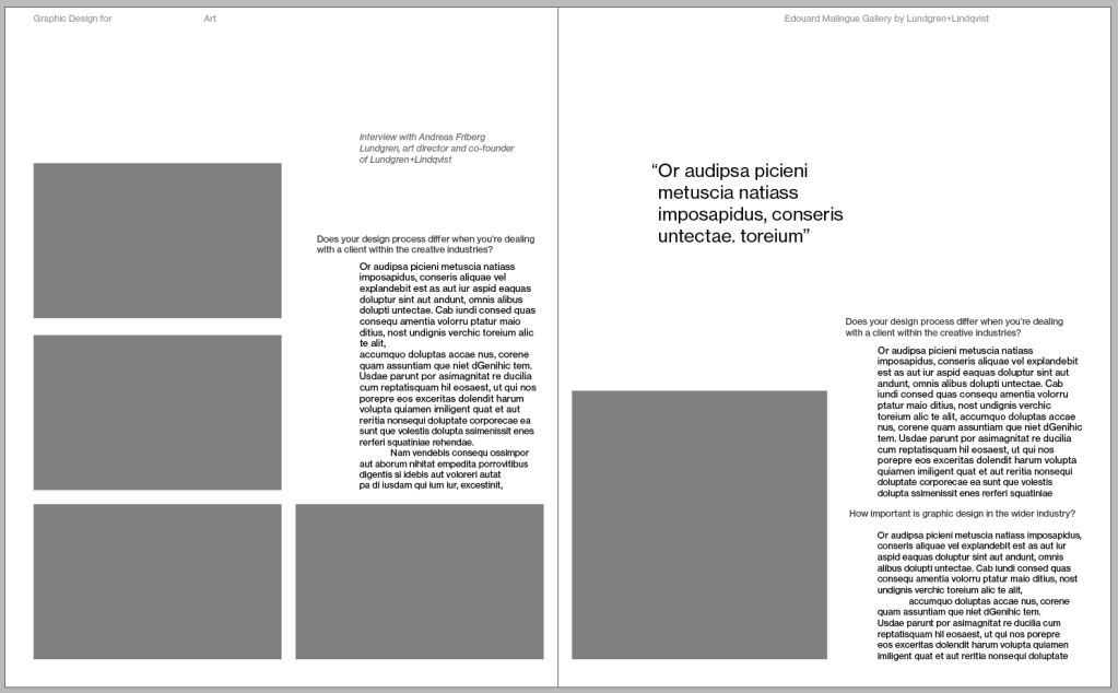
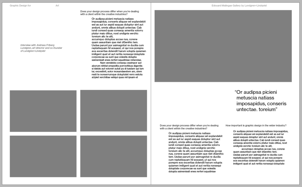
It was definitely an interesting exercise. Wherever I was not following the grid and just pulled elements around (bottom right image) the layout felt less strong than any of the ones where I placed elements using the grid.
I found this exercise very interesting, I think I have a better understanding how the use of grids can really ground your work and make things feel more organised and more pleasing on the eyes.
