
The golden ratio is a special ratio that has been used in art and architecture for hundreds of years.
It is a ratio that cannot be expressed in a rational number and this number is described in mathematics as Phi (Φ ). What makes this number so incredible is that if we use this to create a rectangle – also known as the golden rectangle – the proportions are, so that if you cut off a square off this rectangle, the remaining part would have the exact same proportions as the original rectangle.

I found the below video on YouTube that explains the golden ratio really well.
It has been observed that this very special ratio can be used some very interesting geometrical shapes, such as the regular pentagon and regular pentagram. The regular pentagram has the ratio repeated in it quite a few times, all the triangles that make it up are golden triangles.
I found this image that explains everything there is to know about this special number on an infographic.
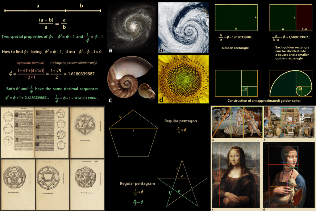
It is generally something that we find pleasing to look at and artists have used it to create compositions for centuries.
Golden ratio in art
Next I wanted to look at where in art the ratio has been used. Found quite a few images online where people have overlaid the golden spiral to reveal how the golden ratio applies to various pieces of art.


If you look at something long enough you will start to see patterns that may or may not be there. I think this is just generally how our brain works, we like to make connections to recognise things. I think perhaps the golden ratio is just that too, a familiar ratio that is pleasing to our eyes because it can be repeated within itself infinitely.
Definitely find this very interesting from the geometric point of view, but to say that it appears in nature in so many places that it must be coded into the universe itself is just complete nonsense in my opinion.
That out of the way, I wanted to look at how this magic number can be applied to graphic design and more specifically books.
I read through Canons of page construction on Wikipedia, and found it quite interesting but wanted to see how this is applied in practical terms so I went to YouTube and found a video that explains this really well.
I found this really interesting and I wanted to construct my own to really learn how it works.
The first problem I encountered using the above method is that your page format doesn’t always conform to this 4:3 ratio. I was wondering if the base grid was needed at all, and looked at some alternative guides on how to construct this.
It is actually quite simple, but takes some practice. I made myself a cheat-sheet that I can use when I get stuck with creating this grid for books.

I guess you could also extend the text rectangle to the pink line to make more space for text if you wanted to, though this would potentially make the page layout a little top heavy. Somehow I felt like the bottom margin feels way too wide.
I looked at quite a few books and it seems only a small handful follow this way of laying out the text, the common layouts seem to balance the top and bottom margins a little more to give more space for the text.
I guess you need to take into consideration more than just the one principle when designing a book, but some of these are definitely lacking a good margin.
While I don’t hate the last one, you can definitely see how this could be slightly impractical, when you hold the book your fingers might get in the way of reading.
I also come across the Fibonacci Sequence which is basically what the golden ratio is also based on. The further you go with the sequence the closer the ratio between the neighbouring numbers get to Phi.
I found this video about how this can be applied to Graphic Design and typographic layouts.
I found this very interesting. Also I like how the more I learn about grids the more I see how designers relate to the topic. It is something that needs to be used, however it should not dictate but help you with finding the best layout for your page.
This is a massive topic and I think you can never do enough research, but I find it interesting and I would like to pay special attention to it going forward in this course to make sure this is an integral part of how I approach design.
