
Identify a range of books that have fundamentally different functions in terms of how these books are engaged with – how they’re held, where they’re read, by whom, and for what purpose. Try to look at least six books, but you can extend this if you want to. The differences between these books might be determined by their genres. For example, you might look at a cookery book, a biography of a sports personality, a travel guide, a work of historical fiction, a teenage film tie-in like Twilight, this course guide – the choice is yours.
Think about how each book’s form reflects its function. The front cover is an obvious starting point (and the focus on your upcoming assignment) but try to look more broadly than this. Think about things like page extent, paper quality, typeface, the weight of the book, imagery and more. Is the book illustrated with photographs, reproduced images or drawings? Are these concentrated in one or two places or distributed throughout the book?
What about front matter and end matter? Historical novels like Hilary Mantel’s
Wolf Hall may have family trees and/or a list of characters as part of the front matter. A scholarly biography will usually have many pages of end-notes and references.
Reflect on this in your learning log, with examples of some of the books you’ve selected. Identify how each book designer has reflected the genre and function of your chosen books in their final design.
Book Design 1: Creative Book Design
For this exercise I was asked to look at 6 different books and analyse them in terms of their design that is based on their function.
I started the exercise by looking around bookshelves at home to identify a range of books. I looked at some travel guides, some art related books and some cookbooks to mention a few.
What was immediately visible as I gathered the books is how different they are in shapes and sizes.
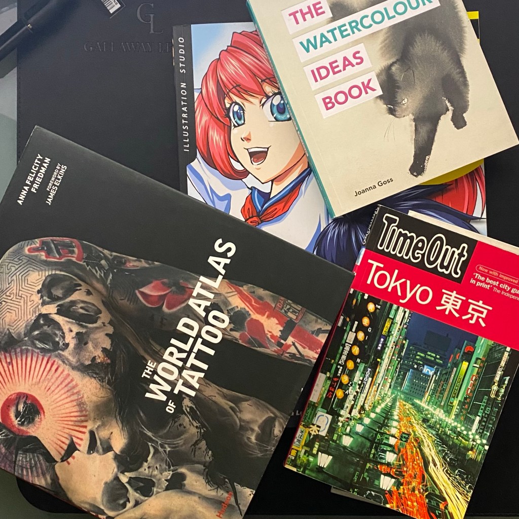
Most interestingly, some of the books that were covering a very similar topic were at the 2 extremes. The Watercolour Ideas Book by Joanna Goss is a small form factor while Beginning Manga, is huge in comparison. They are both soft cover, to allow easy handling.
I think this disparity comes from the fact that they are perhaps aimed at slightly different audiences. The Watercolour Ideas Book is more of a grown up publication with high concepts while the Beginning Manga is a book for beginners, perhaps with a much younger audience in mind.
The Watercolour Ideas Book
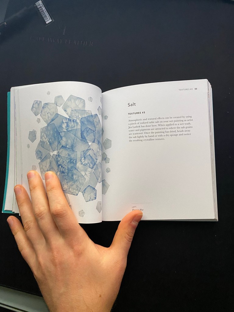
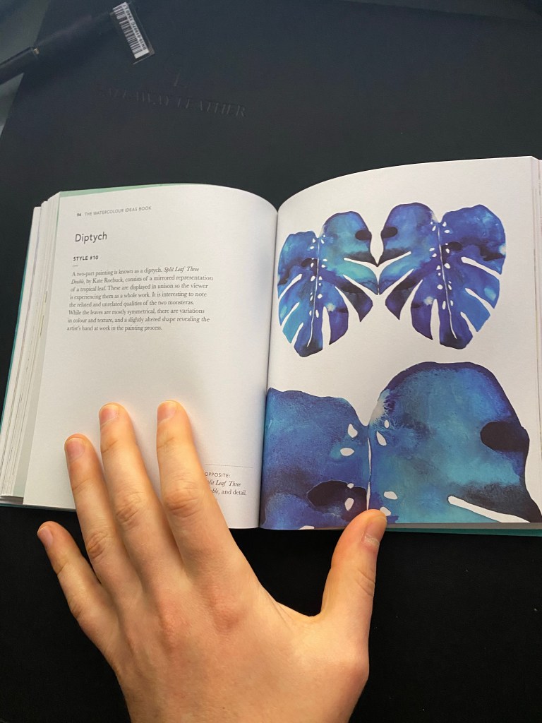
The Watercolour Ideas Book has a range of ideas using the same medium, not so much of a practical guide, but more of an object that can inspire. For its size, I think it is so tiny so that it can be tucked away somewhere in the artist’s workspace giving immediate access when the inspiration is needed the most. It has a soft cover with the title slightly embossed to make it pop a little, but there is nothing too fancy to it. It has a simple layout with no chapters. It works with 2 page layouts for each of the ideas, one page describing to the reader what they can observe on the other.
Beginning Manga
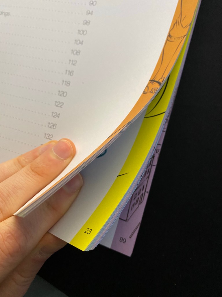
Beginning Manga is a relatively large book with a soft cover. It is slightly more educational in purpose than the previous book and probably aiming for a slightly younger audience. The book has coloured borders to signify what chapter the reader is currently viewing which I think is an easy way to distinguish each of the chapters from each other.
The large soft format of the book means that it can be folded open to reveal the content, making it easy for pupils to follow the step-by-step guides. I think this must have been a big consideration when coming to the decision to make the book so large.
The book also has pages where the reader can practice things they have learned in the section making this more of an exercise book, which is probably another reason for its size. This is also probably a reason for the type of paper used. It is thick (around 130gsm) with a bit of texture to it so should be easy to draw on with a pencil or pen.
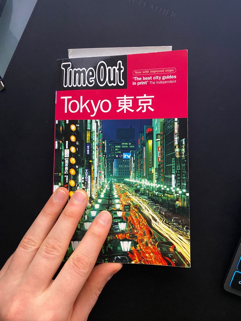
Time out – Tokyo
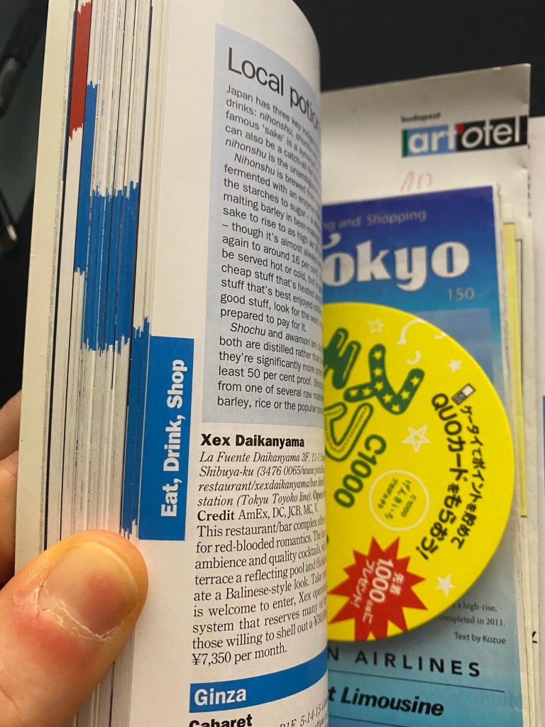
My next book I looked at was a travel guide from TimeOut for Tokyo. This book is relatively small, but wouldn’t call it a pocket guide. It is roughly 20 x 13 cm which would make it easy to show it into a backpack when out exploring the city. The print in this book is very small I would estimate it around 7pt and its pages are really thin. This makes it so that the 336 page book is still very easy to carry around so it makes a perfect travel companion. It has small tabs for each of the different categories which makes it super easy to flip through and find what you are looking for.
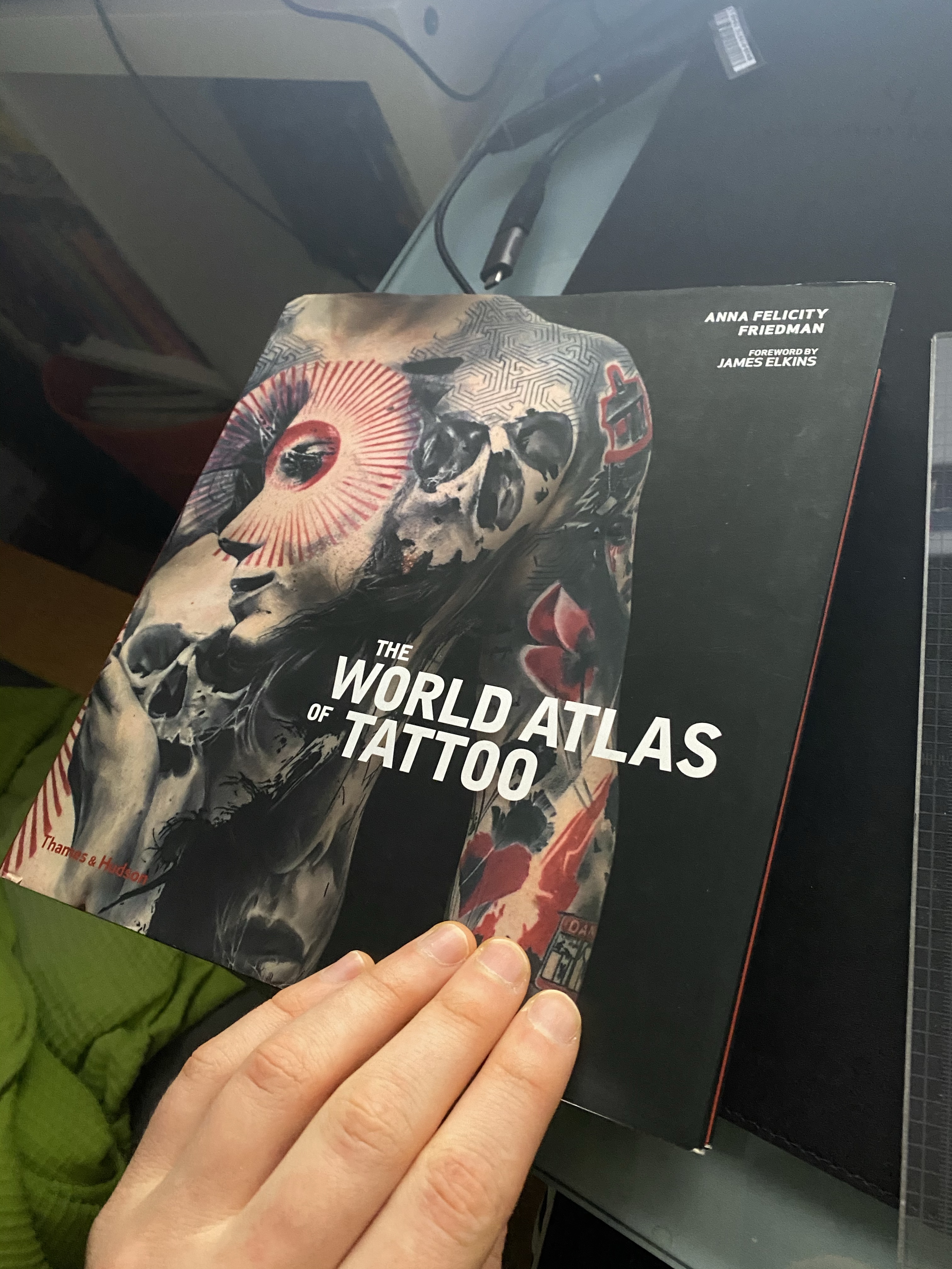
The World Atlas of Tattoo
Next I looked at The World Atlas of Tattoo by Anna Felicity Freidman by the publisher Thames & Hudson. This book is a square-ish format, relatively large at 24×23 cm. It is a heavy and thick. As a coffee table book I think the size needs to be slightly larger but not too large. If we think about the purpose of the book it would be something one flips through while at someone’s house as a guest and waiting for the host to serve up cocktails or for the other guests to arrive. It is a conversation piece and is something that could be considered a communal viewing experience. I can also imagine this particular book would be a prefect addition to the waiting area of a tattoo parlour.
The book is hard cover and has a book jacket which reveals the same cover but a simpler version without typography at the front to reveal a much sleeker looking book.
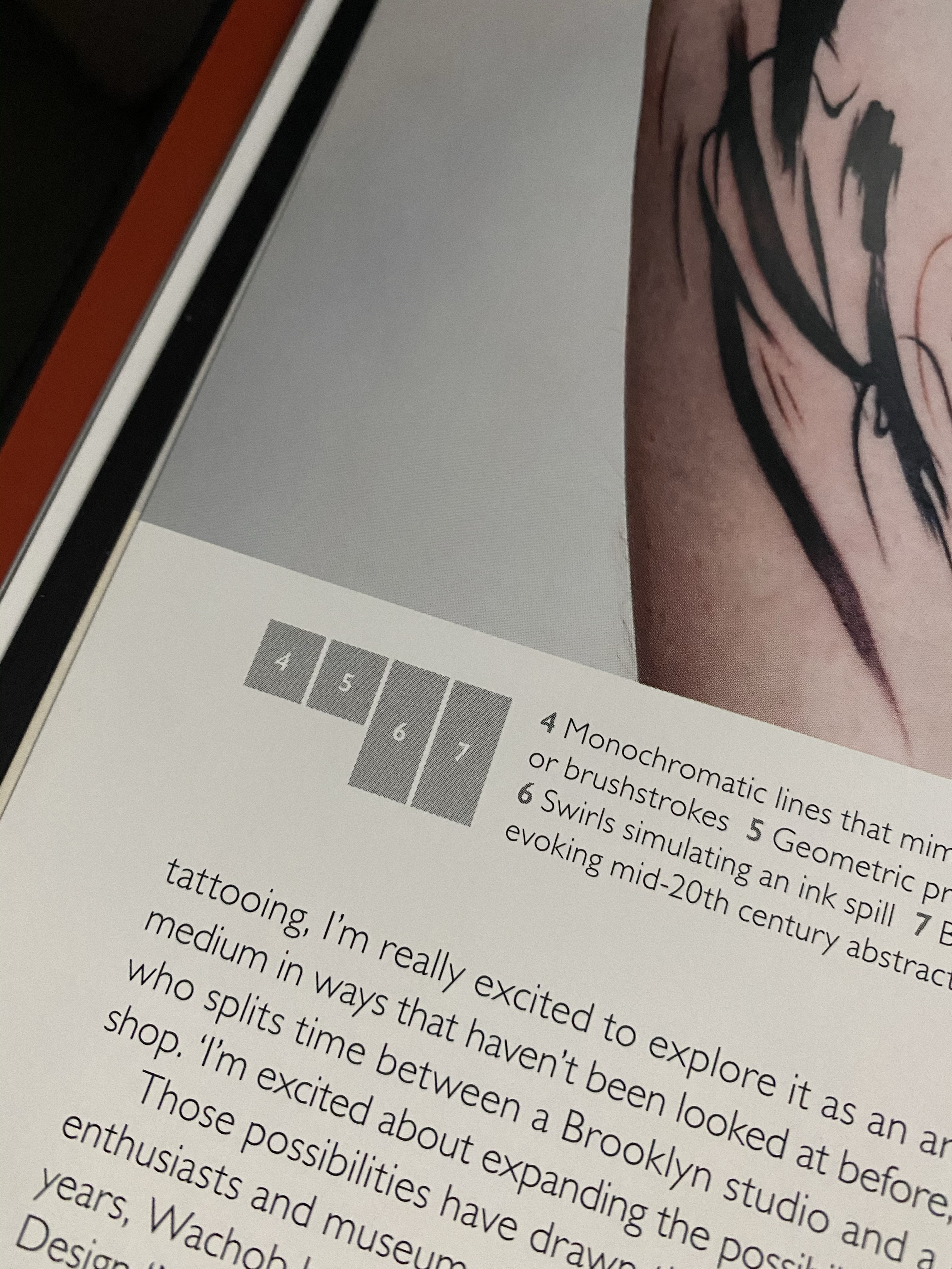
The pages are fairly thick and glossy making it perfect to showcase the series of high quality photographs. As the name suggests, the book breaks down its topics by geographical locations to guide through the viewer of the world of tattoo. Each section has some written content but beyond the introductory sections, about 70% of each spread is taken up by photographs. It has some small diagrams on all pages to show what each of the photographs are rather than trying to squeeze the captions under each image, which makes it a more gallery like experience and give images more breathing room.

Jerusalem
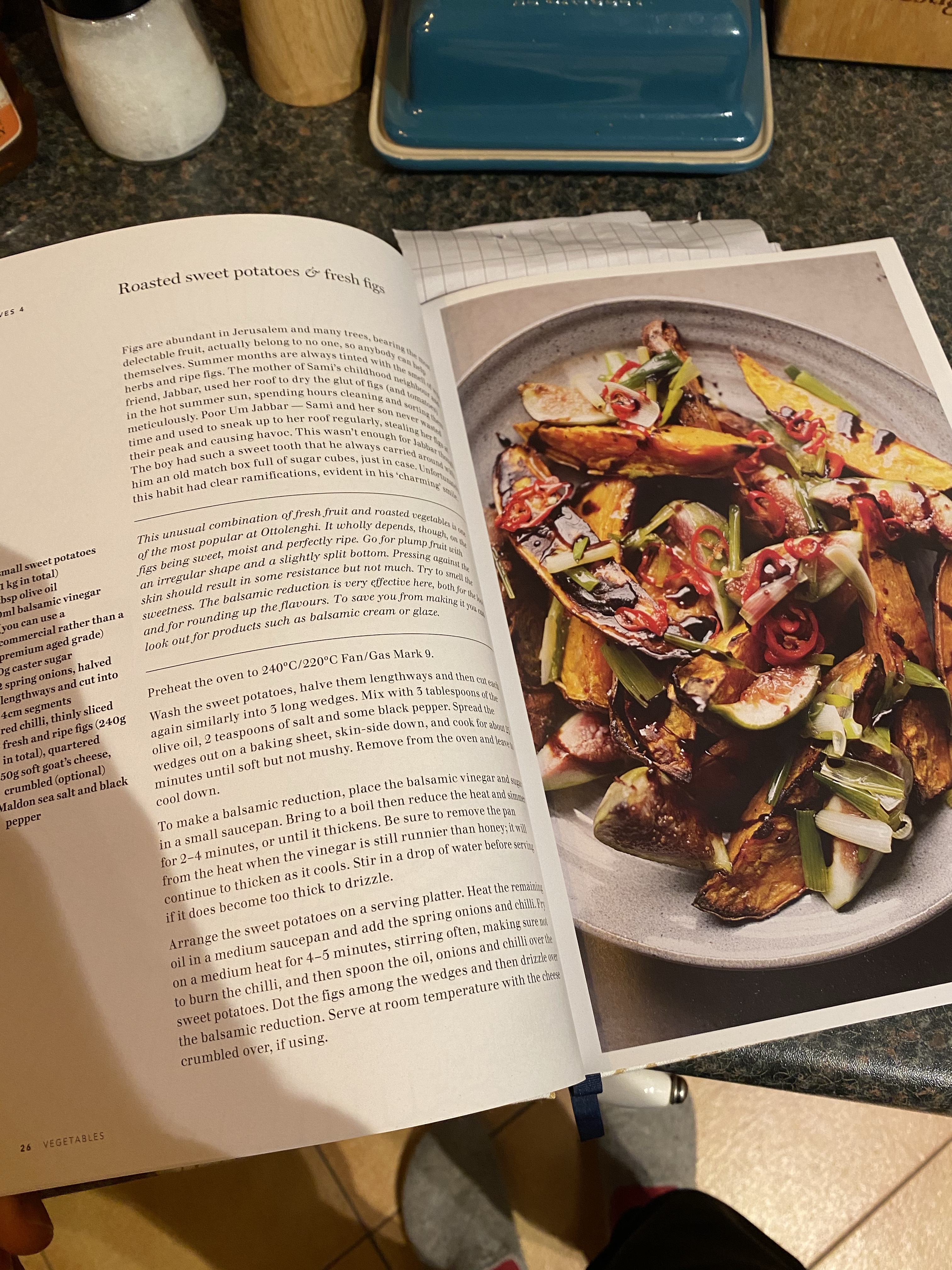
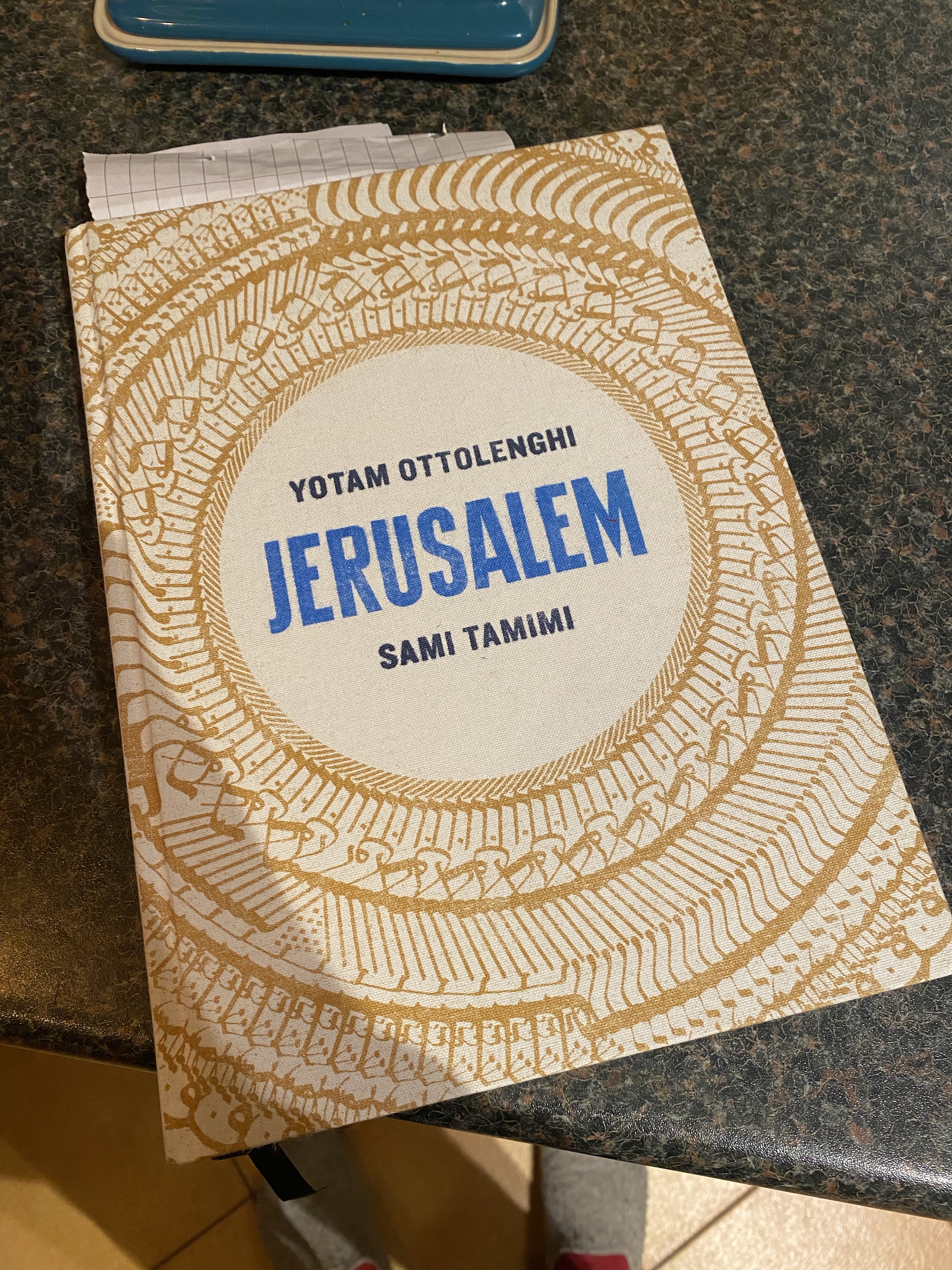
The next book I looked at is very different in its function, however I found it has a lot of similarities with the above book. It is Jerusalem, an Ottolenghi cook book.
The book is hard cover and pretty heavy and large. To be honest this is quite different from other cookbooks I have handled before. The book has a cloth cover which makes it slightly impractical for the kitchen in my opinion, however I think this will make the reader handle the book slightly more carefully considering where they may place it whilst cooking. I feel the cloth cover is a n odd choice here as if the book got dirty with food it would not be easy to clean it.
The book is large at around 40×30 cm and it has heavy pages on a glossy roughly 140 gsm paper.
The book features a built in bookmark, which I think is a nice touch as it enables you to mark recipes while browsing the book.
The page layouts are usually in a way where ingredients are boxed out into a separate column and the description of the background of the recipe and the methodology on in a wider column, with some beautiful food photography on the opposite page.


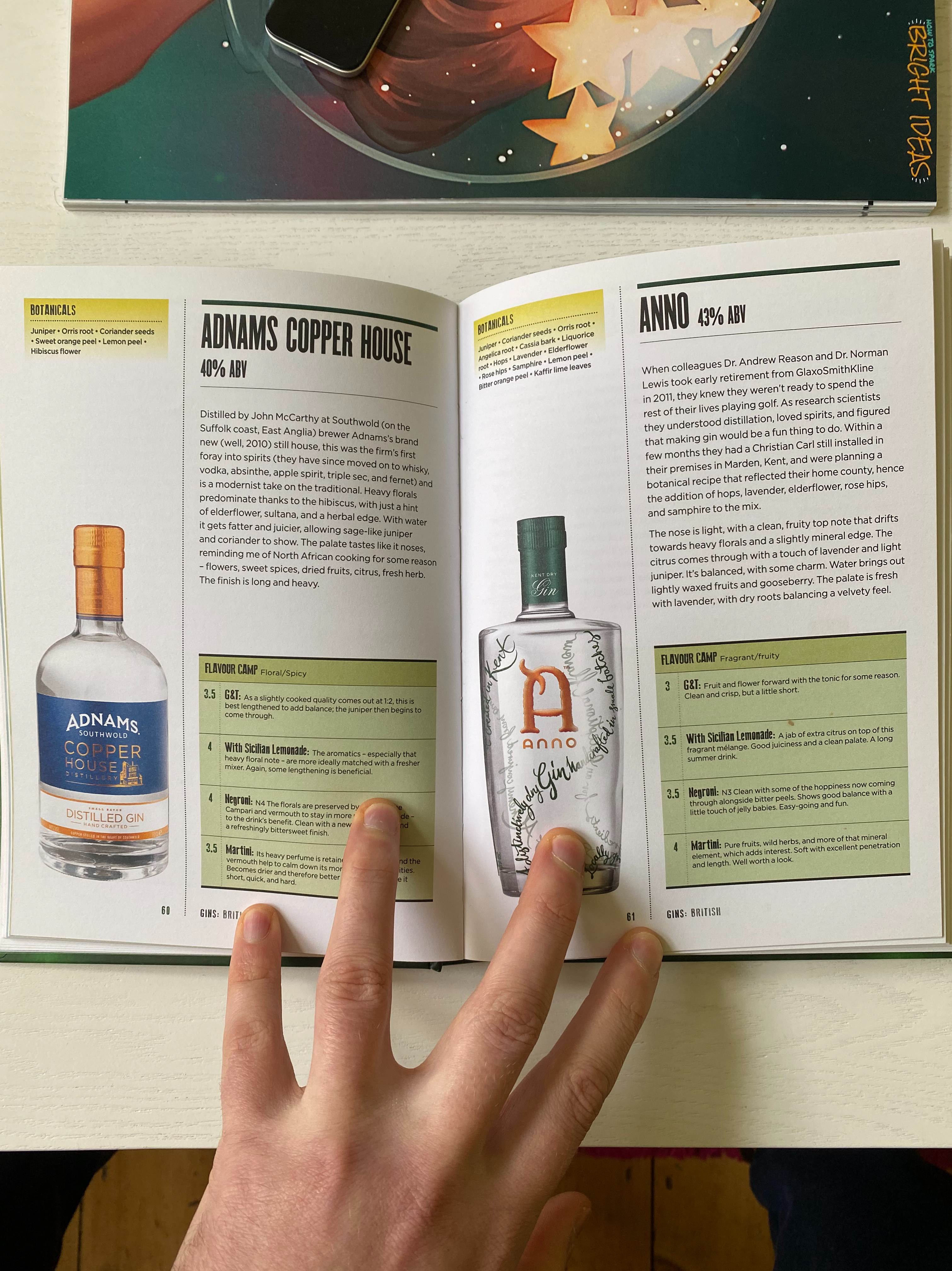
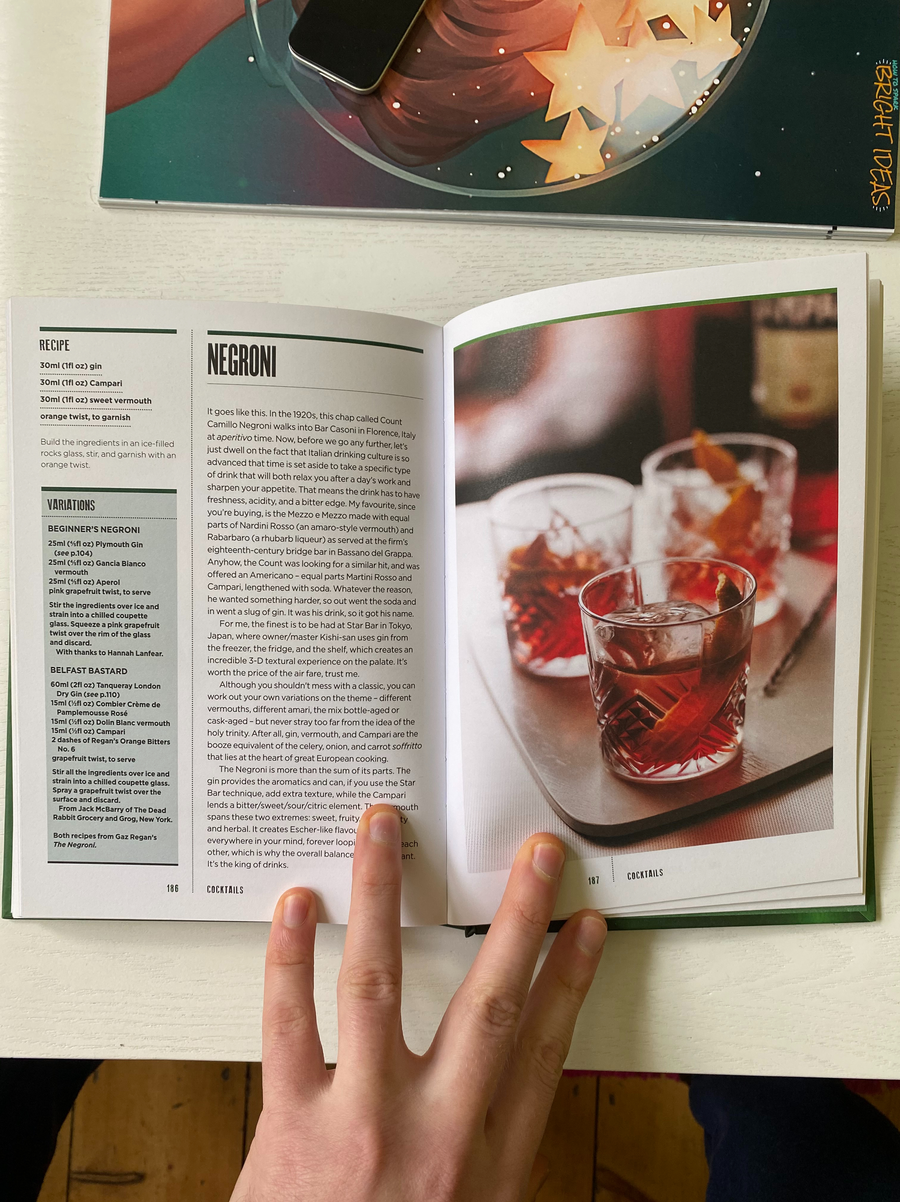
Gin – The Manual
This book is all about gin. The cover is a bottle green with some explanation on the front of the book what it is all about. Its hard cover is slightly embossed to raise the title, the design inspiration probably was a gin bottle. In terms of size, I would say this is an average size book around 20x15cm.
The paper is matt and pretty thick probably around 100 gsm, which is slightly odd for such a small format book in my opinion. The book is 224 pages, but due to the paper choice feel quite hefty. The thicker pages do give this book a more premium feel.
There are few different chapters but the layout is kept to a consistent 2 columns with roughly 40/60 weighting. The left hand columns always the slimmer one and houses images for most part of the book. There are some occasions where this rule is broken to give space to full page images.
There is a subdue colorisation for the different sections and subsections that is only noticeable when you are looking for inconsistencies between sections.


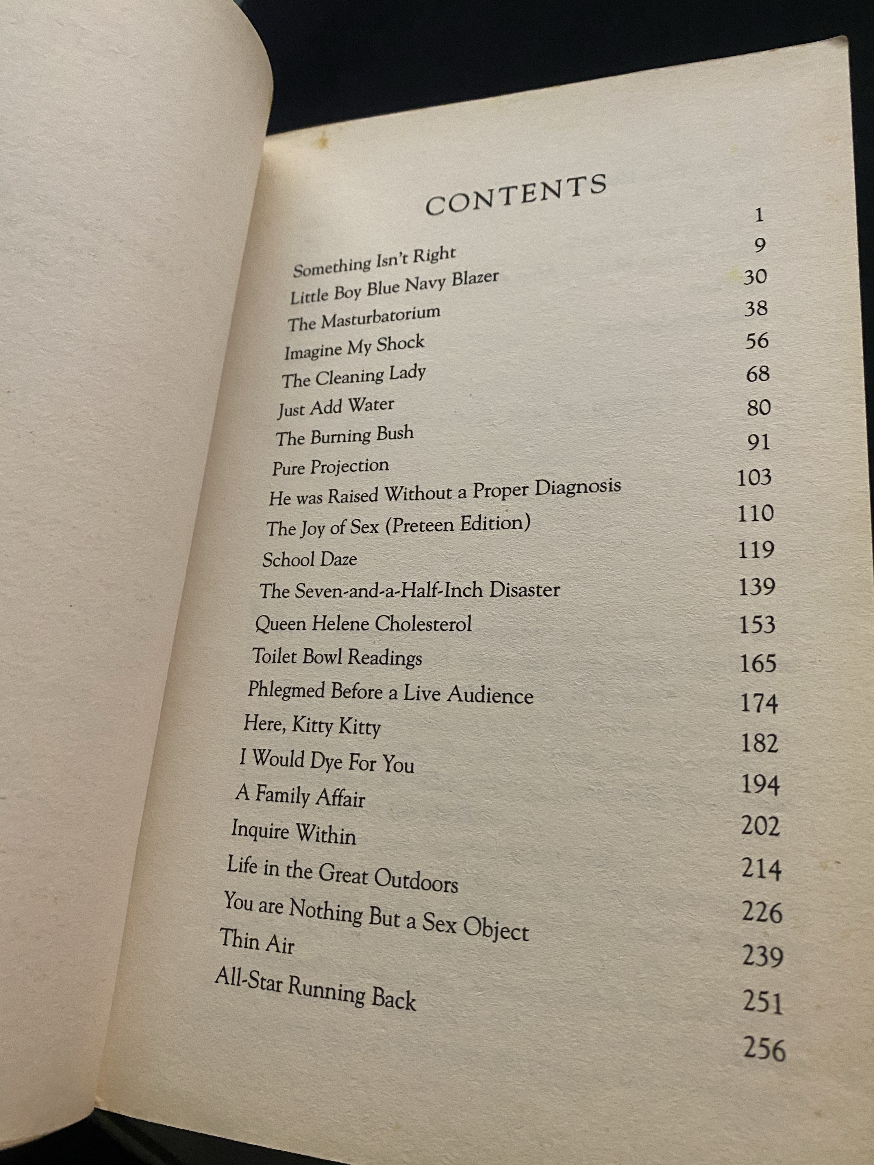
Running with Scissors
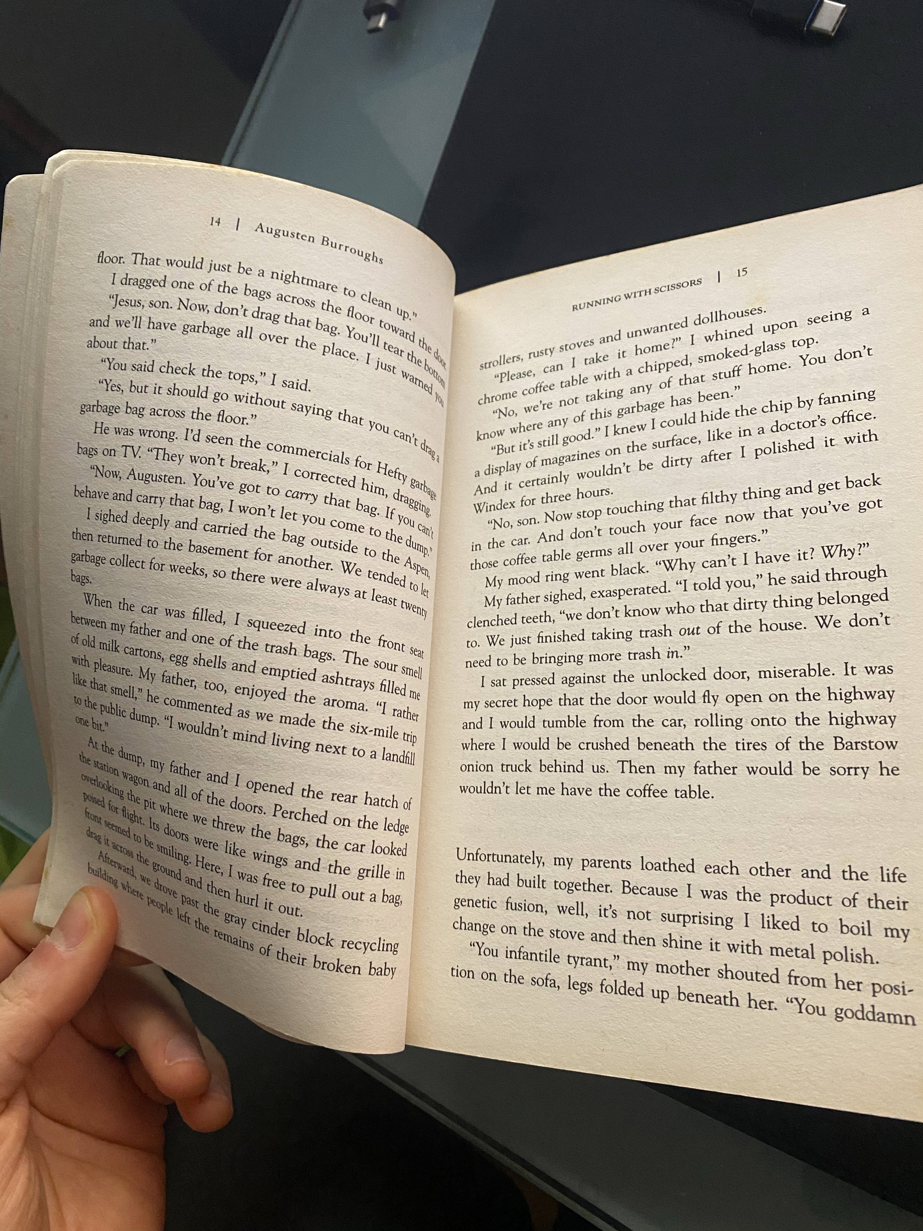
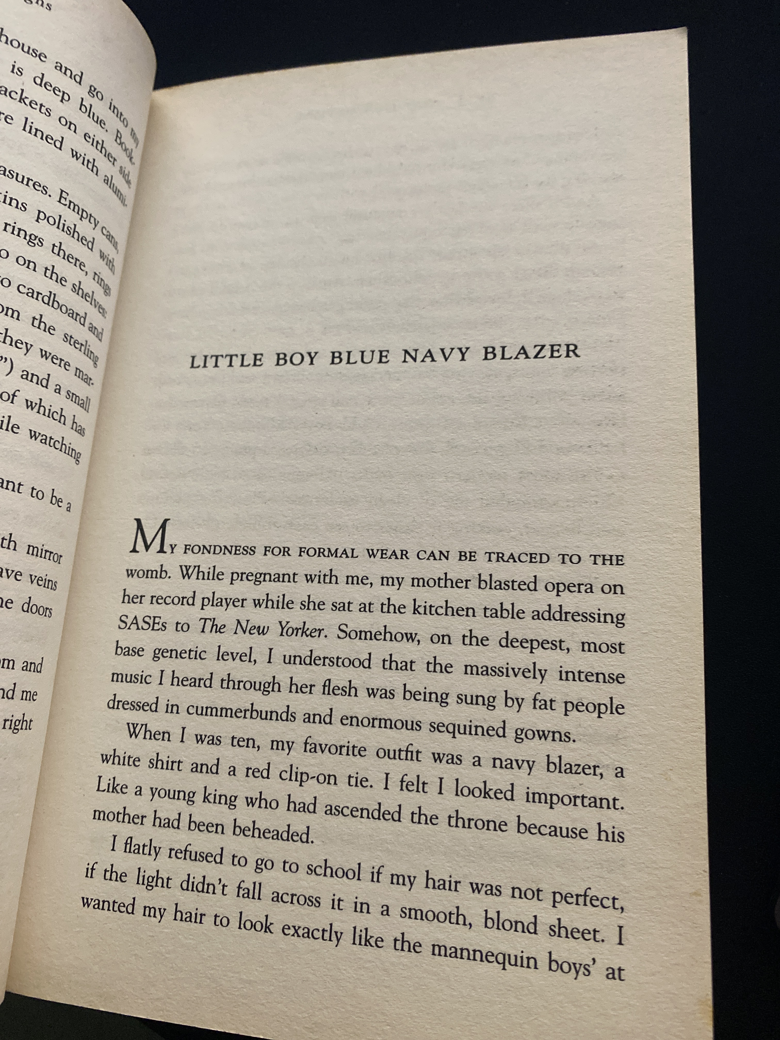
Augusten Burroghs’ Running with Scissors is a memoir style novel. It is a soft cover book is about 20×13 cm in dimensions. The book has no fancy features, it is basically made so it can be folded open with one hand to make it easy to read and carry with you to read it on the go. It is just over 300 pages but thanks to the thin and light (probably recycled) paper the book is very light which further aids its portability.
The cover is nothing fancy, it has a picture of a child with a box on his head, I guess this in in an attempt to set the tone for the book. The type used on the front cover for the title of the book is slightly messy which also reinforces the idea of chaotic childhood.
The inside pages of the book are a very simple, 1 column layout. The chapter title pages start half way down the page and have a drop-cap to divide them from the rest of the pages. All normal body pages have the page number with author’s name on the left, book’s title on the right of each spread.

Conclusion
I found this exercise pretty interesting and eye opening. As a book designer you need to be very aware of the context of which each publication is made for and make sure that the book fulfils its purpose. The choice of the paper inside and the layout of pages with just words is just as important as the book cover itself, The book cover is what will make the reader pick up the book but if the pages are difficult to read, or if the book is too heavy to carry around (in case of certain books) it can ruin the experience.
As a designer it is our job to make the reading experience as befitting its purpose as possible so it reflects well on the authors of the publication.
