
Collect as many examples of imagery for children as possible. Group the illustrations you’ve collected into the target age groups. Include at least one image for each age group.
Pre-reader, Pre-school (3–5), Early reader (5-7), Established reader (7–9), and Older age groups.
Take two of these age groups and, for each one, go through a process of brainstorming around at least one word chosen from this list:
Festival, Scary, Wild, Growing, Journey, Sad, Family, Discovery
Pick an animal appropriate for each age group and brainstorm to identify themes, images and ideas pertinent to your age groups. Create a simple image of your animal engaged in an activity that communicates this word. Be conscious of the need to achieve stylistic consistency in the development of all the content you include within your imagery. Remember that you’re creating the world in which your character operates. Explore the colours and materials to use for your illustration. You’re engaging in a process of visual communication and you need to be conscious of the nature of your visual language in the same way as you would use language when speaking to a child.
Are the target age brackets for children really as clear-cut as we’ve made them here? How did the function of image and text differ within the different age groupings? What is your response to the idea ‘all children’s illustration has bright colours’? Make notes in your learning log.
OCA Key Steps in Illustration
Research
I started by collating imagery intended for children and categorising them into the age groups that were set out in the exercise.
After some research I would definitely say, that the age groups are not as clear cut as it was made out to be in the description of this exercise. Sure, most children’s illustrations will have an intended age group but I think it is largely dependent on the level of development of the child rather then on the age per se.
I have categorised the illustrations I gathered on this Pinterest board, I will keep adding to this but I think I distilled the following characteristics for the different age groups:
Pre-reader
This group would prefer bright colours and bold distinguishable shapes in my opinion. Clarity is key when it comes to this group.
Pre-school
The illustrations can be a little more sophisticated and the colours can be a bit more muted. I think this group is looking for adventure in a story book and hence children their age are often included in these illustrations. The illustrations usually more action packed and depict the protagonist in a tricky situation.
Early reader
For the early reader category I found that the illustrations are leaning towards the simpler side again. I guess this might be because the children are further encouraged to read the story for themselves and make up the visual details of the story themselves by comprehending the reading material. Characters tend to be more stylised.
Established reader
The established reader group gets a similar treatment to the pre-schooler books in my opinion, the illustrations tend to be more detailed and fewer in number. Some abstract elements are introduced but generally showing the characters of the book in a situation that would pique the interest of the reader.
Older age groups
For older age groups pretty much anything goes. The full range of abstract is introduced and the topics might be a little bit deeper and more complex and therefore the illustrations are less to the point and more abstract to entice the reader to find out more by reading the book. Humour is often used as a tool to create more interest.
I found looking at the different age groups and trying to analyse them quite interesting, although I think there is definite overlap between them, I found it interesting that the depiction of elements goes from simple to complex then simple again and then it is getting more complex and introducing more complicated abstract ideas. I will need to keep this in mind when brainstorming ideas for my illustration for this exercise.
Brainstorming
I chosen the word “scary” to brainstorm around as I think this will be quite interesting. As for the age groups, I wanted to do the two extremes so I will be using the youngest (pre-reading) and oldest (older age groups) as an example. I think this will show a better range when it comes to the final illustrations.
I started red by creating a spider diagram for each of the selected age groups.
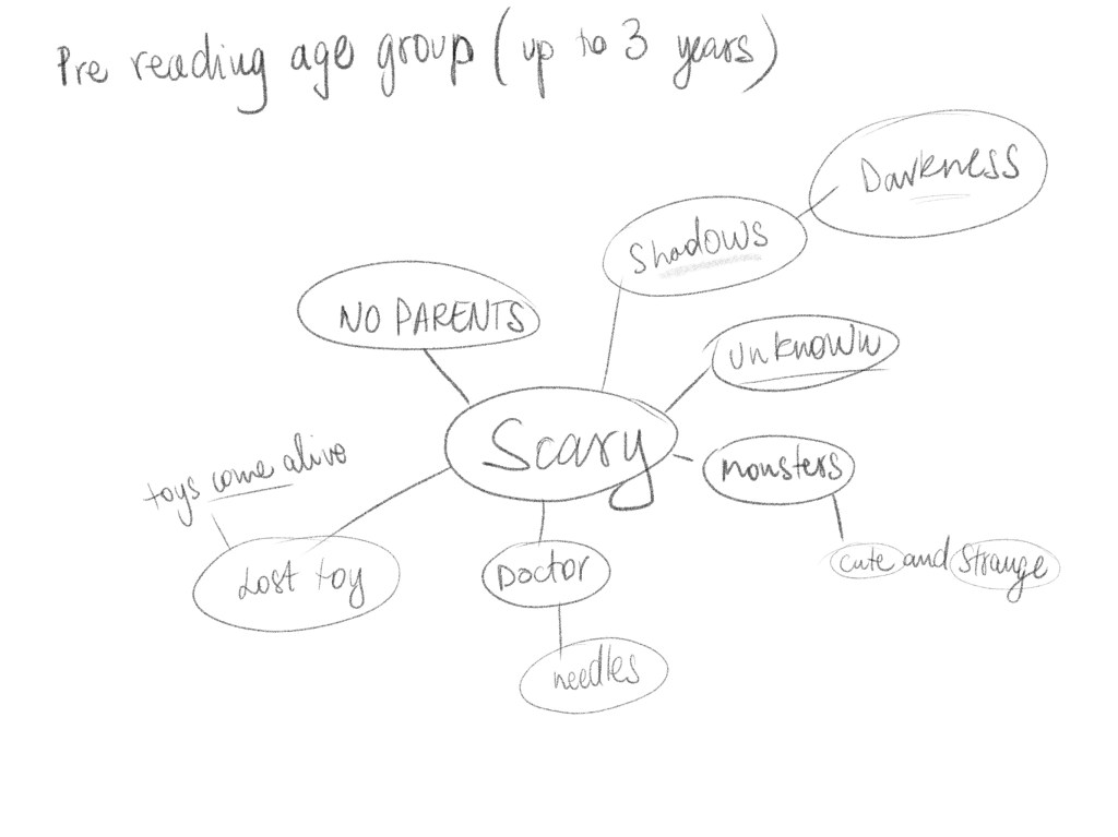
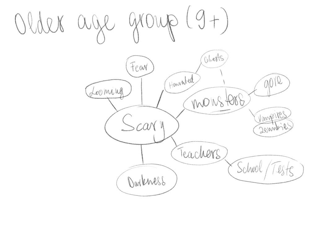
These were really quick but I think I found a good subject with darkness and shadows. I think this is fear is definitely something that is there in all children and I think this would be interesting to explore in 2 slightly different way.
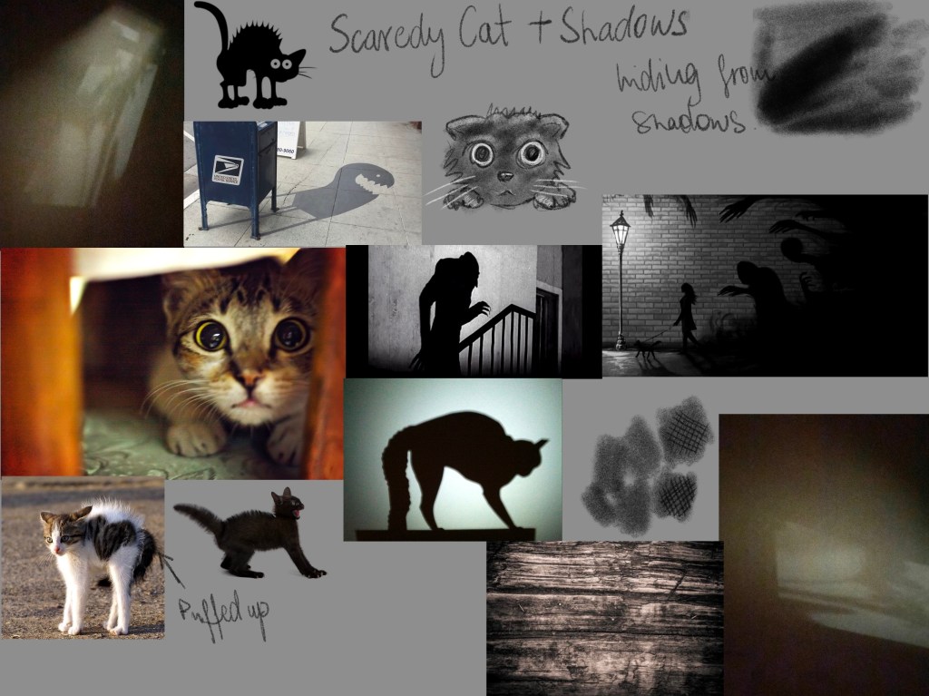
For my animal I chosen the cat, because of the phrase “Scaredy-cat”. Cats have a very obvious way to display shock and terror so I think this will make it suitable for this exercise. I have put together a moodboard to capture the topic I wanted to explore.
This was a good starting point I think and I wanted to jump into brainstorming my illustration in the form of thumbnails.
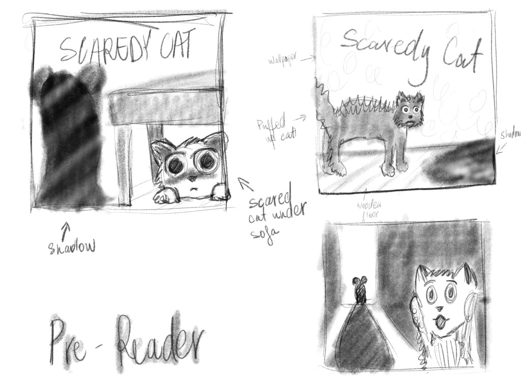
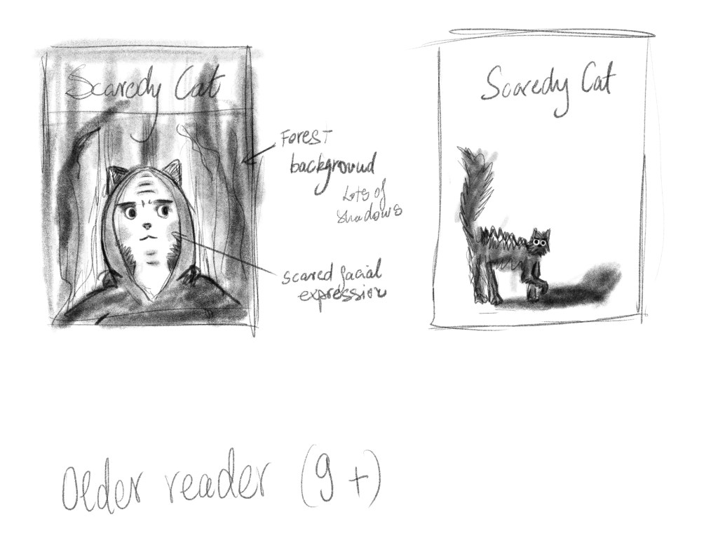
I felt like some of these ideas were very on the line of being suitable for both of my selected audiences, I really liked the Van Gogh idea (Younger audience bottom right corner) and the first idea for the 9+ audience (left hand side thumbnail). I decided to further develop these to see if I can make them as different as possible while keeping my intended audiences in mind.
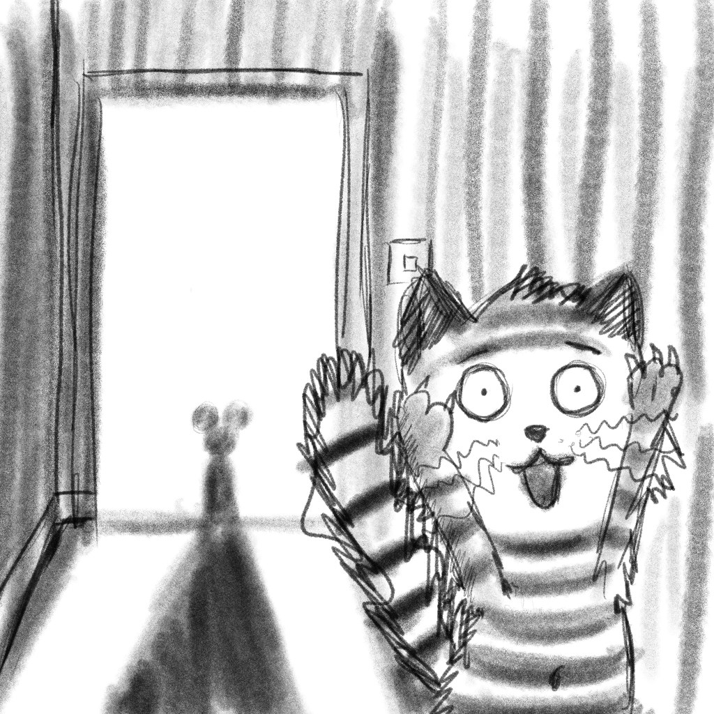
I really liked the humour in this. Obviously a cat is not supposed to be afraid of a mouse and I think this gives it a really comic quality while still plays on the topic of scary. I think for this I want to go a little bit sketchy in style as I really like the energy that comes from the quick linework here. I am going to colour this in a sort of light watercolour wash.
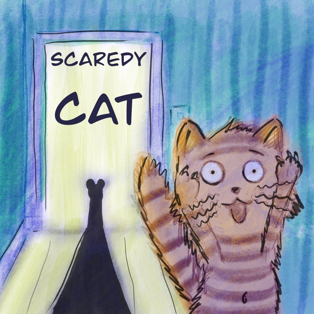
I think this turned out quite playful and it does illustrate the scared expression quite well. I think even little ones would understand what is happening in this illustration.
For my second illustration I wanted the cat to convey a teenage angst beside the terror that the image should communicate. I will try to make this a little more grown-up in style, but it will show a very similar topic. A scared cat with some looming shadows.

I actually thought that the black and white illustration worked to fulfil the idea I had in mind for this second piece. It had a moody energy to it which I liked very much. I tried adding colour but it seem to have taken away from the piece rather than adding to it. I think I managed to capture that scared emotion on the face and also the feeling of the piece had that shadow play element that I had in mind.
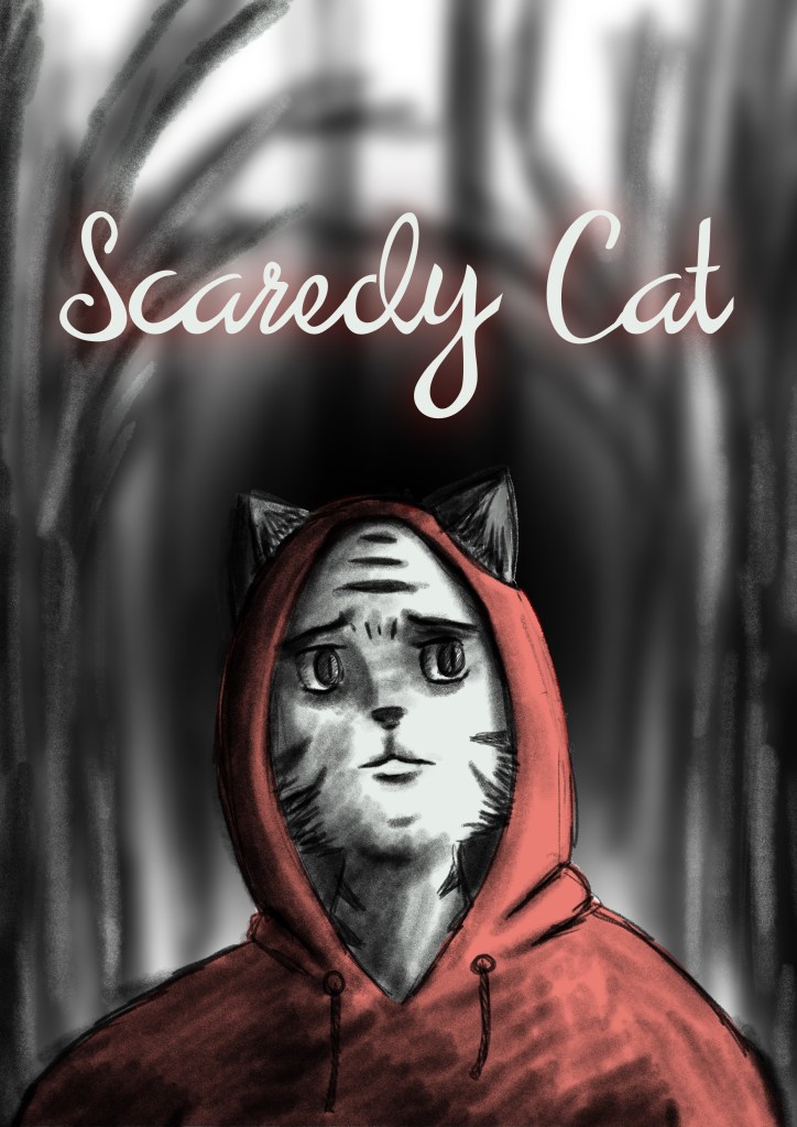
After a little more debating wether to add colour, I decided to add a bit of red. I had those little red eyes in the darkness often seen in cartoons to depict the lurking danger. I think this has added a bit more interest and fun to the piece.
Reflection
I think this exercise was quite interesting. I enjoyed exploring what makes illustrations for different child age groups distinct from each other. I think my second illustration is more successful and a lot more polished than the first one, although I think I prefer the idea in the first one.
This is a topic that I would need to study a lot more before I can really get the nuances for each of the age groups right, but I don’t think my first attempt at this was too bad. I think I lacked direction somewhat as this exercise wasn’t really explicit in terms of the use of the final final illustration, which made it harder for me to get going with it.
