
Buy a newspaper with a supplement and go through cutting out any article that contains an illustration.
Notice the heading for each article and read the text that the illustration refers to. Make a mental note about the way the illustration relates to the text, how its ideas relate to the meaning of the piece, how it extends the content of the piece.
Analyse the type of illustration – is it decorative, conceptual, informational? Does it use metaphor to convey an idea or does it have a narrative base? Is it representational, abstract or diagrammatic?
Now imagine that you’ve have been commissioned by the paper to create an illustration. Your task is to provide a visual interpretation of one of the headings below:
– How green is your food?
– The best restaurant in town
– Loves me, loves me not
– Throwing your money away
– The object of my desire
– Finding your family history
– An interview with Melvin Bragg
– Paris, still the best place on earth
You may find it useful either to find some text that suits the heading or write a few sentences yourself. Your interpretation can be as personal or as open as you like. For example, you may decide to go and draw an object or place or situation – or your might decide to create your image in a more interpretive or conceptual way.
If you’re confronted with several hundred words of text to illustrate you may find it hard to identify key areas of focus. Approach the task in a series of stages. Start by reading the article all the way through to get a sense of its entire meaning. Try not to think about your visual interpretation at this point. You might find it useful to sum up the article in a short series of sentences.
Next, go through the article with a highlighter pen and identify sentences and words which you consider to be important aspects of the text. Be conscious of connections between these words and the way in which one aspect of the text relates to another. If you’ve been given a heading by an editor, that might point you in the direction of the aspects that you’ll need to respond to in your illustration. Finally, read the text again with a sheet of paper to hand and sketch down ideas as you read through the article. Don’t draw self-consciously. Enjoy the process of visual brainstorming and be open to whatever results from it.
Make a list of words that describe the illustration you want to create. This should be as clear as the analysis you made of the illustrations in the newspaper or magazine and will help you decide how to proceed. Identify what the function of your image will be. Will it contain information, offer opinion, clarify or decorate the text?
Working within the size of one of the images that you analysed earlier, create a visual in response to your ideas. Be thorough within your processes of idea generation and development and refer often to your heading and text. Be realistic about your abilities at this stage and choose content according to both the meaning you want to communicate and your confidence in achieving this visually.
When you’ve created a line visual that you feel is appropriate for the article go to the artwork stage. If you can identify a palette and medium that you think sums up the sense of the content you may find that you can photocopy your visual and colour it in or scan it digitally and explore several colour variations before moving onto the final artwork.
Using materials and a stylistic approach which you feel comfortable with, translate your visual into artwork. You might decide to trace the image onto a surface appropriate to the media you’ve chosen, scale up the format you intend to work within and trace from an enlargement or draw the image freehand, using your visual as a guide.
In your learning log note down the types of editorial illustration you related to most positively, the early ideas you considered, and the process by which you decided what aspects of the text you wanted to focus on.
OCA Key Steps in Illustration
I started by as the exercise suggested and found some newspapers that were laying around from some previous exercises and found any illustrations that I could find in these.
I found some interesting illustrations in some of these pictured below, and I particularly liked one of them as I thought it was really clever in relation to the text.
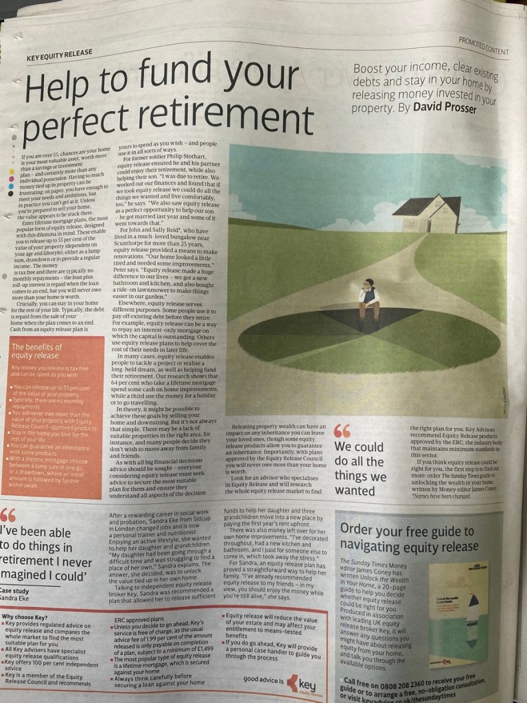


My favourite of these illustrations was the one for the “Help to fund your perfect retirement” article. This illustration was created by Andrea Ucini. I looked further into her illustrations and I found them really interesting. She uses a muted colour palette that works perfectly for newspapers. The article is about how you could release funds that are tied up in your home using a specific loan that is designed to do just that. The house in the illustration helps show that this article has something to do with your house and the big pie-chart like patch of grass under the thinking figure is a brilliant way to communicate finances in a subtle way.
I decided to go with the “How green is your food?” topic for the article, and I managed to find an article that was using a very similar topic. I decided to use this as the basis for my illustration.
https://blogs.ei.columbia.edu/2012/09/04/how-green-is-local-food/
To sum up the article here is my short synopsis.
Local food production is usually labelled as kinder to the environment because it requires less amount of fuel to transport, however, this is only making up a small portion of the food’s carbon footprint as many other factors are at play. Other important factors are due to the production of the food which accounts for a much larger portion of the greenhouse gas emissions, depends on many factors such as the extensive use of ploughing and pesticides. The greenhouse gases that are released into the air are more potent than CO2. A study found that red meat production is responsible for 150% more greenhouse gas emissions than the production of fish or chicken. This means that buying local would have a much lower effect on reducing the greenhouse gases than replacing a proportion of the diet that is currently dairy or red meat with other things that are kinder to our planet. Eating foods that are in season and organic are other great ways of reducing the environmental impact. The article then goes into the facts around how locally produced food has a big impact on local communities and argues that it has a bigger impact on that than the greenhouse gas emissions. The closing segment of the article talks about how the answer to the question “How green is local food” is very complex and almost impossible to answer.
To help me fully understand and analyse the article, I printed it out and using highlighter pens I highlighted the bits that I found most interesting, and sparked ideas in terms of visual representation and find key areas that my illustration should focus on.
Words and sentences I highlighted in my article: (direct quotes from this article)
“the impacts of food on climate depend not only on the distance it travels but how, and more importantly, on what happens before it ever gets delivered.”
“transportation accounts for only 11 percent of food’s greenhouse gas emissions”
“Moreover, transportation related emissions vary according to how food is transported; for example, rail and water transport are much more energy efficient than air or truck transport.”
“The production of food accounts for 83 percent of emissions, and can vary according to if food is grown in heavily fertilized fields with extensive plowing, or with intensive use of irrigation and pesticides, etc.”
“substituting part of one day a week’s worth of calories from red meat and dairy products with chicken, fish, eggs, or vegetables achieves more greenhouse gas reduction than switching to a diet based entirely on locally produced food”
“fertilizer used, amount of pesticides and herbicides applied, type of farm machinery, mode of transportation, load sizes, fuel type, trip frequency, storage facilities, food prep, waste, etc.”
https://blogs.ei.columbia.edu/2012/09/04/how-green-is-local-food/
Visual brainstorming
Next, as the exercise suggested; I wanted to read the article once more and draw things to create a visual brainstorm.
List of words that should inspire my illustration:
- Green
- Sustainable
- Local
- Beef, fish, chicken, vegetables
- In season
- Organic
- Pesticides, herbicides, fuel types etc. (factors that contribute to greenhouse emissions)
- Greenhouse emissions
- Complex
- Percentages
- Study
I want my illustration to be decorative but with an element that eludes to the fact that the question is quite complex and cannot be answered simply. I have some ideas in mind that might work, but I would like to create some thumbnails to explore some further ideas. I will make the illustration roughly square format as this was the format used in the newspaper I have analysed. Although I know that other illustrations in the same paper were different formats so it could be almost any aspect ratio.
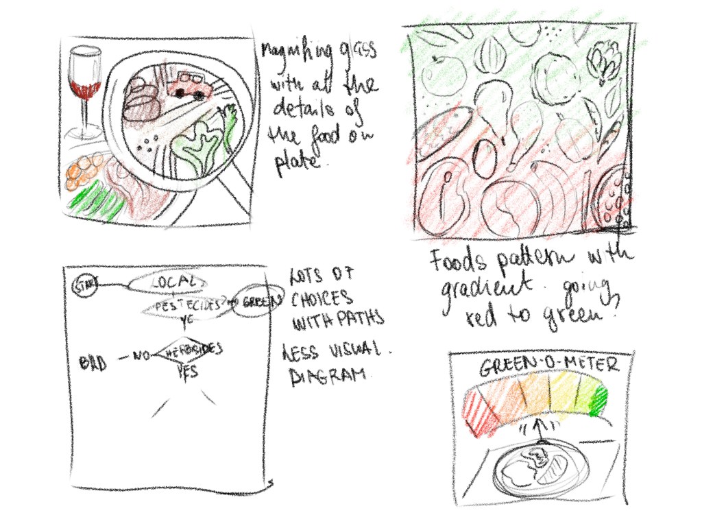
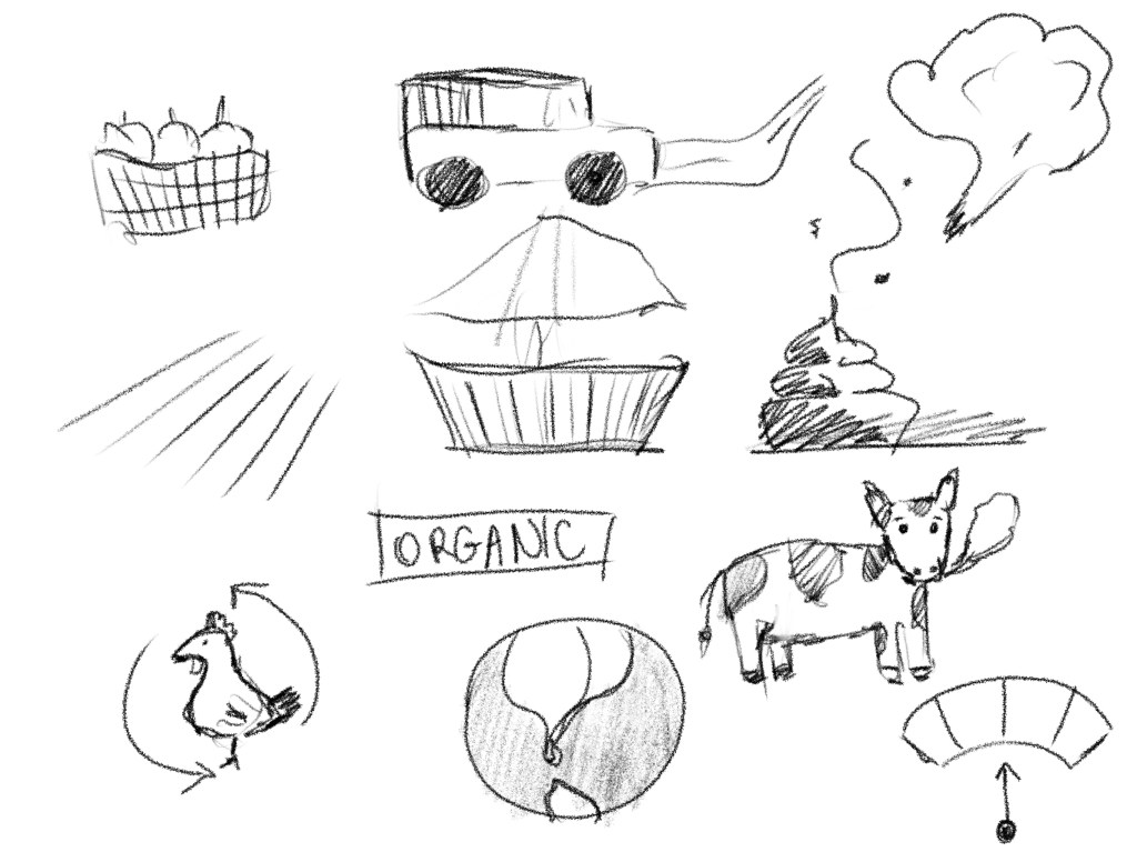
This topic is actually quite complex so I had quite a few ideas. I thought that I could show a plateful of food and then raise a magnifying glass over this to reveal the components that may make or break the green-ness of the particular food, though I think some of these things would be pretty difficult to illustrate. I also liked the green-o-meter idea, this is a bit more whimsical and light-hearted. I also had an idea that would be just silhouettes of food items and they would go from red to green. I think this would be a simple decorative way to say something about the content of the article, without going into too much detail.
I decided to use the idea of number 1, but I needed to do some research to be able to illustrate some of the elements that would influence the green-factor of the food on the table.
From my earlier analysis, I found these factors really stand out; fertilisers, fuel used for transportation, type of farm machinery, fuel type, food prep.
I was thinking in terms of what I can imagine that I would be able to illustrate at a relatively small size to a good effect.
I also decided at this point looking at my image that I will treat 2 parts of the illustration as separate and will put it together as 2 layers, this way I will be able to fully control the layout of the final image.
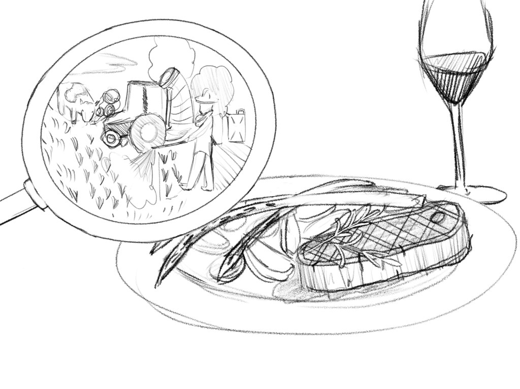
I think the image works, however I have some reservations about the image in the magnifying glass. It looks a bit busy and also I am not sure if it communicates the unsustainable farming practices. The man is spraying pesticides the cow is grazing and then doing what cows do, but I am not sure if this reads well. I decided to add some colour to my visuals to be able to see how this would work as a colour illustration.
I shared this with some friends to get their opinions, and whilst most liked it, it became apparent that the magnifying glass wasn’t reading as such.
I wanted to make some changes to make this easily recognisable.
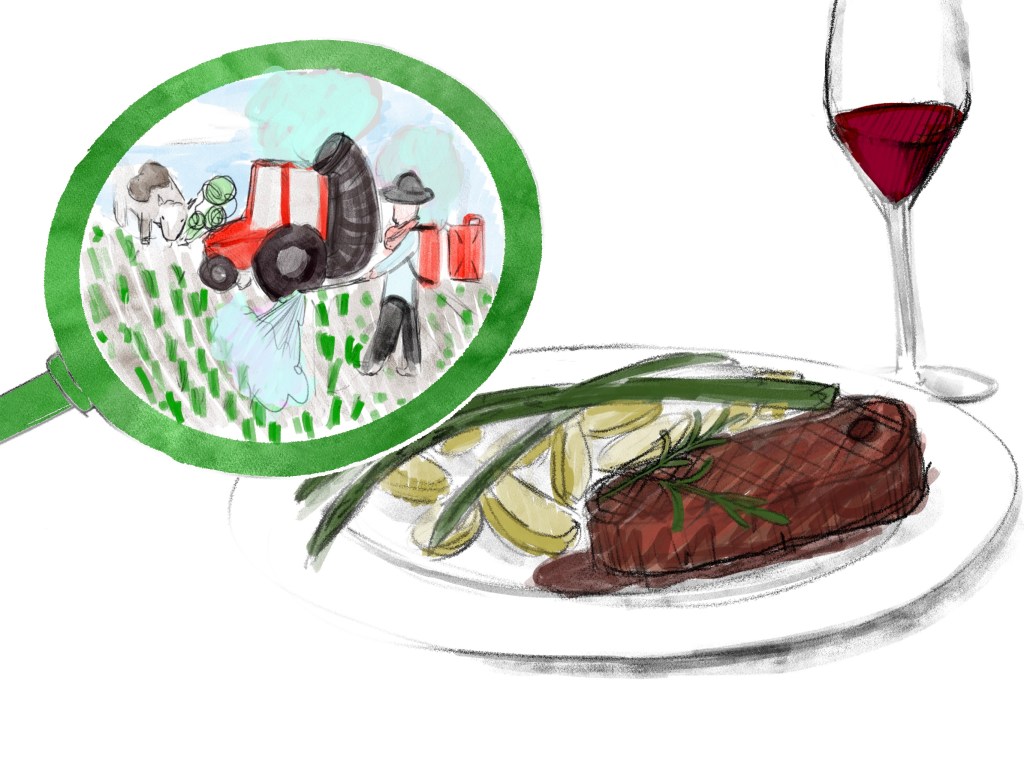
I think this started to work better, but felt like something was missing and also the layout wasn’t working too well.
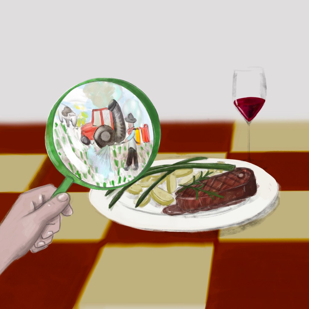
I decided to add a table under the plate and reposition everything in the frame to make this overall more balanced. Looking at this I realised that the tablecloth is quite unrealistic looking in terms of the pattern, I wanted to make this somewhat more interesting.
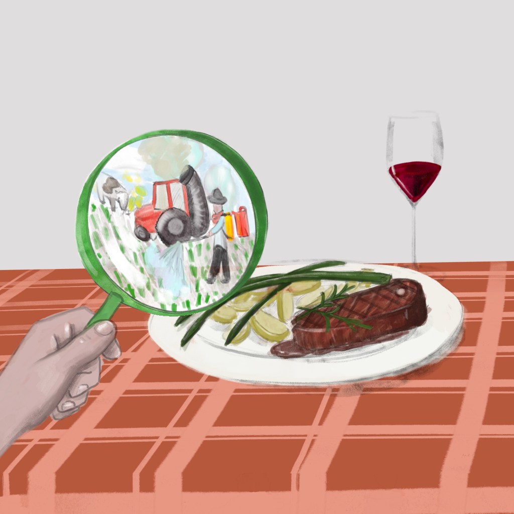
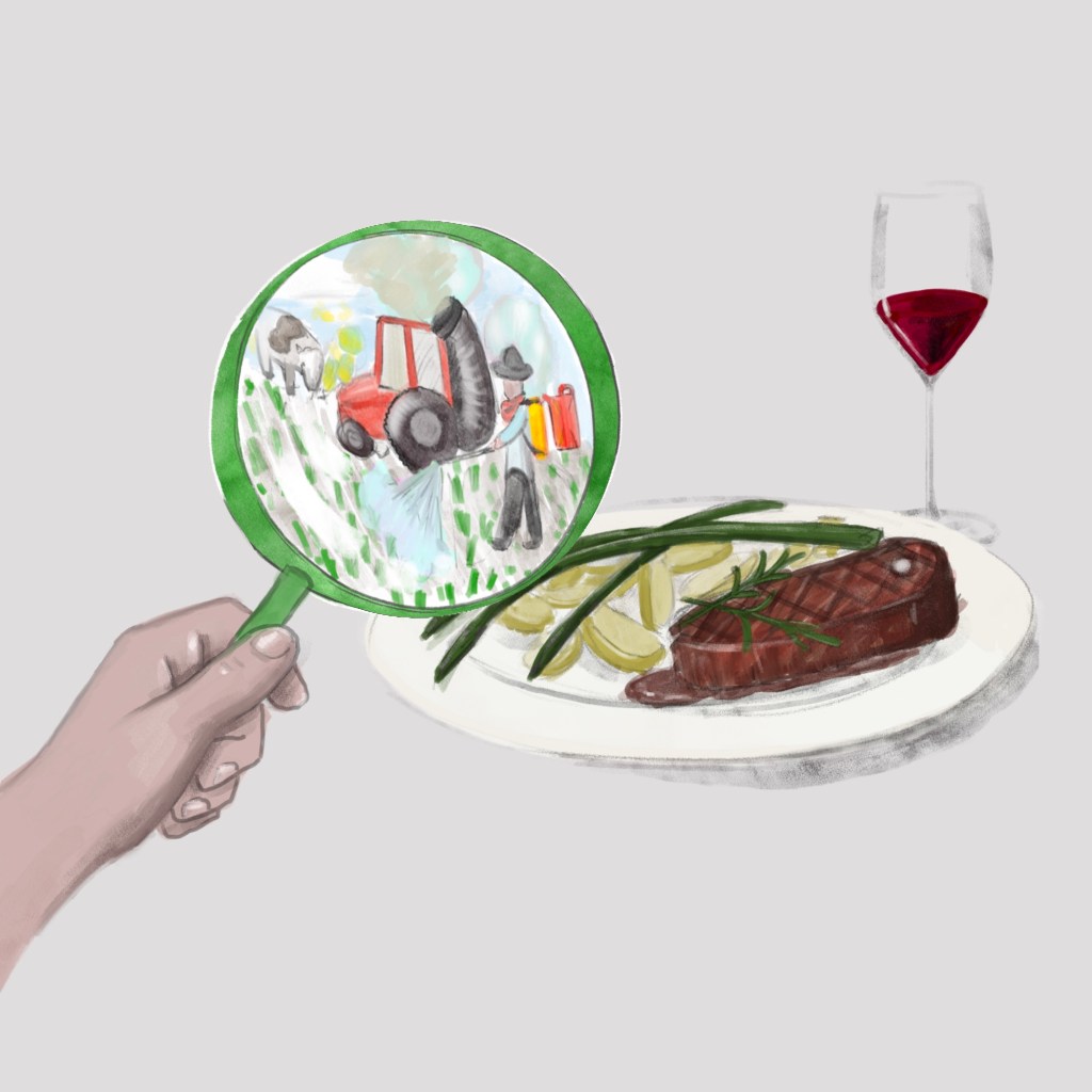
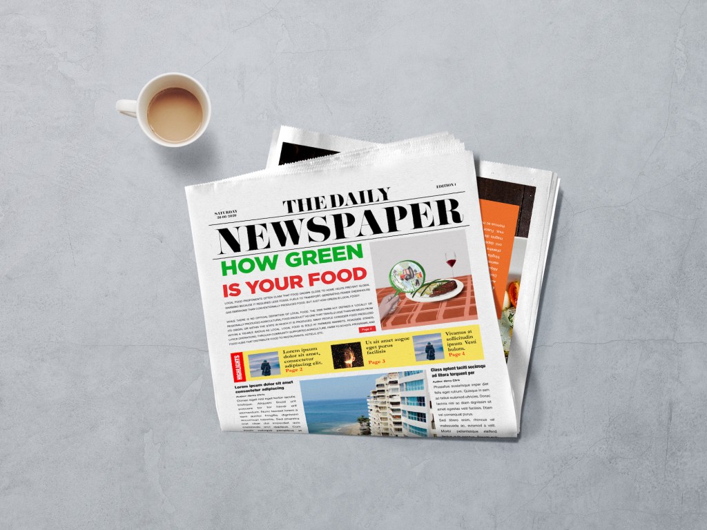
I revised the tablecloth as the initial one was too boring and also thought that the tiles were too large. I think I am now overall pleased with the illustration. I might adjust a few more things such as the shadow under the plate that should be much smoother and the joining points where the tablecloth is changing direction. I would like to polish these things up and then create a newspaper mockup to see how this would work in the context of a newspaper.
Reflections
I first was put off by this exercise because of the length of the description, I thought it will be super difficult, but as soon as I started I realised that it is not that different from what I have been doing so far during this course. If anything it was somewhat easier because the brief created by the article made it easier to focus on the illustration rather than the idealisation stage. I found it helpful to read through the article multiple times to increase my comprehension, which in turn I believe meant that the illustration is pretty effective. Sure the illustration is not perfect and perhaps the metaphor used is a little obvious, but I think accompanied with the article it does make sense.
Overall, I feel like this was a pretty useful exercise to teach me how to handle bigger chunks of text to inspire my illustration process and create something that speaks of the content.
