
This assignment should give you the opportunity to show off your developing style and use of tools and materials. If you decide to work digitally save the early stages of your image and print out key points of your experimentation.
Often illustrators working editorially for newspapers and magazines will be given a very loose brief such as this one. The conversation with the art director would normally reveal more about the complexion of the written article, as would your own knowledge of the context in which the illustration would be seen. For many illustrators working with such an open brief is the best way to operate. In this instance your interpretation of the theme is a flexible one.
The brief
A magazine wants an illustration on one of the following topics:
Lost, Disaster, Discovery, Guilty secret
They want an illustration based on a still life. You have the freedom to select the items for the still life and are given creative free rein. The rest of the content, the method you use to produce it and the colours you use are all for you to decide.
What to do
Working at a maximum A3 size, produce a well-observed, objective drawing of your set up.
Consider the materials to use and do thumbnail alternative compositions to explore variations and formats. Allow yourself to distort your drawing to convey the essence of the word. Each decision you make – choice of subject, arrangement of subject, placing of subject in the frame, choice of media – should contribute to the overall description of the theme you have chosen.
Either trace, scan or photocopy this drawing and then do a tonal version of it. You may choose to totally eliminate the line from the drawing or to build tone around it.
At this stage you may wish to introduce a character or be more specific about a location to suggest a narrative. Alternatively you may continue to work with and modify your original still life.
Create a line visual that should communicate clearly the final artwork. Take this visual through to final artwork.
OCA Key Steps in Illustration
This assignment seems quite simple on the surface, create an arrangement of items to serve as the basis of an illustration on 1 of 4 topics; Lost, Disaster, Discovery or Guilty secret.
I think I was gravitating towards the word Lost. it seemed the one I had instant ideas about, but also wanted to interrogate the other 3 just to make sure I uncover any hidden potentials that are not instantly apparent to me.
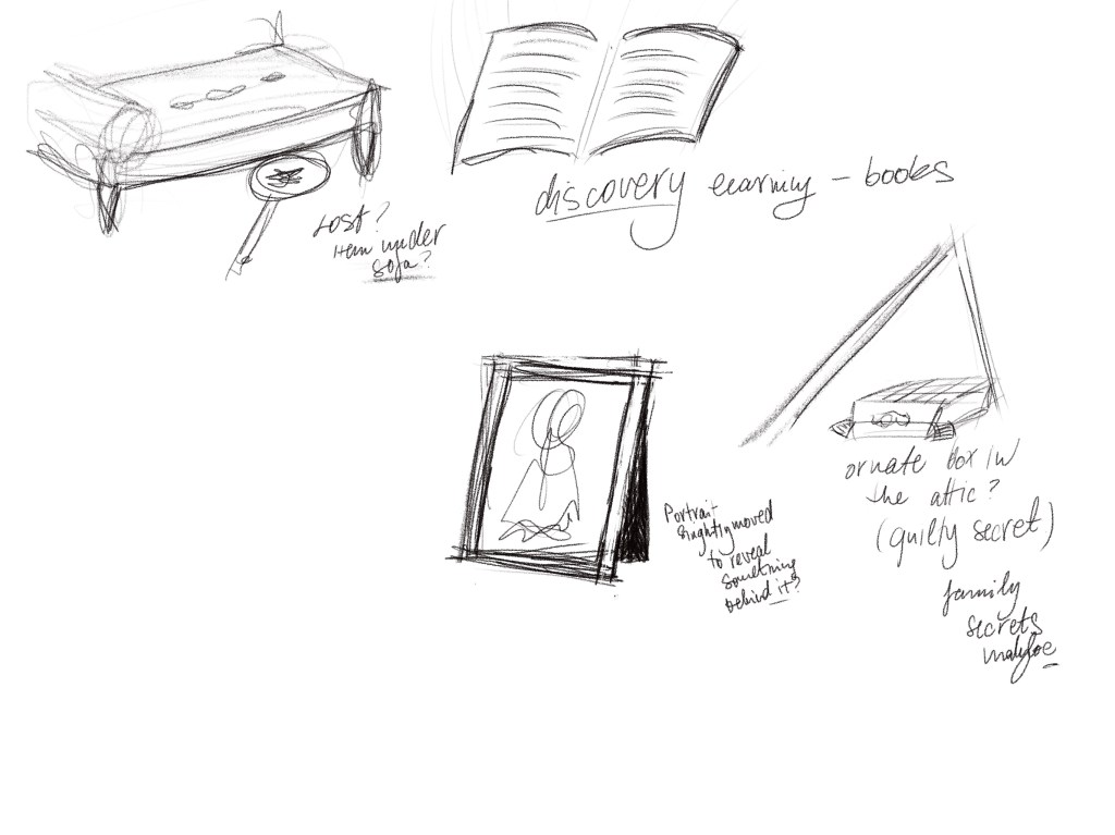
I wanted to start by creating spider diagrams around all 4 words to see if I find a topic that is really peaks my imagination.
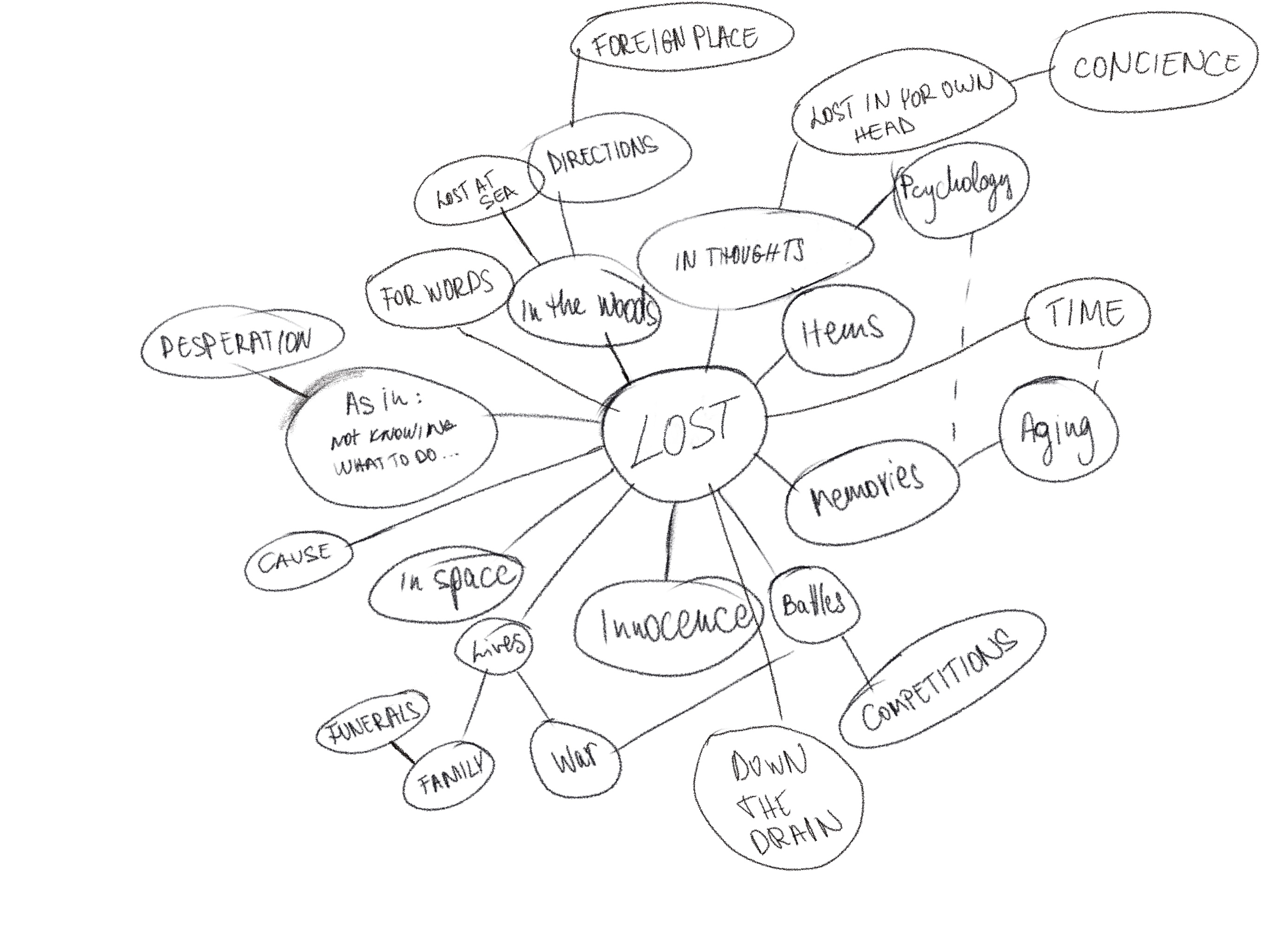
Lost 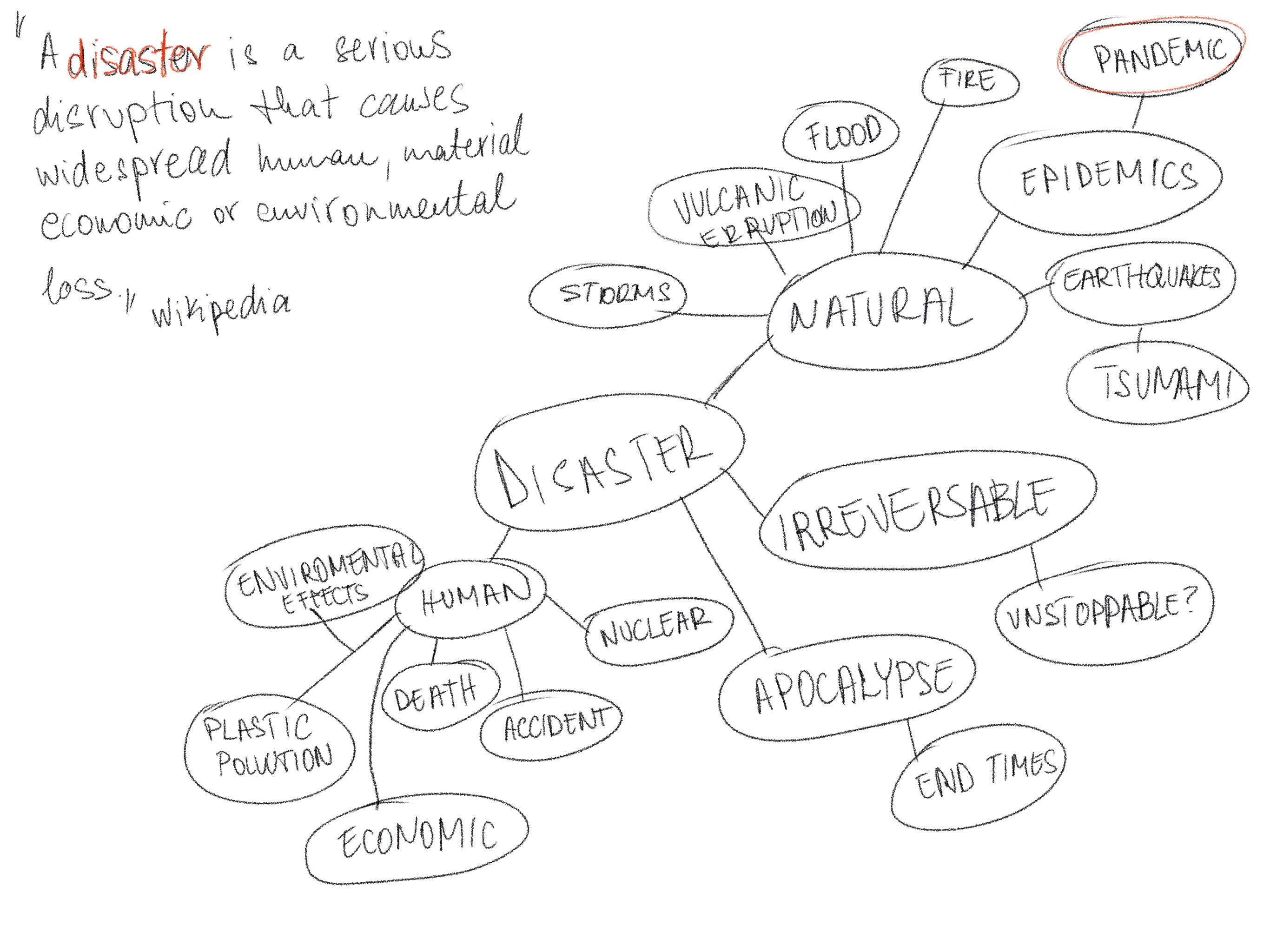
Disaster 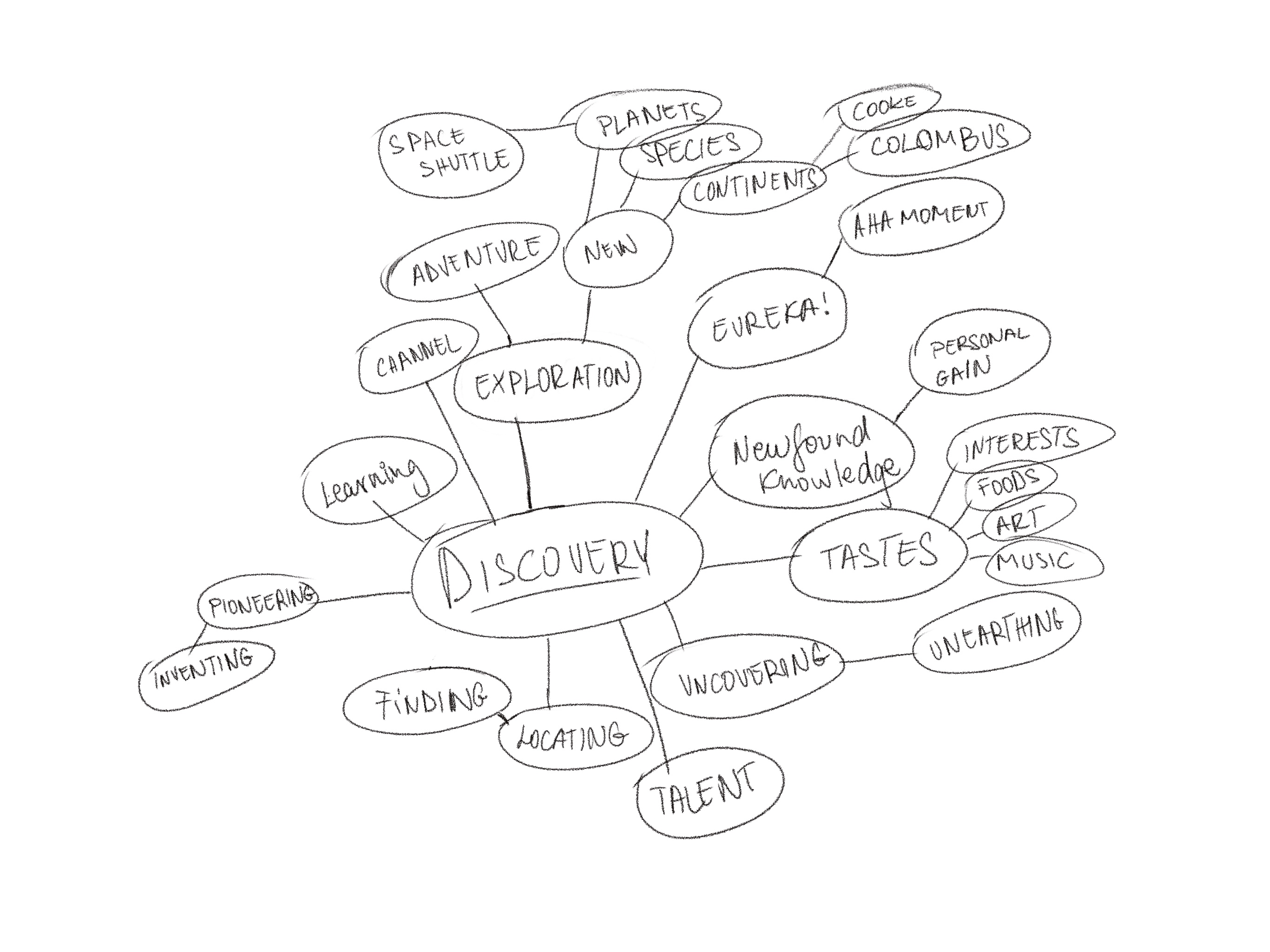
Discovery 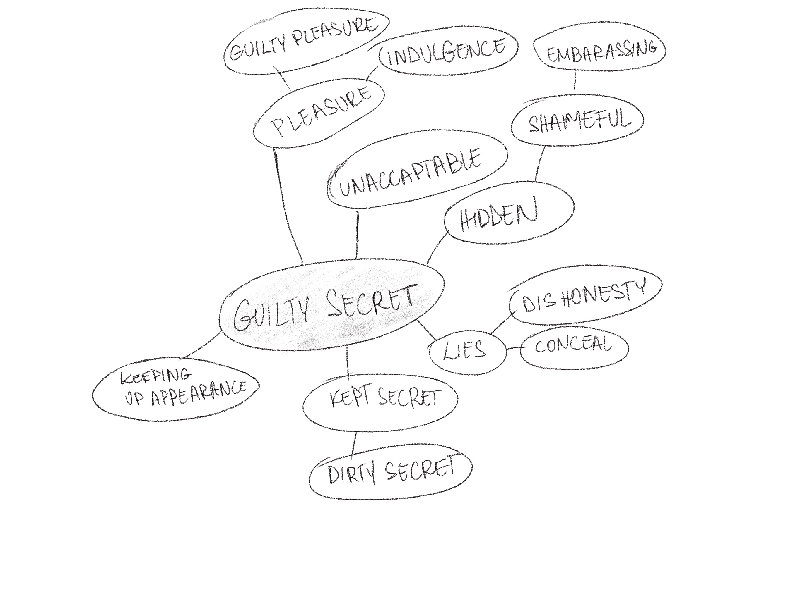
Guilty Secret
By far I found Guilty Secret the hardest topic to explore. I think because it is more concrete than the other concepts.
I had some ideas for each of the words at this point, but I wanted to do some sketches to record these in a basic form before I would gather items and see up my sets for the objective drawing.
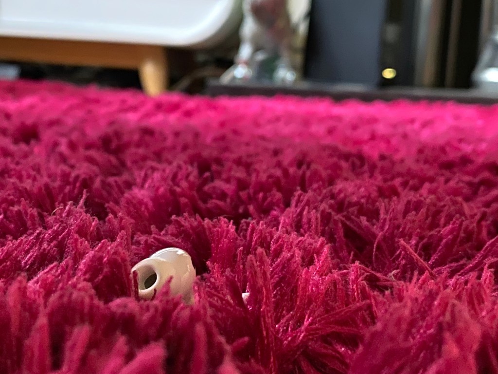
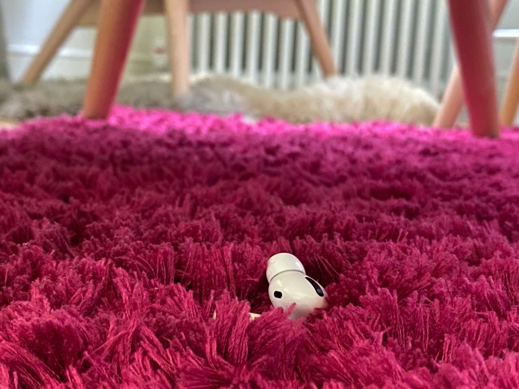
I had some very basic ideas and wanted to take some pictures around the house to explore these.


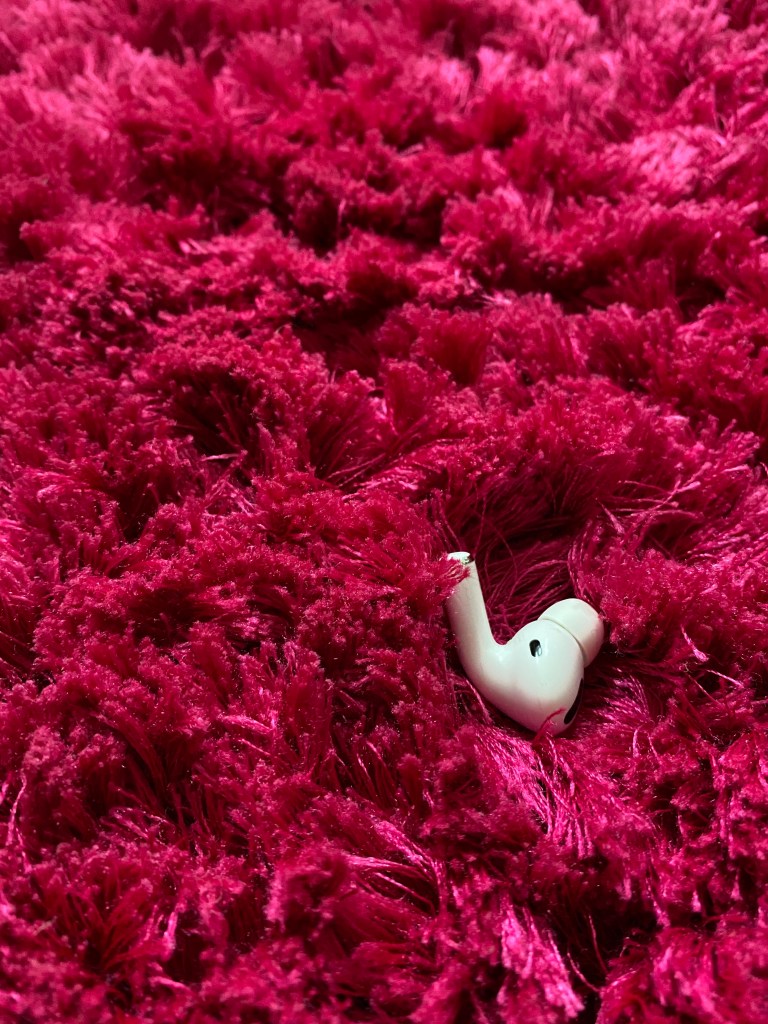
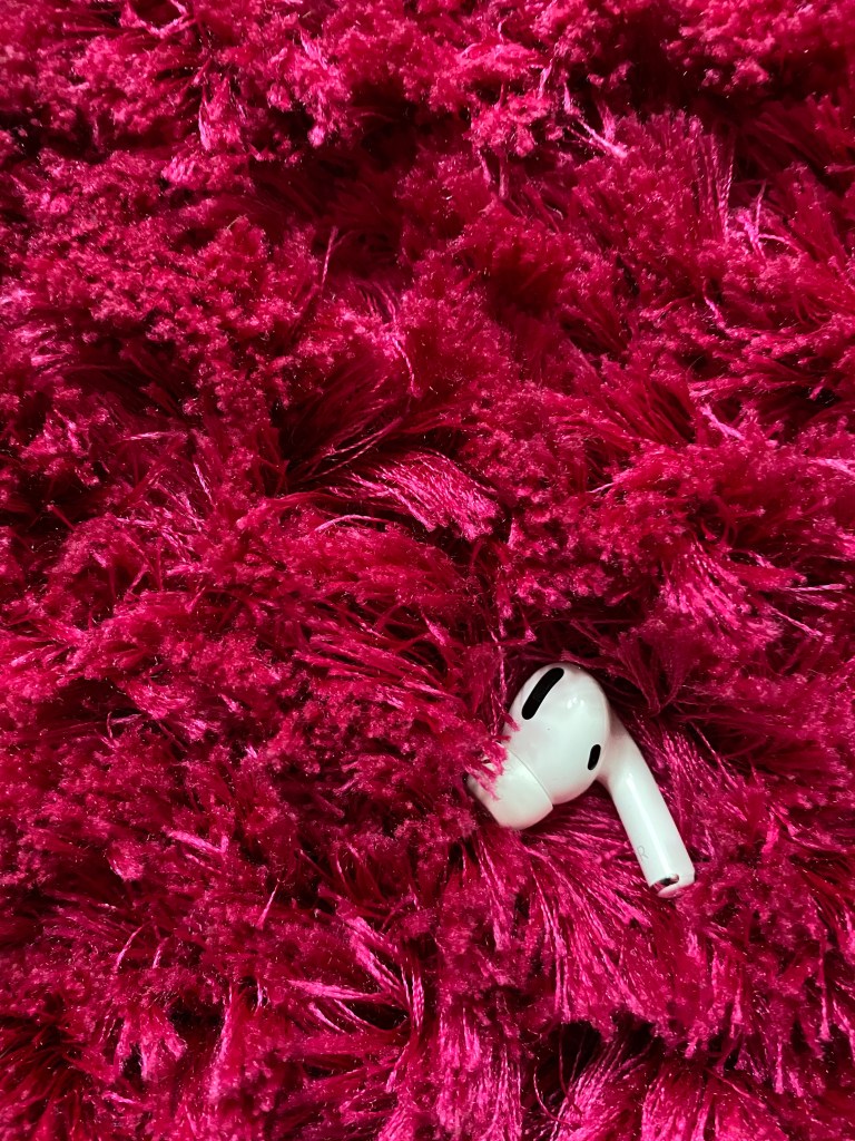
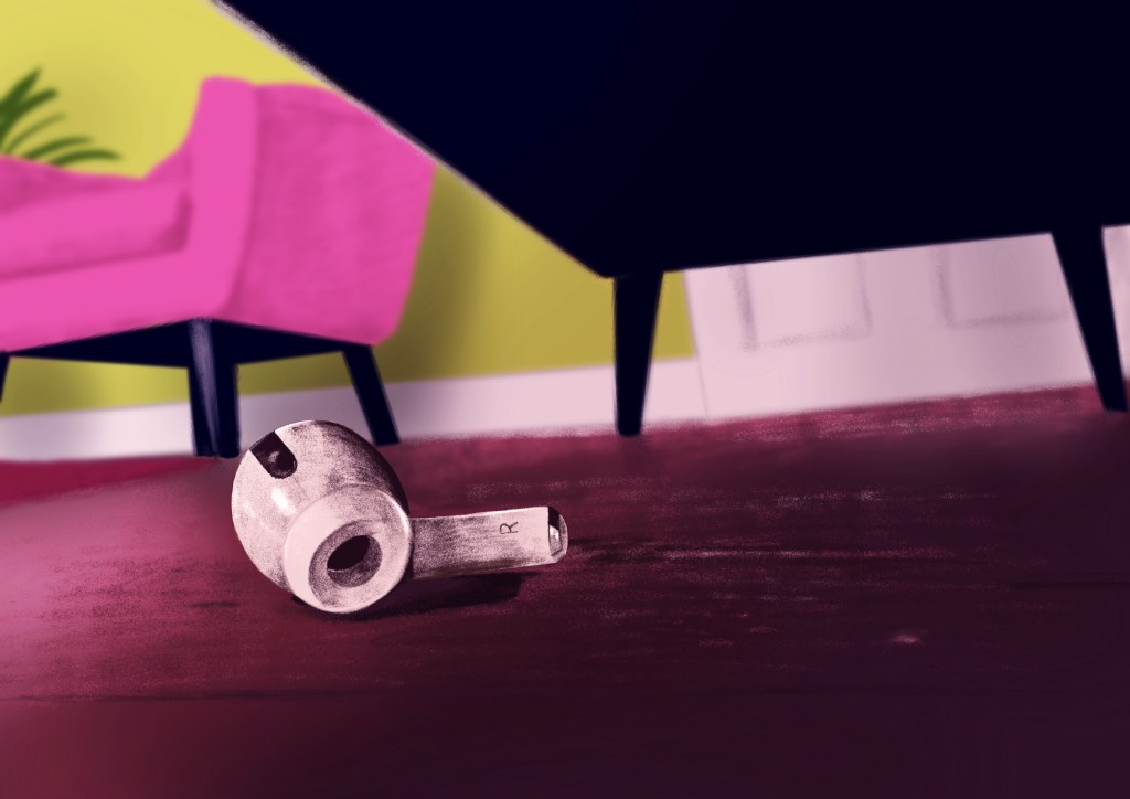
I quite liked the idea with the lone AirPod under the sofa. I think it conveys the idea; “lost” pretty well. I wanted to explore this idea further in different settings to find something that is both visually pleasing and conveys the idea well too.
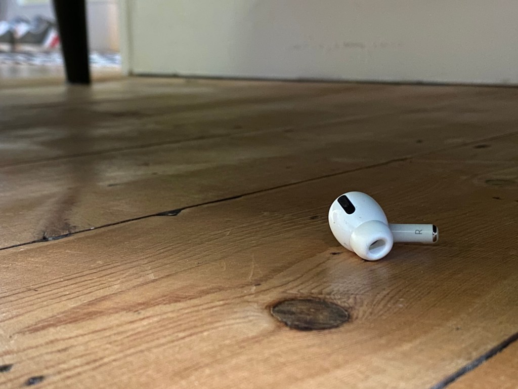
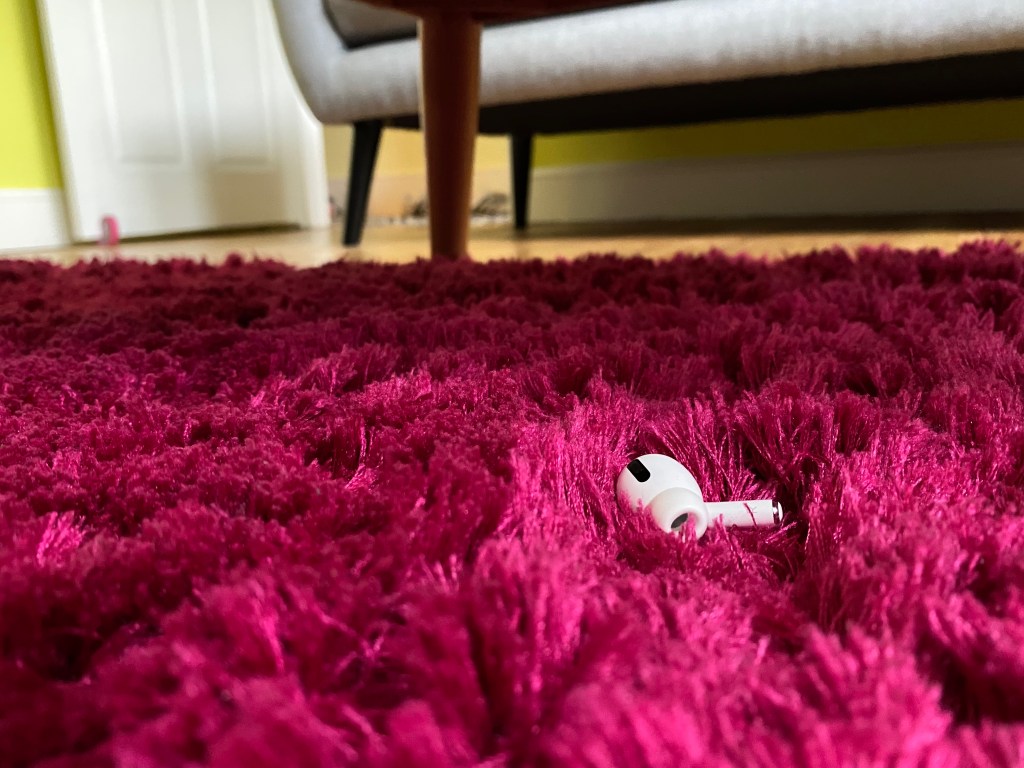
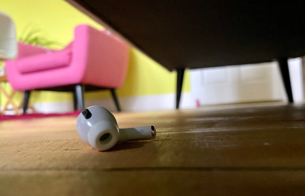
The last image above was my favourite. I think the composition was pretty god as anybody looking at the image would know what the inspiration behind it might be. I was thinking this is maybe a little too literal, but I didn’t have any better ideas how to convey the word, so I decided to use this as the basis for my illustration.
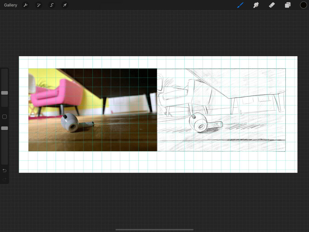
I went ahead and sketched a few of these to see if it feels different once I understand the structure of the image better.

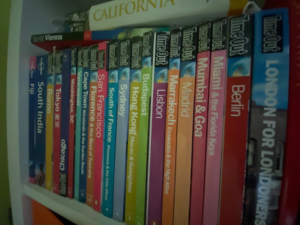
I was doubting if my interpretation was too literal, and if this would be an illustration that would ever be created for a magazine. I was trying to come up with the backstory, but I was really struggling. The only thing that sprang to mind is a tech review of sorts, how the lost AirPods can be located or similar topic. I wasn’t too sure if a tech magazine would ever use illustrations instead of an actual photograph though. I decided to have a little research to see if tech magazines use illustrations, and if so, what kinds.
I looked at the WIRED magazine and I was relieved to find that they use a nice range of illustrations in their magazines, mainly for the editorial pieces.

I really liked this illustration in particular, so I decided to look into her work a little more and see if there are any style choices I could borrow to make a stunning illustration.
I really liked how she combines the simple graduations of colours with the more grainy pencil like edges. I think most probably she is working digitally. I also loved the colour choices, and how her illustrations always have a sort of neon light atmosphere. I would love to achieve similar in my illustration. Her portfolio can be found here: https://www.cathryn-virginia.com/illustration
Now suitably inspired to create my illustration, I wanted to start the objective drawing from the image I took.
Once I was happy with my sketch I wanted to move onto creating the tonal version. I wanted to use colour in this so I can really show the image I had in mind. I wanted to go with a palette similar to that used in Cathryn’s illustrations.
I just blocked in the colours behind the line drawing and then shifted the hues using Hue, Saturation, Brightness tool on my software until I found a colour combination I liked.
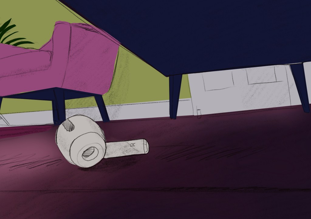
I think the best part of this illustration was the way the perspective worked to tell a story. I was really inspired to make this painting really cool.
I was first struggling a little to get that texture that I seen in the illustration, but then I realised that it is probably not very important to follow the texture used in her images very closely and started to have fun with it. I still kept the initial principles in mind when painting, I wanted no harsh edges, and wanted to pair back the colour palette to create the atmosphere of the image.
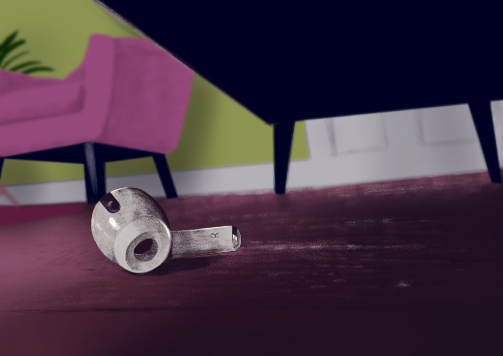
I was getting really excited as I think the image started to turn out beautifully. It really captured the word lost and I was really happy with it. After a bit of analysis I noticed a few things that I wanted to correct to make the image read better. For example the leg of the chair and the earpiece were creating a tangent that was quite uncomfortable to look at, so I decided to move the ear piece slightly towards the centre of the image. I also felt like that a little more tonal variation may do good so I added an overall shadow to the bottom right corner of the image.

I felt like the image was getting together nicely, however it started to be a little muddy and dark, so I decided to do some adjustments and punch up the contrast slightly to make things pop a little more.
After looking at the 2 images, I thought actually the more muted version worked better as it conveyed the emotional side of loss a little more. The new image was a little too cheerful with the punchier colours, so I decided to actually go with my original when mocking up my magazine page using this illustration.
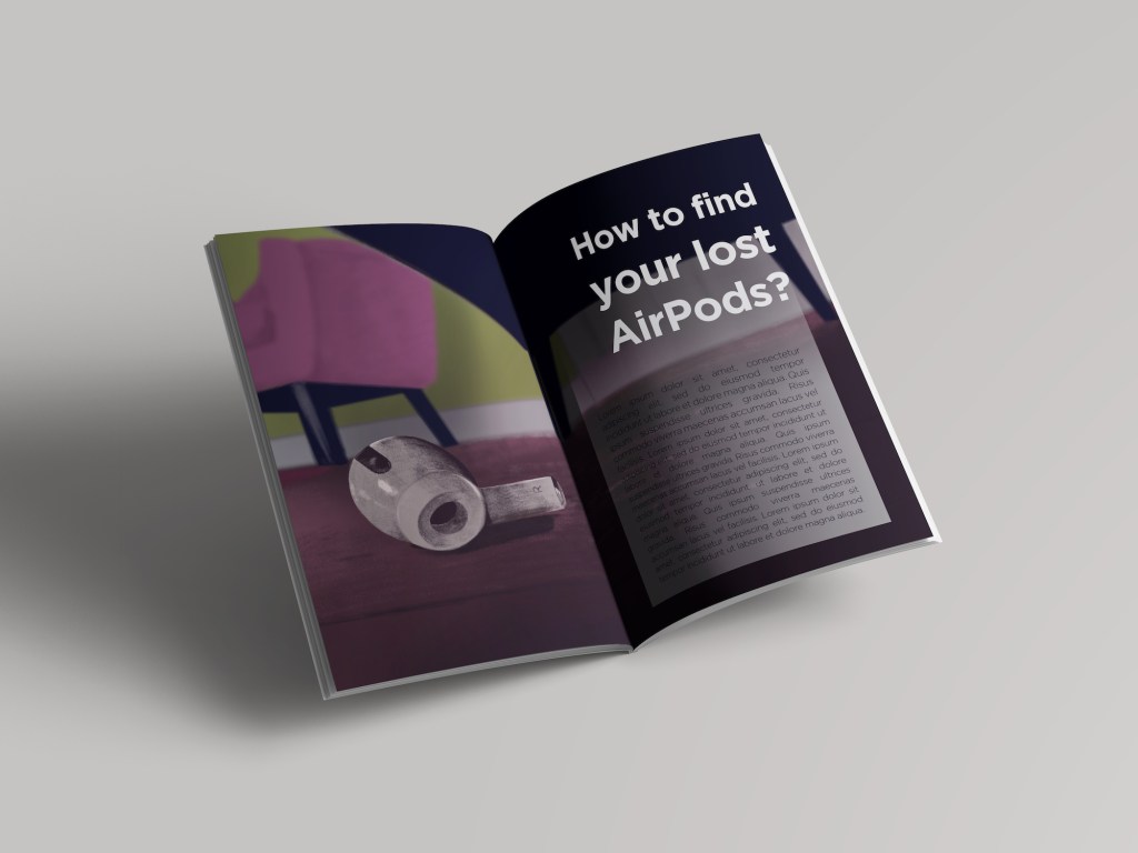
I felt like the meaning of the image gets a little lost when it is laid out over 2 pages, so I would probably try to do a single page layout for it. I feel like because the way the right hand pages is filled with the text the sense of the lost object is eliminated. I want to see what happens if I reduce the size of thee illustration and make it fit on the bottom of one of the pages.
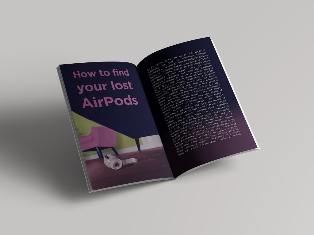
I think the new layout works much better. I think it communicates the point much better and feel like it is actually works with the illustration rather than against it. I think the spread looks quite stylish.
Reflection
I really enjoyed this exercise and I think the final artwork really shows this. Definitely think that the fact that I started from an image that was showing an interesting perspective and this helped me create an interesting image in the end. I feel like I haven’t really distorted the original image, but I felt like the image that I captured from under the sofa worked pretty well and I didn’t feel like I would add anything by changing the proportions or the perspective. I had to move the item slightly but only to improve the readability of the final image.
I feel like Part 4 really helped me push boundaries of what I thought I was capable of and understand that style is a very big part of illustration. I think now I see that the materials and the techniques used are a massive factor that can make or break the image. I feel like I have been able to create some interesting work in this part of the course and feel like I gotten better at creating illustrations. I think my process is pretty solid now and I can vary this well to make it suitable for almost any project. I also thought that I have done better research in this part, this is something that I need to develop further, but I feel like I am able to investigate my ideas quite effectively and create work that is of good quality.
Correction
My tutor has commented on the fact that the AirPod looked dirty in my image due to the colour of the shading. I have decided to give this a go.
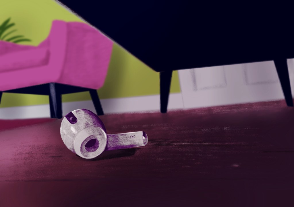
I have used the colour balance to shift the hues of the shading on the object, and I agree, this looks way better already. I think the other issue is the patchiness of the shading which makes it look like there is something on the surface of the otherwise shiny plastic. I think I could make this more uniform by using some blending so that there are no visible streaks on the object.
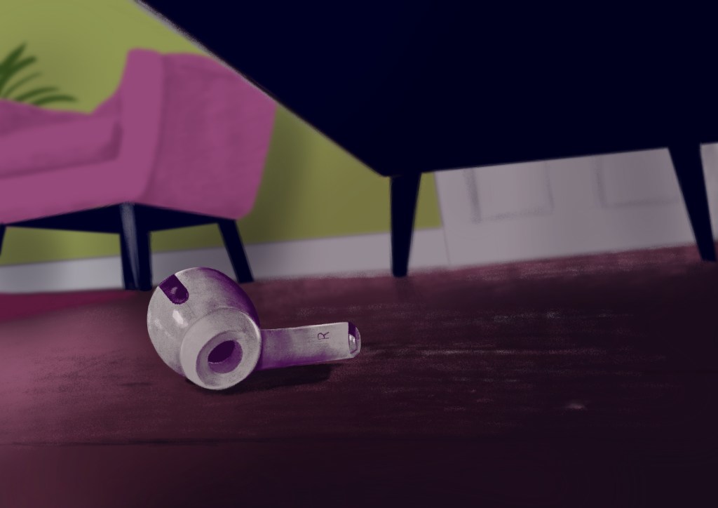
I think blending actually made a bigger difference. At the time when I was working on this piece initially, I think I was really wrapped up in trying to emulate the style of the artist I have chosen as inspiration and thus lost sight of the issues with the image.

One Comment Add yours