
This exercise is designed to push you through a deliberate process of stylisation. Tackle it with an open mind and be prepared to adapt or adopt some of the approaches you discover.
Begin by drawing a cat or dog. Use reference from any source – life, photos or images from the internet. Draw the animal in a way that makes it ‘real’. Remember to describe some aspect of its appearance or personality.
Do a second drawing using no more than five lines. These lines can join up with each other and overlap or can be less connected; they can be straight or fluid.
Now make a collage from bits cut from a magazines and printouts. Let the texture of a tree be the fur for example. Have fun introducing surreal elements. Deliberately distort.
How far can you bend reality?
Produce a drawn version (not a tracing) of your collage. When drawing, edit and select from the collage being aware of the properties you want to create a strong character.
Review the distorted version and decide how you can refine the image. This image can now be incorporated into a bigger image. Use your imagination and introduce at least one other element that introduces a narrative. Be creative but consistent in the development and rendering of this additional content.
OCA Key Steps in Illustration
In this exercise I was asked to produce 4 different illustrations, first a fairly realistic representation of a dog or a cat from a photo, second a line drawing, then a collage and after creating a collage create a drawing of the collage and incorporate other elements to create more context for the illustration.
I found this image of my sister’s cat that I thought works pretty well for this exercise.

I thought it was super cute and I wanted to capture this in my painting.
I’ve done some digital portraits before but never of animals, so I thought this could be a good excuse to use my trialed technique to create this. I usually put the image right there on the canvas and pick my colours from it while making sure the proportions are correct. This way the outcome usually bears quite a bit of resemblance to the reference.
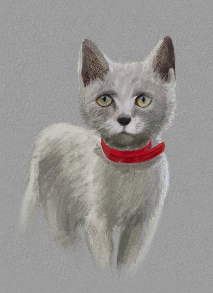
I was pretty pleased with this. I had some small proportion issues with the head that I noticed after I uploaded the drawing, but overall I was pretty pleased with it. It did resemble the cat I was depicting and I think I captured the essence quite well. I was tempted to keep on working on this and make it really realistic, but I wanted to move onto the more exciting parts of this exercise, so I decided to keep it somewhat painterly with some loose strokes here and there.
It wasn’t fully explicit from the exercise, but I decided to recreate the same image with the other 3 techniques, that way I can put them side by side and see how the image transforms dependant on the tools/style used to create the illustration.
Next, I went todo the line drawing.
I got out an A4 piece of printer paper, and a ballpoint pen to do this. I don’t often do this sort of thing on paper, but I think digital would not have the same effect here, and probably will be easier to do it this way.

The fist one I did without lifting the pen at all. I think it looks more like a dog than a cat. I underestimated how difficult this would be to do with just a few lines. I wanted to try a few more times to see if I can improve.
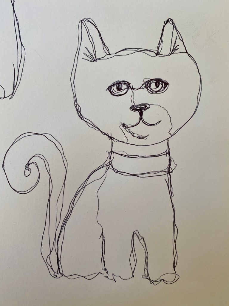
For my second attempt (still using 1 line) I went a little cartoony and exaggerated the head quite a bit to give that kitten like quality. I think when it comes to this image, it is a lot more apparent that it is a cat, but still has no resemblance to the original image whatsoever. I think this technique would take quite a lot of practice to get to a level where I can be happy with the outcome. I wanted to try a few more times on a page in a thumbnail format to see if I can sass out what makes the cat on the photo who he is.
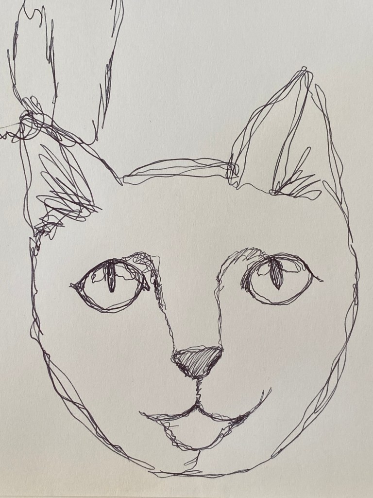
In one of my sketches I concentrated on the eyes more and therefore I think it did capture the essence of the subject quite well, however it was pretty bad overall and I ran our of space around it, so I couldn’t finish it, but I think I get the idea behing this technique. It is all about limiting your lines to still convey your subject. I think this style can make amasing icons if mastered properly, because the image is inherently simpler and also distorted in a way because this technique is quite limiting.
Next I was going to move to collaging. I normally do most of my collaging digitally because it places less limitations on you, but for once I wanted to see what I can come up with on paper. I decided to gather some magazines and cut them up to do this.
I haven’t had many magazines laying around but I piled them all up and started collating things that reminded me of a part of a cat. I found mainly hair, because it was the Attitude magazine and there wasn’t much else in them but people, so I went with these and collated a lot of hair samples.
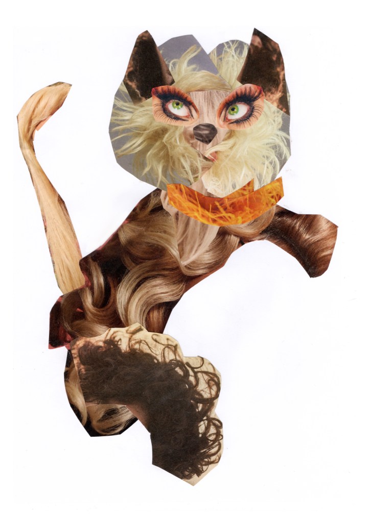
I thought this turned out pretty fun. I was looking forward to drawing it. It looked like the cat was jumping and looking back. I wanted to capture this pose in my next illustration too.
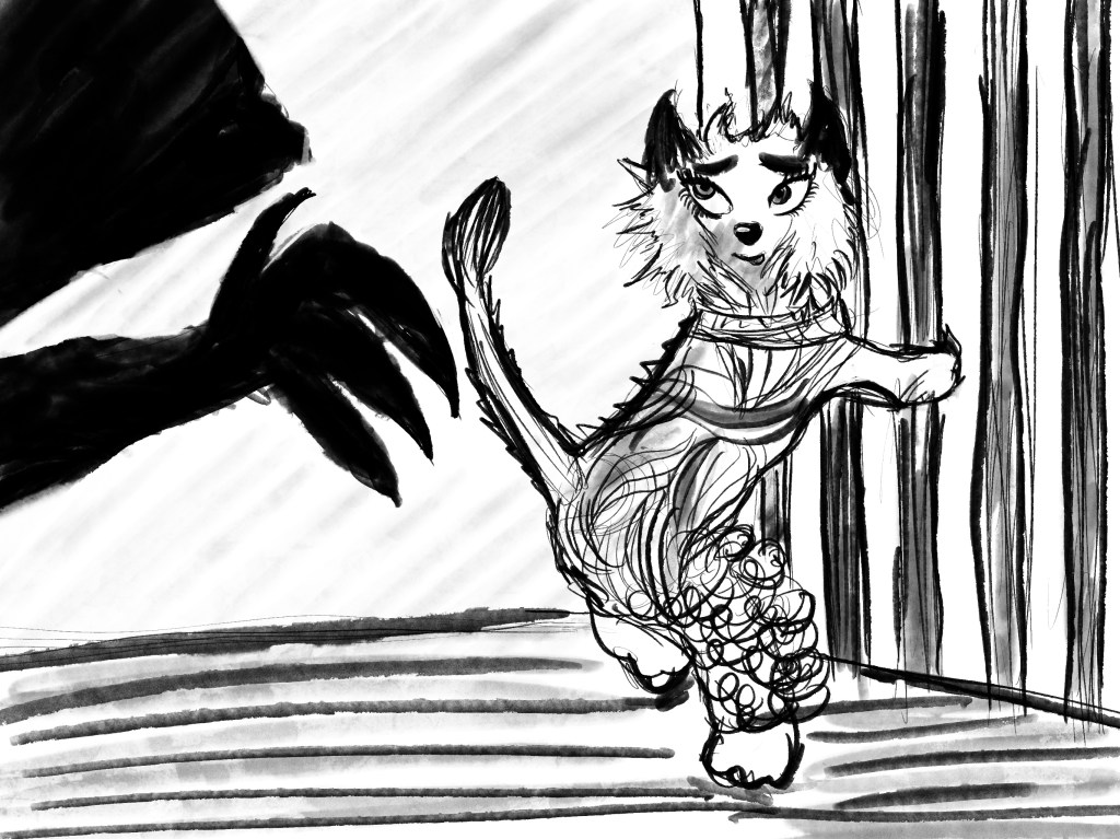
It looked like that the cat was scared of something, so I decided to make a little scene where this extremely hairy cat is looking to escape a cage that it is locked in with another unknown creature.
I think it captures the gesture of the cat from my collage and looks like it could actually be the reason for the pose and the facial expression. I decided to also see what it would look like if I merged the 2 illustrations.
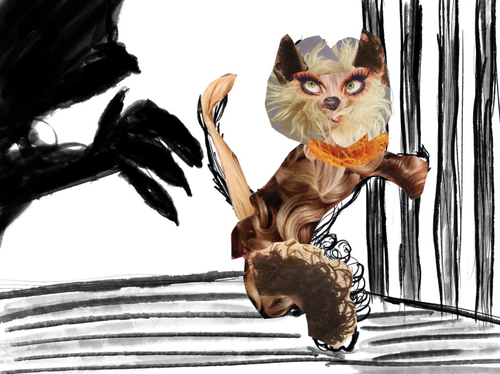
I think there is something humorous and charming about the final image. I like how the pose is being given context and how the whole of it comes together.
Reflection
I enjoyed this exercise. I think it was super fun. I see how using different techniques can result in a very different outcome. Sure the last image stretched the initial image and frankly has almost nothing in common. I think the final image is fun and definitely not something I would have created if it wasn’t for this exercise. Going forward, if I get into a creative rut I will make sure to use the last technique, as I think it would surely inspire. It would also be an invaluable tool when creating characters for example, because you end up mixing several different things and see them as a whole. It can be very rewarding.
