A friend has asked you to design a tattoo for them based on the word Mum. He would also like you to make it into a greeting card that he can send his mother. (What a good idea for Mother’s Day).
Research the history and conventions of tattoos and body art – as well as the modern ranges look at the designs from the past and other cultures.
Decide on how complex your design will be and whether you will be using colour.
Draw up your design on a large scale, mindful that it will be smaller both on a body and the card.
Write up your decision making process in your learning log.
OCA Key Steps in Illustration
Designing a tattoo is a super personal thing. The person who gets the tattoo will have to live with this illustration for the rest of their life, so it needs to age well as well as being timeless enough to survive and be meaningful for a long time.
I have been an avid follower of tattooing as an art form for a few years since I got my first tattoo about 8 years ago.
Research
I started my research with a book I had lying around. The World Atlas of Tattoo by Anna Felicity Friedman.
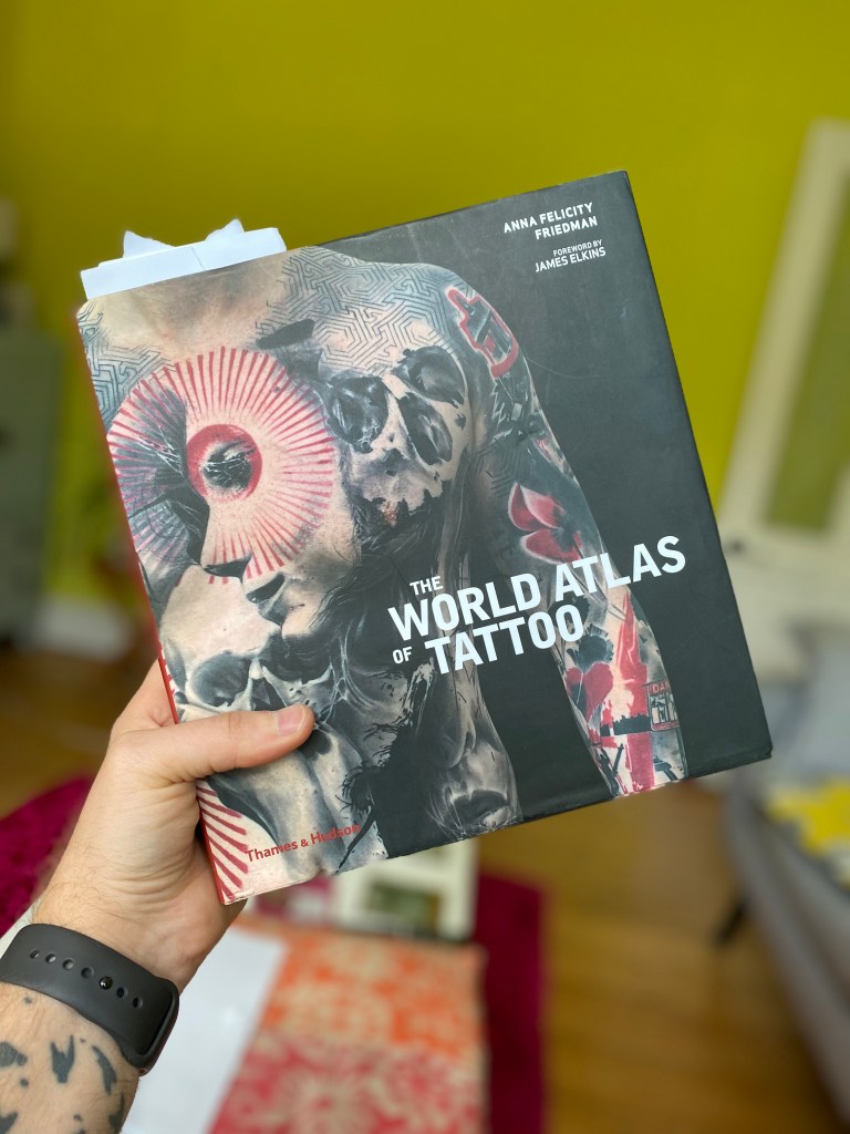
This book was a very helpful guide in terms of recognising the different tattooing styles that are around and being practiced today and gave me a small glimpse into the history of the practice too.
I also found this insightful video on YouTube about the subject.
According to the video, the practice of tattooing could reach back as far as 10,000 years. There are evidences of this in many historical artefacts.
The word tattoo is fairly newfound in relation, it is a modification of the word “tatau” which is a Polynesian word used in Tahiti to describe the practice. It was adopted by by James Cook in the 18th Century and adopted into the word we all know as tattoo today. Interestingly, in Victorian England it was commonplace to have tattoos amongs high society but it was not a well known fact and tattoos were mostly hidden from the public.
Tattoos weren’t always inflicted by ones upon themselves willingly, they have been used to mark people for centuries too; in Japan they marked prisoners since the 7th century and greeks and romans tattooed slaves to mark them as their property. These forced tattoos have later transformed into the popular act of tattooing and became a fashion trend.
The modern tattoo machine was invented in 1891 by Samuel O’Riley and was based on Thomas Edison’s stencil machine from 1876.
Tattooing went through peaks and throughs throughout history often marking the social outcast but other time marking achievements in life or the belonging to a certain social group.
Throughout the ages many different styles have developed that are still being used today in different forms.
During my research I found a few styles that really stood out to me; such as the Old School and Traditional Japanese tattoos.
I really liked the Old School because of its cartoon like appearance with the thick outlines and distorted characters. These tattoos often include text and framing and can include inanmiate objects, animals and people. I think this would be an excellent style to try my hands on.
The other style that stood out to me is the Traditional Japanese style of tattoos. Typical symbols that are used in this style are nature; flowers and animals, and lots of abstract waves or water like shapes that connect these into a block.
I think the Old School style will be more suitable for this design as I can imagine this would be more personal and less spiritual. While your relationship with your mother can be spiritual, I think it is more personal and probably can better described by the old school style. That said, I will keep an open mind when coming up with ideas and not make a commitment in terms of style until I know what the content of my illustration will be.
Idea generation
The brief calls for the tattoo and greeting card design to be made based on the word mum.
We all have a mother and this is for majority of people the most intimate relationship that one can have in their life, so it makes sense why so many people would like to honour their life giver with a permanent marking on their skin to show their appreciation.
First I wanted to brainstorm some ideas in terms of words and concepts that comes to mind from the word mum.
I decided to try something while coming up with ideas. I wanted to listen to some music while coming up with concepts for my design. I found a nice Mother’s Day playlist on Apple Music, I was listening to this while gathering ideas, this way I was able to incorporate ideas communicated by these songs, which given another dimension to my research.
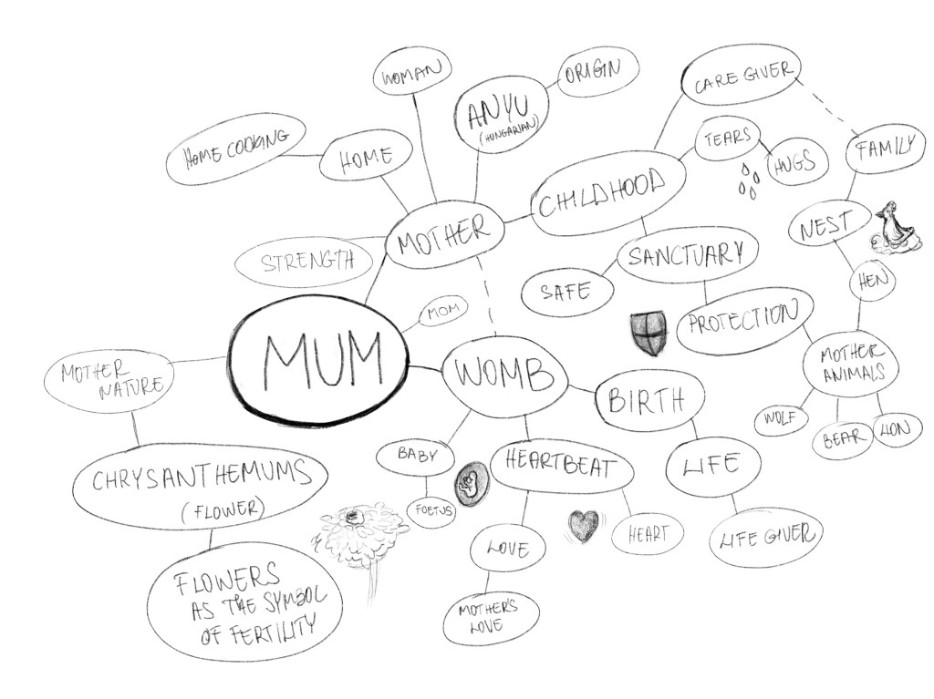
I felt quite inspired to start sketching. I thought I managed to gather a range of ideas when it comes to the concept of motherhood and what a mother means to their children. I wanted to create something beautiful that any mother would be happy for their child to bear, but cool enough that a child would want to wear it on their skin.
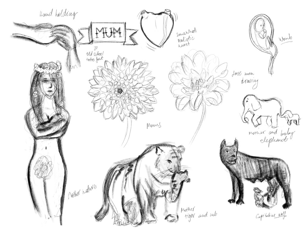
I had a range of ideas. I was thinking to play with some animal motifs because I think there is something in common how mother animals care for their young that is very nicely illustrate the way our mothers care for us when we are children. I quite liked the elephants. The Disney movie Dumbo made a massive impact on me when I was young, I thought that the scene where Dumbo is separated from his mother is the most heartbreaking moment ever. In contrast my elephants are happy together, the baby holding onto the mum’s tail. I think this works really nicely as a metaphor for children being held by their hand when they are learning to walk. The only issue I found with this idea, that it might be a little too cute for a man to get this as a tattoo. Maybe depends on the rendering though. I think my second favourite is the was the capitoline wolf. This is a brilliant symbol of motherhood, and also a piece of cool myth about how the city of Rome was founded.
I was thinking that I could somehow make the elephants work maybe in a traditional Japanese style. Although elephants are more associated with India, I have found a few depictions of them in some japanese art, so I thought I could make this work somehow.
This was a great way to get inspired and to think about elephants in a different way. In the works of Ichiryūsai Yoshitoyo, the elephants look quite fierce and ferocious. I think if I made mine look similar to these it could make an interesting tattoo. Also, since traditional japanese tattoos most often also use some flower symbols, I could use some mums to do frame the piece.
The second artist depicts these animals looking much more docile which is probably a better approach when it comes to appealing to a mother’s sensibilities. Still cool enough though to make it interesting for a traditional Japanese style tattoo.
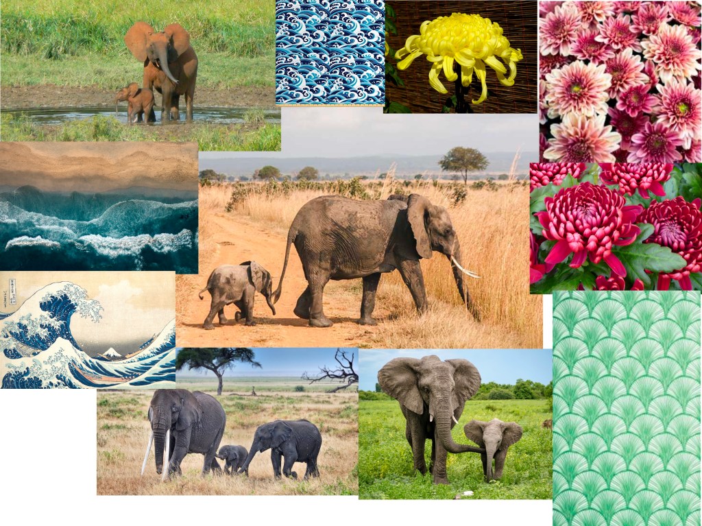
I made a moodpboard to look at some of the elements I wanted to include in my design. I was thinking, while the traditional Japanese tattoos seem yo have the wave element in them most often as filler between shapes, I wasn’t sure if this would work with elephants, so I also found some Japanese grass patterns which may land better with this idea.
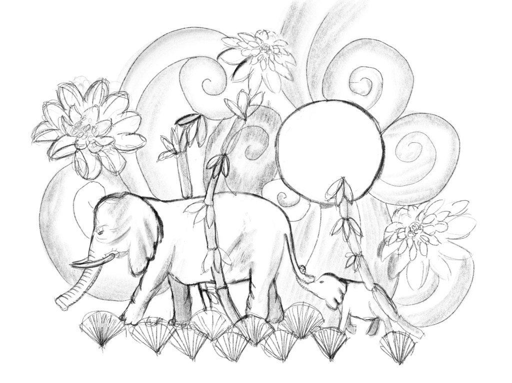
Next I wanted to create a sort of colour visual for myself to make sure I still like the idea when the colour has been applied.
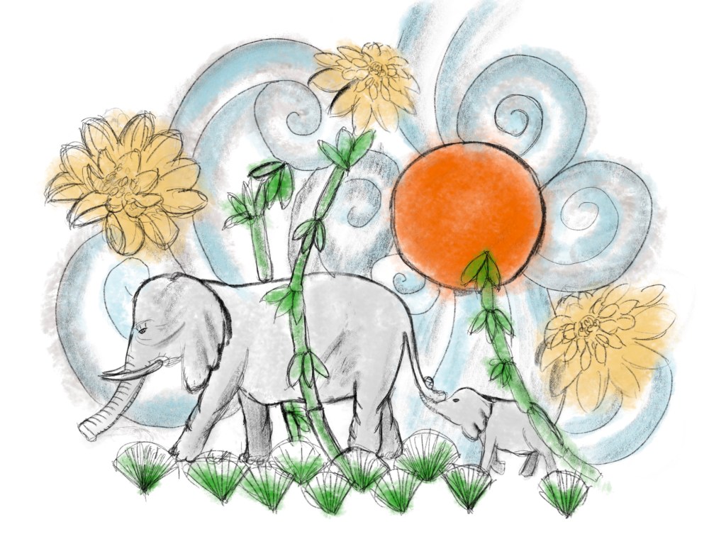
I was actually pretty happy with how the sketch turned out, but wanted to get the opinion of my mum to see if she liked it, and also what she would say if I decided to get this tattooed on my skin. I think this is a crucial part of this exercise. A tattoo design that nobody would want to get is not successful, so I wanted to make sure this is mother approved.
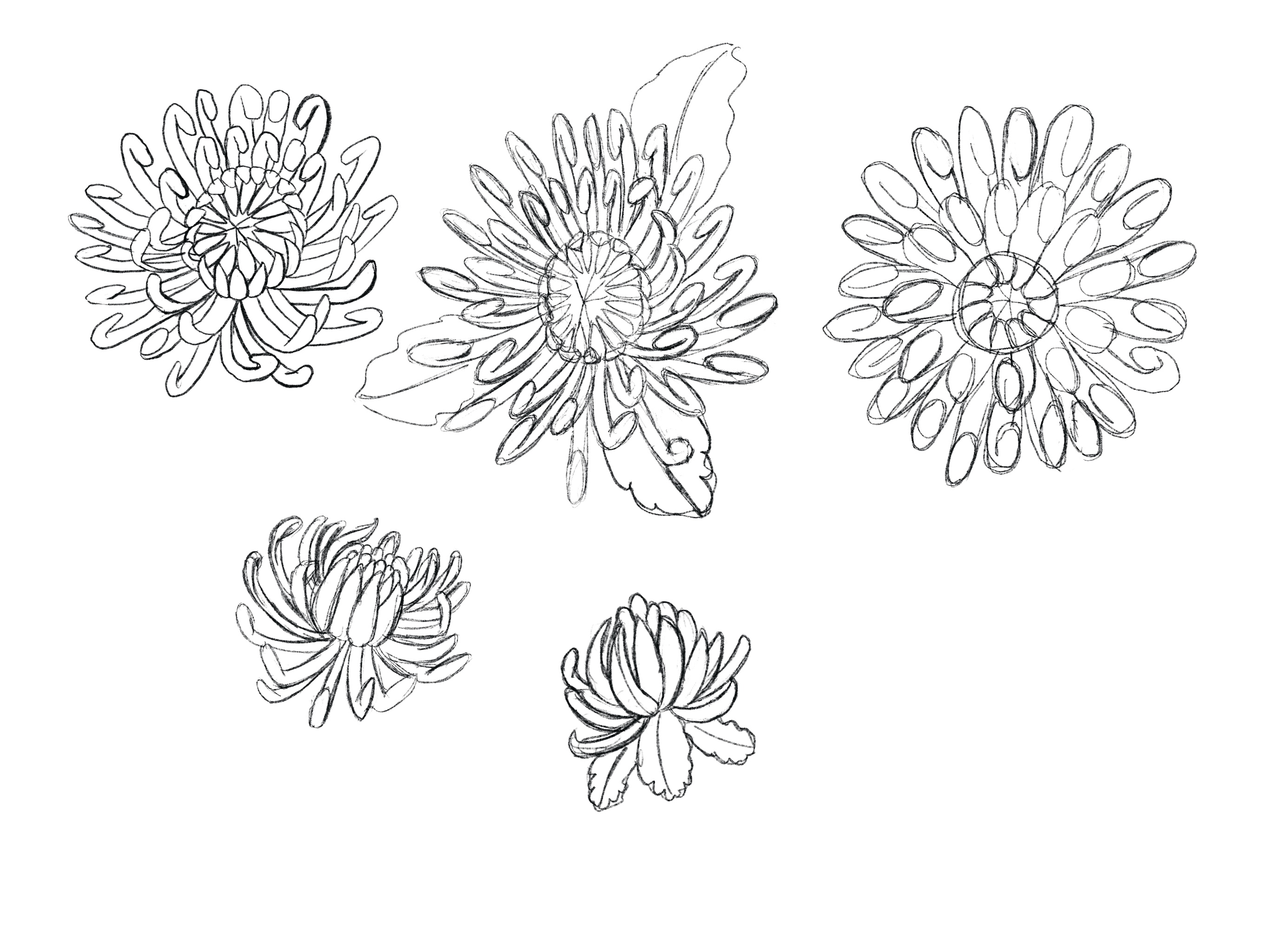
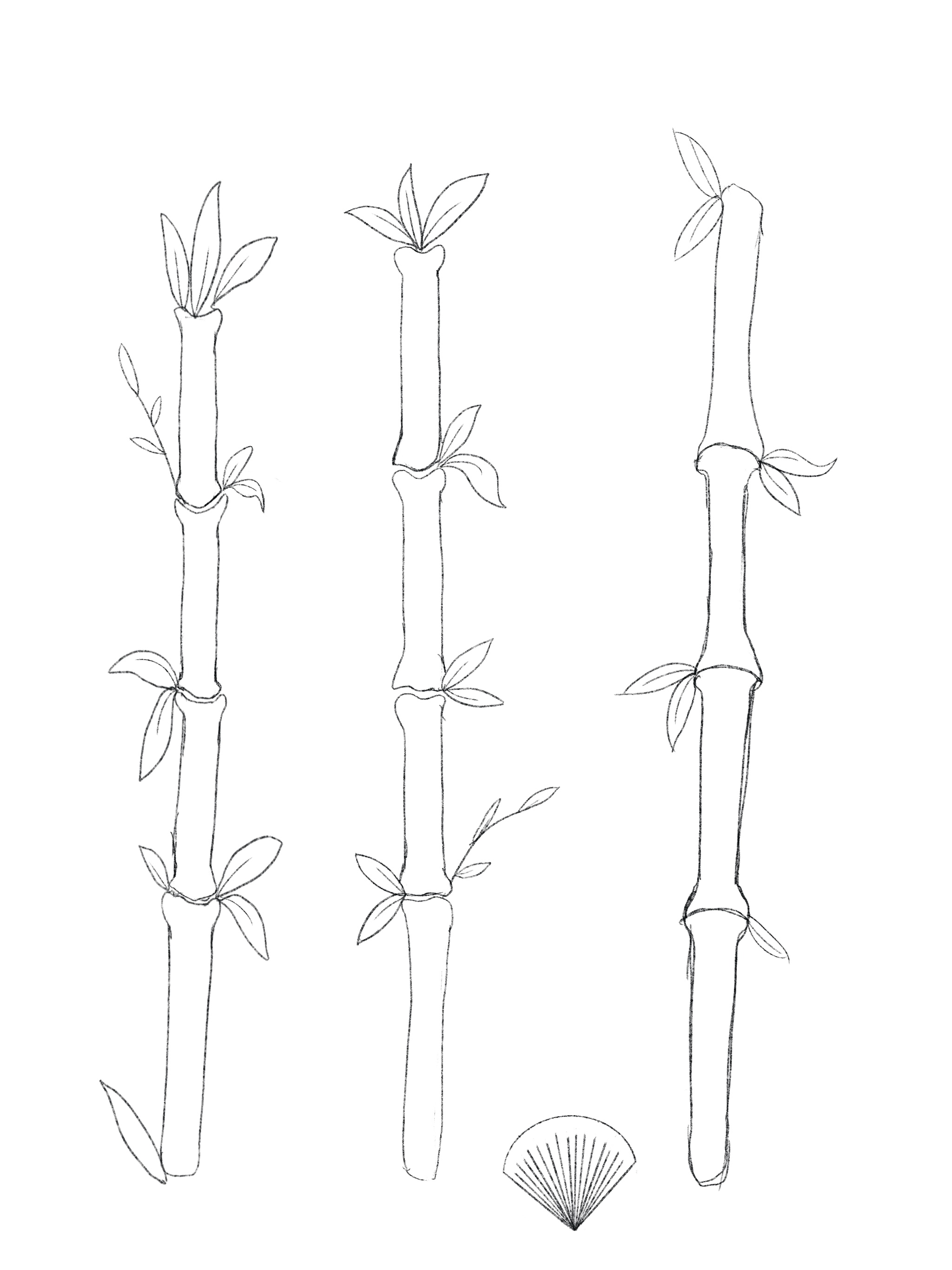
I created all of the elements on different layers, as I thought the original layout wasn’t working super well. This way, I thought I could just arrange the different elements of the composition until I find a layout that works.
I have iterated the pieces a little to make them more unique, as for example the bamboo I ended up only using 2 of the pieces. I tried to distort and remove certain elements to make them a little more individual.
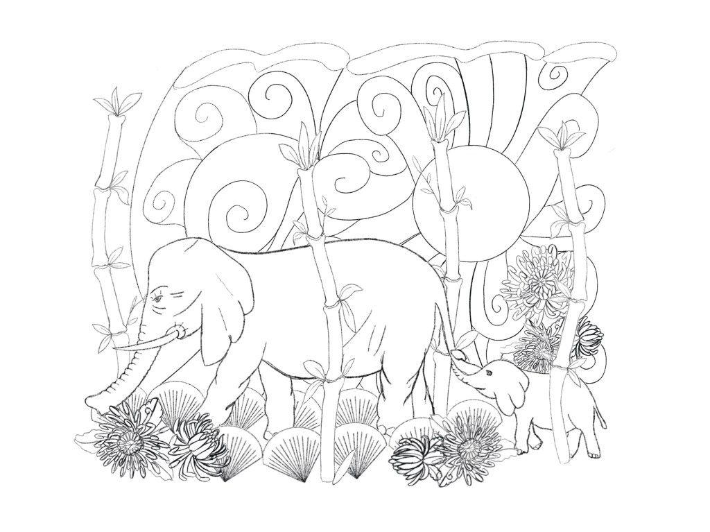
I made this layout after a long time playing around and I was starting to get disheartened by the process as it was not coming out as I expected it to. I liked my original sketch much more. I couldn’t quite put my finger on what the problem was though.
I made a different version where I pulled some of the flowers and put them to the top portion of the image, and I think this worked slightly better, however I still wasn’t happy.
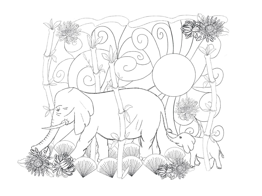
I think the second version was slightly better, but I think I was blind to it all at this point, and wanted to step away for a few hours to refresh my eyes and come back to it later.
The next morning when I looked at it, I found that it wasn’t quite right, but since I had every element on a separate layer, I could move objects around in the image to find a more pleasing composition.
After numerous attempts to make the image less busy, I decided to land on the most pleasing layout I could find and start inking the artwork. I thought that maybe this is analysis-paralysis, because it was so easy to readjust the artwork I couldn’t stop moving things around.


After spending a long time on pushing elements around I landed on something that was pretty balanced in my opinion and thought it would work for my final, so I decided to ink the whole thing.
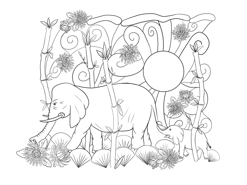
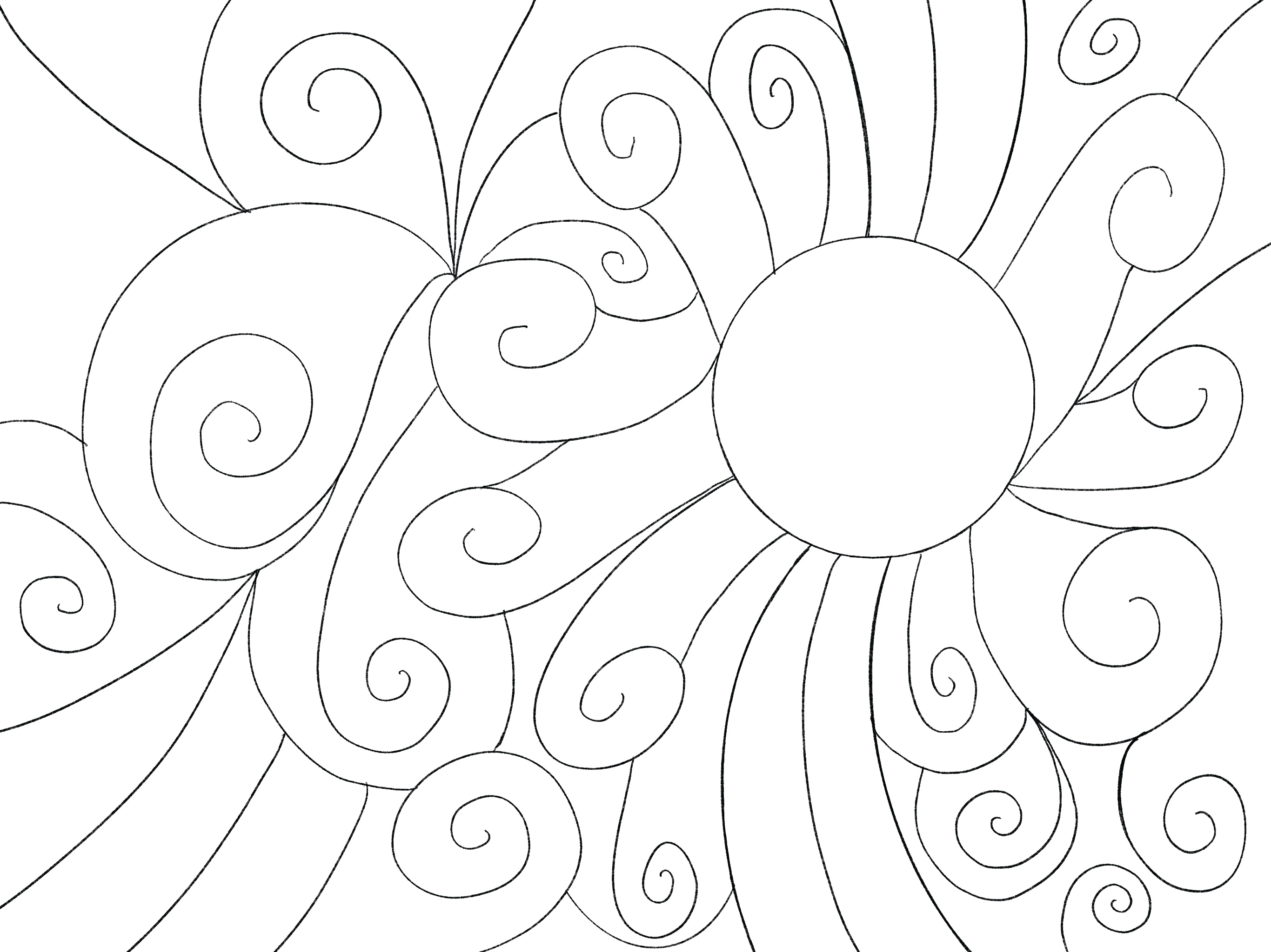
Only when I was looking at references again of Traditional Japanese tattoos to look at how to colour things it hit me, that the background was completely off. I went back in erased all the lines that were making up the background and created a new simpler background. I think this was a good decision as all the squiggly lines were quite distracting.
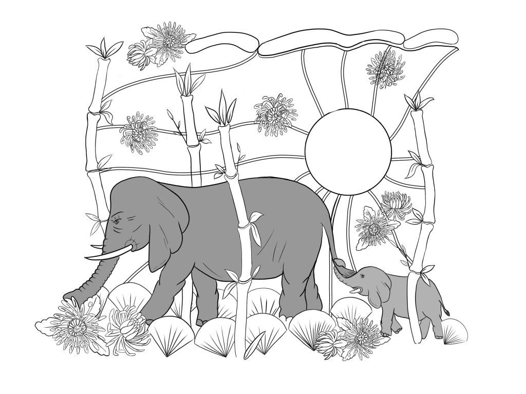
Once I was happy with the line work finally, I wanted to move onto applying colour to the design in a similar way that this style of tattoos were using it.
I noticed that the colours are usually smooth with a slight gradient for shading and highlights, so this is what I’ve done to my own design.

I decided that I would keep the flowers as just line work, so this way the colour of the skin could serve as the base colour for the flowers. I think this is a cool little touch, but I thought this could serve a dual purpose. On one side it will keep the colour palette very paired back, on the other it keeps the folwers relatively simple and blend into the background more.
After looking at this again with fresh eyes, I decided that some shading should be applied to the flowers to make them a little more 3 dimensional.
I also added some finishing touches, such as a bounce highlight on the elephants to make them stand out a little more from the background. I thought this is important as they meant to be the main stars of the design and at present they were blending in with the background a little too much.

I really started to like this again and was excited to see how this would actually looked as a tattoo.
I found a great tattoo mockup online here.

I was actually pretty chuffed with how the final design turned out and how it looked on the mockup. I think it does look like a traditional Japanese tattoo, although I haven’t kept in mind an important bit from the brief. There are some pretty intricate small details that might be loose when applied at a smaller size. The flowers are way too detailed so if this was meant to be applied as a smaller size tattoo, it may need to be simplified.
Next I wanted to see the design as a Mother’s Day greetings card, so I went ahead and assembled this his as well. Again, the small size meant that the flowers were a little too detailed, but I think they would still be readable as flowers, so not all is lost.
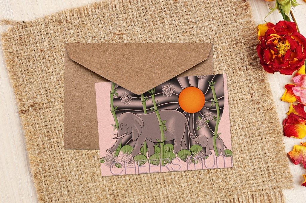
I think I managed to create a cool greetings card design. It is relatively simple, and I realised that most greetings cards are portrait orientation, but overall, I think I am happy with the design on a card, although I had to crop it slightly to be able to maximise the space that it is taking up on the card for the above mentioned reasons due to the details in the flowers.
Reflectiom
I think this exercise went really well, however there are a few small details that I would do differently if I started again in terms of the approach. I think the fact that I enjoyed this exercise really shines through. I believe the final illustration is one of my best work to date. I really like how following stylistic choices dictated by a particular style really helped me achieve a professional looking illustration that I believe mostly fulfils the brief.
The things that I don’t like about it is probably just stemming from the fact that I haven’t kept in mind the entire brief and therefore the illustration wasn’t the easiest to use for a greetings card, and perhaps some parts of it were a little too detailed to use at a small size.
This exercise shown me that I should try out different combinations of things before I ever commit to one. The background was very distracting at first and if I swapped this out earlier, I would have saved a lot of time and effort. That said, I managed to get to a final product that I am proud of and overall the process didn’t take that long. I believe I spent about 8-9 hours total on this exercise over a few days, so I think that is not too bad.


One Comment Add yours