For this exercise you are asked to provide an illustration for use on the menu of a sophisticated, quality fish restaurant – one in a chain sited in major European cities. The menu uses fresh ingredients and the ambience of the restaurant is modern, bright and contemporary in design. Any food depicted needs to be visually appetising.
Although the image will be used at a small size on the actual menu, if it is successful the restaurant would be interested in also using the image as a logo on their stationery and vans. As such the image will need to be reasonable simple and clear. You will probably want to work on the artwork at a large scale but you need to provide an example reduced to 40mm x 40mm as it will initially be used.
OCA Key Steps in Illustration
I think this exercise is aimed to teach me what the requirements are for an illustration to be versatile enough to be used at both small and larger sizes. I think in this case iconography with less detail would work best. I will have to start with some research to find inspiration and find find what is popular when it comes to menu card illustrations, but also keep the above in mind so I don’t create something with lots of detail that will be lost when the illustration is scaled down to a relatively small size.
Learning from the previous exercise I thought it would be a good idea to jot down anything that I think might work while I am gathering visual references in a form of a spider diagram.

While I was working on this I was thinking if I would somehow combine the creatures of the see with some nautical icons, that would make and interesting and memorable logo.
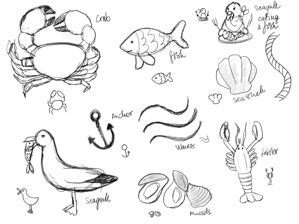
I sketched a few things that came to mind when I was thinking about the fish/seafood restaurant to see what I can come up with that might work in terms of a small illustration/logo for a menu.
While I was drawing I read the the exercise text again, and it seems I misinterpreted what needed doing slightly. It is a fish restaurant, not all sorts of seafood. So I think I need to axe some of the ideas I had. I really liked the seagull idea. It is humorous and I think it could work as a simple line drawing that is scalable.
I decided to take my drawing into a vector programme and create the icons that way. I was first thinking to use Adobe Illustrator, but then I decided that I should start learning Affinity Designer that I purchased a couple months ago, so I decided to use this instead.
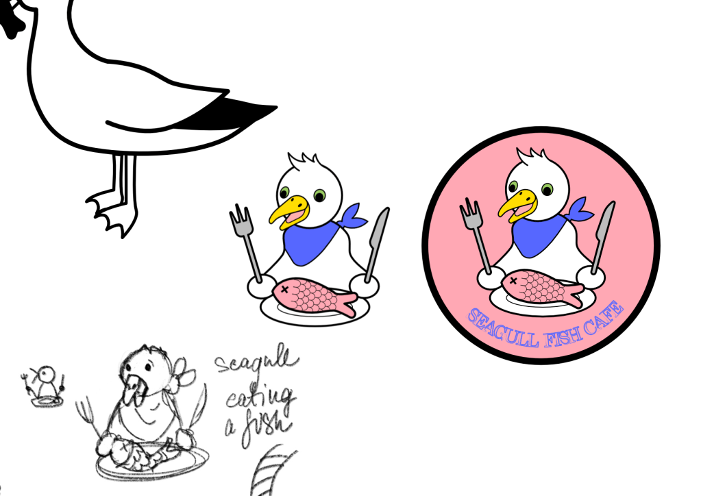
Once I took the logo to a finished place, I realised that this will definitely not work for this brief. The the above is not sophisticated by any stretch of the word. I decided to try to come up with a simpler more sophisticated idea. I think part of the problem with the above is that the character is too cute and too playful. Definitely doesn’t resonate with a more sophisticated client.
I decided to ditch this idea completely and start over.
I made a couple sketches and I found that I still had my head filled with the seagull idea. I wanted to take a different approach, but I found it quite difficult to depart from my previous one. I made a few sketches, and I finally started sketching a fish. Just a simple, generic fish. I was thinking how I can make it modern and interesting, so I drew the scales as little triangles.
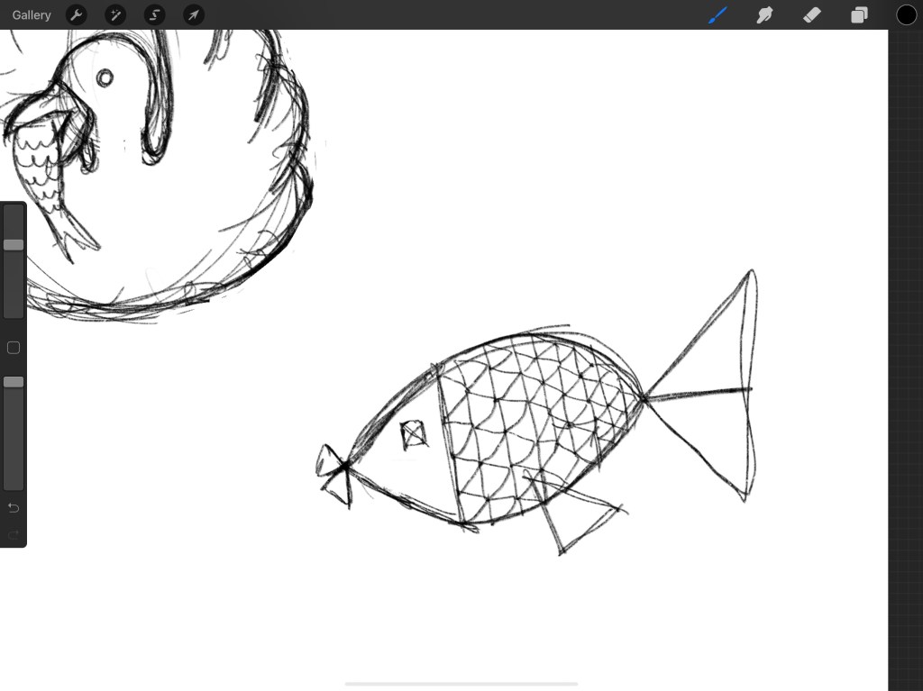
I thought this might work as it will be modern and quite minimalistic so therefore sophisticated.
I started by creating my first basic fish in my vector software, and then I started iterating this to create as many different versions as I could.

I felt like this was a little simple, so I wanted to explore some further shapes to see if I can create something more exciting.

I shared this with a few friends to ask for their opinions and to select the most eye catching one of the bunch. I got varying responses but ultimately I liked the one in the bottom right corner the most. It is simple and elegant in my opinion. I wanted to add something more to it though as it was a little bit out of context in my opinion.
I thought adding a plate under it to give the restaurant context would be a good idea.

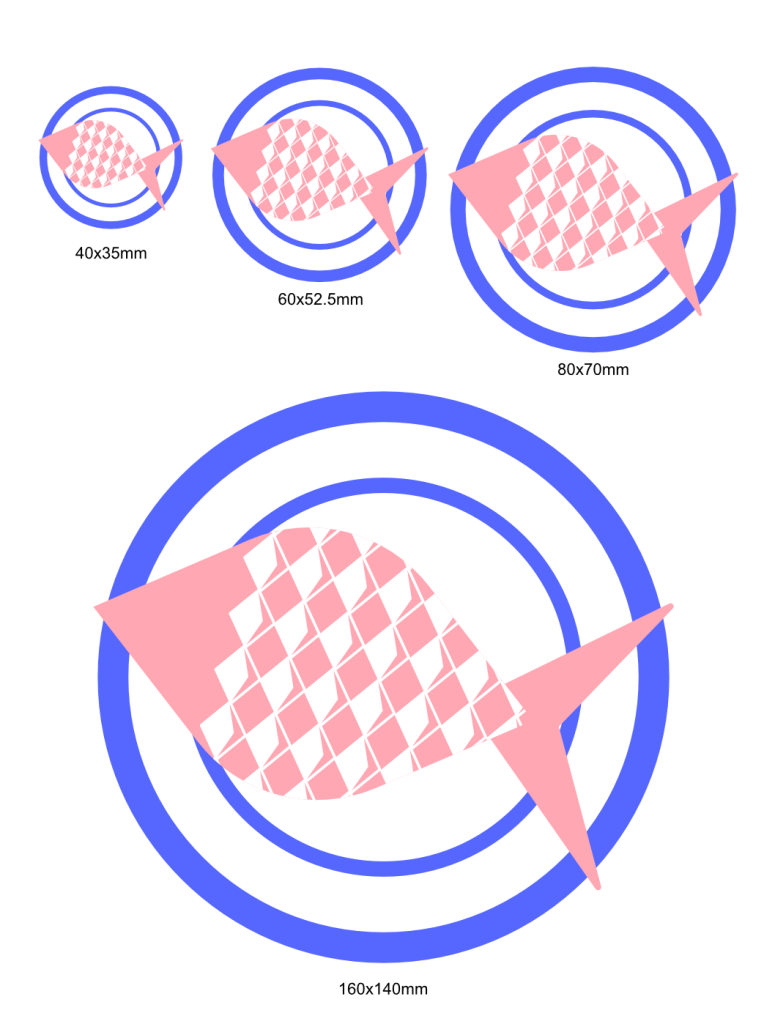
I think my finished logo fulfils the brief and it is an illustration that is modern and sophisticated. I think because of it’s simplicity it is going to be suitable for a chain of restaurants across Europe.
I changed the size to make sure the idea is readable at different sizes as well.
I was questioning the colour as well, so I thought I will try out some different colour combinations to see if there is any that really speaks to me.
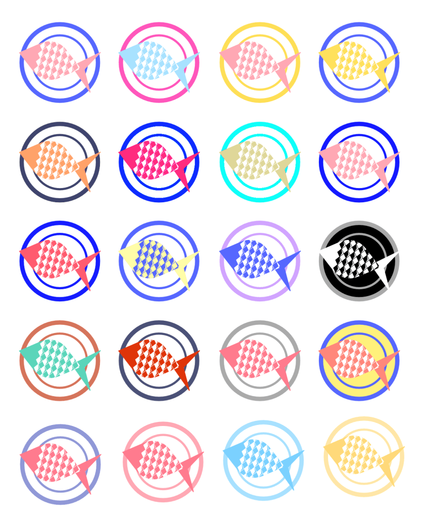
I was looking to create as many different variations as I could. I was trying to keep in mind what the exercise said, if food is depicted it needs to look appetising. I tried to stay away from non food colours for the fish. I did one where the fish is sort of green/mint colour, but this definitely didn’t work. I dound an approach towards the end of making the illustration all the same colour but different tones of the same to create a bit more depth and make the plate and fish readable as separate elements. I think this is a good approach for this as this way the restaurant will be able to make the logo of any colour of their choosing and maybe even use a variety of colours based on branch or different areas of their marketing collateral.
I think I managed to come to a cool little illustration that I believe fulfils the brief well enough.
I wanted to try this out on a menu to see how this would work in a real world scenario.
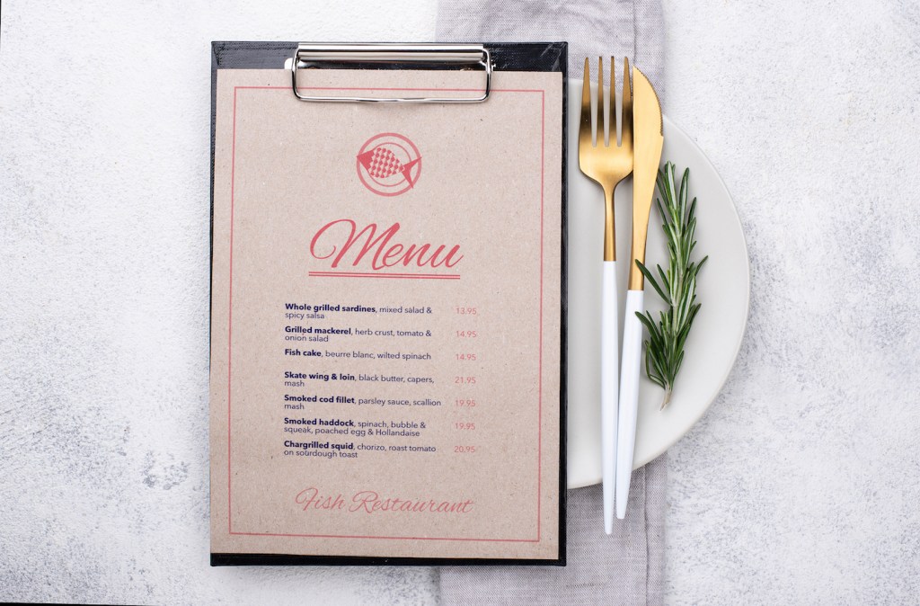
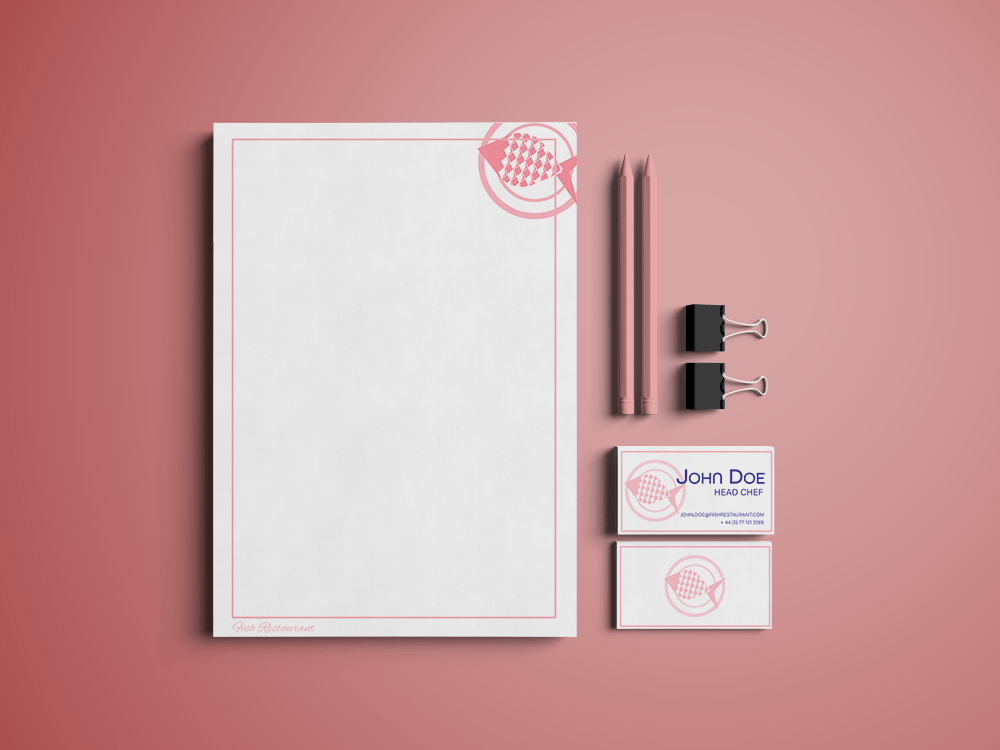
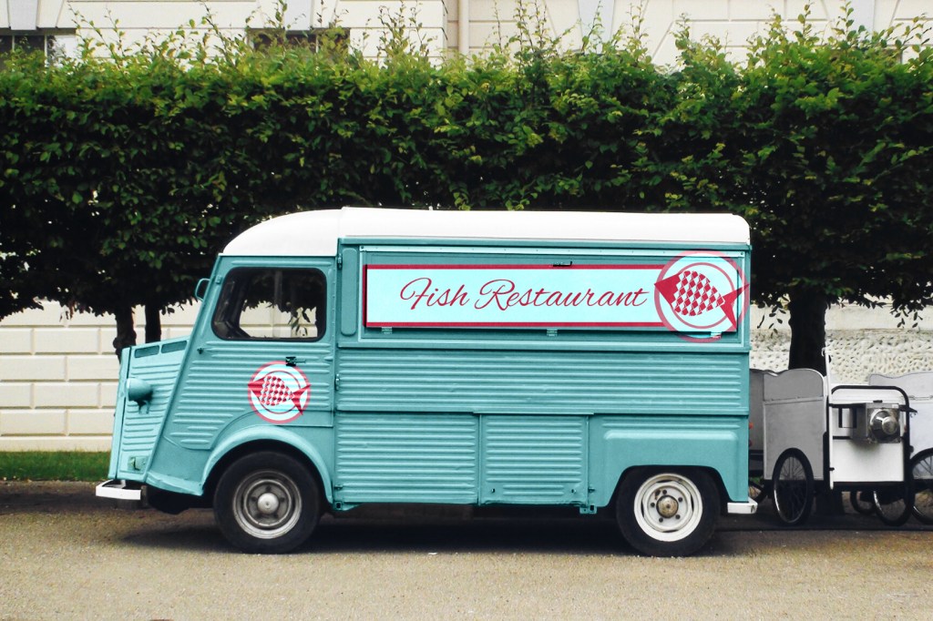
Reflection
I started this exercise with another slight misdirection. I should really pay more attention to the briefs, because I feel like I am wasting effort doing things that don’t really contribute to the end product. That said, I feel like the first half of what I done served as a good warmup exercise and the logo I created is pretty cool, even though I was not able to use it for this exercise.
I am happy with the final outcome of this exercise, I think I managed to create a logo that is memorable and true to the brand guidelines set out in this exercise. I am quite proud of how the mockups turned out as well! I think they really bring the logo to life.
