
You have been asked to produce three illustrations be used as part of a series of A3 posters to publicise the museum to the following audiences:
Child aged (5–9) Teenager (13–16) General adult audience
The museum wants to encourage diverse sections of the population to visit and to perceive it as a place of interest. Select one object for each of the audiences and create an image centred around that object in a way which you think best presents it to your market. Go to your local museum or anywhere that has a range of interesting artefacts to gather good visual references. Choose exhibits which are either appropriate for each of the audiences or which you think can be made interesting for the audience through your visual intervention.
Catalogue the exhibits in some way: photograph them, do printouts or make a series of drawings. Organise your images according to the audience groupings.
You are making three illustrations for three posters from the same institution. Will they be a ‘family’ or very different? If they are all different how will the audience know they come from the same place or doesn’t this matter?
Decide on the visual approach you would like to adopt. Do you want to introduce a character and create a visual narrative? Do you want to make a decorative interpretation of the object? Do you want to place the object in the historic or geographic setting in which it was created? Do you want to depict the object to convey some aspect of it that you feel will be interesting to your audience? Will you choose an abstract, representational, or diagrammatic approach? Remember to consider viewpoints and explore the best position for your content within the format. You don’t have to be bound by direct representation of your object but it should be recognisable.
Explore options and make notes in your learning log.
Choose the media and colour range appropriate to your audience – but avoid generalisations and stereotypes.
Working to a scale that best suits you, produce colour visuals for all the posters – remember that for a poster you’re aiming for visual clarity and directness. Posters are often read from a distance so your image needs to be reasonably bold.
Prepare finished artwork for at least one of the posters.
OCA Key Steps in Illustration
Due to the current real life situation, I was not able to go to a museum to do my research and find things that would serve as a subject of my posters. Instead I needed to do my research online.
Luckily as a response to the pandemic, many museums started to move their exhibitions online.
The Victoria and Albert Museum always has interesting exhibits, so I decided to take a look at their website to find the artefacts that would serve as the basis for my illustrations.
I quickly found a collection that peaked my interest, the Glasses exhibit (an online exclusive) seemed like a perfect candidate for this exercise. I will play with the thought what if the exhibition was on in the physical location of the V&A and will need to first further analyse my target audiences to see if I can come up with somethig that fits all 3. I think this will be challenging, especially for the little ones, but I will do my best to make this appealing.
First off, I needed to brainstorm about what my age groups would be interested in and what they respond to.
Children (5-9)
To be frank, I don’t know very much about this age group, because I don’t have children myself, but I think from seeing my nephews and nieces growing up, I have a vague grasp of what they respond to.
- Bold colours
- fantasy characters
- playfulness
After these 3 things, I kind of ran out of ideas so I started to do some research online to see what I can find in terms of advertising to children and what content they enjoy. I found a super interesting article regarding the topic here: https://www.theatlantic.com/technology/archive/2017/07/what-youtube-reveals-about-the-toddler-mind/534765/
Toddlers crave power. Too bad for them, they have none. Hence the tantrums and absurd demands. (No, I want this banana, not that one, which looks identical in every way but which you just started peeling and is therefore worthless to me now.)
The Atlantic
I found the above very interesting indeed. It is not something I thought about before in depth, but there is obviously a lot of psychology behind all the advertisement that is put out there for children. I think I will look at some toy adverts next to see what commonality I can find between them. From the above article, (although I realise it mostly talks about toddlers which is just age group below my target audience) I added the following things to my list:
- Being in charge of what’s happening
- Surprises
Next I looked at a website called verywellfamily.com, a parenting advice resource. I think this might be the key to understanding better what the specific aged children would find interesting by understanding them better from the development point of view.
Children this age may also increasingly express a desire to choose their own clothes, wash themselves, and comb their own hair. Parents can encourage this independent self-care and offer some guidance. You can let kids wash themselves but “help” at the end or suggest a sweater and tights if it’s too cold to go to school in just a favorite frilly skirt, for instance.
https://www.verywellfamily.com/6-year-old-developmental-milestones-620703
The above part really grabbed my attention, because I thought maybe the glasses exhibition can also play to the need of the child to express themselves by the means of clothing. This was something that I would have considered for the teens age group, but I think this makes sense. Maybe, I could mix this with some fantasy elements, to make the poster more playful.
Colours
When thinking of kids of any age, I am thinking that bright colours will be the best way to go. Obviously I will try to make this tasteful still, but I think this will be the way to go. I looked into what colours appeal to children the most, and found this to be supported by studies.
Bright colors catch young children’s eyes because they help kids to distinguish objects from one another in their field of vision. Children spend more time looking at bright colors as opposed to looking at muted shades or pastels.
https://sciencing.com/do-bright-colors-appeal-kids-5476948.html
I will probably need to look into colour psychology as well when I am selecting my colours, but for now, I know that I will need to look amongst the vibrant prime colours when designing the poster intended for this audience.
Exhibits found that may work
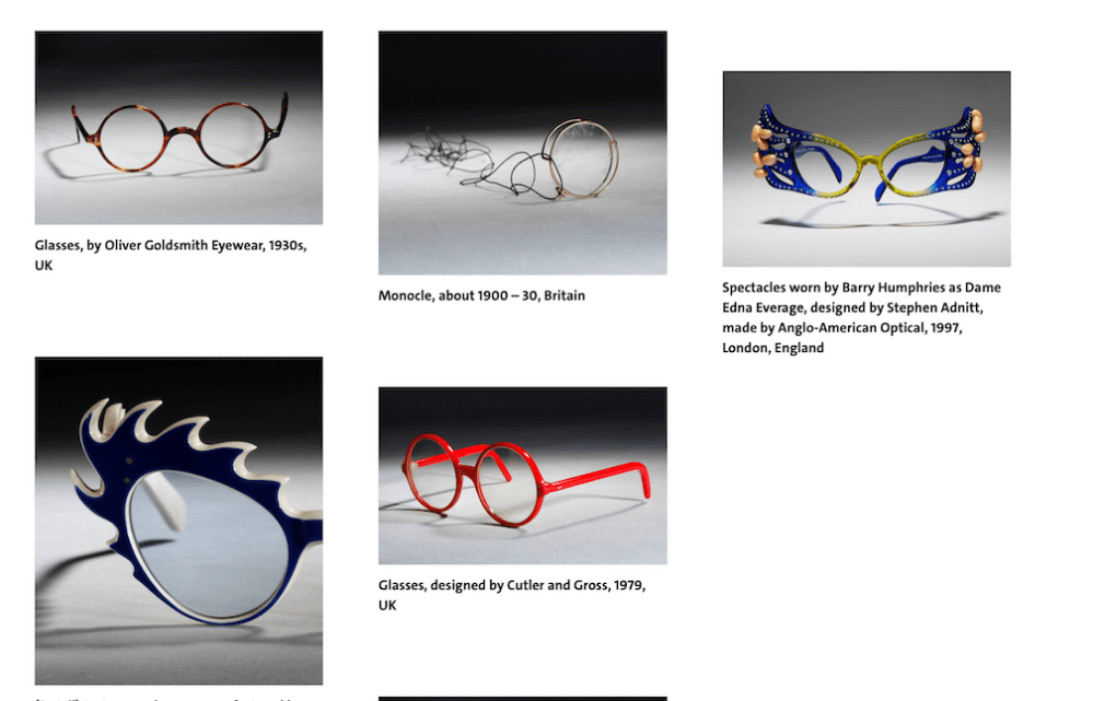
Even though glasses are not something that would be too interesting to children at first glance, I think there are some interesting pairs here that would peak the interest of children, teens and adults alike, so I have included this in all 3 age groups.
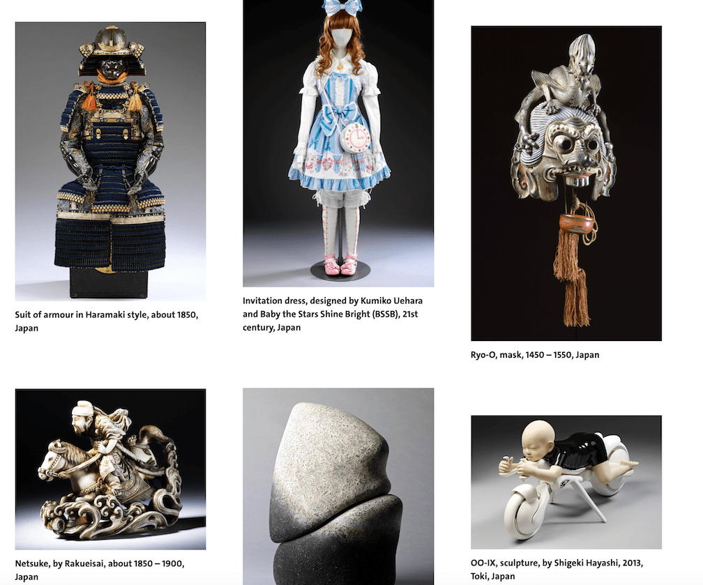
In a similar vein, I think the Japan collection would have objects that are attractive to all of the 3 age groups.
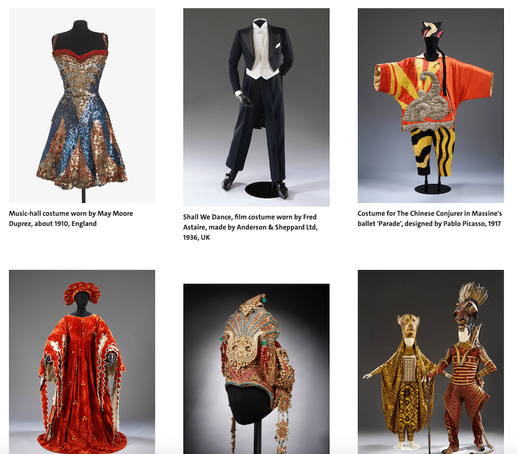
The costumes exhibition is another that I think I could make work for all 3 audiences. I am beginning to think, that any exhibition that would be interesting in this age group would most probably have pieces in it that could work fo the other 2. If I made my series based on one of the exhibitions, I think it would make a more cohesive series of posters.
Teens (13-16)
Teens are a totally different kettle of fish. From my experience with kids this age, I would say the following things would grab their attention:
- Celebrities
- Being cool
- Social media
- Friends
I looked at the same website as I think it is a really good resource when it comes to understanding the different age groups. After reading my resources I was able to add the following things to met list:
- Romantic relationships
- Video games
Sixteen-year-olds are entrenched in a social world that includes friendships and romantic relationships. They spend less time with their families and more time with their friends or dating interest, or they might prefer to spend more time alone than they used to.
https://www.verywellfamily.com/16-year-old-developmental-milestones-4171922
I think the above quote sums it up pretty well. It will be important to include the coolness and the individuality in this poster so that teens could see the exhibition as a tool of finding themselves and finding their own voice and individual style.
At this point, I had a really solid idea of what I wanted to do, however there is still an age group that I must explore.
Colours
When it comes to teens, I think the key is being cool and growing up. So, I think the colour palette will need to bee more sophisticated with the vibrancy toned down and going towards darker shades of colour with a pop of vibrancy here and there to drive the eyes around.
Sophisticated patterns and colour palettes are more appealing, and as they hit their mid teens, children, especially boys, start to show a preference for darker colours like black.
https://www.resene.co.nz/homeown/use_colr/colours-for-teenagers.htm
Exhibits found that may work
- Glasses
- Japan
- Costumes
General adult audience
This audience is basically anything goes. I think because the this is such a large category and potentially has so many different type of people in it, it is quite difficult to find commonality.
The best approach for defining what this person might be looking for, is probably if I imagine what the above said child/teen’s parents would be looking for in a poster.
I think generally when it comes to parents they would mostly do this for their children, but again, they would need to find this appealing too as they will most probably drive the visit to the museum. The children will not be able to make this decision on their own.
As such, I think an approach where the exhibition is made to look interesting maybe combining elements from the other 2 to convince parents, while peaking their own interest too.
Colours
Again, a sophisticated colour palette will help. I think this will be quite close to that of teens as I don’t see this as an entirely different category but more as an extension/evolution of the previous one.
Exhibits found that may work

Others that may work from the other categories:
- Glasses
- Japan
- Costumes
As a conclusion, I think maybe the adult audience is the only one that would be interested in some exhibitions that the other two wouldn’t care for. As such, I think I would like to base my posters on some of the exhibitions that are featured in all 3 age groups, to have a thematic connection between the posters.
Sources:
- https://www.verywellfamily.com/child-development-overview-4172261
- https://sciencing.com/do-bright-colors-appeal-kids-5476948.html
- https://www.resene.co.nz/homeown/use_colr/colours-for-teenagers.htm
V&A Style
Next I wanted to look at some posters that were used by the V&A to see what sort of things they normally go for. I think this might be a good phase to gain some insight into what the museum’s design aesthetic is like, and also gain some visual stimulus for the next part of this exercise.
Looking at these posters I have observed a few things that is almost always true to V&A posters.
- The logo is always prominent
- limited colour palette
- Use of photography and graphical elements interchangeably
Sketching
Initially, I wanted to explore the glasses exhibition that first peaked my interest to see if I could make this work for all 3 of the audiences.
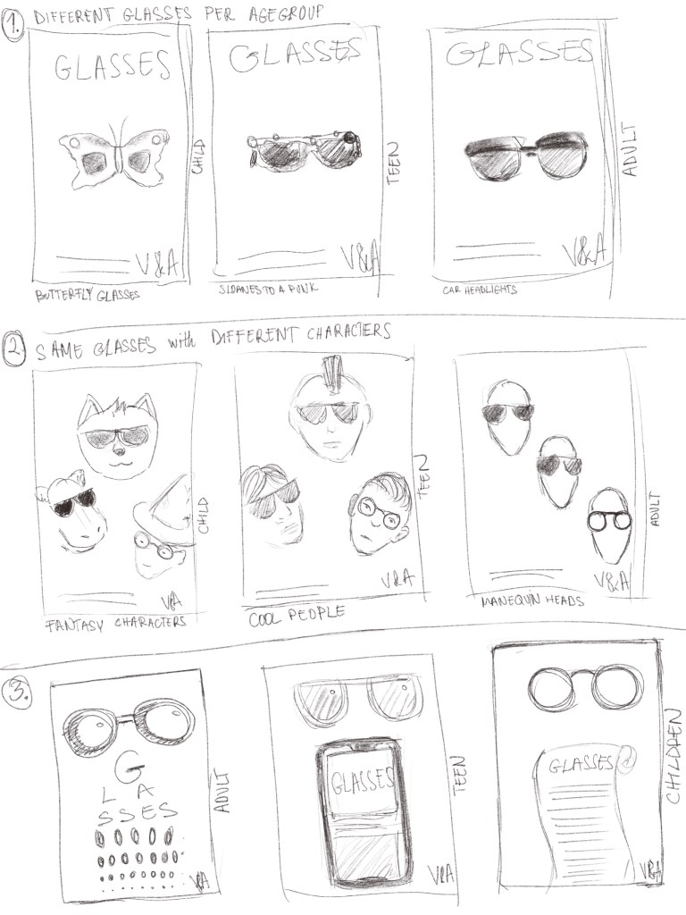
I wanted to look at the series as one and create similar layouts for each while keeping the idea that it should be appealing to the intended audience.
The first series is simply depicting a pair of spectacles that in my opinion would intrigue the audience in mind.
The second, I was thinking that the glasses could be the constant, but I could add characters behind them that would make the poster speak to its intended audience.
The third series, I thought a I could play with the function of glasses, so therefore there is something that poor sighted folk would need to get glasses for. I think this is quite playful, but not sure if it would translate to a poster.
I decided to go with the second idea because I feel like this is the strongest concept. I think I can make this work.
I was thinking about this and because I was really inspired by the style of Nadia Flower in my previous exercise I thought I could do something similar, where details are added to a photograph digitally to add further context to it. I think this would be quite interesting and cool fitting the V&A’s design aesthetic.
I was slightly concerned about using images from the V&A website as they are copyright protected, however I think in a real life scenario I would probably be provided these if I were to be appointed by the museum to create a poster for them, I would be able to use these and since I am not using this comercially, I think it will be ok. I will link all the photos used in the sources section of this exercise.
I begun the whole process by finding the spectacles that I believe show the range available at the museum and look visually interesting.

Butterfly (Sunglasses) 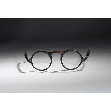
Tortoiseshell Glasses 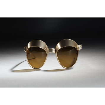
Car Headlights Sunglasses
I decided on these glasses because I thought they show a nice range of glasses that are part of the collection and also I think represent the 3 age groups in some way.
I started by cutting out the glasses digitally so that it is easily usable in my poster. Once I had this done, I wanted to start with the adult poster, because I thought this will be the most straight forward.
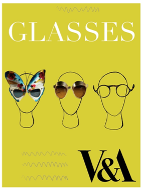
For this poster, I wanted to just use sort of mannequin heads as I think these are really easy to draw and also because of their blank quality, they would work for the more general adult age group. They don’t represent age, race or gender, so therefore the viewer can project their own personality.
Next I wanted to create the child age-group poster. For this I had a strong idea what I wanted to do – I wanted to create playful characters to appeal to the 5-9 age group and had the idea to use strong colours too to make the poster eye-catching.
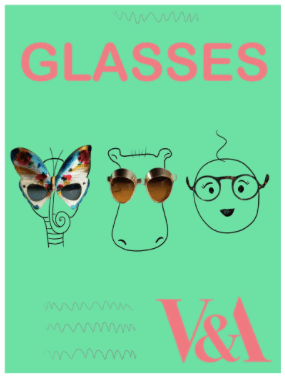
I think creating the little characters definitely helps cement the idea that this is aimed at children. I didn’t quite follow the research about using the primary colours, however I feel like the colour palette I managed to find was pretty eye catching and playful.
Next, I wanted to make the hardest of the 3, the teen poster. I think this is difficult because teenagers are notorious for not caring for anything. I think my best shot here is to create some cool characters that teenagers would identify with.
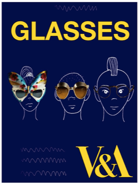
I wanted to use a darker colour to make it appeal to the age group, as according to my research they respond to darker colours. I think this is still pretty eye catching, but the characters are pretty generic. I tried to create them to be cool and relatable for this age group.

I think these are mostly successful in fulfilling the brief. I had some minor issues with them all, like the colour of the text, but I think they are overall look like a family of posters and are recognisable for the relevant age groups I believe. Something I haven’t mentioned above, is that I have changed the fonts between posters as well to make them more appealing to the relevant age groups.
After looking at my posters and discussing them with friends and family I decided to work on the poster for the adult audience. This was by far the simplest, but I think it spoke to most people because of its simplicity.

I looked at some other V&A posters to see how they normally lay them out and I tried to mimic this but also paid attention to what was working well for this poster.
Reflection
I think the end result is pretty good. I like the simplicity of it. To be honest, I think it is one of the strongest posters I have put together so far. This is probably due to the fact that I strongly connected with the content and done quite a bit of thinking in terms of what would work for the different target audiences and thought about the client as well. I think I done some pretty well rounded research and this has led to a pretty solid end product.
During this course whenever I use collaging techniques I always feel like it is a bit of a cop-out, but I really enjoy mixing mediums because I feel like it is really modern and can be really appropriate depending on the topic. I think for this topic it worked well, because the it is showing the actual objects that can be viewed in this exhibition. I could have chosen a different style but I think the outcome would have not been as strong or as on brand for the client and therefore I feel like this was the right approach. I am pretty proud of the outcome.

One Comment Add yours