
Find a range of illustrators who use a particular medium. You may focus on the traditional such as pencil, watercolour, paint, gouache, coloured pencils, oil or acrylic paint, coloured pencils, collage, prints or on the more obviously digital processes – including digital collage, photography, digital drawing and painting.
Catalogue the illustrators according to similarities in the way that they use tools and materials. How do they distort or exaggerate the representation of elements in their work? How do they communicate through use of metaphor or symbols?
Choose one image which you most appreciate visually. In your learning log write about the way that the illustrator works. It often helps to begin by describing a picture. Ask yourself questions as you write such as: How is the image composed? How are colour, tone, and texture used to evoke mood or convey an idea? Has the illustrator distorted the content within the imagery and how does this work for the purpose the image fulfils? Go back to a visual you created for an earlier exercise and now render it using the same tools and materials as your chosen artist.
Now choose a very different artwork and repeat the process.
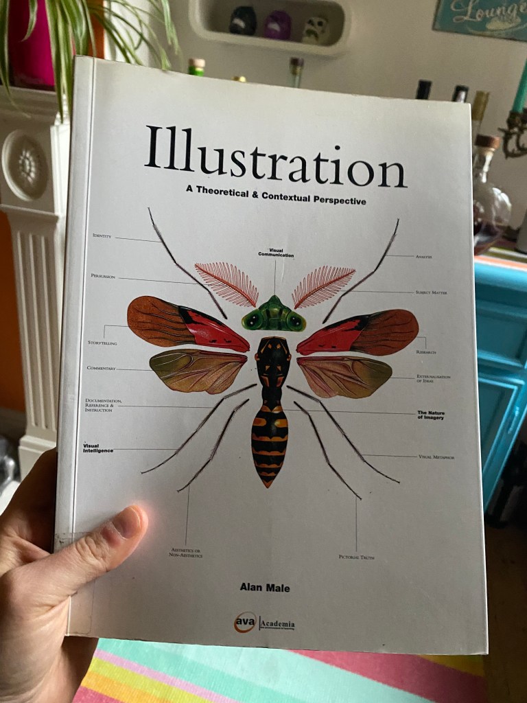
OCA Key Steps in Illustration
I started my search in a couple books I have as I didn’t want to always result to using the internet when doing research.
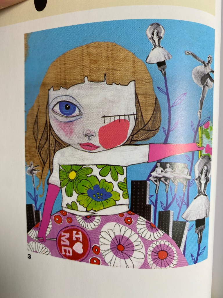
I started reading the book but quickly realised that for this particular assignment, it is probably better if I look online as the book is not likely to feature many pieces by the same artist, but I found a few pieces in here that I quite liked and decided to use as the basis for my investigation. I found out this way about Fey Dodson for example. I really liked the below piece, but was not able to find any more of her work online.
After this, I decided to put the book aside and try to find illustrators who’s work I can properly analyse by having access to more than one image.
Next I started to look through a website called IllustrationX that was recommended by someone else on the course. I found this approach much easier because artist portfolios are collated here and I can just browse countless artists’ work without going down rabbit holes.
First I wanted to look at artists that use watercolour. I used this a little recently myself and really liked the results so I thought it would be interesting to see how it is used by more established artists.
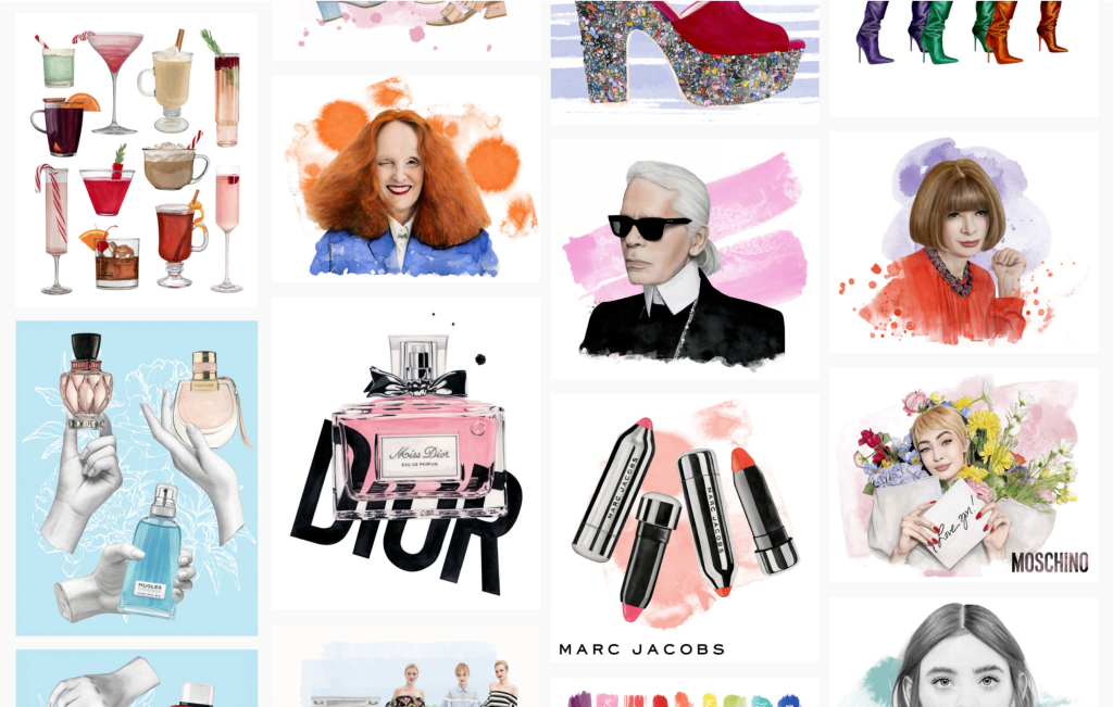
Dena Cooper 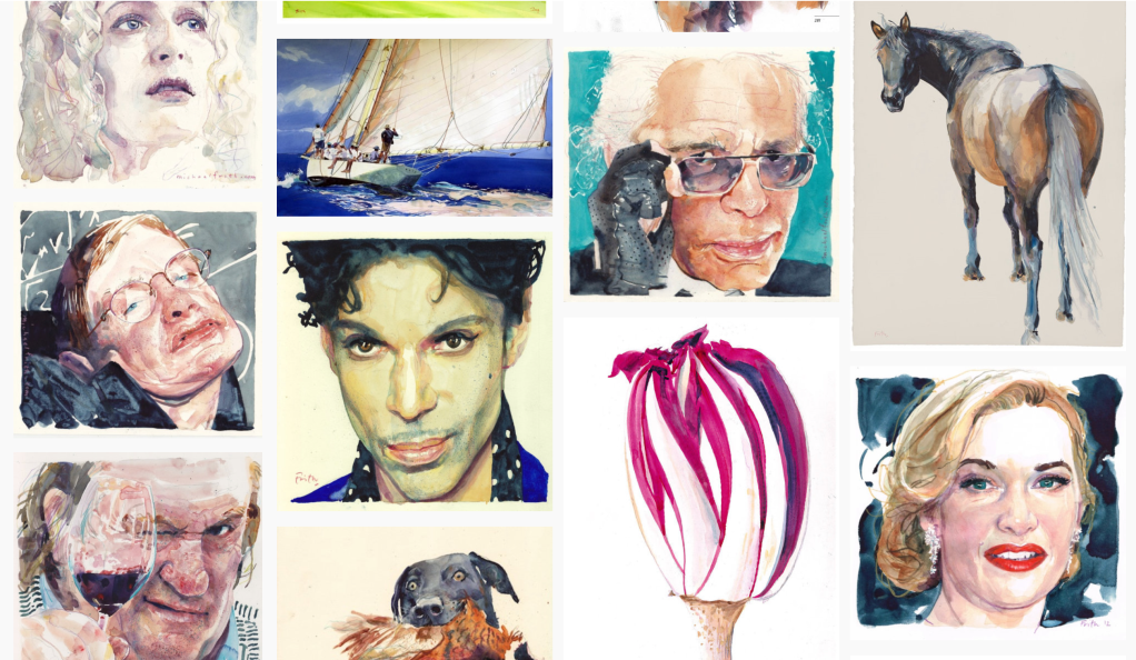
Michael Frith 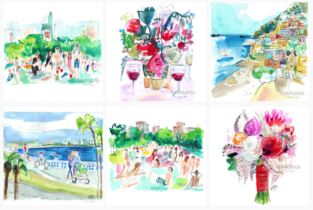
Martha Napier 
Jessine Hein 
Petra Dufkova
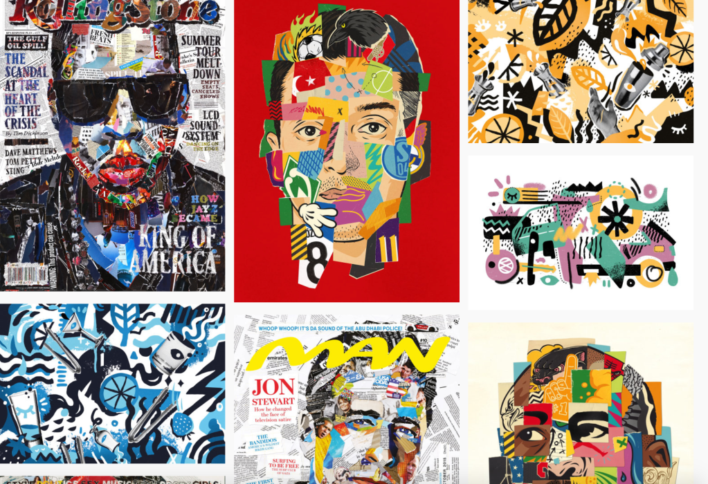
Next I looked at some illustrators that use collage as their main form of practice. This is something that always fascinated me as I think it is a very edgy and cool style.
Andy Gellenberg 
Danny Allison 
Frank Neidhardt 
Andre Bergamin 
Nadia Flower 
Tanya Cooper
Inspired by what I seen in the collage department, I also wanted to look at some illustrators that make their pieces by physically cutting out pieces of paper. This paper cutout technique seems laborious but produce a very tactile illustration as a result.

Annemarieke Kloosterhof 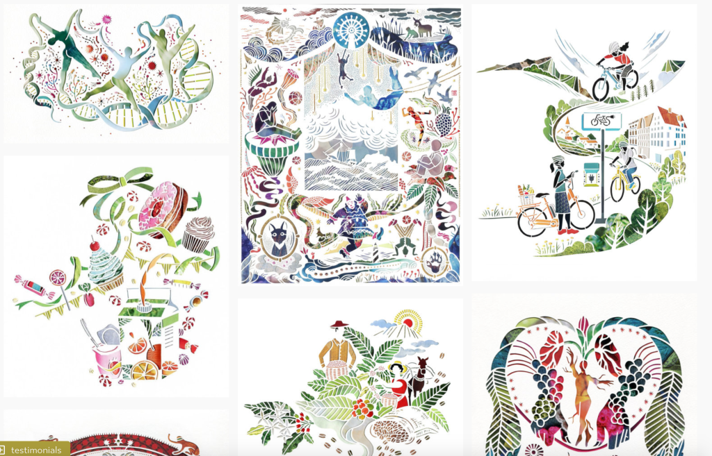
Mayuko Fujino 
Vicky Scott 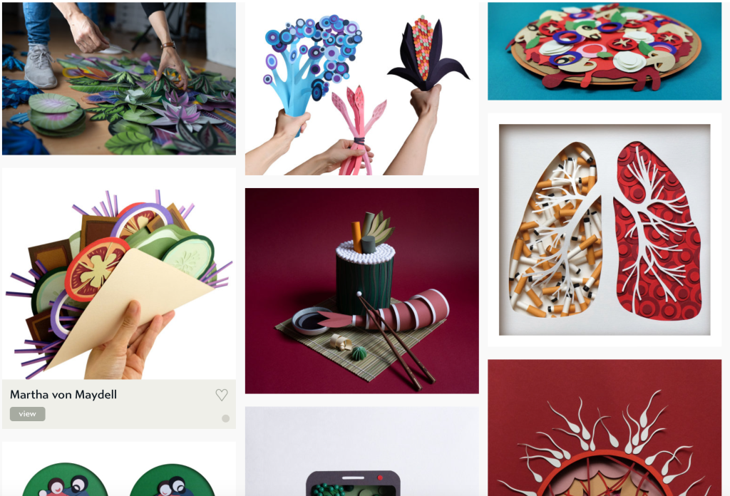
Martha von Maydell 
Gail Armstrong
I really liked these, and I respect the number of hours that must have gone into creating each of these pieces.
Next I wanted to look at the above selected artists individually to see how they use their respective styles and what makes them different from others in their category.
Dena Cooper
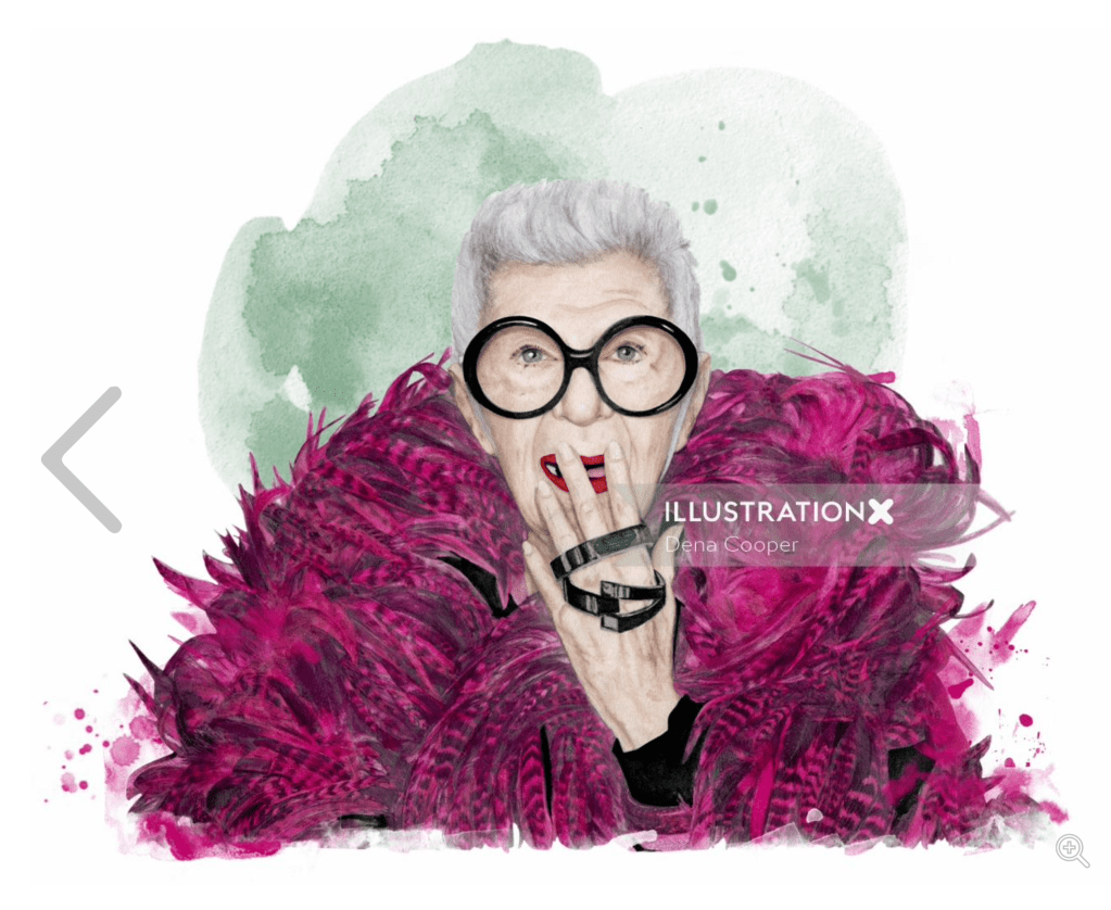
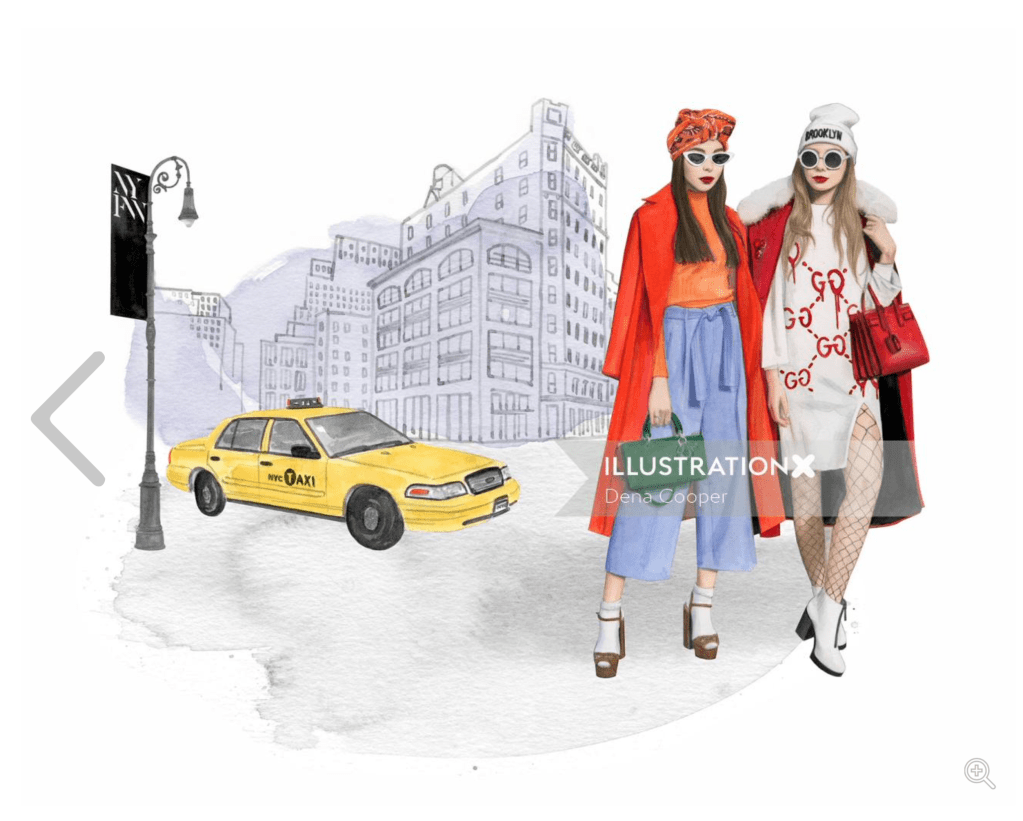
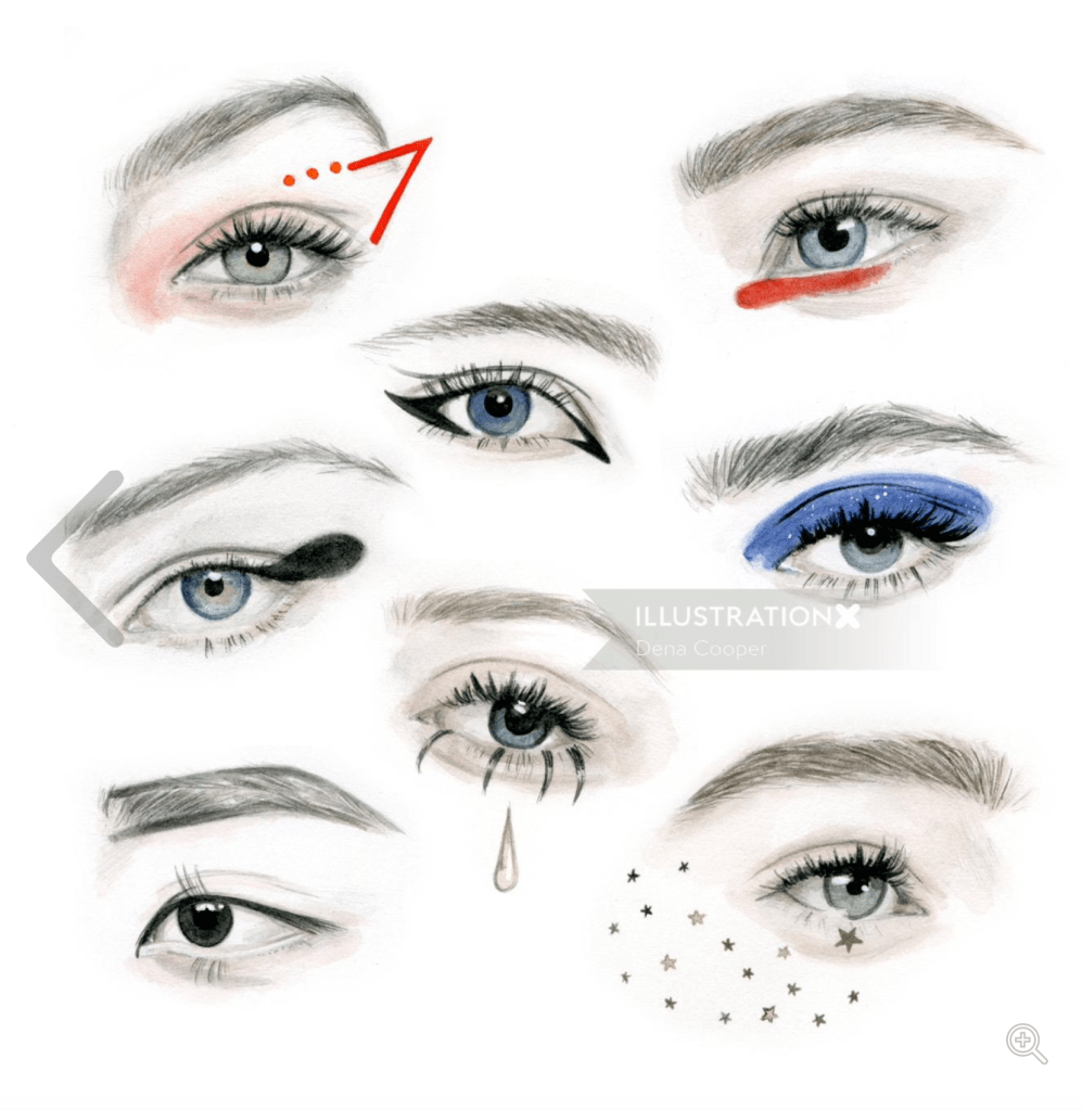
I really like Dena Cooper’s style. It is painterly but also employs some really strong details in places that make the illustrations have a very interesting juxtaposition between the material which is inherently have the effect that makes the works more painterly and the subjects that are usually seen in glossy fashion magazines.
Petra Dufkova

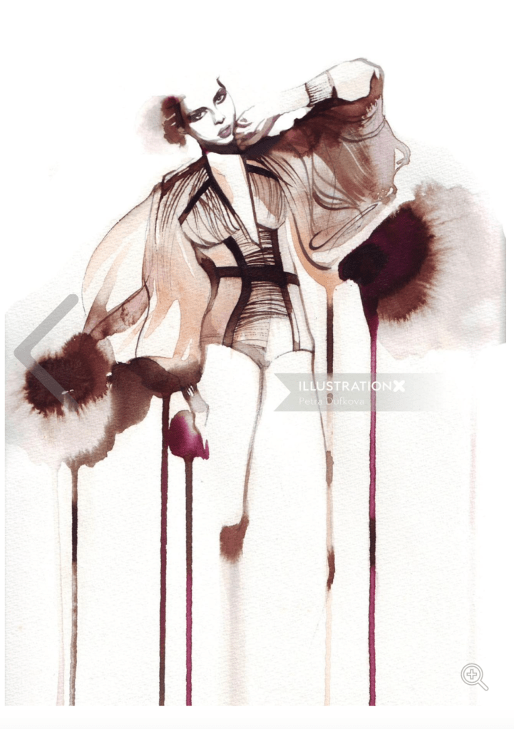
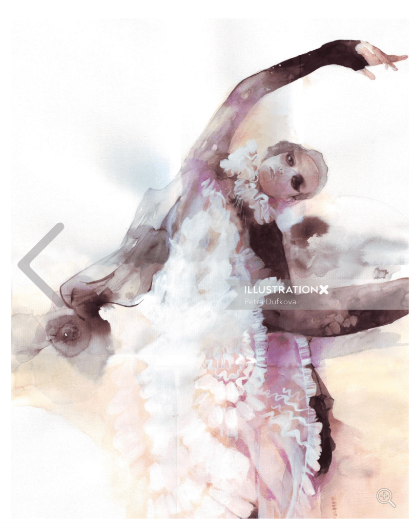
Petra Dufkova often mixes broad loose strokes with the tight details which creates movement and dynamism in the images she creates. They have an almost ethereal feel that is captured by the big blotches of colour. I really like the fact the closer you look the more you see the intricacies of her work.
Michael Frith


Michael Frith’s style is a little more rough a lot closes to the traditional watercolour style I seen before. His portraits are hauntingly accurate but the brush strokes and the usage of the paint is very apparent. He seems to be using the colour in its more concentrated form and therefore the contrast in his work is pretty high. At closer inspection you can see lots of different techniques used in his works such as splattering and scraping. I really like the boldness of his art.
Andy Gellenberg


Andy Gellenberg’s style is really bold. He uses interesting collaging techniques where he only uses fragments of the original artworks to describe his subject doing so very effectively. His youthful style is very eye-catching and makes you wonder about the process and spend some time deciphering what you are looking at. I like the way the strong colour choices make his work almost psychedelic.
Tanya Cooper


Tanya Cooper’s style is very thought provoking and very bold. I love the way she plays with scale of objects to create a surreal atmosphere in her work. It is very playful and has a sense of ease to it but if you look closer you realise that every piece is meticulously planned.
Nadia Flower


I really like Nadia’s work! So fresh and has that coolness and edge I love in modern illustration. Her work mostly focusses on strong lines and doodle like qualities. It is super charming and refreshing. She oftenn customises goods of big fashion brands that are normally seen as super expensive and perhaps a little stuck up, and gives their products a much needed facelift with her playful scribbles. I find her style a little reckless and super refreshing. It shows that sometimes style can rule over technique.
Mayuko Fujino


Mayuko’s work is really interesting. Using paper cutting techniques and a lot of negative space in her work. She mixes a lot of different subjects of nature with fantasy elements to create these ornate patterns. She is using magazine pages as the material for her collages which gives her lillustrations a little more depth. I really like her style.
Gail Armstrong


Gail Armstrong’s style is super detailed and she seems to be able to turn paper into 3 dimensional works of art that are super fascinating. I think I would never have the patience to cut out all these small pieces. Her work is really inspiring nevertheless. The colours are really well chosen and they add to the playfulness of her art.
Focus piece 1
I found this image by Tanya Cooper very fascinating. I really like her style so I decided to focus on this for my first style.

This digital collage depicts a woman wearing designer clothes, such as Louis Vuitton and Burberry and the other 2 women are much smaller in size compared to her. This is probably eluding to her status in society. The other 2 figures seem to be seamstresses and are quite small in relation. I think this might be making a reference to how the workers in fashion, the ones that put the garments together often underpaid and have a much lower social status than the people these products are aimed at. The composition also reinforces this by putting the main figure front and centre where the other 2 figures are to the side being very much secondary. Even the tools get more emphasis than the workers. There is a strong contrast in both the colours used and the way the artist mixes the hand drawn elements with the collaged images. The background has strong references to chinese culture. The clouds are like those in oriental cloud tattoos, this further enforces the idea that this scene is set in China. I also looked at some of her other work, mixing stong colour and black and white photographs seems to be a staple in her repertoire.
I am thinking that maybe some of the images I used in my Illustrating Visual Space exercise might be good to rework for this exercise. It would also be interesting to create the same image in another style that I am yet to choose. I think I want to chose something that is as far from the collaging technique as possible so I will probably choose a piece from one of the watercolour artists.
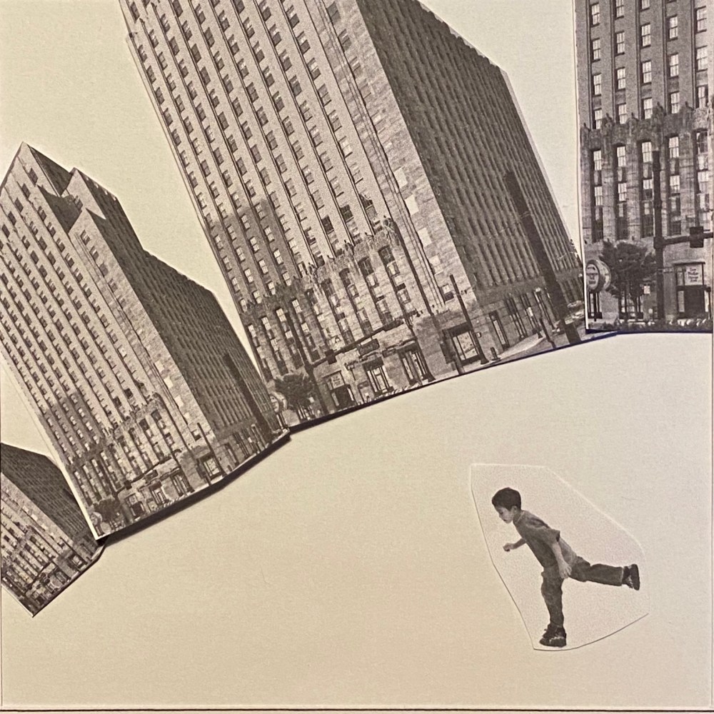
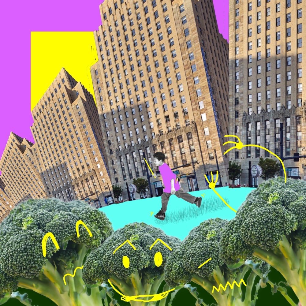
I initially tried to keep my illustration as close to the one I conceived back in Illustrating visual space as possible. I was working digitally so I could play with the cutouts quite easily. I was asking myself the question why is the boy running? What is the context of this image? What’s the message? Then something hit me, the trees looked a lot like florets of broccoli so I decided to do away with the trees and introduce the broccoli instead. I think the image had a totally different meaning instantly. I quite liked this humorous take. I think it is also in line with how Tanya creates her illustrations, however I noticed that her collages normally have quite a bit of negative space around the edges. My illustration was going outside of the bounds of the frame which worked well for this illustration in my opinion, but I wanted to see if I could make to it emulates her style more by changing the layout slightly.
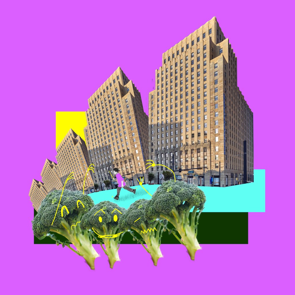
I think this definitely changed the dynamics of the image and made it more interesting. Maybe because you can see the whole of the buildings and therefore you can appreciate the scale? I quite like my final illustration here. It came together rather quickly, but I think it worked for this exercise.
Image Sources
- https://dissolve.com/stock-photo/Children-royalty-free-image/101-D1028-65-727
- https://www.6sqft.com/a-first-look-at-walker-house-newarks-historic-bell-telephone-building-conversion/
- https://www.gimmesomeoven.com/how-to-cut-broccoli/
Focus piece 2
For my second focus piece, I wanted to choose a very different style so I decide to go with the below piece from Petra Dufkova.

I chose this, as I thought trying to illustrate the same thing in a watercolour medium in her loose style would be an interesting exercise. I also wanted to challenge myself to do this using some traditional mediums.
The above illustration of a cityscape is really interesting because of the softness of the watercolour combined with the hard lines of the buildings creates a nice contrast. I like Petra Dufkova’s signature style whereby she makes parts of the illustration look like they are unfinished. I like how she plays with the shapes of paint blotches that could look like a mistake, but in her paintings it resembles something that very much meant to be part of the picture. In the above example the watered down paint creates the waterfront in which the buildings reflect. I really like the simple deliberate paint strokes of the buildings, they exude confidence and strength. The limited colour palette really works to emphasise the greyness of cities with the yellow accents really tying the whole picture together. The accents help your eye travel across the picture in a circular motion that keeps you engaged for longer.
I started by using a flat brush to emulate the way she blocks in colour and added some details on top of this. I kept on looking at the above image and tried to emulate as many small nuances as possible to make the image resemble her style
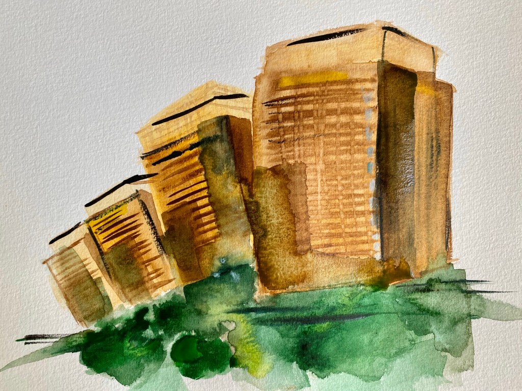
I was then trying to make the bottom half of the image a lot looser to resemble her loose and expressive style. In my piece the blotches of paint were resembling shrubbery rather than water. I think the end result is pretty good, although I lost the boy that was part of the initial illustration, because when I started to paint him in, it looked very childish and frankly awful. I think my use of this medium is still not where it should be, but I am pretty pleased with the illustration overall. What I also noticed that I was able to make this picture in about 30 minutes, however the whole process took me much longer because I needed time to set up and clear up after myself which is something I don’t have to do when painting digitally. This is just another reason why I prefer the digital media. Although I normally reach to use digital, I think I would have not been able to create such a loose and expressive painting that way.
Conclusion
This exercise was pretty interesting. I think it shown me that you can use the exact same subject for your illustration, but the style that you choose to do this is equally as important as the subject itself. During this exercise I think I also gained a better understanding of how some contemporary artists create their pieces by analysing their work. I think it is going to be crucial for me to start and look at other artists more in depth while trying to find my own voice. I like the pieces I created, because I don’t think without looking closely the observed art I would have come up with similar pieces.
I guess I will need to try to incorporate this into my workflow by looking at artists that work with similar subjects/materials when coming up with concepts and choosing materials. I think I am definitely guilty of reaching for the digital because I find it more comfortable/convenient. I need to strive to introduce different styles and mediums to my workflow to find my own voice.


One Comment Add yours