
The brief
To design an illustration for a poster for a music event.
An Early Music concert, a Jazz evening or for a pop group. You can choose.The finished poster will be reproduced at A3 size, but you can work at the size, in proportion, that you feel most comfortable with. You will need to provide your working drawings – the thumbnails and visuals – with the finished piece.
The poster will include the title of the event, the date, time, place and any other information you think appropriate. You can either include this on your artwork or indicate where it will be positioned.
What to do
Start by brainstorming and create a moodboard. Produce a range of alternative thumbnails in which you consider viewpoints and various arrangements of the content you have selected.
Choose the two compositions you like best and create two line visuals. Don’t get bogged down by detail that doesn’t help you to describe the main structure and content of the image. If you are including type are you confident that you have chosen the right typeface? If you are not including it indicate where it will go. Check that when added it will neither get lost or obliterate or compromise your composition.
Take the composition you think works best and create a colour visual. Use your mood board to help you to establish a colour range to work within. Be selective.
Finally, produce your final artwork.
OCA Key Steps in Illustration
I had no idea initially what kind of poster I wanted to make, so I have decided to look up a list of the most popular pop groups right now as a starting point. I have no real interest in Jazz or Early music, so I wanted to go with pop as I think I will have a better point of view for this.
I was browsing this page for inspiration. https://www.ranker.com/list/best-current-pop-groups-and-singers/ranker-music

I found Panic! at the Disco at position 26 and decided to take them as a starting point. I loved their latest album; Pray for the Wicked, so I thought this would be fun to work with. They are a quite edgy pop-rock group with a very cool vibe which I think will be interesting to illustrate.
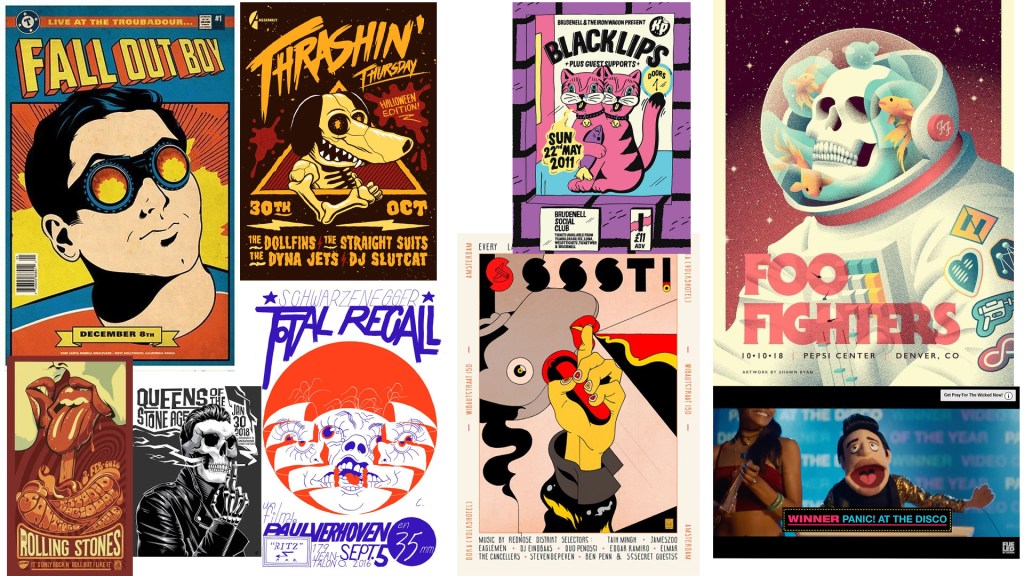
Next, I wanted to look at some concert/band posters for inspiration and collated them to a Pinterest board.
After having collated some of these posters, I had a strong vision in mind. I wanted to create something with strong colours and line-work that is sort of cartoony, like many of the posters that I have pinned to my inspiration board. I put together a mood board that would carry some of these elements.
I wanted to use this comic book cover-like style. I think it it’s really cool and would resonate well with what this band is all about. I liked the video for “Hey Look Ma I Made it” song and thought it would be interesting to maybe use the muppet version of Urie, this will definitely be easier to draw and I think it would land itself well on a poster.
I watched a lot of videos of the band also to be able to distil what they are about. I think this was a good idea because I got quite a few ideas.
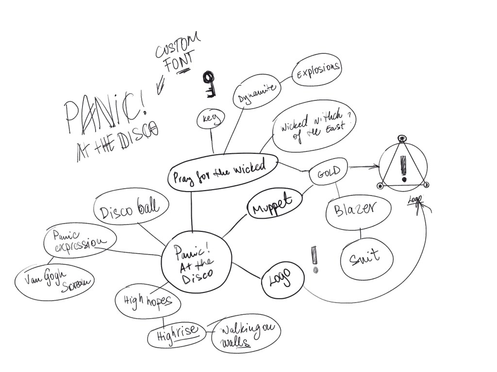
I had a few ideas in my head at this point which I wanted to quickly record in a form of some thumbnails.
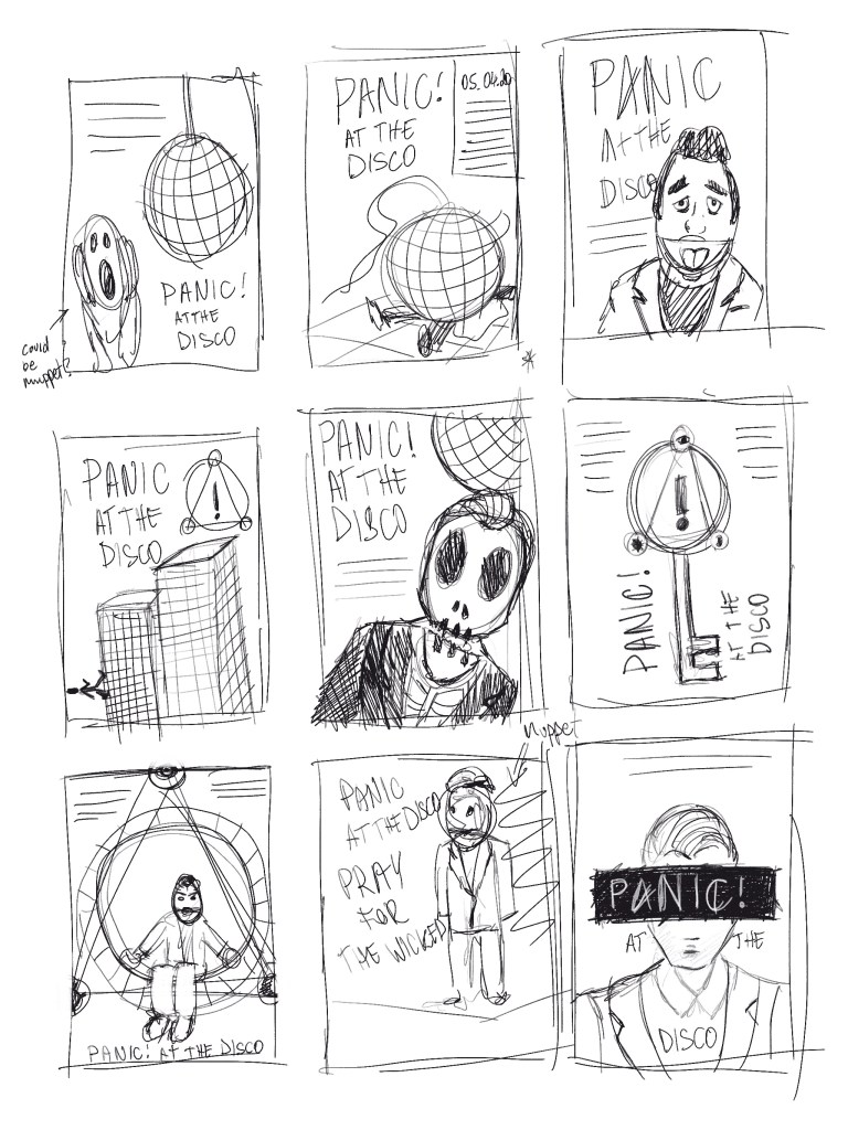
I wanted to create something slightly humorous and dynamic. I really liked the 2nd idea, as I think it would be pretty cool in the style that I had in mind. I decided to start by creating a visual for this to see what this would look like at a larger scale. My second favourite was number 9, however for this I would imagine a more subtle style with a more realistic drawing.

I really enjoyed the idea of no 2. I just thought it is hilarious and really resonates with the name of the band. If I can pull it off in that retro comic cover style I think this could be pretty awesome. I was excited to get started.
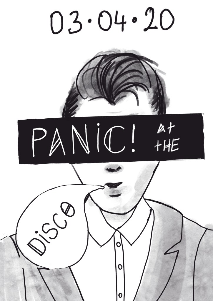
I proceeded to work on the poster by tidying the line work and deciding on the layout.
I found this really cool event poster and I was inspired by the colours.
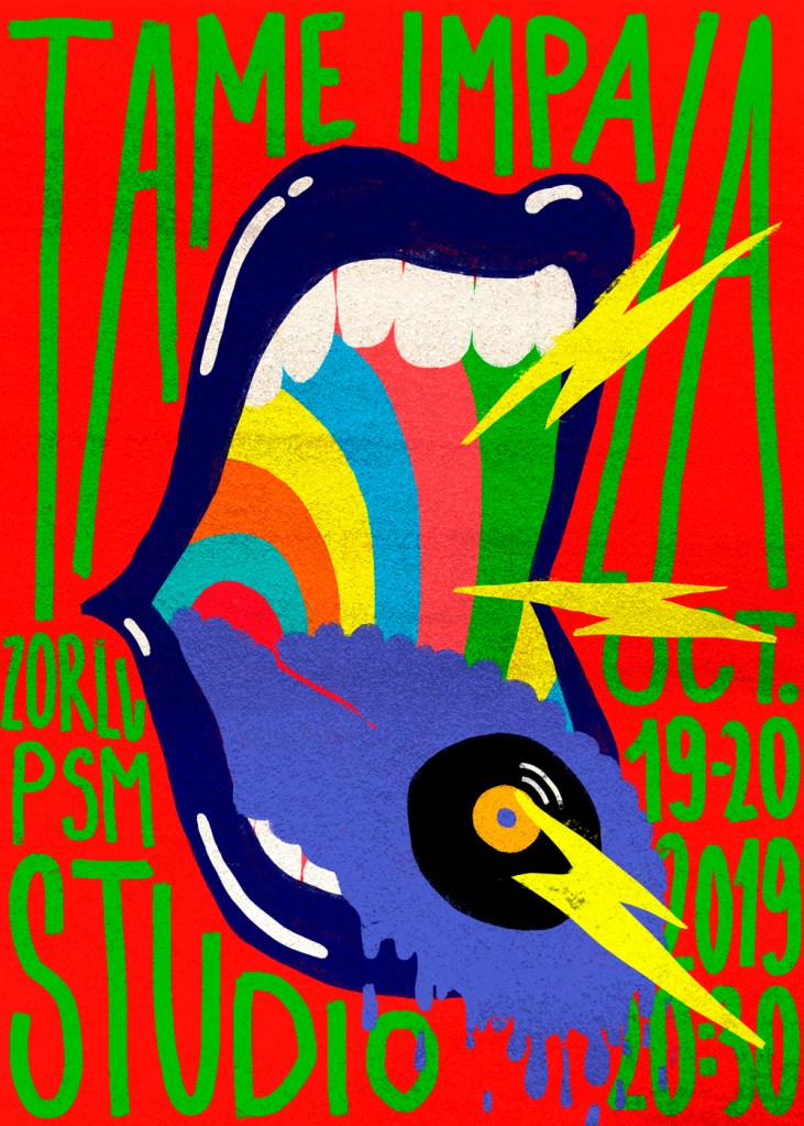
I decide to try to copy the colour scheme for my poster.

I didn’t quite like how this turned out. I think the original image is so effective because the colour blocks are next to each other and so they create this cool contrast but becauseI have the black lines separating the colour blocks maybe it is les effective.
I needed to try other colour schemes to see if something else would work better. I found this nice purple and yellow colour-scheme in a Blink182 poster that I really liked and decided to see if this works better for the poster.

I also realised that the hand written font probably doesn’t land itself quite well enough so I decided to just finish up the illustration on my drawing software and then try to add the text in my DTP software.
After I managed to find a colour scheme I liked I wanted to make sure that the font is working with the overall design and so I tried out a few different layouts and fonts until I found the below font and. layout.
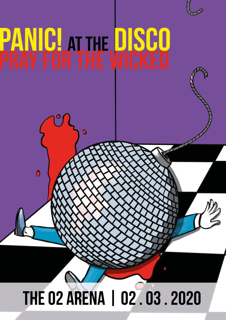
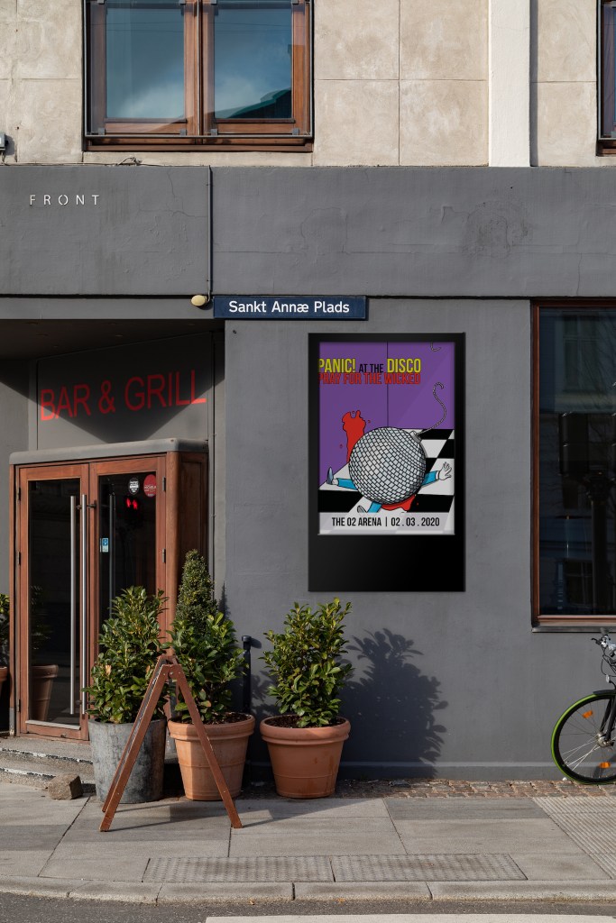
I think the poster turned out pretty well. It has humour and some grit, which I think resonates well with the band. I will try out what this would look like in a poster mockup so I can decide wether it is effective as a poster.
Unfortunately, I cannot print A3 at home and I am not able to go to the office due to covid-19, but I think a digital mockup will give me a good idea of what this would look like in a real world environment.
Reflection
I enjoyed working on this assignment. I think the end result shows this well. I believe I managed to create a brief for myself that was fun to do and shows my current level of skill. I think the drawing is not perfect by any means and doesn’t really look as nice as the ones I have seen in the posters during my research, however, I am pretty proud of the poster because I think it is pretty cool. I think changing the colour scheme and the fonts used was a good idea and as a result, I have achieved a much more effective end product.
This part of the course was very good at reminding me how to string all the different techniques together to come up with ideas and to be able to find the one that is worth pursuing.
Overall, I believe I became a better designer due to this part of the course because some things have just clicked. I think I am ready to invest more time at the research stage of projects which opens up a world of visual stimulus that leads to better designs. I just need to remember this; better research always means a better illustration in the end.

One Comment Add yours