
For this exercise you are going to mock-up a book cover. From your book shelves or the library choose a book title that appeals to you. Read the blurb on the back of the book (or the whole book if you have time). Examine the design of the cover to identify what the brief would be for the illustration and establish the function you want your image to perform.
You may already have done an illustration you can use or you may be inspired to make a new one. If you are using one you have already done you may need to modify it in some way. You may need to play with the colours, edit or adjust the composition or alter the size or scale. Don’t make changes to the original.
Either copying the design of the cover and adding your illustration or designing the cover from scratch, make sure that you incorporate the title, author and publisher’s details. If possible choose a paper for the mock-up as near as possible to that which would be used for real.
In your learning log note how well your image worked and any technical problems you had to overcome to make a convincing mock-up.
OCA Key Steps in Illustration
I feel like that this exercise is very similar to the one I had to do for Graphic Design: Core Concepts. (Link)
I first contemplated looking into creating new versions of my covers, however I didn’t feel completely inspired to do this. I then remembered that there is a special offer for audiobooks on Audible and decided to look at finding an audiobook, listen to it and create an illustration based on this.
I found this audiobook: Zero G by Dan Wells.
I really liked the synopsis of the story, so I thought this will be as good start as any, and started listening.
The s
Synopsis
It’s one kid versus an entire band of space pirates in this cosmic middle grade caper from New York Times bestselling author Dan Wells.
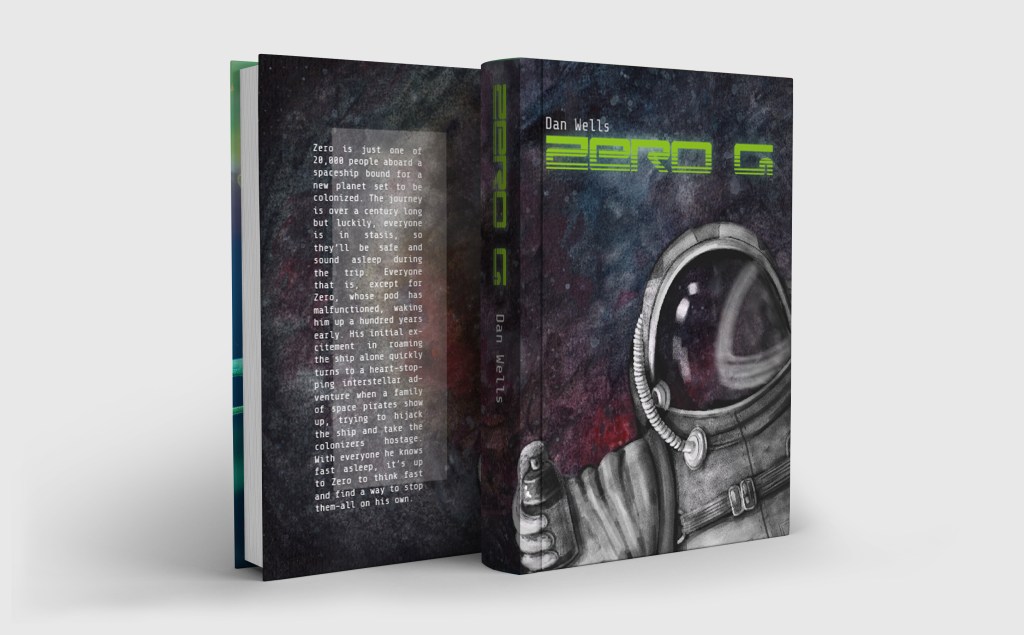
Zero is just one of 20,000 people aboard a spaceship bound for a new planet set to be colonized. The journey is over a century long but luckily, everyone is in stasis, so they’ll be safe and sound asleep during the trip. Everyone that is, except for Zero, whose pod has malfunctioned, waking him up a hundred years early. His initial excitement in roaming the ship alone quickly turns to a heart-stopping interstellar adventure when a family of space pirates show up, trying to hijack the ship and take the colonizers hostage. With everyone he knows fast asleep, it’s up to Zero to think fast and find a way to stop them–all on his own.
Audible.com
While listening I wanted to start gathering some visual inspiration to be able to start off on the right foot when it comes to creating the illustration so I started gathering space related images on Pinterest.
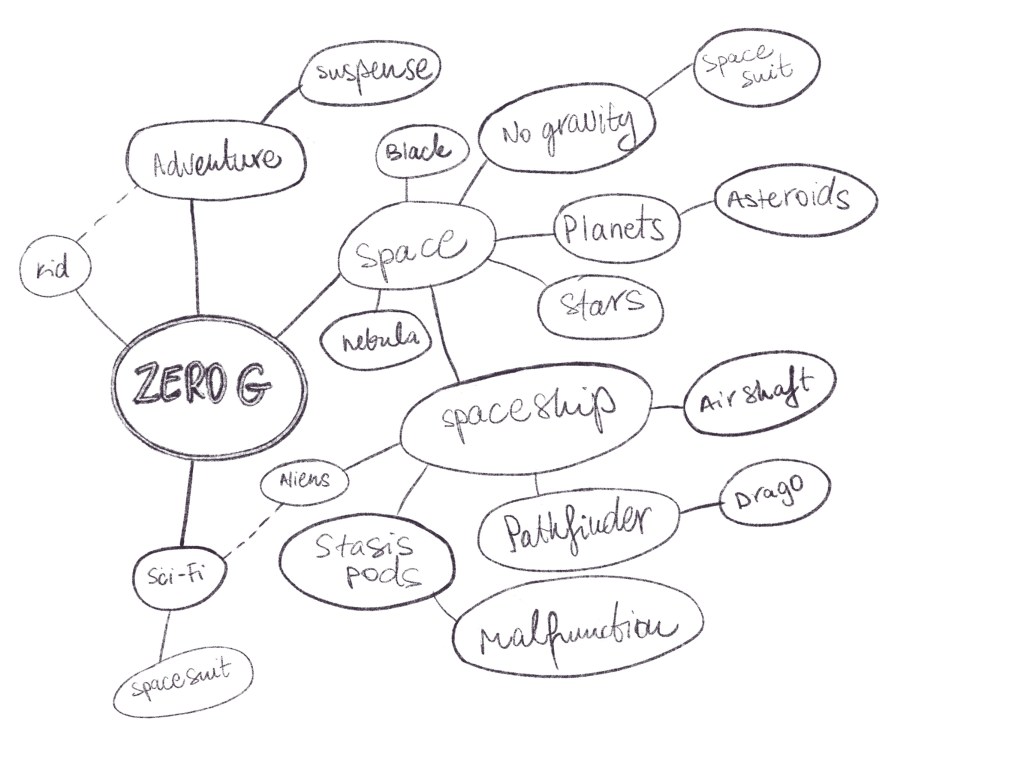
I also started a spider diagram to gather all the thoughts that came to mind when I was thinking about this book. I managed to gather quite a few topics, I thought this would be useful when looking for references to add to my mood/reference board.
After this I felt like I was ready to play around with some thumbnails.
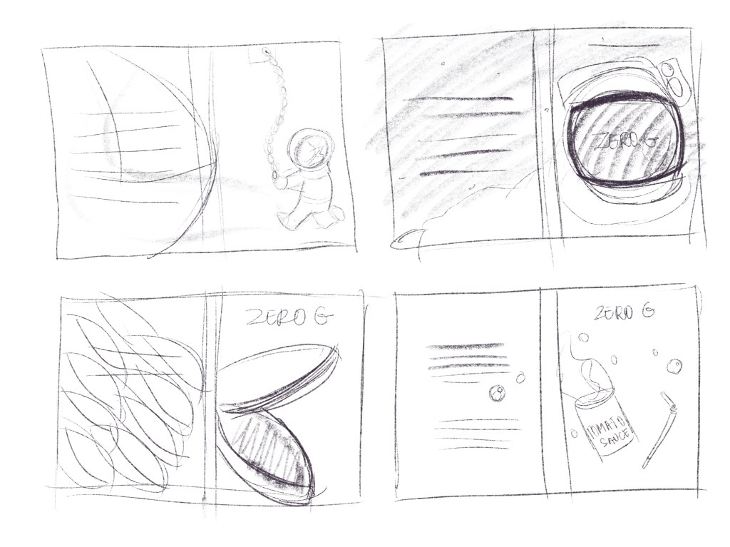
I wanted to cover the whole of the book with the illustration so I decided to include the spine of the book in the sketches to guide me with the layout. I wanted to focus the interesting part of the illustration to the right side of the illustration with less visually active side being on the left so this could be used for the back cover. I had some ideas with using the space suit as I think this would instantly elude to the content of this book, but also played with the idea of using things from the story that are a little more obscure.
I wanted to make this appealing to younger audiences as well, so I think the space suit is definitely something that would be more attention grabbing and to the point. It was also something that I could enjoy drawing I think.
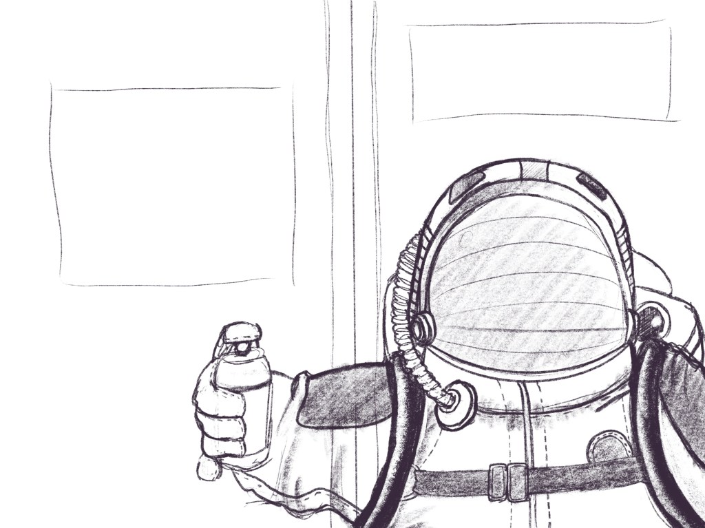
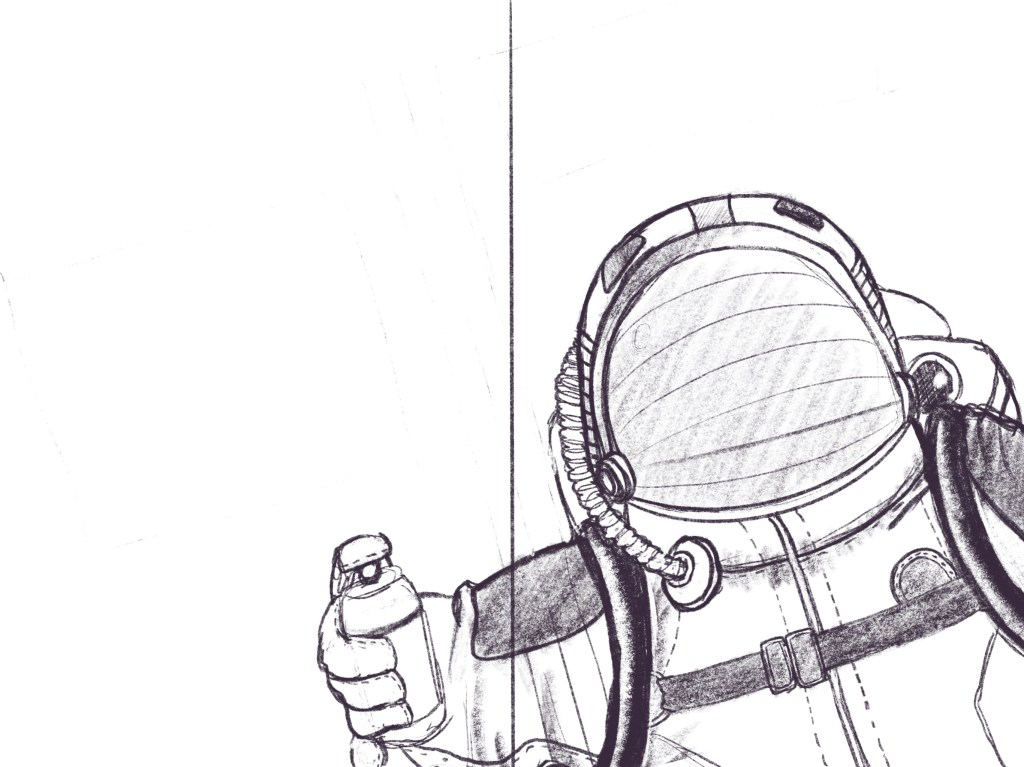
I was looking at all sorts of references to try to draw a somewhat convincing space suit. I though perhaps adding the spray paint would add a little further interest to the piece, as it is an integral part of the story but it is not a straight up obvious spoiler. I was pretty happy with the outcome, it looked suitable spacey, but comfortable, which was fitting with. the space colony kind of backstory. The only thing that sort of bothered me, was the staticness of the figure due. to its very vertical positioning, so I decided to try to shift the the drawing in the frame to see if a diagonal layout may work better.
I really wanted this illustration to be something special, and so I decided to start by painting a backdrop for the image. I usually leave this last minute, and just make it very simple, but because I wanted a really nice space backdrop, I decided to start with this.
I found a tutorial on how to paint nebulas on Skillshare and wanted to give this a go.
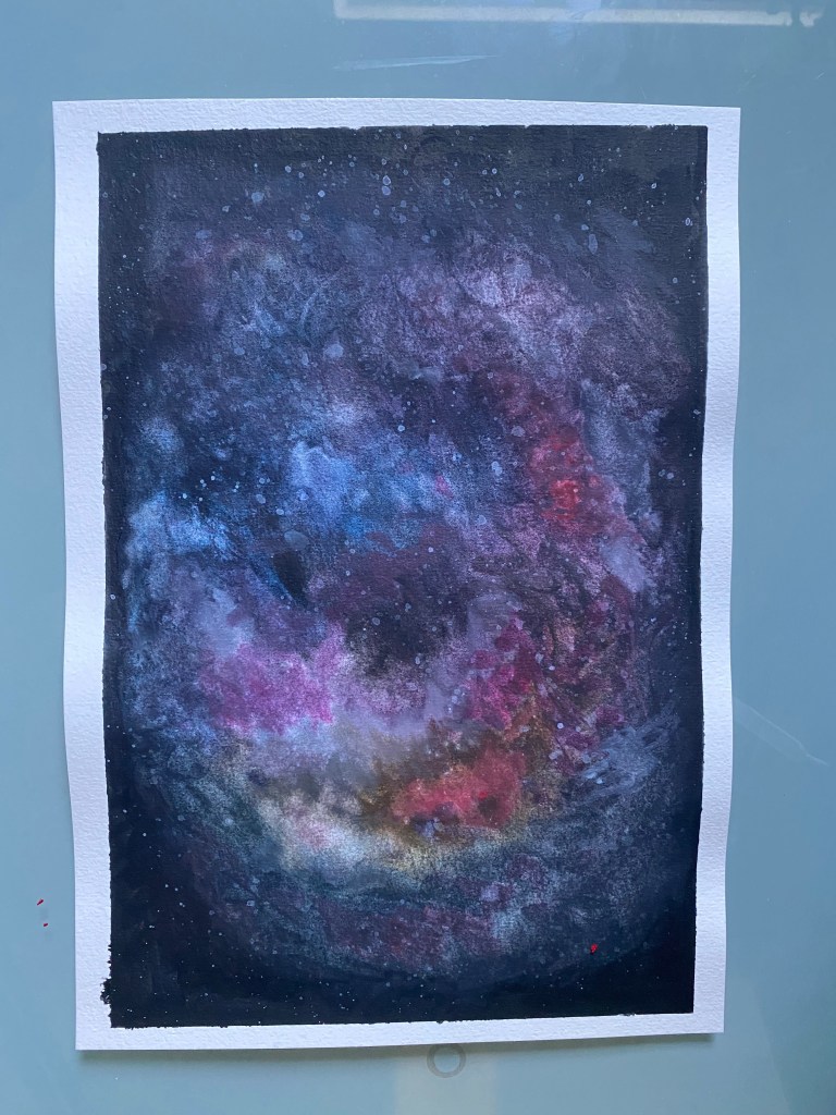
I thought this turned out pretty well, and apart from being a little dark, I think I was pretty happy with it. In any case, this will be more interesting in the background than plain black with some dots to. illustrate space. I scanned this and was ready to go back yo my initial illustration to start painting it over my background.
I wanted to make the painting really nice and detailed, and sort of realistic. I have done some painting tutorial for more realistic painting in the past, and I thought it would be good to put those skills acquired to a good use in an actual finished article.
I decided to block out the silhouette of my drawing in dark grey and only paint in white on top of this. This way, I was able to make the figure pop over the dark background. I think it turned out pretty well.
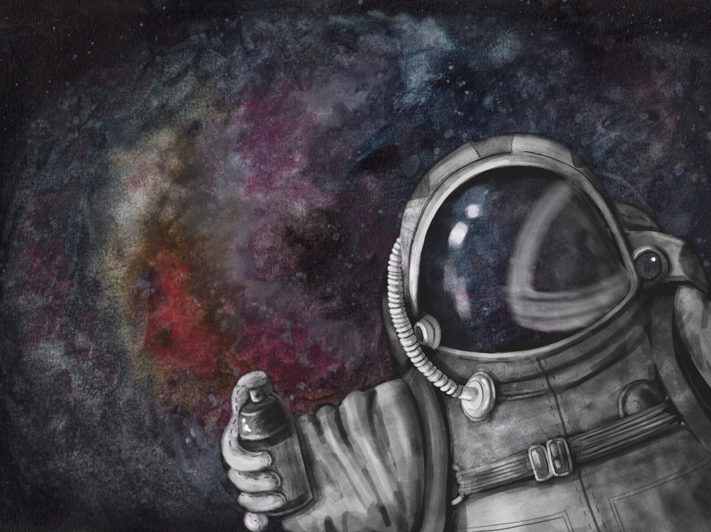
It didn’t turn out as realistic as I hoped. I think this is due to the fact that I never really painted anything similar before. Nevertheless I was really proud of this as I think this was. the perfect combination of digital and traditional painting techniques. I imported this to my computer to start working on the rest of the mockup there.
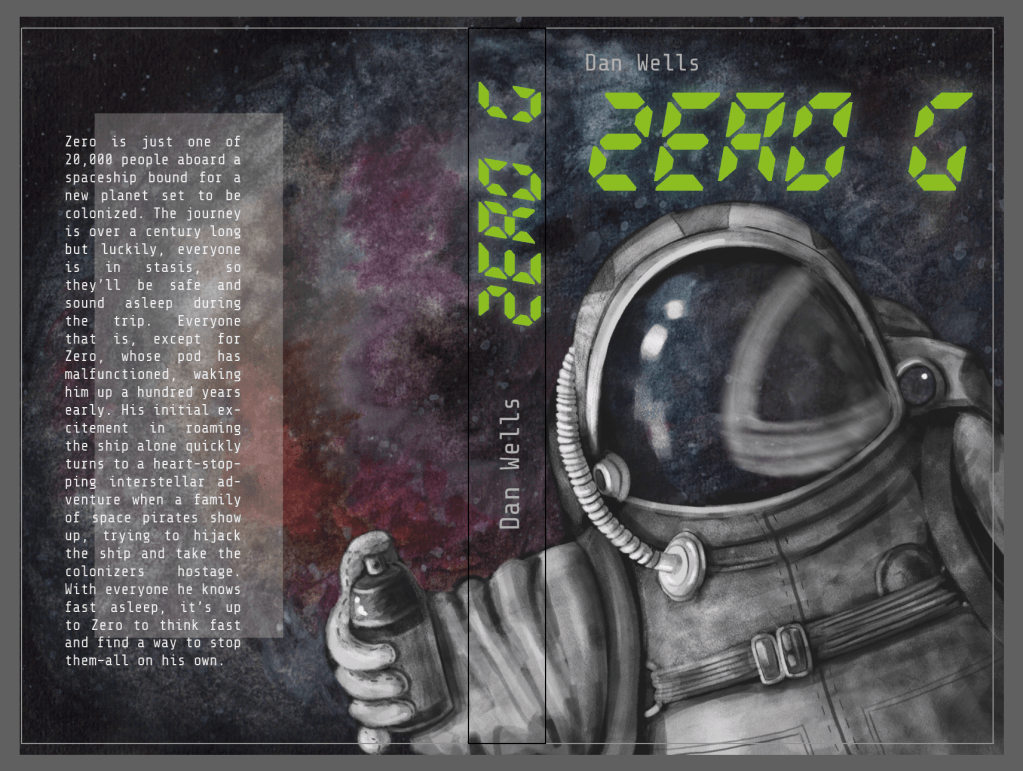
Once I matched this up with the mockup I could find, I discovered that the astronaut was a little too large in my painting. I think it should have just covered the front cover and not go on the back as it loses some of the meaning because you cannot see the spray can.
I went back to my original file and made the astronaut a little smaller, hoping that this will resolve the issue, but kept a copy of the original just in case.
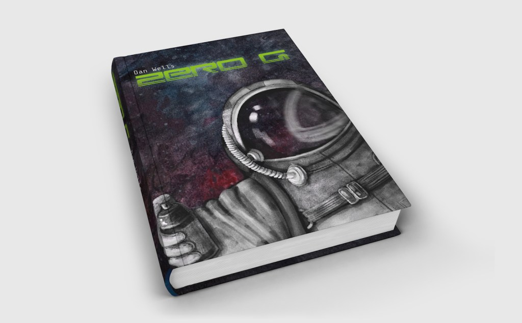
I think it is super important to be able to adjust the illustration once the finished article is made to make subtle changes and make the end product more effective. I think the second mockup works better because it shows more of the context, shows that it is actually talking place in space and shows the spray can that is actually quite an important element.
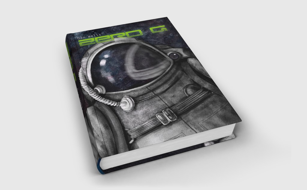
Before moving on, I wanted to see what my cover would look like in real life, so I went ahead and made a new version of it to fit the dimensions of an old book and try to stick it on the cover to see how this looks.
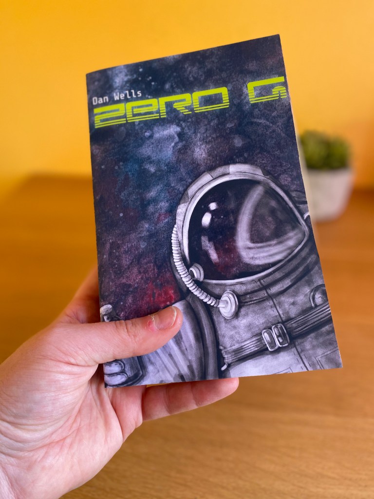
My physical mockup turned out pretty well I think, although it took quite a few ties before I got it (almost) right. I kept cutting the image a little bit too short but got there at the end. I also think that a semi-gloss paper would have been better to print off the cover, however I only had this matt or ultra glossy photo paper at home.
Reflection
I have made quite a few mockups before and I find that this is definitely something I grasp quite well. I think the importance of this cannot be stressed enough, as a client would most often would like to see what the end product will look like without wasting money and resources on reproducing the artwork. This is also a great tool in the illustrator’s arsenal to be able to showcase their work in different settings. I really enjoyed this exercise, and I think I was able to create a convincing mockup and a product that I am proud of .

One Comment Add yours