
This exercise is to help you to edit an image to its main structural form and to practice creating a clear visual. From the work you have collected pick at least two finished illustrations. These illustrations should contain a range of content. They can be representational, diagrammatic or metaphorical.
Measure the image at the size it was reproduced. Draw a box at least two and half times larger and in proportion to each of the printed illustrations. Using a form of line which feels comfortable and which you can confidently manage, create a visual for each illustration. You are not tracing from the original nor are you claiming this artwork as your own. Be aware of main shapes and directions; draw the elements of the image with sufficient detail for them to be readable.
Explore how many lines you need to use to describe the content. Try another version of the same image and see how much content you can remove so that the image is distilled to an extremely edited form but still makes sense. This practice in editing and purposefully using selective line to describe an image will be applied in later images of your own generation. Give yourself space of a couple of days and then refer back to the original illustration and evaluate how honest your visual is to its source.
This exercise may have given you insight into the reverse process where the client edits the visual to get a final image.This is known as art direction.Find some images that made you more aware of the art direction behind them and annotate them to explain the thinking behind them in your learning log.
OCA Key Steps in Illustration
In this exercise I was asked to create a client visual. This technique is a visual communication method usually used between the client and the illustrator to decide the layout and overall visual for an illustration even before a rough of the drawing is created.
I decided to go with book covers as I don’t really have much else with illustrations laying around the house. The largest paper size I had to hand was A3, so the artwork had to be maximum A4 so I could increase the size to create a larger visual.
I found a couple books that I thought this would be interesting to do this exercise with.
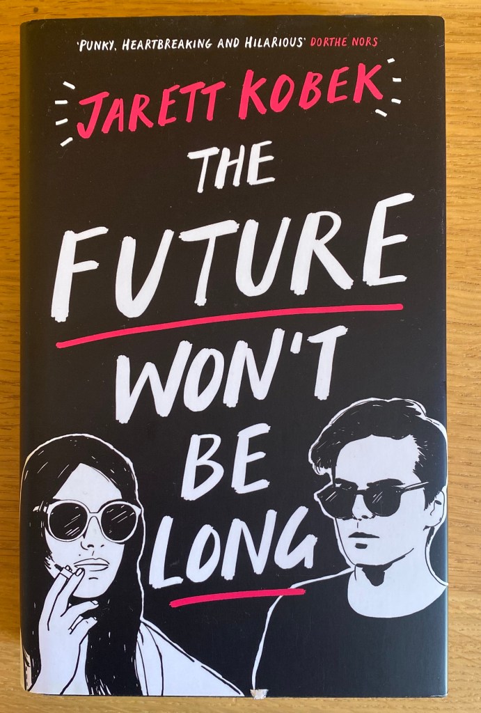
This book looked cool so I thought it would be good as a starting point. I really liked the graphic nature of this cover and how it was very simple yet had a lot of detail.
I thought this was mostly successful, however the above book cover I think is very effective because of the black block of colour with the white almost cutout like figures at the bottom. I don’t think I can convey this with a sharpie. Maybe I could do this on black paper with a white marker.
I decided to ditch this first book because I think it would have been quite hard to convey the subtlety of the characters in a quick sketch.
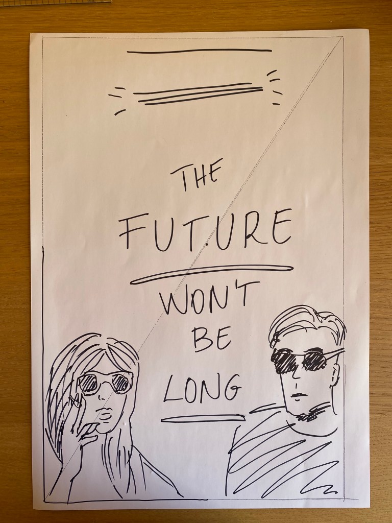
I tried this technique with another book cover, to see what I would do differently after this first attempt. For my second choice I looked at something where the illustration is a lot more dynamic and therefore (hopefully) easier to convey in a line drawing.
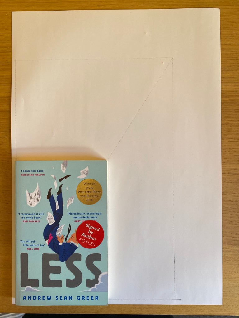
I liked this Illustration on the cover of Less by Andrew Sean Greer. Really dynamic and strong concept. I first drawn around the book and then using the technique shown in the KSI textbook increased the size of the rectangle to make a a larger visual.
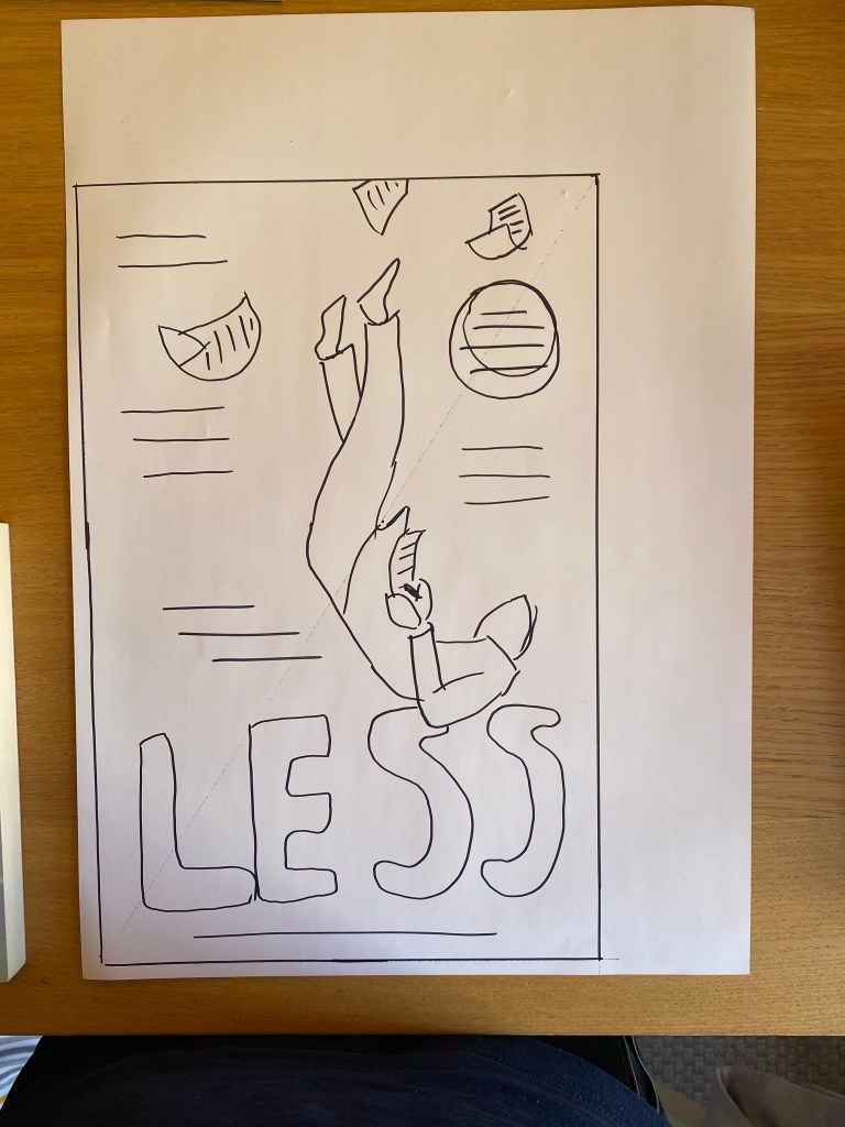
I think this was mostly effective, however I think I may have oversimplified the idea and thus the image doesn’t have sufficient detail to give the artist the full brief.
The things that were missing is for example the clouds at the bottom of the illustration that gives context to the whole image and the flapping tie that was making the figure more dynamic.
I needed to add a few more details for this to be effective in communicating what was going on in the image. I decided to go back in with a different colour pen and add these details to see if they will make some difference.
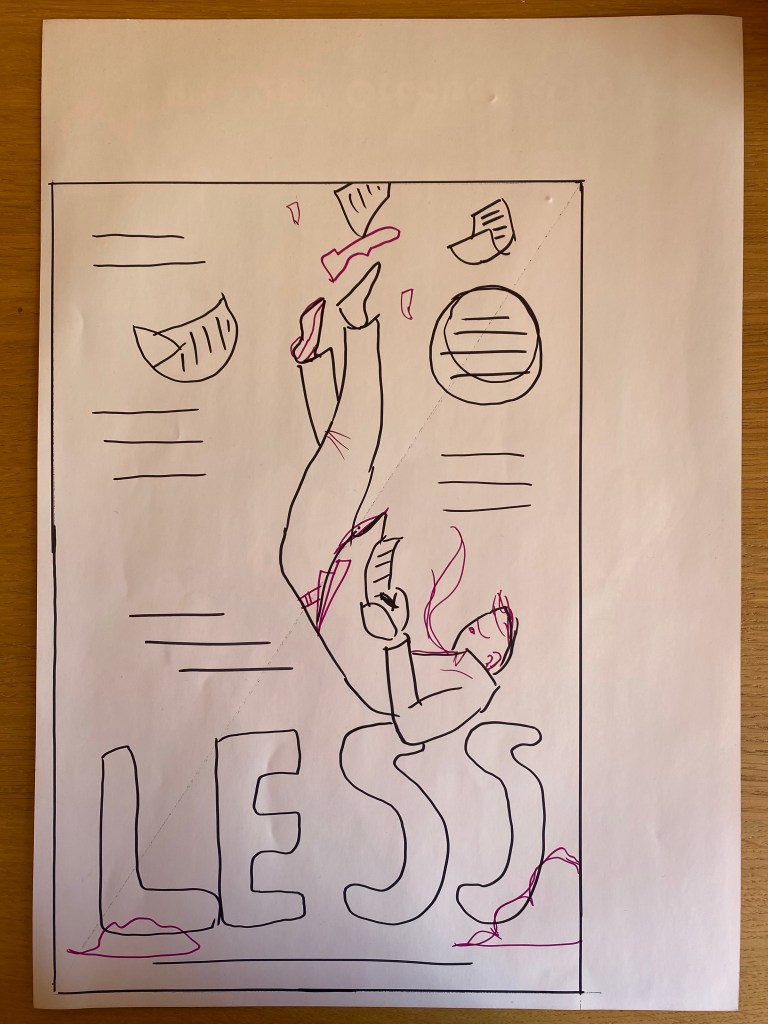
I think the second revised visual was a lot more effective because the small details I added described more of the context of the illustration. For example in the second image you can tell that the figure is falling through the sky and the speed of this action because of the flapping details such as the tie and the suit.
In a way, I think I done this exercise back to front. I should have started with the image that describes everything and then try to remove some elements to see if the image is still effective.
From the above I could definitely remove all the placeholders that supposed to represent text and the image would still provide with valuable direction to the illustrator I believe.
I wanted to redraw this as simply as I could.
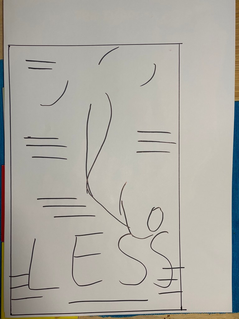
I think the above really doesn’t give enough information to the illustrator at all, but would probably communicate the layout quite effectively. I think if I have been given this as a client visual, I would really struggle to understand what the client wants. On the other hand, if I was given this picture with a sufficient amount of written brief, I think I would be able to look at this and start coming up with ideas. I am not sure if I would get to the exact same outcome as the book cover I based the above drawing on, but at least the pose and layout would be similar.
Reflection
I think this exercise was similar in nature to the viewpoint exercise, because I tried to convey something more complicated in a few lines. This is definitely a challenge and I think as a result I will look at thumb nailing in a different light. I think this is very useful from the point of view of understanding how demanding it can be to explain something visually without knowing the final outcome and hence client visuals can be a little hard to understand at times.
To be honest, I didn’t quite understand this exercise, but I think the point was to force myself to see the underlying structure of an image. In retrospect I should have done this exercise with an image that is a little more complex, as this was pretty easy to distill into a simple line drawing.
