
Using the internet, magazines, reference books leaflets, brochures and flyers make a collection of examples and reference materials that can help you with an illustration to fit one of the categories below.
Making a cup of tea
Getting to my house
Playing a tune on an instrument
Start by working out the information you need to impart and the steps involved. What are the main points? How many stages are there? Working at a fairly large scale, work out the space needed for each step. You may decide to have one picture that encompasses the whole process or you might want to break it down into a strip with clearly demarcated steps. Try as many possibilities as you can.
Be mindful of the hierarchy of the elements in the composition and the dynamics needed to draw the viewer’s eye from one stage to the other. Try to use as few words as possible.
Best of all use none.
Keep all your sketches and notes in your learning log.
Before you start the final artwork take a critical look at your roughs and compare one element to another and be especially aware of what is happening in the immediate background of the image.
Decide on the tools and materials you will use for your illustration. If you usecolour be aware of how it adds focus and can help your communication process.
When you have finished show it to other people to check that it works both as an attractive illustration and in its main function – to give instructions. Record your findings in your learning log.
OCA Key Steps in Illustration
I started my research by looking at examples of diagrammatic illustrations that I liked and have collected on a board on Pinterest.
I tried looking at all sorts of different topics in advance to widen my understanding of what works and what doesn’t in my opinion. I really like the loose hand drawn illustrations with watercolour tinge behind solid line-work. I think this look is beautiful and easily translates to a diagrammatic illustration because it is easy to read. Through this process I found that diagrammatic illustrations and infographics have a lot in common, with the main difference being that diagrammatic illustration should be displayed as a piece of art where infographic is more of a tool to explain complicated ideas in a simpler graphic way.
I chose the topic “Making a cup of tea” because I think it would be something that translates nicely into an illustration, and the other 2 topics didn’t really resonate with me.
I started by gathering references and inspiration on a Pinterest board. I tried to keep this to actual photographs first to not influence my choices in terms of technique used for the final illustration.
Found this very useful guide on tea making: https://insearchofyummyness.com/a-beginners-guide-to-loose-leaf-tea/ and this article on the history of tea https://ttr.com.my/the-history-of-tea/ this video was quite useful in understaning the process of tea production https://www.youtube.com/watch?v=V8UuRV7qq18
also found this video about how to brew loose leaf teas. I found this very well thought out and interesting. https://youtu.be/le6vodQGeVI
At this stage, I had 2 slightly different ideas. Show the entire process of making tea, from the growing of the Camellia Sinensis bush to the cuppa. The other idea was just to show the different elements of the tea in a sort of infographic/blueprint style. I quite liked this second one as I think it would make a cool piece of art for something like a tea house… however I am not sure if this style would fit well with the delicate process of making tea.
I think I need to start sketching out these ideas to see how they look on paper first.

I really liked the blueprint idea. I think this would be really cool once it’s properly drawn and thought out. I wanted to draw a few different versions some that were like blueprints with the typical blue background and the technical drawing like line-work, and some that were more like watercolour paintings. The latter I think I can do on paper instead of using digital techniques.
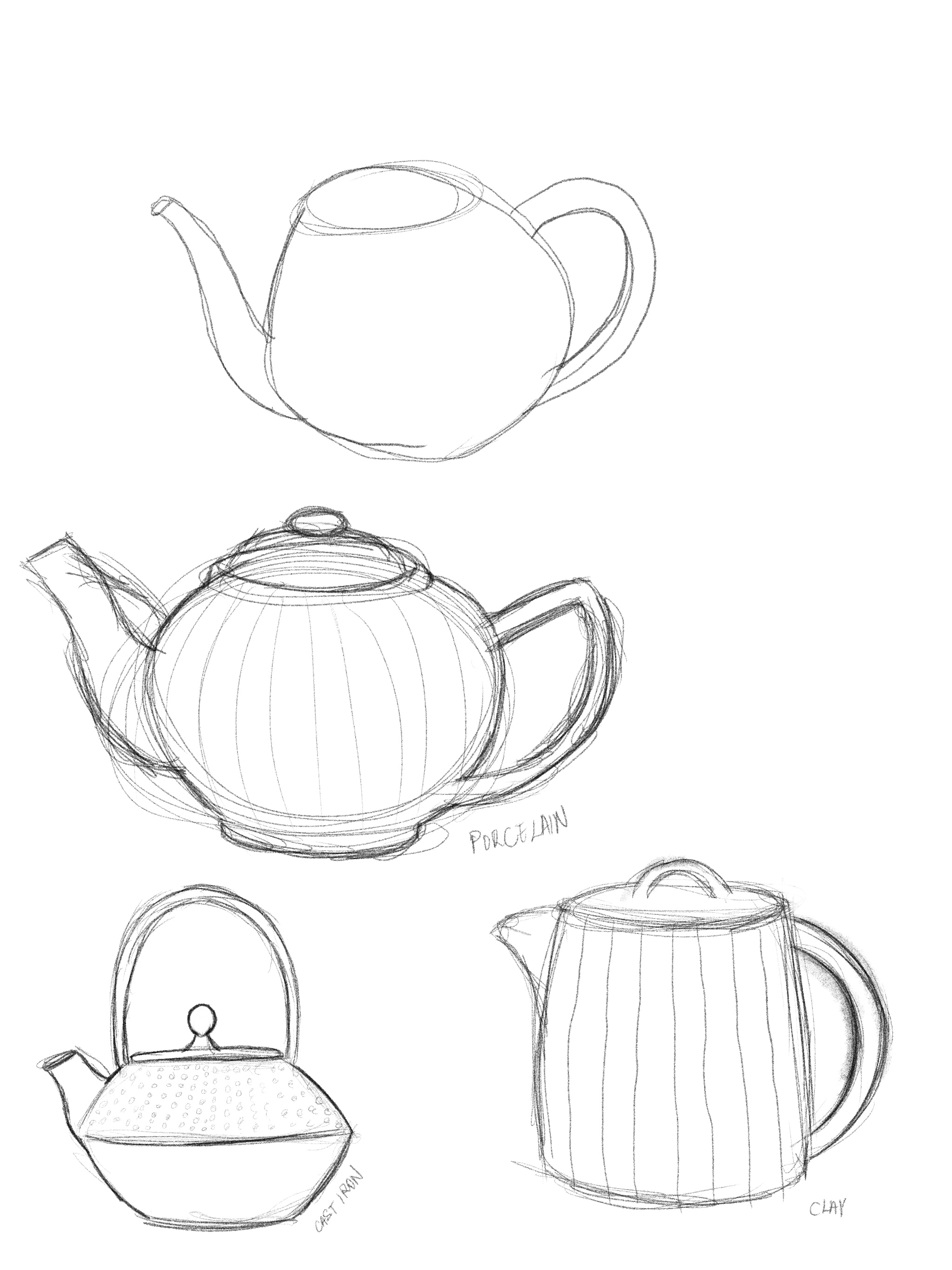
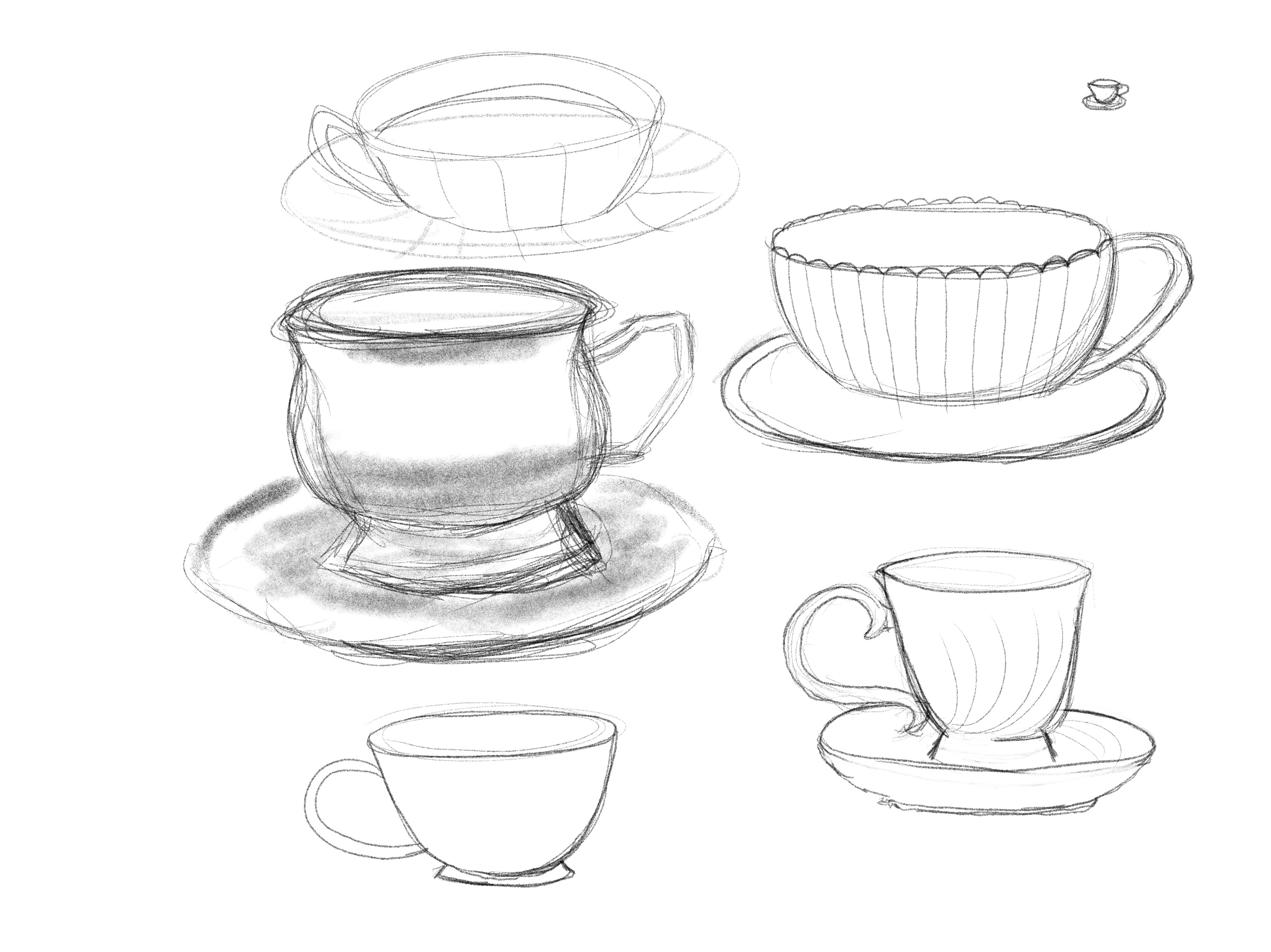
I started by making some sketches of items that I was considering drawing for this assignment and trying to figure out which ones I found most visually interesting.
I then went on and tried out my initial idea of drawing the different elements of tea making in a way that they would go into the teapot to make the tea.
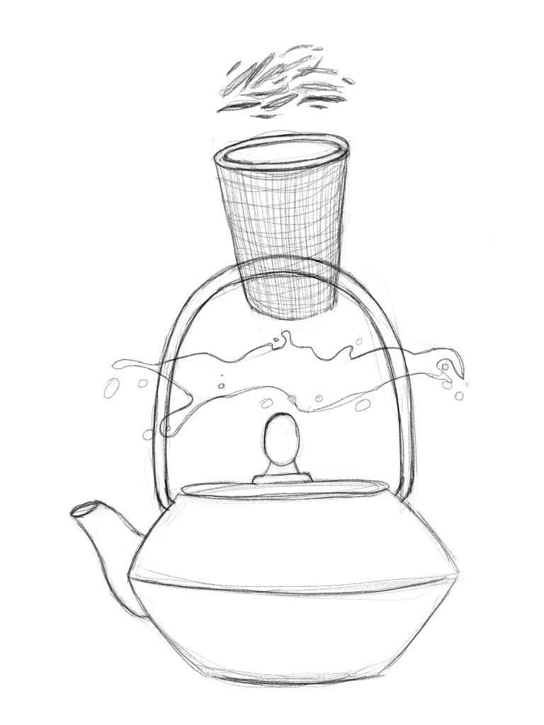
Looking at this, I was not sure what to think. I liked it as a picture, but not sure if it would be strictly categorised as diagrammatic illustration. I was thinking that this could work in the blueprint style that I had in mind, and could be pretty cool, but not sure if it would answer the brief fully enough.
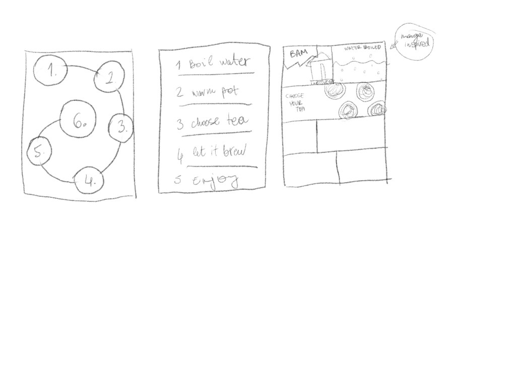
I set down to look at what different layouts I could come up with for my diagram and drawn a couple things before it hit me.
When I thought of the manga idea, I got really excited. I thought this could be a good opportunity to create something I could be proud of and it would be pretty unique. Manga has the inherent nature of linear storytelling and therefore I think it would be perfect for this brief. I also really like this style of drawing so I think this will be a good opportunity to try my hands on this.
I needed to write a little story that would show the process of tea making and I would also like to make this slightly humorous and quirky.
My comic should cover the following:
- Draw some fresh water into a kettle (could this be replaced by go to a spring and gather water?)
- Boil the kettle; (electric or on fire?)
- Choose your tea (Green? White? Oolong? Black?)
- Put your tea in a teapot, pour the boiling water
- Wait a few minutes based on your chosen tea’s steeping times
- Pour through a filter
- Enjoy your tea!
I think the above will give me a nice little structure when coming up with the layout for this illustration.
I watched some videos on how to lay out manga pages and started to draft my own.
I made the frame and after making the drawings I added them to the frames.
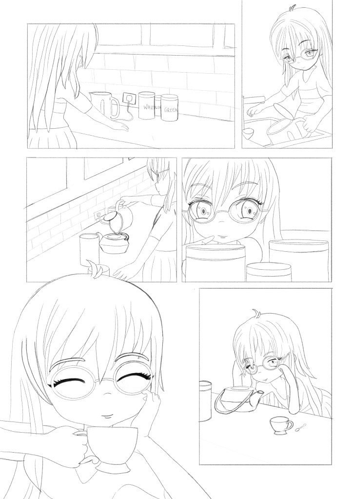
It took me a good 4-5 hours to create this page, but I was mostly happy with it. I seen a few issues with the expressions, but I thought it might look different once I shaded the drawings.
I went with a manga ordering in terms of the panels but looking at it, I think this might not be the best choice, as the viewer could easily get confused by this. I might add some text or numbering to aid the flow of the reading. I tried adding small cues that should show the reader the correct order, but this may not be enough, especially for western audiences.
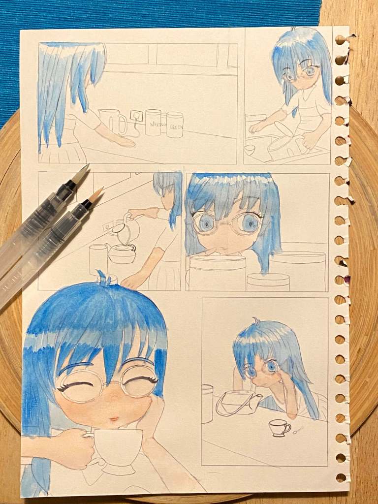
I started working on the same sketch on paper. Printed the sketch on some watercolour paper and started to give it life using watercolours. Although I normally find this very charming, I didn’t quite like it in this instance. I wanted that real manga look in strong contract black and white with the halftone and found that this will be easier to achieve digitally.
I went ahead and perfected my drawing further and started adding halftone, by first laying the halftone pattern on the page and then masking away the parts I didn’t need. I was so excited, as it was really starting to look quite manga like, which was my aim with this piece.
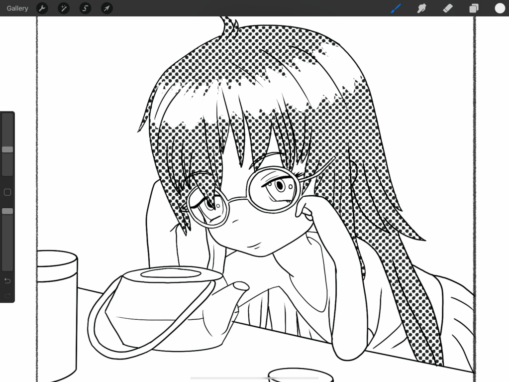
halftone shading 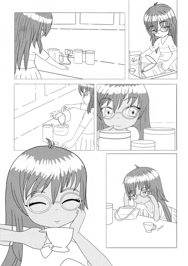
My whole image at this stage
I really liked the results and shown it to some friends, asking for their opinions. Most people really liked it, however there was a bit of a confusion around the reading order. I think the fact that most of the people I shown it to were not familiar with the Japanese reading order was the problem. I decided to flip my artwork horizontally (thank god for digital). This has also revealed a few things to me that looked odd and I have not noticed before. I heard of this trick before, but I might actually start using it now as I think it really helps.
Further refined the halftones next by erasing away parts that I thought should have a little highlight on them such as the hair to give this a little more dimension and some of the features of the face.
I felt like parts of the image needed something else, and so I decided to add some backgrounds to the panels where there was much empty space behind the character. I think this really adds to the overall piece.

I think the piece really started to pop! I wanted to add a little bit of colour, and I quite liked the watercolour, but thought it will mess up the line-work if I add this on paper. I decided to paint the colour blocks on some aquarelle paper and then get these scanned in and add the blocks of colour to my piece in a similar way I have done with the halftone. I think this will marry the digital and traditional work quite nicely without too much worry on my technical skills in the traditional medium.
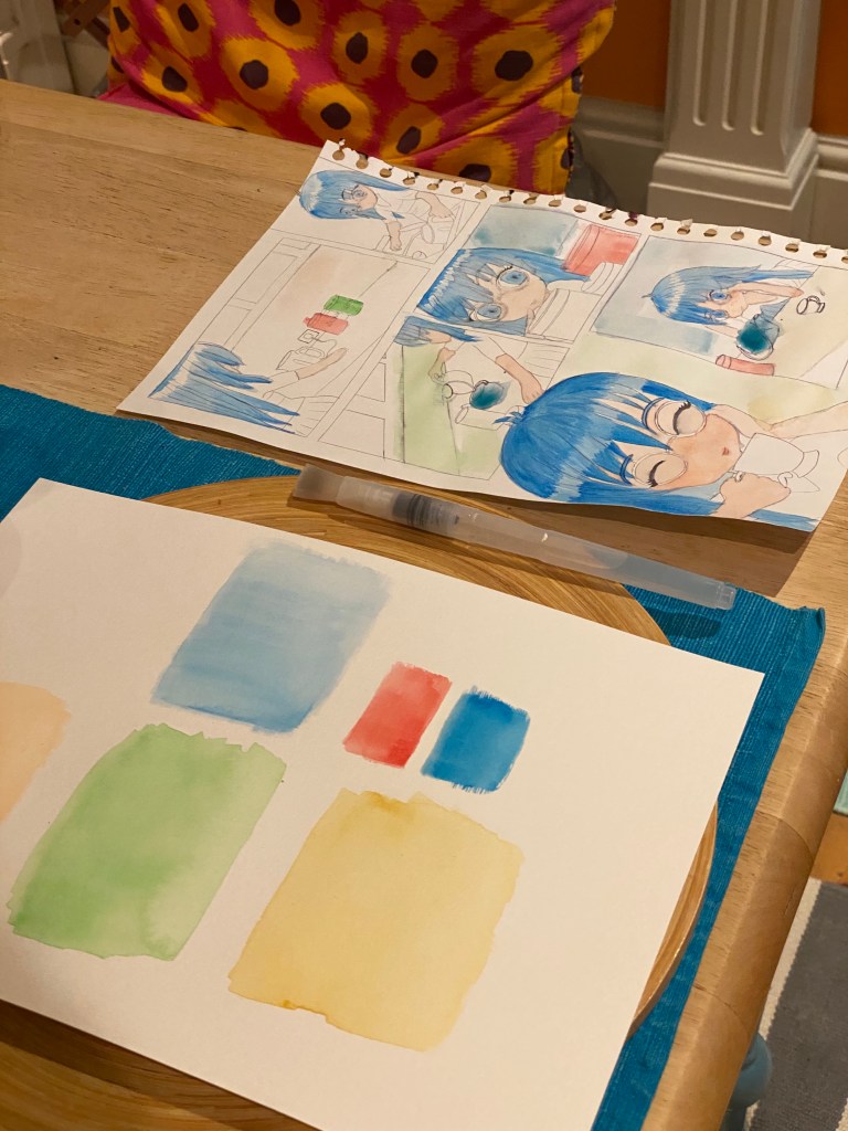
I kept the original of the piece that I started painting on earlier to one side and tried to consider what colour would go where, and keeping in mind where I wanted the centre of attention to be.
I have added the colour blocks to the image and duplicated them as many times as they were needed to cover all of the areas, and then using the mask tool made sure they are only colouring the desired areas.

After this stage, I still felt like something was missing, so I went ahead and added some text to the illustration. This made it a lot more manga-like.

Reflection
Overall, I am pretty proud of what I created. I think I managed to mix the digital and traditional techniques, which is a nice step towards getting out of my comfort zone. I have never created anything as complex as this before, and I think this turned out pretty successful. I think I could have done something different that is more basically showing how tea is made, or something more complex that would give more of a cultural background to the piece, but I think it does answer the brief pretty well.
I think I learned from this exercise that you cannot jump in without planning. I needed to write down the story to be able to start creating my strip, and to be able to generate ideas for the layout. I also think in this instance I let the layout dictate the style of the illustration quite a bit, and not sure if this strictly counts as diagrammatic illustration.

One Comment Add yours