
Listen to a piece of instrumental music by a musician such as:
George Gershwin The Gypsy Kings Beethoven Miles Davis
As you listen to the music create marks which convey your interpretation of the essence or mood of the piece. Work quickly and intuitively to bring a degree of self-expression to the exercise. Be selective in your use of materials, colours, marks and textures.
Stand back from your worksheet and choose an adjective or word that you feel describes the tone of the piece.
This is your interpretation and not a definition of it. Go through your drawings and choose a square area that you feel communicates the meaning of your chosen word and has visually interesting qualities.
Using a square format and working at any size, reproduce your selected area. Starting with your chosen adjective, introduce colours, textures and shapes. Choose any media you like for this exercise and experiment by mixing them. Try not to over complicate the image.
Be conscious of the mood you are trying to convey – keep listening to the music as you work to help you focus more clearly. You can add forms or create the shape of an element with some representational value. Any additional shapes should enhance or extend the design and fit together visually within the structure you have created.
Constantly reappraise your image to ensure the composition suits what you are trying to say. You may find that you are editing and removing elements from the original and replacing them with others.
Do you think your image would work as an illustration for a cover of a CD for the music you listened to?
OCA Key Steps in Illustration
First off I started listening to some of the above mentioned composers’ music, I was familiar with Beethoven and The Gypsy Kings, but never heard of the other 2 and I wanted to hear what they are all about.
After about an hour listening to a variety of music by all of them, I have landed on Beethoven’s Symphony No. 1 in C Major; Opening 21: Andante cantabile con moto. It really resonanted with me. The piece was bright and hopeful.
I started listening to it on a loop and took out my iPad to start painting. I have chosen this because I am the most comfortable with this medium and I thought this will not inhibit my ability to paint freely without restrictions or with the constant fear of messing things up and getting paint over everything.
I did everything while listening to the music; pick the colours, the paint brush and the size of it, then just started making marks on the canvas.

When looking at this image adjective that comes to mind most is bright.
This is interesting given the fact that this was what made me attracted to this piece of music in the first place.

When I fist started to paint it again, I was trying to stick to the original image and crop, and tried to match the colours. I really liked these bright, almost neon colours on the black canvas.
I was reconsidering elements to see what I could be replacing to covey the message a little more but not lose what made the image initially effective in my mind. I liked the repeating shapes as the music has these repeating structs that everything is built on.
My final image was created relatively quickly without much effort. I love creating like this, it is very relaxing and uplifting.
I think this could work quite well as an album cover, however it is quite busy so would probably need to be toned down.
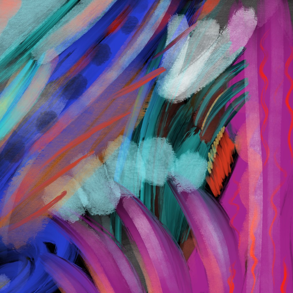
I love the strong colours and like how the intricacies how the bold and fine lines mix together in the piece. I have dabbled in creating abstract art before, but I think this is by far the most successful, probably because I never used a piece of music to aid the process. I think I need to bring music into my work more.
I wanted to try out this as an album cover to see how this would work in the real world.
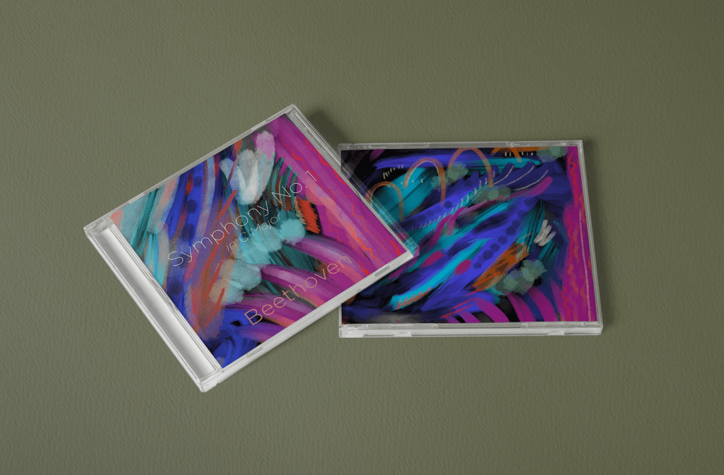
I didn’t mute the art, but rather found a spot on it where the title could sit well. I am pretty proud of this. I think it turned out really well! I love the colours and positive attitude of the piece. Though I am probably bias, I would be inclined to pick this up if I seen it in a store.
Reflection
Although I stayed within the digital realm for this exercise which is within my comfort zone, I think normally I would have stopped after cropping the piece because I was really happy with it. I was a little reluctant to repaint the crop as a fresh piece, but I think the second has more dynamism and character as a result. I think it works well, and fulfils the brief. This shown me that there is never too late to redo a piece, it will almost always result in a better piece the second time around.
