
Cut two ‘L’ shapes of card or stiff paper. You are going to use them to explore formats, to zoom in and out of compositions. Take an image which has a range of content – a family photo, and interior from a magazine or another artist’s work – and enlarge it to A4 and make ten copies.
Scenes with action with a background and foreground can be most useful for this kind of exercise. Use the ‘L’s to create edited versions of each image. Retain the content but try presenting it in different ways in different formats.
Repeat this using all of your photocopies.
Do some images seem to have more drama because of the way you have cropped them?
Has the focus changed – have you made the original subject of the image seem more or less important?
Choose a word for each image that relates in some way to the content. It may contradict the image and show an alternative interpretation or may extend the narrative by describing the content in a slightly different way.
Using one of the images as a basis for an illustration, draw up your artwork to make a poster. Add colours and textures to emphasise your message. Use the word you selected as the title and reproduce it in a typeface you feel suggests or reflects the meaning of the word itself. Position the text alongside the image.
OCA Key Steps in Illustration
Reading through these instructions I was scratching my head a little bit. I understand it is important sometimes to work in a physical medium, but I think using the above mentioned technique to just crop images is super wasteful, so I have decided to do this exercise digitally as I think I will be able to get the same results without printing a single page.
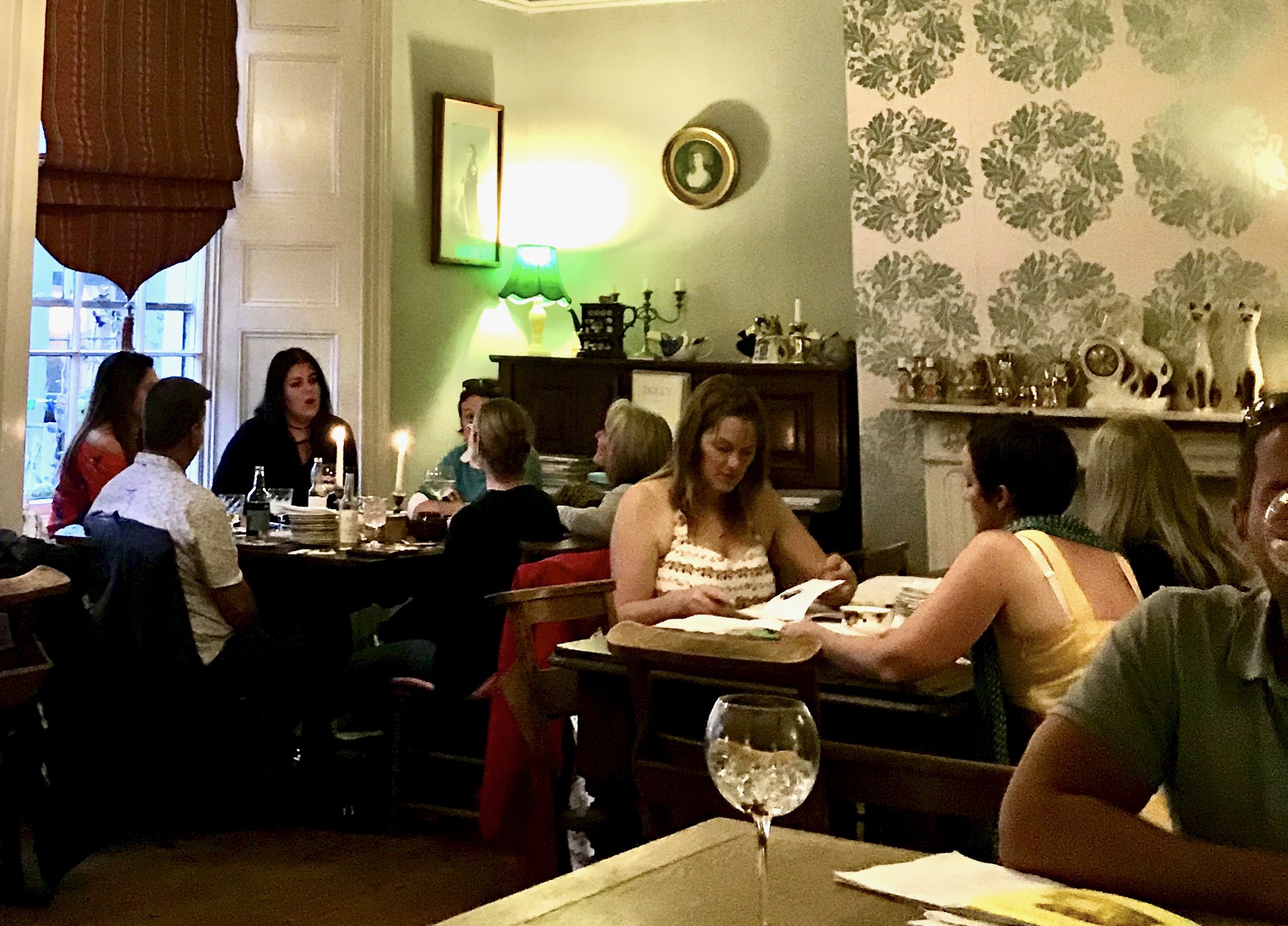
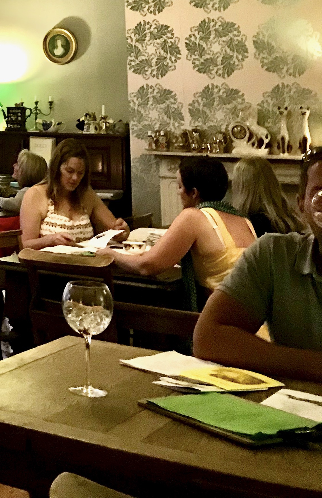
I went through my photos on my phone to see if I can find something with lots of “content” as the exercise described. I found an image that I took in Falmouth in a restaurant/bar about a year ago. I thought this would be a good one, as it has many people just doing something mundane, drinking, eating etc. I think this will create interesting little stories when separated out. The image quality is not the greatest, but I think it will be fine for the exercise.

My original snap
I started by transferring the photo to my iPad as I thought this will be easier to crop on, and will be more like what the exercise has asked for in terms of size when I am looking at the image as a whole.
I came up with the below crops.
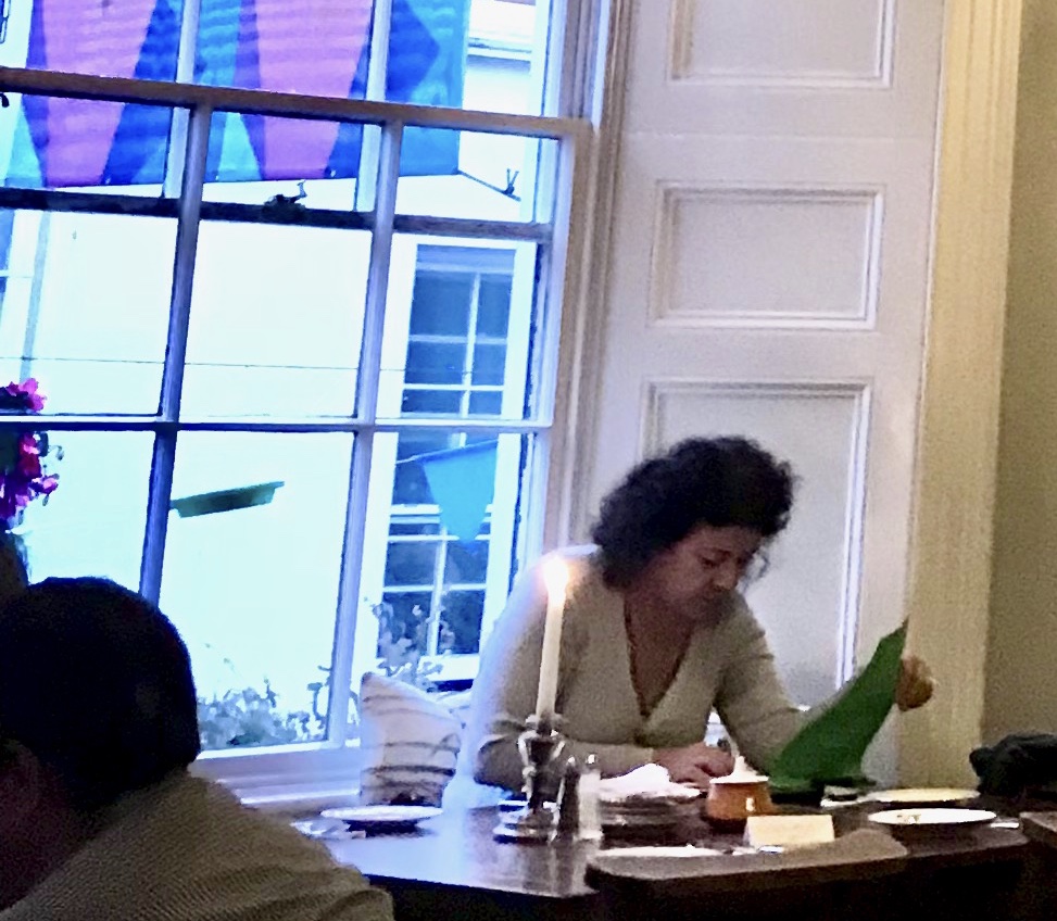

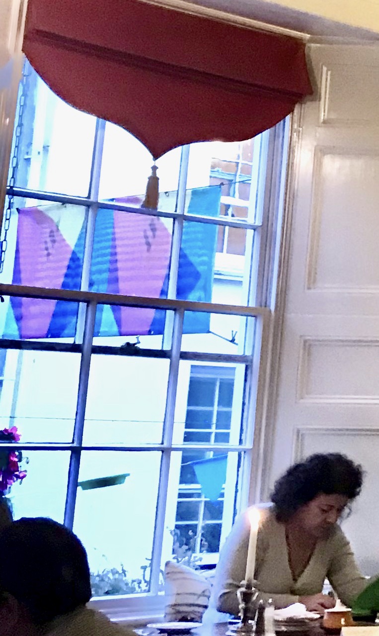
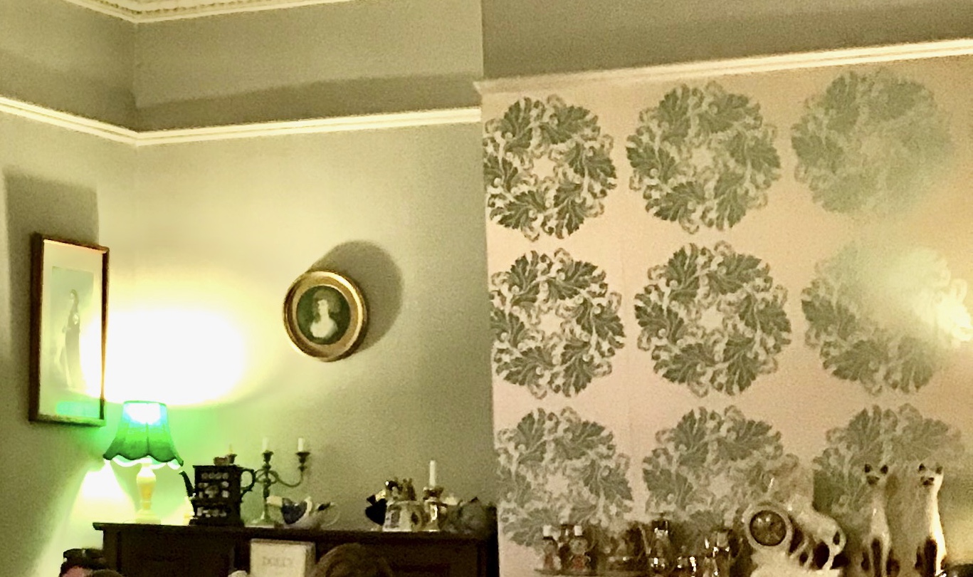
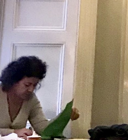
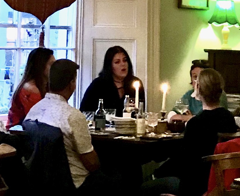
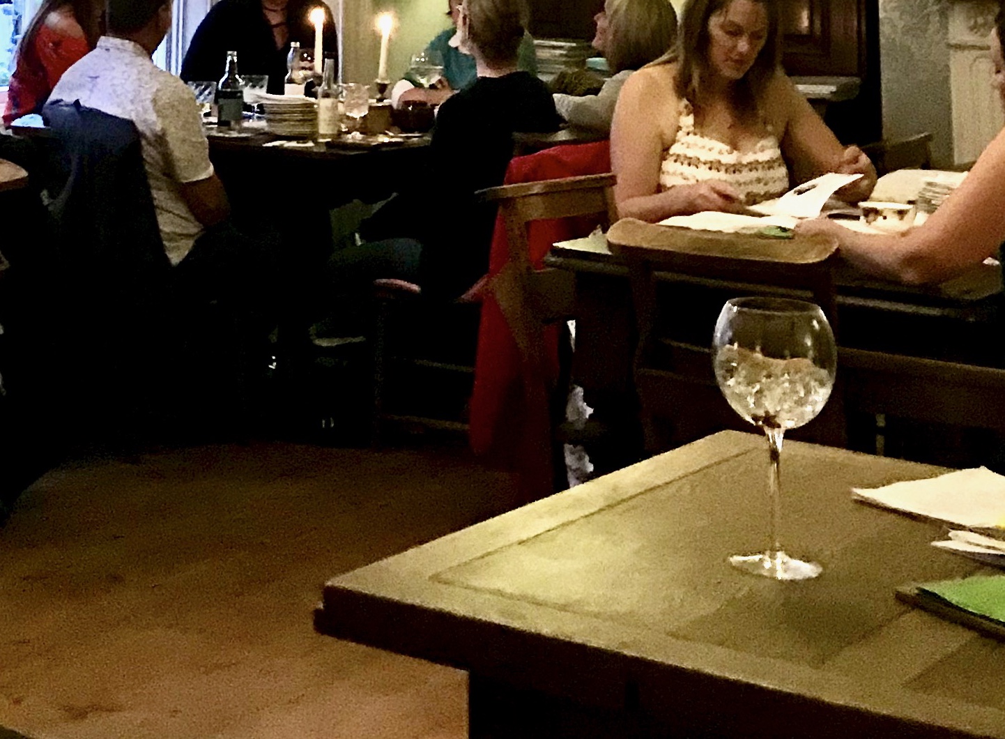
It was interesting to see how the dynamic of the image changed as I cropped out different elements. I think this shows that some small elements even when we think we don’t pay attention to them have a great effect on the way we perceive the image overall. Although I did feel like I was running out of options after about 5-6 crops. This was potentially due to the fact that there wasn’t too much going on in the image, eventhough at first it seems like there are loads of options.
For my illustration I selected the “Socialise” image, as I thought it would look great as I thought the image and the text I selected would work great together as a poster. I was thinking that the format of it wouldn’t be great as a poster as posters usually are a portrait format rather than a long landscape like this image. I had something in mind to tackle this however. I was thinking if I created the image in bold colours, I could just layer the same artwork in varying hues to create a portrait poster.
my initial image turned out pretty interesting, I was playing with fonts and different colours throughout the process and eventually have settled on the below:

I was wondering if I could create the poster by repeating the same image a few times to create a more conventional format poster.

1 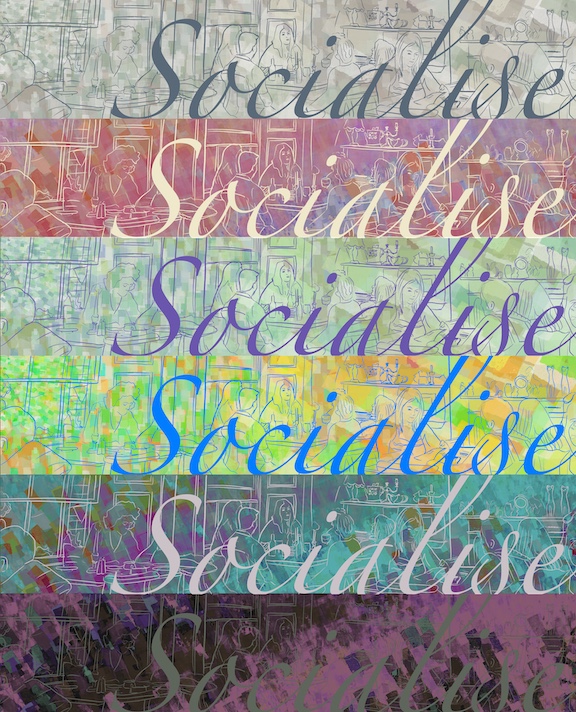
2 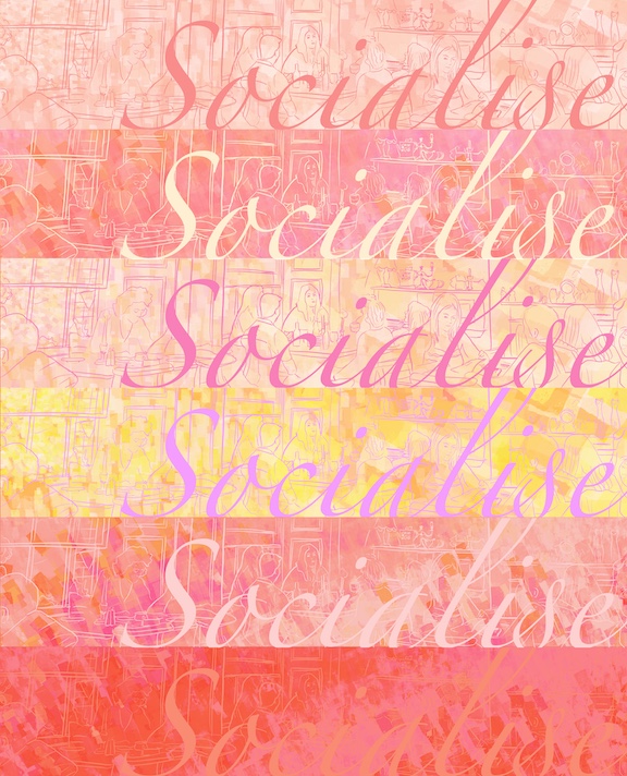
3 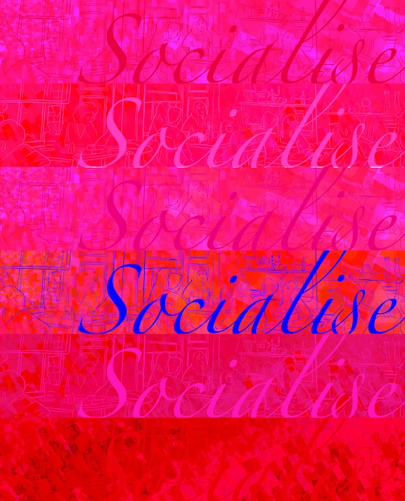
4
I was playing with different colour schemes too. My favourite is No.2. I think the colours work well.
When I shared these with some fellow students, they gave me the idea of changing the layout slightly to be like those scenes in movies where there is a panorama at the bottom of the screen and there is text at the top half of the screen. I liked this idea so decided to give this a go, and the below image was born.
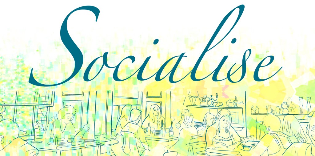
I think think this image turned out pretty well. I didn’t spend too much time on the drawing part, but I think the free expressiveness of the line work and the free-flowing font works well together. I could imagine this as a poster or mural at a social gathering space of sorts. I think it would work quite well.
Reflection
I think this exercise shown me that even the worst image I have taken a long time ago could serve as a basis for a cool new illustration. To be completely honest I didn’t quite get what this was supposed to teach me at first, however I think it was worth doing for the final image, and I certainly didn’t see this coming out of the original image. Goes to show that sometime playing around with a picture can yield some pretty nice results.
