
Produce a line visual around one of these words:
Sea, Extraordinary, Building, Journey
Through brainstorming you may decide to draw from an object or selection of objects or work in a more narrative way around a scene or idea. Ensure that the line visual you produce through visual exploration and development is very clear, employing a line which is solid and definite – fine-liners over a pencil visual should give a clean edge. Photocopy or scan your image so that it fits into A3.
Using the invert function on the copier or computer produce an additional copy where the line has been converted to white and the white of the paper has become black. Using the lines in your image as a guide, cut shapes from the black copy to collage into the white copy. Your ‘filling-in’ should be considered – are you going to suggest that there is light entering from one direction or use white in a decorative way to create a visual pattern?
Work with the biggest areas first and maybe Blu-Tack your pieces down until you are confident about their final placing. To refine your image re-introduce white shapes to the black areas where needed, by cutting from another sheet. There should be no lines left when this exercise has been completed. You are working with areas of black and white and the lines are the edges that you will cut around. Keep standing back from your image to assess its readability – you are aiming for visual legibility and need to avoid creating a disjointed piece. As well as physically standing back, visual distance can be achieved by looking at an image in a mirror, by scanning and looking at it on screen or by printing out a scale different from the original.
When you have finished compare your tonal image to your line drawing. How has the use of black and white altered it? Where does the focus now lie within the image? Make notes in your learning log. An image, which is simplified in this way, is often described as a ‘graphic’ image. Are there any examples of other illustrators’ work which you could describe as graphic?
OCA Key Steps in Illustration
In this exercise I was asked to create a black and white illustration using a collaging technique described above.
I started this by creating a few different thumbnails for my chosen topic – sea.
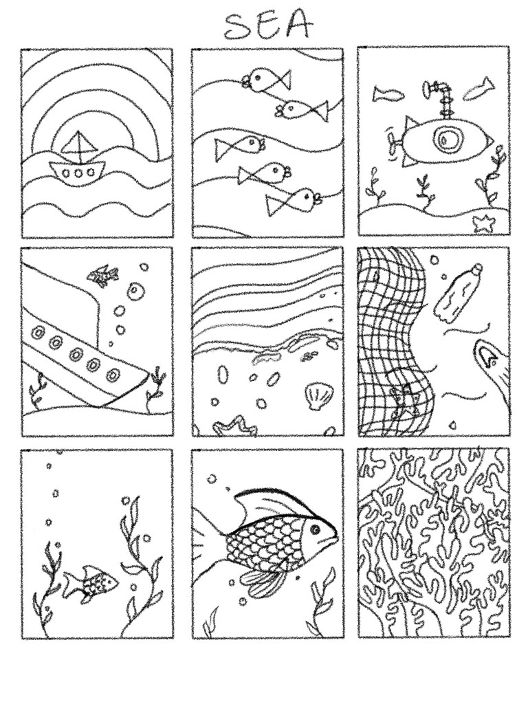
I tried to keep my lines clean as I knew that I was going to need to cut out the shapes t create the final image. Most of the drawings seemed a little childish, but I quite liked the 5th and 9th thumbnail. I think these were a little more on the abstract side, and I think these will work better than the others once I started blocking in with the black pieces.
I decided to go with number 5 because I thought that number 9 would be quite messy.
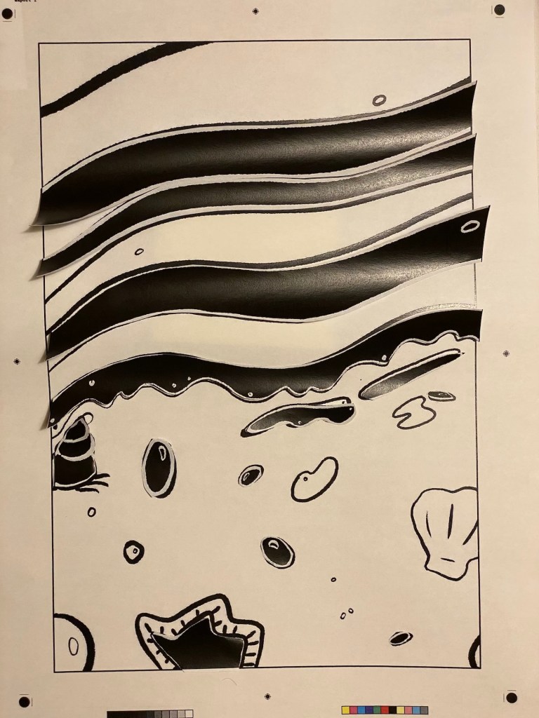
I blown up the image and tidied the line work adding a little more detail to it to make it more interesting.


I thought how the waves come in and wash up all sorts of sea-life. I kept the drawing very loose drawing only from memory.
I created a PDF to where the images fit inside a frame and added printers marks to be able to easily fit the pieces once I have printed this on an A3 piece of paper.
Once printed and cut out all the pieces I started re-pasting the black pieces one by one thinking about the following things:
- Where I’d like to have focus in the image?
- Would the object be darker or lighter than its surroundings in real life?
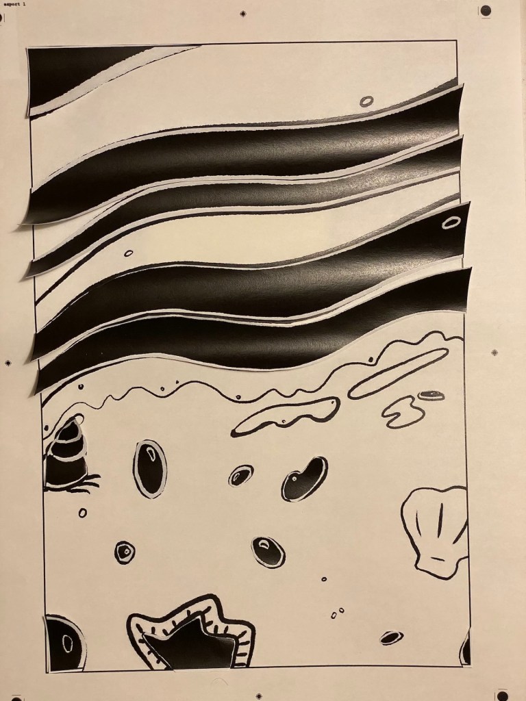
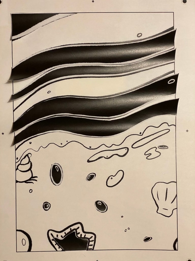
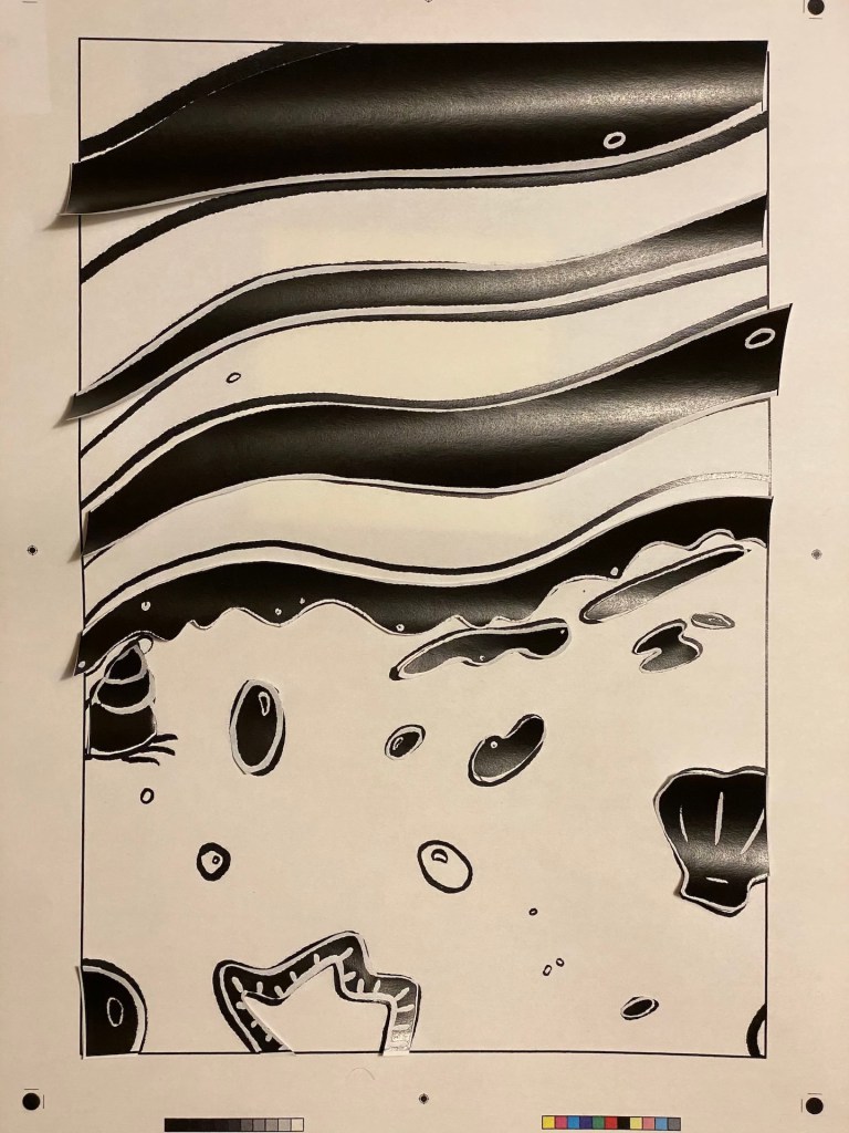
Once I laid down what I thought might work
Here are some examples:
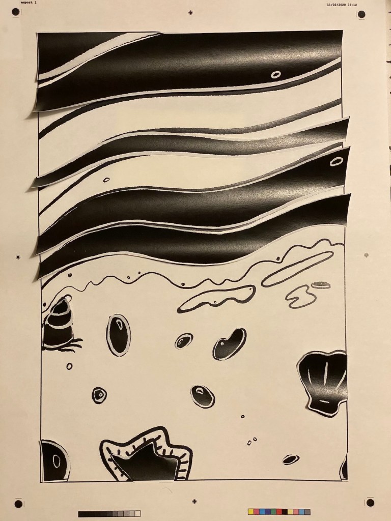
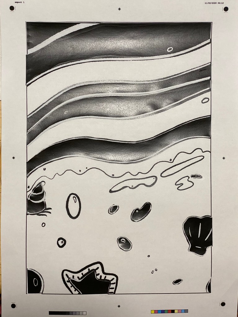
I found it much easier to look at the piece and see if I think it works by taking a photo and looking at the photo. I don’t know if this was just due to the size, since I am normally working on smaller sizes, or because this took away the 3D qualities of the curling paper that I otherwise found quite distracting.
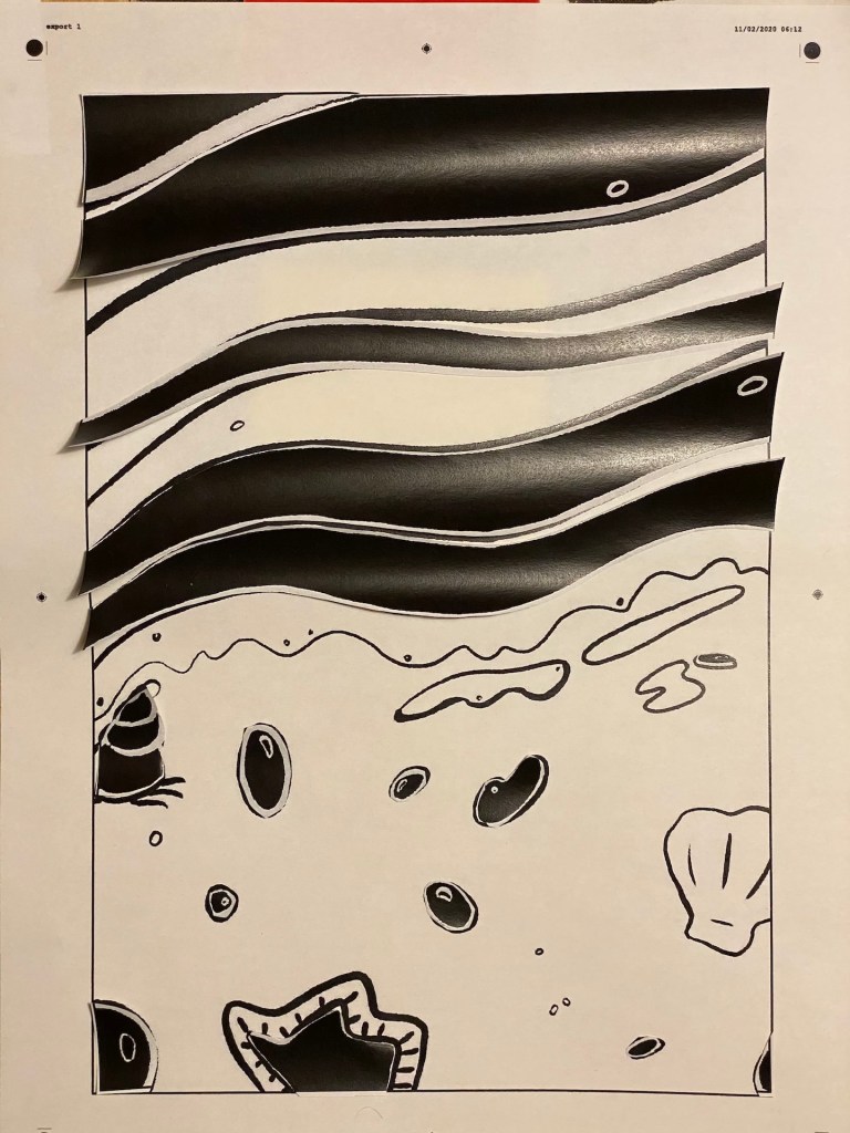
Once I settled on one of the versions, I glued the pieces down. Here is a photo of my final arrangement:
I did a little digging and found some interesting pieces that use the strong black and white graphic illustration style, and found an illustrator called Henn Kim, who uses this style exclusively. Looking at her pieces makes me quite inspired. Should have done this research and found her before this exercise!
https://society6.com/hennkim/prints?sort=popular
Reflection
I think this exercise was quite fun. I almost never work with paper, and although the initial illustration was created in a digital format this exercise definitely gave me a different perspective. I think the final piece is quite interesting, certainly not something I would have created normally. I was also thinking during the process that it would have been so much easier to produce the same image digitally. Interesting experiment indeed.
