
This first assignment is to introduce yourself to your tutor and give them the opportunity to get to know you and your work. This assignment is not submitted for formal assessment
OCA Key Steps in Illustration
You are going to send a ‘greetings card’, telling your tutor about yourself, your interests and inspirations, the materials you feel happy working with and maybe what you would like to get from the course.
First of all you need to work out what you want to say. Keep notes to accompany the making of this illustration in your learning log. These notes could cover why you decided to portray what you did – what you included and even what you omitted.
The artwork can be in any form and size. You can use any drawing or painting materials, collage or produce it on a computer.
When you have finished photocopy or print it out at greetings card size to check that it works as a card.
Brief
Create a greetings card for your tutor that introduces you and tells her a little bit about what you would like to achieve with this course and what materials you are comfortable with when creating illustrations.
Questions that I should answer to create the brief.
- Who am I? (This is a big one)
- What are my aims with this course?
- What materials do I like to use?
- What technique should I use for this illustration?
Who am I?
I think this question is really difficult to answer. My main interests are music, video games, art & design, fashion and visual culture.
I consider myself a multipotentiolite. A multipotentiolite is a person who can never rest and feels like they must try everything and while they learn very quickly and can excel in multiple skills, they lose interest very quickly so they are never able to master things. I guess the “Jack of all trades master of none” phrase of old is referring to these kind of people. This personality trait is something that can cause quite a bit of suffering because we live in a society that values true mastery more than multi-discipline. I grown to accept this and try to embrace this part of myself now, but I know that this has caused me quite a bit of anxiety throughout the years, and perhaps this is why I am only working on my first degree now.
What are my aims with this course?
This is also something that ties back to the previous point. I have always had a strong interest in arts and in visual arts in particular. I have dabbled in photography, fashion, illustration, music production to mention a few things. The one thing that I think is common throughout all my interests is creativity and the desire to conjure up new things that explains to people around me how I feel and what is on my mind.
My aim for this part of the course is to better understand what illustration is, and how to create more successful images that are able to communicate my thoughts more effectively. I would also like to push myself to create by using techniques I haven’t before to better myself as an artist.
What materials do I like to use?
This is a question that is on my mind a lot. I am a digital native and like to use innovative software and tools to create images and surprise myself with the results. I love the feeling when I create something when learning a new piece of software and have outcomes that I didn’t think I was capable of. I like to use my iPad when drawing, my favourite software is Procreate, because this app allows me to create things that often look very traditional without having access to lots and lots of tools. I like the feeling of being able to create pretty much anything I dream up.
Throughout this course I will challenge myself to create more of my art using traditional mediums to help me appreciate the more traditional side of illustration.
What technique should I use for this illustration?
For this illustration I would love to create my image by combining digital and traditional techniques. I feel like this approach will enable me to create an image that is exciting and also let me use my digital skills to create something that is more polished.
My idea is to paint the colours I need using watercolour and then scan these and use the scanned pictures as part of my illustration.
My mind maps
I find that creating mind maps when working out ideas for an illustration can be very helpful as I am able to come up with ideas with branches of thought that I would forget otherwise.
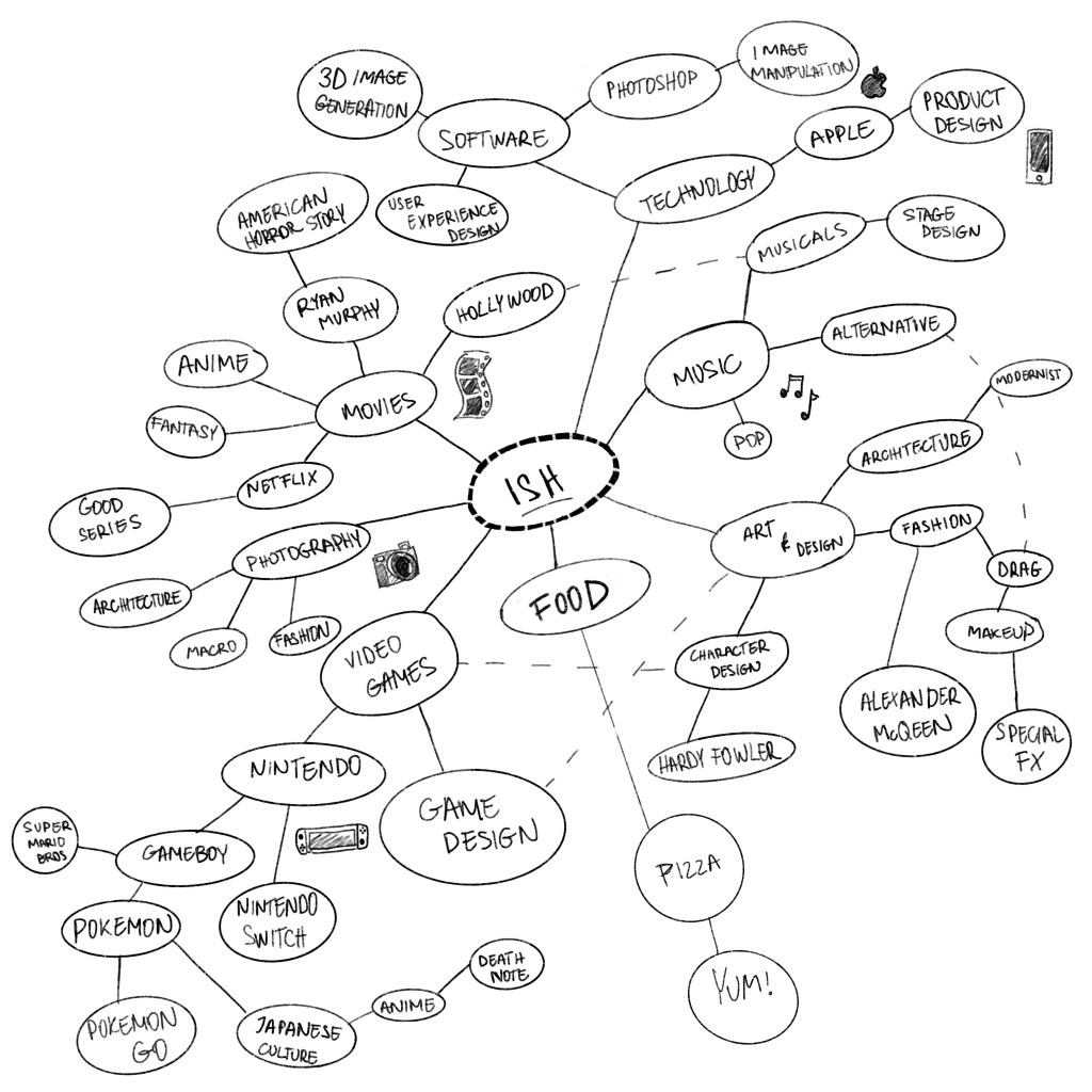
Working on the above mind map I was thinking about all the different things that interest me and wanted to make connections between them to see if I can see a real pattern emerging. I think there are quite a few common areas here that mostly group around art and design in some shape or form.
When I was done with this, I had a few ideas swirling in my head that I wanted to record in a form of a few thumbnails so I don’t forget these ideas.
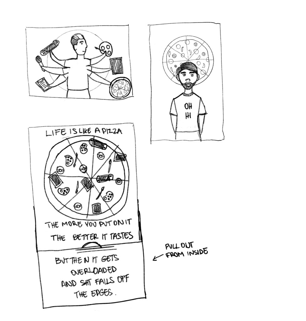
I was thinking along the lines of my likes and how they influence me and my life in general. The first sketch (top left) is about how I want to do a million things at once and reflecting my interests, and things I do on the daily basis.
The second idea is really simple, it is a cartoony self portrait with a pizza halo. I love pizza! I don’t think this is very descriptive or successful really, but wanted to let the ideas flow.
The third one is a pizza (inspired by the previous idea) but instead of the toppings I have things that relate to my life loaded onto it. I am quite fond of the caption too;
Life is like a pizza, the more you put on it the better it tastes –
but then it gets overloaded and s**t falls off the edges.
I think this is quite funny and captures what I feel like is wrong with life in general. You want to do everything all the time, but there is only so much time to do it all. I guess this is an idea I could play with a little more, as I think it is quite relatable and sums me up as a person.
The next day I started a new page to see if I can come up with different ideas.`
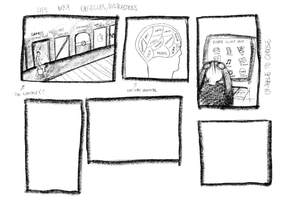
I must say that I felt really uninspired by any of my ideas and had a little bit of a rough patch in terms of coming up with something that I was able to connect with and felt like it is a good idea.
My dream studio
I like to do learn new things online, and I felt like a tutorial that I started on Skillshare to learn a new piece of software had a great topic that I think would be able to use as the basis for my illustration.
The idea was that all artists have a space they could picture themselves working in and I felt like this would be a really good way to introduce myself to my tutor with a illustration of what my ideal workspace would look like.
As it came out from my previous sketches and my mind maps, Pokemon as a piece of pop culture has a massive influence on who I am. I played the game since about the age of 10 and it has always had a special place in my heart. I wanted to capture this in my illustration somehow.
I first wanted to capture the idea in my own words.
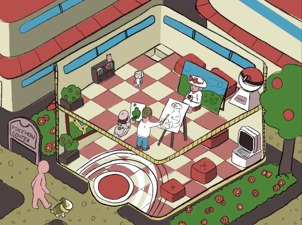
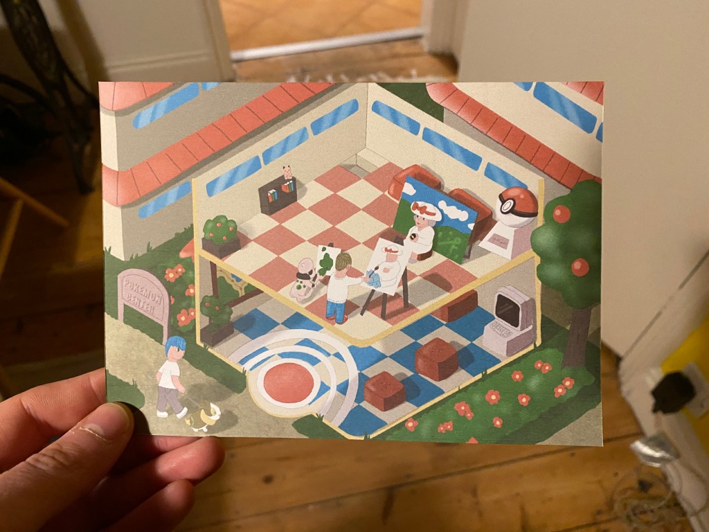
Okay, so I think my dream studio would be at the upstairs area of a Pokemon Centre. These buildings are a very important piece of The Pokemon universe, this is where trainers take their injured Pokemon to heal up after a long day of battling. I would like to be surrounded by these creatures, and I thought it would be really fun if I depicted myself as an artist that is working in a Pokemon Center, painting portraits of trainers and their Pokemon.
I think an isometric style illustration would be best for this, and I think it could work as a postcard also. Maybe it will be quite nerdy, but I think I feel like the outcome would be something special to me that could speak volumes about who I am, and what makes me tick.
Things that I would like to keep in mind:
- I would like the final illustration to be really fun and colourful
- I would like to include some of my favourite Pokemon.
- Nurse Joy should be in the illustration.
- Isometric style
- Simple colour palette
I started by sketching using my iPad, to try to come up with the basic proportions and lay the foundation for the drawing, using an isometric grid as a guide.
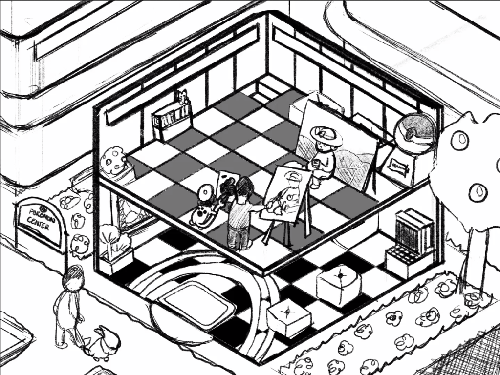
I was getting quite excited about this as I have never done such a fully fleshed out environmental illustration. I have dabbled with isometrics before but never took it as far as this. It was challenging to be able to show the inside of the building and while I really wanted to show something on the lower floor or the building it wasn’t really possible without distorting the proportions too much, so I decided to focus on the upper floor instead.
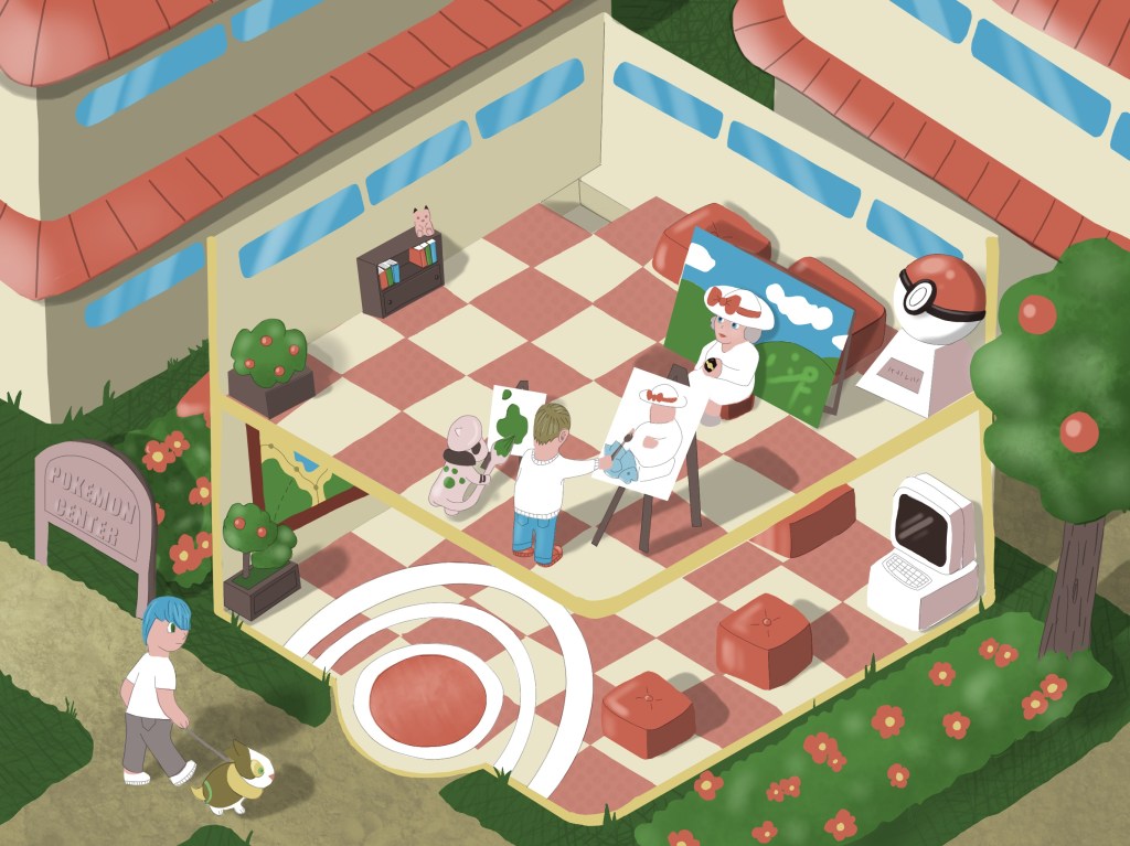
In the next step, I reduced the opacity of the sketch and traced oner this free hand to keep the original linework but reduce the density of the drawing. I tried to be lighter handed as I wanted to place the colour under my sketch with the blocks of colour showing through.

The illustration at this point was quite hard to read but served as a good foundation for my illustration because I could select the areas that I wanted to add colour to and fill those areas with solid colour. Once I started filling this with colour, I realised that this will not be a 5 minutes job to finish. There are just so many separate elements to consider.

At this stage I realised that my sketch was quite off in some parts and I wanted to rectify this when adding the colour. Note for example the entrance to the building, the colour layer looks completely different from the sketch, because thee circles were way off centre and I wanted this to be quite symmetrical.
I kept adding more elements and tried really hard to keep my colour palette simple. I was keep on considering if a new element needs to be a different colour for it to read properly on the illustration. For example when looking at the plants, I thought it was really important to keep them green to make them recognisable.
Adding the colour taken me longer than I thought. Sometimes it was really difficult to know what layer should go above or below others but this technique enabled me to adjust the small parts of the illustration separately which was really helpful towards the end.
Once I had all the colours in place, I sent this to the student community to get some feedback to see what other people thought of it, and if there is any flaws that really stick out.
I got the following comments:
- There are some perspective issues with the circles on on the ground
- The 2 floors are not distinguishable
After these comments I thought these are things I can easily remedy by tweaking things a little.
I added shading to the bottom floor, and changed the colour of the tiles so that this is less confusing, and also fixed the perspective issue with the circles on the ground by warping them to better fit the perspective of thee floor.
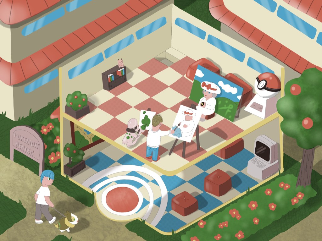
I was quite chuffed with the results. I think I managed to achieve most of the goals I set at the beginning of this idea. It is time to try this out as a postcard.
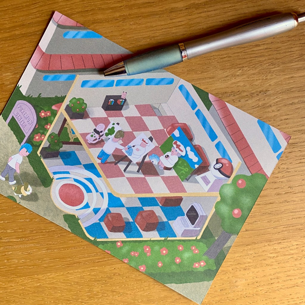
I went ahead and created a A4 document where I added a 5″x7″ (127 x 177.8mm) rectangle to see what this card would look like when printed. I immediately seen that some of the smaller details are completely lost at a smaller size, but wanted to see what this would look like once on paper.
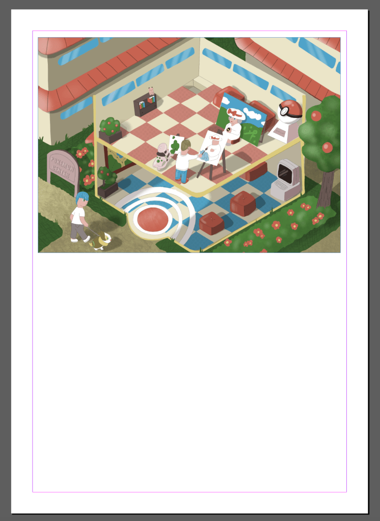
I was actually really happy with how the piece turned out once printed. I don’t feel any of the important details were lost, if anything, I found the illustration a little busy when printed in such a small size, so perhaps removing a few elements would be a good idea?
I also detected some issues with the way everything is clustered on the top floor, so I think I will move my painter (me) and Smeargle (the Pokemon to my left) slightly to the left to balance things a little.

I think after moving some of the elements and adding a new Pokemon to the spot that was perviously covered by the canvas, made the composition is a lot more balanced. I think I am happy with the results now. I have printed the postcard again to see how this works on paper, and to confirm I am happy with this.
Reflection
In this part I think I started to look at illustration a little more seriously and feel like I have gained a newfound appreciation for more manual techniques. I am still favouring digital over traditional, because of the accessibility aspect and the fact that I can take everything with me and carry on whenever the muse strikes. Since I spend very little time at home, having my iPad to access all the drawing tools I could ever need is very convenient. I need to expand on using more traditional tools to create my artwork and perhaps spend 1 day a week painting on actual paper with paints.
Overall, I think this card reflects my current ability well, and showcases a topic that inspires me to do illustration as well, so I believe it is fulfilling the brief that was set out for this first assignment.
As a closing note, I wanted to share my entire process of creating this illustration, as I think this can teach me a lot about how I could change my approach in the future to get better results.
