
Choose an editorial from a newspaper or magazine. Read it for information or pleasure as you would ordinarily. Read it again and this time highlight or underline key words which you think are important to conveying the meaning of the piece overall.
OCA Key steps in Illustration
You may find that you are choosing a single word per sentence or that your selection is dispersed throughout the text and denser in some areas than others.
Read the text again. You may well find that your understanding of the text changes as you re-read it. This time focus specifically on the words that you have already selected. With a different colour, jot down the words that summarise the meaning of the entire text.
Depending upon the nature of the content, this may be one single sentence or a string of words. This process of distilling and condensing the text will help focus on the message that needs to be communicated.
The words that result from this process are your starting point. You can now say to yourself “I’m going to create an image about….”
Now have a go at an illustration for your text. Try a number of different ideas or variations. Keep the drawings together with the text so you can refer back to them.
The editorial
I wanted to do an editorial that is discussing something meaningful, and so I looked at The Guardian Online to see what their editorial team was discussing at the moment.
I found an article about Extinction Rebellion and how their protests around the world have caused quite a stir. I thought this would be a fun thing to illustrate.
I pulled off a PDF of the article so I have it to hand and I can work on highlighting key words to get a better understanding of the article.
After marking up the document as asked for by the exercise I think I had a much better idea of what the intent of the article was. It was meant to highlight the fact that Extinction Rebellion’s work is to open the eyes of politicians and civilians to the fact that the climate crisis is just as important as other issues, such as the economy. They keep the idea at the forefront and aim to get politicians to aim for slightly unrealistic goals to be able to attain the more realistic ones by aiming further afield.
My key phrases from the article:
- Climate Emergency/Crisis
- Zero Carbon Footprint by 2025/2030/2050
- No practical answers
- Hyperbolical – may harm the cause
- Keep it on the minds of people
- Urgency
- Provoke politics for unrealistic goal
- Climate Crisis = Economy
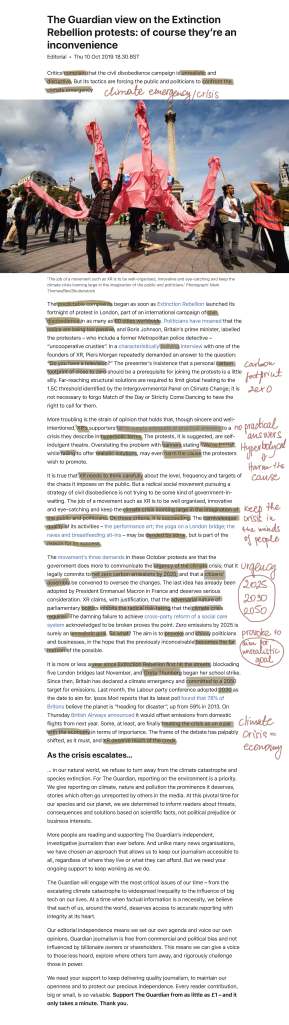
I wanted to start sketching out some ideas I had in mind.
My first idea was to play with a visual metaphor around aiming for 2025. In this picture I wanted to show a politician as a darts player and the crowd cheering for him, with phrases like “You can do it!” “Aim for 2025” etc. I thought this was a fun idea, but didn’t really describe the editorial well enough.
The next sketch was inspired by something Greta Thunberg said along the lines of if your house is on fire that requires a certain amount of panic. I represent the world leaders with the accountant who is more focussed on solving the issue at hand which is some money problem rather than realising or paying attention to the fact the house behind him is on fire. I quite like this idea conceptually, but again I am not 100% sure it was reflecting what the article was saying.
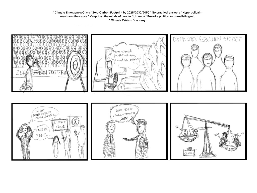
In my 3rd image, I wanted to play with the idea of how Extinction Rebellion has made people think about the issue of Climate Change in a broad sense. I thought it would be cool to show a crowd of people where you’d be able to see into their heads.
Number 4 was all about world leaders not listening, I wanted to play with something where you’d see the actual protesters in the image, but I thought this was a little too literal.
In the 5th thumbnail, I thought it would be a good idea to play on the thought of the protesters provoking the politicians into making a bold move and committing to zero carbon footprint by 2025. I like the simplicity and cartoon like approach to This his.
The last idea and perhaps my favourite is the one with the scale. The idea is that small people’s opinions weigh less and so therefore the scale is unbalanced. If more people would pile onto the left hand side of the scale this would eventually trigger change. In the other tray of the scale is world leaders, there is not as many of them but they weigh a lot more. I think this is a great idea, but not sure how true it rings with the article itself.
I have sent the thumbnails to some other students on the Visual Communications degree pathway to see which one they liked the most. They have picked out number 3, which was also one of my favourites.
I sent it to some friends with no design backgrounds and they seem to have gravitated towards the last one on the board.
I decided to give number 3 a go first by trying to re-iterate the idea in different ways to see what effect the layout of the design have on the overall idea and to further investigate what I could do with this concept.
I really liked the heads against the globe approach. Setting the heads against each other creates a strong pattern and I think it conveys the idea of the quite well. Something along the lines of we all need to think about our planet in advance to save it and this is why movements such as Extinction Rebellion is ultimately doing good for the planet as a whole.
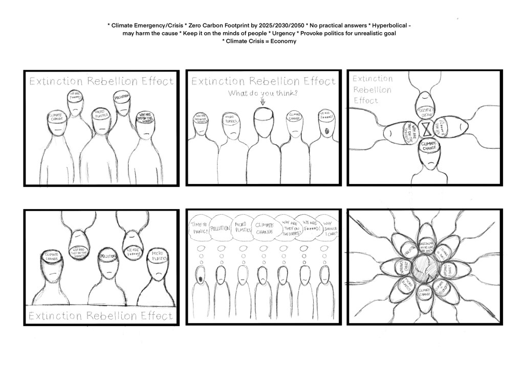
I shared this with some other students and they game the idea of creating a similar layout but using the figures to recreate the XR logo which is a simplified hourglass.
I quite liked this idea, however it kind of limited the number of figures I could put into my design which would limit the number of different thoughts I could reflect on the piece.
I felt ready to take at least one of these designs to a more finished state.
In terms of style, I kept on thinking about some generic people drawings I made before in Affinity Designer on my iPad. These were quite playful and I thought it could work as a basis for my illustration.
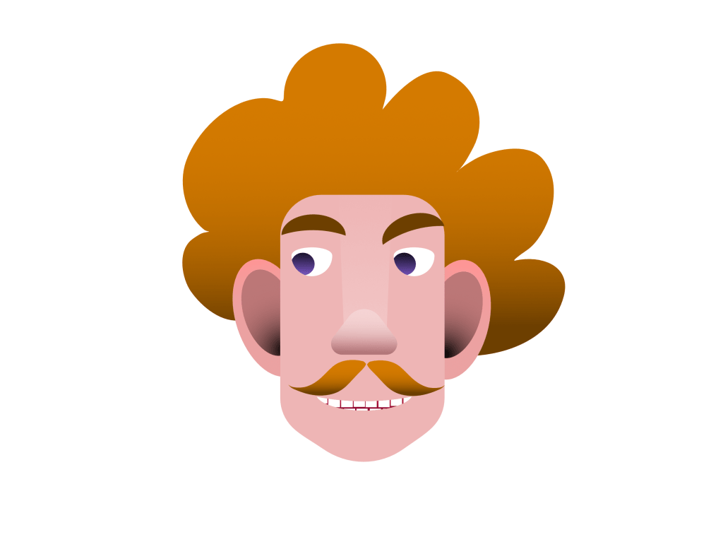
I don’t quite remember what I created this for, but remember that the process was simple and yielded great results. I thought I could create different looking characters and add the circle where the brain is to these to both add visual interest and dynamism to my final image.
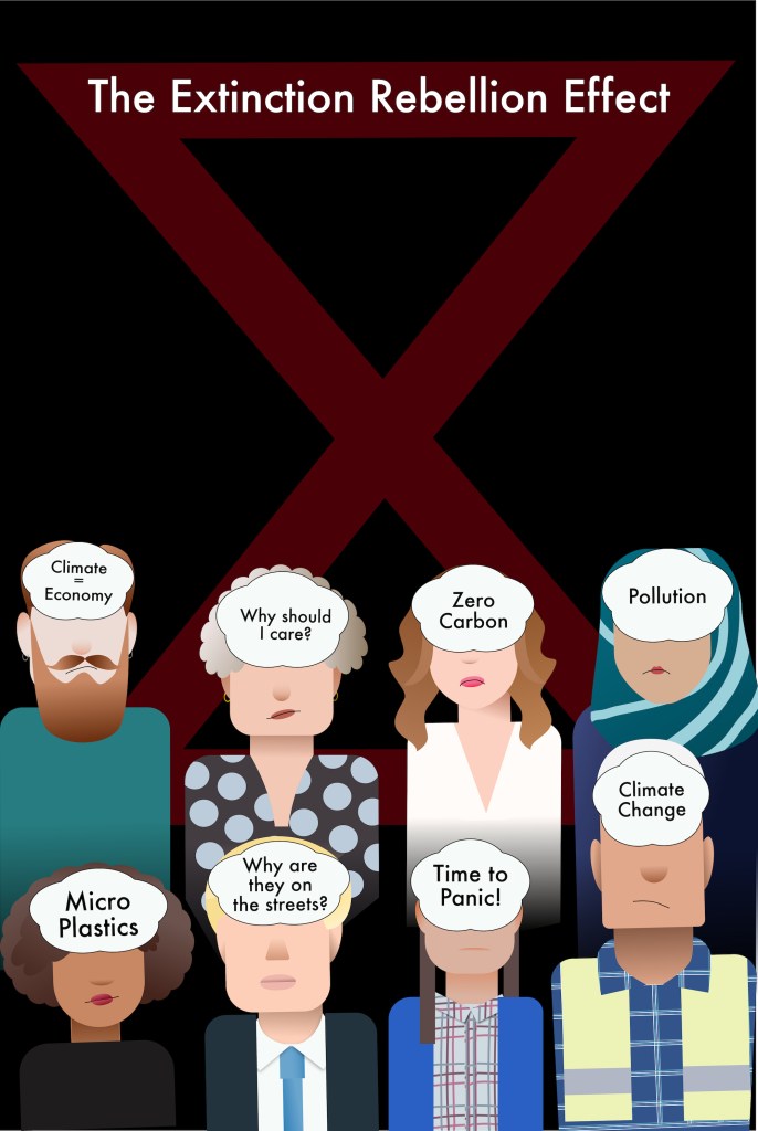
I knew I wanted to include Greta Thunberg as a character in my design as I think she is largely synonymous with the green movement nowadays and also has some great lines that are associated with her that I could include in my design.
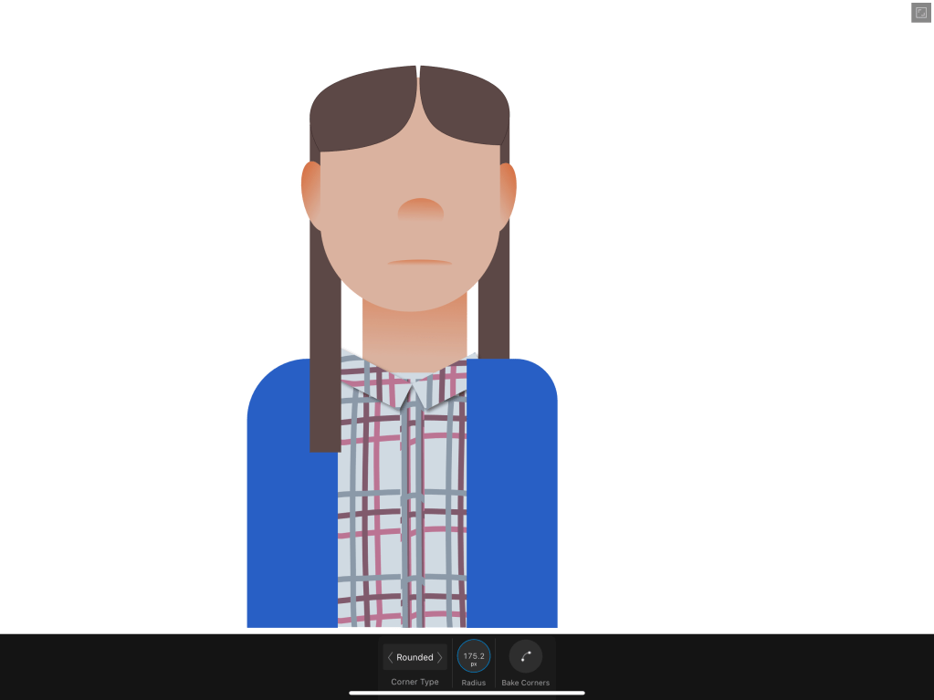
I really liked the blocky quality of this and was trying to come up with characters that are as different from her as possible to show a degree of diversity in my piece. I thought it was important to give all sorts of opinions/ thoughts that the XR movement may have stirred up a place in the final work. I started to gather pictures of people from all walks of life, some are people I knew from the media and some that I didn’t.
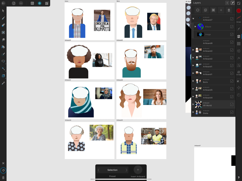
I really liked how this is started to turn out in terms of the individual elements and I wanted to see how it all looks together.
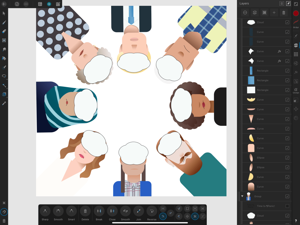
I put all the characters together on an artboard and arranged them in a circle. I wanted to re-create the last idea from my sketches. Added a quick earth illustration to show that this is the subject at the centre of it all and the Extinction Rebellion logo on top to link back to the article a little more.
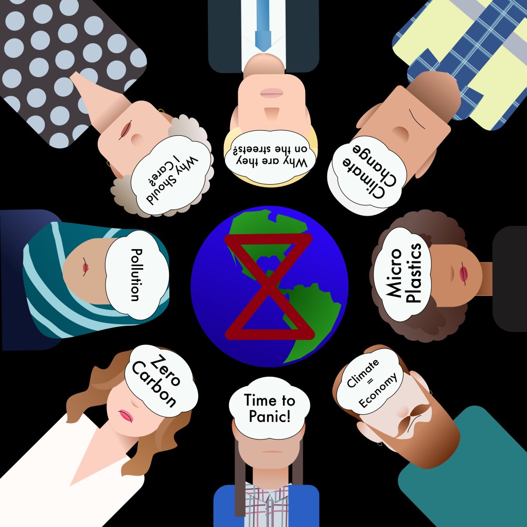
Although I can see many issues with this, I thought it is kind of cool overall and in my opinion fulfils the brief.
The problems I had with this concept is mainly that there is way too much text, but I didn’t exactly know how to illustrate all of these different thoughts so it works and the final piece is still as readable, and also I think the text might be difficult to read if it is upside down in certain places, but I didn’t want to turn the text around because I think it creates a nice balance in the piece at the moment. If the text was facing different ways, I think it would look messy and distracting. Also, I think this approach keeps the viewer engaged for longer as they may need to spend a little more time
I wanted to see what other layouts that I sketched out I could create using the characters I already built, to see if I can come up with something with a better impact.
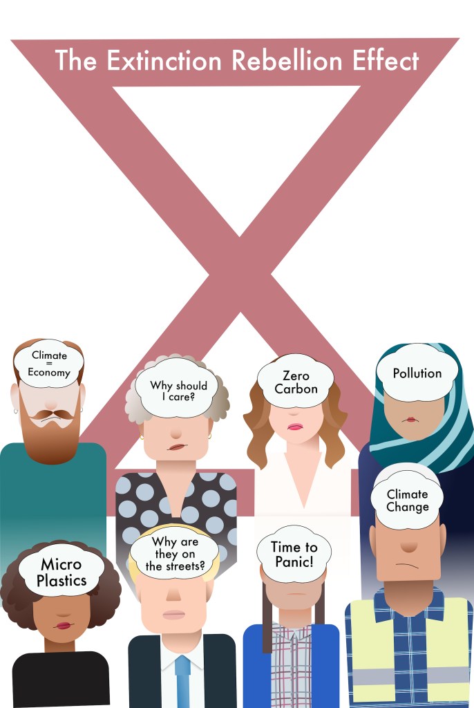
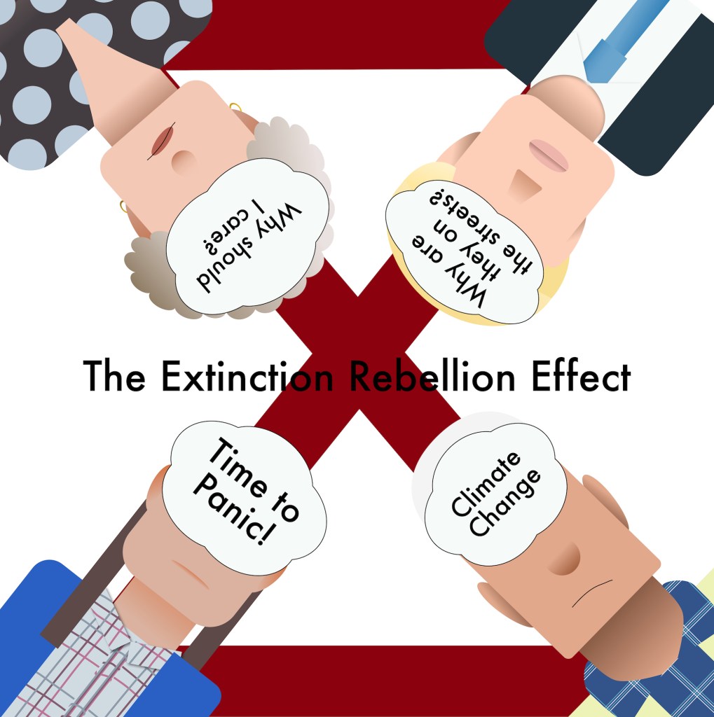
After playing with various layouts for this, I decided that the original with the earth in the middle was still the most successful in communicating the idea from the article.
Reflection
I think this exercise was quite good at showing me how to distill the ideas from a relatively complicated idea to create an illustration. I enjoyed how the article was the basis for the illustration and therefore the outcome in more meaningful and sophisticated. I think having a strong concept behind an illustration is just as important as the technical ability to create a drawing.

One Comment Add yours