
Brief
In this exercise you will explore how illustration has evolved over the past 50 years.
Start by choosing one from this list of illustrators:
– Edward Bawden
– Kathleen Hale
– Eric Ravilious
– Edward Ardizzone
– John Minton
– E H Shephard
Then using books and the internet, find out about these artist’s work and the cultural context in which they created their most significant works.
Now find a contemporary illustrator whose work you like. Explore and identify the differences in style, context, production and imagery between the two illustrators.
Write notes in your learning log about the work of each of the two artists:
– Did the work of the illustrator that you chose from the list seem old fashioned?
– What was it about the work of the contemporary artist that attracted you to their work?
– How did each artist produce their illustrations
– What tools and materials did they use?
Now draw an illustration in the style of each artist, selecting similar subject matter and using similar media.
OCA – Key Steps in Illustrations
Research
I decided to first look at the work of all the illustrators that were listed above and try to find one that I find most interesting.
Edward Bawden
Bawden was a painter, illustrator and graphic artist, most known for his prints, book covers and metalwork. Bawden was a teacher, war and commercial artist. He mostly worked in watercolour but also known to have used many different art mediums.
His tile work that was made for London Underground in 1928 is still displayed at various tube stations, such as Victoria, and Tottenham Hale.
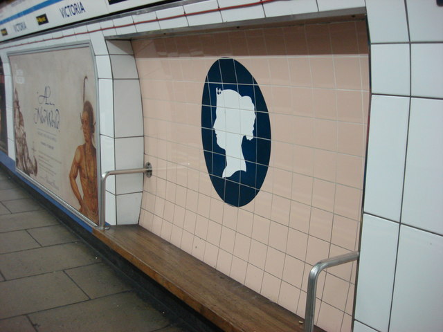

I read on Tate online that Bawden used Lithograph on paper as the technique for these prints in his Six London Markets series, and I wanted to find out what this technique is all about.
The lithography process starts by coating the surface of a block limestone, or a metal plate, with chemicals. An artist then draws an image onto the surface with a greasy crayon that will hold ink in place. The plate is then covered with damp paper before it’s passed through a printing press, and the paper will then retain whatever was drawn by the crayon.
Our Pastimes
I found this technique quite intriguing, and would love to try it out some day.
Sources
- https://www.tate.org.uk/art/artists/edward-bawden-707
- https://en.wikipedia.org/wiki/Edward_Bawden
- https://ourpastimes.com/the-difference-between-print-and-lithograph-12326125.html
- https://www.tate.org.uk/art/art-terms/l/lithography
Kathleen Hale
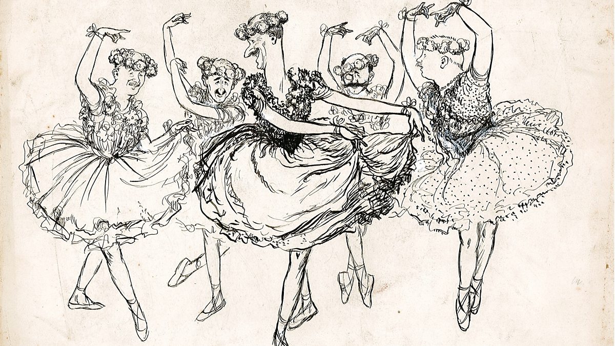
Kathleen Hale is most known for her book series Orlando, the Marmalade Cat which she wrote and illustrated. These books were a breath of fresh air for the children after the war as things were very drab and lacked colour. These books have shown a very much needed positive, colourful outlook for children at the time.

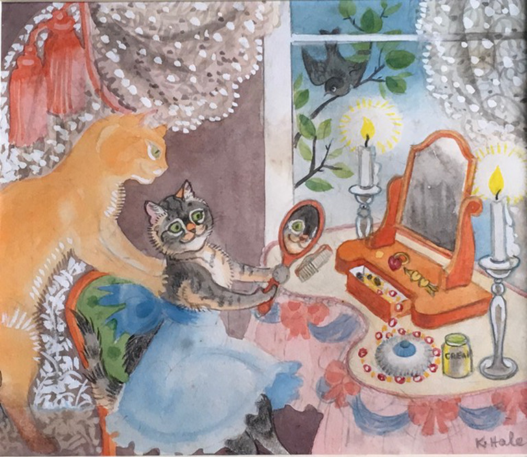
Her illustrations mostly very colourful and often depict animals and nature scenery. I like her style and really impressed with her colour choices. I like that she depict animals with some human traits that makes them all the more likeable.
Sources
- https://www.independent.co.uk/life-style/nine-lives-of-a-cat-woman-1161295.html
- https://www.parkinfineart.co.uk/kathleen-hale
- https://www.theguardian.com/books/2000/jan/28/news.obituaries
- https://www.parkinfineart.co.uk/kathleen-hale
Eric Ravilious
Eric Ravilious was a painter, designer, book illustrator and wood-engraver. He is mostly known for his watercolour paintings of English landscapes. His style is very interesting with lots os small strokes for the shading and the man made objects are very clearly drawn and accurately proportioned.


Sources
Edward Ardizzone
Edward Ardizzone was an English painter, print-maker and war artist. He also illustrated many books, mainly for children.


I like how his themes are mostly about people and how society works. I think this makes him different from the other artists that I looked at as part of this exercise so far. I quite like his style as well, it is more about the feeling of the scene rather than the actual accuracy of proportions. I like this style of illustration as it is more loose and in the moment.
Sources
John Minton
John Minton was a painter illustrator and stage designer. He taught illustration several art schools and consistently produced work throughout his life.
He is mostly remembered as an illustrator, however he also designed textiles and wallpapers. He produced posters for London Transport and Ealing Studios, he was also highly regarded as a portrait painter.


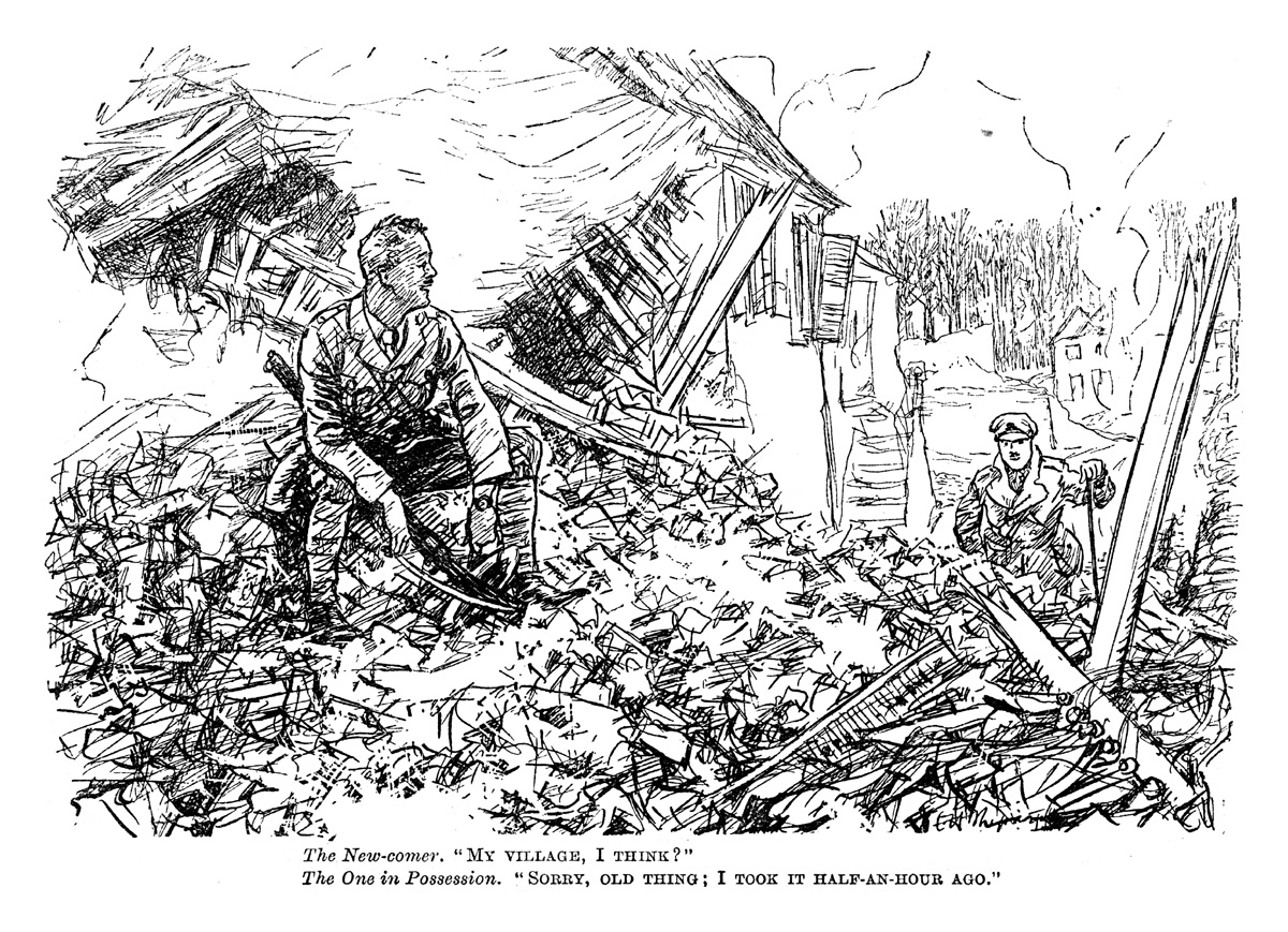
When looking at Minton’s paintings one can feel a certain sadness and melancholy radiating through. In his 1946 piece he depicts an abandoned London street after the Second World War, the pile of rubble takes foreground to show the amount of damage the conflict has caused.
Sources
- https://www.tate.org.uk/art/artists/john-minton-1644
- https://en.wikipedia.org/wiki/John_Minton_(artist)
E H Shepard
Ernest Howard Shepard was an English illustrator mostly known for Illustrating Winnie-the-Pooh. He also served as an officer in Royal Artillery in the First World War and worked as a war artist and produced work for the Punch magazine at the time.
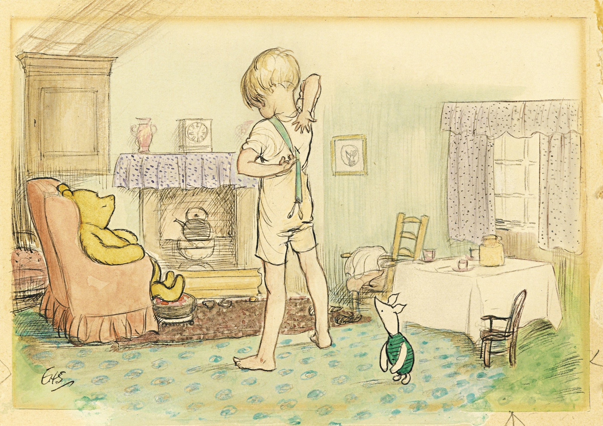
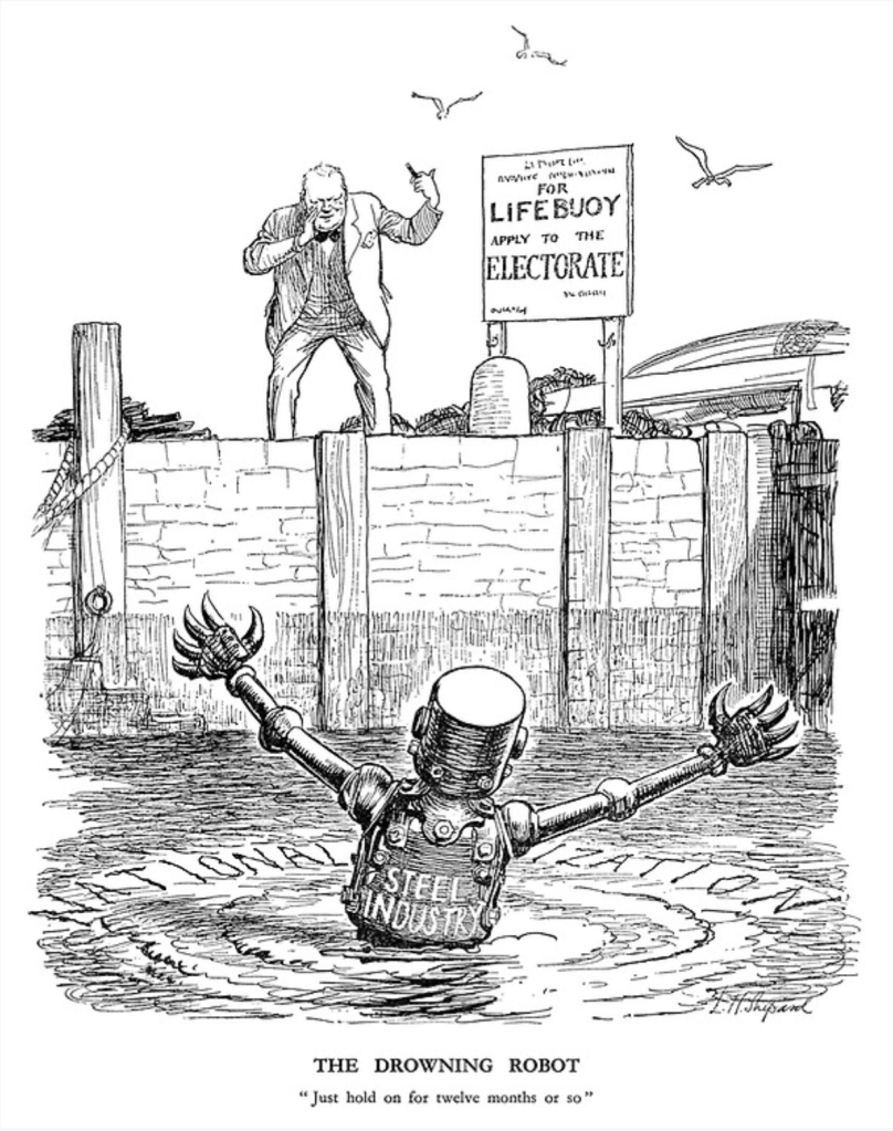
Shepard’s work was mostly line based, not often using colour as these pieces were produced for the Punch magazine that was printed in black and white at the time. I really like his style, quite cartoony and hilarious, not afraid to make political statements in his illustrations.
I believe he produced his images using a pencil that was recreated as a print.
I think I will try to produce an image in his style of a current issue, as I feel politics never fail to provide topics for an illustration that is similar to the ones E.H. Shepard used to create.
Sources
- https://www.illustrationhistory.org/artists/ernest-howard-shepard
- https://en.wikipedia.org/wiki/E._H._Shepard
- https://punch.photoshelter.com/search?
E.H. Shepard
Although Shepard was mostly known for his illustration of AA Milne’s children’s book “Winnie-the-Pooh” in 1924, he also worked for at Punch magazine for 2 decades prior to this and has been creating cartoons for the magazine from the front line during the First World War. He became a permanent member of the editorial staff at the magazine from 1921 and was made the chief cartoonist in 1945.
I especially like his political cartoons from 1933 onwards as I think these are what great illustration is all about. I love how the images always show the problem at hand in a humorous way.
I also chose this as I managed to find a huge catalogue of his work online, which will give me lots of opportunities for primary research.
Sources
So after submerging myself in the political comics by E H Shepard, I decided to pick a topic that is very controversial at the moment and try to make a comic that reflects the current situation.
The topic of BREXIT is quite divisive and I thought this would be a good place to start. I have tried to steer clear from the whole brexit issue so far as I find the whole of it quite upsetting, so I had to wrap my head around what is happening exactly.
I started by devising a mind map that would pick out key words of the current news articles on the BBC, and trying to make sense of it all.
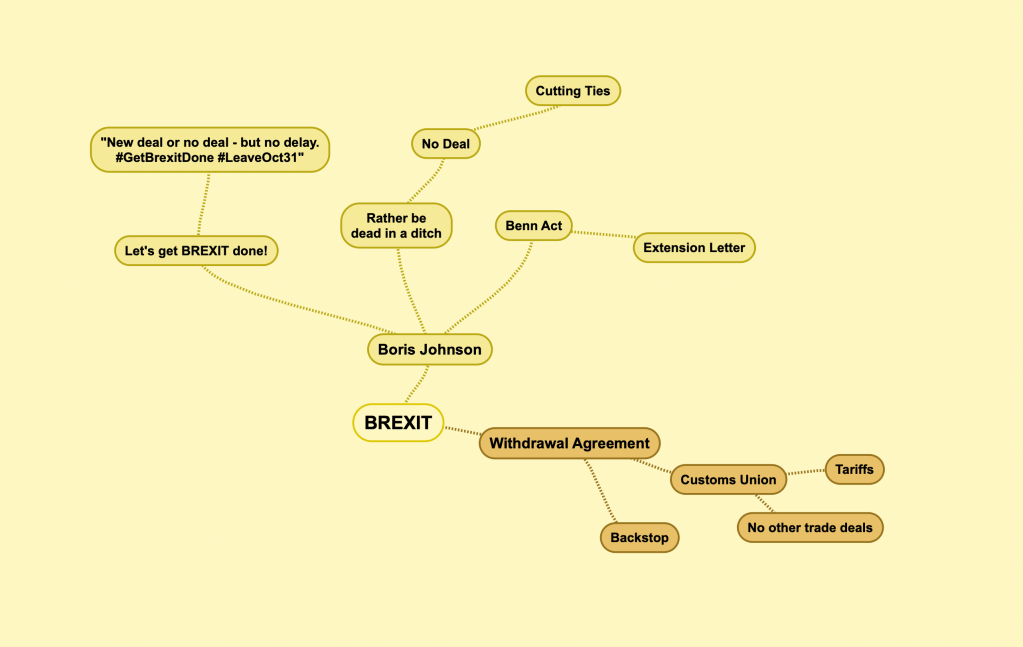
After the mind mapping I had a pretty strong idea of what I would like to do for my first ever political comic. I thought the “cutting ties” phrase could turn into a nice visual pun. I imagined something where Boris Johnson would literally cut the ties of influential EU leaders.
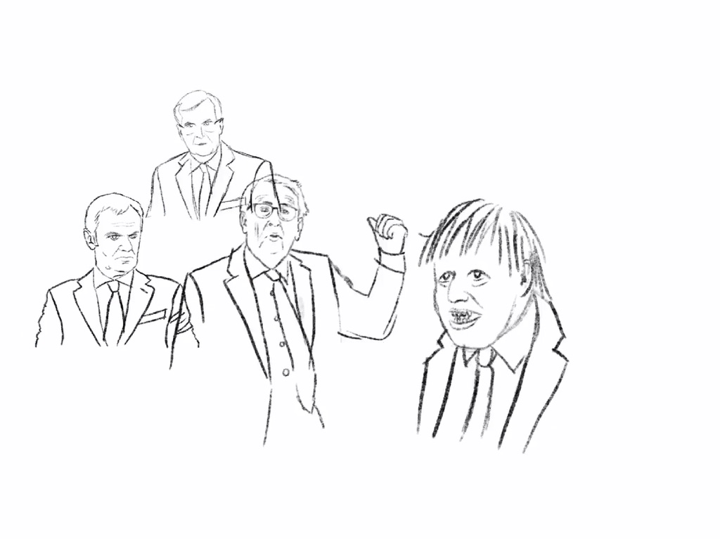
To start my illustration, I gathered images to use as inspiration. I wanted the people to be recognisable and so I gathered photos of them from Google Images, and also looked at images of a person cutting another person’s tie off, which was helpful in getting the pose somewhat correct.
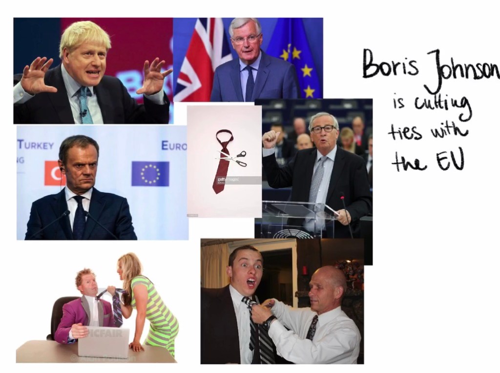
Once I had these images I wanted to see if I can draw over the characters for my illustration to capture their likeness, and attempt to create a composition using these outlines. I was quite excited about how this was starting to turn out.
I had to mirror some of the leaders as I wanted all of them to all face BoJo in the final image.
Once I had a composition I was happy with, I merged all my layers with the line drawings on and started to work on making the drawing make more sense hierarchically by rubbing out some of the lines that would logically sit behind other elements.
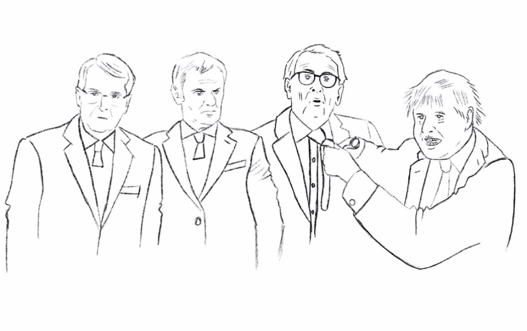
Once I had my final line drawing, I went back to some EH Shepard illustrations, to take a closer look at his shading technique. I observed that he mostly uses cross hatching to shade his scenes, and I wanted to try to apply this to my artwork.
Once I started shading the image really started to come alive, however I was not sure if this technique was ever going to be my favourite. Drawing so many lines side by side didn’t come easy! I wanted the line-work to be consistent throughout, and also with what I observed in the original images.
As soon as I reached a point where I thought the characters were shaded to my liking, I wanted to add a tag-line to the image in a similar fashion as EH Shepard done before. I thought this is a great technique to drive the point of the image forward. I had a few tag lines in mind, such as: BoJo the chief negotiator, Brexit negotiations, Cutting EU ties. At the end I went with “Brexit Negotiations – Cutting all EU ties”. I thought this was funny and also explained the image a little just in case it wasn’t clear.
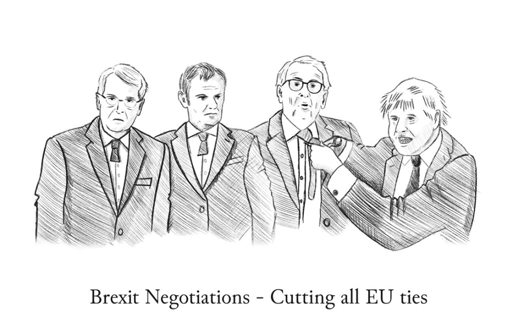
Overall, I think I am happy with my image as a first try at something with a political background, and also at a style of illustration that I didn’t know I would be able to do.
I found the line shading more difficult to do than I imagined it would be and I feel that I didn’t do a fantastic job with this. I might go back and add some sort of background as well, as in Shepard’s illustrations there was always context, but mine seems to just float in the air.
Contemporary Illustrator
To be quite honest, I am quite oblivious when it comes to names or recognising peoples artworks. I know of a very few illustrators, so I thought this might be my opportunity to dive into the world of modern illustration and see what I can find!
I thought it would be a good idea to start my search through my instagram account… just because I didn’t remember their names, it doesn’t mean I wasn’t already following a few illustrators.
After some scrolling around I found the following illustrator that really stood out to me.
Christoph Niemann
Niemann has illustrtated covers for the New Yorker, National Geographic and The New York Times Magazine. I first came across Christoph Niemann’s work through a show called Abstract on Netflix. I was really inspired by the mixed medium works he creates by mixing real world objects with illustrations. I found this very very inspiring and I decided to give it a go myself.
While I usually create my work based on a quite rigorous process. I come up with an idea, then conceptualise those ideas by creating thumbnails and creating the finals that way, I found the idea of looking at objects in my surroundings for inspiration and creating the artwork based on these items very liberating. I didn’t really need to think about what I wanted to create but rather let the ideas come to me by reacting to my surroundings. I found this technique akin to watching the open sky and imagine all sorts of images in the clouds.
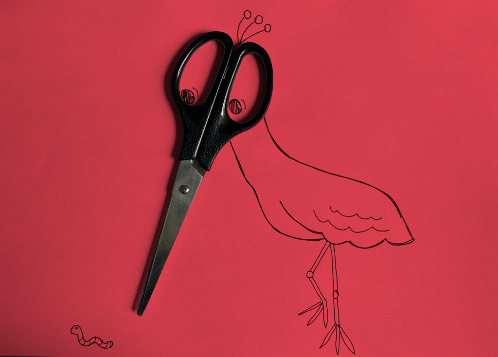
My first image was based on a pair of scissors. I thought they resembled the beak of a bird and so I wanted to create an image of a bird. I added the worm to create a story.
I thought this was fun and wanted to take this idea further and apply it to different items, so I looked around my desk to see what else I can find.
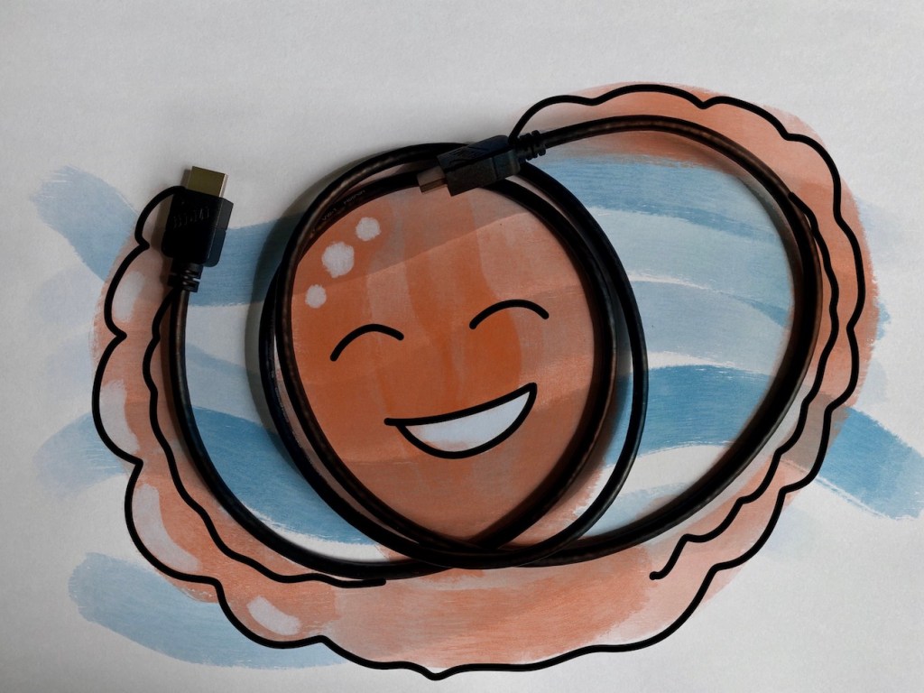
Next I created some different doodles based on an HDMI cable that was laying around. I found the pliable nature of the cable quire interesting. I made a few different drawings based on this.
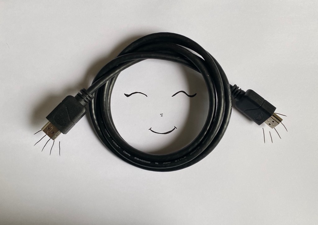
I thought creating a cute face based on the loop of the cables was a simple idea. I could really see a young girls with pigtails right in front of me.
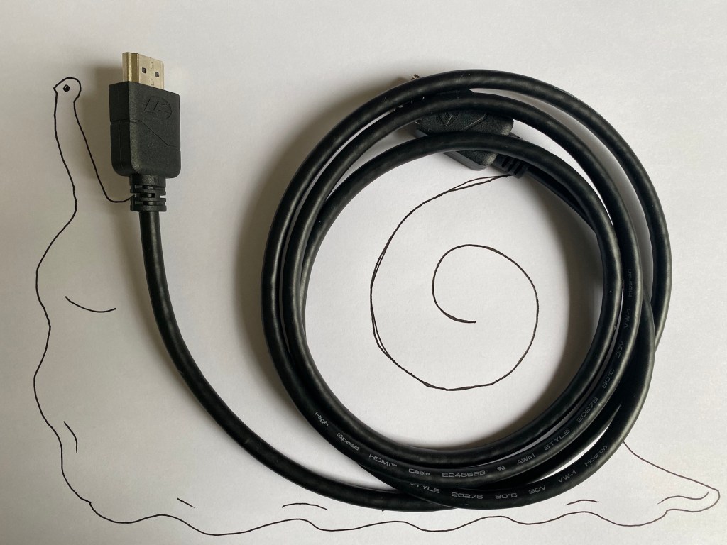
A snail came almost naturally as the coiled up cable reminded me of the spiral of a snail’s shell. I wasn’t too sure of this one.
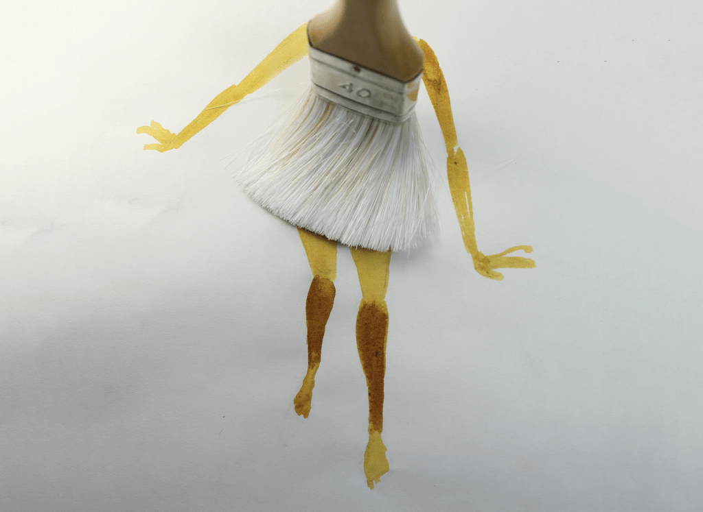
For my last illustration I decided try to create the image using some digital techniques, as the pens I had to hand were limited and all my drawings looked quite similar due to this.
I photographed the image and added all the doodle around it using my iPad in Procreate. Added some watercolour to the image as well as I thought this was fun and really made my happy octopus come to life.
Although the idea was inspired by Niemann’s work, I feel like the output was quite different. Perhaps it is because of the different mediums used, or just purely because my technique is less refined, but I was quite pleased with the results.
Comparison
When looking at the works of the two illustrators I tried to emulate, I found a few differences.
While I think EH Shepard’s style is quite timeless, I felt that the techniques available to him were quite limited when comparing it to the options available to Niemann. This naturally leads to a lot less intriguing image and find that the outcomes are a lot less exciting.
The way Niemann blends real life objects with his illustrations is only possible due to the recent advancements in technology. Sure, it would have been possible to illustrate a bird with scissor beak before digital photography was available, but would have been so much harder to produce this kind of imagery.
I think the available tools are what ultimately makes Illustration from our time more interesting. The way we can use a plethora of tools that were previously just not available gives us the opportunity to create in so many different ways.
Reflection
I really enjoyed this exercise. I think it is super important to look in the past to find inspiration and to be able to look at other artists’ work and decipher the way they gone about creating their works. This helps us create new things we didn’t think of before and inspire to blend techniques and try new things.
I think I will make a habit of looking for inspiration by trying to recreate styles by other artists, and hopefully this will help me find my own style.
