
This final assignment is an opportunity to consolidate the understanding you’ve gained so far, reflect on the work you’ve enjoyed and your achievements. It allows you to create certain parts of the brief yourself so that you have the maximum capacity to show off your interests and talents.
Choose one of the briefs below. Then work through the design process, researching and visualising a range of ideas before critiquing your work and choosing your selected design to present as print ready artwork.Brief 1: Book design
Penguin Books have asked you to design a new house style for a collection of books on design for children and young people.
They are starting with three titles: Colour, Typography and Photographs. You will need to produce three covers (front, back and spine). The designs will need to be recognised by readers as a series and at the same time be appreciated on their individual merits. The book dimensions are 190mm wide by 225mm high.
In addition they have asked you to produce the one on typography called A is for… It doesn’t have to be a conventional text book. Create an introductory chapter of at least 4 pages that is visually interesting and will entice young people into wanting to buy the book and read more about the fascinating world of typography.Brief 2: Promotional design
A youth theatre club is performing a production of Abigail’s Party. Mike Leigh’s tale of suburban taste is set in the 1970s and explores middle class aspirations and preoccupations.
You will need to acquaint yourself with the play if you don’t know it already, as they are particularly keen for it to have a 70s feel. The play will be touring local theatres for a month, performing every Friday night and Saturday matinee.
Produce a poster (A3 portrait), a flyer (A5 landscape, double-sided) and newspaper advert (A6) to promote this event. In addition they would like their A5 programme cover to continue the design theme.
For the purposes of this brief you need to invent dates, times, places, names and any other information you think will be required. Use Lorun ipsum text for areas of body text.Brief 3: Charity work
OCA Graphic Design Core Concepts
The Gerald Anthony Furniture Store is a charity that helps poor and displaced people furnish their homes with the basics. It has been running for over 100 years, staffed mostly by volunteers. They would like you to design a generic business card, letterhead, and paper mock up for the home page of their website. In addition they want you to design their 8 page annual review.
The review will consist of:
• front cover
• inside front with a bit of blurb about their history (90 words)
• the chair’s report (365 words)
• the co-ordinator’s report (300 words)
• the treasurer’s report ((260 words)
• a graph or design to show the breakdown of income and expenditure
Income
– local authority grant £48,927 – grants from trusts £66,750
– donations £14,655
– other £4,032
Expenditure
– direct charitable expenditure £113,192
– fundraising costs £6,655
– management and administration £10,924
• a page giving the names of the main grant funders (20 in total with each name about three words long)
and a list of the management committee: chair, treasurer, co-ordinator secretary and five other members,
• the back cover with an advertisement to encourage people to volunteer.
Maybe the biggest challenge of this brief is to solve how to break up and lay out the text in the 8 page document. Photographs will need particular care as some people who benefit from the charity may not want to be identified.
Brief Analysis
For assignment 5 I was asked to choose 1 of 3 options. After reading through the options, I feel like I would benefit the most from creating Brief 2, the Promotional design. I think this is something I haven’t fully tackled in this previous part, and I am excited to try my hands on creating something 70s inspired. I also thought this is the most light hearted of the 3.
For this assignment I will need to create the following items:
- poster (A3 portrait)
- flyer (A5 landscape, double-sided)poster (A3 portrait)
- newspaper advert (A6)
- A5 programme cover
I need to invent dates, times, places, names and any other information that will be needed for the designs.
Some questions that came to mind from reading the brief:
- Who is the audience?
- Am I allowed to use photographs?
- Will the newspaper advert be greyscale or colour?
List of information to include in my poster:
- Title
- Director
- Time
- Dates
- An illustration of sorts
- Some quotes?
- Any other info?
Research
I will have to thoroughly research the style of the 70s. This is an era I don’t know much about, but really want to get under its skin to be able to create designs that look like they were made in the era. To do this, I will want to look at designs made in that era, and look at any stylistic choices and colour palettes that would have been used at the time. I want to be as true to the era as possible.
To prepare for my assignment I first watched the movie version of the play, this was filmed in 1977 so it gave me a glimpse of that era as well as shown me what the story is all about. It is an amusing watch, I am looking forward to creating something that captures the essence of the play.
I started by some visual research by looking at various libraries online such as Bridgeman Education, and looking at art from the era. I didn’t want to go too cliche with the styling of my artwork and so I wanted to distil what art of the 1970s looked like.
Here is some art I really liked from that time period:
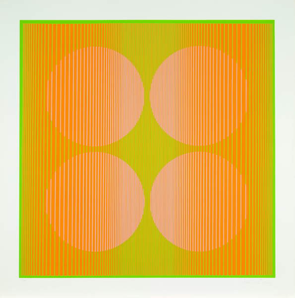
I really liked this print because I always think of the 70’s as beiges and browns, but this print shows that some brighter colours were indeed used in the era.

The next print is more something that I had in mind in terms of colour scheme when thinking of the seventies. I really like the mixture of different textures in this print, I find this quite inspiring. I also like how the waves create an almost hypnotic rhythm in the piece drawing your attention to the central piece.
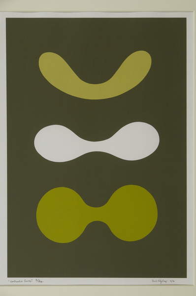
The next piece is also an interesting abstract screen print from the time. I like the harmonious colours of this print, it has a very calming soft feel to it. The organic shapes seem to be in a sort of sequence morphing from the bulbous shape to something more streamlined. I like the simplicity of the colours.
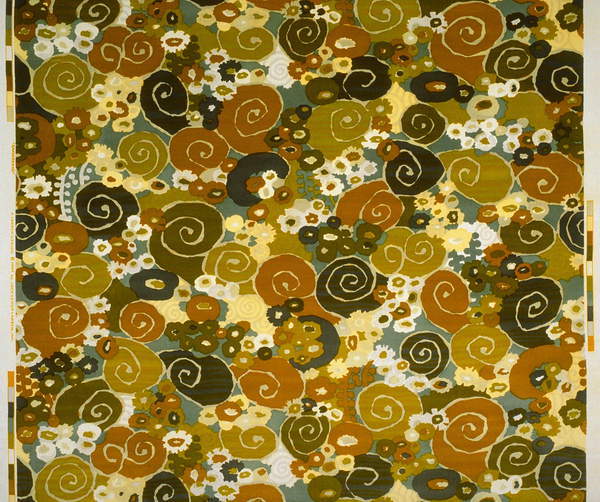
The next piece I chose because of my pre conception of what I think the 70s was all about. When I think 70s I think of all the above muted brownish colours and the organic, sometimes hand-drawn patterns. This is a textile design from around the time although the exact timeframe is unknown.
Next, I wanted to take a peek at what sort of posters/promos have been created for the play before, and if I could learn anything from these.

I thought this DVD cover is quite successful in conveying the era with colours and the tinted photograph. Obviously I won’t have access to photographs, for this as it is fictional, but I think I can learn from this. I like how. the colours work together and the font is very interesting.

This is a more modern poster, but it has some elements that give a gentle nod to the 70s. The colour and the font are quite fitting for the era, however the layout and the photography invoke a much more modern feel in my opinion.

In this poster, I feel apart from the font, and perhaps the actress’ hair nothing reminds me of the 70s. I think for this assignment I would like to anchor mine using a lot more elements than that. If I looked at this poster without knowing the era, I wouldn’t be able to guess the era very well. The bottom font is more of a modern take on the 20s than 70s, and the photography is very modern. I think I would like to go down more of an illustrative route.

In this next one I feel like that there are some good ideas. I like how the pattern is brought in with the font but not using a strictly 70s looking font. I also like how the pictures are simply put into polaroids for the actor that appear on the show. It seems to be a common theme of using photographs on these materials, so I have to reconsider the style I had in mind for my version.

I think this next one is super successful, and probably my favourite of the ones I could find. I really like how it doesn’t involve people but rather shows an assortment of significant items from the show that are all very symbolic of the era. I love how this is made to look modern but keeps enough visual cues for the viewer to decide in what era the play is set.

This next poster is for a production of the play at SF Playhouse, and I think the poster has some really great ideas. It shows the lead actress holding a drink and some olives having a good time. I think the poster is successful, but perhaps a little too strongly coloured for an authentic 70s poster in my opinion. I really like the font that is used for the sub headings.
Mind Mapping
I decided to draw up a mind map to help me decide with the direction for my designs.
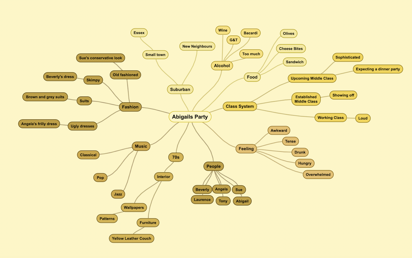
Most of the things that came to mind were very non-graphical, and hard to describe without words, but a lot of the other ones were quite easy, and I thought I could focus on those for my design, such as the furniture and fashion of the time. Maybe even the food would be a great topic to explore as the food is quite distinct and invokes the feeling of the story.
Next I wanted to have a look around the internet (Especially Pinterest) to see what sort of inspirational material I could find. I found quite a lot, however I sometimes found it extremely difficult to focus my search for the 70s. It is mainly because its smart algorithm almost forces you to look at other images slowly taking you off the path you were originally on. In any case, I put together a Pinterest board with all sorts of inspiration I could find this way, to aid my decision making later on when creating my own designs. The thing that immediately stands out about this board is the monotone colour scheme. It is using browns and beiges, some oranges as an accent colour. I think I will stick to these colours when creating my designs as well.
Sketching
I wanted to create some sketches to see what I could come up with in terms of layout and illustration ideas. I decided to do all my sketches in brown instead of black as an experiment to see how this changes my perception of what I create.
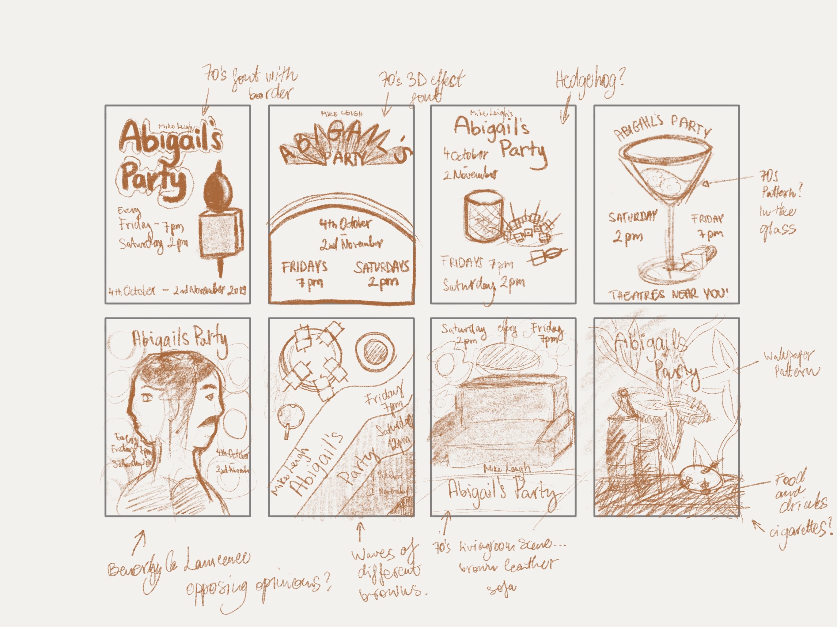
Sketching in brown was interesting, but I don’t think it made a big difference to my process.
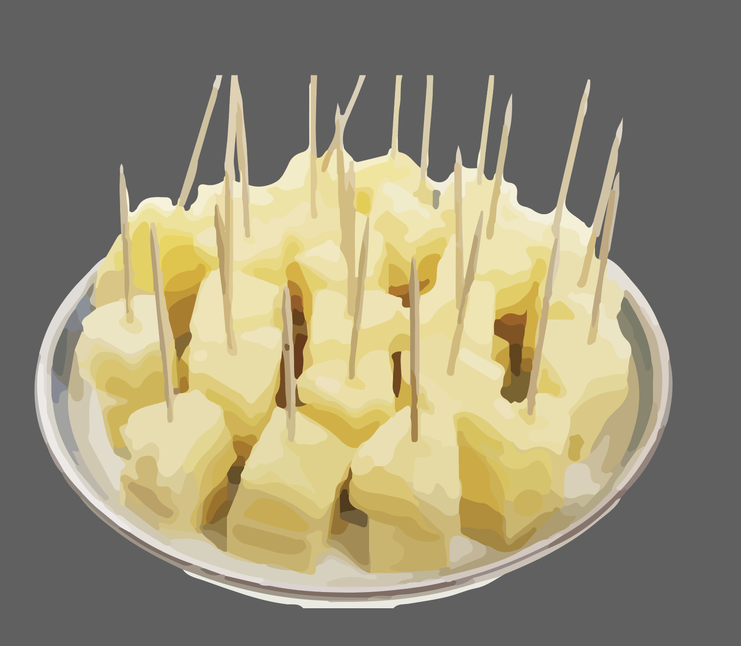
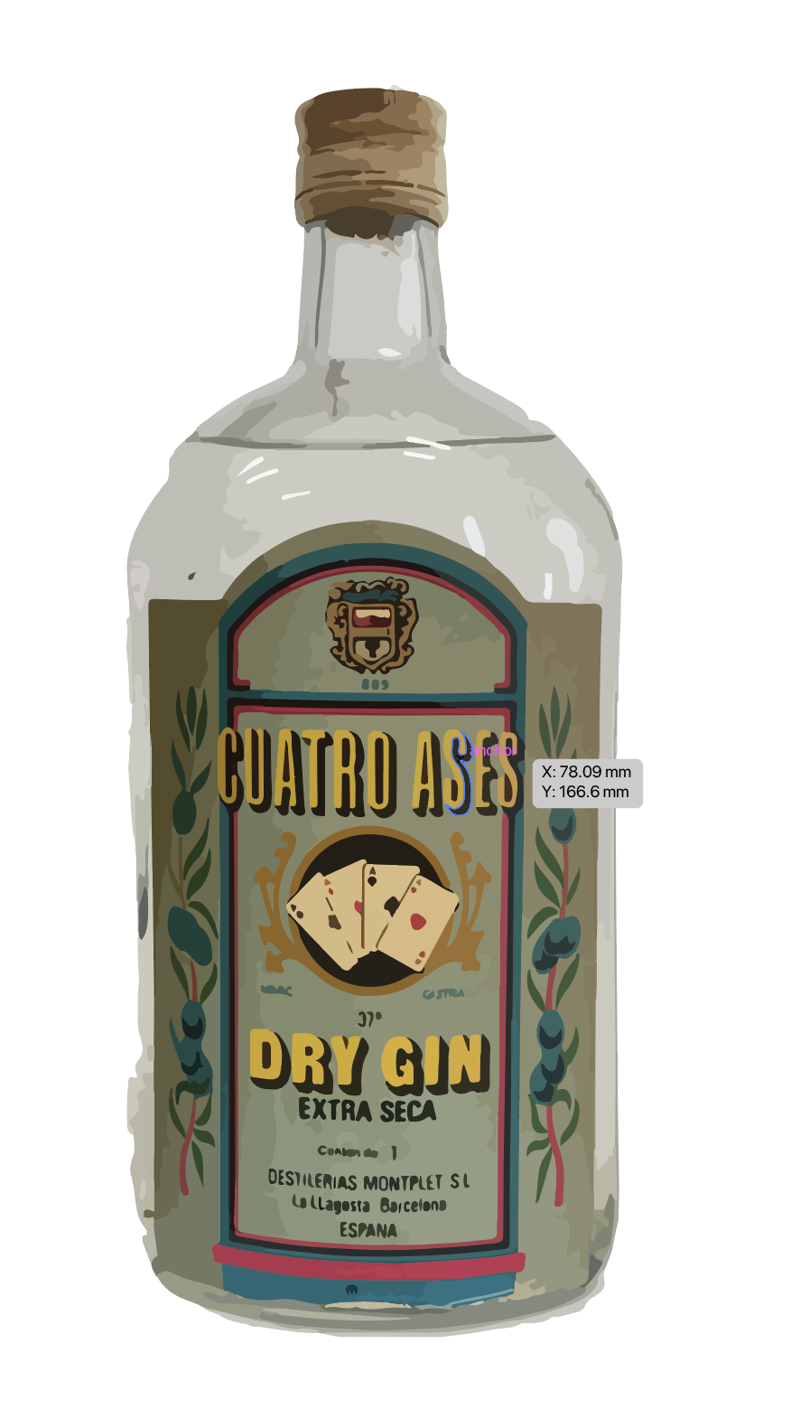
I sketched out 6 ideas, trying to implement what I learned about the play and the feelings I wanted to convey, plus tried to keep it as seventies as possible. I had a strong theme of using food and drinks in the illustrations, as I thought this would be something that is a very integral part of the story. I wanted yo include the cheesy-pineapple bits, as well as the olives. In terms of drinks I would like to show the spirits and the wine, as this nicely represents the struggle of the classes that are represented in the play. I think using the food could be quite playful and probably also easier to illustrate.
I wanted to start experimenting with the last idea I had with the coffee table with the spread for the party on it. I wanted to include some wallpaper designs that are true to the era, so I researched some designs that would have been used around the time to inspire my own.
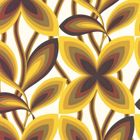
I really liked this wallpaper by Little Greene. I like how it combines the flower patterns that were quite popular around the time according to my research and some of the iconic golden shades.
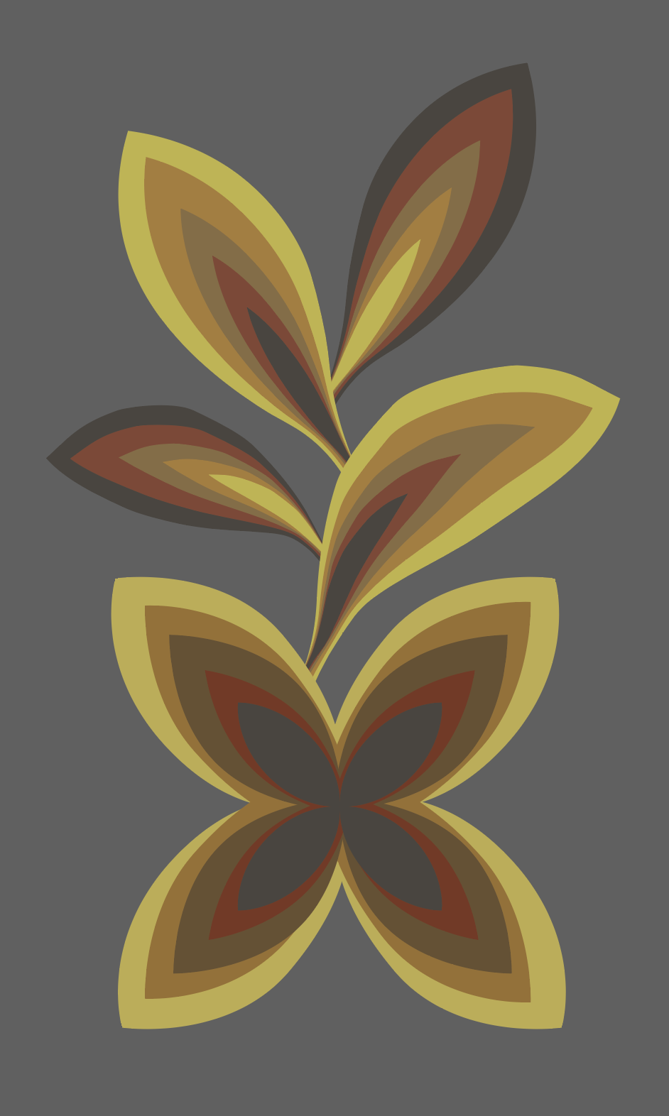
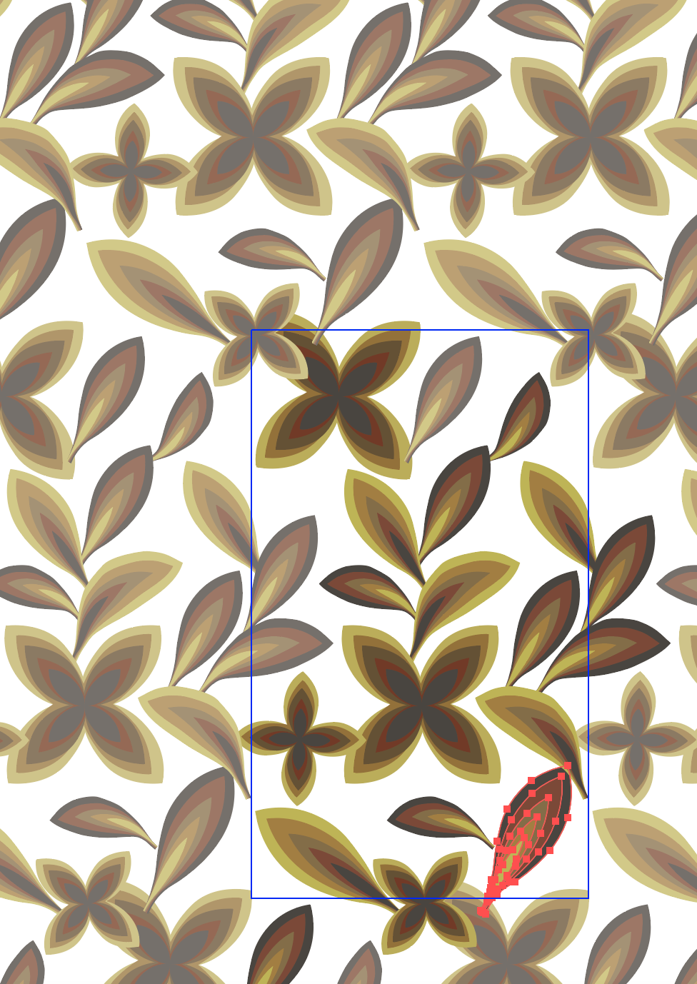
I made this pattern using some of the elements from the Little Greene wallpaper and sent the pattern to some people to see if this looks seventies enough. While waiting for some feedback I also wanted to experiment with some of my own ideas.
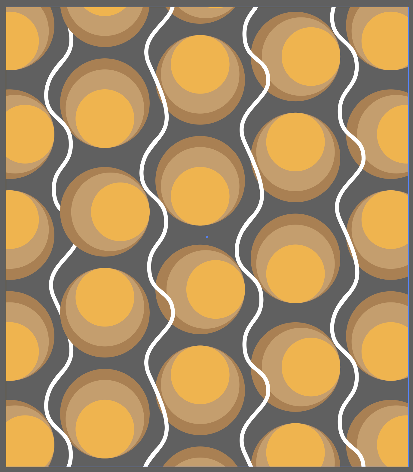
I made this pattern from some circles and some squiggly lines. I think it looks pretty spot on in terms of what would have been done in the era, but at the same time has something modern about it.
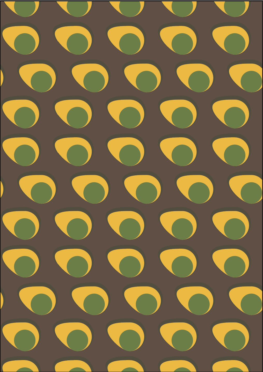
when I tried to move the circles I didn’t realise that I had my direct selection tool selected in Illustrator and this resulted in this avocado shape that I quite liked. It isn’t likely that I would be using this, however I feel like it is important to document when mistakes lead to some cool results.
Showing my 2 different wallpapers, my friends thought that the second one that consist of circles is a stronger pattern, so I decided to use this as part of my poster (however I will probably try out both).
Next, I moved onto creating the objects that would create my scene, by using image trace on photographs I found on the internet, and manipulating them to create the objects I needed.

The sources for my images:
- https://www.pamono.com/lacquered-brass-coffee-table-from-maison-jansen-1970s
- https://www.ginkiosk.com/products/vintage-cuatro-ases-dry-gin-1l-37-abv
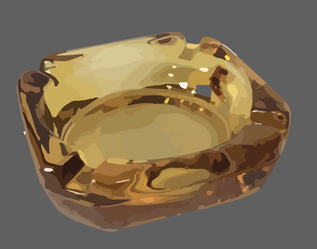
- https://www.irishtimes.com/life-and-style/food-and-drink/the-1970s-party-food-from-the-decade-that-taste-forgot-1.3864882
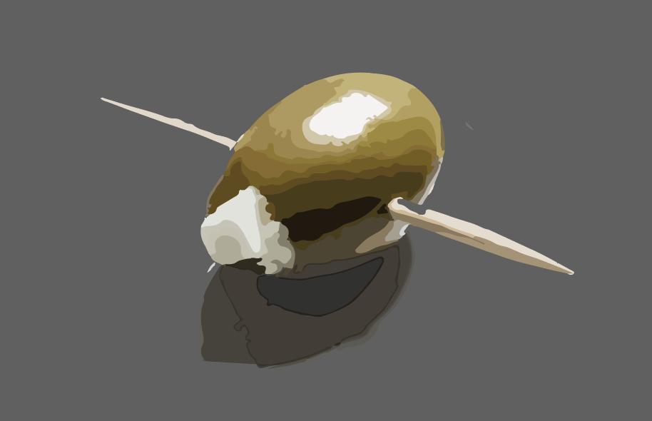
- https://www.etsy.com/listing/579136011/vintage-amber-glass-ashtray-square-retro
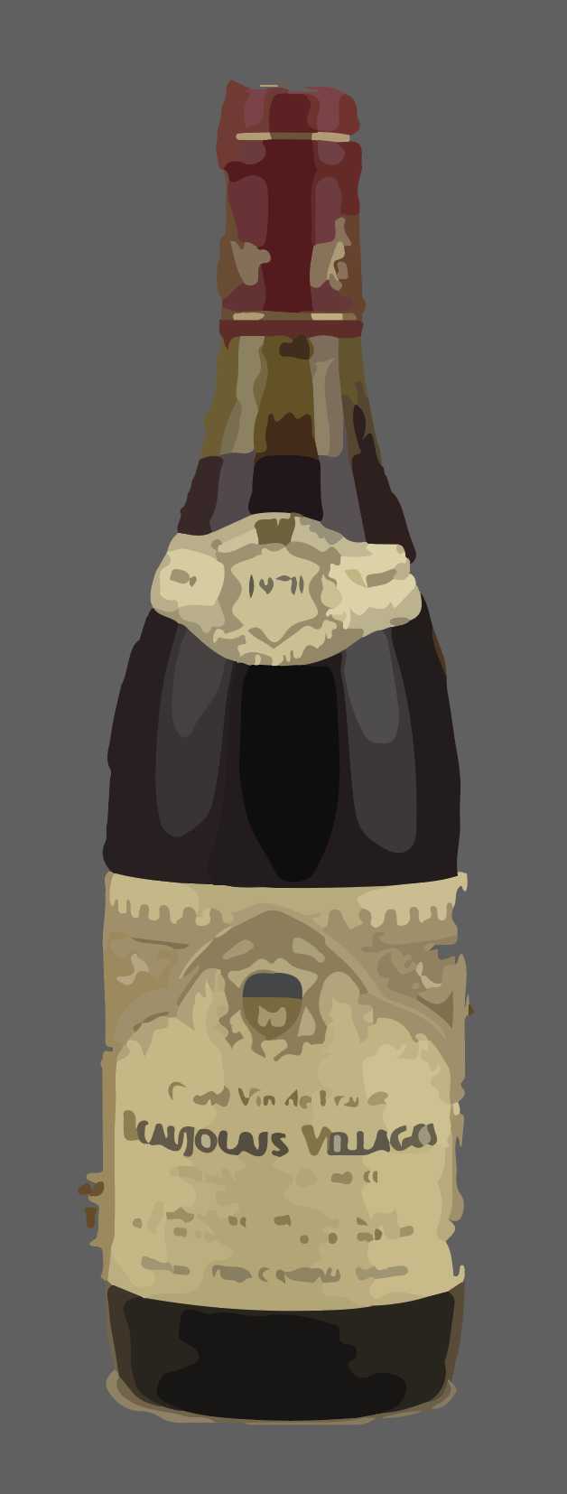
- https://en.antikwein.de/1978-Beaujolais-Village-Selection-Mon-Caveau.html
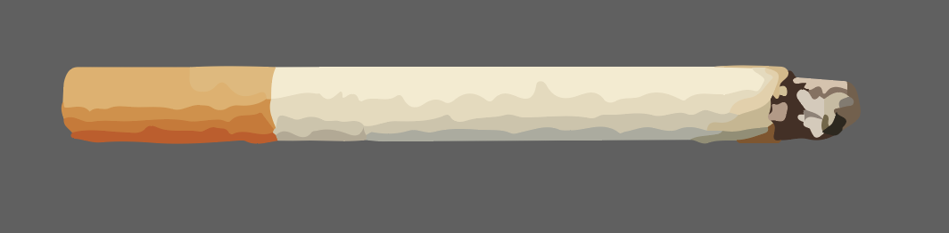
- https://www.consumerreports.org/smoking/why-smoking-even-just-one-cigarette-a-day-is-bad-for-you/
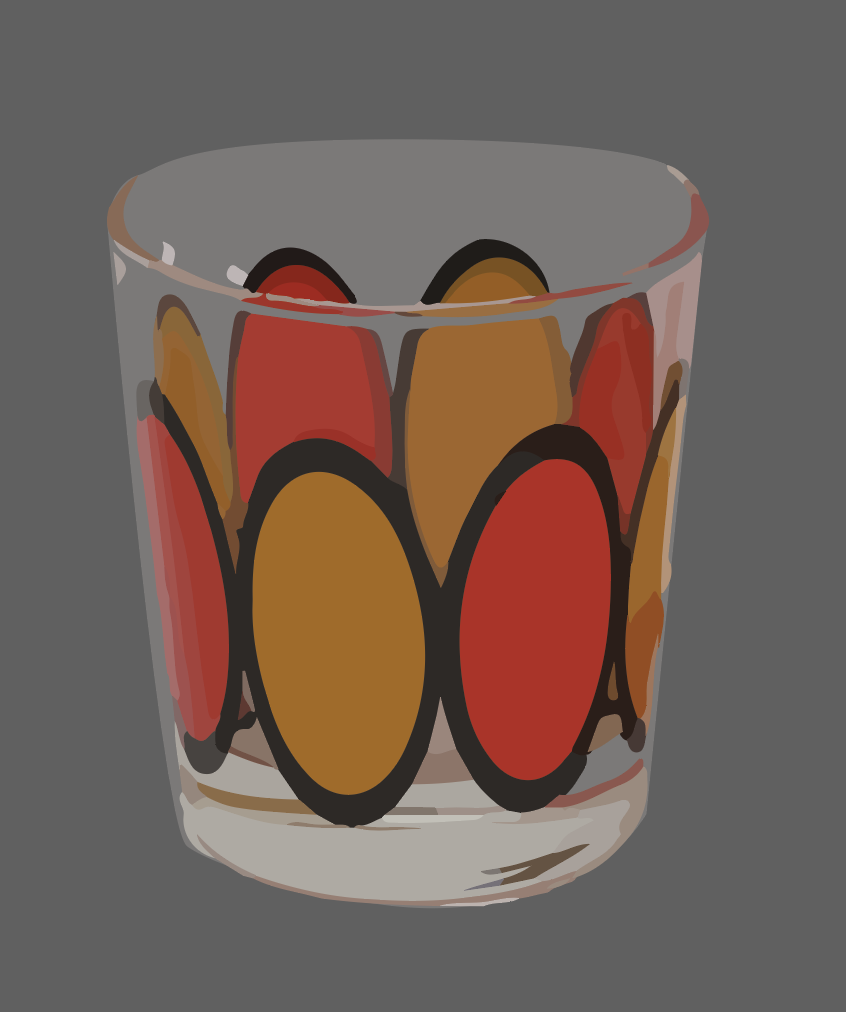
- https://1stopretroshop.com/item-pages/orange-black-design-glasses.htm
I liked this process because it was quick and it produced a retro, screen printed look for these objects when I used the low fidelity photo setting to process these.
Once I had the objects I wanted to use for my poster, I started to assemble these on a table that I created using the same process.
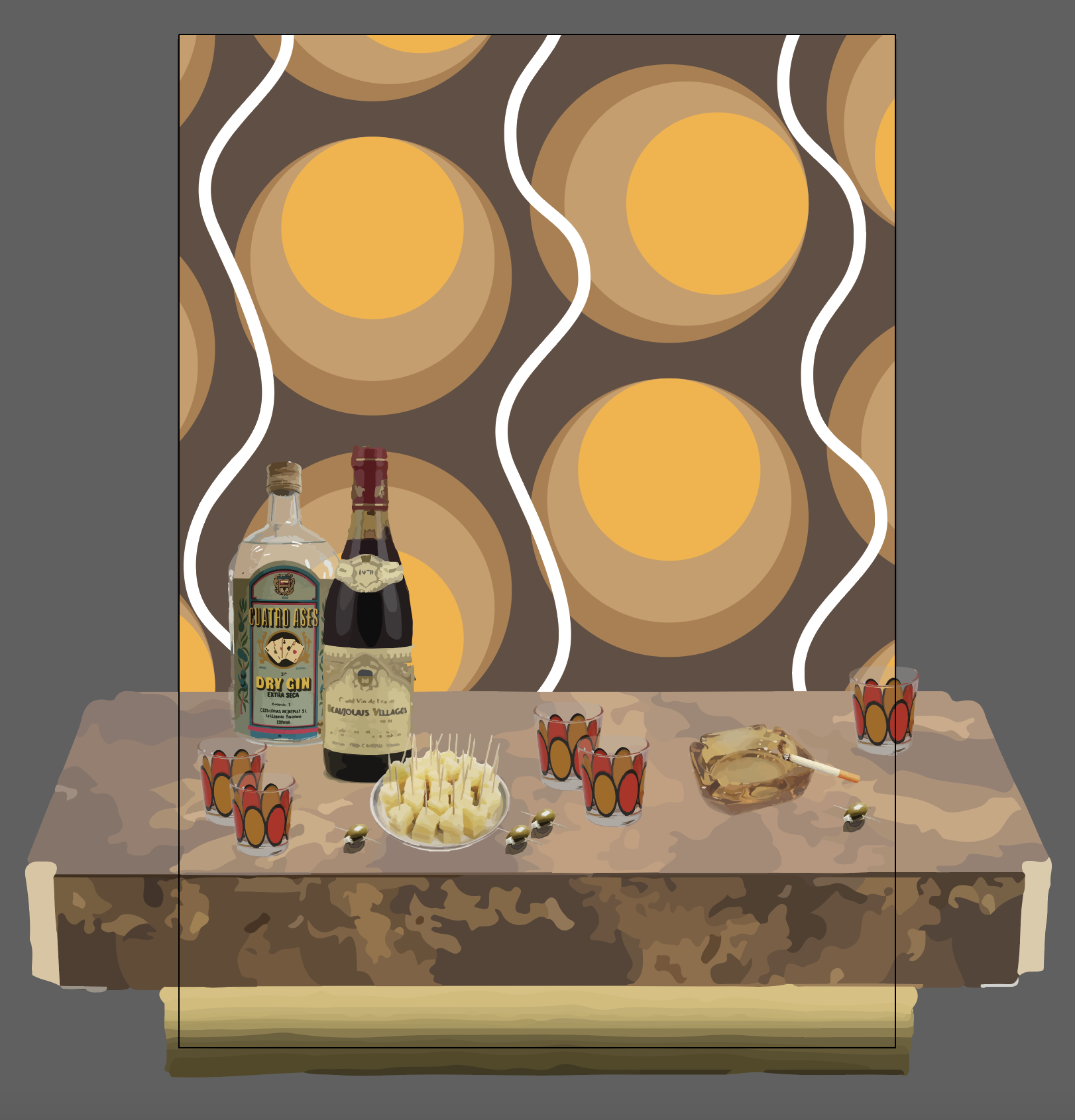
Once I had this in place, I started to play around with text over this, so see how I could make this even more fitting to the era. I wanted to see if I can find some good 70s fonts to use.
I wanted to find something that is quite seventies but also has a modern edge.
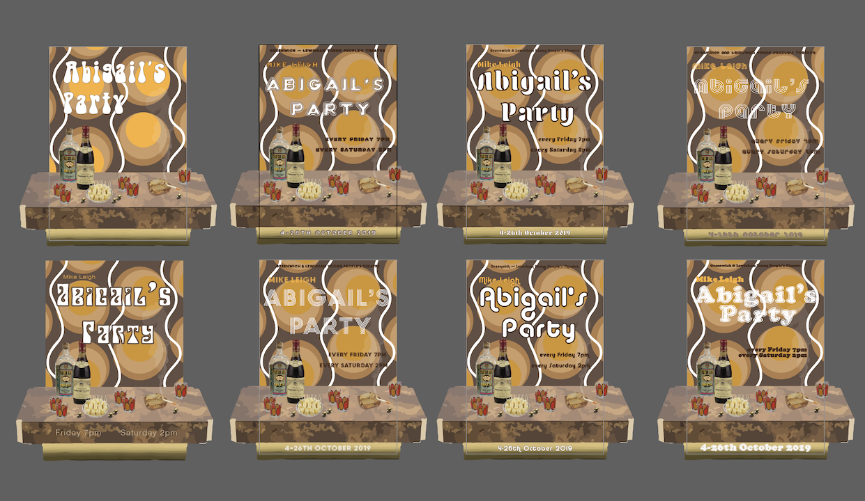
I went through quite a few different variations, some more blocky, some others that were more stripe based, I thought these all invoked a 70s feeling. I especially liked #3 (Aromatron) and #6 (Alba Matter). I shown these different designs to some people and people seem to have favoured Alba Matter.
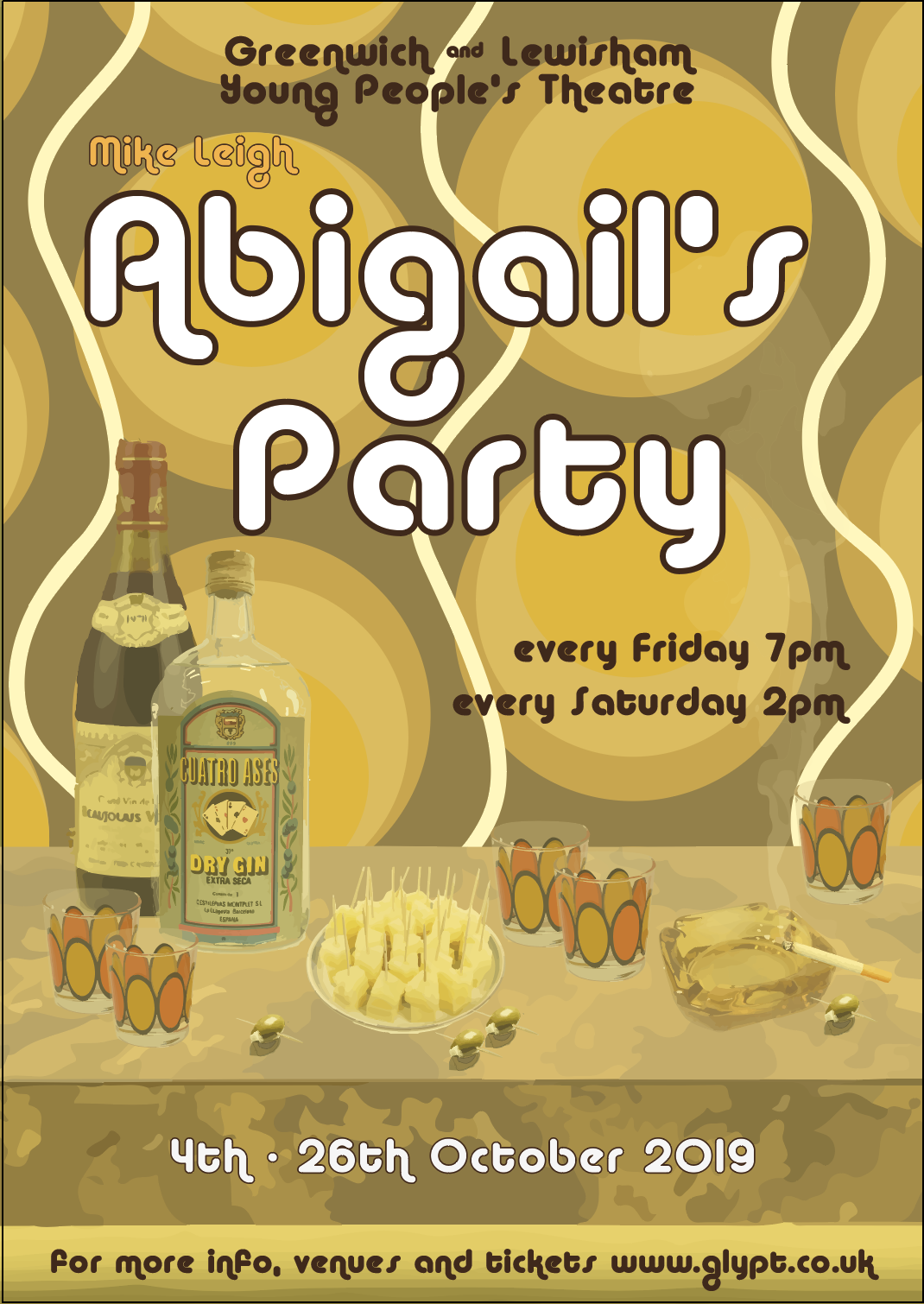
I quite liked this, but had a feeling that maybe it is a little forced and quite busy, I wanted to try out different ideas to see what else I might be able to come up with.
Idea 2
For my second poster, I wanted to see how I could introduce a little more dynamism to my poster. I wanted to include some of the 70s golden waves to elude to the era, perhaps use a photo as well that depicts a typical dinner party.
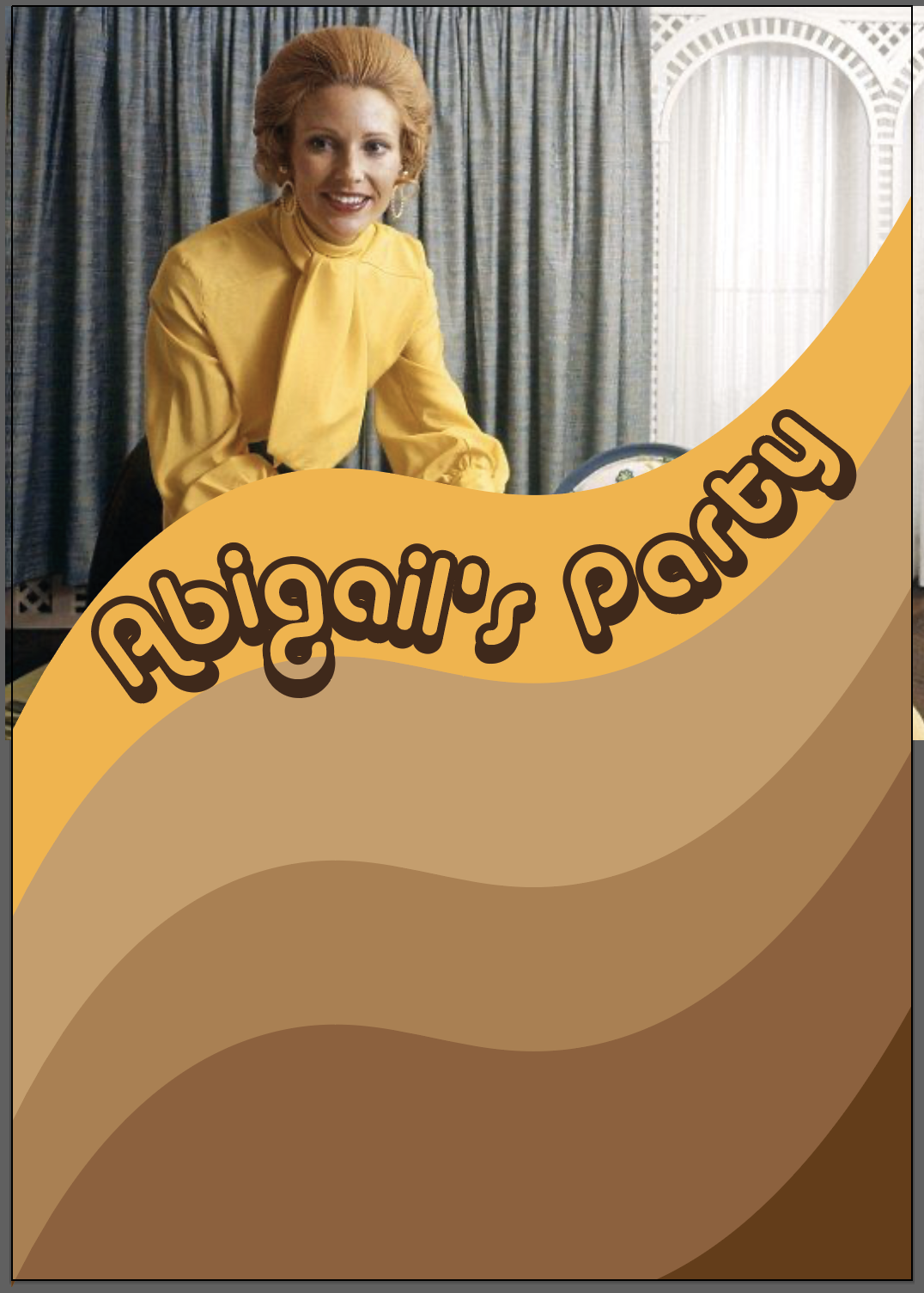
I made a shape that I could repeat over and over, creating the 70s wave pattern in the brown and yellow colouring. I have tried to use many different 70s photographs that I thought was suited to this play and gave a glimpse into the sort of thing the play is about. I liked how the colour of the blouse worked in harmony with the yellow I chose, but didn’t think this photo conveys what the play is about. I felt like it had to include food in some shape or form.
I used Alba Super for the title, I thought this font family worked really well in my previous poster, so I wanted to keep this as part of this experiment as well.
I was wondering if I could take my own photographs at this point, but then I came across this photo. https://www.flickr.com/photos/glenhsparky/6640619737/

I really liked this photo, because the colours were really vibrant and shown a nice seventies spread that I thought would work quite well for my poster.
I thought this worked really well! I was also amazed how quickly this second poster I was able to make. Once I put in the text everything seems to have fallen into place.
I think the grid will still need to be tightened to make sure it has a solid structure, but I was quite happy with this poster. I feel that whilst the photo may not be as accurate as the illustration I made from different photos for my first design, I think the photo landed itself quite well. I guess the image is a little misleading as this looks like quite a generous spread, but in the play there is hardly any food and the drinks are heavily pushed by Beverly.
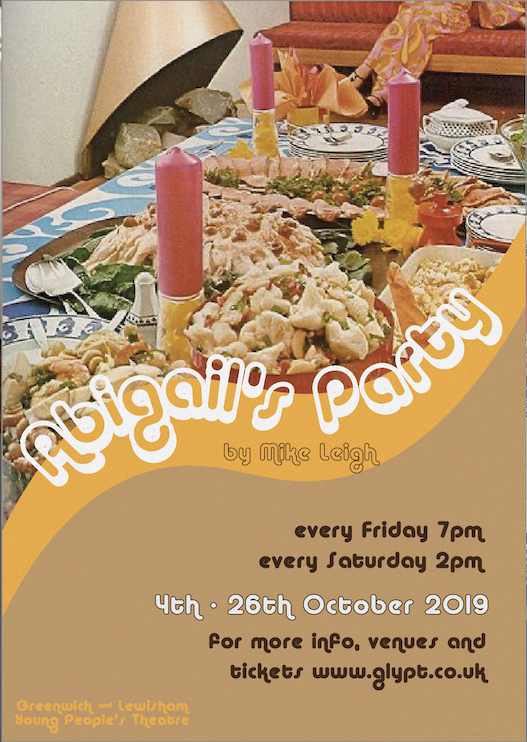
Idea 3
For my 3rd poster idea I really wanted to do something that would push my technical capability and make an impact as a result. I will try to recreate the below poster for my own topic, using some illustration that I will make from a photo perhaps and make it very 70s looking. I am excited to get started!

I really loved this poster as I think the layering of the font and the illustration is really clever, and the poster really pops. I am not sure if this poster was actually made in the seventies, but I think it has a strong connection and therefore I would like to use this as inspiration for my next piece.
I started by looking for a picture that I could envision being part of my poster and shows some of the character traits of Beverly. I was looking for 70s fashion shots first to see if I can find something that I could see to form a part of my poster, and form a basis of something that screams seventies without being too obvious.

I really liked the model’s stance at the front. I thought she had the right attitude to be Beverly, so I decided to try the image as part of my poster. First I had to carefully remove all other parts of the image to make her pop. Unfortunately a part of her hand is cropped off, so I had to be inventive. I decided to delete that hand altogether and replace it with the other model’s hand.
Once I had the image sorted I wanted to find a font that was similar to my inspiration and see if I can make it sort of 3D like in the image. I used Shagadelic Bold that I have found during the earlier part of this assignment, a font that I first deemed unsuitable due to the fact that it had more of a 60s feel to it. I felt that this font was the closest to the one used in the poster I was inspired by so I wanted to give this a go.
In terms of colours, I wanted to use the peach that I could pick from the jumpsuit from my image, and use some neutral browns to complement this.
I quite liked the way this has turned out. I thought the attitude was strong and it looked really inviting. I feel like this would be a play I would want to watch after seeing the poster.
Compare
Once I had 3 designs drafted, I wanted to see which one was the most effective by analysing them side by side.
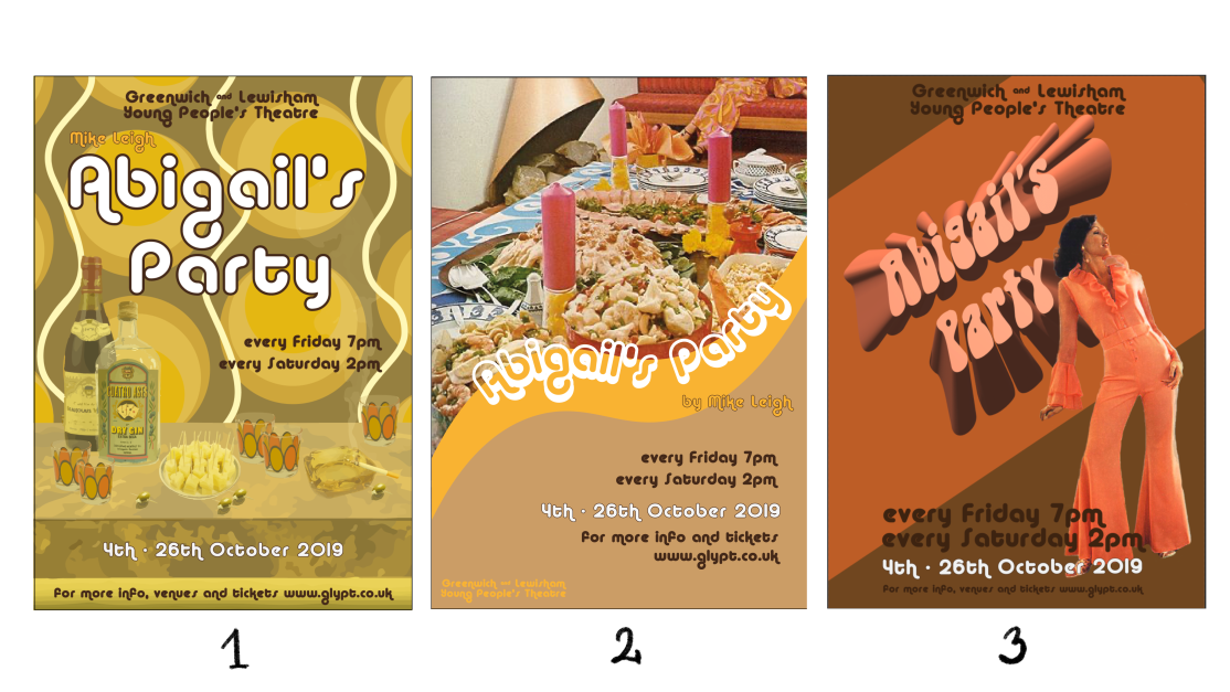
I have sent this picture with all 3 designs to some people to see which ones they would prefer the most. Some votes came back for #3. I think this is because if you don’t know the story this may be the easiest to relate to. Having a person in the poster, we make an assumption that the person of the photograph is who the play is about, perhaps we jump to conclusion that the person depicted is Abigail. The other 2 posters a little more abstract, because there aren’t any people on the illustration.
I think number one speaks to the story the most of the 3 and is something that could be used quite well for that reason. I can’t put my finger on it, but something is not quite right with that poster however. It could just be the colour scheme, but I am not sure if this would be inviting enough to attract people to a play.
The second one sort of falls in between the other two. Whilst it doesn’t directly depict a person, you can see that someone is present because they are visible at the top right of the picture, you can also see some of the 70s interior, which is a good thing, however I feel like that the spread on this picture is too generous to show the essence of Beverly’s Party accurately.
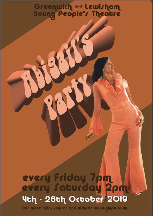
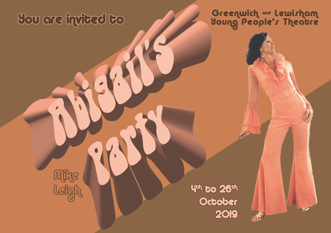
It really pains me to say (because the amount of hours I spent creating the other 2) but the most successful of the 3 will have to be number 3. I am wondering if I could somehow include the coffee table with the assembly that I like the most from poster 1 into poster 3? Let’s try.
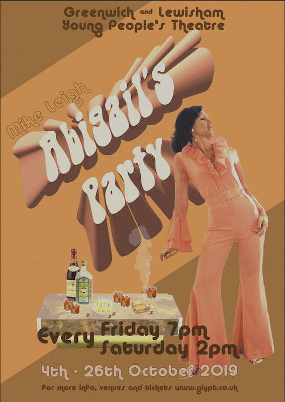
I think this actually works really well. It marries the 2 ideas, it gives you the person to connect with and invite the viewer in, but the coffee table with the gin, wine 5 glasses and most importantly cheesy pineapples are all there to support the feeling in the poster.
I will need to play around with some ideas in terms of the colour scheme as I think it is not quite right, but I think the content of the poster is now where I wanted it to be.
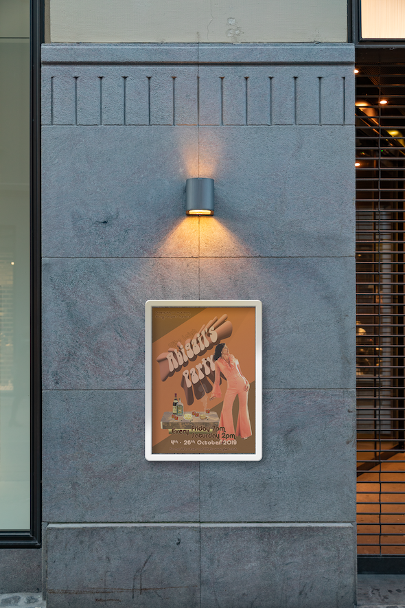
I also mocked up the poster as if it was used for advertising on the street. I think it is quite effective, however I see some potential readability issues at the bottom text and also at the top in the brown area. I think this is due to the size of the poster isn’t a huge problem as A3 can only really be viewed up close, if this was for a billboard size, I would have to readjust the text to be more clear from a distance.
Flyer
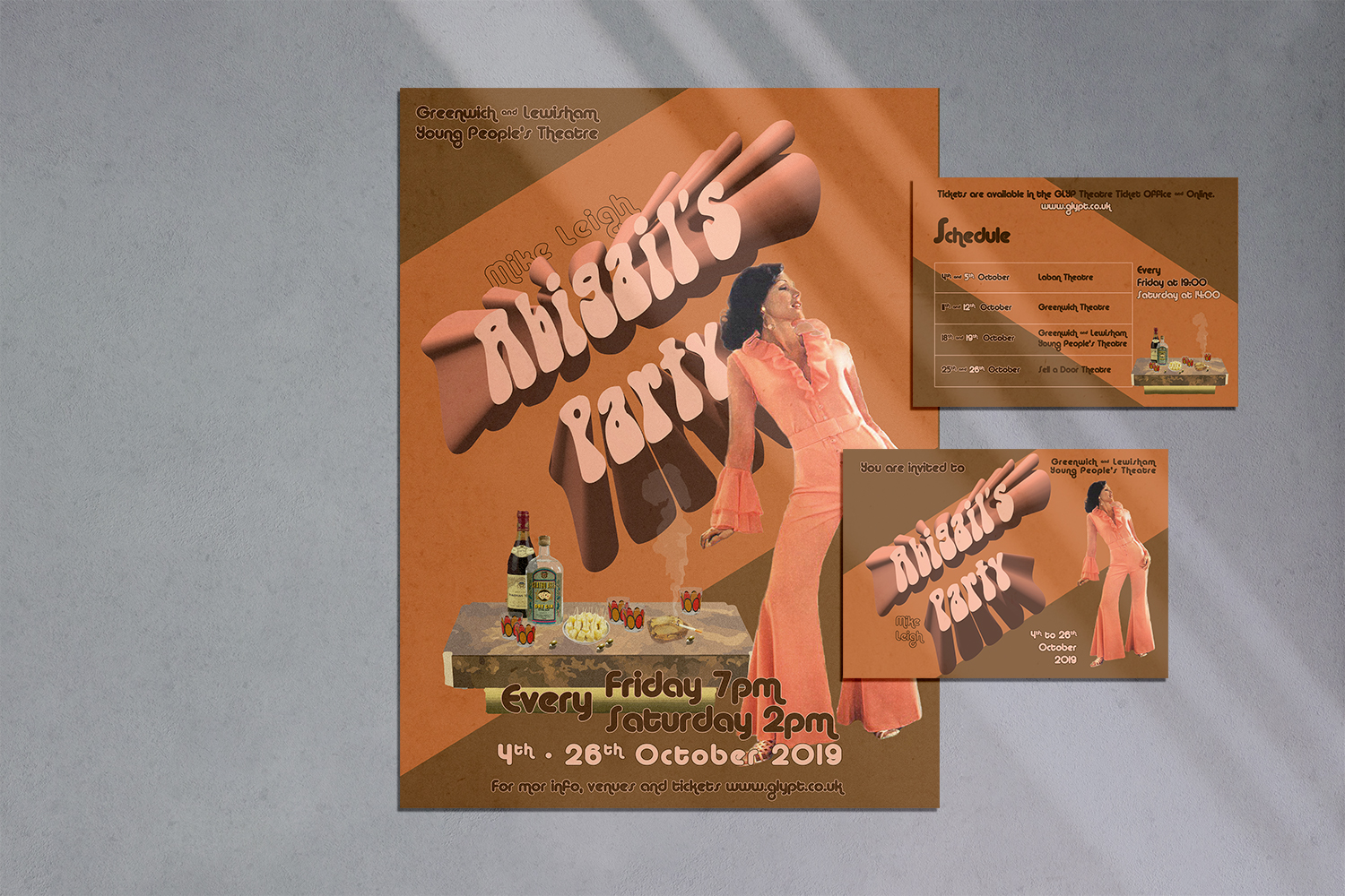
For the flyer I wanted to use the assets I already made for the poster and lay it out on the A5 landscape pages.
I decided that the front of the flyer will be relatively simple, while the back will have all the information one should need to be able to decide if they wanted to see the play and the full schedule of the tour.
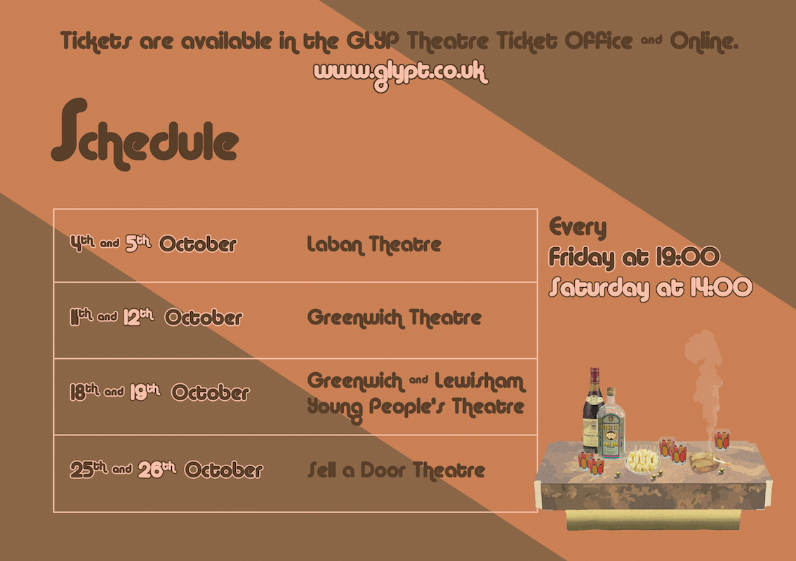
I think this flyer gives all the necessary information in a logical way to the theatre-goer. It has the full schedule of the tour and information on how to get the tickets. I purposefully didn’t put a price on there as I think theatre tickets can widely vary in price and it is difficult to show a price that may not be accurate or available when the recipient of the flyer gets to the ticket office where they can buy the tickets. On the back I decided to use the same colour for the text where the time is being highlighted for Friday and Saturday and the respective dates. I think this makes it easier for the viewer to know which dates are Saturdays and Fridays.
Theatre Programme
For the Theatre Programme I had to do a little research before I could jump right in to ensure the right things are added to this.
I know I was only meant to design the front cover, but I did the front the back and the inside pages as well as I thought it would be nice to be able to create a fully realised product. I made the inside pages the same pink as the font in the headline to make it more fresh on the inside, I didn’t want to use the brown as I thought this would be too dark and heavy for the inside of the programme.

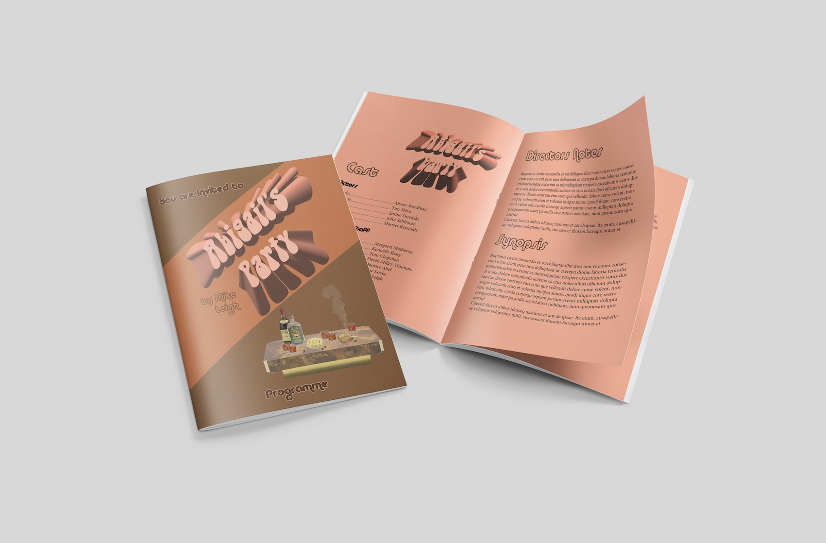
I think this turned out quite chic and I like how the programme has a modern yet 70s vibe. I think it is quite successful.
Newspaper Ad
For the A6 newspaper ad, I think the main challenge might be getting all the information on there and be able to entice the reader into visiting the website for more information on the play. I will need to add the title and the dates to this, so the reader can know if the information is still relevant, then the website and an illustration to be able to get the viewer’s attention in the first place.
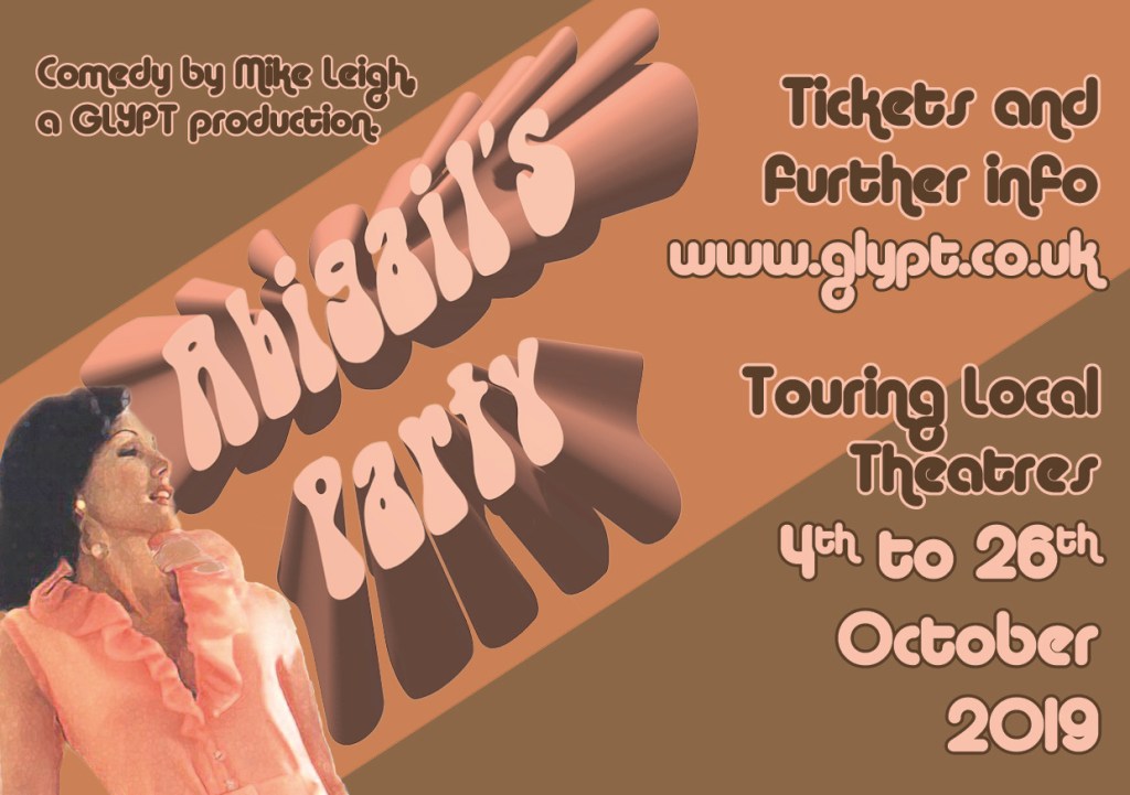
I tried to mock this up to see how it would work in a local newspaper.

I think the ad is eye-catching enough but also fits in, definitely gives off that 70s vibe and gives enough information so that a viewer would get curious about the play and would want to check out the website in my opinion.
All my materials together

I think when looking at it all together, it does all look like they are part of the same campaign and it looks pretty 70s which was my aim all along.
Reflection
Part 5 of Core Concepts was great. I feel like it has reinforced the idea of how colour and typefaces have such a significant impact on how we perceive design. Throughout this part, I was given some exercises that helped me to discover how clarity in your design is really important and how using colour strategically can help the consumer navigate, and why the layout has to be well thought through in advance to make sure the viewer can read the content without getting lost on the page.
This assignment was quite interesting because I didn’t just have to make a design that I liked, but also had to stick to a framework of the chosen era, and stay true to this. This has required to rework my ideas quite a few times in advance to create something that is both true to the decade but would stand on its own in a modern environment.
I think my design is mostly effective. I say mostly because I feel that some of the colour choices are questionable, but this is probably due to me trying so desperately to create something that looks very seventies. I also feel that by creating a diagonal title on the page to add more dynamism, I cornered myself in terms of layout. I feel like the rest of the layout is a little sloppy as a result.
Overall, I think my final design definitely shows the journey and development of an idea, that I wouldn’t have arrived at when I first started designing this poster, let alone looking back 6 months when I started the course. My progress might be slow, but I am slowly getting more confident producing work everyday.
My understanding of colour is much better then when I started. I find it very interesting that throughout this part of the course, I ended up using more of the muted colours (not just the Assignment but the entirety of part 5), in contrast, when I started the course I was very heavy handed with colour and was almost always using bright sometimes neon shades.
Looking back at the journey, I definitely feel like my layouts and my overall taste levels have improved, there is still a lot of room for improvement, especially in the taste department. I think very often I have an idea and stick with it, instead of thinking outside the box and re-thinking the ideas altogether. In this assignment for example, I think the fact that I stuck with a quite limited colour scheme has hindered my ability to create something that I am truly proud of. I think if I tried (entirely) different colours I would have been less constrained, but I had a strong preconceived idea about what a 70s colour scheme is, and I didn’t want to stray from this too far.
I am pleased with the results, and I feel like I understand the 70s just a little bit more as a result of this project.
