
Newton and Ridley, the brewers best known for their pub, The Rovers Return, are opening
OCA Graphic Design: Core Concepts
a cafe/wine bar nearer the city centre.
The bar is designed to appeal to younger women and sophisticated young men. The brewery has identified a gap in the market and wants to provide a ’sophisticated and relaxed’ venue for the ‘discerning’ drinker. This bar is to be called the French Hen and will be in direct competition with the cheap ‘binge drinking’ venues on the same street. The brewery is also trying to enhance its own image as a ‘respectable’ alcohol vendor.
They want you to develop some ideas for a logo, to be used:
• on covers for the food and cocktail menus
• in colour on the signage outside, and as a cutout for a window detail
• on T-shirts for the staff and paper napkins
• for one side of a beermat, the other will carry advice on sensible drinking.
There are many conventions that have been developed around the marketing of both bars and products to this age range. You need to be conscious the whole time of avoiding clichés and stereotyping.
Draw up at least three ideas to start with. Be critical of your work. Check it against the information you have here. Will it do what the client wants – and how will you know?
When you have decided which one you are happiest with, mock up the menu covers, the outside sign, the window detail, a T-shirt, paper napkin and beermat. Does it all still work?
Research
I wanted to research the type of venue the exercise was calling for. In my mind, this is the sophisticated wine-bar type of place that is really chic has a nice quiet atmosphere with some smooth jazz playing in the background. I wanted to capture that feeling in my logo.
I started by collating images of the type of place I imagine this to be, and adding all of these to a Pinterest board. I included the some pictures of people I imagine would visit this place, some logos I liked and thought have reflected the sophistication I had in mind and some interiors of what I thought this place would look like.
Once I had a fuller idea of the type of place I am designing for, I dove right in and started sketching out some logo ideas.
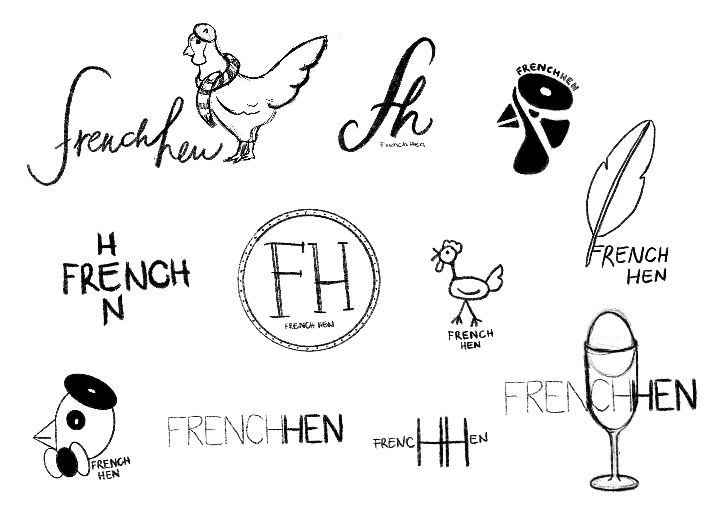
I went asked some friends to pick out their favourites. People seem to have liked the 2nd one from the top row, the 3rd one, the round one in the middle the feather one and the first one of the bottom row.
I liked number 2 on the top row, but felt like this is not very imaginative and this type of logo has been done millions of times. I felt it is quite sophisticated, and could see it being used in many ways, but I wasn’t feeling too strongly about it.
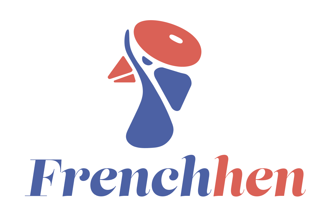
My favourite was the third one on the first row. I think this has great potential as a logo. It is icon like, so it could be used in many ways. It is abstract enough to make the viewer think and perhaps even change their perception over time. It is also modular, so it could make great colour and non colour versions. I felt quite strongly about this and was excited to see where my experimentation takes me when digitising this.
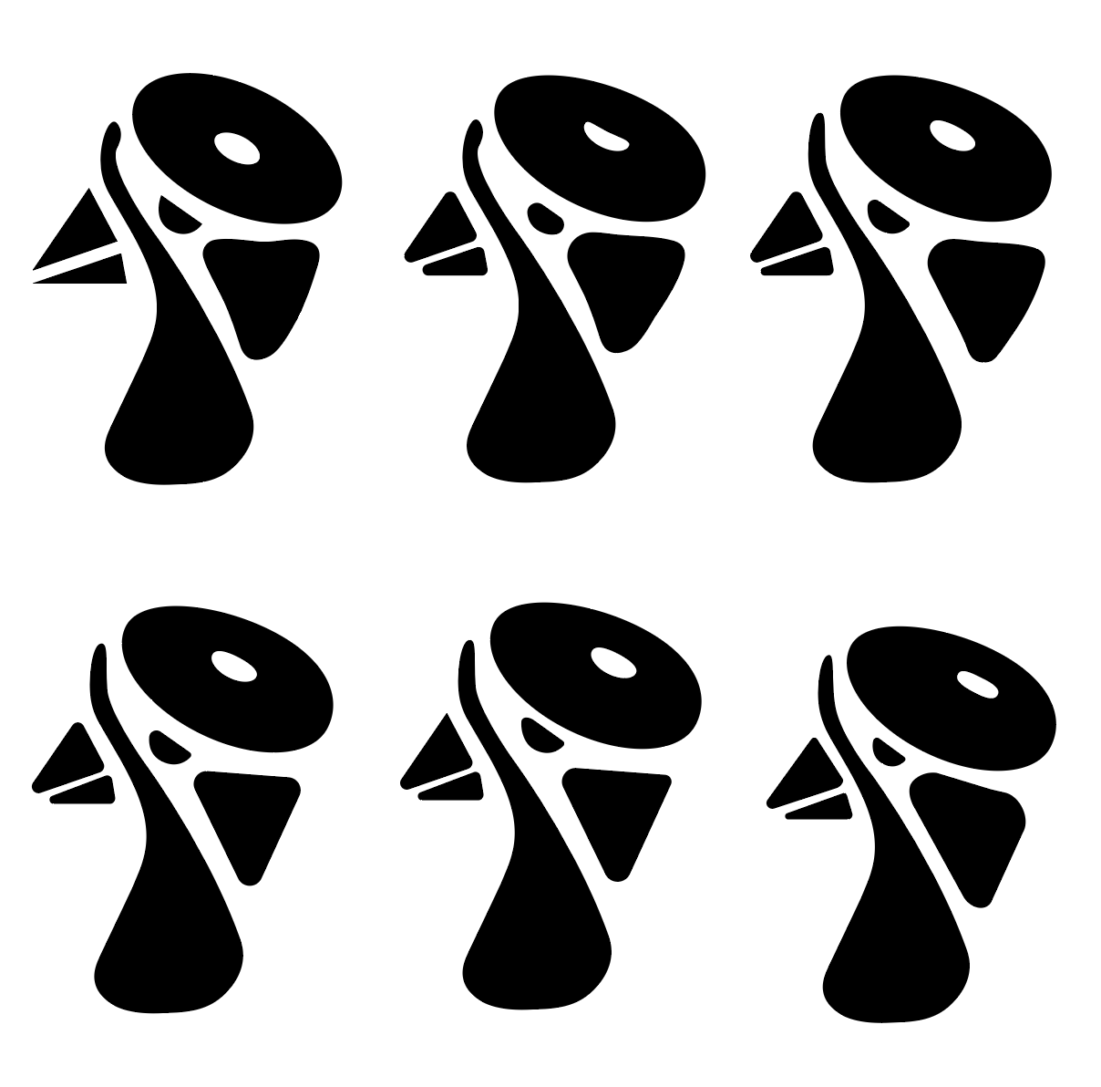
I traced and iterated the logo until I was happy with the shape.
I liked the bottom right the most, I wanted it to look soft and hand drawn but neat at the same time. I think I managed to find a good balance between sharp edges and soft lines.
Next I wanted to play around with some colour combinations to see what works best.
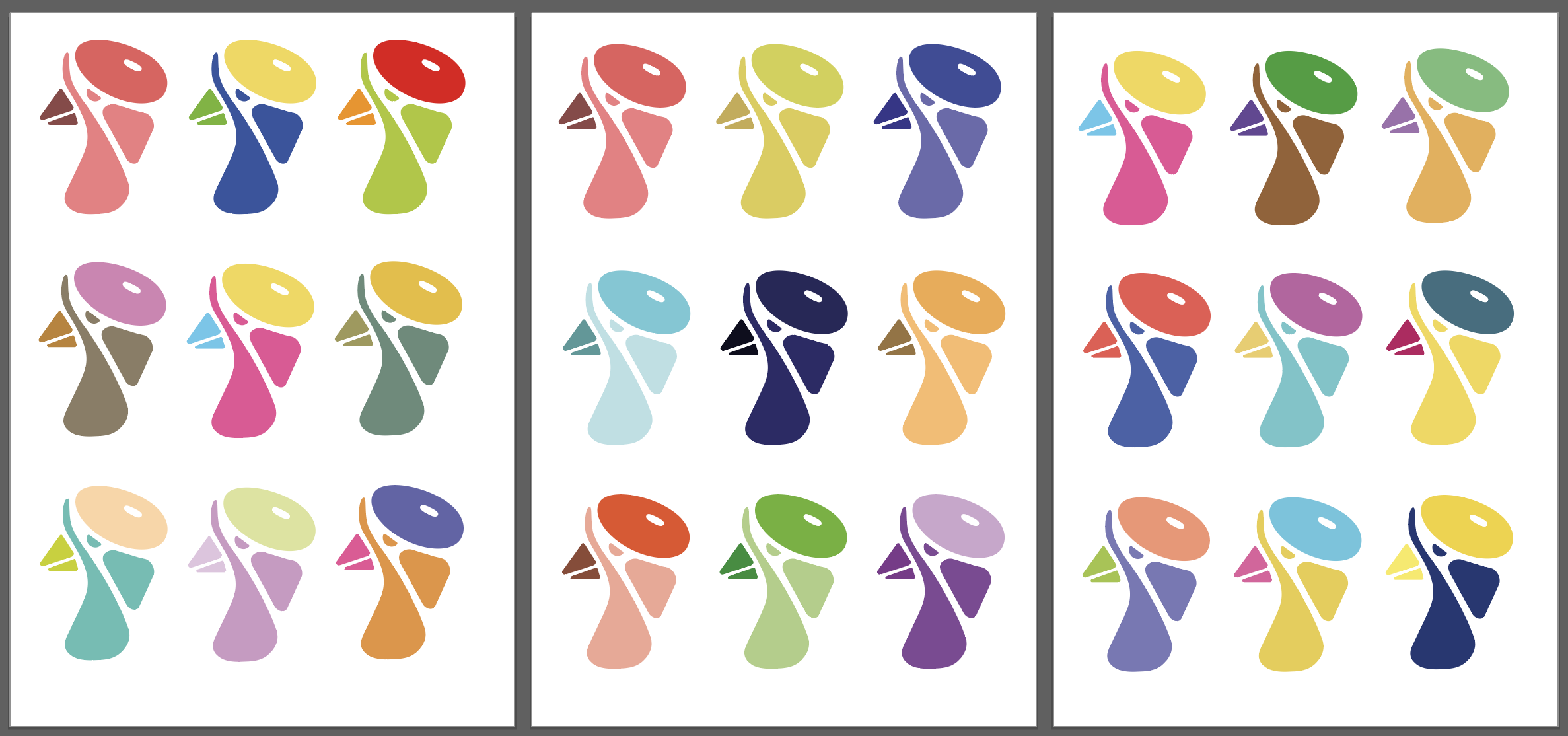
I liked quite a few of these, however I felt that the blue and red combination worked the best. This reinforced the French feel by mimicking the colours of the French flag.
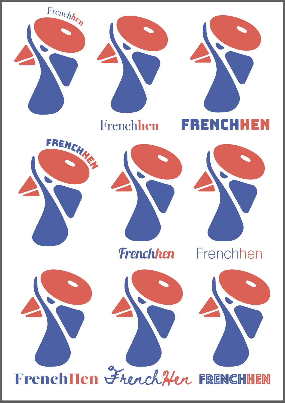
I sent this to some friends to see which ones people preferred the most. The majority picked out the top and bottom right and side font. I liked both of these as well, but felt like that the bottom one felt a little like a font that would be used for a fast food restaurant, so I decided to go with Bungee (top right).
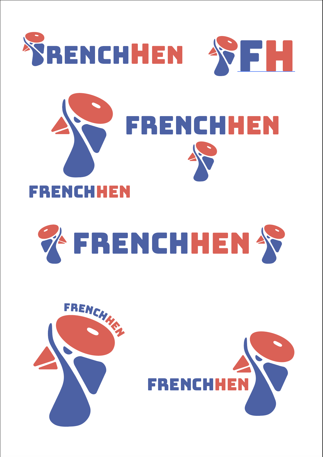
I felt like this font worked really well in contrast with the logo as it had similar rounded qualities to the illustration. I wanted to create different layouts using the French Hen text and the logo. I managed to create quite a few that I believe work in their own way. I felt like my logo was successful and I was excited to mock up all the different materials using it.
I left the design at this stage for a few hours and when I came back to it I realised that my colour scheme wasn’t supporting any of the ideas I was after for this logo. It looked more up beat and fun than sophisticated and elegant. I decided to switch up the colours to make this more elegant.
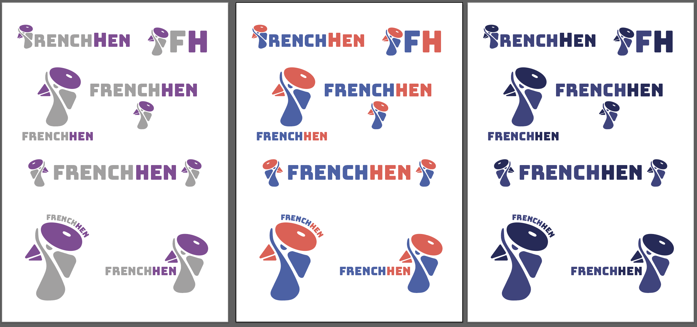
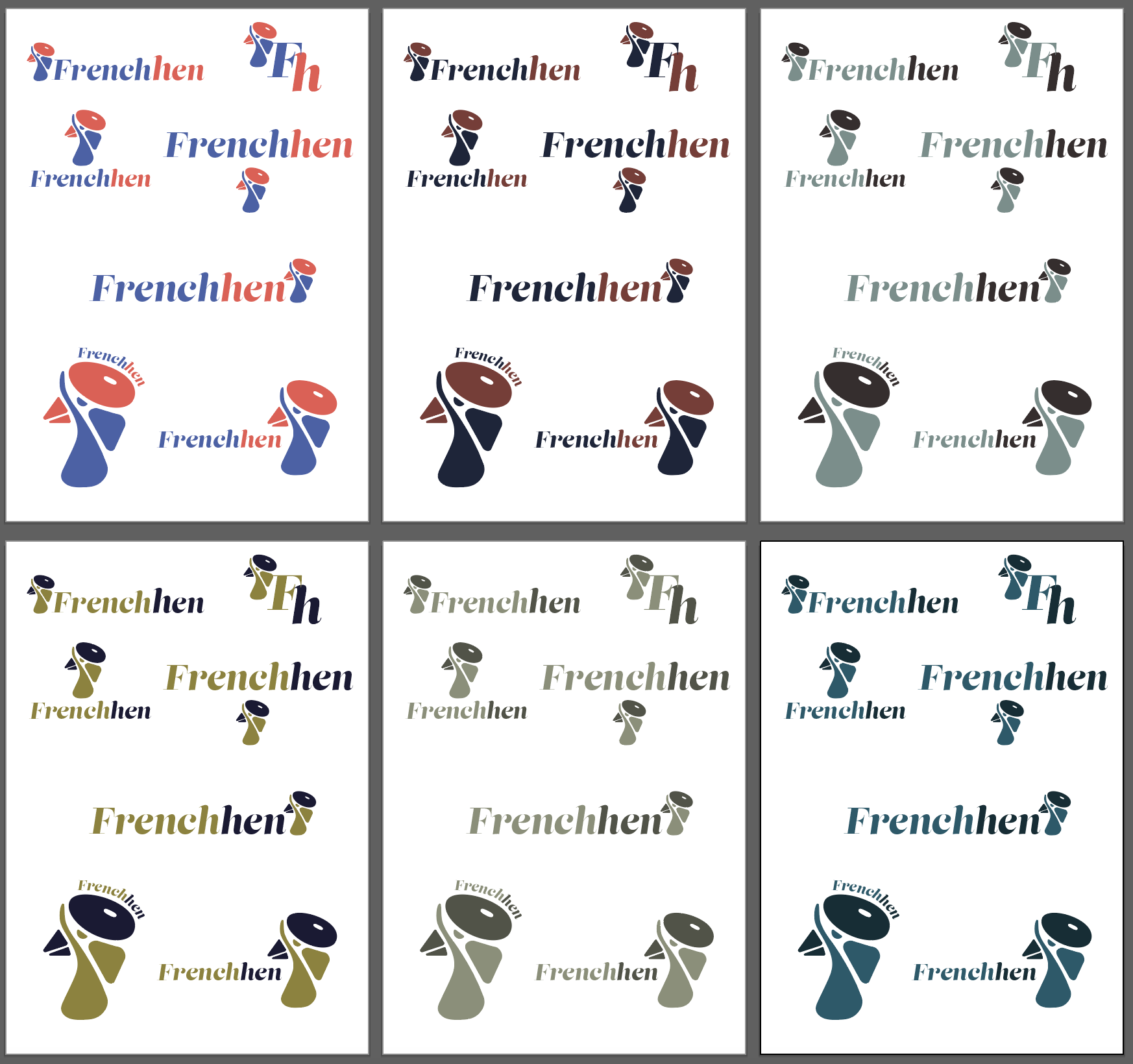
After trying different colour schemes, the logo still felt wrong. I think this might be the fonts fault. I believe this front was too modern, too bold. I wanted to see what other fonts from my previous selection would work.
I was a lot happier with this font, as it looks more sophisticated and felt like it will lend itself better for this assignment. My other issue was with the colour. I felt like this colour was not very sophisticated and so I wanted to try some other variations.
I found that limiting the colour palette further from the 2 colours to 1 colour with different shades of that particular chosen colour produced a more sophisticated colour palette. I found this quite interesting. I really like the bottom right, dark teal colour combo, so I decided to go with this one.
Mockups
I started working on different mockups using my logo, to see how the logo behaves in different situations.
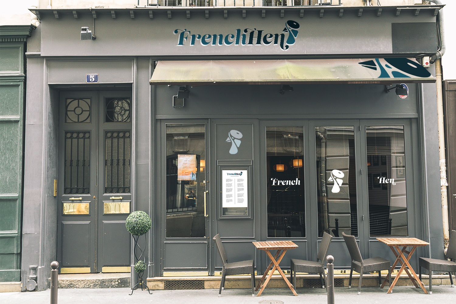
I believe the logo works for the store front type of setting. I had the window decals in mind in particular when designing this logo in the first place, and I think for this reason it works quite well. I also think that the colours for the main logo lend themselves quite well. They are calm and sophisticated, just what I had in mind.

For the menu I have changed the logos colouring so I could give the whole menu a luxurious whole page colour but still keep with the limited palette I have chosen for my brand. I think this worked out really well also. This only thing I felt, is that the logo itself was perhaps a little hard to read at a smaller size and lower contrast against this blue background.
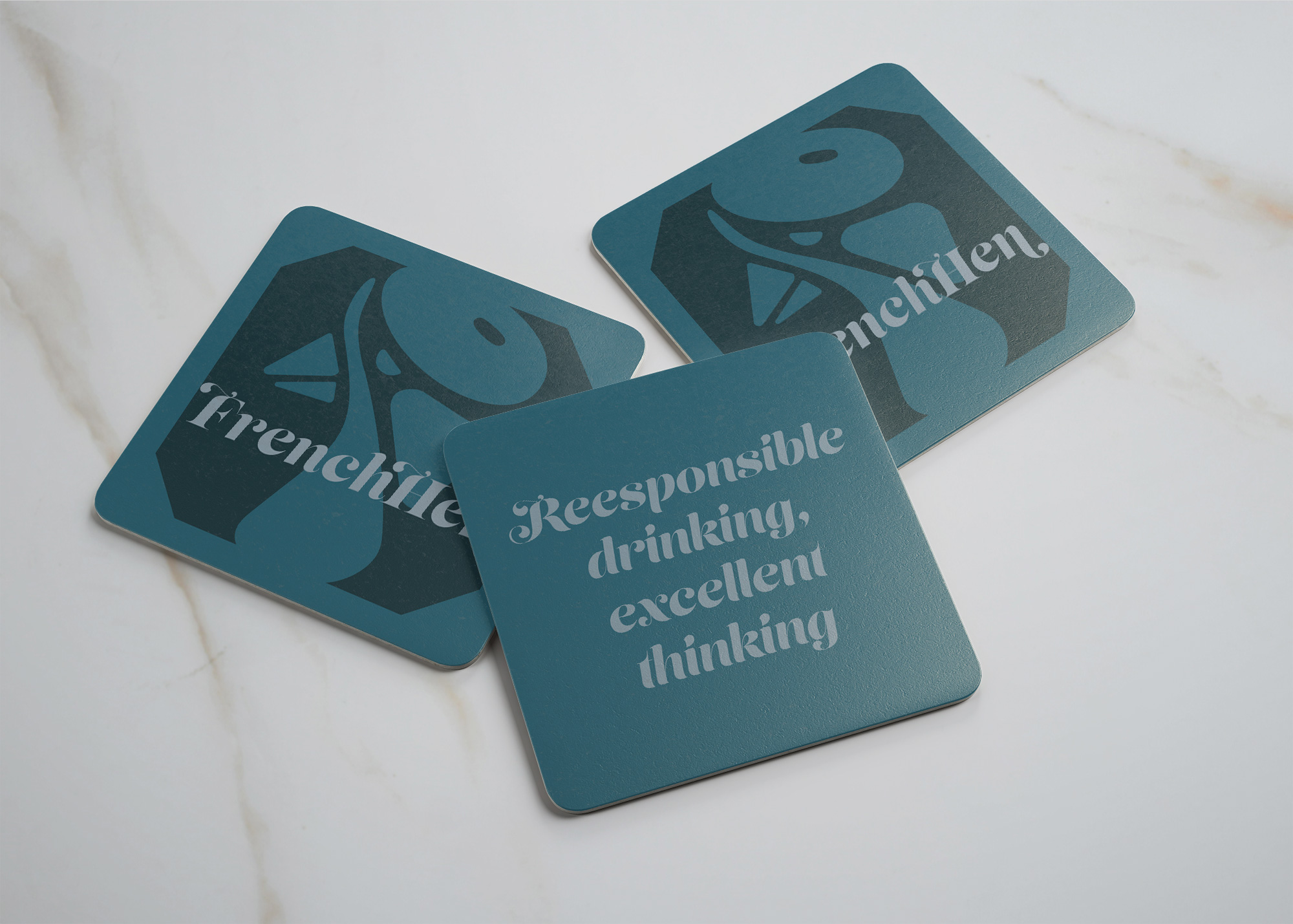
For the coasters I also went full blue colour and added the French Hen logo, for the back of these I added a quote that advocates responsible drinking as per the ethos of the establishment. I think these are quite good looking for paper coasters.
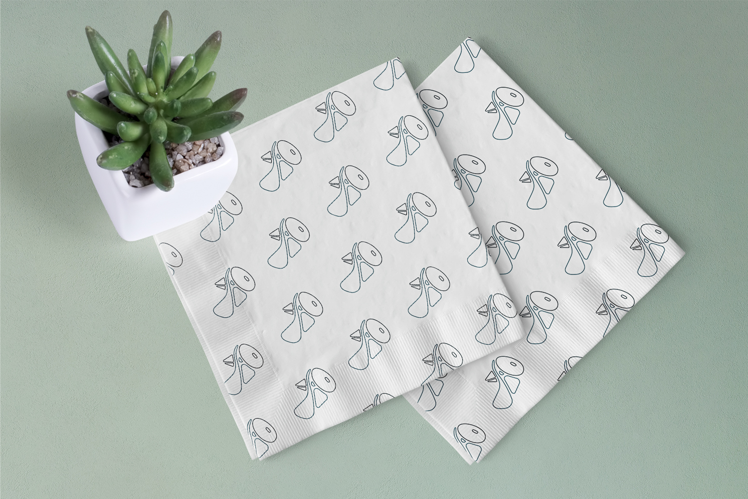
For the napkin I thought it would be nice to create a pattern, I think this is quite cool and fresh looking. I made the pattern in illustrator then added it to the napkin mockup. I started with the solid shapes but I found that it looked a little heavy for the napkins so I changed the pattern elements to the outline of the logo, which worked much better in my opinion.
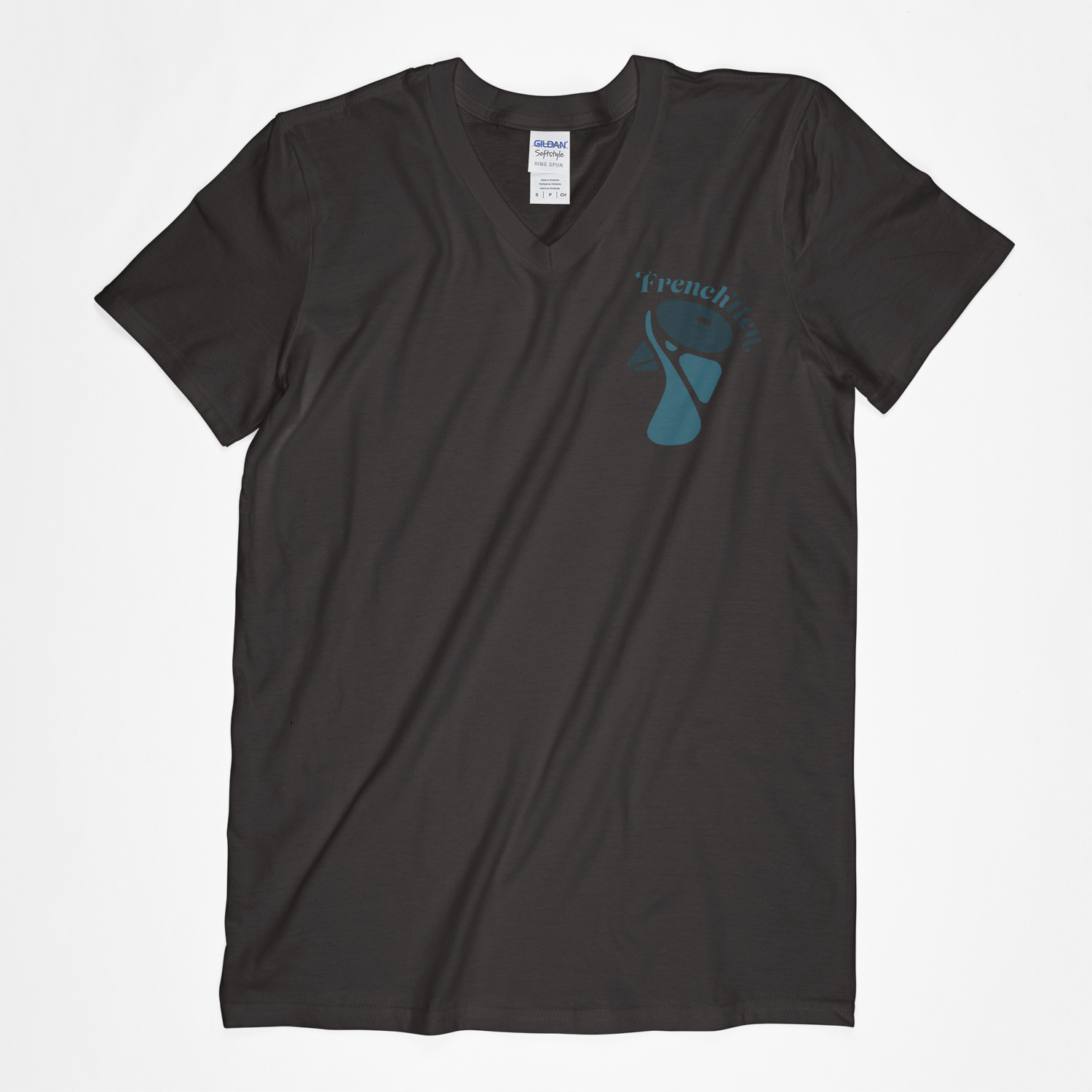
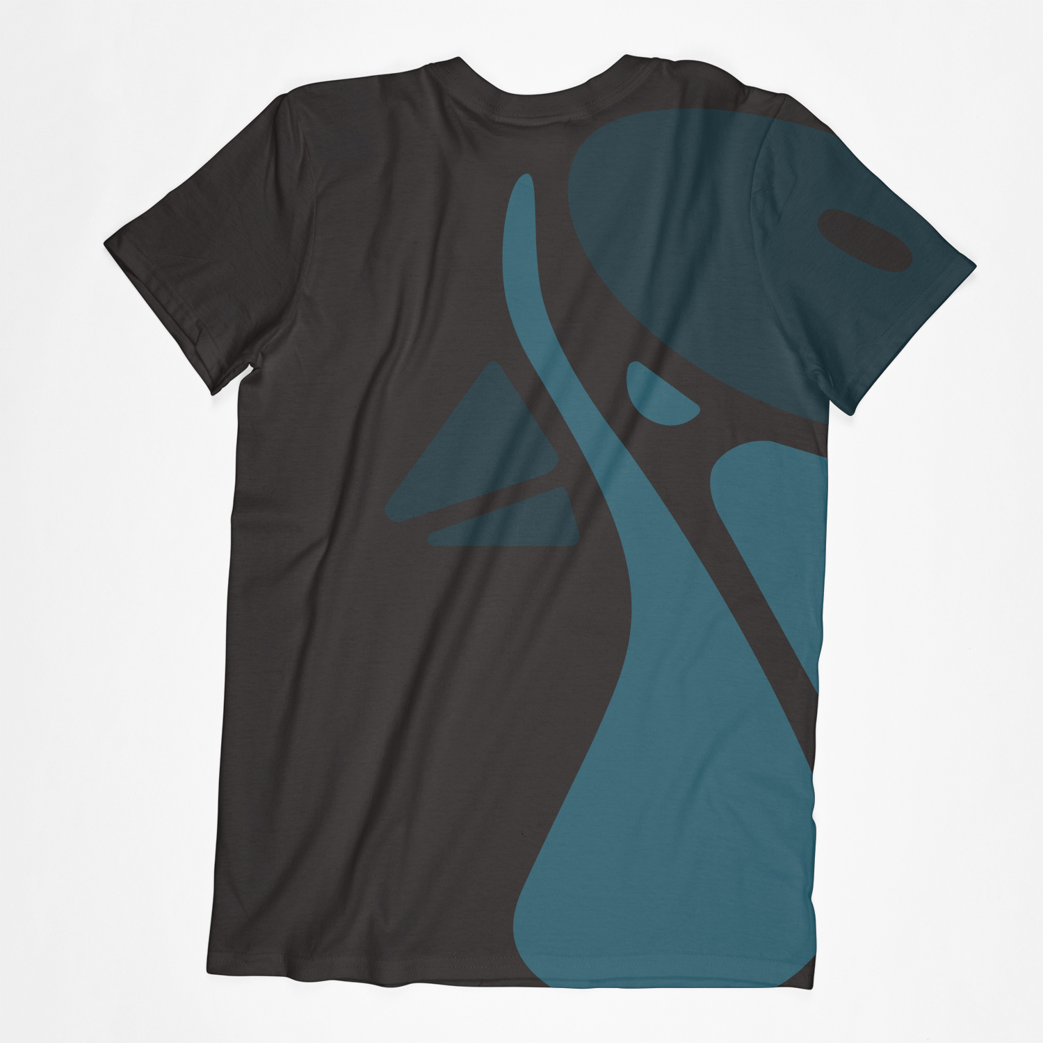
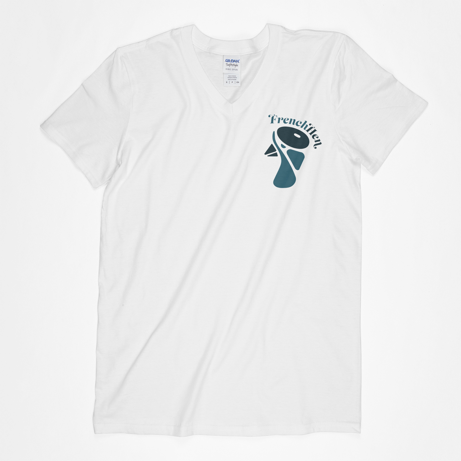
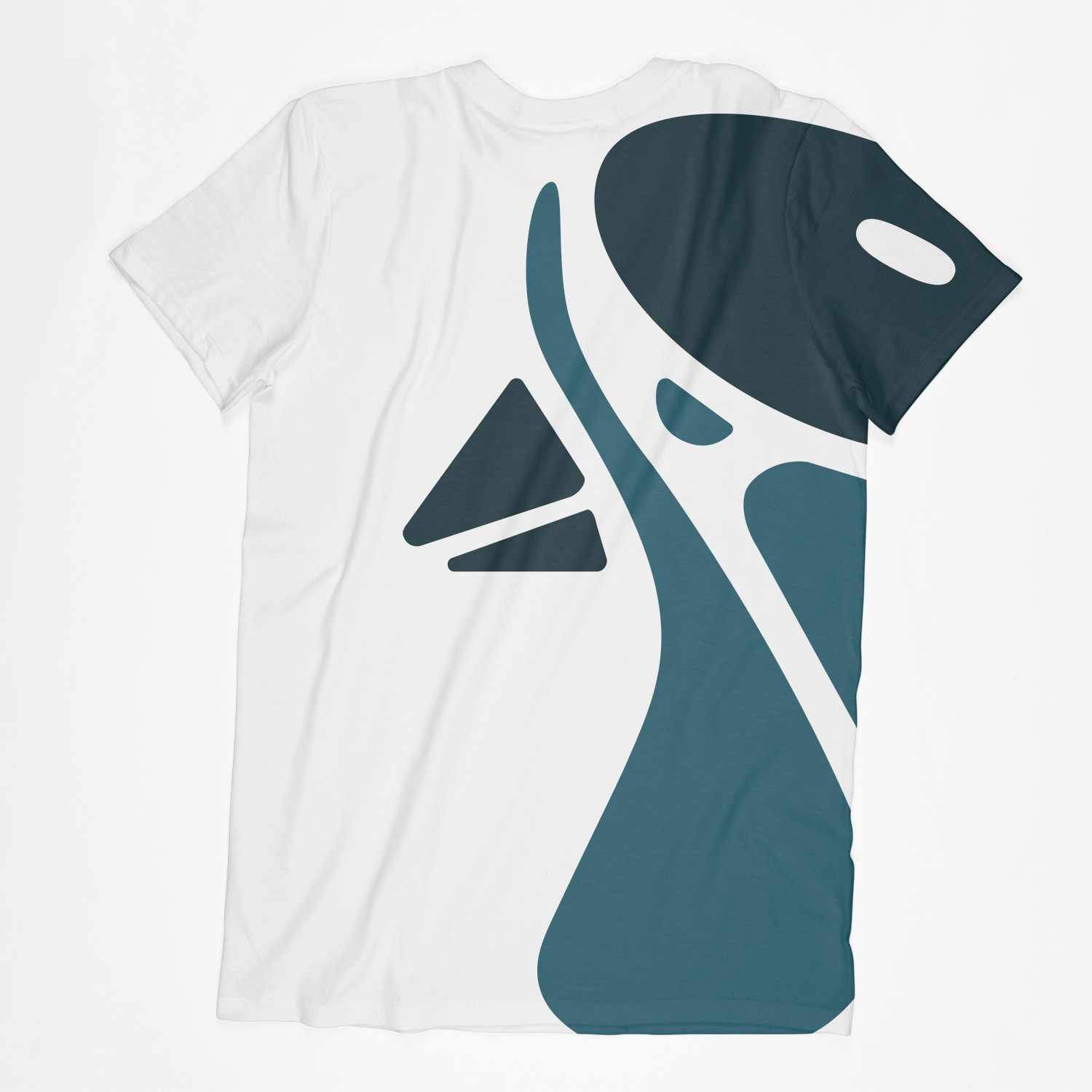
I made a black and a white version of the t-shirt. I think the cropped logo on the back looks pretty interesting and adds a nice visual element to the back of thee T. I also thought it would be good to have something on the back of the t-shirts as bartenders often turn their backs when getting drinks for you, so this is nice touch to still show the branding when the person at the bar isn’t facing the customer.
Reflection
This exercise taken me longer than I thought, partly because I had to re-think the colouring and the font a couple of times and partly because I had to source all the right mockups the exercise required.
Overall, I am excited how the end product turned out. I think I managed to create something quite cool looking and I am proud of it. I think the logo is pretty strong and I am happy with the font I chosen at the end as well. Something that I need to keep in mind is that gathering the materials for these types of assignment takes quite a while. Now that I have all these mockups, I will be able to reuse these for different pieces of work, so filing these correctly will be of utmost importance.
