
The Chance Housing Association has been set up to try and help first time buyers get onto the housing ladder and they want you to develop a brand image for their stationery. It is important to them that the Association is seen as being different from the other local housing associations – more modern, more helpful and definitely welcoming to young people wanting to buy a house.
They want to use their logo on their letterheads and office stationery and it will also be used somewhere on the sheets that hold the property details. It also needs to be reproducible in the local newspaper and professional trade magazines.
What to do
OCA Graphic Design: Core Concepts
• Research other housing associations’ and estate agents’ styles. Look at other publications designed for a similar audience. This information should help you identify as much what you don’t want to do as what you do.
• If this was a real job you would need to visit the housing association’s offices and website, if it has one, to see how many decisions they have already made – for example they may have painted their sign silver and dark blue and used a particular font. As the designer you may want to continue with and develop those decisions or change them.
• Using just typography sketch up some designs. You want to come up with at least three initial ideas to show the client. In this instance you can decide which one you think works best to further develop.
• Mock up a letterhead and business card using the logo and house brand. Look in you local newspaper and mock up an advertisement to fit in the paper. Measure the space carefully remembering to leave sufficient margins so your text isn’t cramped. Photocopy in black and white onto cheap paper – does your logo still work? Have any fine lines got lost? Are the differences between colours still discernable?
• Show your designs to your friends and family. What is their feedback?
• If you need to, go back and adjust your artwork. If all is well make up a
presentation pack to show the client – in this instance your tutor. Keep all your work and record the process in your learning log.
Brief
Create brand image and stationery and other printed material, including letter heads, information sheets and newspaper/trades magazine articles. The brand needs to stand apart from other housing associations; needs to look more modern, helpful and welcoming than others.
Research
I started by finding a housing association to use as my starting point and to see what sort of colours and branding is commonplace in this industry.
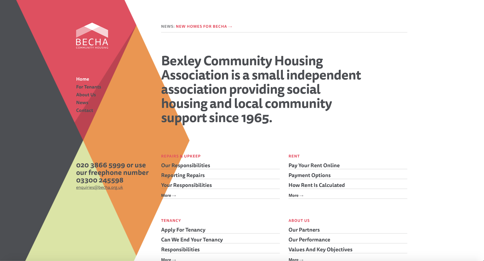
I looked at the becha.org.uk website. I really like the colour choices and the geometric shapes that made up the website. I think it looks very cool and young.
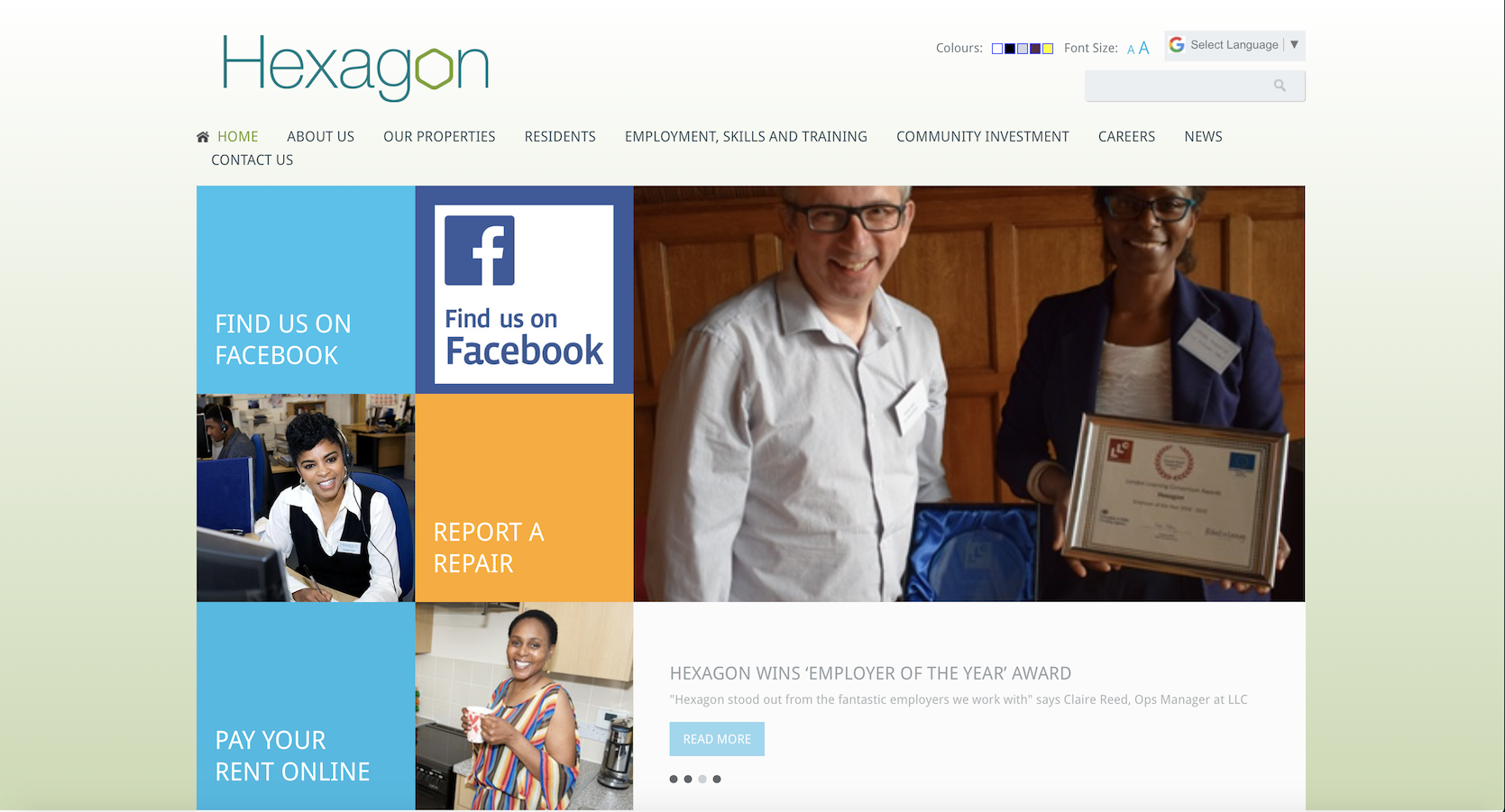
Another site I found and looked at is hexagon.org.uk this one is a little more corporate looking, and less modern. Still, the website looks professional and suitably fresh.
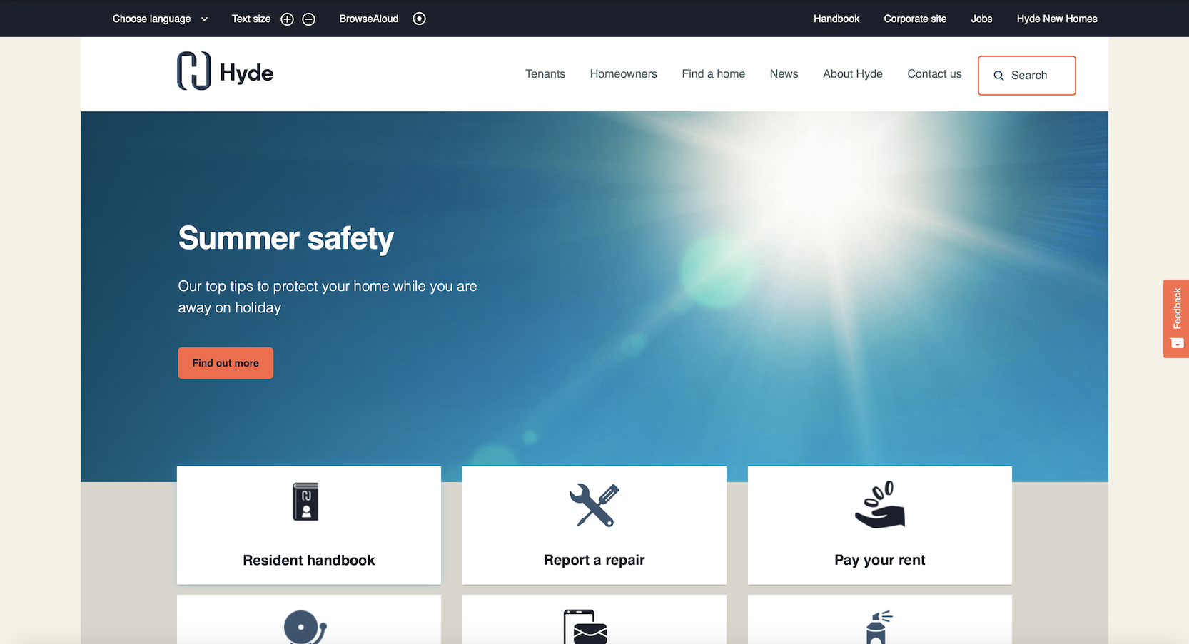
The next company I looked at was Hyde Group‘s website. I quite like how they created the logo out of the letter H. It looks fresh friendly and professional. I also liked the contrast colour of orange as it feels warm and inviting.
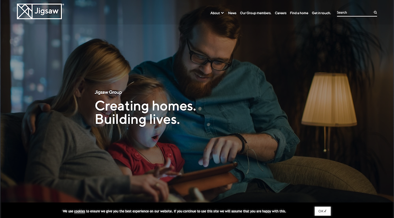
I also loved the website for Jigsaw Group and how the style of the group carries through to all of it’s member companies too. I really like the modern and fresh design for this website including the logo and the imagery and colour schemes used.
Next I wanted to look at Housing Association logos to see what other companies are using currently, and see if I can see a pattern.
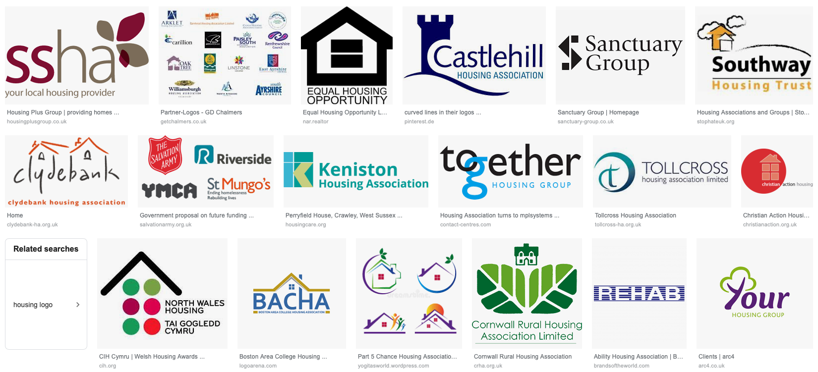
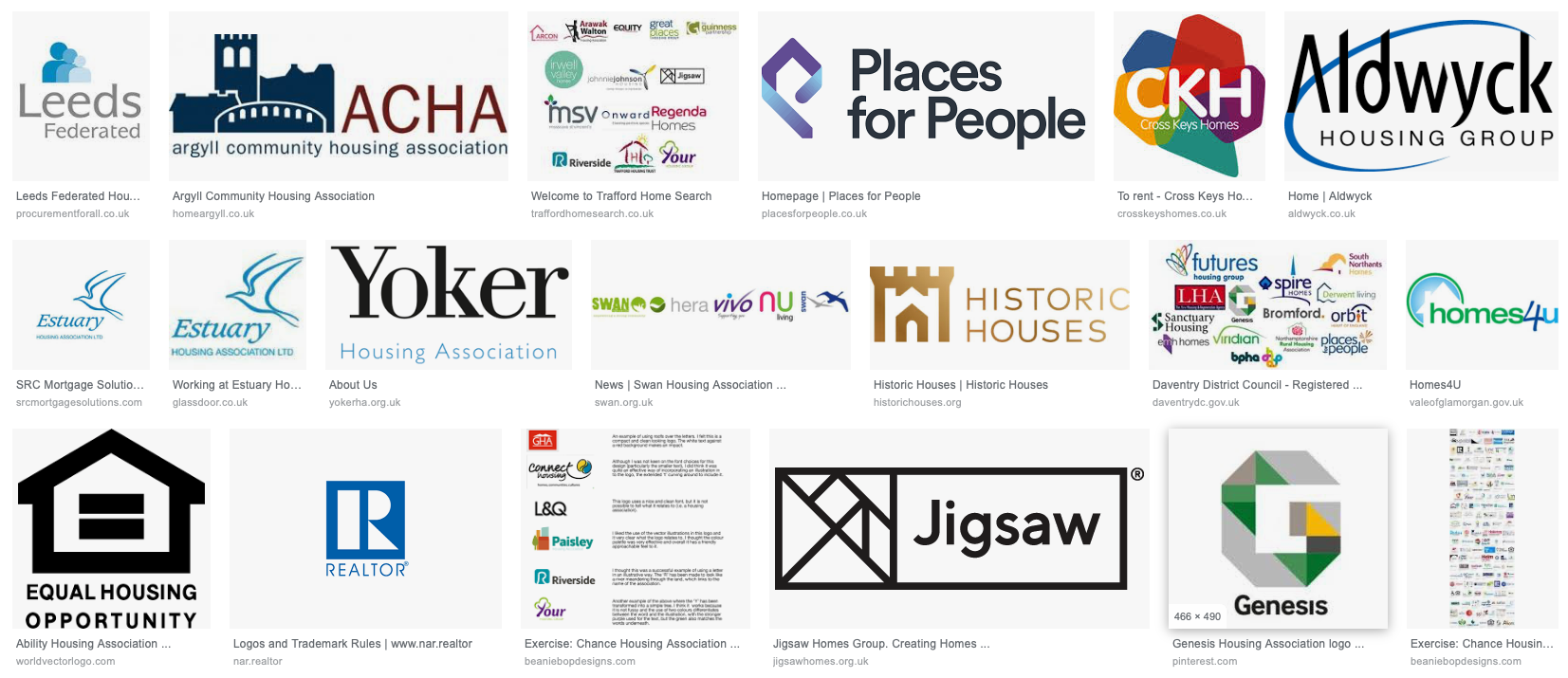
I wanted to pick out my favourites and analyse why I think they work.

Jigsaw: I think this is a simple an elegant logo that just works. I like how the logo is a play on the word, as it has to be reassembled by the viewer, but also resembles a house which shows the viewer what the company does. I think it’s a clever logo.
The Places for People logo is also very successful in my opinion. I like how it uses a slanted P as the logo that also made to look like a rooftop. Again, I think this is quite successful in conveying what the company does without being too on the nose. I like this.
The Cydebank Housing Association’s logo looks interesting. It is quite old fashioned, but I think it looks quite friendly and inviting. It has that retro feel to it. I like the playfulness of the stems of letters creating the walls for the houses. This is very successful in conveying what the company does, however a little bit on the nose perhaps. I like when logos are a little more abstract.
The Hyde Group logo is also very nice in my opinion. It is clean and simple, yet somehow the H looks like a facade of a building, which I think is great! I think the logo is definitely less likely to communicate to the viewer what the company does, but I feel that this is a memorable logo due to its shape.

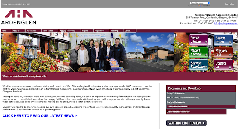
I really like this one. The top line is a logo made out of the abbreviation AHA for Ardenglen Housing Association. It is made to look like a roof to show what the company does, and I think this is super cool. I love how the H is hidden in the negative space between the symbols. It is not very obvious, but once you deciphered it, I think it is very memorable.
However when I visited the website, it looked very different from what I imagined it would be. It looked clunky and old fashioned.
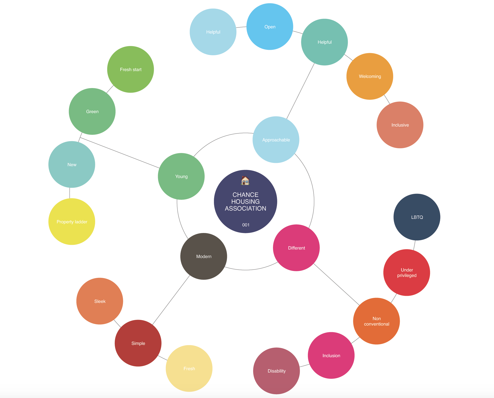
Mind Mapping
In recent exercises I have dropped the mind mapping, but I feel like this exercise really calls for it as I am not too sure where to begin with the exercise. I decided to start by gathering all the words that came to mind that I wanted my logo to reflect and try to arrange them into small categories to see what path I might take.
After I had this done, I wanted to start by looking at some options for a logo, by sketching out what I had in mind.
Logo
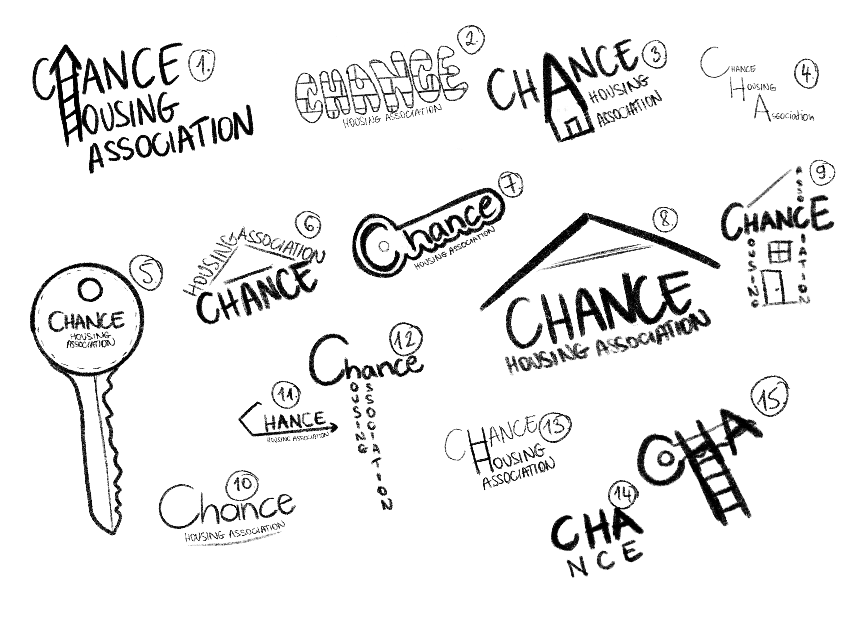
I shared this with the other students on the course to see which one they think is the strongest idea. They picked 3, 7 and 8. My favourite as an idea was number 7, so I decided to go with that and develop the idea further.
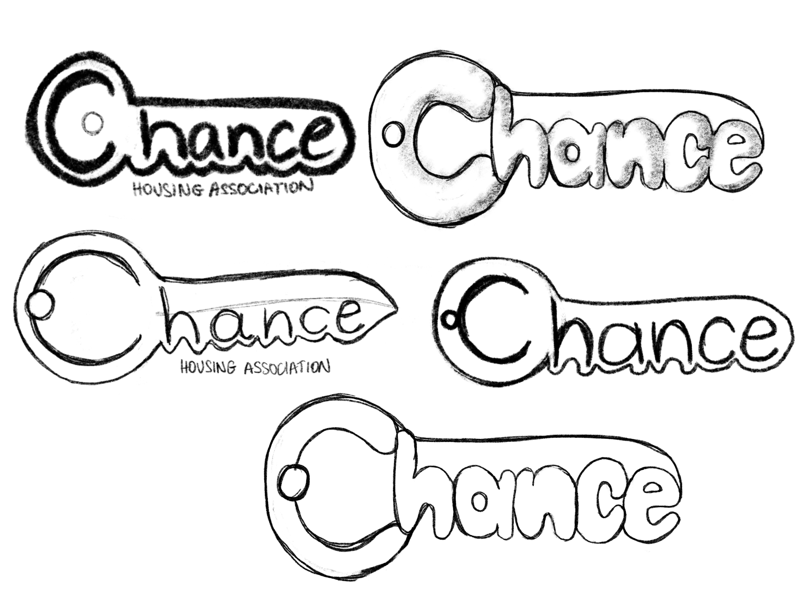
I tried playing around with different styles and thicknesses to see if I like the outcome. I will move this to illustrator to see how I am able to replicate the idea using vector tools.
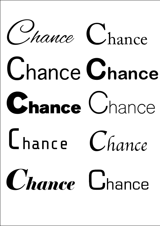
Next I just laid out the word chance and started playing around with different fonts to see which one I could envision as part of my logo. I really liked Share Tech Mono (left column 4th from the top) but also thought Shree Devangari 714 works quite well too (no 3 in the right hand column)
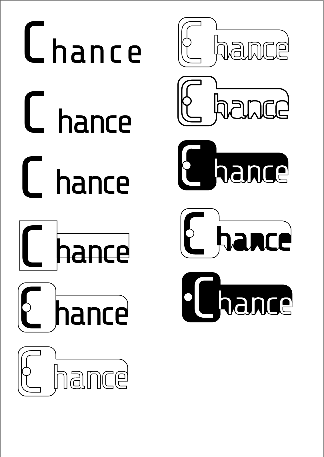
The Share Tech Mono font landed itself quite well for this. I was pleased with how it turned out, but wanted to try out the other chosen font as well.
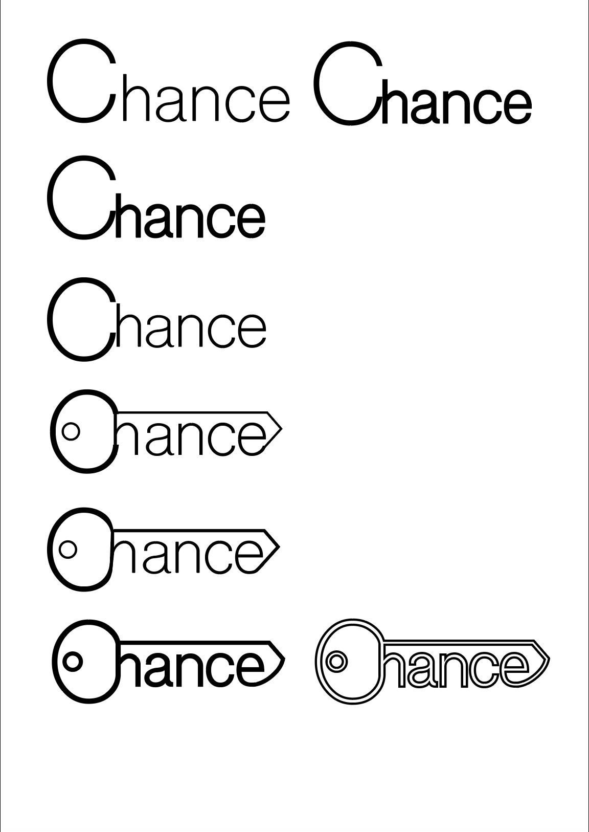
I liked this very much. Probably turned out better than my first version. It truly looked like a key and I was excited to see how this would work in different settings. I wanted to compare the 2 at different sizes to see which one would work better at most sizes.
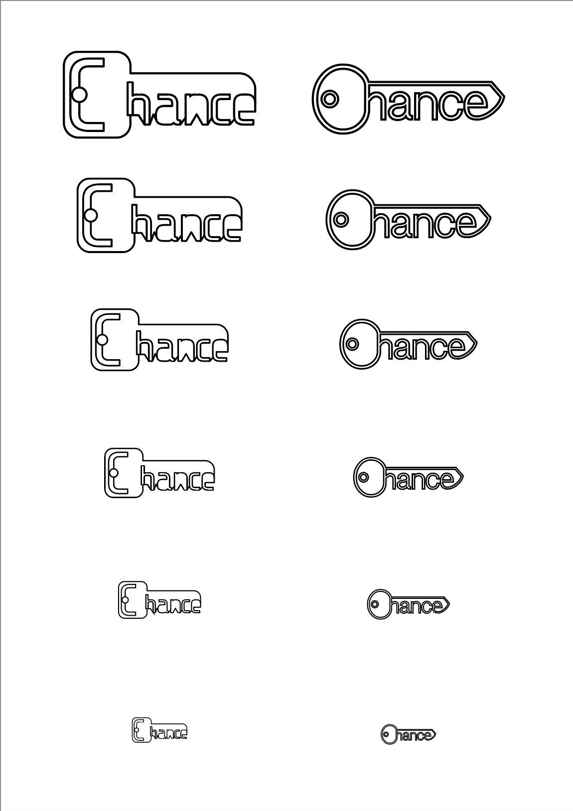
I felt that the right hand side logo worked better at all sizes, because the font I used as the basis for this is a lot more legible at smaller sizes. I decided to go with this logo for my project.
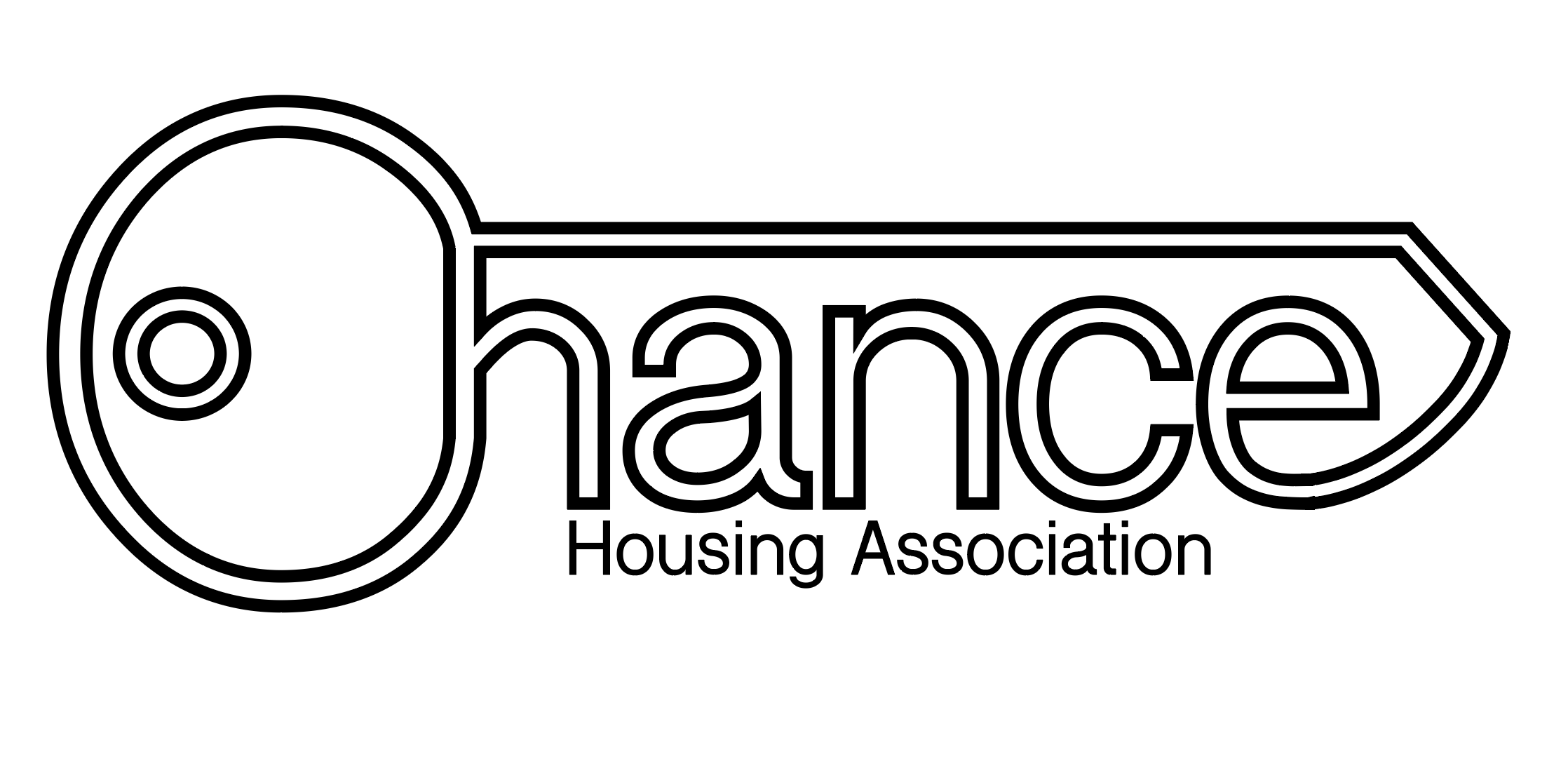
I think this looks interesting and playful, and I really liked the results. The only issue I foresee with using this logo is the letter C. it might be a little hard to see it at first.
Colours
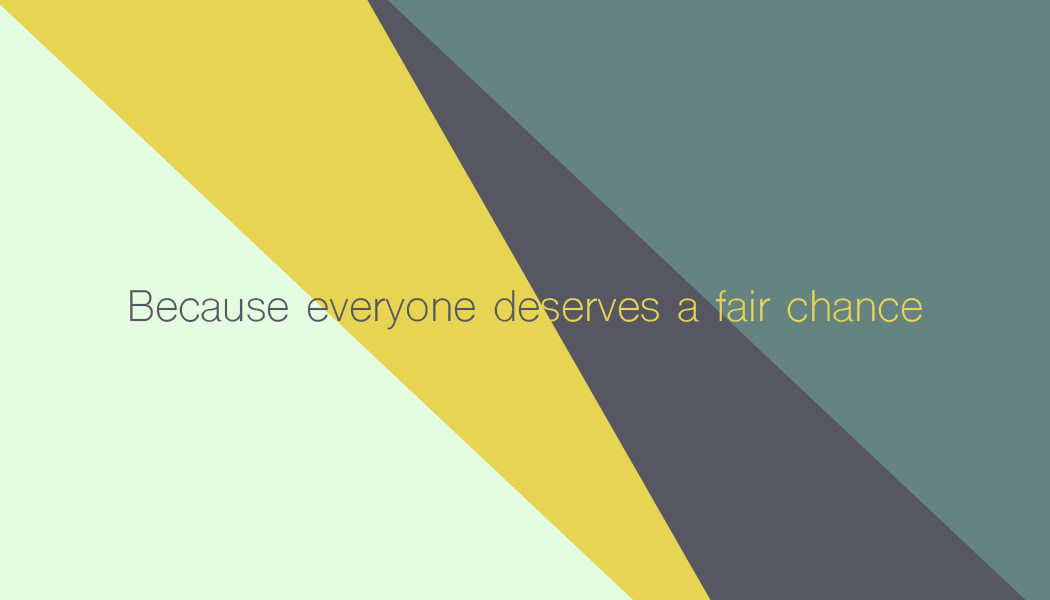
I wanted to explore some colour schemes keeping in mind the company values I have established in my mind map. I wanted to use yellow, as I feel that is a colour I associate the most with helpfulness and positivity. I added the greens as they are safety, tranquility and luck. Here is the initial colour scheme I made using Coolors.co
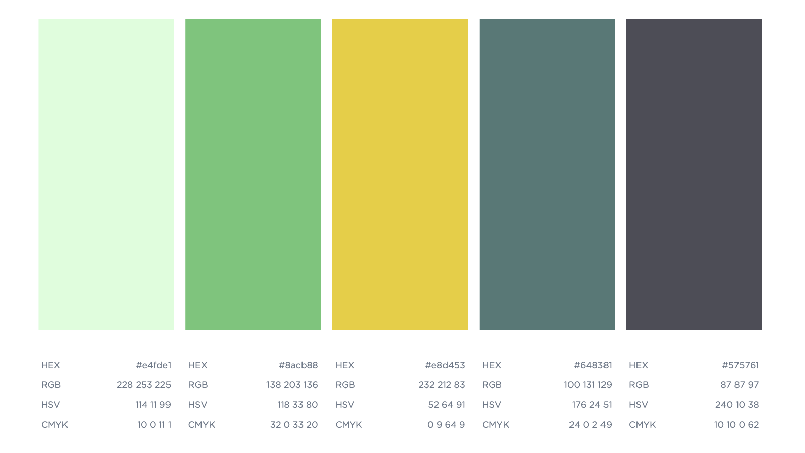
I wanted one pop of colour that is the muted yellow, and some secondary colours, so I can make the branding interesting.
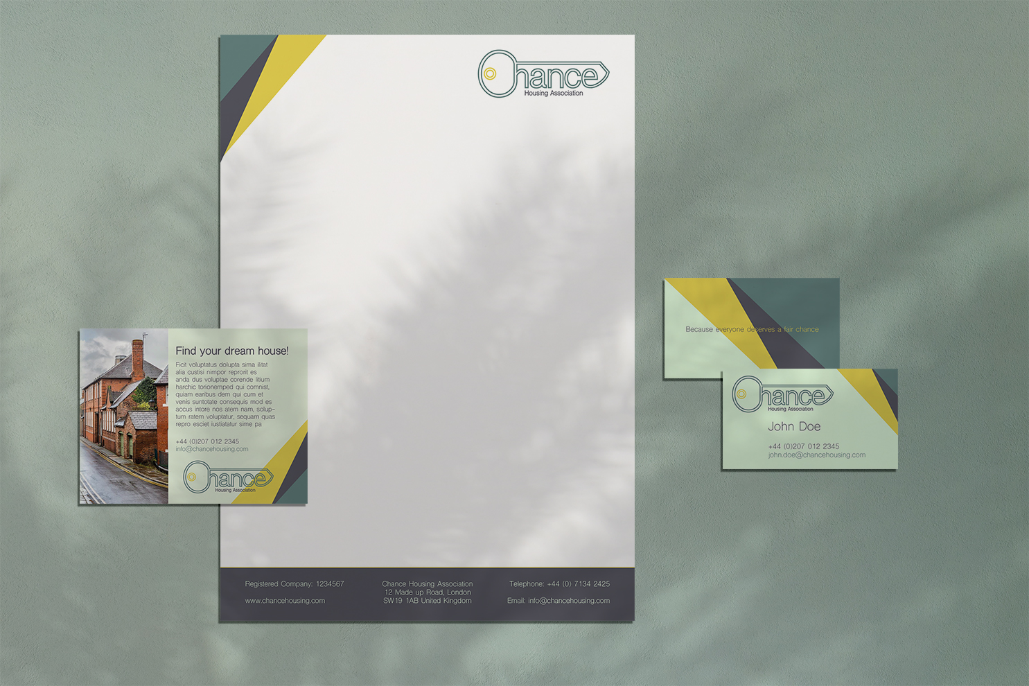
After I had this I started playing around with some different headed paper designs.
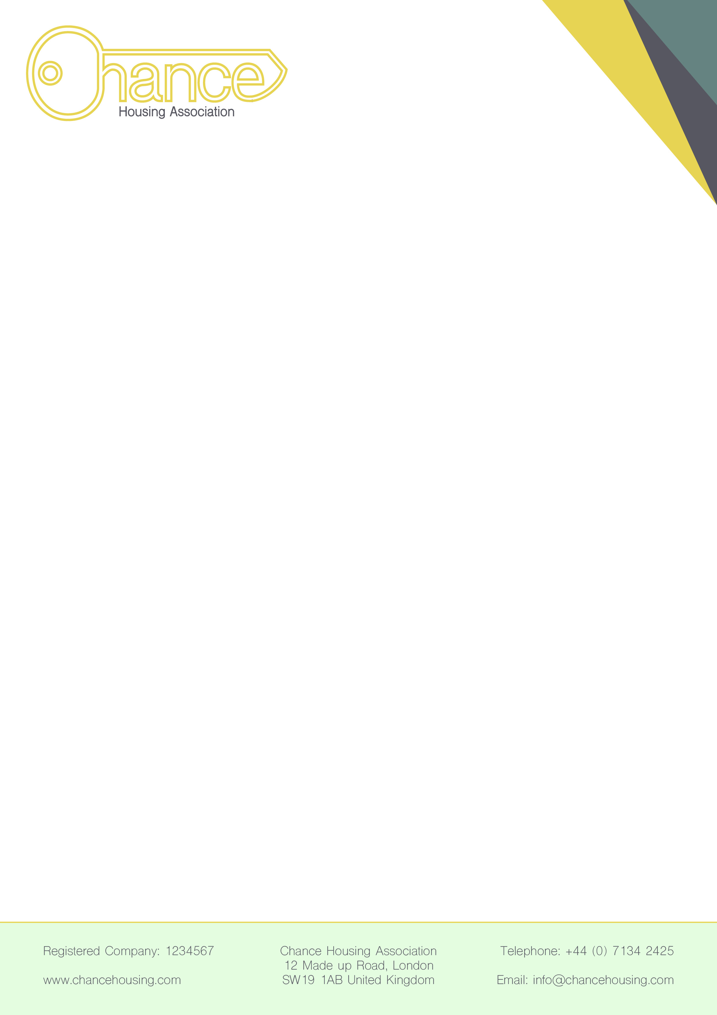
1 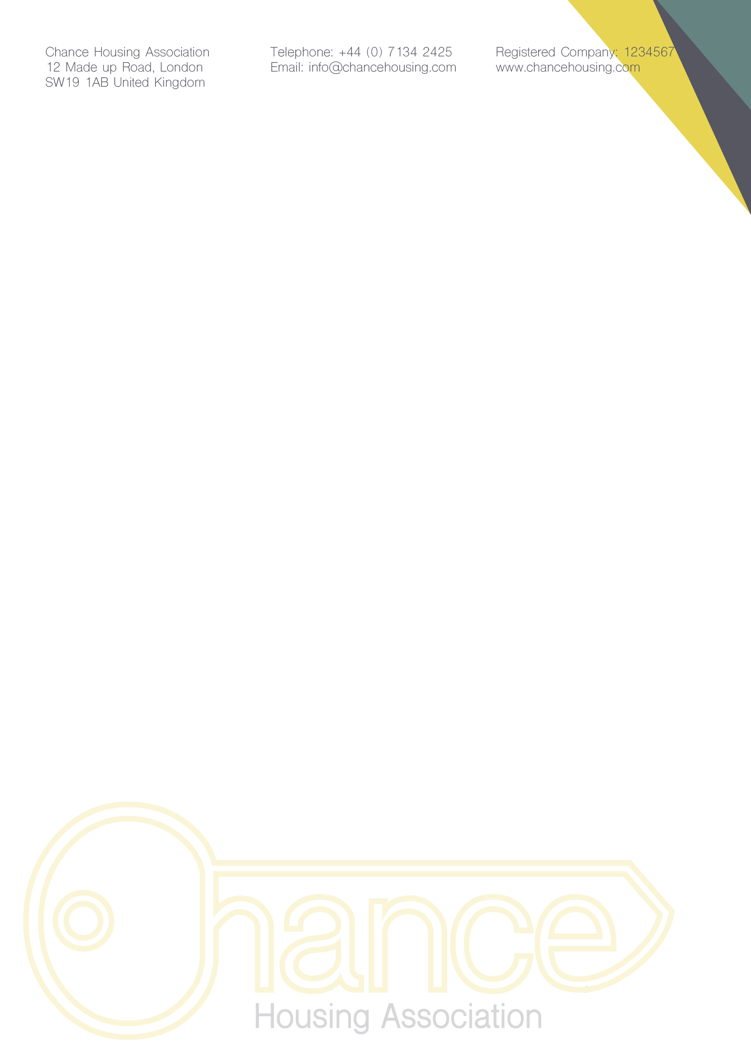
2 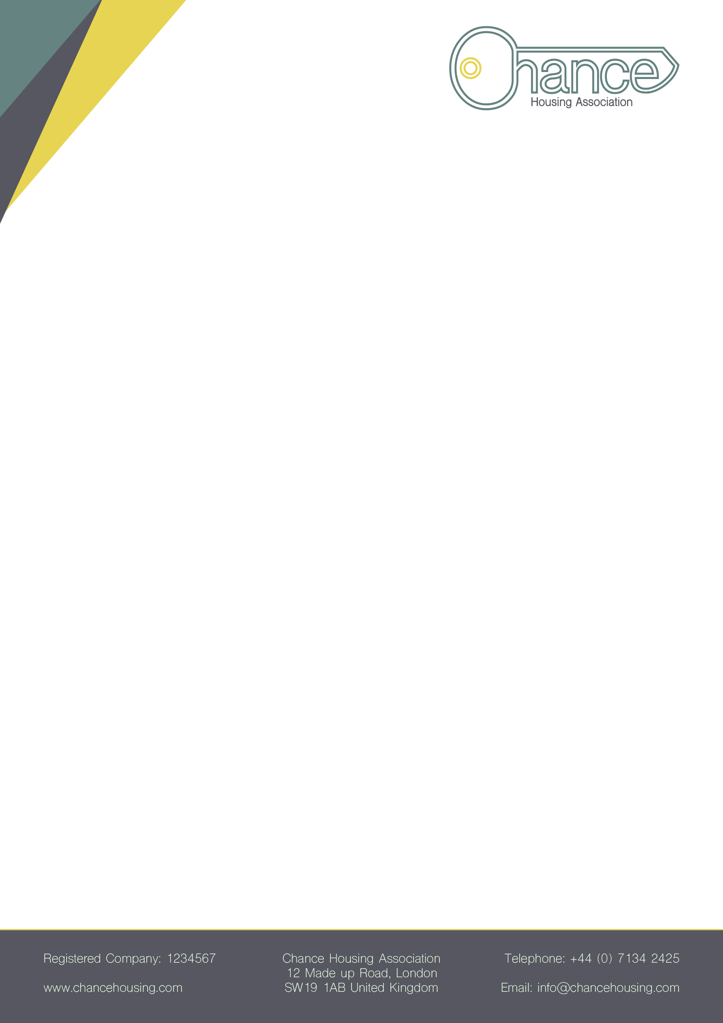
3
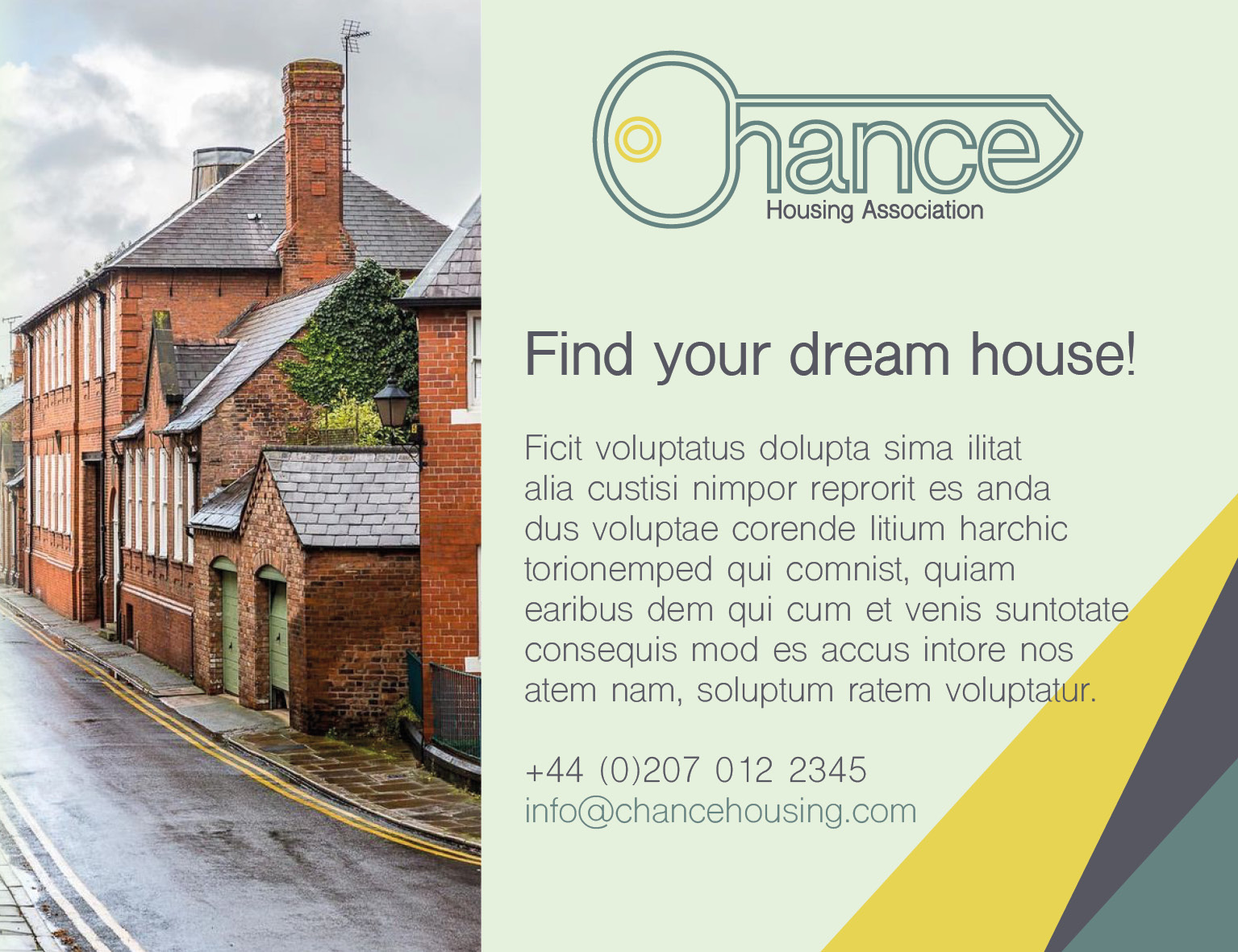
I made 3 different designs with slightly different layouts, but I think number 3 works best. It has the logo up top, and shows some of the company colours, and all the company details in the footer. I think it’s fairly balances with the logo being smaller too.
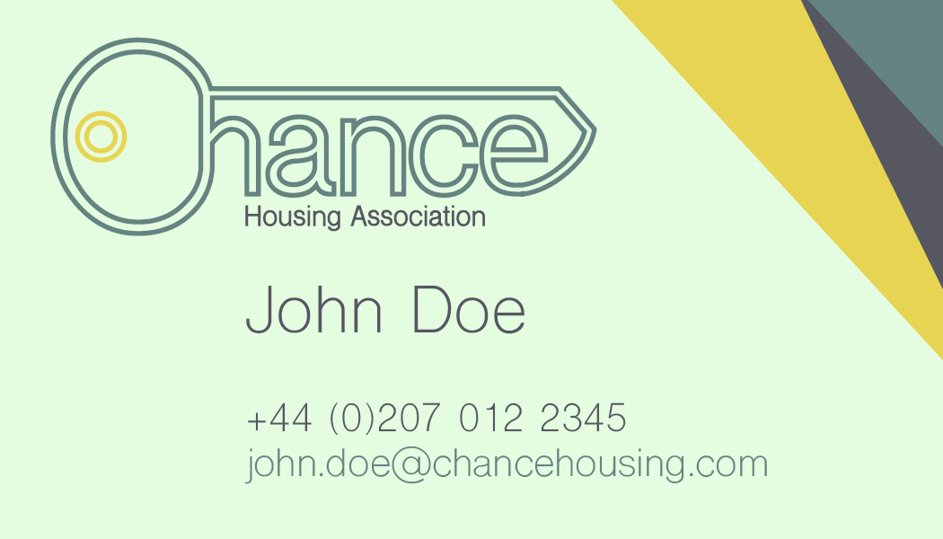
After this was done, I moved onto creating the business card.
Newspaper Ad
To create my newspaper advert, I looked at the properties section of a newspaper to see what the ads in this section normally look like. Here is what I found.
I measured this, so I can design my ad to fit this space. I didn’t have much copy, and I don’t know if I can come up with something, so I will be using placeholder text for this.
I came up with a few different layouts for the ad, and I think it looks like something that would fit in that sort of space quite well.
1 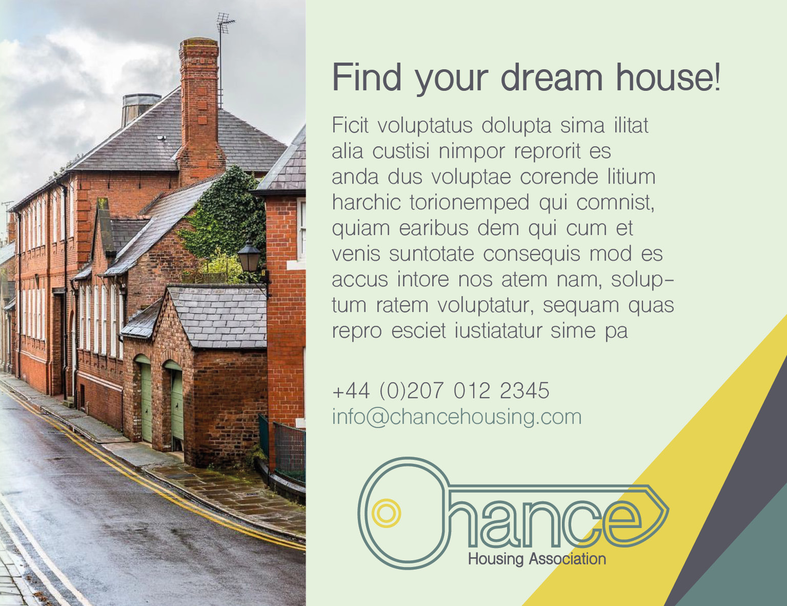
2 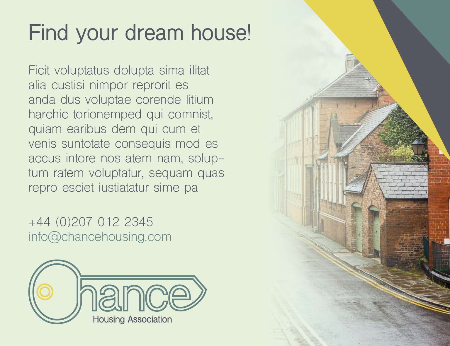
3
I liked number 2 best because it seems nicely grounded and the copy is in the forefront of the ad, but the branding is visible and the picture of the house draws the viewer in to investigate.
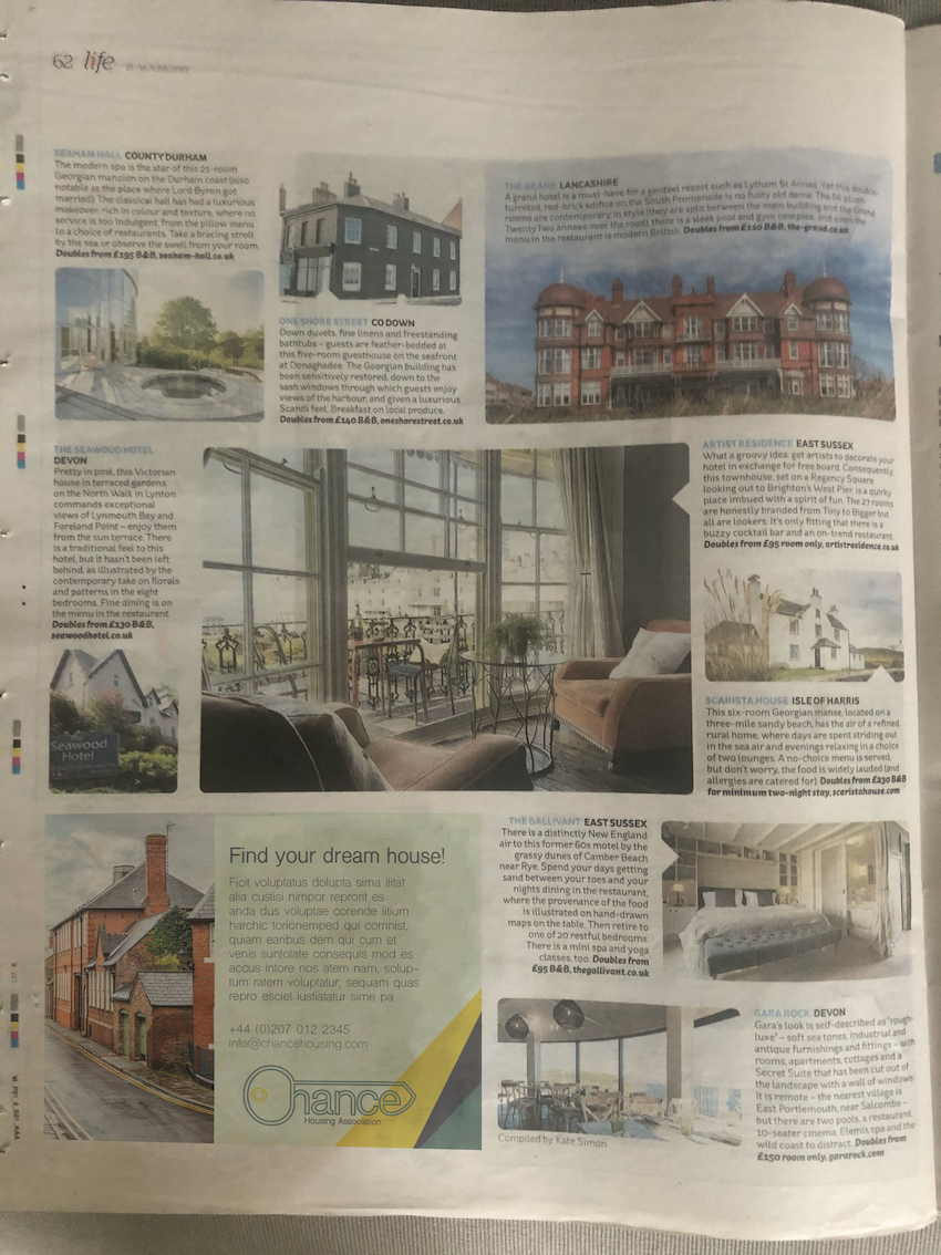
I think this is quite effective, as the colour and the image gets draws attention and the copy would hopefully intrigue the viewer into sending an email or giving a call. I think the colours also work quite well. The only issue I have, is the house font I chosen for this brand might not be the easiest to read in a newspaper as it is quite a fine font. Overall, I think I am happy with the outcome.
Feedback from friends and family
As always I was consulting friends and family almost every step of the way to see what they think of the work. I think the reactions were quite positive. I got reassurance that the logo looks good and the colours work well together. I asked them what their first reaction would be to the branding overall, and they said it looks professional but friendly, which is exactly what I was after for this brand. One commend was, that the emphasis on the key, if you seen the logo by itself, could imply locksmith rather than a housing association, but I think this is a problem you would face with most logos when they first introduced.
Presentation Pack

Reflection
I think this part has shown me that branding is not only a logo, but a plethora of things. Colour, font, layout can reinforce the brand image and when done in a constant way, it can communicate the brand promise and overall feel for a company very well. Choosing a font and a colour scheme is not easy because it needs to work in a variety of ways. It has to work on printed materials in the office, on business cards, in a newspaper etc. It can be quite difficult to make all the right decisions. Thorough testing of the branding can be done in many ways, by printing the designs for example you get a totally different feel for it.
I enjoyed this part, and learned quite a lot I believe. I am looking forward to creating more logos soon.
