
This exercise is about how you deal with two different spaces to work in.
OCA Graphic Design: Core Concepts
You have been asked to design an A3 poster and an accompanying double sided A6 flyer to promote a singing course run by an organisation called SingOut (all one word). They have very little money so want to print these posters on their black and white photocopier. You can use a colour paper if you want.
You may want to include an image such as a drawing or photograph, but be very careful with photos as they tend not to reproduce well on a photocopier particularly if they are colour photos. You will need to check by printing off your design and/or photocopying it.
The information they want to give is:
• Do you love to sing?
• Join us for an exciting opportunity during the day with a professional vocal coach. Learn to sing different types of music, vocal techniques, meet new people and have fun!
• 10.30 to 12.00 every Tuesday from 11 March
• The Community Centre, Charlotte Church Road
• £60 for the course
• No experience needed/no requirement to read music
• For more information call 011779 8765432 http://www.singout.com
The first thing you need to do is work out if you have all the information you need to fulfill the brief. If not what is missing? Work out the hierarchy of the information. How will you divide your information up to fit on both sides of your flyer? How will you link the design for the poster with that of the flyer? How can you make the poster eyecatching and effective with such a limited palette? Which typeface or faces will you use and why have you made that decision?
When you have finished pin your poster up and critique your work. What do you think? Keep notes and sketches in your learning log.
Brief
Create a poster (A3) and a flyer (double sided is A6) to promote a singing course. Needs to be greyscale so it is easy to reproduce with a black and white photocopier. Can be printed on coloured paper. May include simple illustrations.
Info to include on poster:
- Do you love to sing?
- Join us for an exciting opportunity during the day with a professional vocal coach.
- Learn to sing different types of music, vocal techniques, meet new people and have fun!
- 10.30 to 12.00 every Tuesday from 11 March
- The Community Centre, Charlotte Church Road
- £60 for the course
- No experience needed/no requirement to read music
- For more information call 011779 8765432 http://www.singout.com
Have I got all the info?
- full address for the community centre?
- How long is the course?
- Is it 10.30am to 12pm? or 10.30pm to 12am?
How will you divide up the information for the flyer?
Front
- Do you love to sing?
- Some graphics
- Join us for an exciting opportunity during the day with a professional vocal coach.
- No experience needed/no requirement to read music
Back
- Learn to sing different types of music, vocal techniques, meet new people and have fun!
- 10.30 to 12.00 every Tuesday from 11 March
- The Community Centre, Charlotte Church Road
- £60 for the course
- For more information call 011779 8765432 http://www.singout.com
I organised the information in a way where I placed everything eye catcher to the front with a graphic and the back will have all the details.
Make it eye catching
How do you make something eye-catching with such a limited colour palette? I think I can play a lot with negative space on the flyer. Perhaps have bigger black blocks of text that stand out on a white (or light colour) paper. This should make it eye grabbing enough so people would want to pick it up. Definitely needs to look clean and modern so it reflects well on the company organising these singing lessons.
Typefaces
This is something that I normally select via trial and error. I think for this something clean and modern would work. Maybe something with a little flair for the headlines. I am thinking something like Helvetica may work as it’s nice and clean. I will try out a few different ones and see what works best.
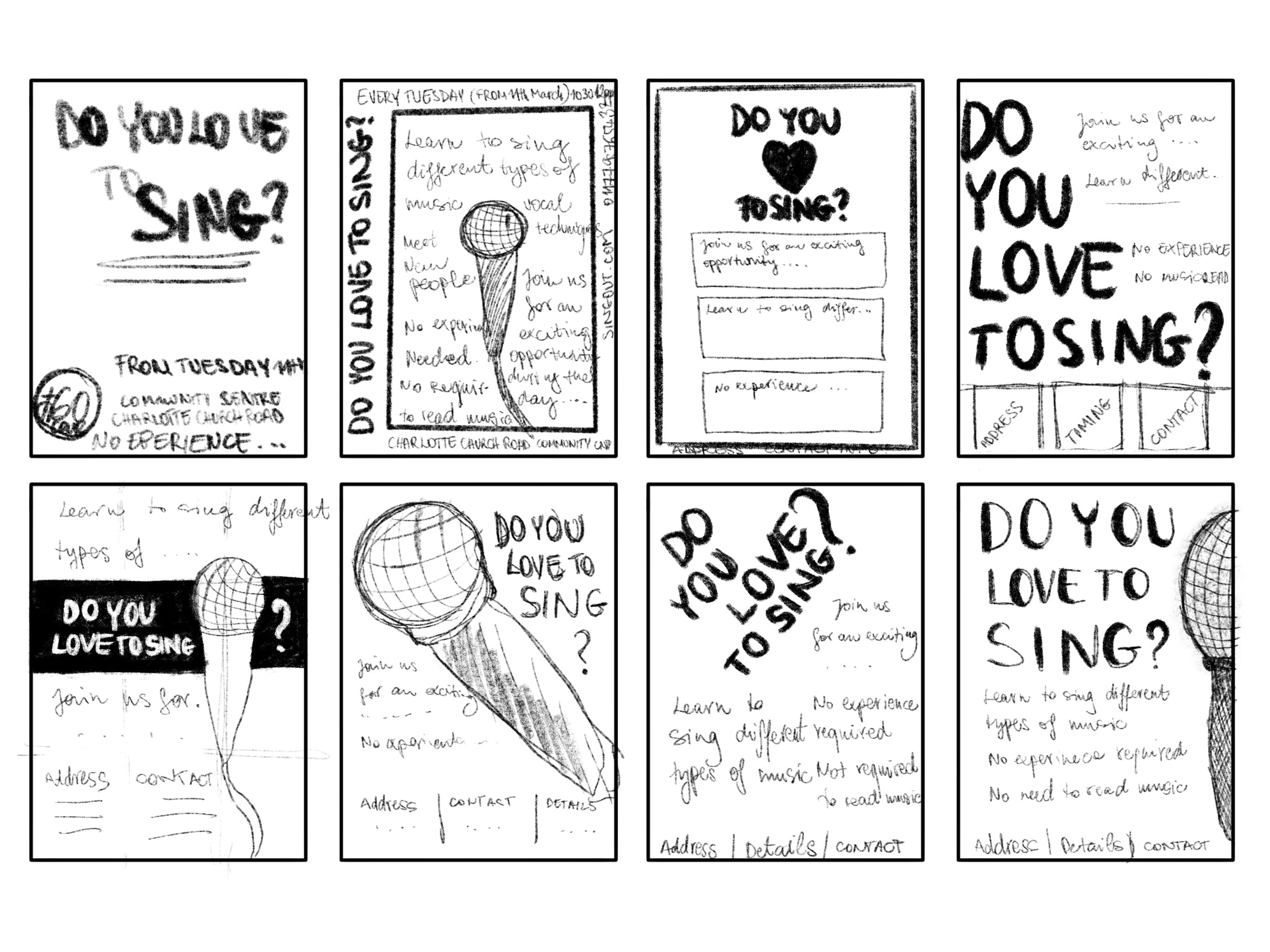
I decided that I would start with the poster, and use the design of this as a starting point for the flyer.
I made 3 versions from my sketches and I sent it to some people to see what people seem to have favoured.
1 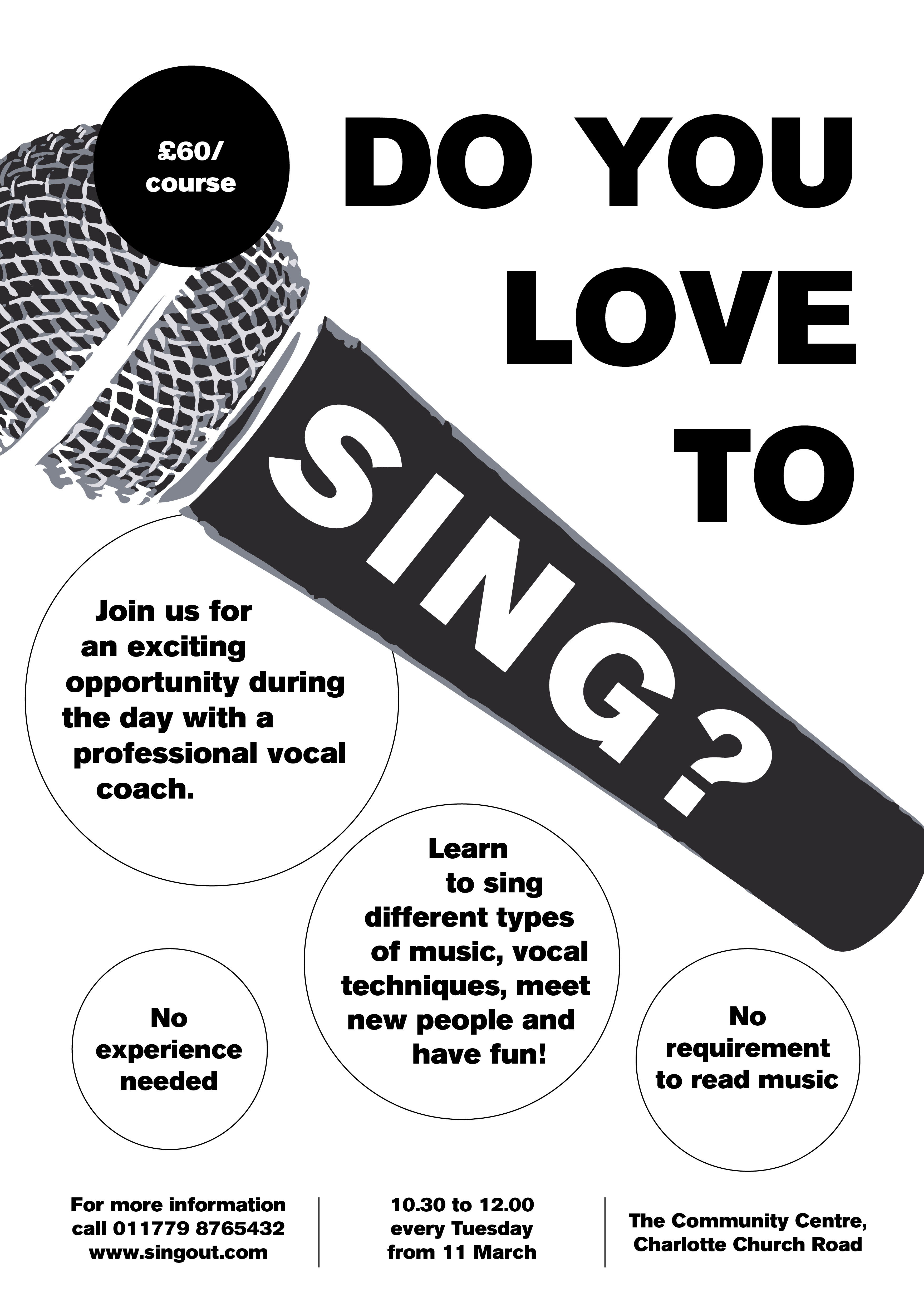
2 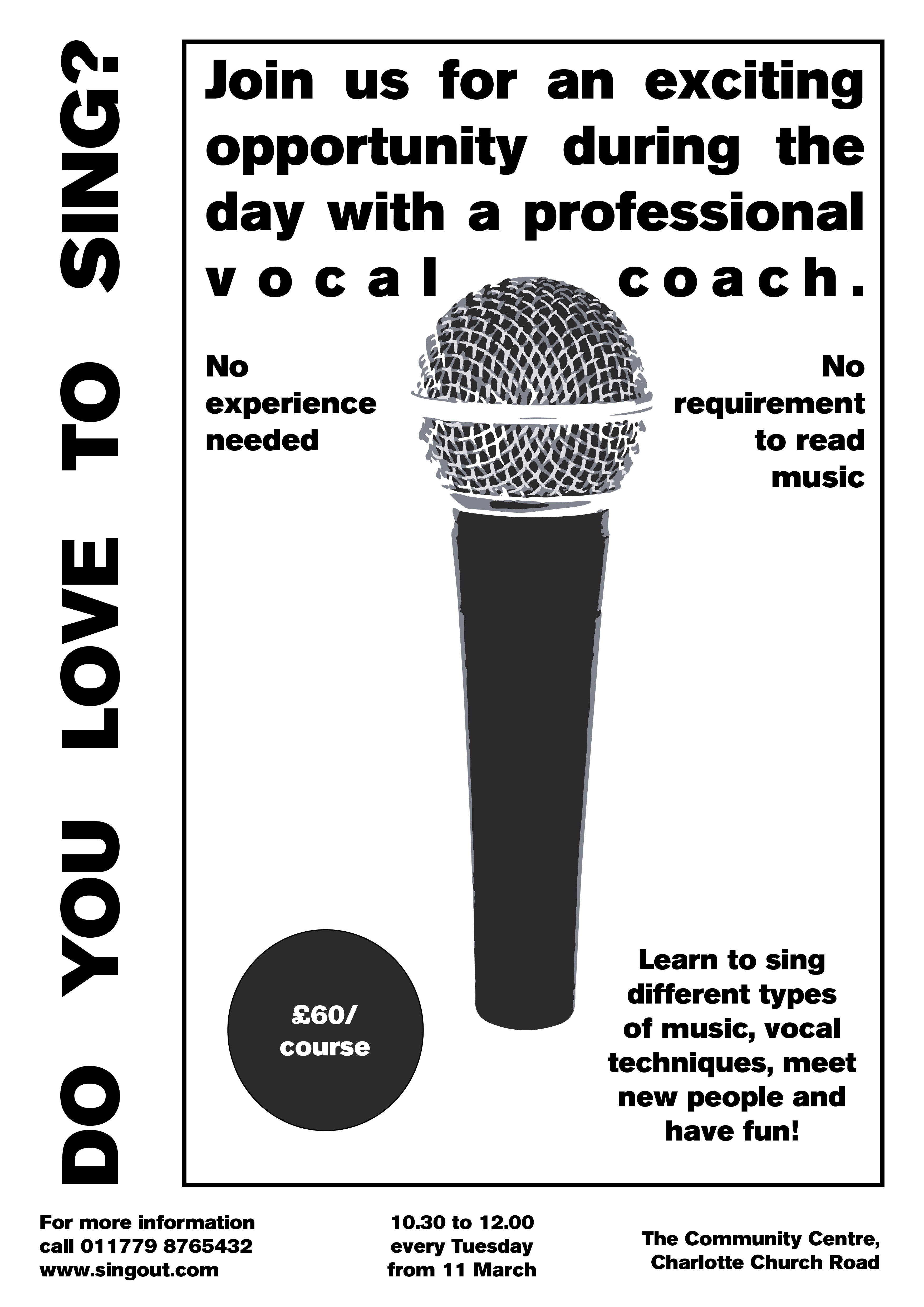
3
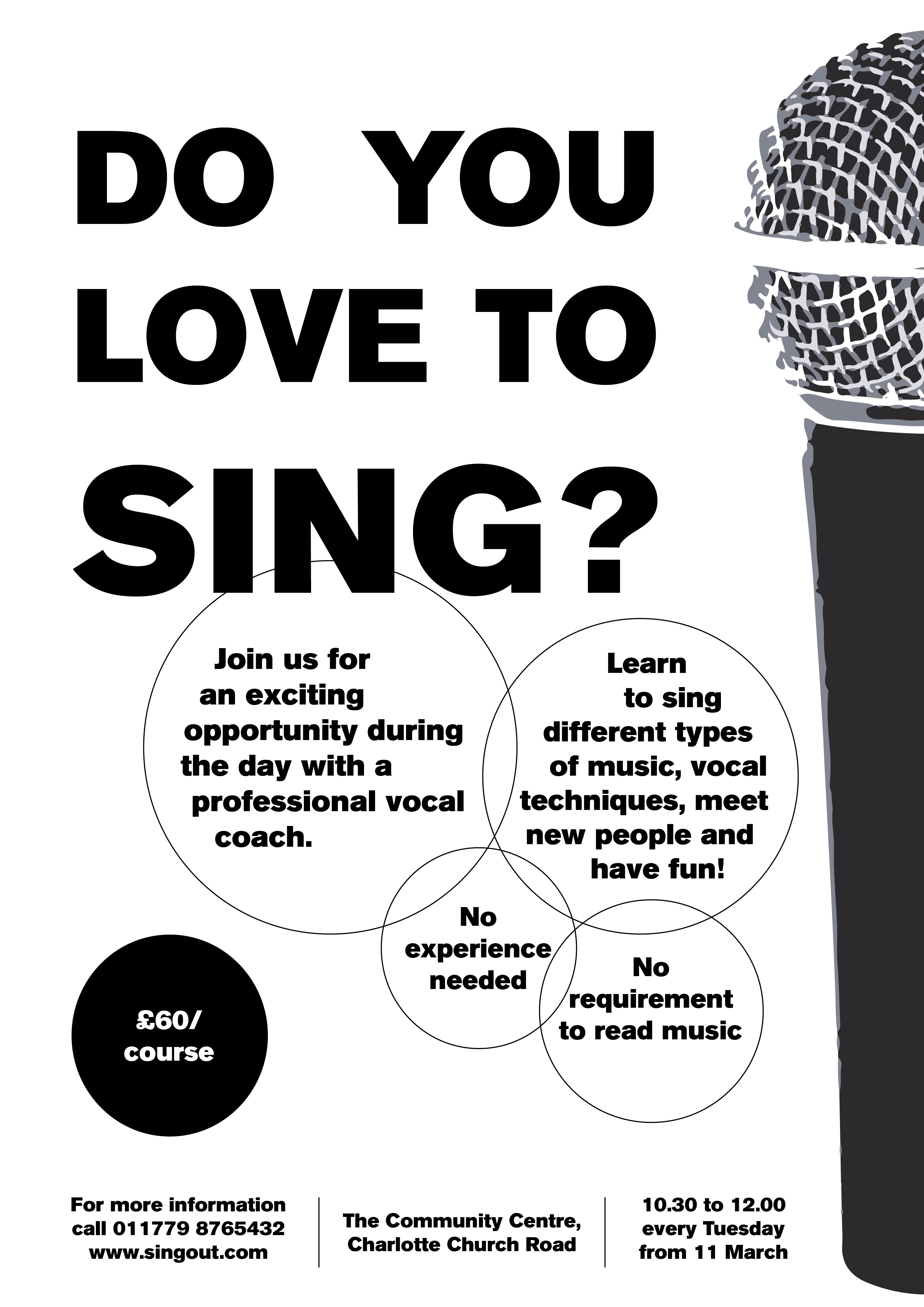
My favourite was number 3, but people seem to have preferred the other 2 designs. I have decided to go with the popular opinion as a poster fist an foremost needs to be appealing to the masses.
I made a few small changes to it, but I think it’s a good poster that will get the point across and also will fit the brief in terms of being easy to reproduce on a black and white printer.
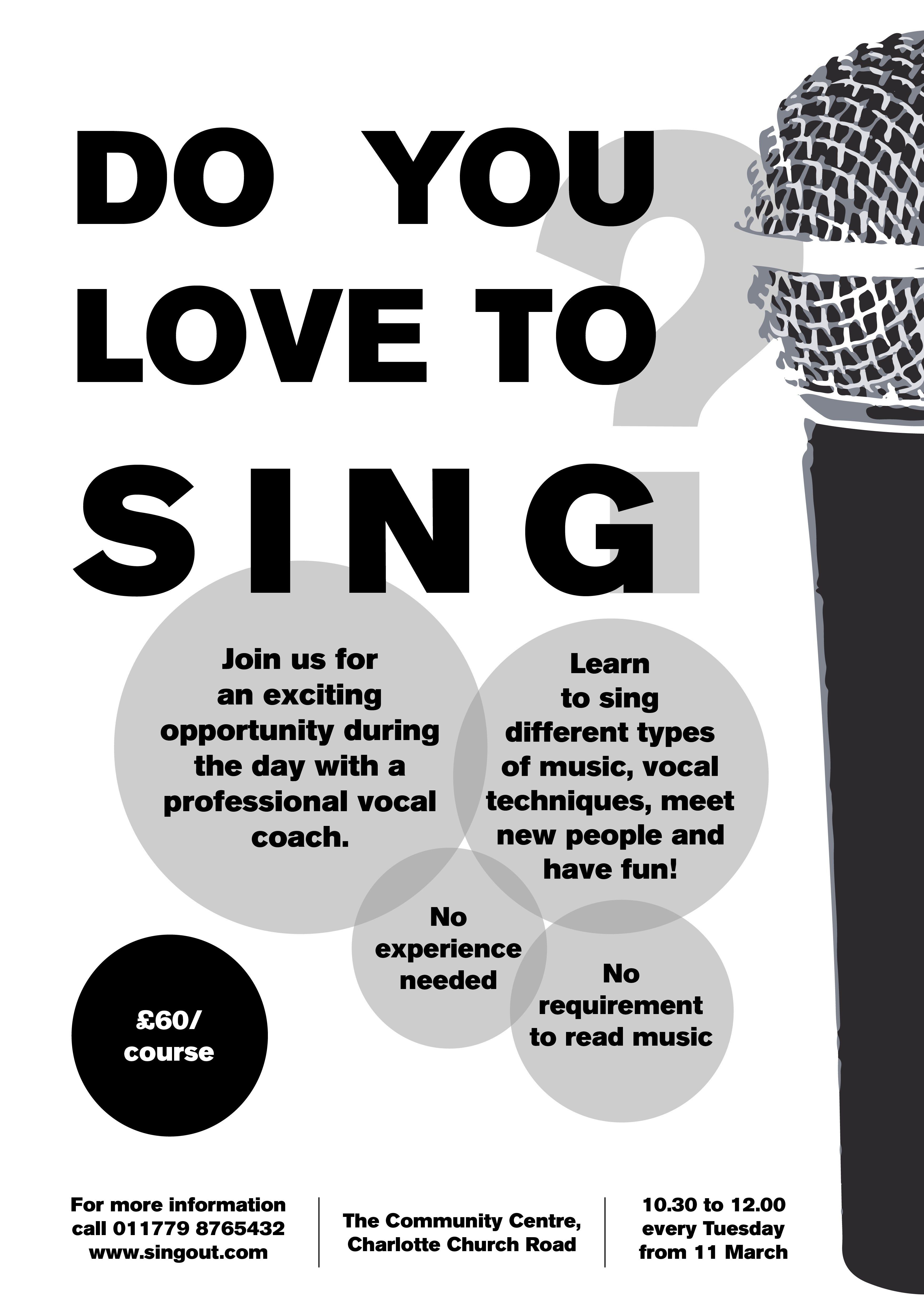
Made the bubbles with the text a little more interesting by making them semi opaque grey. I think this adds some depth to the design. Also removed the question mark from the main body text and added it beind the text as more of a decorative element. I think it works better, because it allows the word “sing” to shine more.
Now that I had my main poster done, I wanted to translate this into the flyer design.
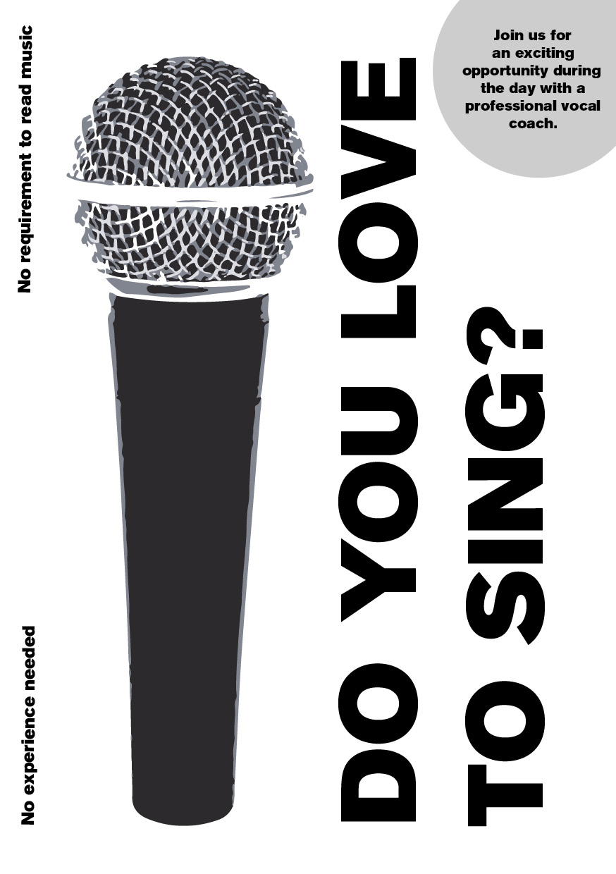
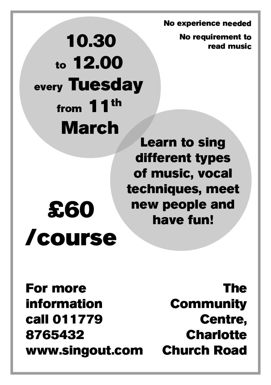
I think the flyer is quite good, managed to get all the information on there in a good size, and I think the hierarchy is in the right order as well. Time to mock up what my printed product would look like on different colour papers.
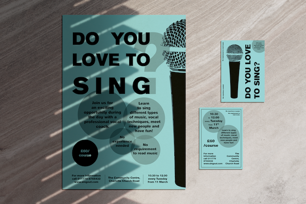
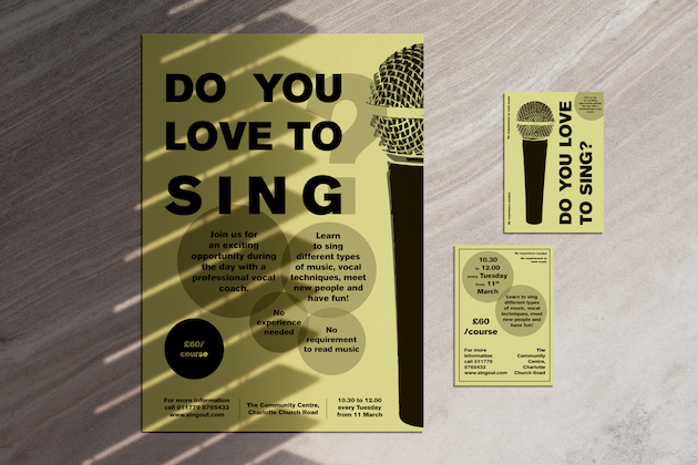
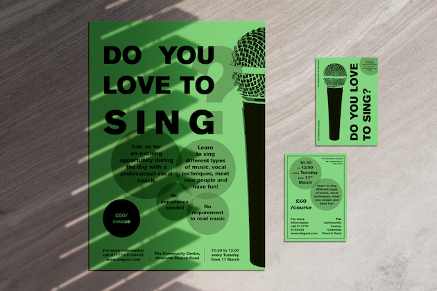
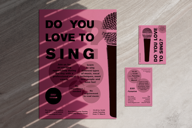
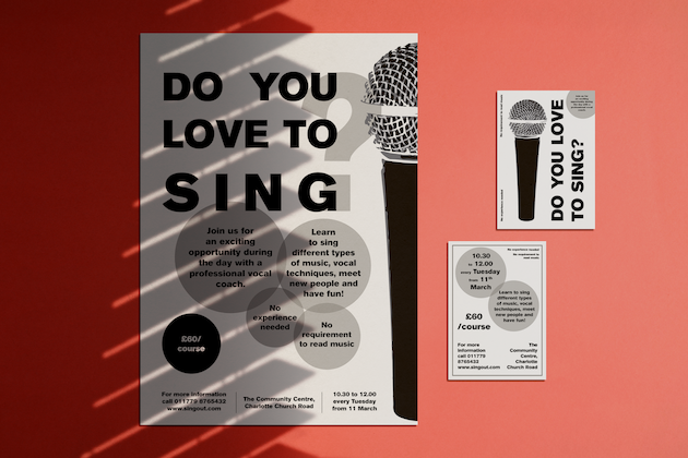
It shows well that just changing the colour can make quite a big impact on the way the poster looks. I used pastel colours as I think that these colours are commonly available and won’t break the bank for this budget conscious client.
Reflection
In this part I was asked to design a low budget poster for a singing course. I believe I managed to fulfil the brief quite successfully. I created the design so it can be printed using a conventional black and white office printer and reproduced well with a photocopier if the client chooses to do so. I tested what this would look like on different colour papers, and I think it looks great on a variety of colours.
One thing that only occurred to me when I finished my product is that I was going right to the edges with my design, I think this should have been avoided for this brief as the client is not planning to use professional printers to get the final product produced, and borders could be problematic when printing these at home.
