
Choose a book by an author you are familiar with. You are going to design two different
OCA Graphic Design: Core Concepts
covers for it, one using illustrations or photography and the other using just type.
Design the whole cover including the spine and back page. Include the title of the book, the author’s name, a brief description of the story and any other information you think is necessary.
As you are working remember that your design is intended to help a reader know what the experience of reading the book will be. Is it a serious text book or an off-beat funny novel? Are the readers expected to be young women or older men and does this matter? Is it an ‘easy read’ or ‘literary’? Does the publisher have a house style you need to be part of?
When you have finished critique your work – which of your two designs do you feel works the most successfully and why? Make notes in your learning log.
In this exercise I will need to design 2 book covers for a single book, one using illustrations, and another using only text.
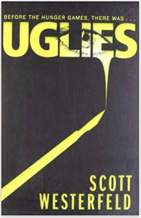
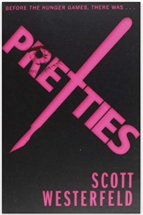
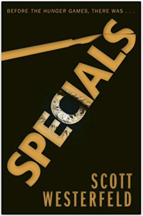
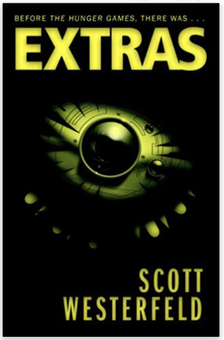
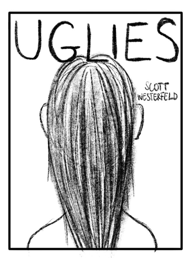
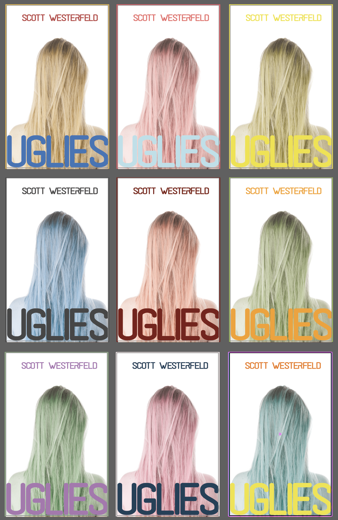
My chosen book will be Uglies by Scott Westerfeld. This is a book I read a few years back and I really enjoyed, so I wanted to create a cover for it. This series had great covers as I remember, but wanted to refresh my memory by looking at them again.
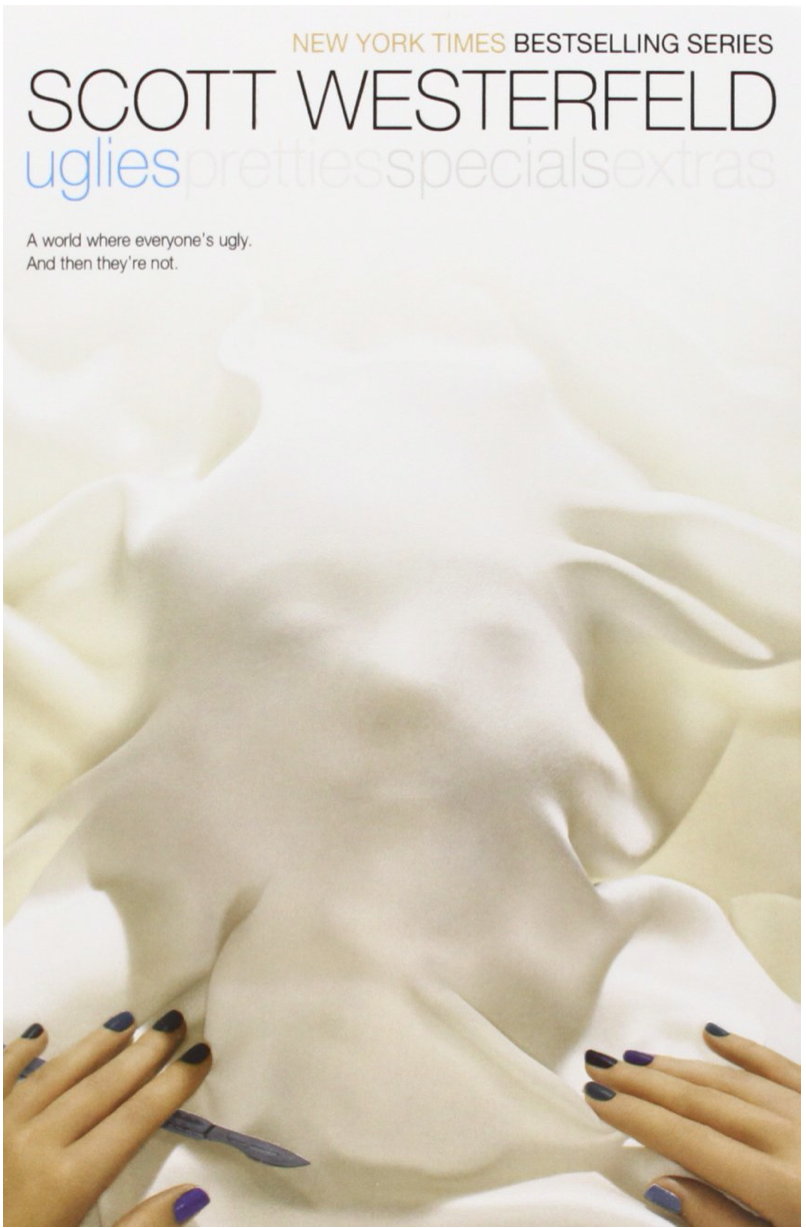
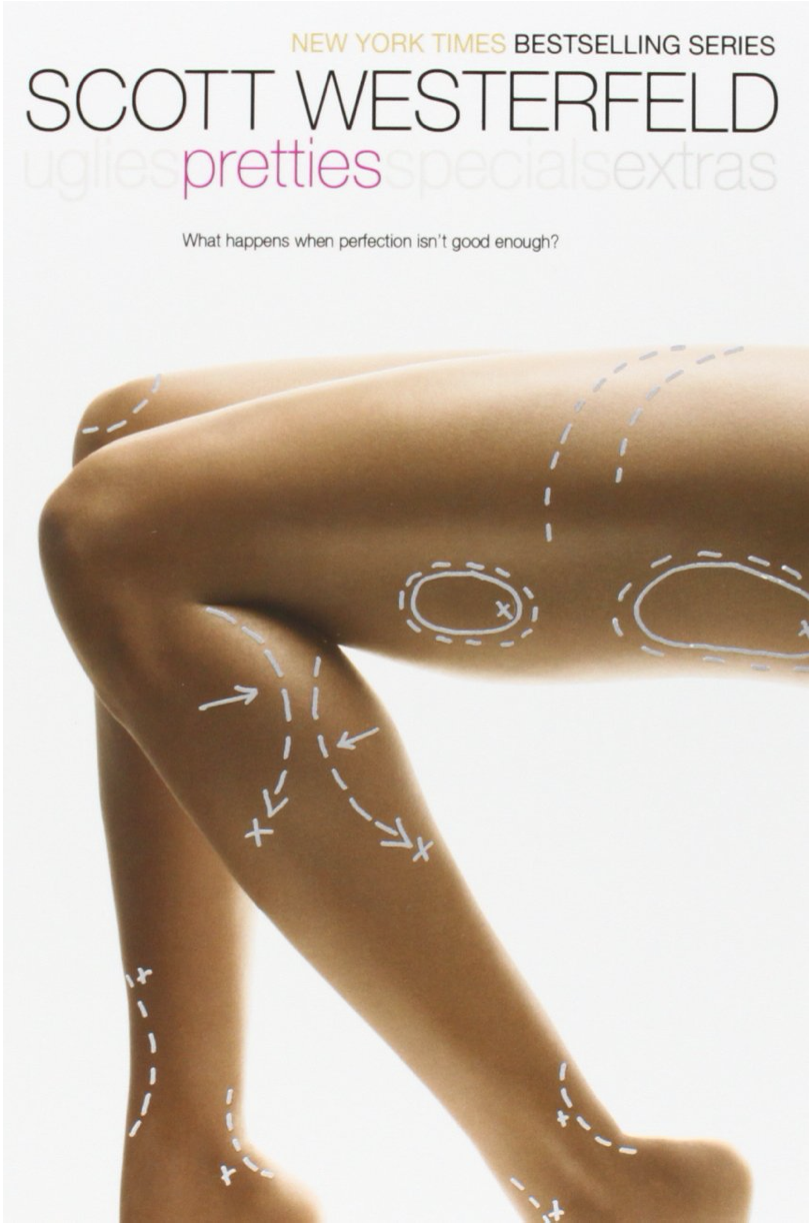
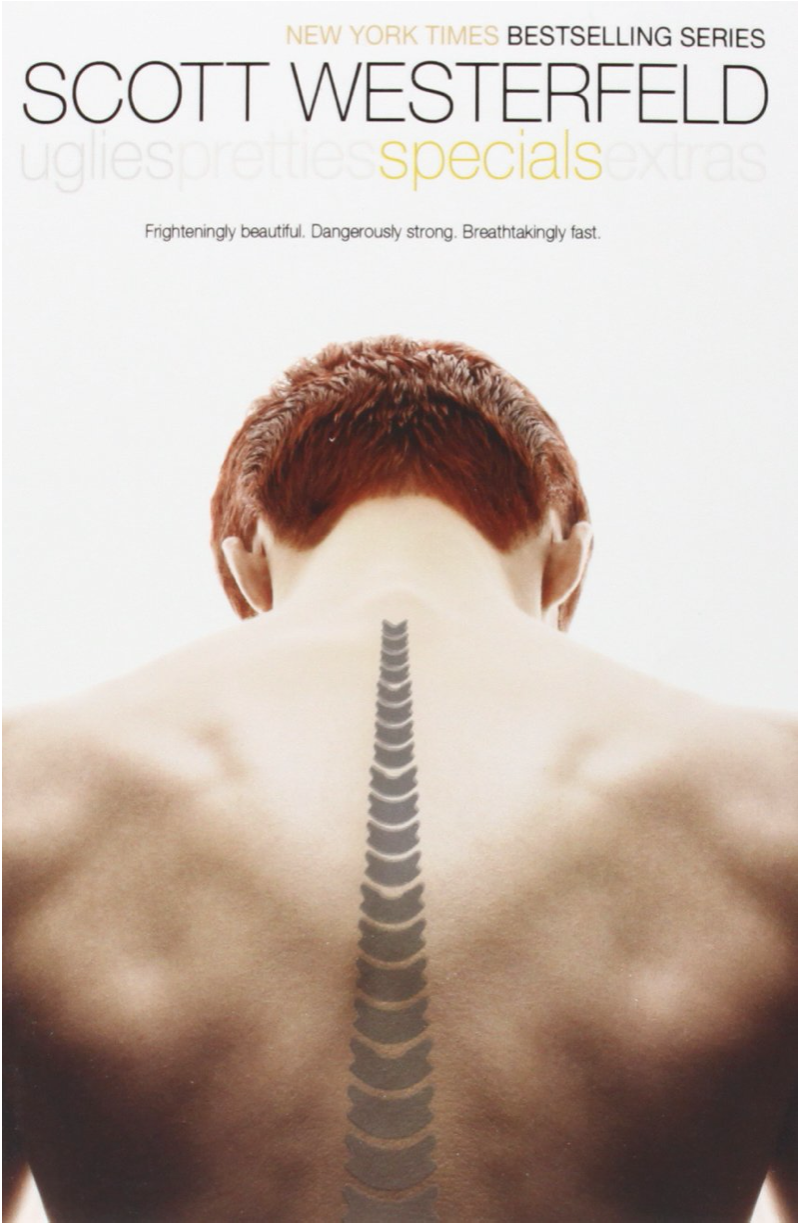
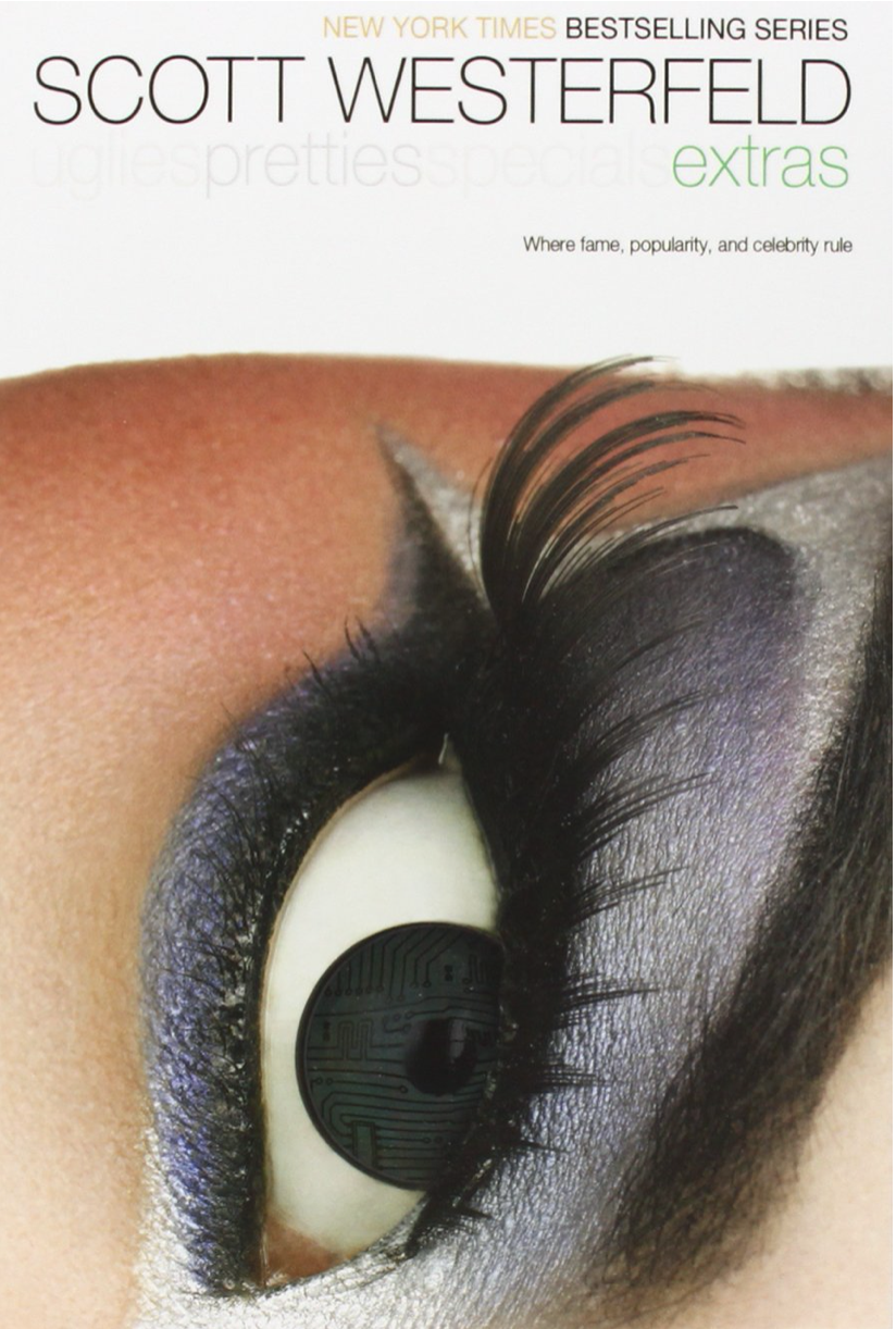
I really liked these covers. I read the books and they definitely reflect the story well. They are simple and effective in my opinion.
After some digging online I also found that there is a different set that was released as well, which is more based on typography, but still using some illustrations.
These covers may be a little more eye grabbing on a shelf of a bookstore due to their colour choices. They also look a little more sinister and less girly. This was probably released to push the books into a different audience.
There was also a re-run of these books under 1 more cover, I could only find one of them though, not all 4 but here it is:

This cover plays with so many similes at the same time. The plastic of the doll parts is obviously meant to represent plastic surgery and also the tray that is being used is reminds you of a surgeons table setup. The bodies are disjointed, and ugly. I think this cover is pretty cool and to the point of the series. I also think the font is quite good, pointing to the sort of era the books are set in, quite futuristic and clean.
After my initial research I had some things in mind, that I wanted to sketch out, to see how this could be created in a way that is not copying any of the above ideas but still talks to the audience of the book.
I think the readership for this book is usually young adults (perhaps especially girls), that like the sci-fi fantasy world that provides the setting for these books. The books are also a very good representation of change that a child undergoes in their adolescent years.
Since I am only designing 1 cover of the whole series, I don’t have to worry too much about what the other 3 books would look like, however, I would like to create a cover that has a strong grid that can be carried forward into the rest of the series all the same.
The book was published by Simon Pulse, a publishing branch of Simon and Schuster Publishing that is aiming at teens as an audience. Their slogan is:
“Simon Pulse publishes the books teens want to read.“
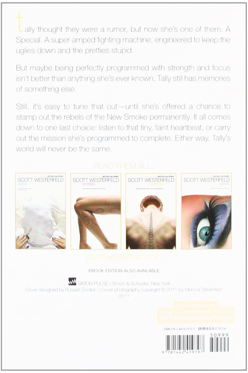
This is the back cover I looked this up to see what sort of other things this publisher includes on their publications. I need to include the Simon Pulse logo and credits for the cover design, barcode and price.
Sketches

I started sketching and decided to create 4 initial sketches of each of the styles required for this exercise.
Once I had this, I shared my sketches with various people, including my little sister who just turned 19 to see which one was the most appealing to the majority. I wanted to share it with my sister, as I thought she is pretty much the only teenage girl I know, which would be the primary audience for this book.
Some raised concerns about a person being depicted on the cover, as they felt that this would make assumptions that the person depicted is ugly. Beauty is in the eye of the beholder, and I understand that this would really tread a fine line. After this, I decided to go back to the drawing board and use something else, instead of a person, as it might be offensive.
This gave me an idea, that perhaps using a composition/image where the subject’s face is somehow obstructed would be a good idea, as this would elude to the insecurities that a teenager feels whilst growing into their skin.
After this consideration I sketched out the below:
After I had this idea, I did a quick search on freepik.com (a website that offers royalty free images) and tried to find a photo of a woman in a similar stance that I could use.
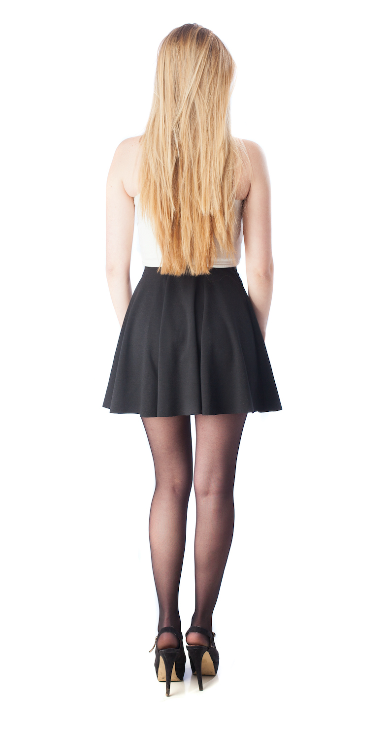
I found this image, that I thought would perhaps work to illustrate my idea. I might replace this image with something else in the end, but this will be good to start playing around with some ideas.
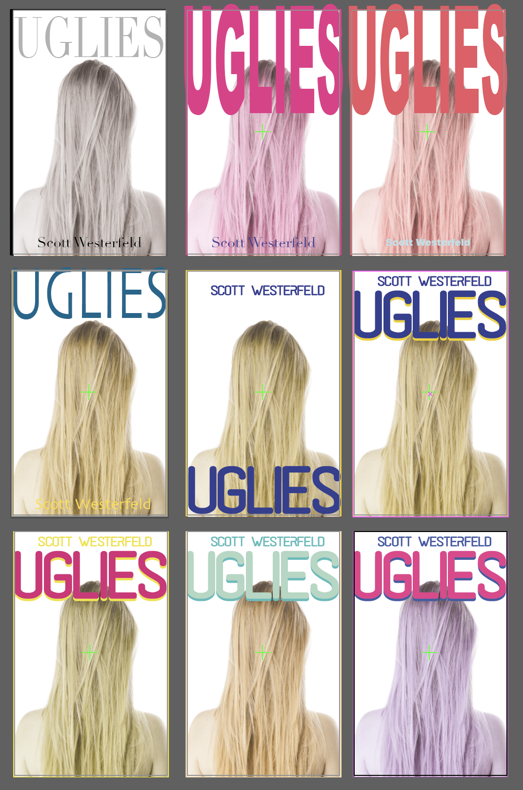
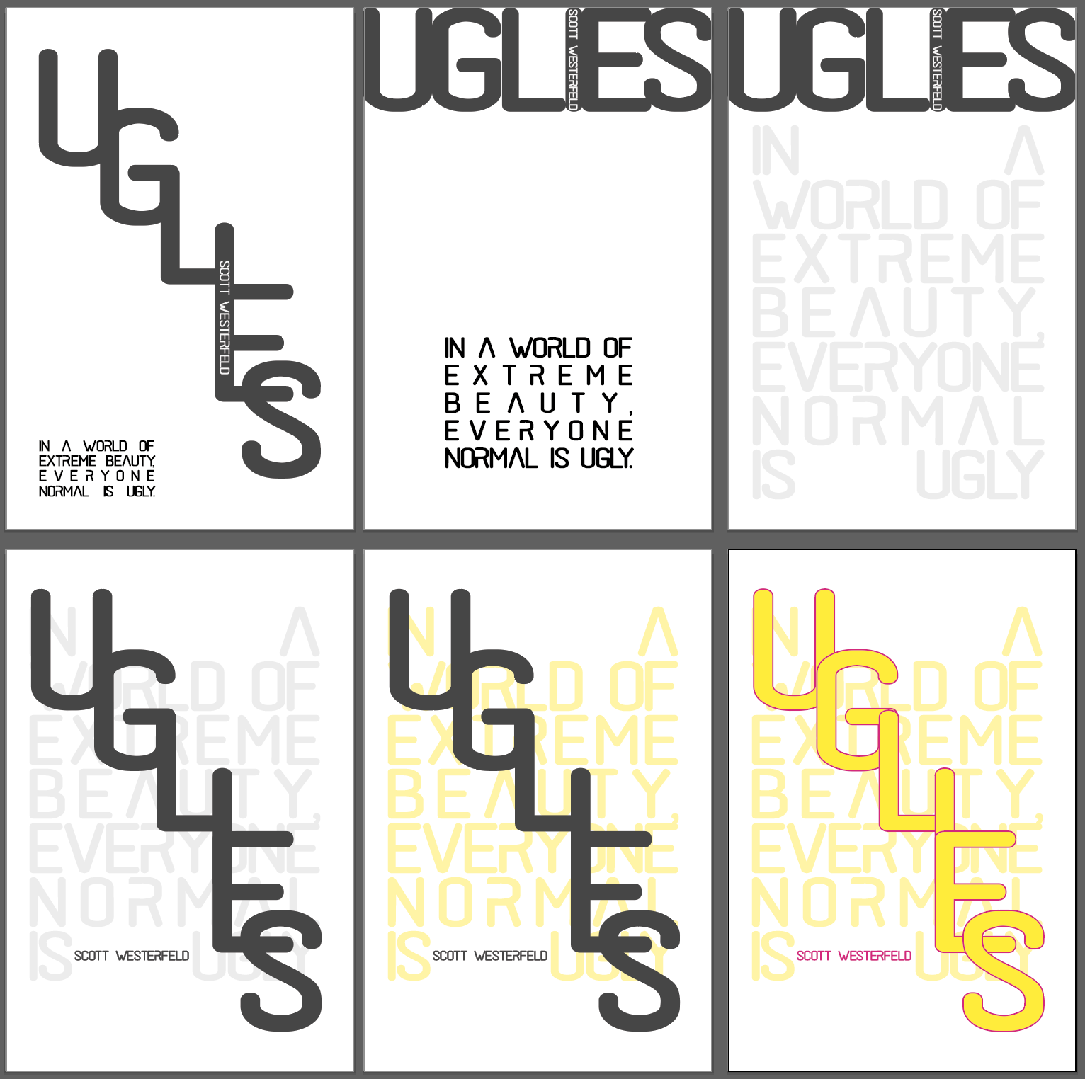
I went through a dozen of ideas to see what I might be able to create. I was altering the layout, the fonts and the colours throughout to find my solution. I think I am quite pleased with the layout on the bottom row, but I am not too sure about the colour. I also like the middle one, as it has a nice simplicity about it.
Once I decided to go with the layout in the middle, I wanted to see how different colours would affect the design.
I sent this to some people to see which one is most appealing.
Most people liked the left hand side one on the second row… I quite like this for it’s simplicity. Also the colour blue is representative of depression, which I thought support the turned away stance of the woman figure and communicates the message quite effectively.
I moved on to designing the back cover and the spine.
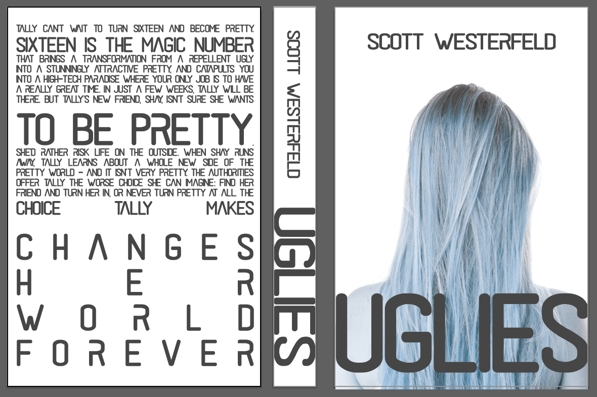
For both the spine and the back cover, I wanted to go with a clean and crisp look. I feel that just using the same font throughout and having lots of whitespace achieves just that. I really liked how this font works for this book. It is somewhat futuristic and has elements that remind me of stencils used on those top secret files etc. I think this looks pretty strong as a cover, but not sure if the back is more interesting than the front cover (which usually shouldn’t be the case).
I felt strongly about my cover, but also thought something is missing to regard it finished. I decided to park this until I create my cover without illustration and come back to this with fresh eyes after I have completed the other cover.
Once I had this cover in place I knew that I had the font that in my opinion was reflecting the story well.
To create the cover without the illustration, I simply went ahead and removed the photo and started manipulating the font to create something that was visually pleasing.
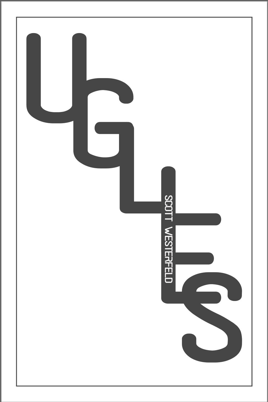
I thought that my first attempt was great, however I wanted to see some other solutions to this as well, so I begun to push the letters around a little. I have also decided to add the sentence from one of the original covers; “in a world of extreme beauty, everyone normal is ugly” as I thought this sums up the story at a glance and would entice the audience to find out more.
As for the back cover, I went back to this, but I felt that my previous solution was pretty suited for this cover as well, so I kept this largely unchanged. I just added a barcode, the logo of the publisher and some design credits as per the back cover of the originals.
I have consulted some friends to pick their favourites and (as I) people seem to have favoured the bottom left design.
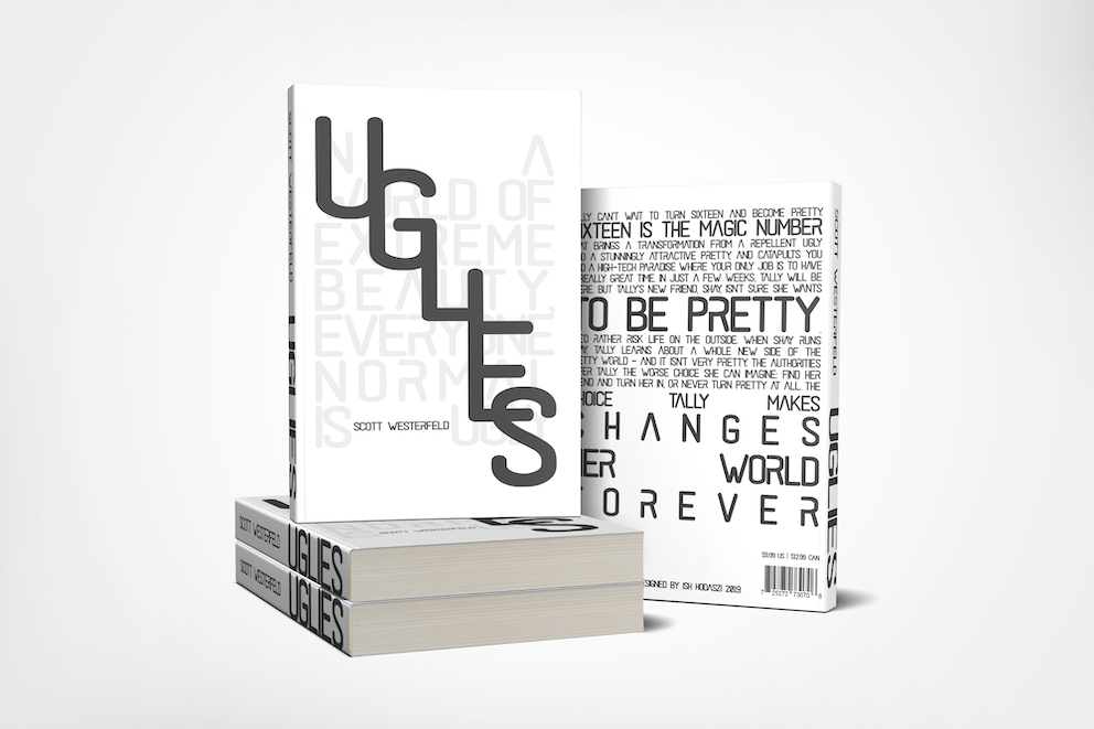
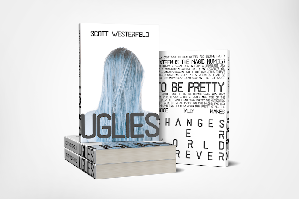
After creating a mockup, I feel like this cover turned out stronger than the illustrative one. It just shows that sometimes a simpler design can be a lot more effective. I feel that given the audience that this book is likely to be picked up by however the first cover might be more effective in terms of sales to a young adult market.
Reflection
In this exercise I was made to think through my design using illustrations and then using only type. I find that my understanding of types getting to a point where I can find the relevant fonts for my designs more easily and use them in an effective way to convey my message better. I feel like that I could have perhaps play will further layouts for my illustrative cover and maybe layer things differently, but I also think that the design is pretty strong and clean. I slowly will need to force myself to use more fonts in my design as I think using a single font can become one dimensional quite easily. In this design I feel like the one I chosen was the right one, but perhaps using a combination of fonts would have achieved an even better end product.
