
Many hundreds of paperback books have been produced over the years. Look at as many variations as you can find to see how different publishing houses designed their covers and how the covers fit together as a series. Select a particular publishing house and describe their design style in your learning log.
OCA Graphic Design: Core Concepts
Softcover or paperback books are usually meant for the mass market and not meant to last. They are made in a way that makes them almost single use and not something that will stand the test of time or regular use.
I have started my research into the topic by looking up major publishing houses and their respective series.
Penguin Random House
The biggest publishing house in the world is Penguin Random House. It was formerly known as Penguin Group, but they merged with Random House – another major publishing house – in 2013 creating the worlds biggest publisher.
They publish many series and I decided to have a look at their website first to identify what series are out there.
First I looked at the Red Rising Series, a series of fiction books by Pierce Brown.
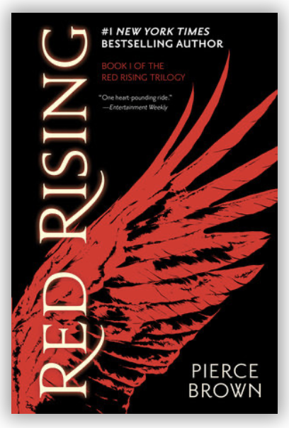
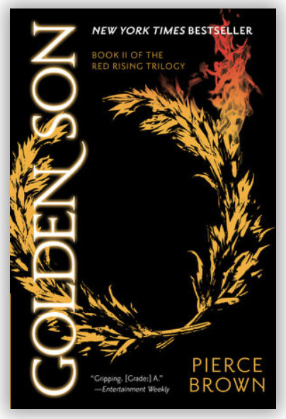
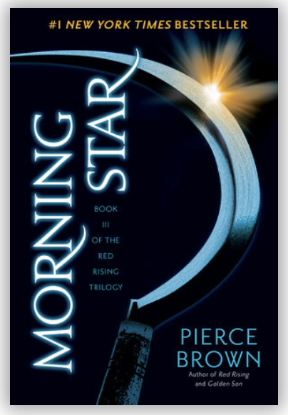
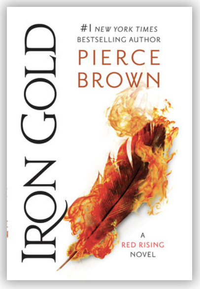

What I observed with these books that the series have undergone a small update throughout the series. At first the illustrations were monochromatic in nature and always using a black background and a similar layout. Later books seem to challenge these earlier decisions by the designer and swap the illustration to more realistic photograph. Still very simple in colour, but ditching the black background altogether swapping this to a white, and later gold. I think this may be due to the changing design trends as the first book was published in 2014 and the latest one is due to be released soon. (2019) This 5 year gap can be the reason for the difference in the style of the covers. The rest of these covers still largely stick to the same basic principles, grid and fonts however, which ties the pieces together nicely.
HarperCollins
HarperCollins is a publisher that was established in the early 19th century (it was known as William Collins & Sons back then) and it prides itself on a variety of publications by established as well as up-coming authors. They have worked with esteemed authors such as Agatha Christie.
A&R Classics
I thought it would be a good idea to look at a collection as well as a book series to see how this may differ.
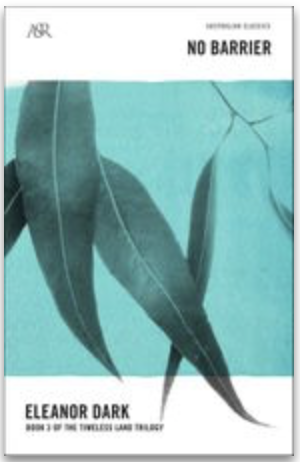
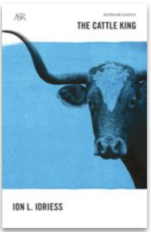
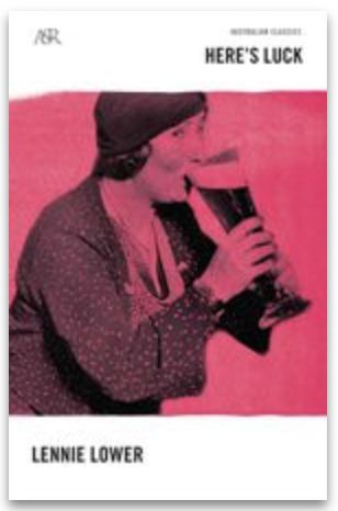

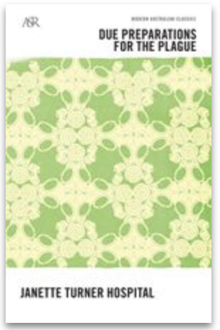
What I found for this is that it sticks to a very rigid almost copy and paste template for the book covers. There is always a colour block that is the same size on each of the covers and a picture with this colour tint. I like this minimal yet effective approach as I think it shows that once you have a solid grid in place, it can be used in a plethora of ways without much effort. This obviously keeps the series very recognisable and cohesive in turn, but also makes the designers life a lot easier.
Bloomsbury
Bloomsbury is a relatively young publishing house but has been very successful. They are the publishers of the Harry Potter books that made them extremely successful.
I looked at a series of architecture books by them (as I didn’t want to look at Harry Potter only) to see how they fit together as a series.
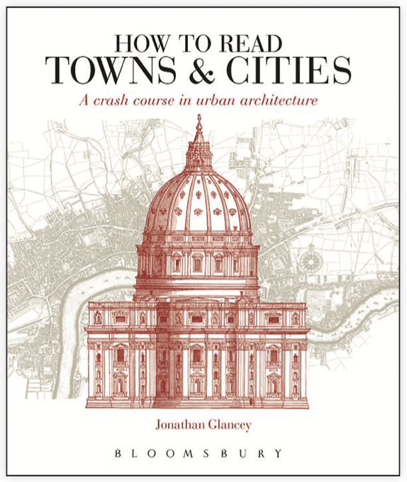
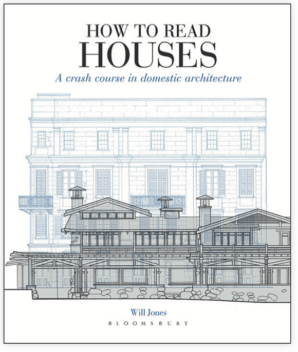

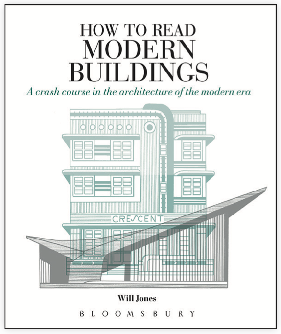
I found these really inspiring. Nice and clean, easy to understand what the contents may entail and look really classic all at the same time. The covers are made cohesive by a few factors; the font is always the same. the illustration is in a similar line drawing style that makes them all gel together. What sets them apart is their subtle colour schemes. The castles one seems to stand apart a little due to the fact that the illustration ignores the bottom margins that the other 3 seems to stick to. The fonts make everything very modern yet classic. There is a nice contrast between the cleanness of the all caps font in the heading and the subtitle which is italic and almost script like.
Reflection
I think this research shown me that there is a very wide variety of design styles that can be considered when creating a book cover. I am excited to find out more, and will perhaps look at book series through a different eye now knowing that there is quite a lot of thought and consideration that goes into creating a cover that can both stand the test of time, and be contemporary at the time of publishing. The first example I looked at is an interesting one as it seems that the design was iterated somewhat whilst the series was published.
