
Choose a magazine, newspaper or journal and work out the grid or grids they have used.
OCA Graphic Design: Core Concepts
You will probably need to look at least four pages to get a feel of the layout.
Measure the size of the pages, the margins, the text columns and the gaps in between them. How many columns do they use? Is it the same on every page?
Can you identify the fonts they use? Do you have it or one with similar properties?
How do they use photographs and illustrations? How much ‘white space’ on the pages is there?
Draw up a two page spread using the same grid as the magazine. Indicate text using Lorum Ipsum and indicate images by either filling a picture box with a 10% tint or using a picture from your collection.
When you have done this see if you can develop the grid further.
Select a title and images and see how many variations you can come up with. What happens when you alter the body font or headline font? Do different kinds of images change the ‘feel’ of the publication? Do you think the readership for each of your variations would be the same? Does the image you choose suggest a different design? Which ones work best and why? Make notes in your learning log.
To start off this exercise, I went to the local supermarket and picked up a magazine. I wanted to go with a kind of magazine I don’t really read to be able to broaden my horizon in terms of designs of different kinds of magazines.
I chose to pick up the August issue of The World of Interiors. This is an interior design magazine, I flicked through it at the store and it looked like it has a nice range of layouts and it wasn’t instantly obvious to me what sort of layouts they work with so I decided to go for this for my analysis.
I picked out a few pages that seemed interesting or eye-grabbing to me in terms of their layout and I proceeded to consider the following things:
Layout:
I looked at the number of columns the width of these, the gutter between them and margins on the pages. These are very varied for this magazine. I found about 3 or 4 different layouts.
Page size:
Height: 28cm
Width: 21cm + 0.5cm for the spine
Margins:
Outside: 1cm
inside 1cm + 0.5 for spine
Top: Varied; around 1 cm
Bottom: 1.9cm (there is sometimes footnotes outside the margin)
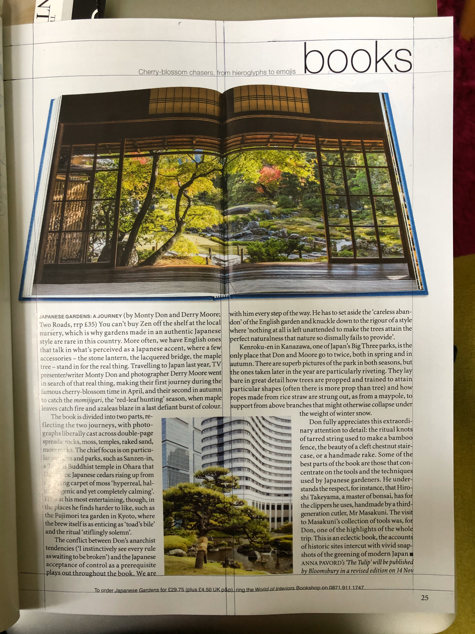
Page 25
2 column layout
Cloumn width: 8.5 cm
gutter: 0.5 cm
Outside margin: 2cm
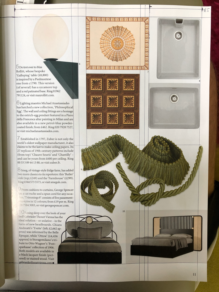
Page 11
3 column layout
column width: 5.7cm
Gutter: 0.7cm
This was harder to work out as the pictures break the grid quite a bit
Fonts
I have looked at some of the fonts in the magazine and tried to recognise them using various tools, such as Identifont and Adobe Capture. I find now that both of these tools have their up and downsides. For example I find that identifont can produce closer matches to the font I am analysing, but can be cumbersome when not all characters are available, Adobe Capture at the other hand is great for finding similar fonts to the one I need, but not very accurate. I guess they both have their places in a graphic designers arsenal. I also find the fact that if I make matches with Adobe Capture, this saves time down the line as I can just add these to my project rather than having to find alternatives that work for this. It saves time for sure.
Here are the fonts I was able to identify:
- Body – Utopia
- Heading – Neue Haas Grotesk Display
- Masthead – Magneta Medium? (Not sure)
I was able to get all of these fonts on the Adobe Fonts store which comes as my Adobe Creative CC subscription.
Photographs
This magazine heavily uses photos of products and interior. Some of the spreads are full size images with some text laid over them as well. Most of these are clean product photographs that depict decorative items removing them from context and some of them are photos of these products in a pleasing composition. I found these very interesting, as the images are obviously purposefully created with the final magazine layout in mind, leaving space for some text to be added in the DPT software. I like this approach as this creates a very tactile design that is pleasing to look at.
On some pages they are using some images of interesting interiors on a 3 column grid.
There are 2 6.7cm wide columns with a 4mm gutter and 2.7cm column with a 1 cm gutter. This layout is mirrored to the other side of the spread. The images are laid out to break the top and bottom margins but have a 1.9cm margin to the outside margin of the page.
I also found the image on Page 25 (picture above) quite interesting. It has a picture of the book that is discussed in the article and it is cleverly set on the page with the 2 column layout so that the 2 pages and the spine of the book mimic the layout of this page.
I like how whitespace is being used in this magazine, they seem to respect the content enough to give everything a little breathing space. This can be observed on most pages.

For the part of the exercise where I needed to recreate a spread, I decided to go with pages 10 and 11. These pages had many images which I thought would be a challenge to recreate, and perhaps improve on later down the line.
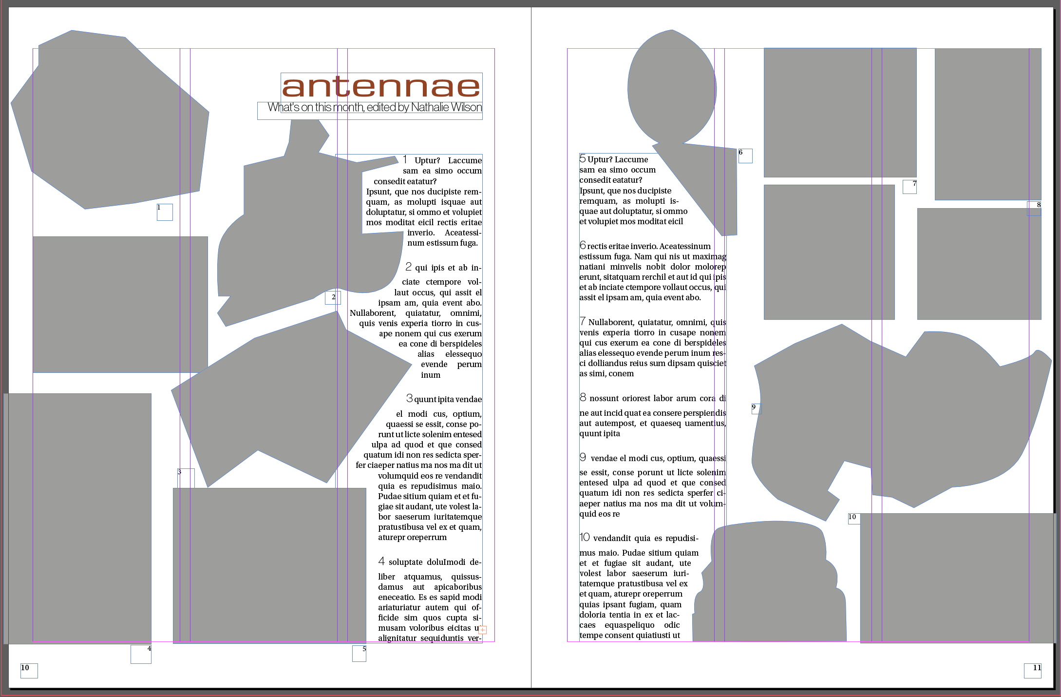
Because these pages have a pretty unstructured layout I thought I could improve this by creating a more structured layout.
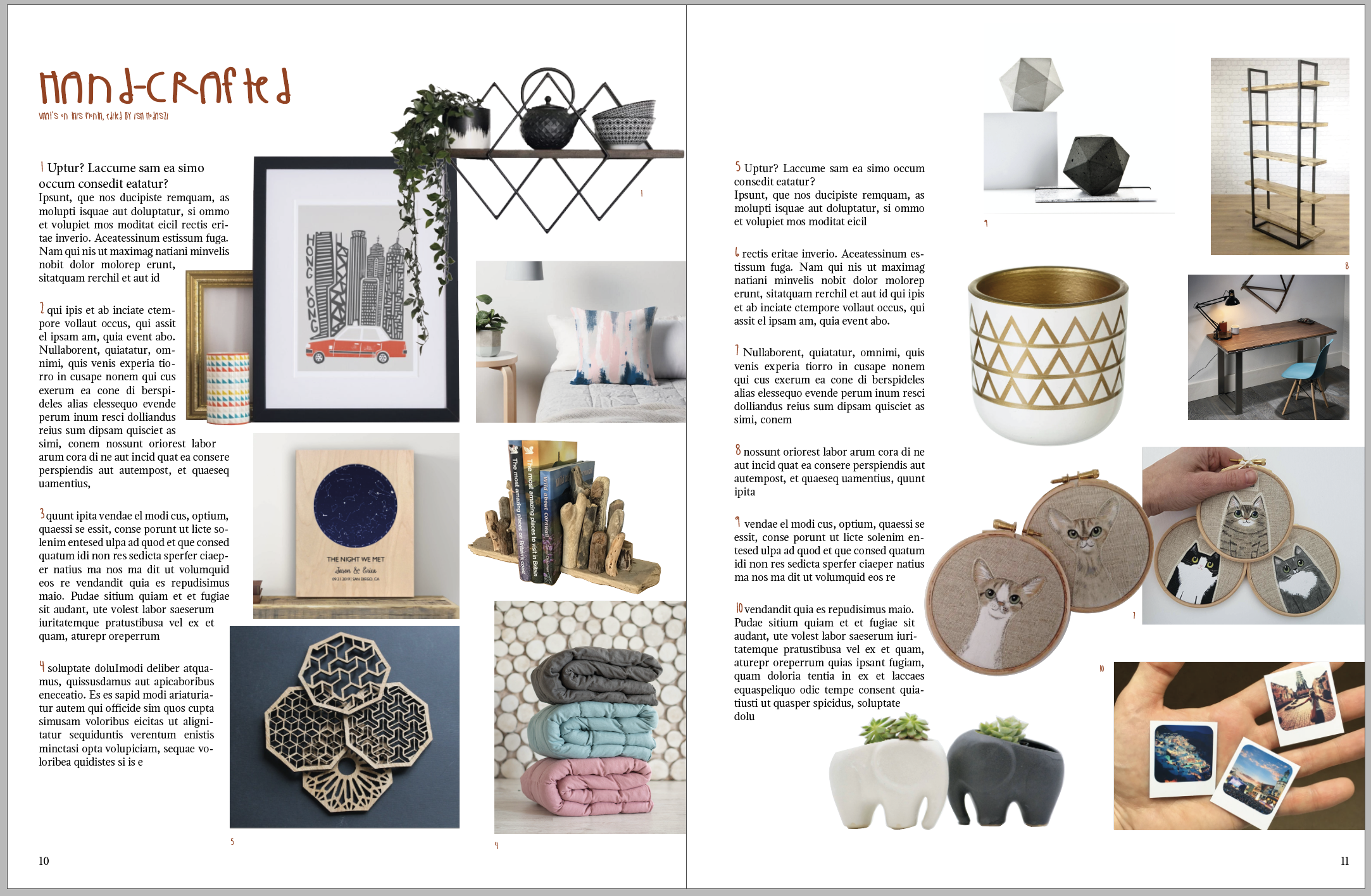
In my first iteration I just set all the text to the left side of the pages and all the images to the right. I thought this creates a nice visual rhythm. I am not sure if this would perhaps confuse the reader in terms of where to find the depiction of each of the items they read about.
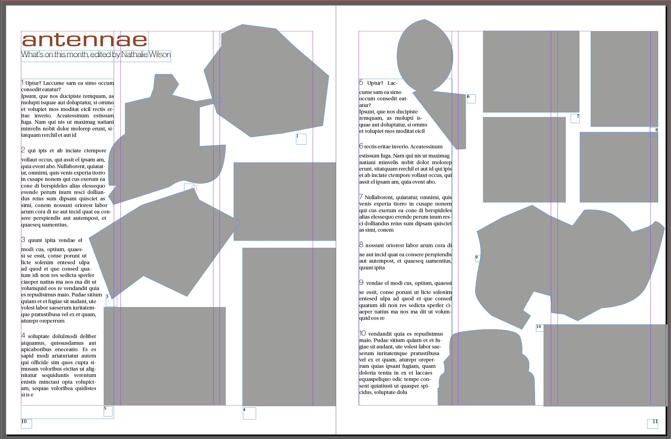
In my next attempt I arranged the pictures more loosely around the page. This resulted in a very messy composition. I definitely see the need to stick to a grid now. Everything just looks totally out of place.
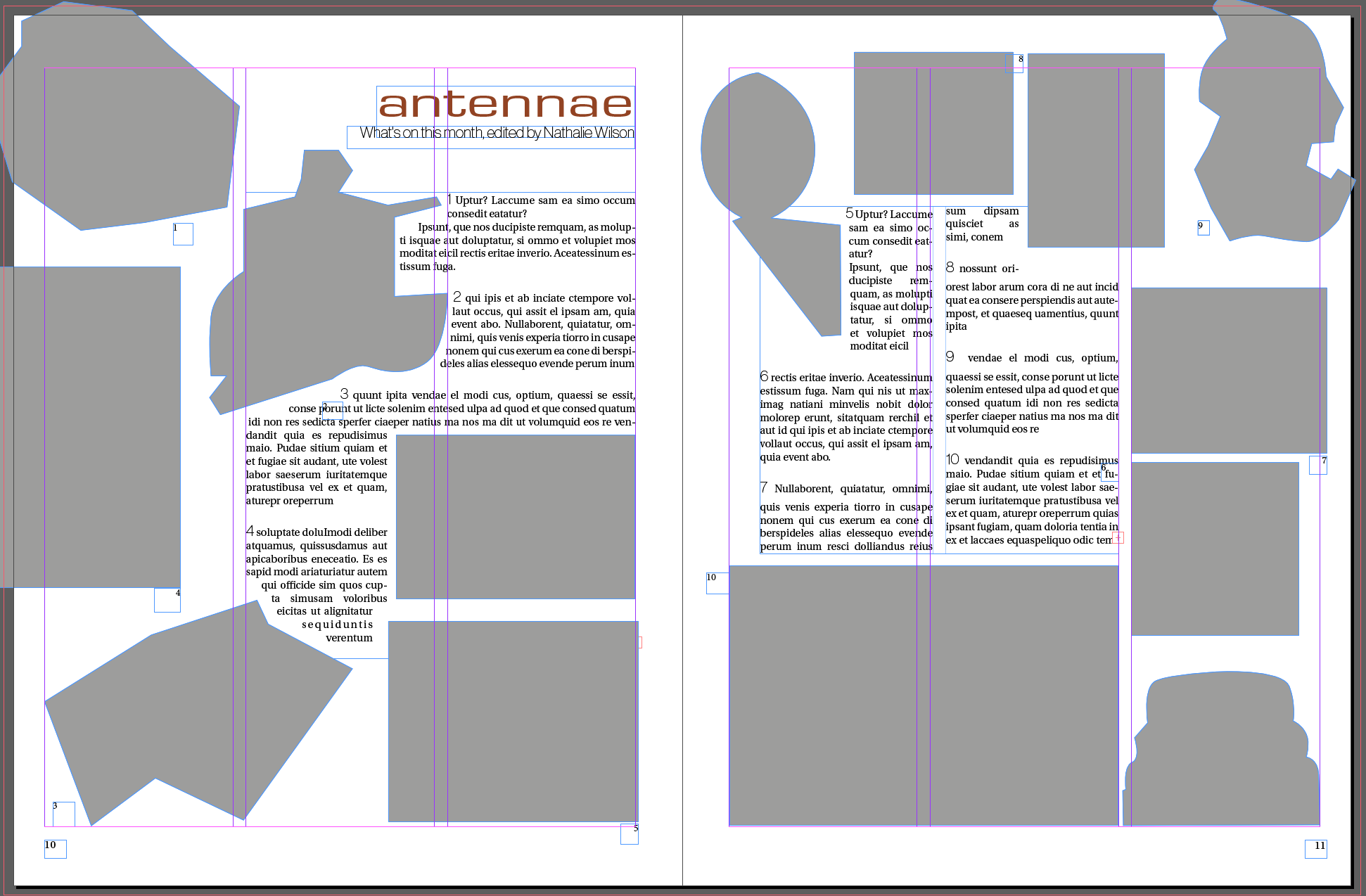
I also tried to create a layout where the images are all at the bottom of the pages and the cutout images are set over the rectangular images. I think this layout works quite well as it creates a nice balance on the page where the visual weight is on the bottom of the page and hence it seems well anchored. I’m not sure if this is an “improvement” per se, but I think it also works as a layout.
Select a title and images and see how many variations you can come up with
I had a few questions here… do I just use the layouts I created above for this, or do I need to depart from that and create create an entirely new layout?
I decided to have a look at some other student blogs to see how others solved this riddle. IT seems that other students went with the grid that they created and then added their own images and title.
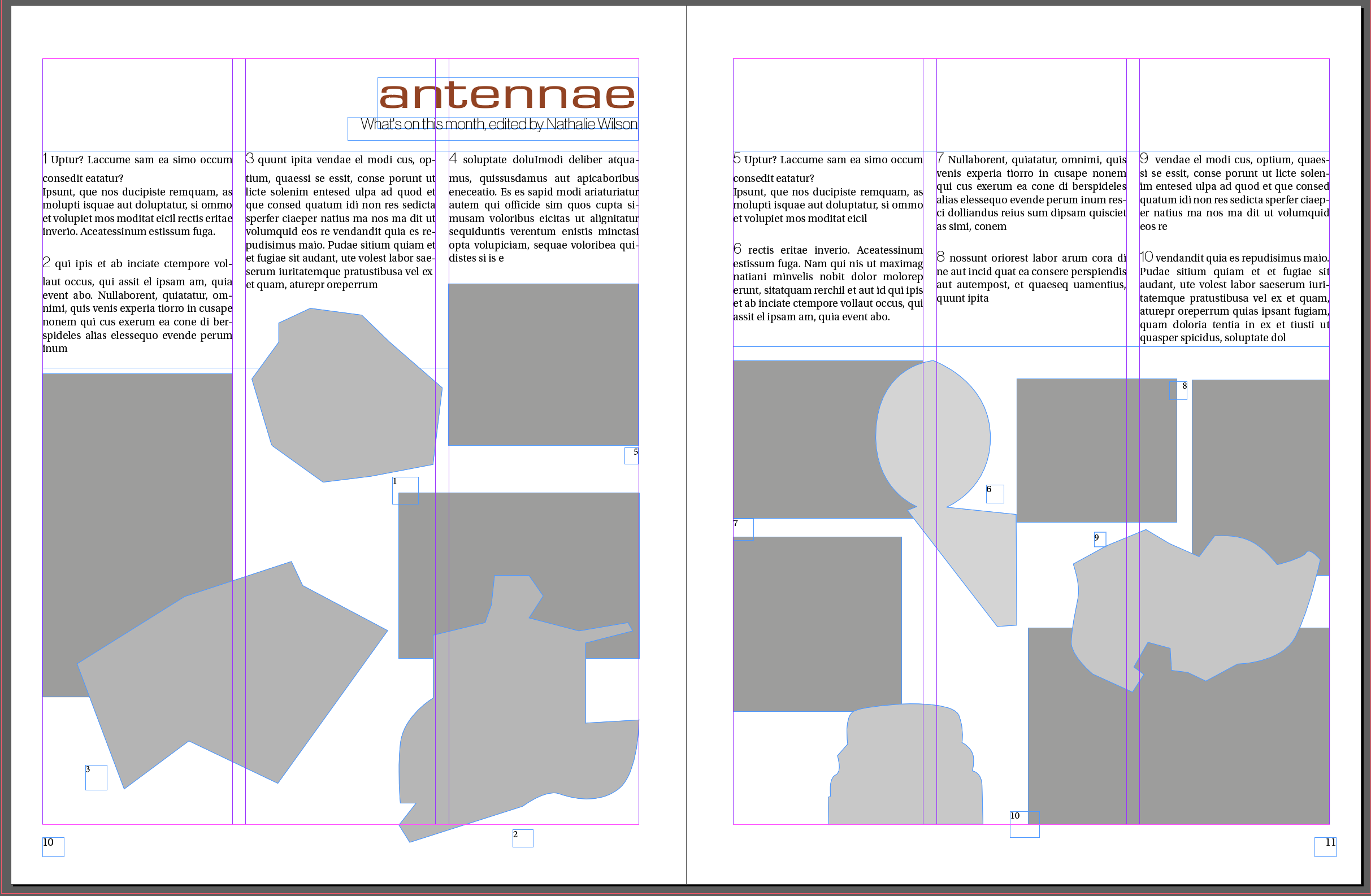
I decided to have fun with this and add images of hand-crafted stuff I can find on Etsy. Since my layout is kind of catalogue like, I don’t think it would suit many other type of articles.
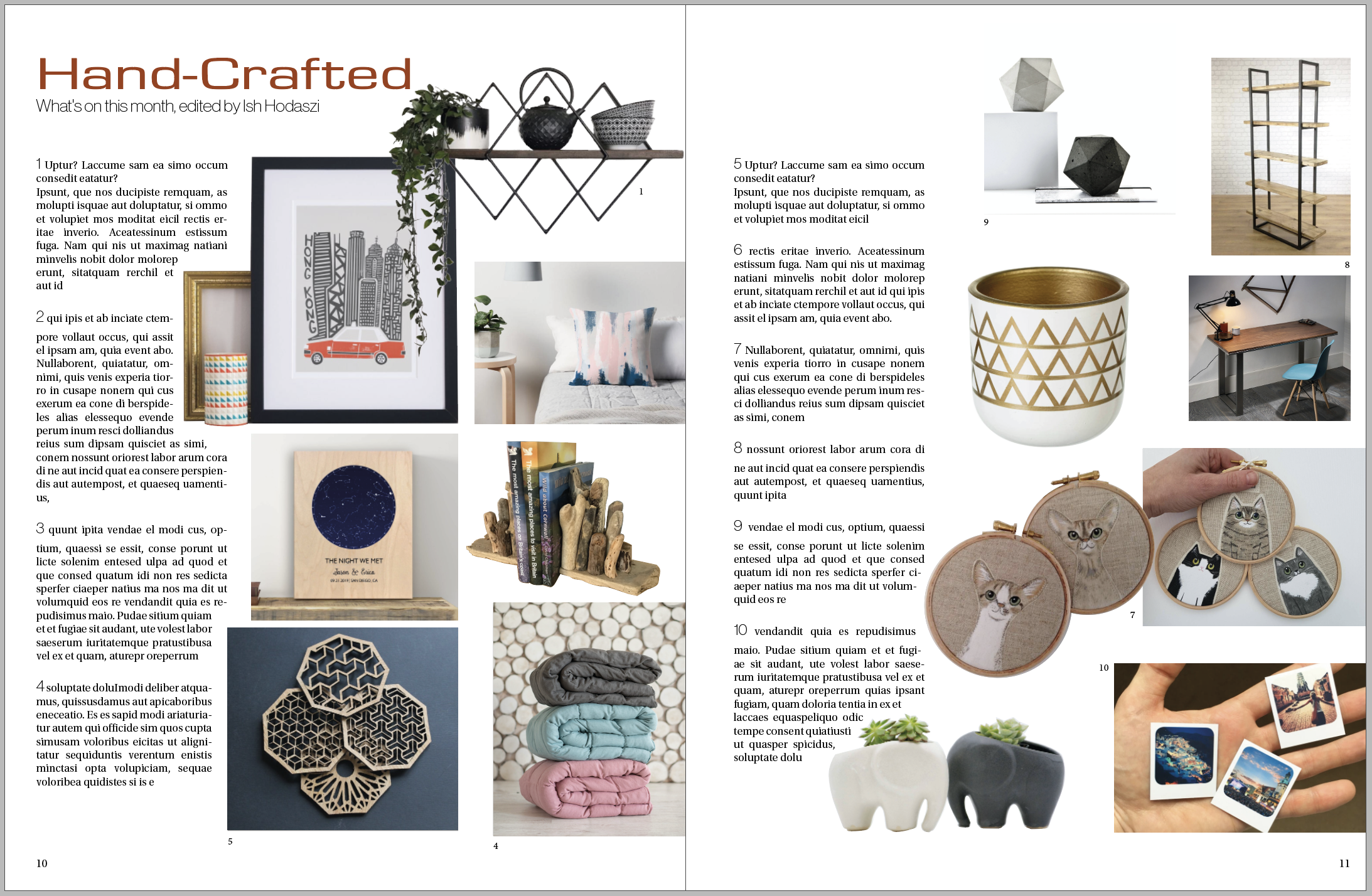
I think this turned out pretty well. I had to reshuffle things a little as the format of the pictured in the original article didn’t fit the objects depicted in these images, but I think overall this is quite successful.
After this phase, I tried out what happens if I swap out some of the character styles to something new.
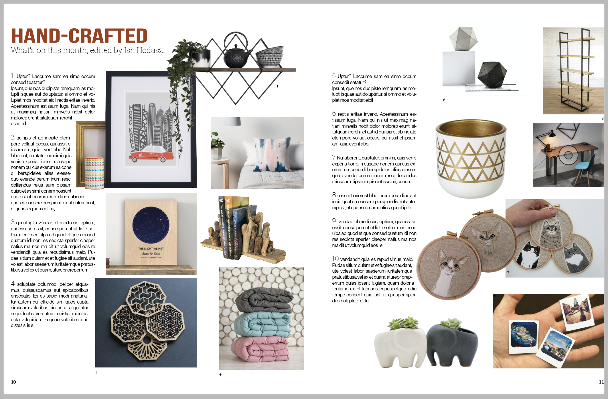
First I swapped out all the fonts to some sans serif fonts. This seems to have made a difference, but I don’t really like the end result. I believe, this looked a little confused, as the sans serif fonts were not different enough to be clearly distinguishable but looked different enough to just make everything looking mis-matched.
After this experiment I thought I try something that is perhaps a little on the nose, but thought it might work with this type of article. I changed the headers and the numbering of each item to a script font, LadyInYellow. I think this works because it reinforces the idea that all of the items on the page are hand crafted. I quite liked this outcome. I also changed the body font to a serif font, which I thought was more suited for the body text.
Images
Images also have a massive impact on the layout and the grid itself. I found that combining images that are cutouts and ones that are rectangular in shape can be quite challenging. With the images that are cut to shape it’s sometimes hard to see the grid. Once I started to work with these I realised that keeping these to the grid is still very important.
I decided to experiment with what happens if I change my pictures from the cutout and original rectangle images to just rectangle.
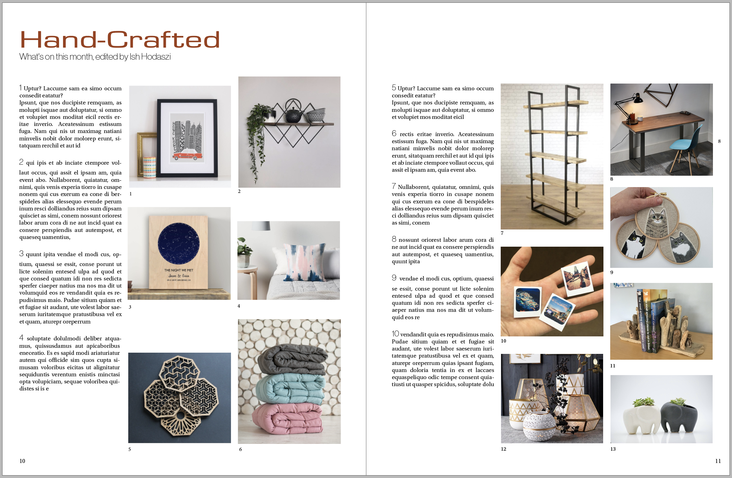
My observation is that while it is easier to get these to form a grid, they make the whole page feel a lot more rigid. Perhaps the fact that the cutout images don’t show the grid so obviously they soften the effect of the grid and the result is a more natural looking grid that works.
I also found that I wasn’t able to lay out as many pictures on my spread as using cutouts, and this also limited the size of my images quite a bit.
I think the one with the cutouts feels a bit more premium than the rigid square based design. The square one feels a lot more like a product catalogue in a magazine produced for a supermarket perhaps.
Image sources:
- https://www.etsy.com/uk/listing/453516762/hong-kong-city-print-skyscrapers-skyline?ga_order=most_relevant&ga_search_type=all&ga_view_type=gallery&ga_search_query=&ref=sr_gallery-2-20&frs=1
- https://www.etsy.com/uk/listing/223236916/custom-cat-portrait-personalised-pet?ref=search_recently_viewed-2
- https://www.etsy.com/uk/listing/674036629/custom-trinity-diamond-shelf-diamond?ref=search_recently_viewed-5
- https://www.etsy.com/uk/listing/521275650/abstract-throw-pillow-cover-blush-pink?ga_order=most_relevant&ga_search_type=all&ga_view_type=gallery&ga_search_query=&ref=sr_gallery-1-4
- https://www.etsy.com/uk/listing/534785642/laser-cut-coasters-set-of-4-geometric?ga_order=most_relevant&ga_search_type=all&ga_view_type=gallery&ga_search_query=&ref=sr_gallery-1-35&frs=1
- https://www.etsy.com/uk/listing/273494916/driftwood-bookends?ga_order=most_relevant&ga_search_type=all&ga_view_type=gallery&ga_search_query=&ref=sr_gallery-3-14&frs=1
- https://www.etsy.com/uk/listing/700658334/linen-weighted-blanket-sensory-blanket?ga_order=most_relevant&ga_search_type=all&ga_view_type=gallery&ga_search_query=&ref=sc_gallery-7-1&plkey=60a1641845b7b2bcc32e1308212644e70ef78eed%3A700658334&pro=1&frs=1&col=1
- https://www.etsy.com/uk/listing/685509606/long-distance-boyfriend-gift?ga_order=most_relevant&ga_search_type=all&ga_view_type=gallery&ga_search_query=&ref=sc_gallery-7-2&plkey=2bfca4f494c942a12b5d778ca5b3f47a28ff81b8%3A685509606&pro=1
- https://www.etsy.com/uk/listing/512947380/white-and-gold-aztec-vase?ga_order=most_relevant&ga_search_type=all&ga_view_type=gallery&ga_search_query=&ref=sr_gallery-2-1&frs=1
- https://www.etsy.com/uk/listing/159152066/elephant-planter-for-succulents-ceramic?ga_order=most_relevant&ga_search_type=handmade&ga_view_type=gallery&ga_search_query=elephant&ref=sc_gallery-1-5&plkey=eb5ee93040e80a9c6b421b473259c24cf550d32d%3A159152066&bes=1&col=1
Reflection
In this exercise I think I learned a lot about the importance of grids, and how somehow breaking your grid can have an interesting effect and how it can add dynamism to your pages. I find it interesting how pushing around the same content can have a significant effect on how the page feels overall. Having more whitespace is definitely my preference, as I feel it creates a nice visual rhythm in the design and allows the content to shine through.
I learned a lot about how I am able to cut images into certain shapes during this exercise as well, which will come very handy for future designs.
