
Brief
Using about 500 words of Lorum Ipsum (or other dummy text) you are going to design
three different pages:
• an interview with a TV actor in a listings magazine entitled: Will Sheila tell the naked truth?
• a review of a new piece of hardware or software in a specialist computer magazine
• a book review in a newspaper’s weekend edition.
Research these types of publications and identify three different combinations of typefaces appropriate for each publication.
Now you need to invent headings and subheadings for your articles. Set these combinations so that your header is above 12pt in size, your body text is 12pt or below and subheadings sit in between in your hierarchy.
You will need to create some text to allow you to show your combinations in action. Use your text to describe your decision making process, why you think the combination works and what your intentions were.
OCA Graphic Design: Core Concepts
Interview in a listings magazine
I wanted to start my research by looking at some listings magazines… but what are they?
These are magazines that are listing upcoming events, such as TV guides, theatre guides, event guides or similar. These magazines are usually presenting information in a chronological order.
I started by collating some images of some listing magazines, to see what these normally look like to be able to distill what fonts and layouts should be.
I don’t normally buy TV guides, but I remember my grandparents used to get these and I remember what they roughly look like. To refresh my memory, I looked at the TimeOut magazine, TVGuide.co.uk’s TV guide and some others that were available online.
I observed that there is usually a small variety of fonts used in these magazines; for body it’s usually a serif font with light weight and low contrast, for headings they usually use some sans serif fonts.
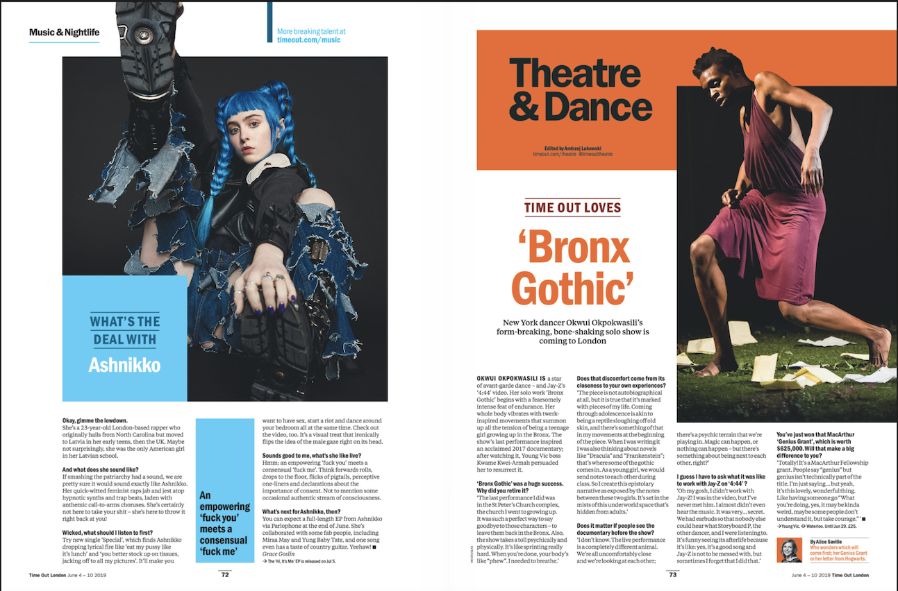
I collected this interview from the Time Out Magazine, I liked the use of the layout and colour. I liked how the pages have their colour identity that is harmonious both with each other and the subject in the pictures.
I went ahead and made a sketch of how I’d like to layout my page for this interview taking some inspiration from the above articles.
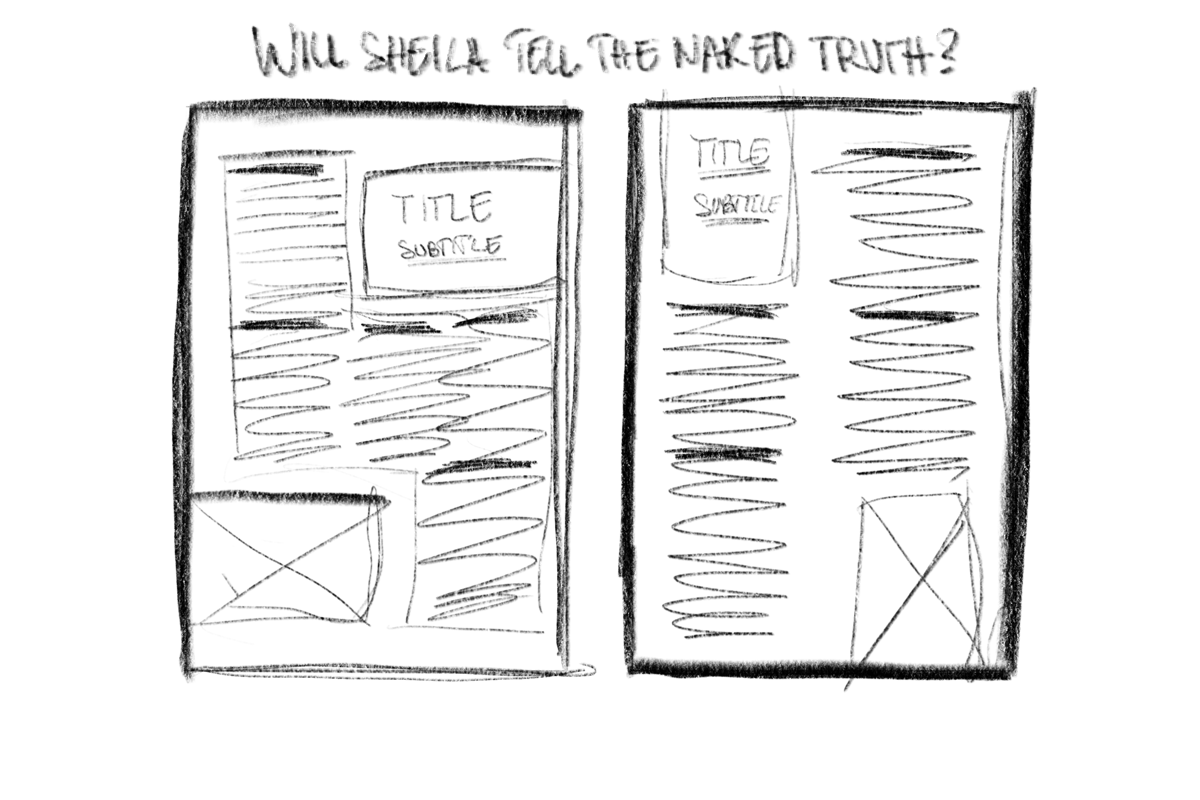
After having a rough idea where I wanted to start, I decided to take this into InDesign and start creating my layout. I feel like I managed to create something that I would expect to see in a listing magazine.

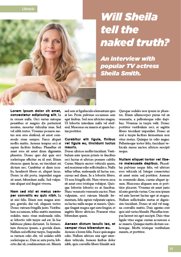
I played around with different spacing of columns and some different positioning for the header block and the image, however I felt like the 500 words interview fills the majority of the page.
- Heading: Gotham Ultra Italic – 35pt
- Sub-heading: Gotham Ultra Italic – 20pt
- Body: Minion Pro 11pt
I really wanted to add good size graphics to the page, so I decided to explore some spread layouts to be able to push the size of the title and be able to show a larger image, whilst still keeping the 500 words interview on the page.
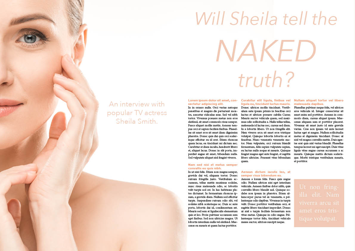
- Heading: Avenir Next – Italic – 60pt – 102pt
- Sub-heading: Avenir Next – Regular – 24pt
- Body: Minion Pro – 10pt

- Heading: Didot – Italic – 60pt & 111pt
- Sub-heading: Didot – regular – 24pt
- Body: Minion Pro – 11pt
- Quote: Didot – Italic – 24pt

- Heading: Gill Sans – Light – 60pt & 120pt
- Sub-heading: Gill Sans Italic – 24pt
- Body: Bookmania Regular – 11pt
- Quote: Gill Sans Italic – 24pt
I felt like that the 2 page layout works better for this and lends itself to a more pleasing page composition overall. This also meant that I could significantly raise the size of the title, which creates a better hierarchy on the pages.
Review of a new piece of tech
For the second part of this exercise I needed to create a review piece for a some new hardware or software. I felt this is something that is more close to heart, and could do a great job with.
I looked up what these articles normally look like to gain some insight and inspiration for the next part.
I looked at some magazines for inspiration and to distil what these magazines look like. I looked at a couple magazines; Mac Life, and PC World.
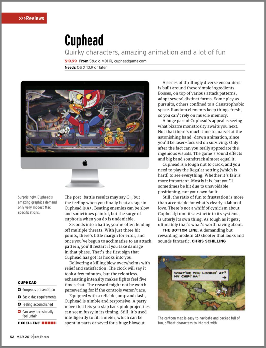
I have observed that reviews are usually include the following elements:
- Rating
- Pros and Cons
- Some pictures of the product
- The review itself
Once I looked at some examples, I went ahead and started sketching up the layouts I had in mind for my review.
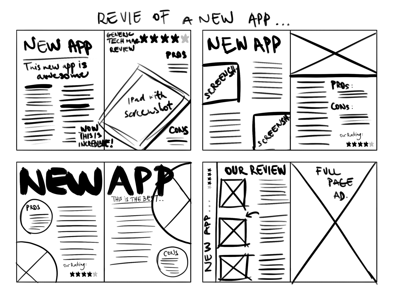
I wanted to try out some different approaches, some double page spreads and some that were laid out on a single page.
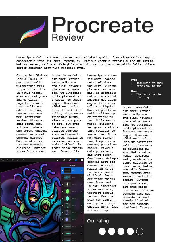
In my first design I wanted to keep everything to one page, but still include some screenshots. I’ve kept the palette of this page very minimal with blacks and whites, and let the image take centre stage this way. I think this first one definitely looks like it could be in a tech review magazine.
- Heading: PingFang SC – 77pt
- Sub-heading: PingFang SC – 33pt
- Body: PT Mono – 10pt
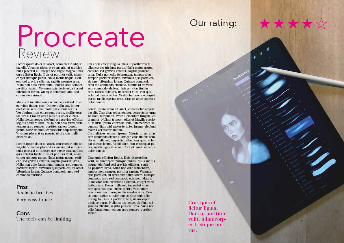
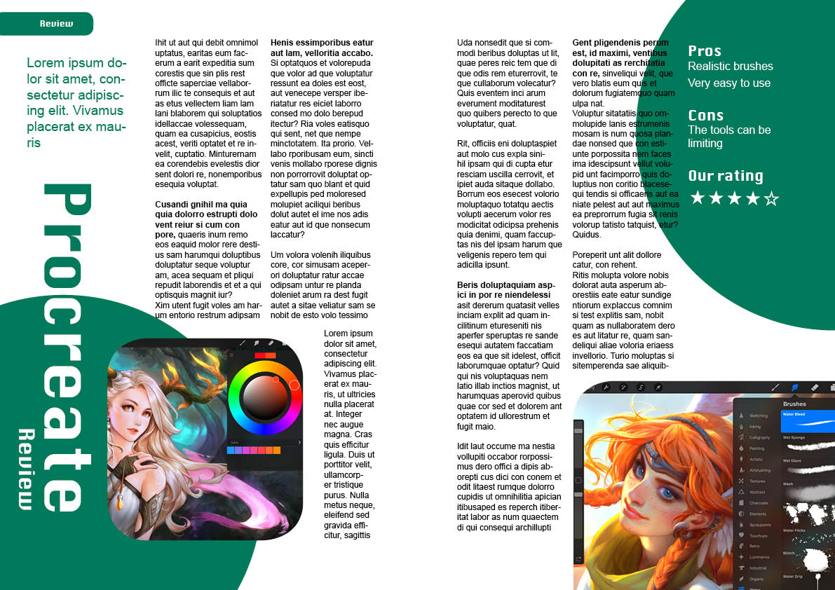
For my second design I taken a photo of my iPad with the Procreate app open and and laid it on the dining table for a more lifestyle kind of look. While I really liked the results, I feel like this might work better in something like a fashion magazine as it has a certain feminine look to it. I used a white overlay as the text was quite hard to read on the textured background in parts, and added the magenta colour to further emphasise the more important parts of the review. There is a callout text which would be something that summarises the article in a sentence, which the reader might want to read before reading the whole article.
- Heading: Avenir Next regular – 104pt
- Sub-heading: Avenir Next Ultra Light – 47pt
- Body: Hiragino Micho Pro W3 – 10pt
- Quote: Hiragino Micho Pro W6 – 16pt
In my next design I wanted to stick to something that is more like a tech magazine layout. I had the idea to use some basic circle shapes and maybe even put the pictures of the user interface in these shapes, however when looked into this, I didn’t like the results so I just rounded off the corners of all boxes instead. I used a sans serif font throughout to see if this works, I think it gives it a more modern feel for sure, but I still prefer serif typefaces when it comes to body text.
I didn’t like this design after all, I am not sure if this was due to the round shapes that give it a slightly child-like look.
- Heading: Krungthep – 89pt
- Sub-heading: Krungthep – 30pt
- Body: Arial – 12pt
- Quote: Arial 19pt

For my last design I tried to mix the more lifestyle design and something that was adding some screenshots of the user interface. I thought this had a nice balance between showing the app being used and also a screenshot of the user interface. I think it achieves the objective of a review where you would be intrigued to try out the app. I also used a more subtle colour scheme, which seems to work better than the more loud colours I used for the first 2 spreads, however I feel like this is a little dry and needs something else to add some flair to the design.
- Heading: Arial – 114pt
- Sub-heading: Arial – 34pt
- Body: Raleway – 12pt
Book review
In this part I was asked to design a page of a book review in a newspaper’s weekend edition.
I started by researching what these may look like. I tried some research online, however these types of publications aren’t seem to be available online. I went to my local supermarket on Saturday morning to picking up a few weekend newspapers to see this in practice.


I found the following things when looking at these articles:
- Newspapers are much larger format than magazines
- In my chosen examples there seems to be a 4-4.5 column layout with the half column moving around on the page to suit the content, often containing some images or callouts
- The papers seem to use serif fonts throughout, and just varying weights and styles
- The body font size is around 10pt
- The titles font size is probably around 70pt
- Subtitles are about 18-20pt
- Pictures are used as cutouts (more organic shapes) with the text wrapping around them, and also as blocks
- There is often a line separating columns
- The main background is always paper, and hardly ever has a background colour opposed to magazines, where this is often the case.
I looked into the sizing of newspapers and it seems that there are 2 common sizes in the UK; broadsheet and tabloid.
- Broadsheet: 749 mm × 597 mm
- Tabloid: 430 mm × 280 mm
I will work to a broadsheet size in this exercise; I want to work with the larger size to see how it affects my designs.
After I have analysed my examples, I went ahead and created some sketches of what I imagine my pages could look like.
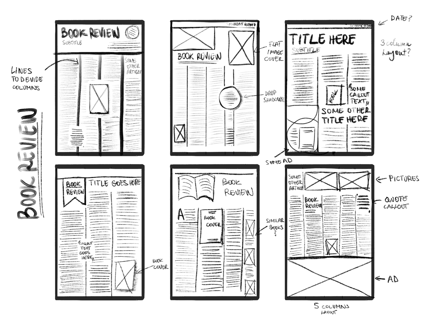
I played around with 3, 4 and 5 column layouts. I think under 3 columns wouldn’t work for the sheer size of the newspaper format. I also thought that 500 words will be lost on this large of a format, so I will need to supplement these pages with some other elements such as another article, or some ads.

I checked by filling the page almost entirely with text meant that I had about a 2000 word count, so my article would be roughly 1 column long if the column was full page length. This means that if I break this up with images and callout quotes, then I can probably fill 2 columns with my book review article. This will largely determine how I will lay out my pages.
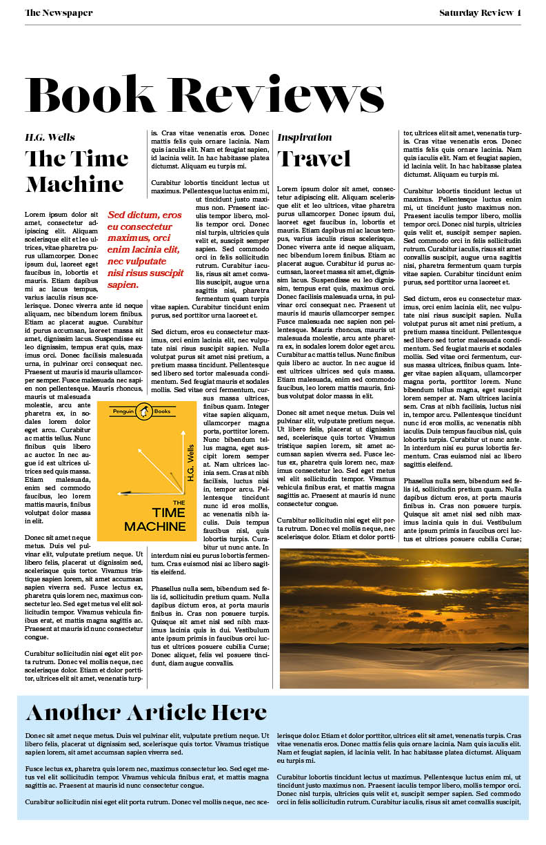
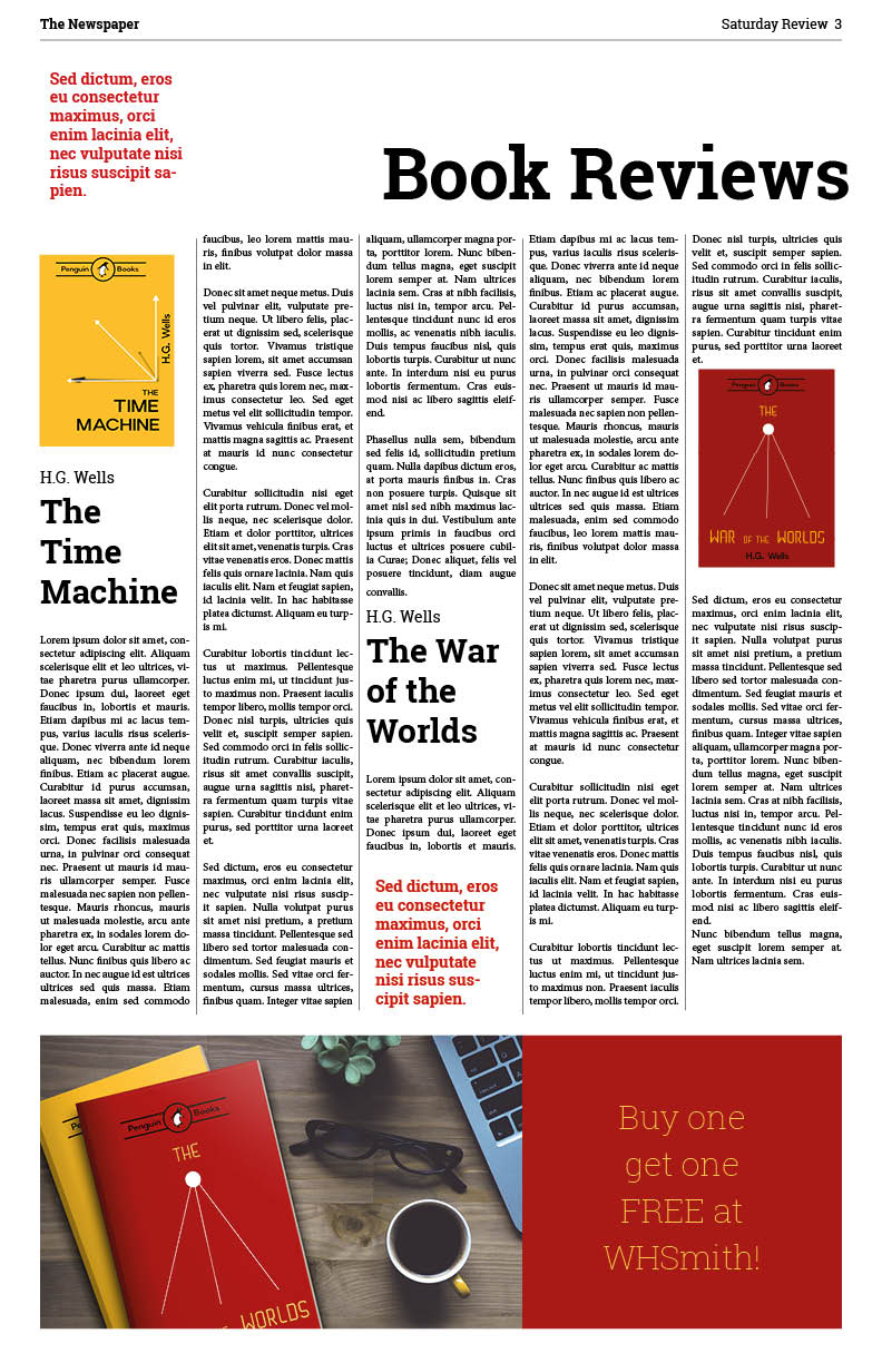
In my first attempt I quite closely followed my first sketch. I think this was quite successful.
- Heading: Lust Didone – 70pt
- Sub-heading: Lust Regular – 31pt
- Body: Bookmania Regular – 10pt
- Quote: Bookmania Semibold Italic – 14pt
These are both serif fonts and so I believe they give my design a very “newspapery” look. I used the dividing lines, and the (mostly) 4 column layout.
I think as a first attempt this turned out pretty well. This is probably due to the fact that I knew exactly what I was after and listed out the characteristics for this based on my research and haven’t gone into it not knowing exactly what I wanted to create. I created another 2 layouts using similar elements but different fonts to see how this effects the feel of the page.

- Heading: Baskerville Regular – 85pt
- Sub-heading: Baskerville Bold – 31pt
- Body: Baskerville regular – 10pt
- Ad call to action: Baskerville Bold – 14pt
I don’t think the 3 column layout works at this size. The lines are a bit long which makes it harder to read.
- Heading: Roboto Slab Bold – 64pt
- Sub-heading: Roboto Slab Bold – 30pt
- Body: Minion Pro – 10pt
- Ad call to action: Roboto Slab Thin – 30pt
For this last one I tried Roboto Slab, which is a more modern font. I think this lends itself quite well, however it has a more casual feel. I also changed the layout to 5 columns, which I think works much better than 3.
Conclusion
I enjoyed creating different types of articles, and delving into what these different mediums demand, however it has highlighted that my InDesign skills are not where they should be. I have enrolled in an online course to learn more about the software half way through this exercise so It has taken me much longer to complete this however I feel like I am really starting to grasp the usage of the software now and feel like I am becoming more familiar with it which will enable quicker and more precise work when it comes to multi page documents.
It also beginning to dawn on me that the different font have different uses and that the same text can look very different dependent on the typefaces used.
I think I still need to improve on being able to nail down the style for the job at hand, as I feel some of my articles (especially early on in this exercise) were a little confused in their style.
