
In this research point, I was tasked with collecting examples of vernacular typography.
I first struggled with this, as I thought that vernacular typography always needs to be crude. Once I realised that this is not the case, I managed to gather quite a few examples where the typography is used to fill a certain purpose, and not created with the typography itself in mind.
I took some photos of some examples I could find around me:
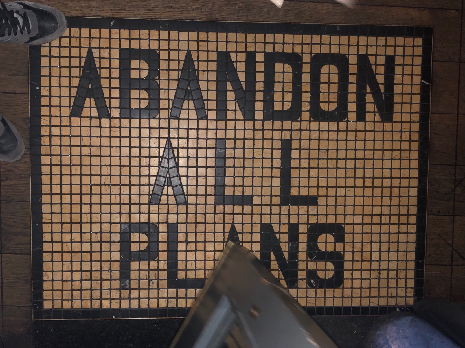
I found interesting how the letters are confined to this grid, but if you look closely, you can see that they cheated with some of the letters… Any letter with a curved line, seems to be using a tile with a rounded off corner.
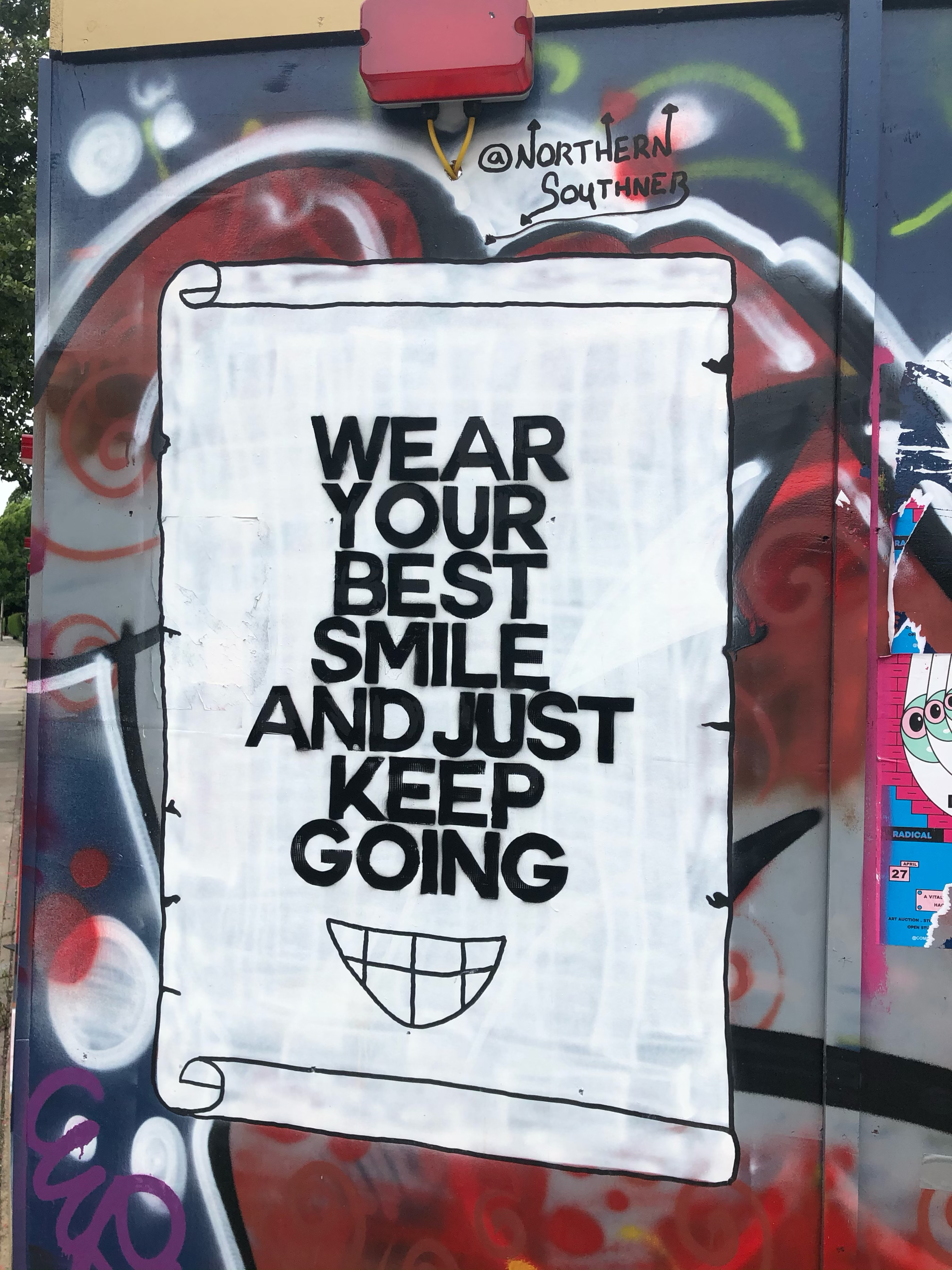
I really liked this graffiti for its message. I think the font they were trying to replicate is something like Helvetica. very simple, they probably used a stencil to get the sharp edges.
The sign is very crudely made by hand, interesting colour choices. The characters definitely have a lot of interest and flair. I found this sign akin of the ones you often find around playgrounds made by children. Talking of which:
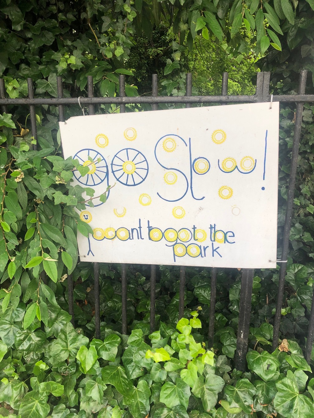
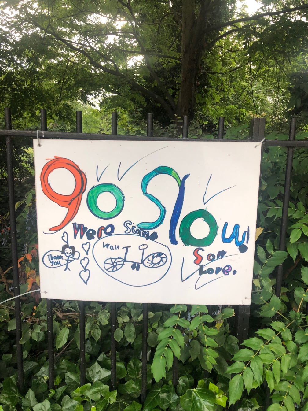
I found these signs near a park in Dalston. The signs are asking cyclists to slow down around the park as children might be crossing the road. The first one is definitely made by an older child, it looks pretty cool in my opinion. I like how wheels are used as part of the type. I am also interested to see that they used a very limited colour palette.
The second one seems like it was made by somebody very young. I like the artistic flair with colour, and the wild roughness of the letter-forms. I think this is effective in a different way, as you can’t help but think about the small person who would have made this.
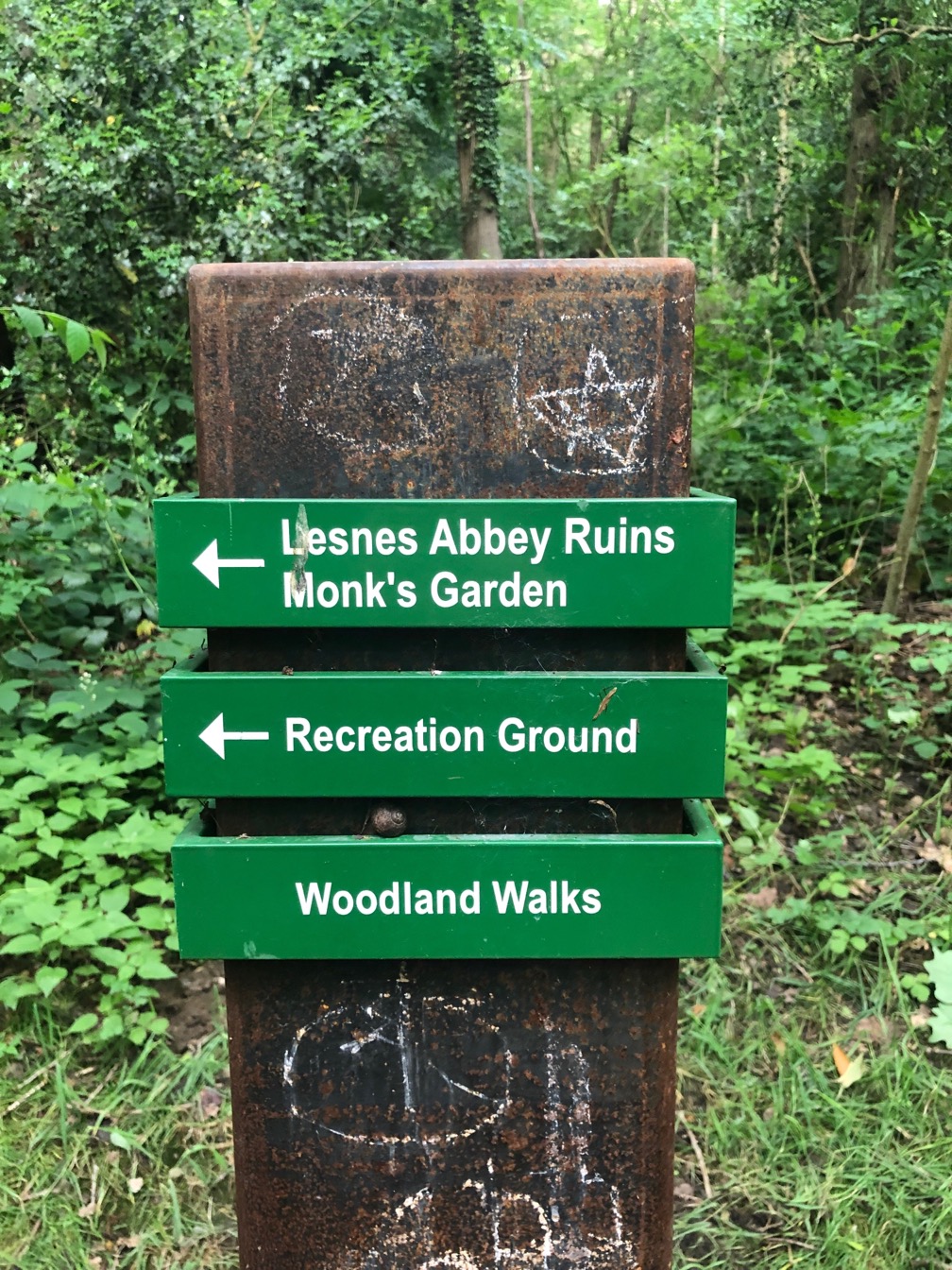
These signs are obviously well made, to suit the environment. They were made to last by using materials that can stand the harsh weather conditions and the passing of time. I think they are quite effective as they are fitting the environment.
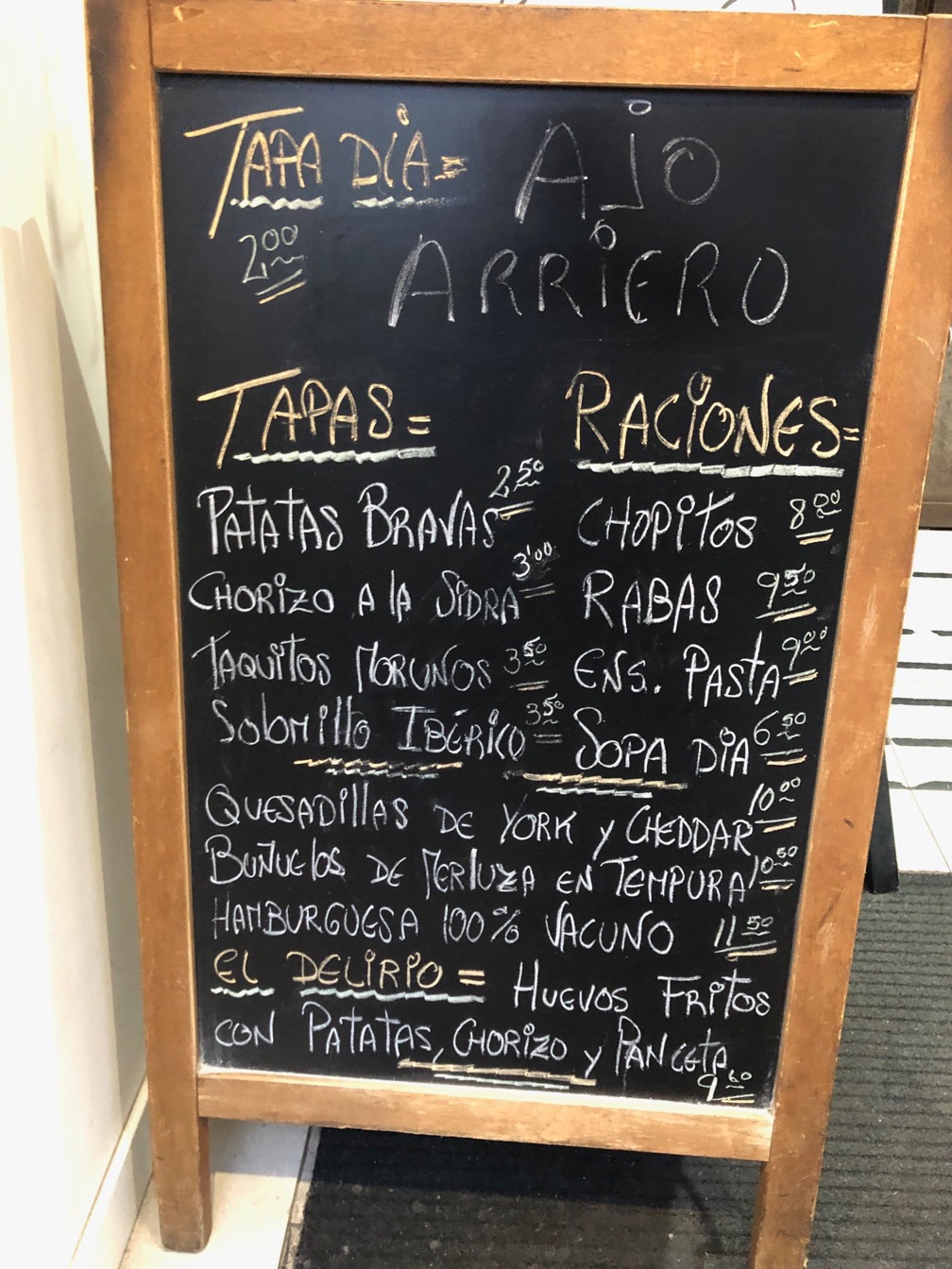
I always liked the look of chalk board signs. I think there is something really interesting about them. They can be quite rushed and crudely made (above) or…
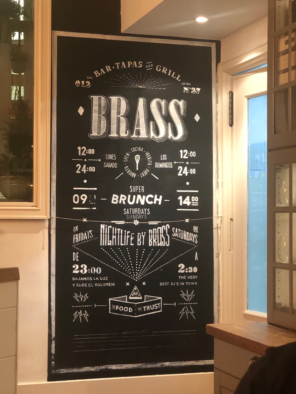
Works of art! The one above almost seems printed. I also liked the layout of the above. Your eyes wander on the board looking for information, but at the same time it’s very easy to find what you are looking for. I think it’s a very effective sign.
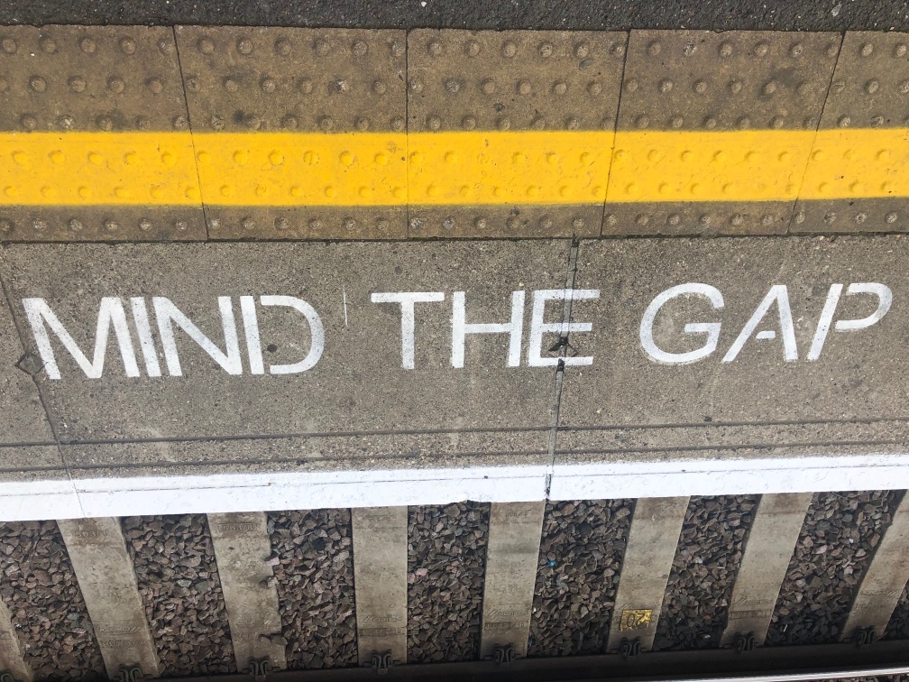
I always thought of the “mind the gap” signs as synonymous with the London commuter life. the letters are vey clear and communicate what they need to. I also like how you can clearly see that they were made with a stencil, due to the gaps in the continuous lines where there is a counter on the letter to keep them from falling out of the stencil. Very utilitarian, very London!
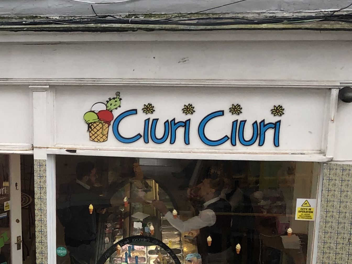
I took these photos of some shopfronts in Falmouth as I found interesting the contrast between the shops tight next door to each other. The first example is quite old fashioned in my opinion and I don’t think the colours work really well. It is an ice-cream shop, but I don’t feel I would be enticed to go in due to the sign alone.
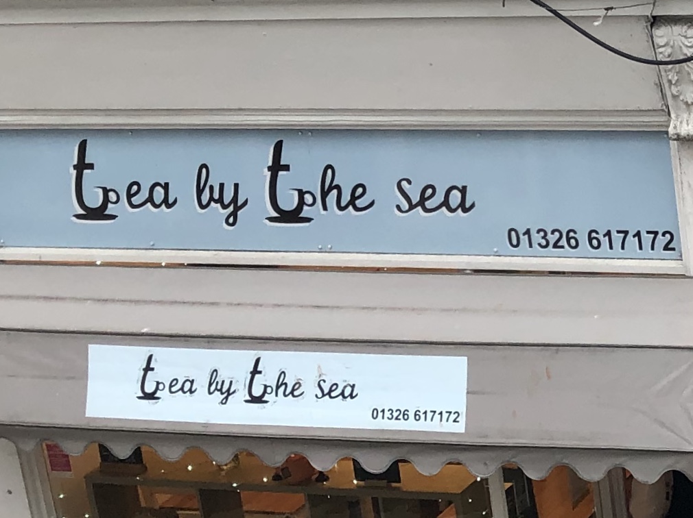
I really liked this second sign! I think it’s really classic with the hand lettered look and I like how they made the letter t a teacup, but they also look a little like an anchor. I would have maybe only used it once and do something with the letter “s” of the word sea, to draw the attention to the words that matter in the title. I still think this sign is overall effective to communicate what the shop is about.
Reflection
In this part I learned that looking around my surroundings and analysing what I see is a crucial part in developing my visual vocabulary and understanding of design in general. I should definitely do this more often to make sure I am always learning.
