
This exercise is designed to help you to look at typefaces more closely.
I decided to do this exercise on my iPad using Procreate, a software that emulates the use of pencil very well, instead of paper and traditional pencil so I could complete this whilst commuting and at work during my lunch hour.
the quick brown fox jumps over the lazy dog
First I’ve taken a screenshot of page 88 of the Graphic Design Core Concepts book to get the parts I needed to trace in the software. I inserted this image and reduced the opacity of the layer to make it easier to trace, and started creating my first letter.
Unfortunately I have started with the letter “t” which wasn’t a good choice. I didn’t know at what hight to put the cross bar for it, and I later realised that I put this in the wrong place.
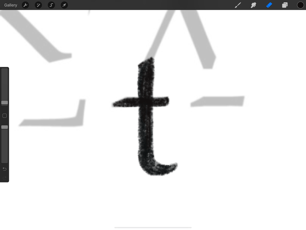
This meant that this looks a bit off compared to all the other letters. I now understand why I should have started by crating a letter that is x height and not with the first letter of my sentence.
The other minor hiccup I had during this exercise is the letter “q”, I couldn’t find anything on the parts that would work well as a tail for this. Later realised that I tried to reconstruct the capital “Q”. The lower case “q” is more like a backwards “p”. I could have rectified this quite quickly as I was working digitally, however I thought it is important to keep these mistakes in and learn from them.
I have created a video of my process to show how I got to my final product.
I enjoyed this exercise very much, and I think it taught me to consider the different element of letters a little more thoroughly.

