
The alphabet is only part of a typeface that contains lots of different characters such as numbers, punctuation, mathematical and monetary symbols and ligatures. Ligatures are where two letters are combined together to make printing easier. Explore you computer keyboard to find some of the other characters. You will need to use your shift, alt and cntrl keys.
OCA Graphic Design Level 1: Core Concepts
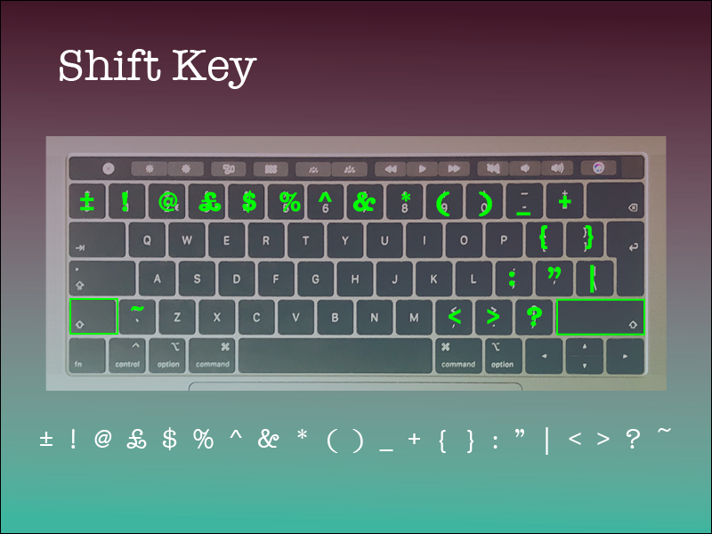
On my Mac I observed that only 2 of the modifier keys work for this, these are shift and Option. I created a page for each of these keys to show what special characters they invoke when pressed in combination.
Started with the shift key. Shift is mainly used to invoke capital letters and also the more commonly used punctuation and special characters.
The option key brings up an alternative character for almost all of the keys on my keyboard. Interestingly, these seem to be some of the more obscure characters apart from the # and € characters, I noticed how these are also shown on the key to aid the user of the computer.

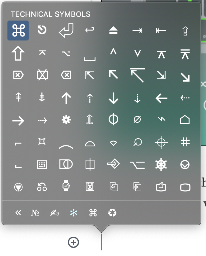
I also noticed that there is an Emoji and Symbols menu in my Edit menu. This brings up the following panel with a ton of characters to choose from.
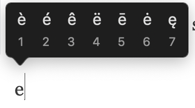
Another way to invoke some characters that are used in other languages is to long press a letter that has accents in certain languages. This technique works for the following letters: e, y, u, i, o, a, s, l, z, c, n
Choose a magazine, for example the Big Issue or Heat, and look at the main typefaces they use for the body text and headlines. Go to http://www.identifont.com and use the programme to identify the fonts. Look at the ranges of typefaces all around you and try to identify their distinguishing characteristics. Make notes in your learning log.
OCA Graphic Design Level 1: Core Concepts
I looked at the GQ magazine to see what fonts are used.
I tried identifying the fonts using a couple of tools, such as the identifont.com website and the Adobe Capture app.
I enjoyed how the identifont.com website forces you to look at the font in great detail, however I also found that this can be cumbersome when you don’t have all the letters at your disposal. I think this helped me more than the Adobe tool.
The Adobe capture tool tries to automatically identify the font from a photo or scanned image. Whilst this might be a great starting point, I found that this tool is quite inaccurate, and seems to bring up more rounded fonts due to the rounding that happens due to the image resolution that my phone was able to produce.
I produced a sheet in photoshop, that highlights the different fonts that were used in this layout.
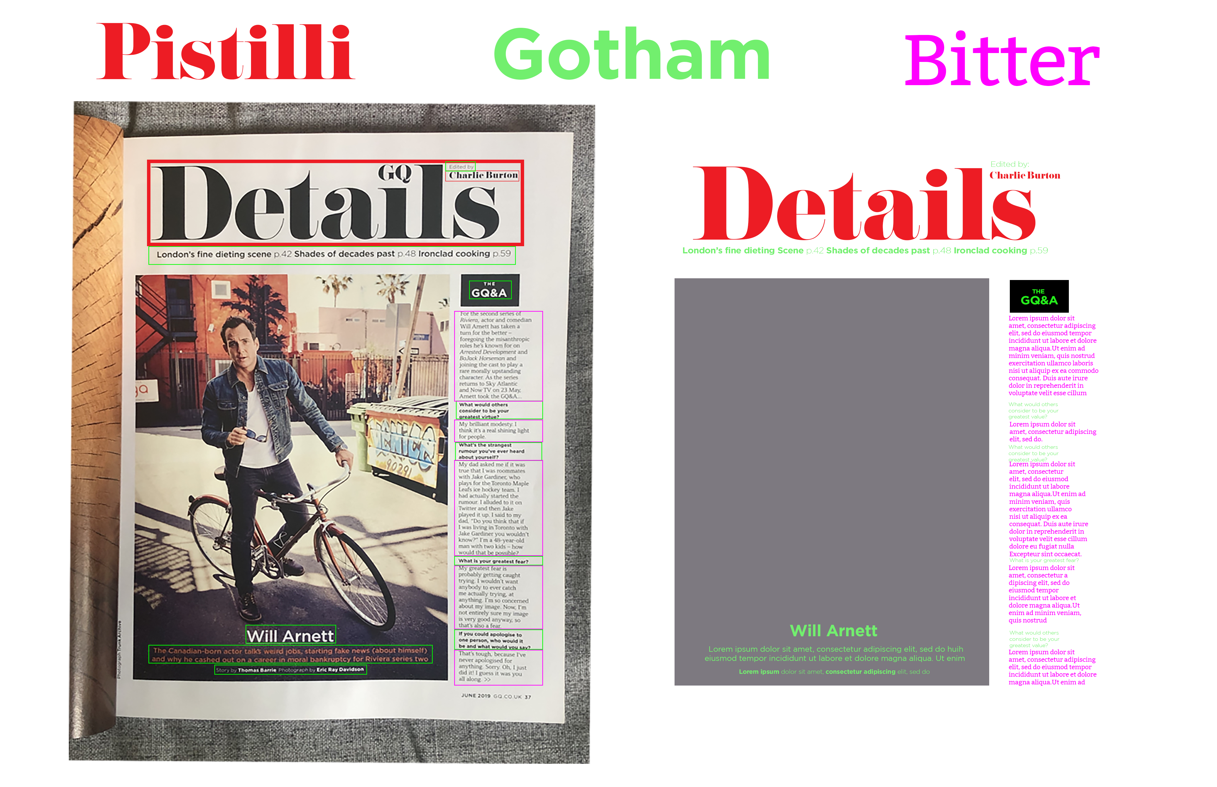
The Pistilli font is a great Modern font that has very high contract between the stroke weights and this is mainly used for the title of the page.
The Gotham font is a great geometric sans-serif font with low contrast and nice clean shapes. This is easy to read, but probably not great for body text.
According to identifont.com the body text is Cornet® BQ but since this is a copyright protected font, I wasn’t able to add this to my design. I replaced it with a font called Bitter, a similar font that is available for free. This serif font is great for body text as it’s very easy to read and easy on the eye at a small font size.
Reflection
I found this research point very useful. I found the second part more interesting as I already knew that I can produce many different characters from my keyboard by using the modifier keys. The second part taught me how to approach finding fonts that I like when I see them somewhere. The automated tools are great in my opinion but seem to be less accurate than actual human analysis.
