
Typography is a fundamental building block of graphic design. This form of visual communication has been developing and and evolving from the early scribing of the cave man to today’s emoji’s.
The prehistoric era
In the prehistoric era pictographs such as cave paintings were mankind’s first way of communication efforts, these were representing objects, activities such as a successful hunt or a place of significance. These have inevitably simplified into a more manageable communication system.
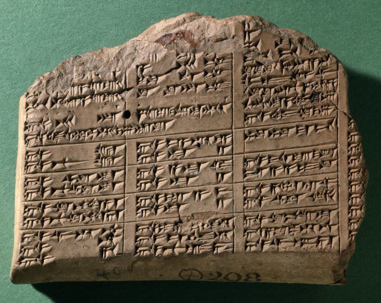
The worlds earliest writing system – cuneiform – was developed by the Sumerians circa 3100 BCE, mankind begun to communicate with this early form of typography consisting of abstract wedge-shaped signs to record information.
Roman Square Capitals
Some of the Greek megaliths (stone built burial-chambers) were inscribed with decorative patterns as early as 3000-1000 BCE.
For more thank 1,500 years, capitalis monumentalis or Roman Square Capitals were the ideal letterforms, these were used across the Roman Empire.
This alphabet was developed from the Greek alphabet and is probably using pictograms similar to Chinese to mimic basic gestures we make when making each of the sounds. They look largely abstract; however if you look at the letter O for example, it is the shape what your mouth makes when forming the sound.
These letterforms were based on pure geometric shapes; square, triangle and circle. The inscriptions on monuments celebrated victories of Roman leaders.
Serifs were developed as a way for keeping Roman masons’ chisels from slipping when scribing scribing, by adding small hooks to the tips of letters. – I find this very early adaptation of design follows function principle very interesting.

This alphabet became the standard and has been used for about 2000 years, largely unchanged. Yes, we have added lowercase letters and punctuation, but the letters are largely the same set as what the people of the Roman Empire used.
Blackletter
The first ever printed typeface – blackletter – was developed by a German man called Johannes Gutenberg in 1439.
Before this invention lettering had to be done by hand, it was very time consuming and expensive. Gutenberg’s black letter used thick vertical and thin horizontal lines similar to hand written scribes. This typeface looked quite dense and was quite difficult to read.

First modern Roman Typeface
The first roman typeface was developed by a French typographer called Nicolas Jenson around 1470 in response to the blackletter typeface, as a more readable alternative.
By about 1477 Jenson was able to expand his printing base to be able to produce 12 prints simultaneously. This was a lot more than any of his contemporaries.
This typeface served as basis for many of the typefaces used today.
Italics
The italic type was created by Aldus Manutius in 1500 in Venice, Italy as a way to be able to create smaller form books by saving space on the pages, and was used in publications that were considered informal meant for leisure reading. Only the lowercase letters were italicised.

Caslon
The next notable development was made by English typefounder William Caslon around 1730 in London.

The Calson typeface was inspired by the Dutch and French types available at the time but set a new standard by creating typefaces that are easily readable and well proportioned. These typefaces were in use until the late 18th century when new transitional-style typefaces came into play.
Baskerville
The Baskerville typeface was designed by John Baskerville in the 1750s. This is the first transitional typeface that was meant to replace the “Old Style” typefaces such as the one by Caslon. The main difference is the increased contrast between thin and thick strokes which makes the serifs sharper and more tapered. The letters of this new type were also more regular in size which created an overall more consistent typeface. Baskerville derivative typefaces are still popular in publishing due to these factors.
Didot
This typeface was created by the French Didot family between 1784 and 1811. This is the first typeface that is classified as Modern. This typeface further accentuate the high contrast of the type developed by Baskerville and pushes this even further, creating a font that is very crisp looking and interesting. A similar typeface was also developed by an Italian man called Giambattista Bodoni.

Modern style fonts are not great for reading due to the imbalance between the thin and thick strokes, as this causes the reader to lose focus quite easily.
Didot became synonymous with style over the years and is widely used in fashion publications such as the Vogue. This magazine has been using this typeface for their cover since 1955.
Sans Serif
Caslons’ great grandson William Caslon IV has developed the first sans serif font by removing the serifs. This type was firs called the Two Lines English Egyptian. This typeface didn’t become popular until the era of computers, where the small details such as serifs would get lost on the low resolution screens or would appear too large.

Slab serif
Slab serif (aka mechanistic, square serif, antique or Egyptian) is a font that was developed during the 19th century as printing and advertising has become more prevalent. The first known slab serif letterform was used for a lottery advert in 1810. The first commercially available slab serif font was “Antique”, developed by Vincent Figgins in 1815. The use of this font family has reduced as Sans Serif fonts gained more popularity and due to the resurfacing of Old Style Serif fonts as part of the Arts & Crafts Movement. These typefaces have been regularly revived since their first appearance in the 19th century.
Geometric Sans-serif
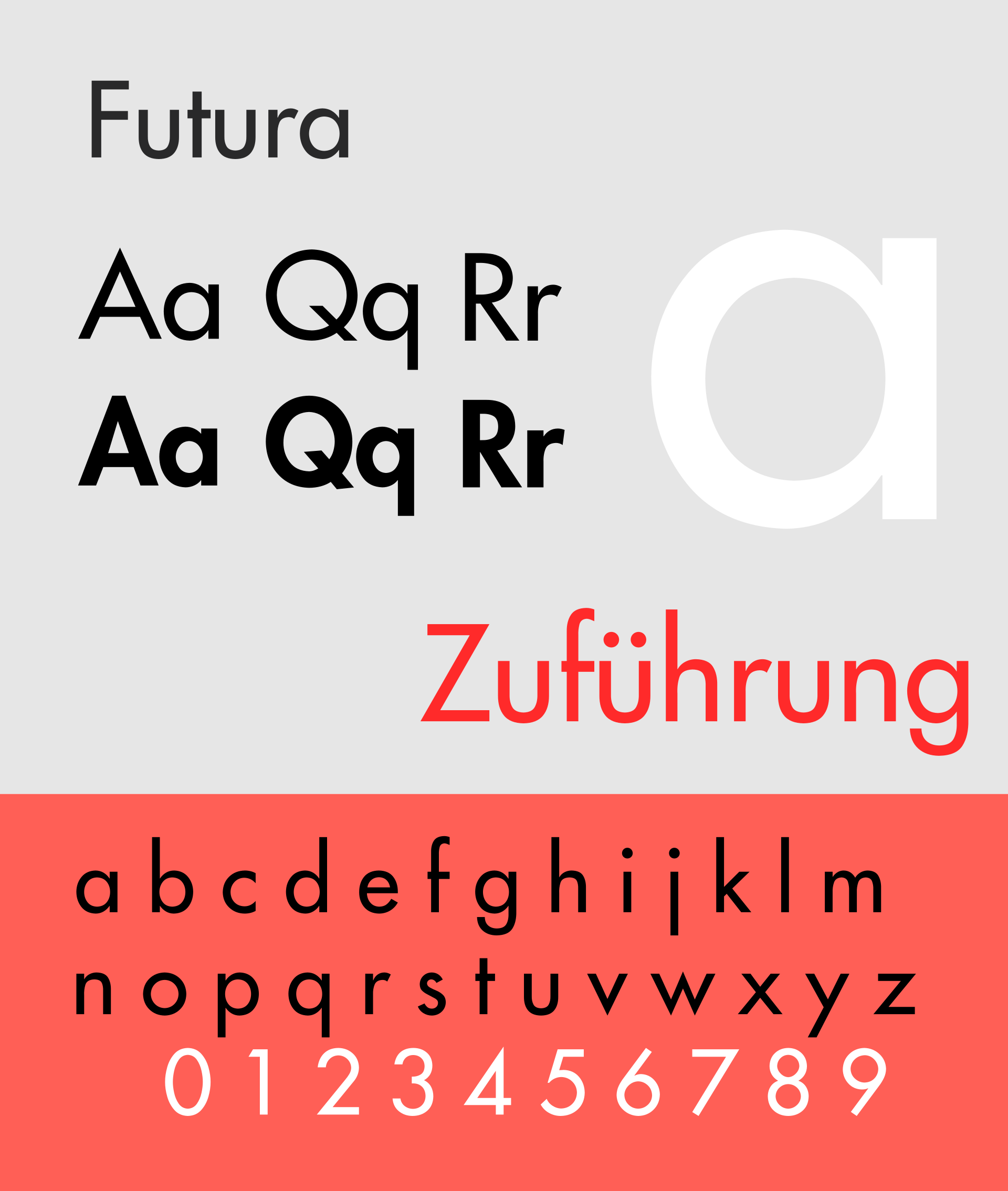
Futura, the first geometric sans-serif font that was developed in 1927 by a German font designer called Paul Renner. This font was incredibly simplistic using only geometric shapes as building blocks. It features even weighting in its strokes and a very low contrast. This font is still very popular today in print and on screen.
Many brands chosen the font to use in their logos, such as Supreme, Volkswagen, IKEA (before 2010). It’s widely used in film and video as well. Futura was used on the plaque lefty on the Moon in July 1969.
Humanist Sans
British designer Eric Gill released a font called Gill Sans in 1928, this font is based on the 1916 “Underground Alphabet” font the corporate font of the London Underground. This font was marketed as a design of “Classic simplicity and real beauty”. Gill aimed to create something that is both classic by evoking the classic serif typefaces but also looked clean and modern. The font was used for London and North Eastern Railway’s posters, timetables, and all publicity material just a year after its release.

Gill Sans became very popular due to its practicality and availability for machine composition in a wide range of styles, sizes and weights. A body text suitable book weight version was released in 1993, this is half way between light and regular weight.
The worlds favourite typeface
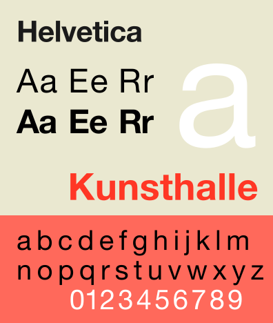
Helvetica is a sans serif typeface developed by a Swiss type designer called Max Meidinger in 1957.
Helvetica is a neo-grotesque font and was inspired by the 19th century “Akzidenz-Grotesk” font and other German and Swiss designs. Its popularity is probably due to the availability of numerous weights widths and styles as well as matching designs for some non-latin alphabets. This font was released as a response to the growing popularity of sans serif fonts around the time among European graphic designers. They created this font with the following things in mind; great clarity, no real meaning in its forms and it can be used across a wide range of signage. Helvetica was first released with the name Neue Haas Grotesk, but has been changed to Helvetica to be easier to market. This name comes from a Latin name for the pre-Roman tribes that became Switzerland. Its popularity grown as it was made available for phototypesetting systems (a system for typesetting before the digital era), lots of copies (knockoffs) were created around this time by typesetting companies.
In the 1970s Linotype (the type foundry of Helvetica) has licensed the font to Xerox, Adobe and Apple, setting the font in stone for the digital era. This has led to the development of Arial for Windows computers.
The computer era
For mass-production printing presses one of the biggest innovations of the 19th century was phototypesetting, first introduced in 1949 by the Photon Corporation in Cambridge, Massachusetts. This method replaced physical type moulds with light. It worked by projecting light through a font disk with character cutouts, this gets put through a magnifying glass to determine the size of the font, this projection then recorded on a light sensitive photo paper or film to capture the words that were typed.

In 1957 a font called “Univers” has been designed bu Adrian Frutiger and released by Deberny & Peignot (French type foundry). It is notable as this font family was available in a variety of styles from the moment of its release, it was made specifically for phototypesetting and was a predecessor for today’s digital fonts.
This font was used on Apple keyboards until 2003.
The post war years brought many new innovations such as the IBM Selectric in 1961. This was the first typewriter that was capable of using different fonts (bold, italic etc.) by changing the type heads. This enabled the use of multiple types by individual typists for the first time in history, thus a giant leap in desktop publishing.
Just a few years later in 1970 the daisywheel typewriter was invented. This machine was extraordinary for the time as it replaced the cumbersome golf ball sized type heads with a wheel like type head, which wasn’t just lighter and more space efficient, but brought its own innovations to the table. Due to the shape and weight of the type heads, it enabled faster typing, and allowed for proportional typesetting. This meant for the first time that different letters could take up different horizontal space depending on their shape. This was the go to printing method even for computing until after the late 70’s when the laser and dot matrix printing was invented. Even after its heyday, landmark digital printing services like the Apple Laserwriter emulated its command-set.
Digiset machines that were created in the mid 1960s, used a similar technique to phototypesetting but replaced the source of light with a Cathode Ray Tube (the same technology that was used in TVs at the time) and instead of using cutouts of characters, but distributed into tiny points (like pixels) and projected in the shape of the selected letters, this technique also known as bitmapping. This was the first truly digital typesetting technique.
The other big advantage this digital publishing had was the ability to edit the text through an editing terminal, and even save the files for this on floppy disks, thus Digiset is considered to be a direct forerunner to desktop publishing programmes we use today.

The first truly digital typeface – Digi Grotesk – was designed by Rudolf Hell. This font was designed for the Digiset machine with its constraints in mind, it had to look good when projected on a grid by small dots of light, thus was created in a bitmap format. These looked really good in comparison with the bitmap fonts that emerged during the 1980s, the reason for this is that the Digiset machine has a relatively high resolution compared to the early PC monitors.
In 1983 Apple released the first computer with a graphical user interface that won graphic designers over and started a new era of graphic design. The only problem was that you couldn’t do an awful lot with the things you designed, since personal printers that could print graphical elements didn’t exist.
Around the same time a couple of people – John Warnock & Charles Geschke – leaving Xerox, have established their own company called Adobe.
Warnock invented PostScript that was a way to convert font information into a smooth vector-curved output, that set a new standard for printing quality using the LaserWriter.
The other component that was missing was a better on screen design software. PageMaker was created by Aldus (later acquired by Adobe) this was the first ever desktop publishing software.
Adobe offered to both Apple and Microsoft to integrate PostScript into their operating systems, but this came at a very high price so the computer companies declined and joined forces to create their own font and page description software. The result is True Type with its .ttf format. This is a scalable vector based font technology that combined the 2 previously used files (one for on screen and one for print) into one file.
This didn’t really take off with type foundries because Adobe was a more trusted, more established entity in the publishing world, as a result many of the True Type fonts were very low quality. In 1996 Adobe and Microsoft joined forces to create the Open Type format (.otf) by combining PostScript and TrueType. This has become the new golden standard for publishing fonts.
Today’s Digital Fonts
As necessary printer hardware and graphical interfaces became widely available typographers had to think about creating typefaces that were suited for bot on screen and print reading.
Steve Jobs has fell in love with the art of typography back in his college days and this has influenced the way the first Apple computer with a GUI had been developed.
Jobs had a vision that the computer – Lisa – needs to use plenty of different fonts and they all had to be proportional, leaving behind monospaced computer fonts of the 80s.
To make his vision come to life, Jobs hired art historian and designer Susan Kare. Kare designed a set of bitmap fonts that were inspired by large cities. These fonts were made obsolete with the arrival of the more smooth PostScript fonts, such as Courier, Helvetica, Times and Symbol.

Myriad was created in 1992 by Robert Slimach and Carol Twombly for Adobe Systems. It followed the traditions of Univers, it was made to be read in digital environments and seemed quite obscure throughout the nineties, but was adopted by Apple as their corporate font in 2002 and became one of the most famous fonts in the world.

In 1996 Matthew Carter was commissioned by Microsoft to create a similar sans-serif font with on screen reading in mind. He created Verdana, a font that is recognisable for its relatively high x heights, wide proportions and loose letter spacing. It makes a font that is easy to read on low resolution monitors, that were widely available around the late 90s.
With the introduction of high resolution digital screens, typography has entered into a new era, where the constraints of resolution are moo longer a problem, and therefore the works of designers of the 80s to 00s have become less relevant.
I think it will be interesting to see where this new technology can take typography.
Source List:
- Graphic Design and Architecture, A 20th Century History – Richard Poulin
- Helvetica – Documentary by Gary Hustwit
- Typography: Referenced – Richard Poulin, Allan Haley, Jason Tselentis
- https://www.youtube.com/watch?v=wOgIkxAfJsk
- http://www.thing.net/~grist/ld/TextBackHome/Roman.htm
- https://en.wikipedia.org/wiki/Johannes_Gutenberg
- https://en.wikipedia.org/wiki/Nicolas_Jenson
- https://en.wikipedia.org/wiki/Italic_type
- https://en.wikipedia.org/wiki/Caslon
- https://en.wikipedia.org/wiki/Baskerville
- https://en.wikipedia.org/wiki/Slab_serif
- https://en.wikipedia.org/wiki/Futura_(typeface)
- https://en.wikipedia.org/wiki/Gill_Sans
- https://en.wikipedia.org/wiki/Helvetica
- https://99designs.co.uk/blog/design-history-movements/history-of-digital-fonts/
- https://en.wikipedia.org/wiki/Daisy_wheel_printing#cite_note-Hendrie_2003_Comstock-1
- https://en.wikipedia.org/wiki/Univers
- https://en.wikipedia.org/wiki/Myriad_(typeface)
