The brief
To produce a poster (297mm x 420mm) that celebrates a colour of your choice.
Choose a colour that has a meaning that you want to explore and celebrate. Think about what the colour you have chosen means both to you and to other people and create something that celebrates that meaning, for example you may choose a golden brown because you like real ale, a vivid green because of a particular landscape, green to celebrate Irish identity or the yellow sandstone of Bath’s architecture..
Requirements
Work only with your chosen colour, its complementary colour and black and white. You can include text, collages, illustrations and photographs. Use black and white to help establish a range of tints and shades with your chosen colour. These limitations are to get you to work with colour thinking creatively about how to make a limited palette work for you.
This project is as much about visual dynamics and contrast as it is about creating something with meaning. Make full use of it to show off to your tutor all the skills and processes you have learnt so far.
Mind mapping and gathering ideas
I have started working on this project by looking at some options for the colour I wanted to use as the basis of this exercise.
I had a hard time finding one particular colour I wanted to explore, so I started my research by looking at colour psychology to understand the meaning of certain colours.
I looked at the below website to start my research:
http://www.colour-affects.co.uk/psychological-properties-of-colours
The colour green really stood out to me for a few reasons. The colour represents the following positive sentiments:
Harmony, balance, refreshment, universal love, rest, restoration, reassurance, environmental awareness, equilibrium, peace.
It also has some negative meanings:
Boredom, stagnation, blandness, enervation.
I have also read through the Wikipedia page for the colour green to gain insight into some of the wider meanings and attributes of the colour, and noted down my learnings via the below mind map.

Some things really stood out to me; such as the production and limited availability of green paint until the 18th century and the toxicity of verdigris that was used in green paints before then. It also occurred to me that the colour is strongly associated with environmental movements, and I wanted this to reflect in my final product in some way.
I have also started a Pinterest board to gather some visual references for this project:
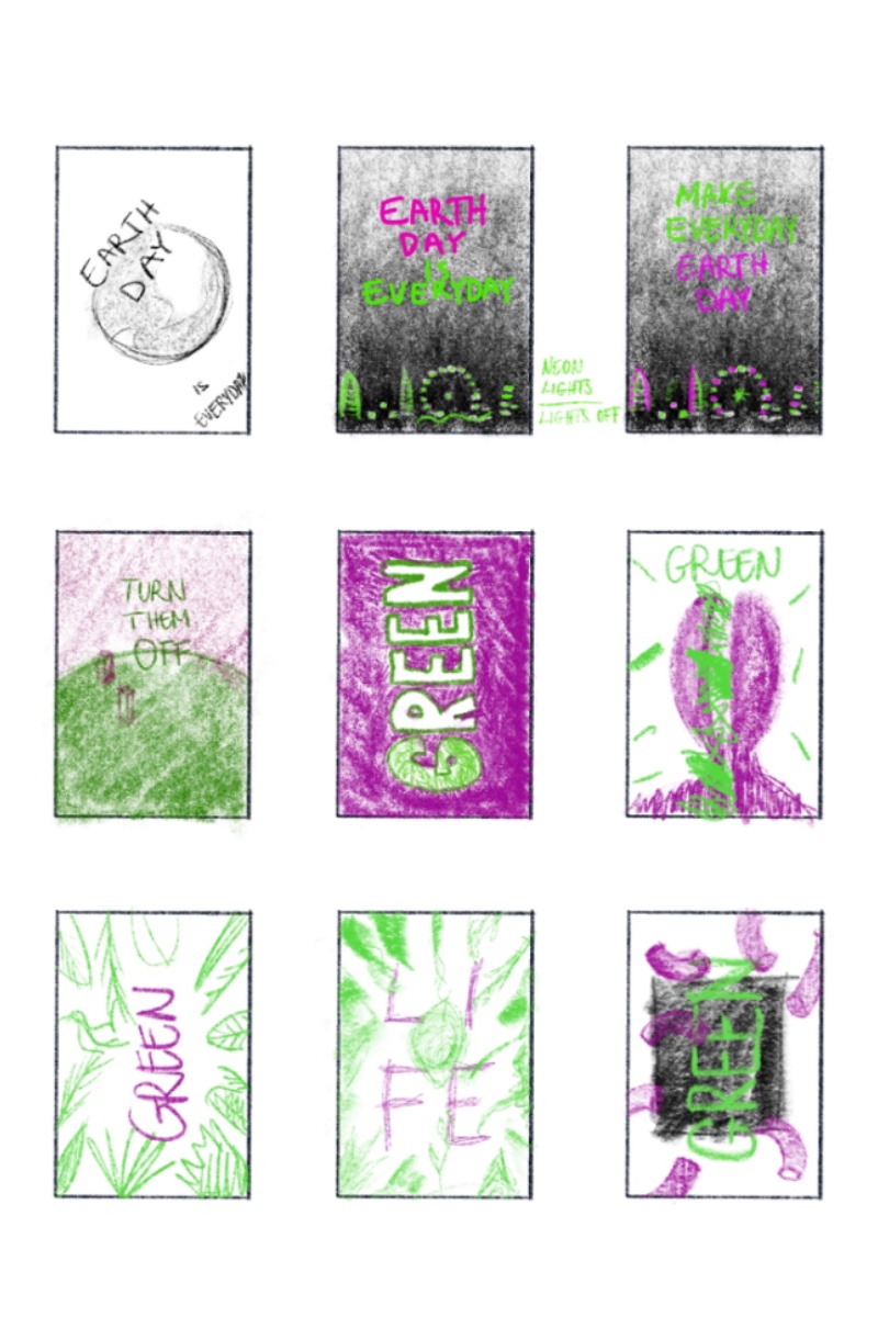
After this stage I had a few ideas to start creating some thumbnails for what I wanted to create. This was a little different from my previous thumbnails, as I wanted to think in colour instead of just using sketches to really anchor my thinking around how the colour should be playing an integral part of this assignment.
Green Split
For my first test I wanted to do a poster that is inspired by some posters I have seen online by Cuban Artis Magdiel Lopez. His work is truly inspirational, I wanted to use some aspects of what he creates in his poster without directly copying his style.
I really like the following posters, these were my inspiration for the first set I have been experimenting with.
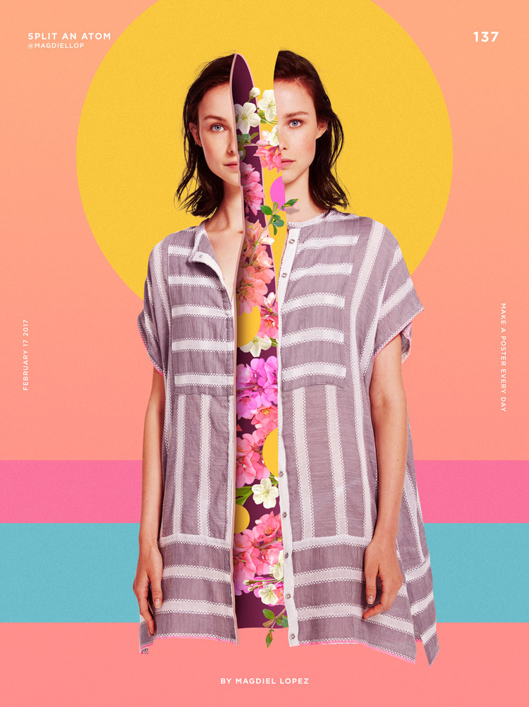
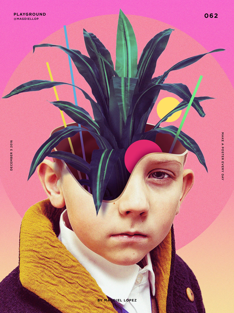
At the start of the project I had no Idea how I will make these work for me, as his posters are generally very colourful and I was restricted to the use of a few colours in this assignment.
I was looking at the meaning of the word and some associations I could draw on when selecting the subject of my poster. I knew I wanted to combine this with images of plants as a representation of the colour green.
My first choice was Frida Kahlo, as she came into mind when thinking about portraiture and plants. Her work heavily references plants, and I found this connection an exciting one.
I found this black and white image of her taken by her father on Wikipedia.
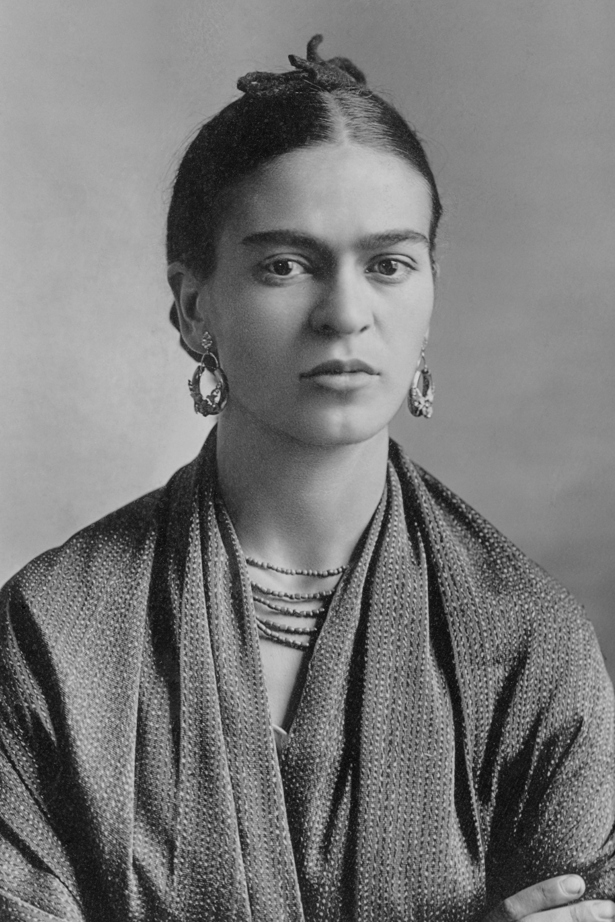
I quite liked the symmetry and simplicity of this image. I also thought it removes a step from my process as it is already a black and white photograph.
I wanted to use some evergreen plants to emphasise the meaning of the word in my final image.
I chose the Monstera deliciosa plant due to its interesting shaped leaves and because it is a plant that is native to the rainforests of southern Mexico. I liked the association between the origin of Kahlo and the origin of the plant.

The colour green is often used to represent health, new growth and life.
Therefore the other plant I added to my image was an Aloe Vera plant, which is known for its healing properties, and is also an evergreen plant.

Deciding the complimentary colour
With the colour green, I have found that the complimentary colour can be either red in the traditional colour system, but can also be magenta looking at the RGB colour wheel. This provided me with a couple of options for the approach of the suitable colour combination.
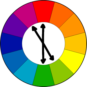
After further observation I realised that the complimentary colour really depends on the shade of green. A pure green’s complimentary colour would be the red and a yellow-green’s would be the magenta.
I decided to explore both of these as and decide which colour combination would resonate better with the meaning of my posters.

In the first iteration of my poster, I have used the portrait of Frida and some of my chosen plants. I dissected the image and added the plants as if they were growing out of her.
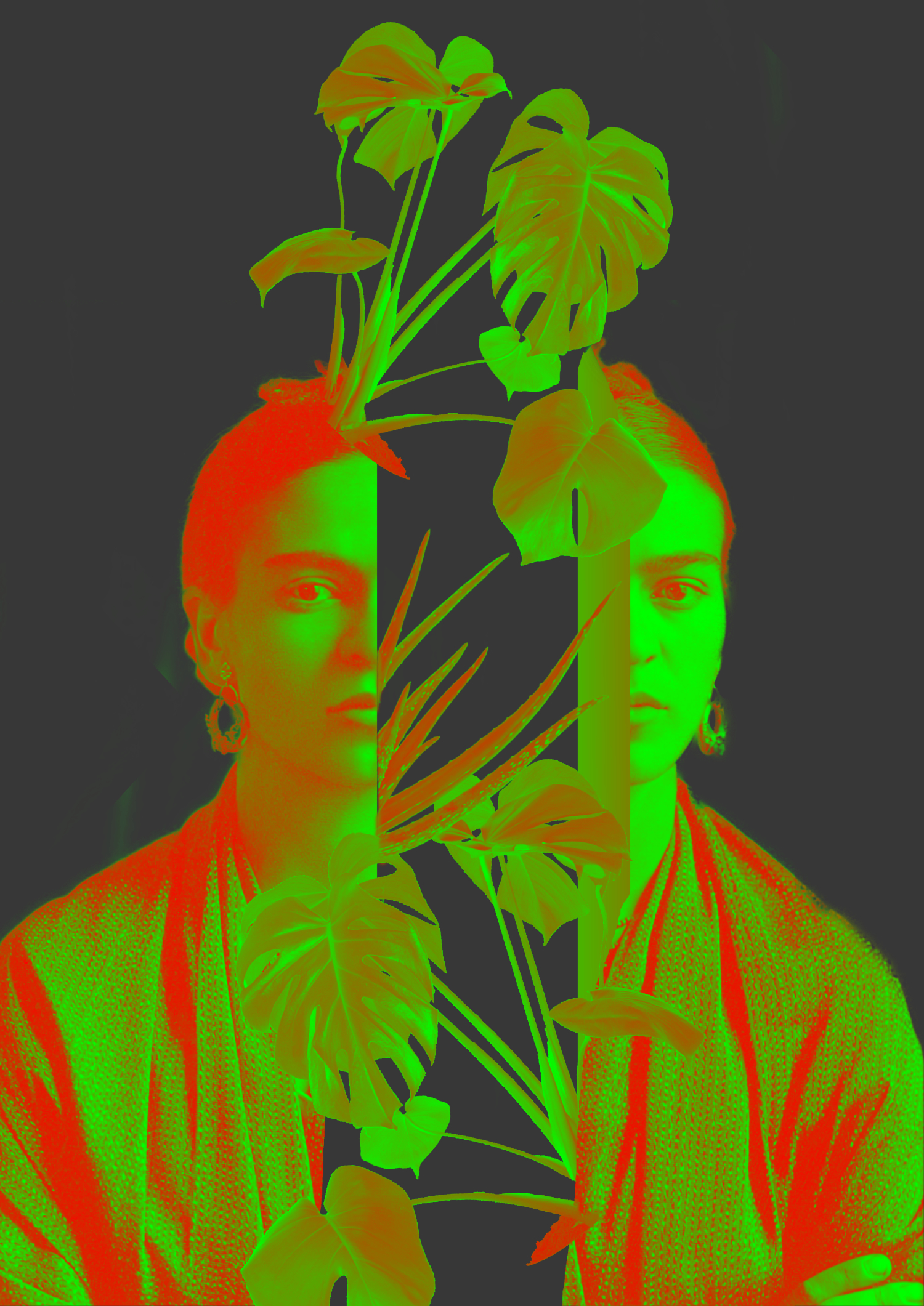
I felt this is a little too plain, and I wanted to emphasise my chosen colour a little further so I applied a gradient filter to overlay shades of green and red. I liked this effect, but I felt like this is not pushing the meaning of the word far enough.
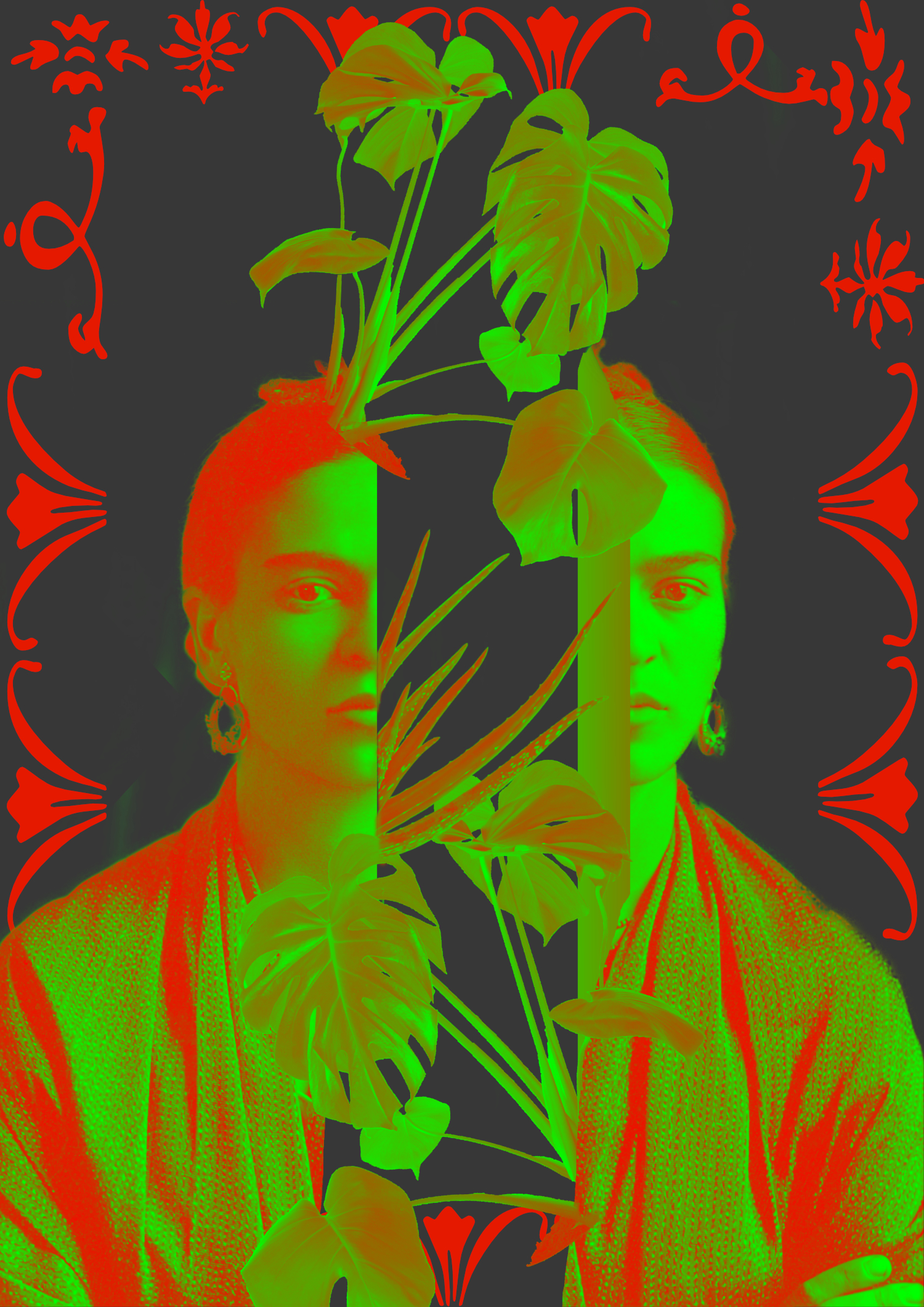
I decided to create a frame of the word green in a glyph font. By using this font I felt like the frame has meaning at the same time as being ornate and adding interest.
Going off on the same idea, I wanted to add the word green in many languages as a background to show my love of languages.
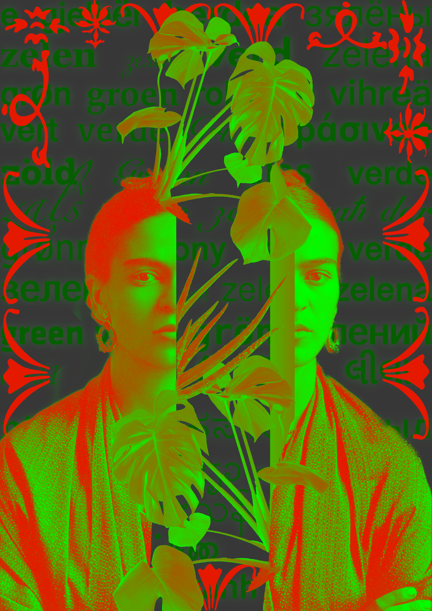
I quite liked the outcome of this, the fact that the words are in many languages lends itself as kind of abstract, but at the same time they have meaning.
After analysing this image and getting some feedback from friends, they weren’t too sure of the association of green with Frida Kahlo, so I wanted to experiment with some other portraits in place of hers.
My next choice was Leonardo Da Vinci’s famous Mona Lisa. There is a definite connection with the colour green here, as she was from the gentry according to the green dress she is wearing. The gentry’s colour was also green.

I used the magenta & yellow green combination here as an experiment, I quite like how the two colours contrast each other, and I feel this colour combination is a little more modern than the red/green as that combination can evoke the feeling of Christmas too much.
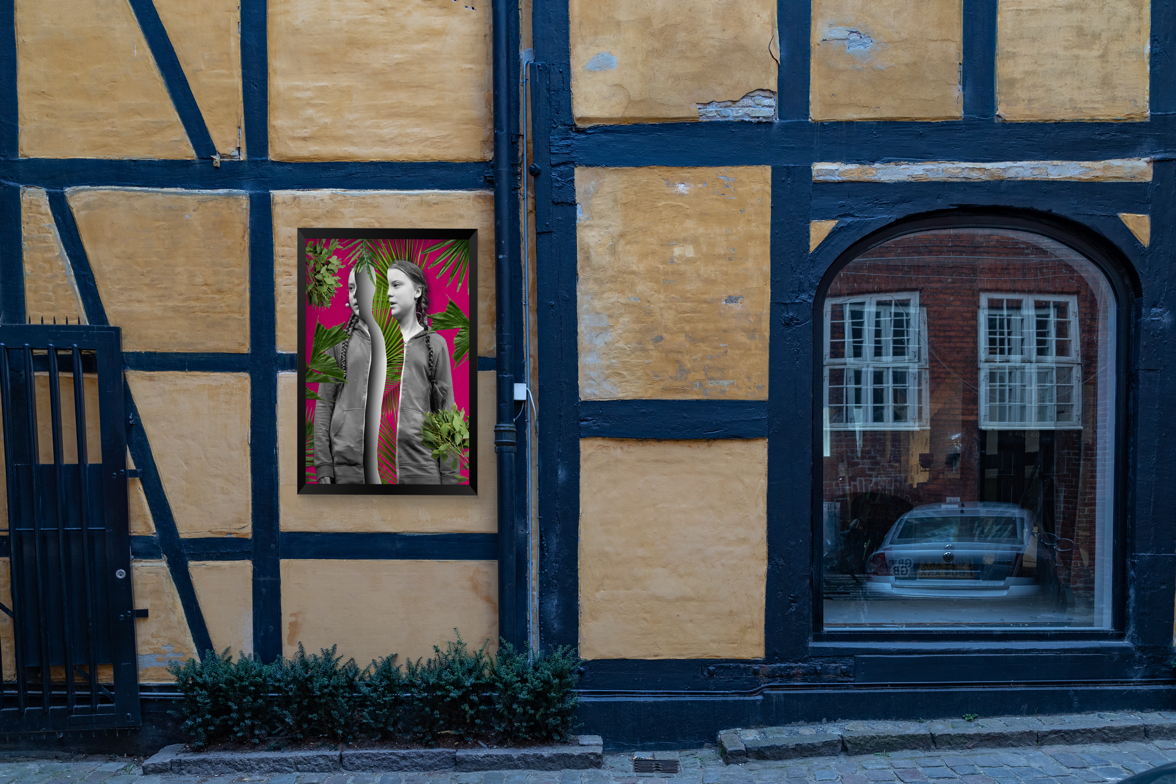
For my 3rd version of this poster I wanted to use someone who is standing for the environmental movement, so I chose Greta Thunberg. She is quite prevalent on the news at the moment and I got quite inspired by how someone so young can have such a strong point of view. I made this poster in a very similar way, using the split person and then some plants to represent the green.

I really liked this last one because I like that it has a good message and turned out pretty strong.
I feel like that I managed to create 3 posters that are quite distinct in their own way but also follow the same principle.
Everyday is Earth day
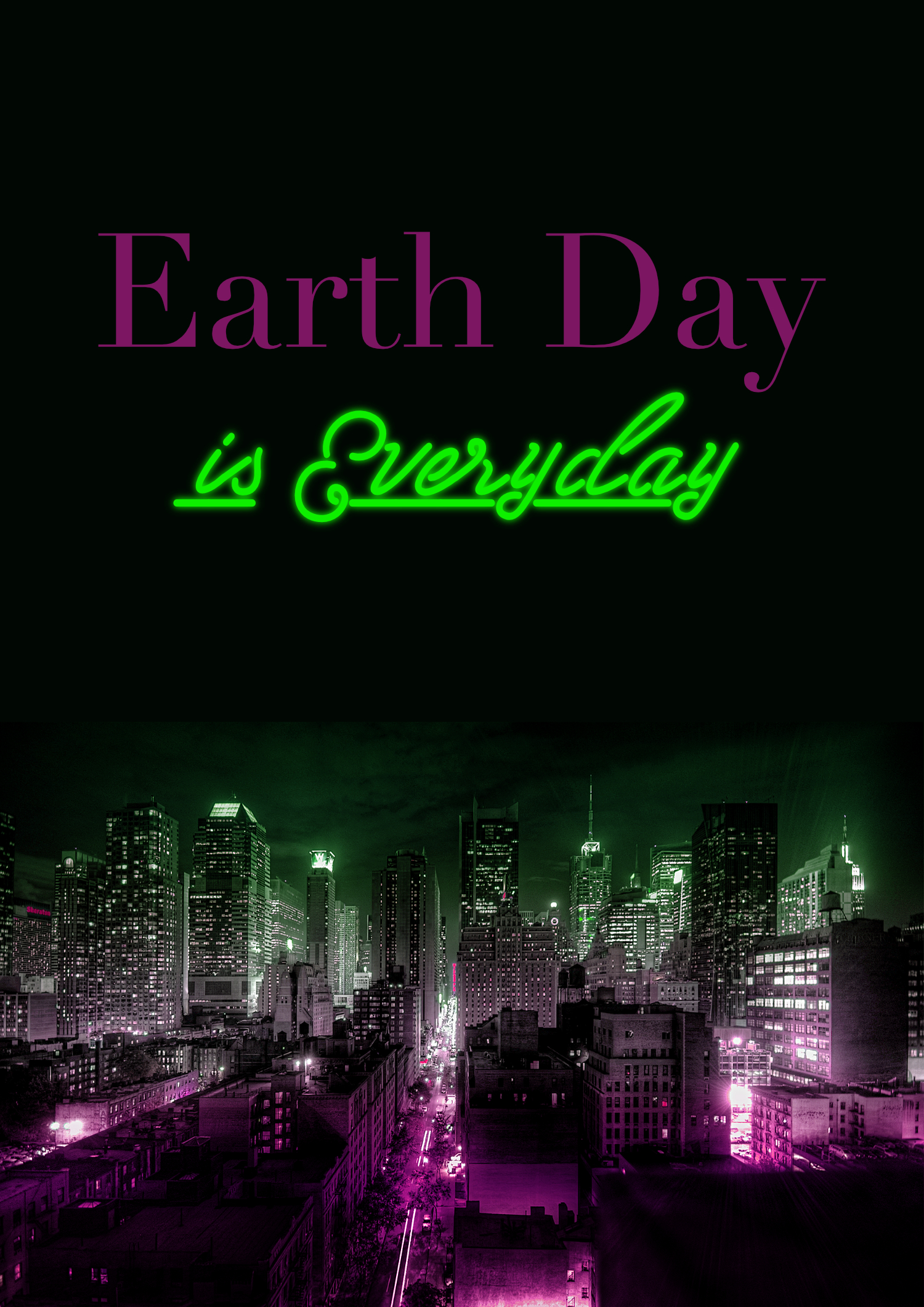
For my second poster I wanted to explore the idea of environmentalism a bit further and I thought that a poster for Earth day would be a nice way to explore this.
I wanted to create a poster that carries a message about the fact that 1 day of awareness won’t make any difference, but we need to be environmentally aware every day to make a change.
In my first idea I wanted to use a picture of Earth and the words simply around it.

I liked the simplicity of this poster and how the message is to the point and carries a clear message.
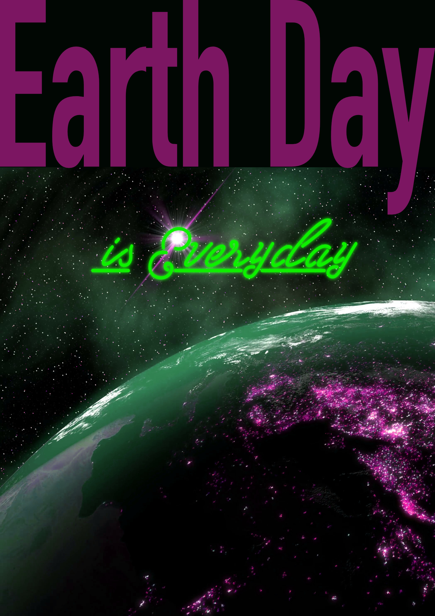
I found a good photo that is of earth with lots of city lights at night. It shows the scale of population really well and the scale of the problem too.
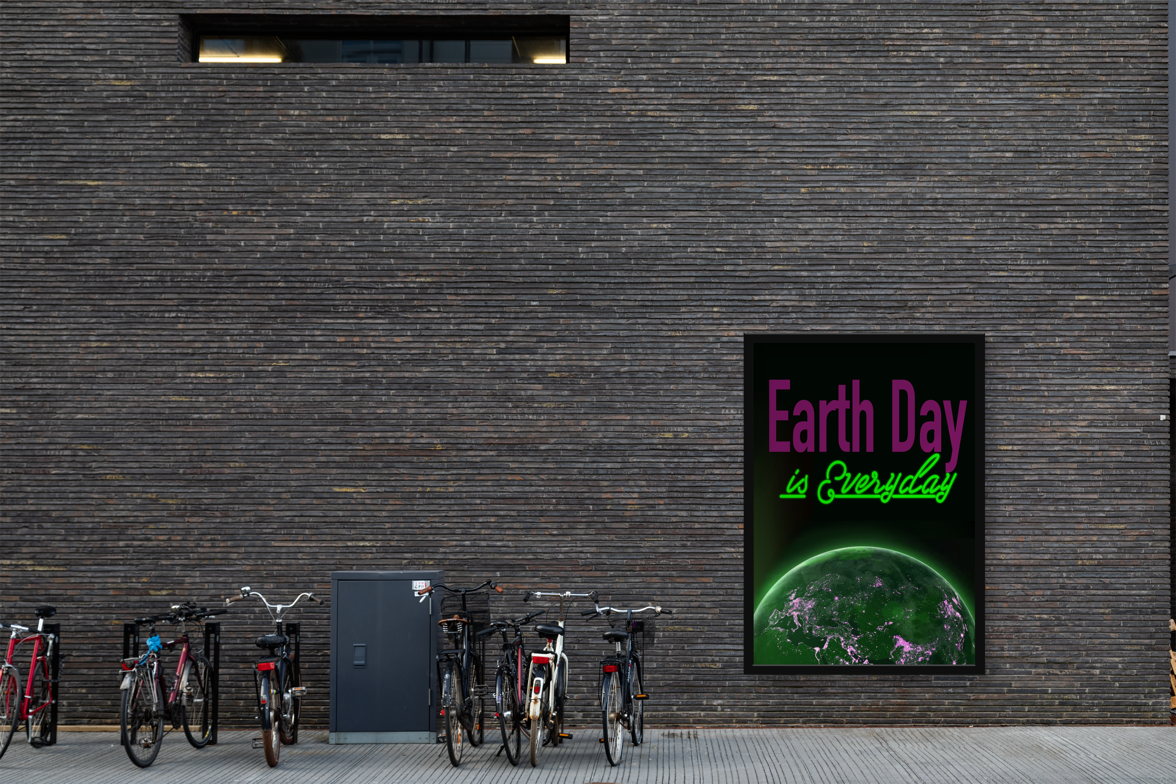
I used a neon sign font in a fluorescent green to show connection with the unnecessary light pollution caused by advertising signs and entertainment venues.

I wanted to depict a lit up city with the words “Earth Day is Everyday!” as a different version poster communicating the same idea. I used the magenta and green combination to make the city look slightly toxic and polluted. this has created a nice green haze over the city which could symbolise smog.
In the 3rd version of this poster, I tried to use the same idea, of the first poster but using a different picture of Earth to get a slightly different layout for my poster.

I liked the message behind these posters and I have been able to generate the 3 different versions quite quickly. This probably shows, when you have an idea that you believe in and feel strongly about you can create things in a more organic way.
Room for growth – failed experiment
I have created a few posters that were celebrating the colour by collaging some green plants together.
I ultimately have rejected this idea, as the posters turned out pretty boring and meaningless. I wanted to create something interesting all along, not something that is completely obvious.

In this first poster I used a bunch of greenery on a green background with the word GROW across it all. It looks pretty nice I think, but I also think it doesn’t have much meaning behind it all, which is failing the exercise.
I made the next poster as a sort of experiment, I wanted to make it look like some close up images of plants, but actually using images of glitter which I have manipulated to be green. I toyed with creating posters in landscape as the exercise doesn’t explicitly call for portrait or landscape orientation.

After this second one, I realised that I wanted to create something more thought provoking and interesting, so I abandoned this idea entirely.
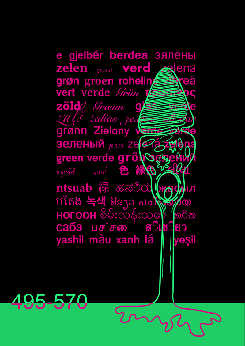
M Cone Cell
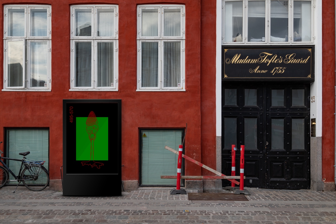
For my first 2 ideas, I got the consistent feedback that they were perhaps too close or too obvious associations of the colour green, so I decided to explore the fringes of my mind map for some more far-fetched ideas. This led me to to think about the colour as an entity of physics and biology. I wanted to create a poster that would be celebrating the colour, but would also spark some conversations. I looked at my list of key words and some things really stood out.
- M cone cell
- 495-570
- Chlorophyll
- Photosynthesis
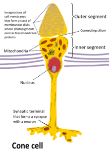
I researched what a cone cell looks like and I quite liked it. It looks a bit like a mushroom which is a plant that is not green, that I found interesting. I wanted to include this in my final poster in some way that is both fun and provocative.
After tracing the cone cell, I realised that I might be onto something. It looks kind of alien and I love the weirdness of that. I wanted to create a visually striking poster that said green without the actual words.
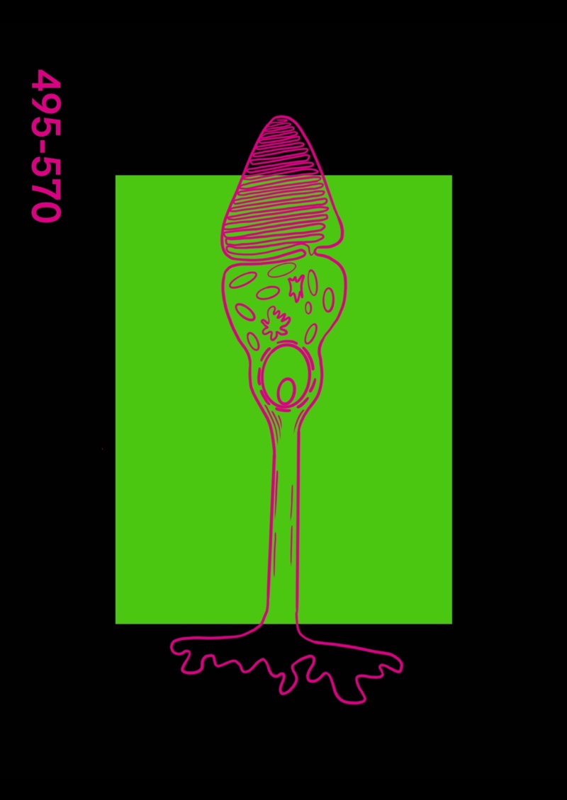
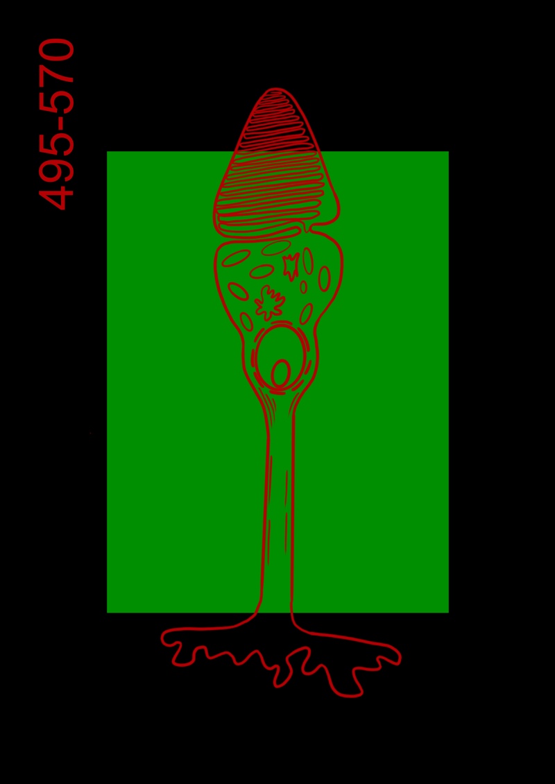
My first version of the poster turned out pretty good. I liked this very much, but also wanted to play around with some alternative layouts and colour combinations. I tried the green/red colour combination, which makes it look like it’s some sort of awareness poster for a new virus.
I also made some changes and used some of the elements from my first posters that I created. I liked how the words elude to the meaning of the poster yet being subtle enough that you dismiss them as just a background at first glance.
This assignment taken me way longer than I expected, because I was struggling with creating something that both has meaning, looks good and sticks to the restricted palette.
I am quite proud of what I managed to put together for this assignment, but I also feel like that the posters aren’t as strong as they should be.
I think my main struggle was finding a theme that I wanted to explore that’s connected with my chosen colour, and keep in mind all the restrictions of the exercise at the same time.
Looking back, I could have come up with my themes from my mind map that explores the meaning of the colour first without worrying about the final colours and layouts of my posters, design something and then apply all the restrictions of the brief.
I’ve made some mockups to see how my posters would work in real life scenarios: