
Draw two grids; one with colour you like and one with colours you dislike. Put them side by side.
I found it interesting how these came together. The fact that some of the, are vibrant and some of them are more subtle makes a nice combination.
In the second part of this exercise I needed to put together 2 colours to represent a certain idea.
I found this in some cases pretty difficult to do, but I tried to do this to the best of my ability.
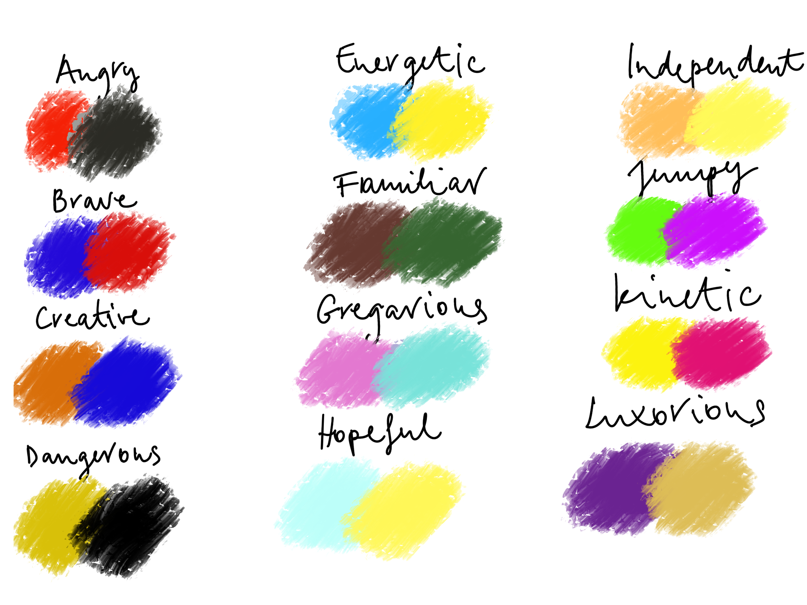
I’m not too sure if I managed to capture the ideas well enough. I think I struggled a little because I normally think about communicating using shapes rather than colour.
This exercise shown me that I need to be more conscious about my colour choices and how these may affect the overall feel of my images.
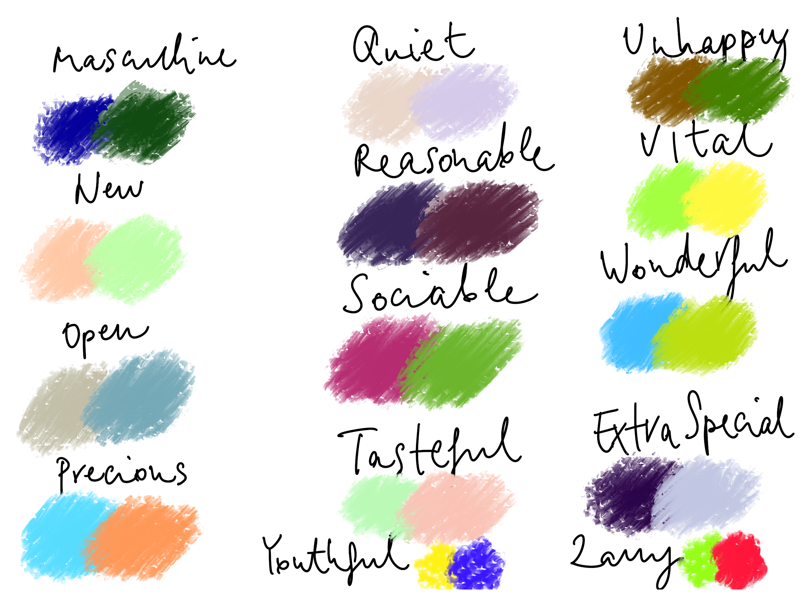
After my tutor feedback
After my tutor feedback I felt it would be important to go back to this exercise and see if I can correct what I have missed. I felt like I rushed this exercise a little and as a result the colour pairs chosen above were quite irrational, fully based on my gut feeling rather than some research.
First off I wanted to look into some images by Johannes Itten, as this exercise mentions him.
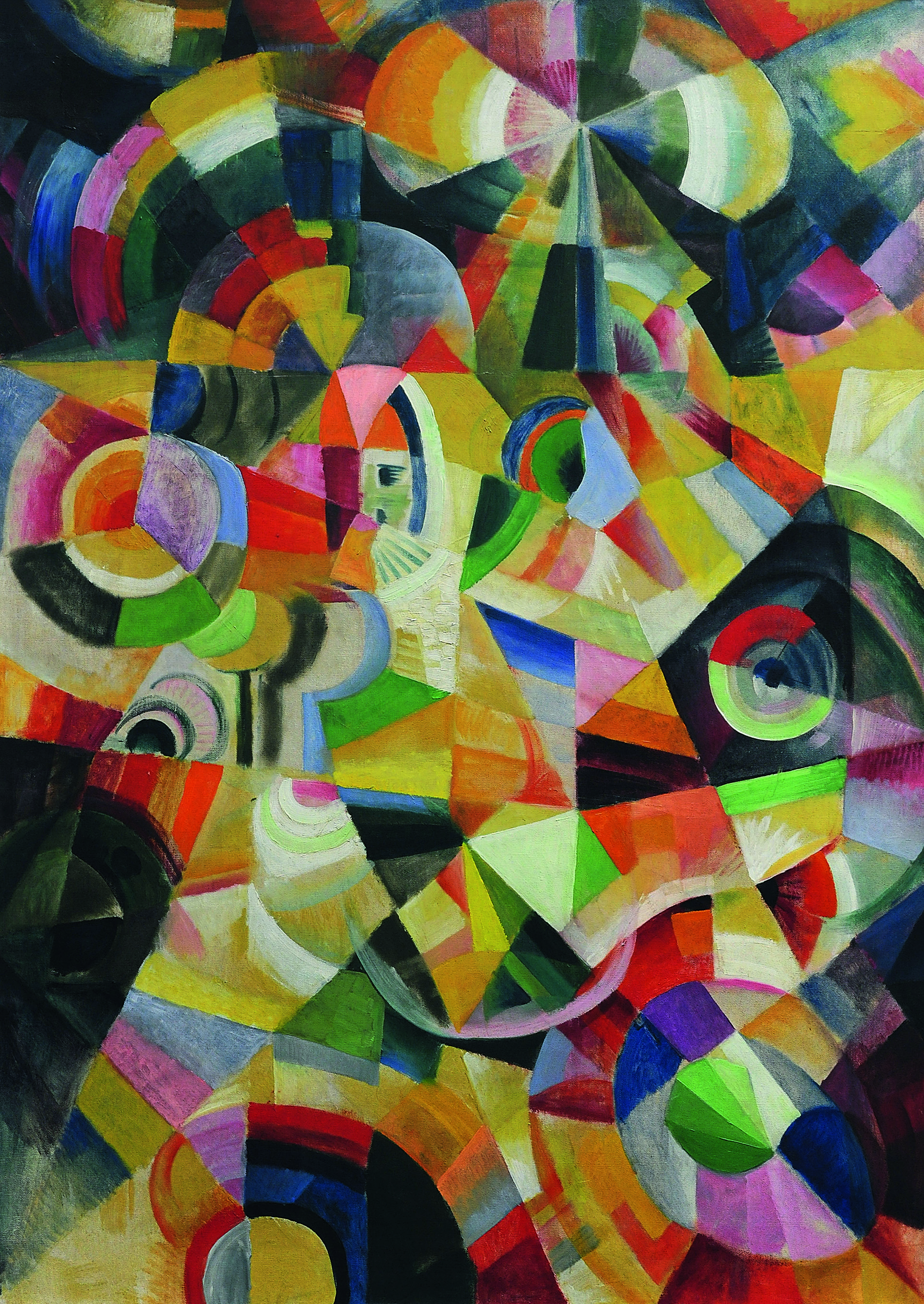
I decided to use this as a basis for my exercise. I decided to create 2 grids with 9 colour blocks each, and pick colours I liked and colours I didn’t from this image by Johannes Itten.

Colours I liked…. 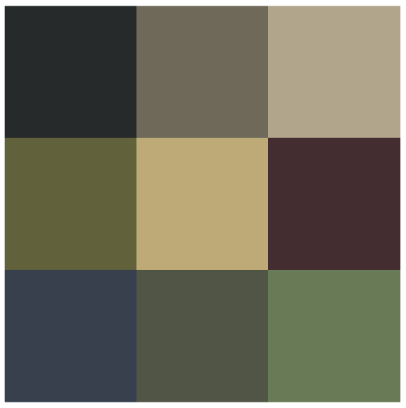
….and colours I didn’t
Interestingly, the colours I picked out first for the like “pile” were the blighter, more saturated colours, the colours I didn’t care for much were the muted dull colours. While the second square looks quite muddy, it is at the same time calm and almost works as a colour palette that would be usable, where the other one is just too bright and clashes between the colours. If I was going to pick the colours from a less limited colour palette, I am sure this would have clashed even more. It just shows that more saturated colours are more attractive to us, however we need the duller colours that can help these colours stand out, instead of having all the colours fighting for attention.
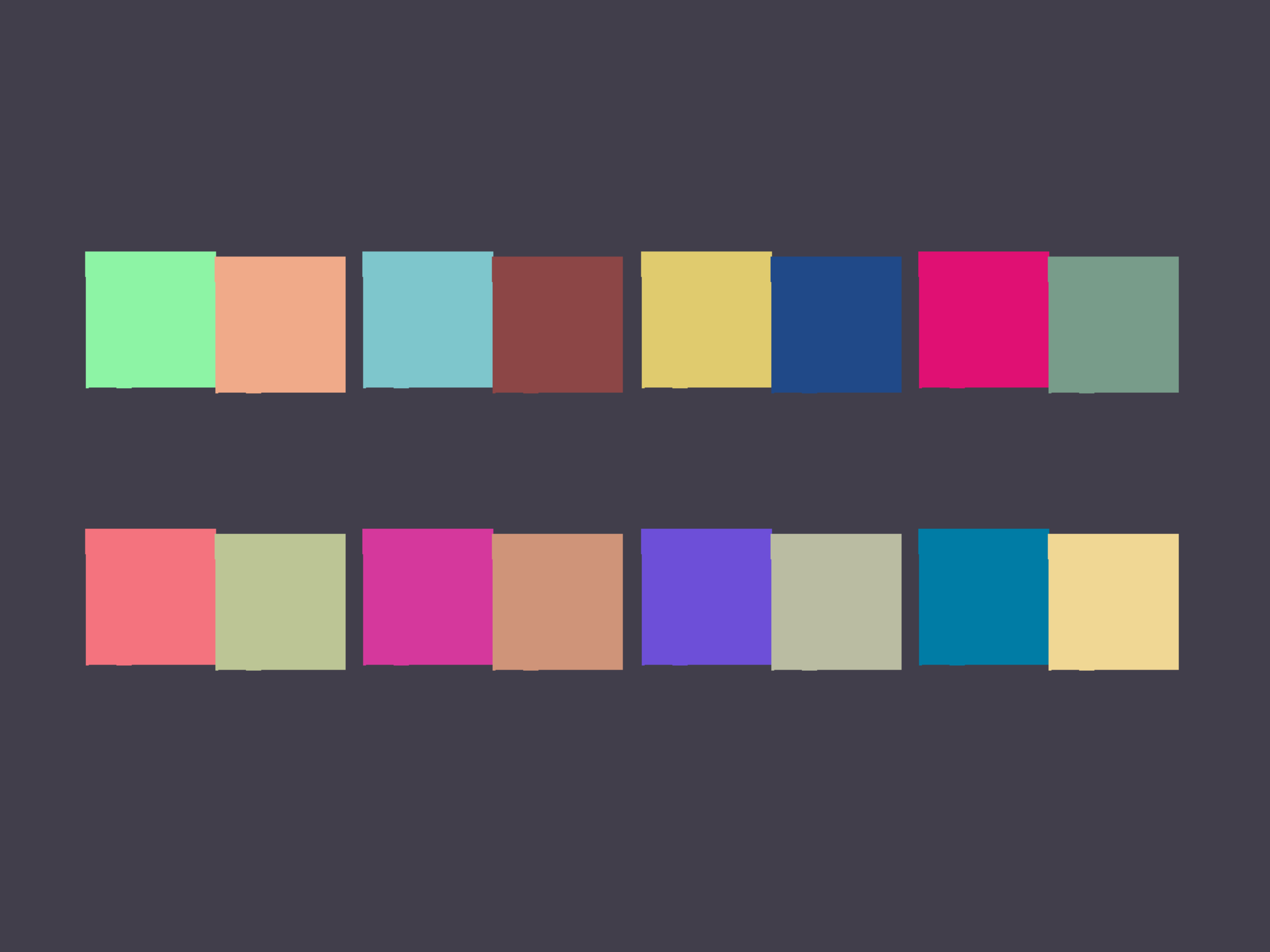
For the next part, I decided to use only the colours I have picked out and create my colour pairs using these.
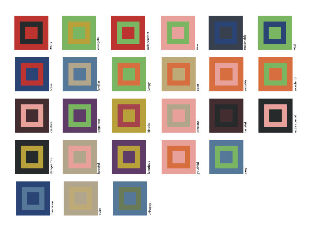
I think this was a lot more successful than the first attempt. It is probably partly due to the fact that I was working from a largely limited colour palette, and this meant that my colour pairs didn’t get out of hand so much. I feel like I leaned on some colours more than others, this is probably again some influence of what colours I gravitate towards whenI picking them. When I got stuck with a colour and didn’t know what colours to pick, I did a quick google search for some visual references, and this helped quite a bit.
Reflection
I think this exercise shown me that colour can be very personal and subjective and also that our perception of it changes over time. I need to look at references when selecting colour, and make sure that my personal preferences are not heavily weighted when making decisions. I think this is an iterative process, and I feel colour awareness will come with time. I am much happier with my end result now that I reworked this exercise after my tutor’s feedback.
