
The brief
The second assignment asks to create a set of greeting cards to celebrate a sentiment or events that are worthy of celebration but not currently catered for by a card manufacturer.
The requirements
- Design at least 3 cards
- Design the cover and the message inside the card
- Unrelated or to work as a set linked to the same sentiment
- Consider the size of envelopes available
- Consider alternative cards such as pop ups
Analyse the brief
The brief is asking for something that is not currently on the market and could be sold to celebrate a sentiment or significant event in life that is worth celebrating.
This warrants some market research to find out what sentiments are currently covered, and see where the gaps are.
The brief is quite open ended in terms of finding my audience, as this could be almost any group, as long as there is a celebration I can cover that is not currently offered on the market as a greeting card.
Research and Develop Ideas
I thought that starting the research by going to my local supermarket will be a logical first step as I could easily see here what topics are being covered and widely distributed.
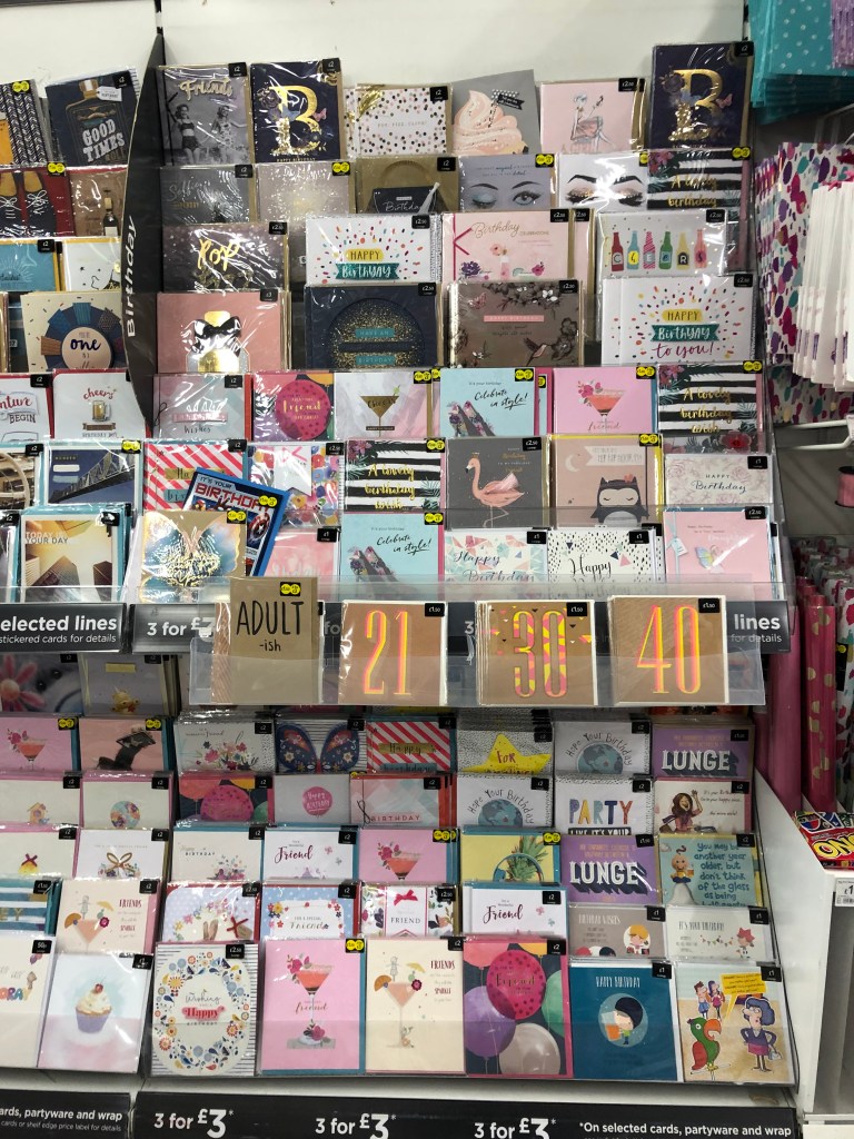
Birthday Cards 
Thank You cards 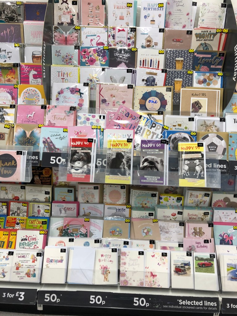
Specific age Birthdays 
Farewells 
Wife and Husband cards 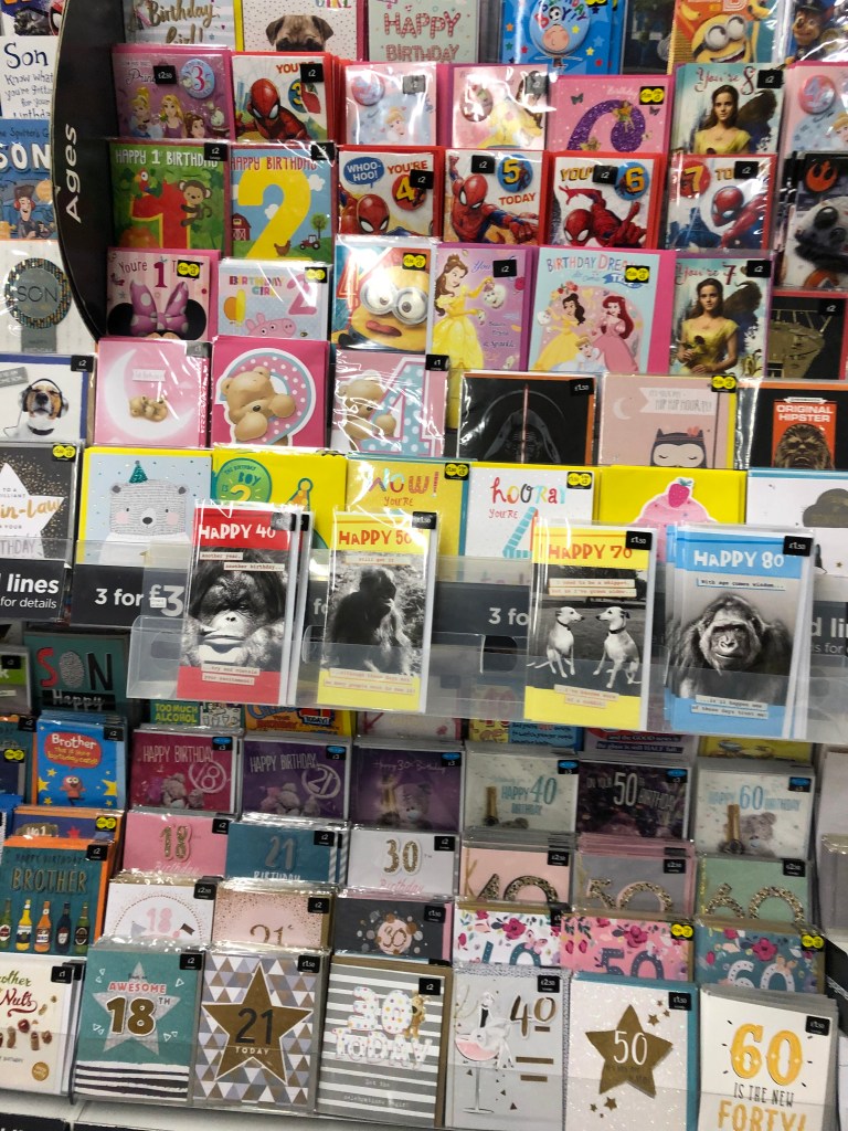
After having done that, I felt like I have a good general idea of what is in my local supermarket, but felt that their range was quite limited and generic, so wanted to do some online research to see what more obscure sentiments are being covered on the greeting card market.
After a quick google search I found the below links:
- https://www.redbubble.com/shop/weird+greeting-cards
- https://www.cafepress.com/+obscure+greeting-cards
- https://theoatmeal.com/horrible
What I found looking at the above sites is that the same sentiments are being covered with a few exceptions just in a different way.
I decided to research what others days there are in the calendar that might worth mentioning and celebrating with a card.
I found this on Wikipedia. Looking at this list I found a lot of International days that people might want to give each other cards for so I collated out the below:
- National Technology Day
- National High Five Day
- International Day against Homophobia, Transphobia and Biphobia
- World Bee Day
- World Turtle day
- Geek Pride Day
I thought all the the above days might be a good starting point.
When I read about Geek Pride Day, It struck me, that maybe what I am looking for is closer to home than I initially thought. I play Pokemon GO, and I know that the community aspect of the game is very important. I’ve done a quick google search to see if any major distributor is creating cards for Pokemon GO and found that apart from a few generic cards there weren’t any and therefore decided to explore some milestones that the game has to offer that might worth celebrating.
I have collected the below list:
- Turning Level 40
- Completing your Pokédex
- Getting a Shiny Pokemon
- Getting a 100% IV Pokemon
- Joining a raiding group
- Turning Best Friends with a friend in game
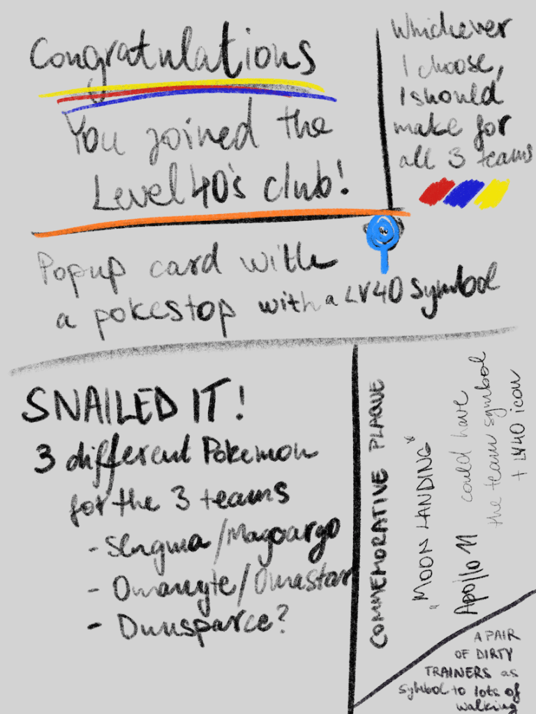
After thinking about these a bit more thorougly, I thought that the Level 40 idea is a good one. I remember hitting Level 40 after playing the game for about 2 years and feeling very happy about it. I thought it would be nice to have a card that would commemorate that feeling.
I had a quick look around and couldn’t find any Level40 greeting cards, so I decided to developer this idea further.
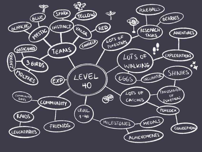
Reaching Level 40
I’ve started to think about all the things that is needed to be able to get to level 40, and put together the below mind map.
I wanted to look at some cards that are available on the market around similar topics, and I have found a few cards that I liked. I went ahead and broken down each of the cards to see what worked for me and what didn’t.

Pop up cards
I played with the idea of creating pop up cards as the exercise called for this and I thought it could be quite interesting.
I had an idea to create a card that had a pop up pokestop (these are real world locations that are essential to the gameplay), so I went ahead and done some research on how these cards are made. I found the below on instructables.com:
https://www.instructables.com/id/How-to-design-pop-up-cards/
I found the idea of designing my cards in this way quite overwhelming. I wasn’t too sure how to engineer these, how they could be printed and put together. I might get back to this at a later date, but for now, I think creating my designs in 2D will be easier and higher quality overall.
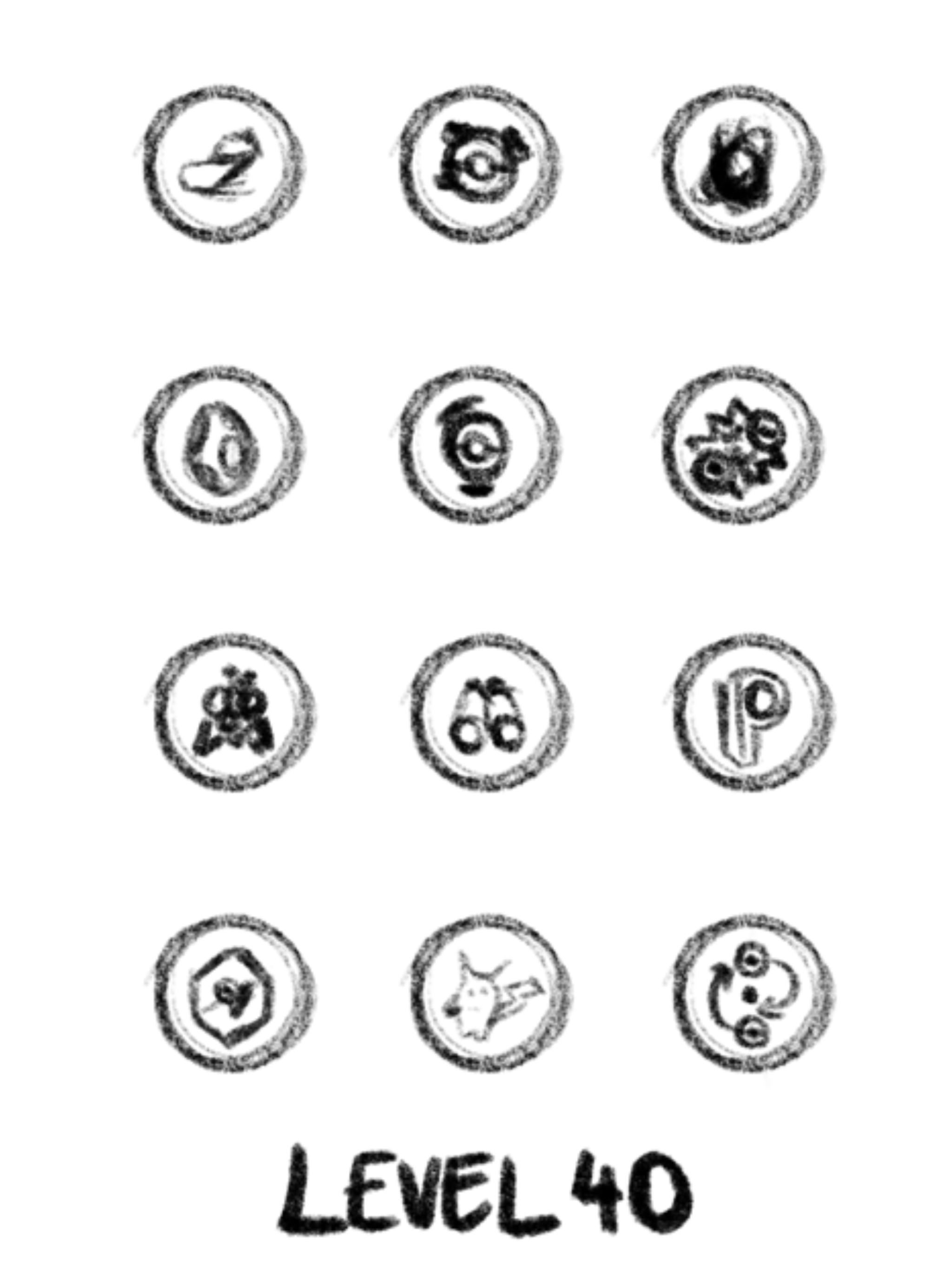
Thumbnailing
After gathering my main thoughts around the topic, I went ahead and created some thumbnails for my cards. I found this quite easy due to my knowledge of the topic.
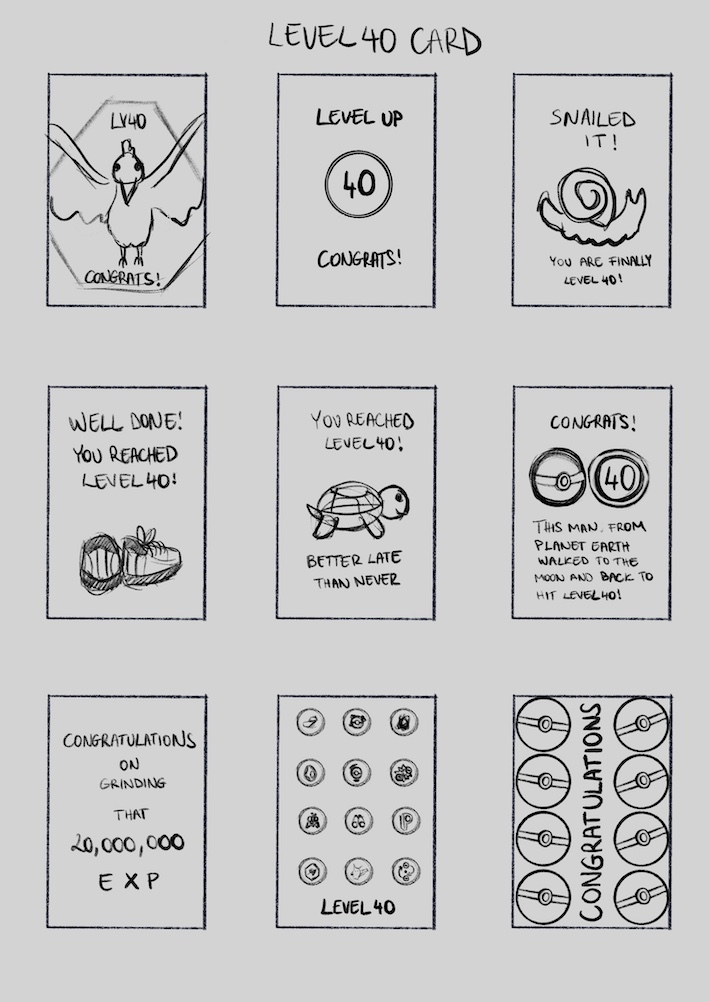
I sent my thumbnails to some people I know that play the game and also the student community to find out which of these ideas stood out the most to people.
People seem to have favoured #3, #5, #8 and #9. I quite liked number 4 too.
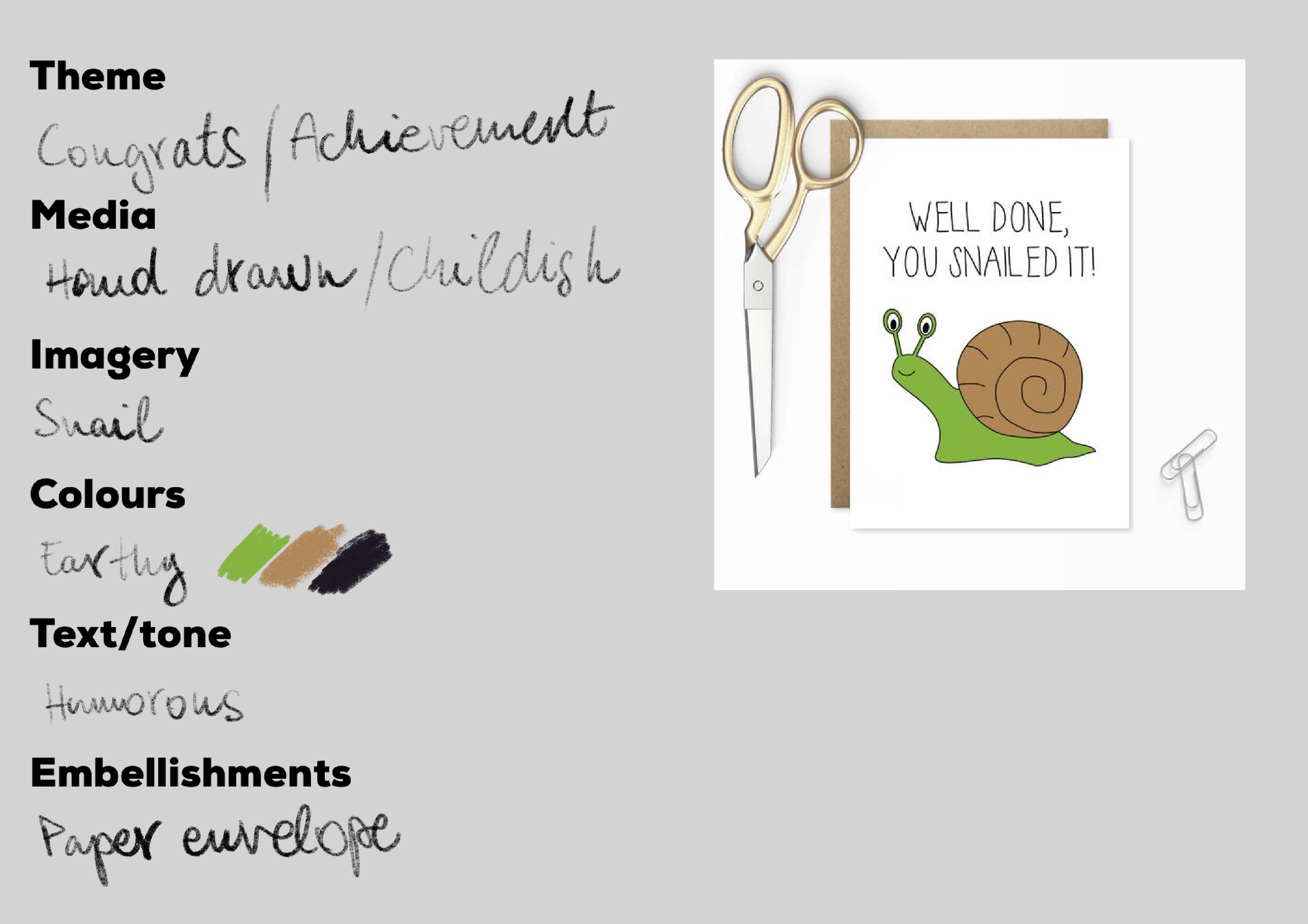
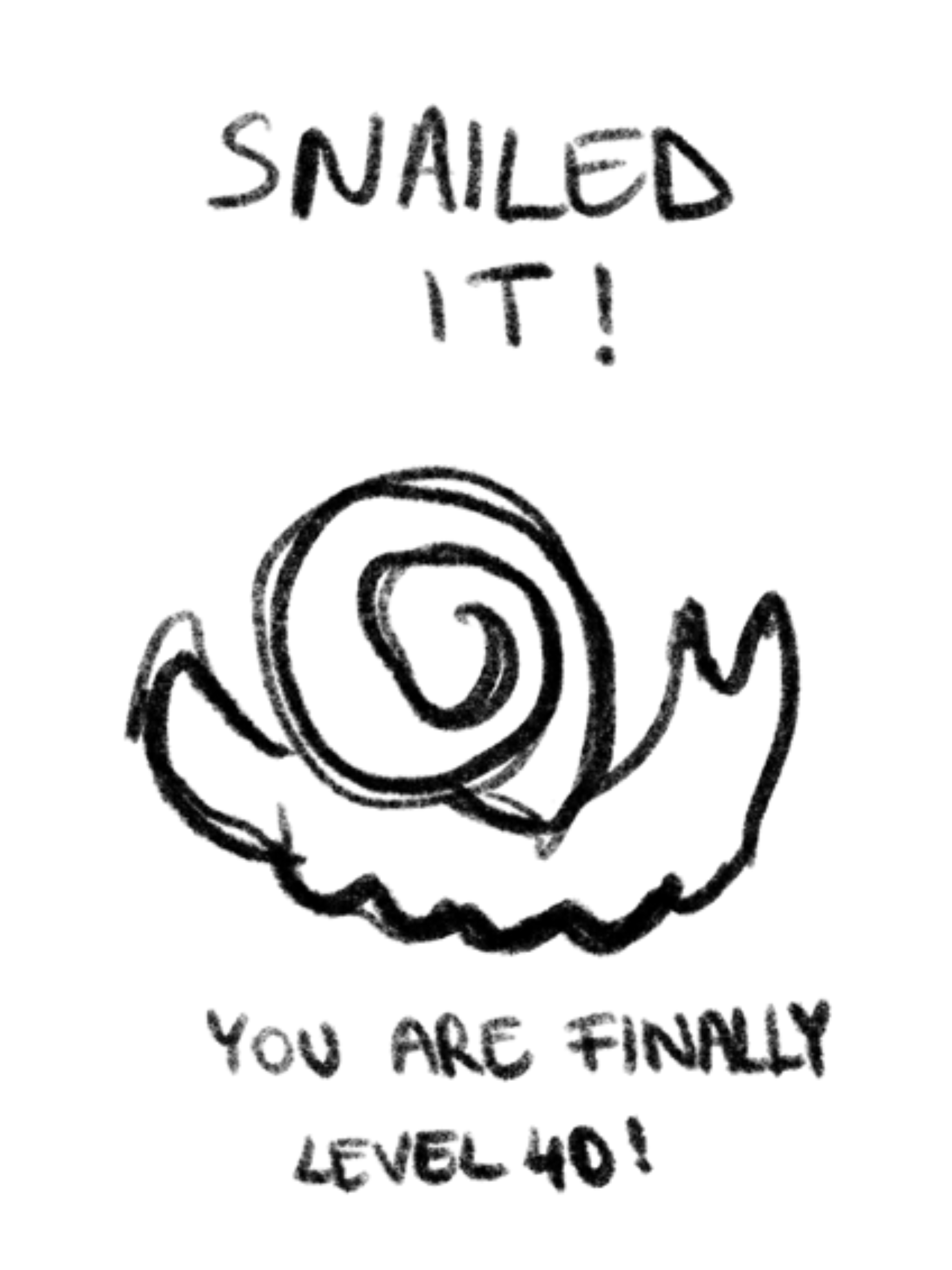
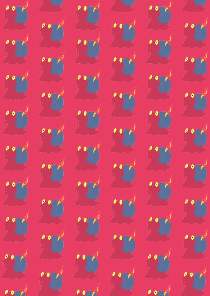
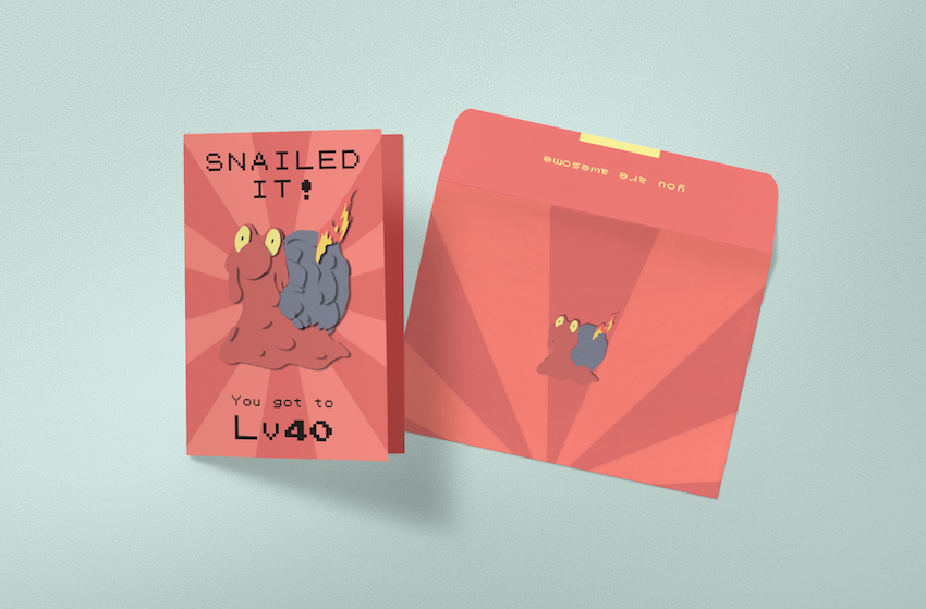
Snailed it!
I really liked this idea as I found it extremely fitting to the topic, since getting to Level 40 in Pokemon GO takes an awful long time, and it often feels like you are not making progress.
I wanted to create one for each of the teams, so I was trying to work out the best way to create 3 cards, a blue (mystic), a yellow (instinct) and a red (valor).

I begun to put together the first cards by using the images I found of the Pokemon.
For the font for this card, I managed to find a fon that resembles the typeface used in the original pokemon games back in 1998. I thought that this would be a good reference to the original games.
https://www.fontspace.com/jackster-productions/pokemon-gb
I put together 3 versions of the snailed it card.
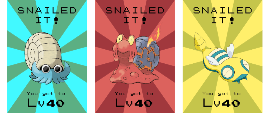
I thought that these turned out pretty well, but I didn’t want to use the original illustrations of the pokemon so, I started making shapes to represent these and paste them on with a drop shadow, to imitate the way it would look if I cut the shapes out of paper and plasted them on the board.
I quite liked this effect, and decided that this will be the thing that I’d go for for my final designs, however I felt like that the designs are largely the same apart from the colour and the Pokemon used, and felt like it might be a bit of a cop-out. So I decided that I should create some of the other designs and see how I can make them to work as a set.
Shoes Card
The shoes idea was one that I was really fond of from the beginning. I thought the worn out trainers would be a nice metaphore for all the walking that goes into completing the game. I really wanted to try this out.
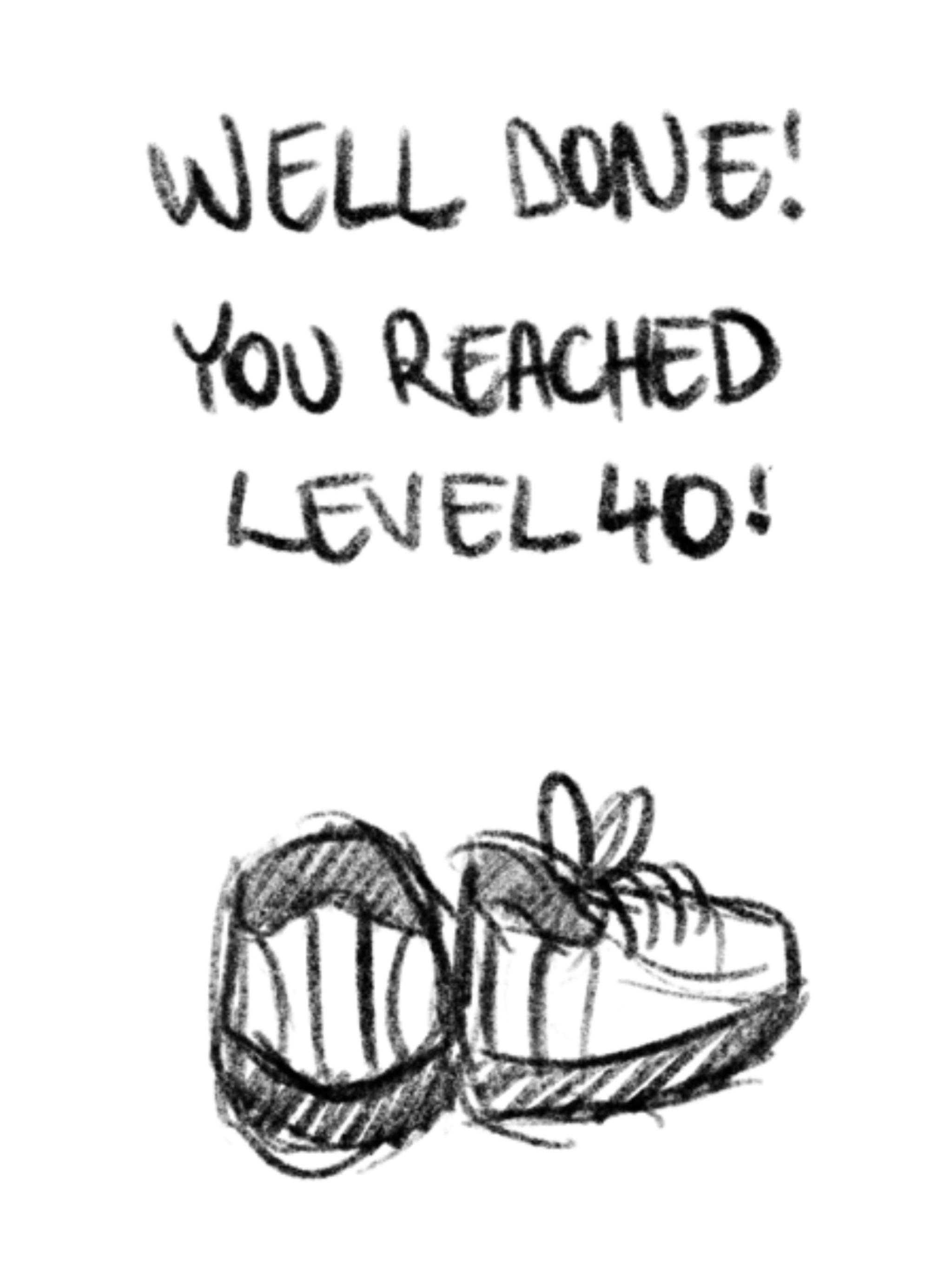
I found this image on google to start playing around with, I was planning on ultimately taking my own photos if this is a path I wanted to take.
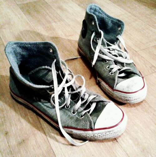
I removed the background from the photo using layer masks and put it on a simple one colour background, with the text “Well done! You’ve Reached Lv40”

After looking at this and sharing it for feedback, I have decided against this design. I found that this would be really hard to depict the same way as a paper cutout like my other cards, and lacked real connection to the game itself.
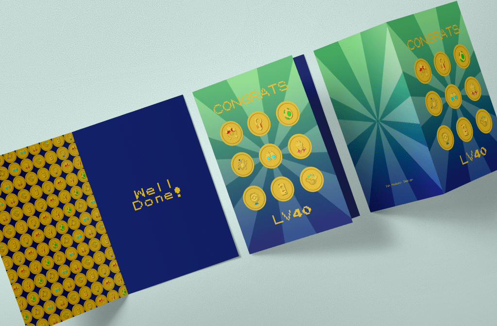
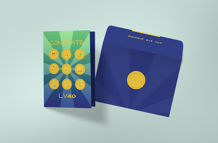
Medals Card
My second choice was my 8th thumbnail of the medals. I liked it and though I could make this in the same style as the the first card.
I took a screenshot straight from the game so I could trace some of the icons to add to my design.
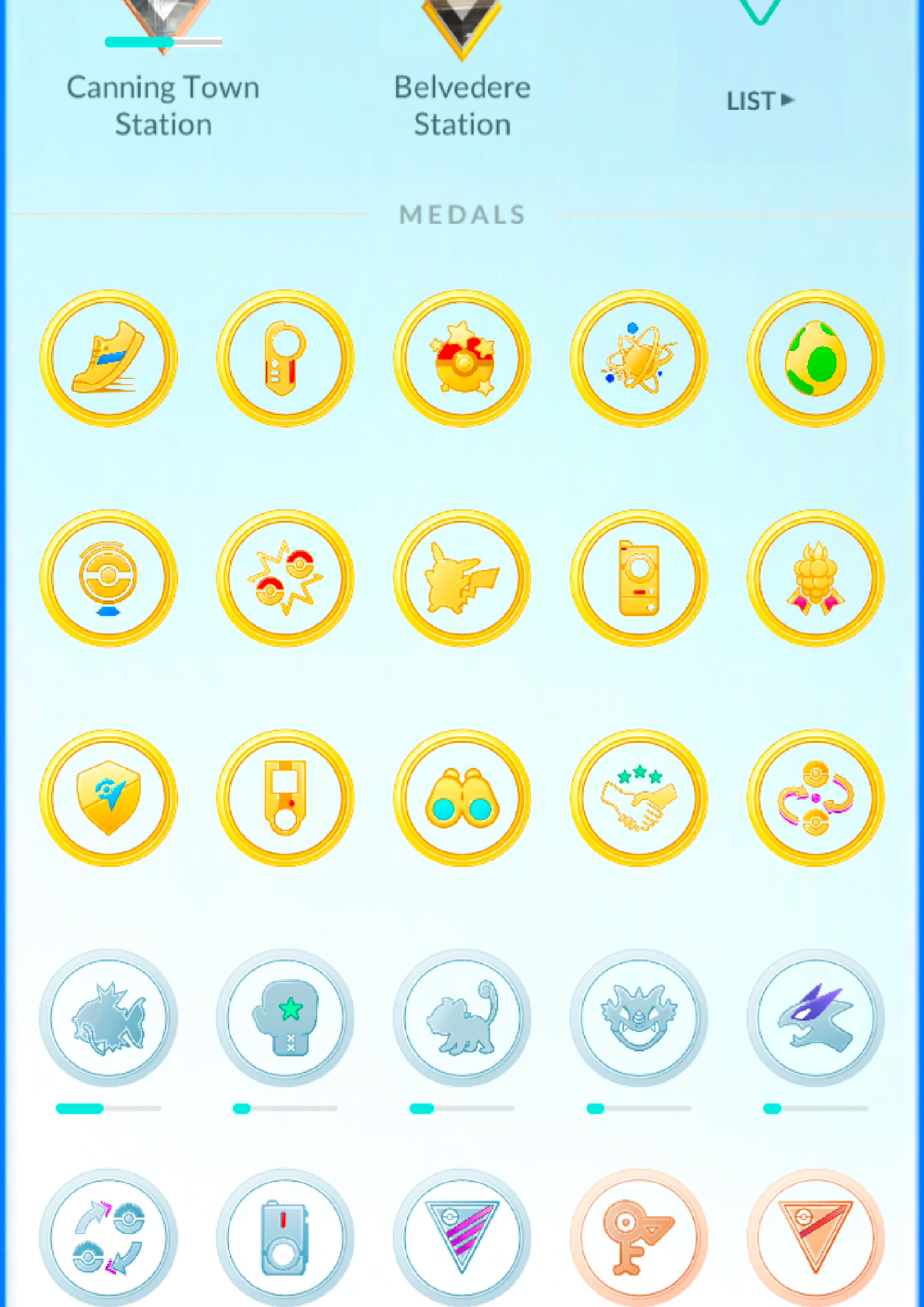
I really like these because I feel like they represent progress in the game really well. I also think they have a really cool design, and I wanted to carry this over into my card.

I quite liked how this turned out and wanted to see how they would work as a set.
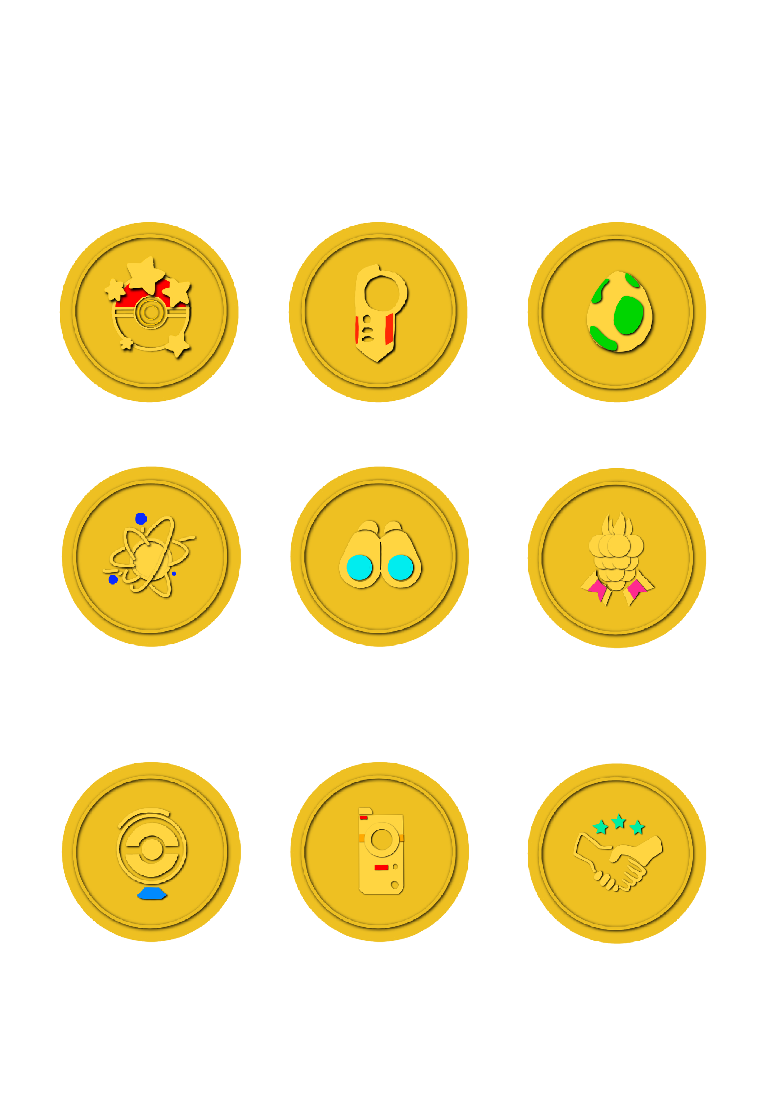
I really liked how the badges looked at this point and moved these into Photoshop to further refine the design.
Once I added the background and the text I was quite happy with the results. I also Included the background graphics from my initial Snailed it designs to make the cards work better as a set.
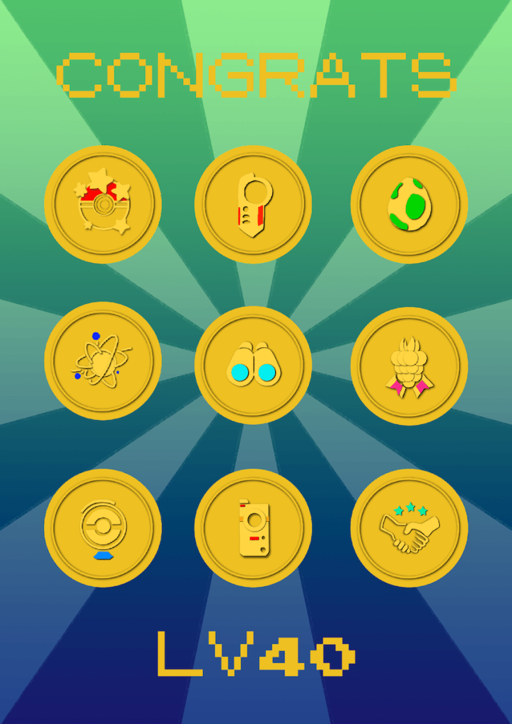
I think the design is clean and I like how the badges celebrate the small acievements that add up to finally reaching the final level. I used the same font as I thought it would be more cohesive as a set if the same font is used in all of the cards.
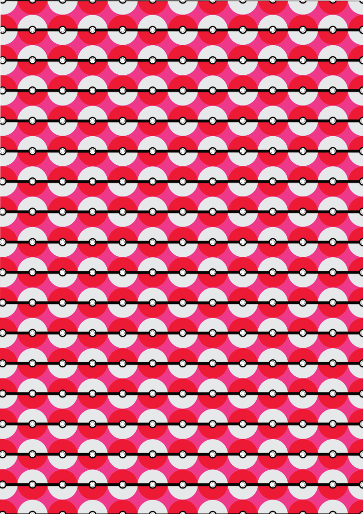
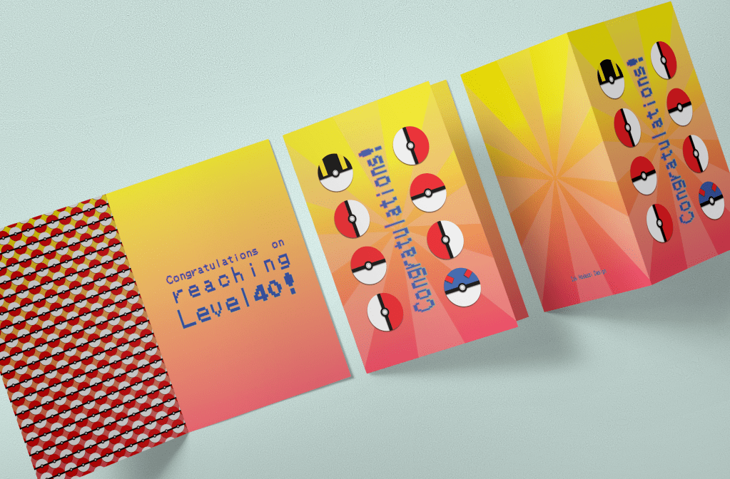
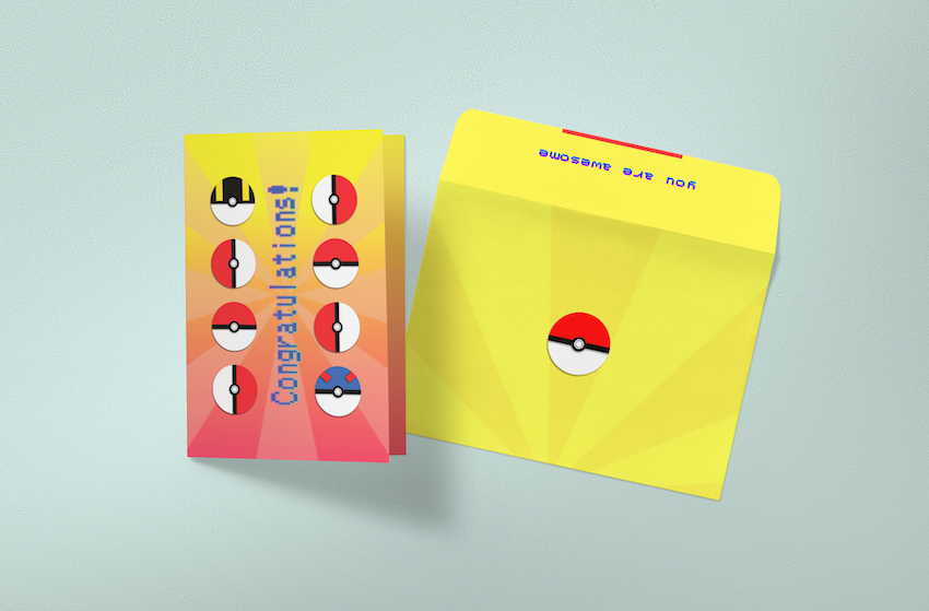
Pokeballs card
For my third design, I wanted to create number 9 from my thumbnails. I really liked the idea, as I thought it will make a nicely balanced design.
I started by putting together the poke balls out of vector shapes and inserting the text in the middle as it was on my thumbnail.

I played around with some other fonts, but eventually went back to the font I have used in my other 2 designs. I did this to make the 3 work as a set.
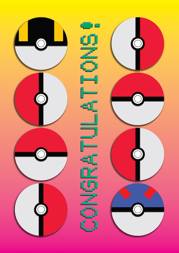
I think this design is well balanced and will fit nicely with my other 2 designs as well.
Finishing the cards
I went to a restaurant the other evening and the I got really inspired by the wallpaper. I really liked the pattern and the repetitive design. I wanted to create something similar for the inside of my cards.
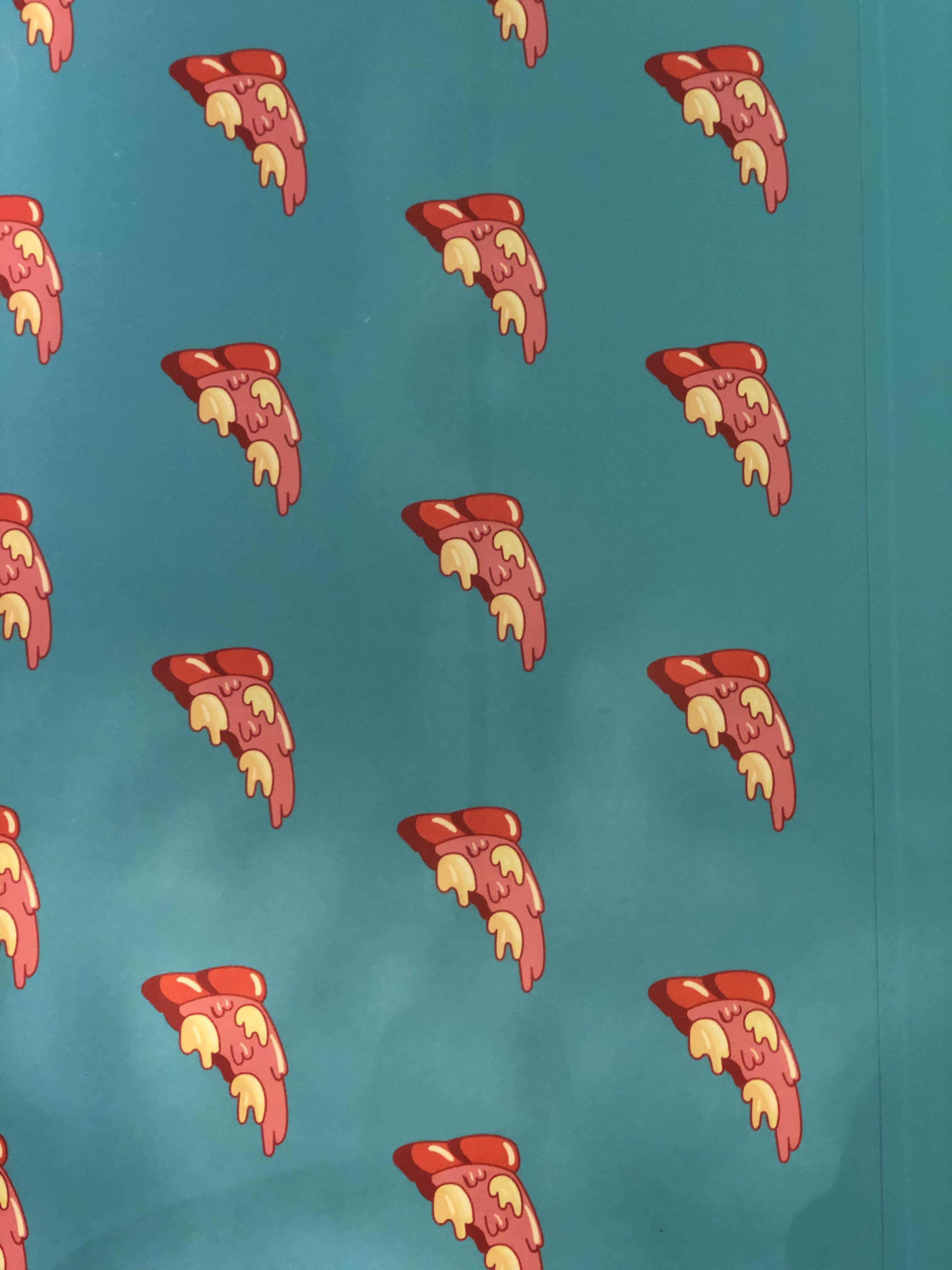
I decided to create a repeating pattern for each of my designs to use it as a lining on the inside page. I started by isolating some parts of the image or icons and simplifying them where needed. After this I picked a colour from the original background and pasted these icons on there to form a repeating pattern similar to the above.
I thought about using this as other parts of the design too, such as the lining of the envelope or similar.
In this pattern I have I have used the pizza inspiration quite literally, trying to recreate the same effect. Have tried contrasting backgrounds, but decided to go with the red to keep it more in line with the rest of the card.
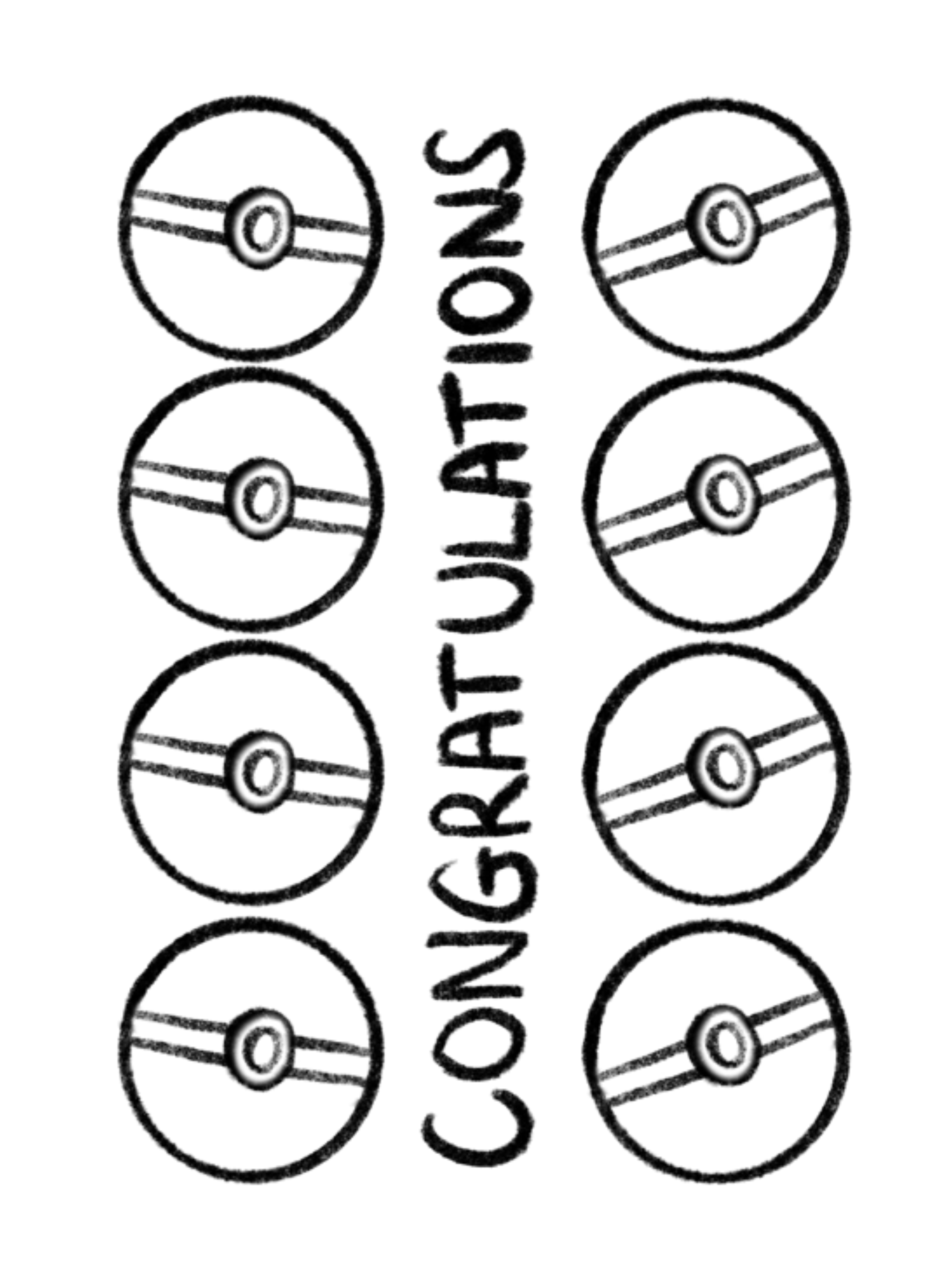
For the medals card, I wanted to use all the medals depicted on the card to create a repeating pattern. Added all the medals to one line and repeated this by shifting the whole line by one for each of the rows, this has created a nice diagonal design, which I quite like.
For the pokeballs card, I wanted to use the simple poke all shape for the pattern. I have tried to use the different coloured pokeballs, but it looked a bit too busy, so I have decided to go with the same ball design but switch things up by rotating every other pokeballs to create the alternating pattern. I quite liked how this turned out as it has evoked the wallpaper feeling I was after.

Glitch
I was prepairing my designs for print when I realised that one of my files were corrupted and I had to recreate the Pokeballs card from scratch. I was really annoyed, but I think I managed to make the deign better thanks to this glitch. This has set me back by a couple of hours.
I have decided that going forward I will save my projects as separate files periodically, and not work on the original files but use copies so I always have backup of what I am working on.
Product realisation
After I had all the components for my cards, I went ahead and created some mockups for them to see how they would look in reality. I wanted to put them next to each other, to see if they work as a set and make any adjustments to make them more cohesive.

I also tried printing them to see if I could add any embelishments, such as real paper cutouts for some of the elements on the card to create a more 3 dimensional design.
I have also created an envelope design to go with each of the cards. I wanted these to reflect what is inside, without spoiling the surprise completely.
Reflection
I feel like I have managed to create a series of cards that I would have been happy to receive when I got to the final level of Pokemon GO. I also think that I would be happy to give one of these to a friend when they finally reach Lv40.
I realised after finishing the cards, that the Medals design is not very usable, because I made the inside of the card dark blue. You’d need a special pen to write in it otherwise it wouldn’t be visible. This is definitely something to keep in mind for next time when I design a greeting card.
I have lost sight of one of my objectives that I set at the beginning of my assignment, which was to create a design for each of the teams. I know that this could be rectified quite easily by using the team colours and creating alternative versions of each of the cards.
The glitch with my design software set me back a few hours which I looked at as an opportunity to improve my design, however I still found this very disappointing. It’s definitely something I will pay more attention to in the future.
I am overall pleased with my performance and the outcome of this assignment.
