
The brief is to create a Point of Sale display for Fruit and Vegetables to be seen from the street to attract more customers to this part of the shop. The final product is too be printed on A0 size, and has to be landscape.
I drafted down my keywords as:
- Fruit
- Vegetables
- Fresh
- Eat
- Food
- Juicy
- Vibrant
I’ve created some thumbnails for the deigns, the pairs are side by side.
I really liked my last version. I wanted the text to look like as if they were part of the plant depicted. I had some difficulties with the word “vegetables” as it is double as long as the word “fruit” but thought the design would still be readable from a distance.
I’ve presented my ideas to the learning community on Discord, and got some feedback on these. People seem to have favoured the first and the fourth design, but I thought they would be too obvious, so I decided to take my favourite thumbnail forward.
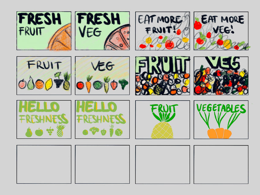
I’ve started off by blowing up the design to the desired size, and tidying up the artwork.
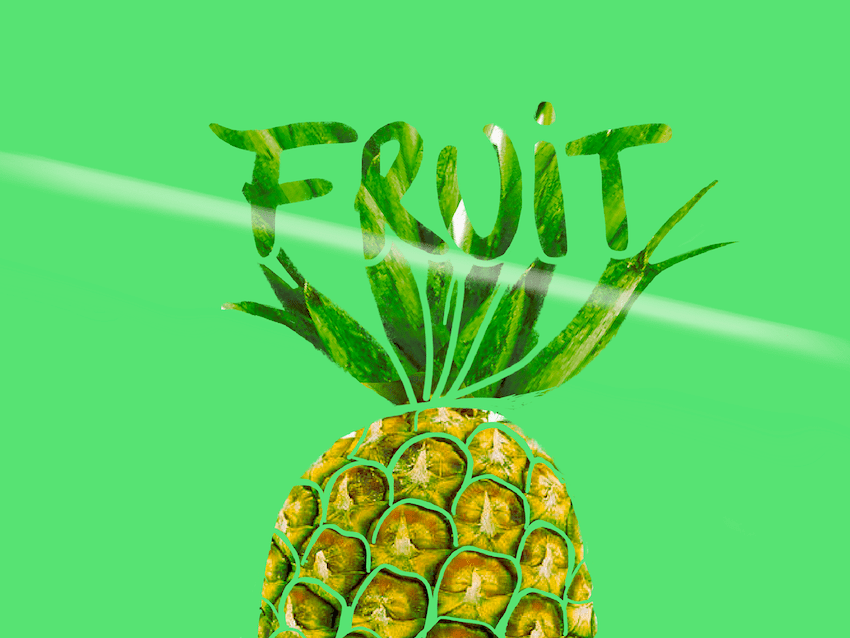
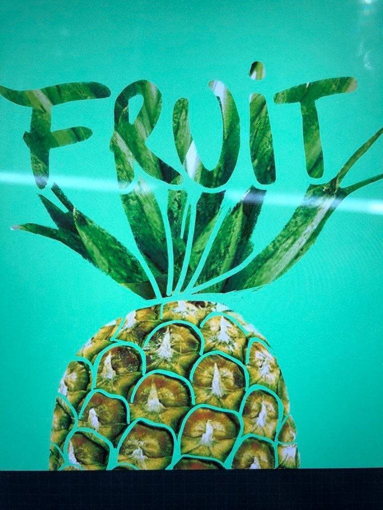
I quite liked this version, and sent this to the student community to give me some feedback. I first sent a photo of my screen that due to the wrong colour reproduction of my camera looked a blue instead of green. The other students seem to have preferred the blue version, so I got this colour back by importing the photo into my design software and matching the background colour to this.
After this, I looked through some typefaces that I could use as the part of my design. Since the shape of the fruit/veg has a hand drawn quality, I wanted to contrast this with a modern clean font. I have chosen the La Mejico font by Awesom Broso, as I found this font playful and clean at the same time which was my overall aim for this design.
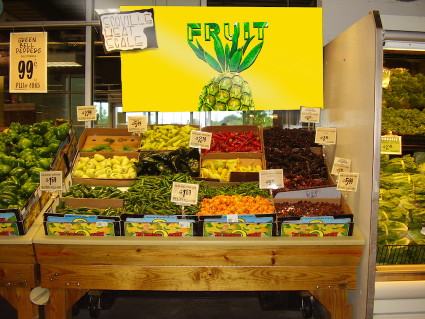
I wanted to see how this would look in practice so I made a mockup using this design.
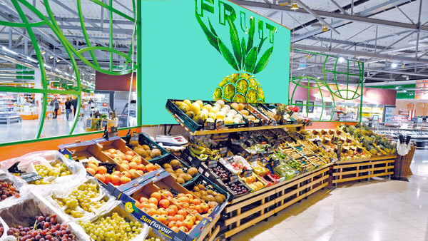
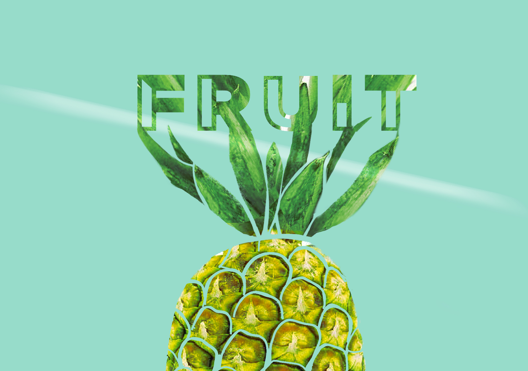
After doing this, I observed that the blue background may not be the best choice. It doesn’t look appetising as it’s not really a food colour. I decided to play around with doing some other colours to see what works better.
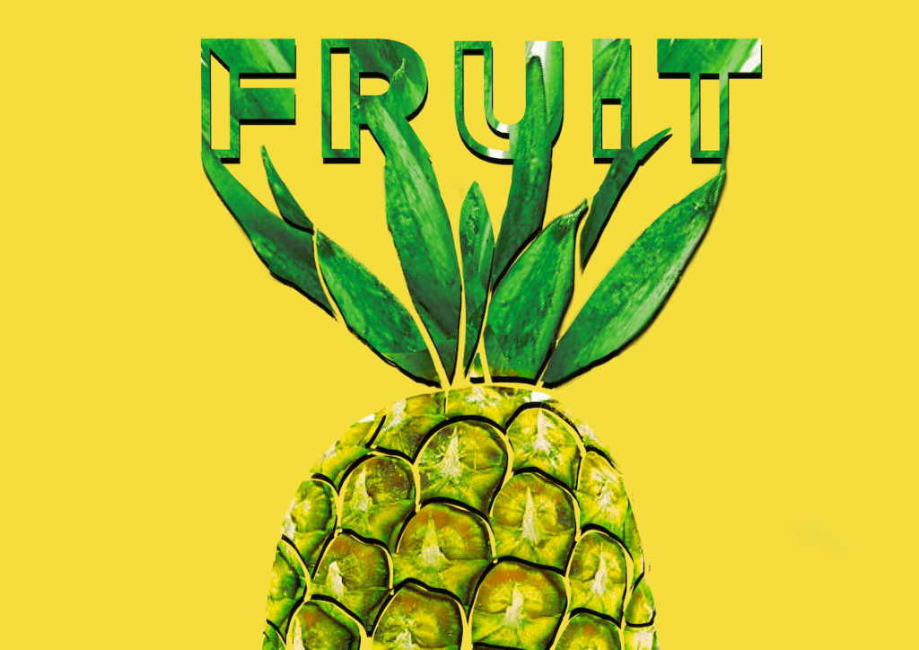
The yellow is still eye catching and I feel like it’s a lot more appetising, so I liked this more, however I felt like the pineapple’s yellow might be too close to the colour and wanted to separate this somehow, so I have added a drop shadow. I really like this effect as it gives the design a little more depth.
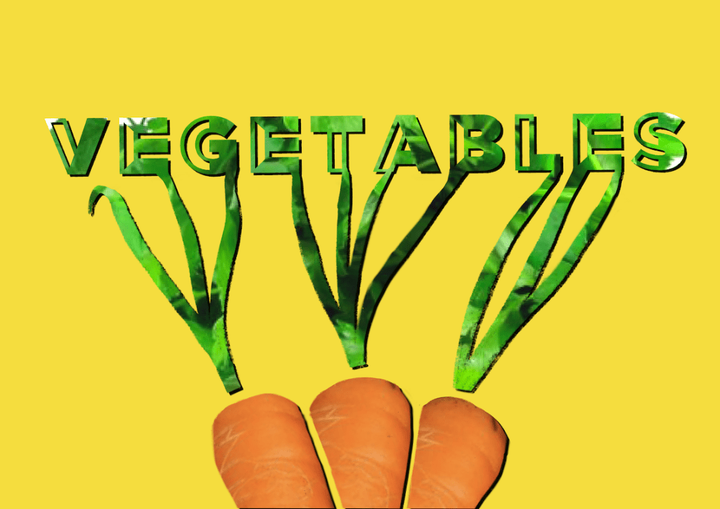
I’ve given the exact same treatment to my vegetables sign to match it to the fruit one, and tried these on a mockup to see how they would work in practice.

Reflection
Looking back, I feel like I managed to create something that answers the brief. It’s fun, eye catching, and readable from a good distance.
The parts I struggled with is balancing the text properly, I am not overly happy with the the text itself, I perhaps could have taken a more creative approach with it.
