
The Brief
The brief for this exercise was to create a set of book covers for some novels by H.G. Wells, to establish them as timeless fiction.
I’ve gone on the book store on my phone to find out what titles there were, and selected a handful I could download as audiobook. I decided to go down this route, as this way I could listen to them whilst doing other things and save time.
Part one: The time machine
The first title I selected was The Time Machine.
Time travel is an exciting topic, so I thought this could be fun and relatable.
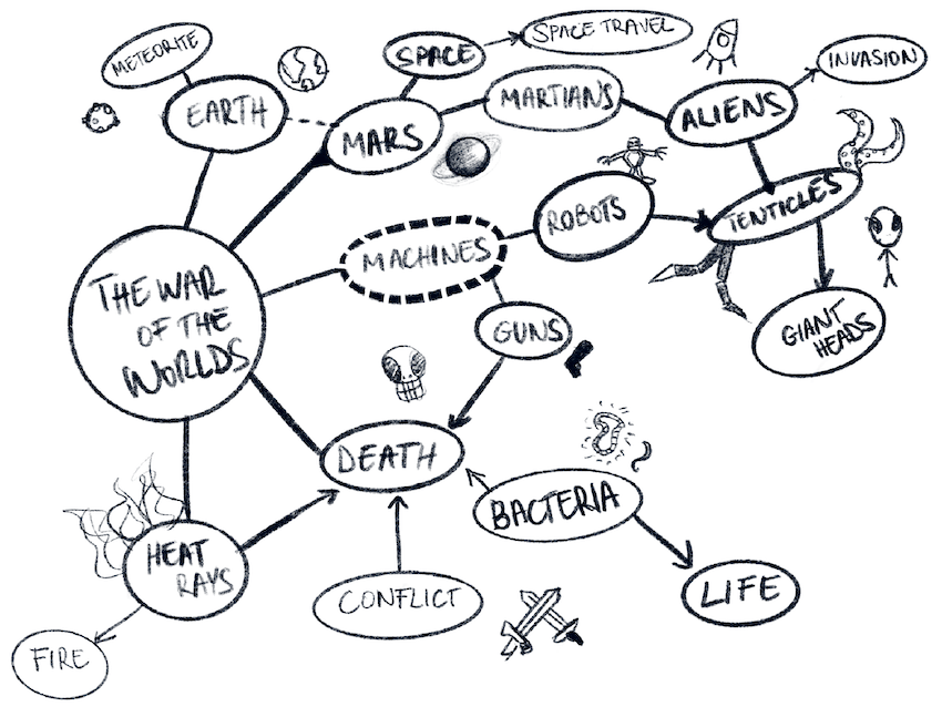
I’ve started my primary research by listening to the audiobook, and when I finished about 45% of the book, I started to work on my mind map to capture keywords that came to mind.

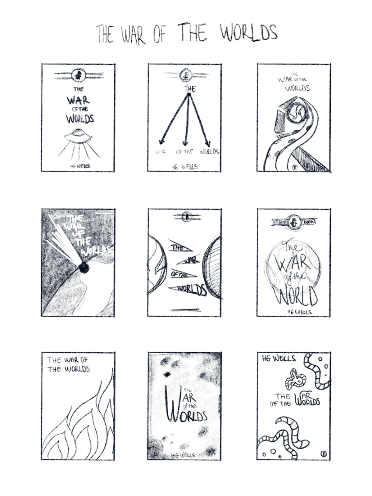
After this, I started to create some thumbnails to capture some rough ideas based on my keywords and flesh out the ideas a little.
I started by drawing things that was most obvious and bashed these out. After about 6 covers I felt like I ran out of ideas, for the last 3 I struggled a little, so I’ve consulted my mind map for further inspiration.

I’ve sent my initial ideas to some friends and some of the other students and some of the ideas seem to have stuck out to most. Based on the popular opinion, I’ve selected 3 of the designs to work on a bit further.
I started to think about the layout of all the text that will need to go on the cover. The brief called to include the following:
- Title
- Author
- Publisher
After working on these I realised that I like the second layout the most, however I still wanted to make the other 2 in colour to see how they turn out.
I went ahead and made the below covers. (click for full size)


I have consulted some friends and family regarding these 3 option and it seemed that most people liked number 1 and number 2.
I liked number 2 the most because it’s not so literal and I like the simplicity of it. I went ahead and created a spine for it, and created a mock-up.
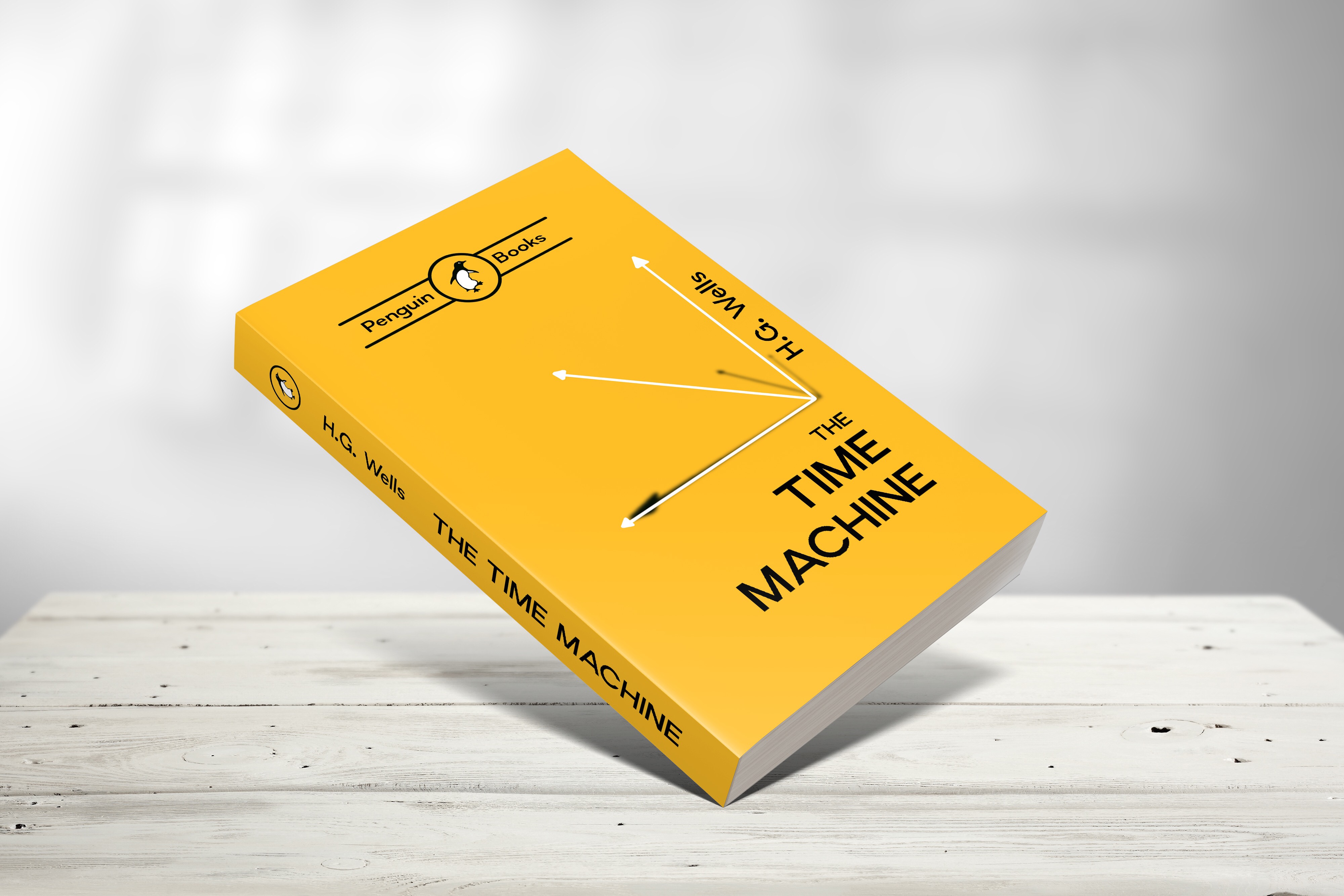
I’m pretty proud of how this one turned out. My first very own book cover.
Looking at the mock-up I see some issues with the illustration on the cover, also some people thought it doesn’t really represent the story, but I am happy overall.
I will move onto the next book and see how I can improve my process.
Part Two: The War of the Worlds
So I have chosen my second title to be The War of the Worlds. I listened to about half of the audiobook, and read the synopsis for it to inform my keyword research.
I tried visualising some of the ideas as I thought it might be useful for when I get to work on my thumbnails.
One big improvement I made for this part of the exercise is that I set up a template for the thumbnails to keep them consistent and presentable. I find that this way I have the right constraints for my ideas when creating these thumbnails.
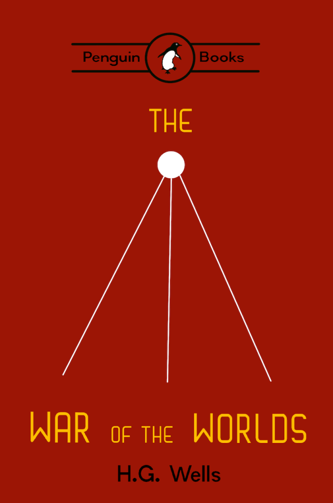
I’ve dome some visual research to see what other covers were published for this book and found that the tripod image was a popular approach, this has reassured my thinking around the minimalist approach of the 3 lines.
After some consideration, I have chosen the second thumbnail, as I thought it will be very consistent with my previous cover.
I went on to producing the colour version for my book cover.
I skipped through some of the parts of getting the layout on paper before creating the cover as I had a pretty good idea where all the text would go from my thumbnail.
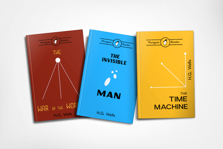
I have also created a mock up with both of my book covers side by side, to ensure they look good together.
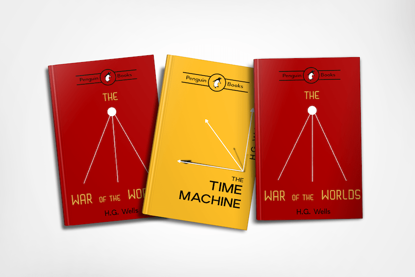
After doing so I realised that the shadow on “The time machine” cover was unnecessary and distracting, so I went back to my previous design and have removed this, leaving the simple white lines.
Part Three: The Invisible Man
My third and final book o choice was The Invisible Man.
I listened to some of the audiobook, but I had a pretty good idea what will need to be represented on this cover.
I skipped ahead, and started this one by trying to create my thumbnails straight away. This have turned out to be a mistake as I soon realised as I got into a real creative rut. I really realise now the value of the mind mapping exercise, it really seems to get me in the right frame of mind and helps me detach my thinking from the obvious ideas.

I couldn’t come up with anything that would be simple enough to go with my other 2 covers and also describe the content of the book to a certain an extent.
I therefore proceeded with reading some of the content for this book and gathering some keywords.
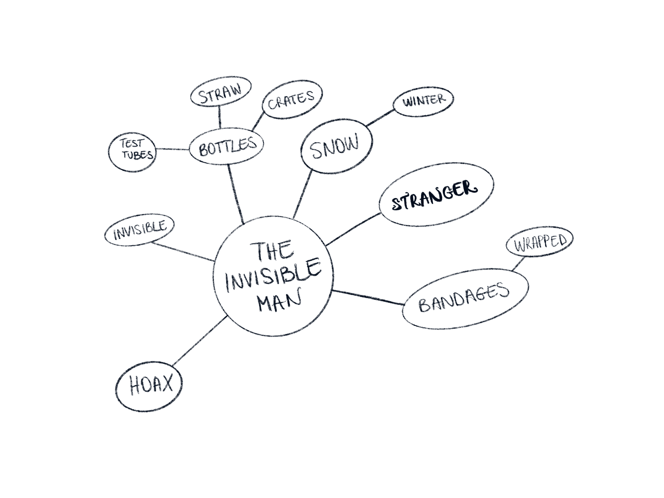
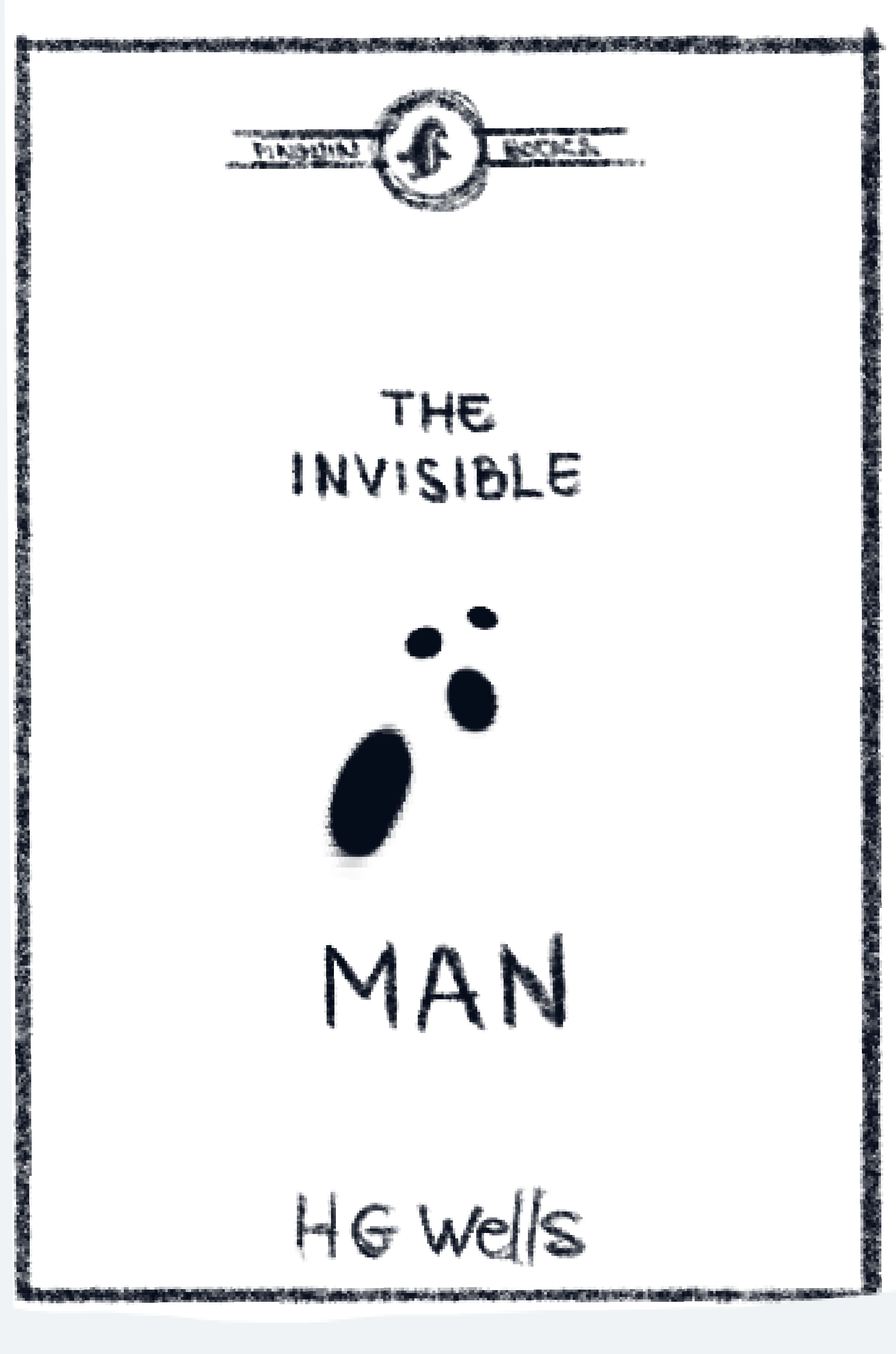
When I written down the words; snow and winter, I had a eureka moment. I thought footprints would be a real good way of simply show an invisible man. I thought this could be used in a very simple way represented by dots on a flat surface. I have later realised that this would be a little too simple, so I have put the dots in perspective as if our invisible man was walking away from the scene, and thus the new cover was born.
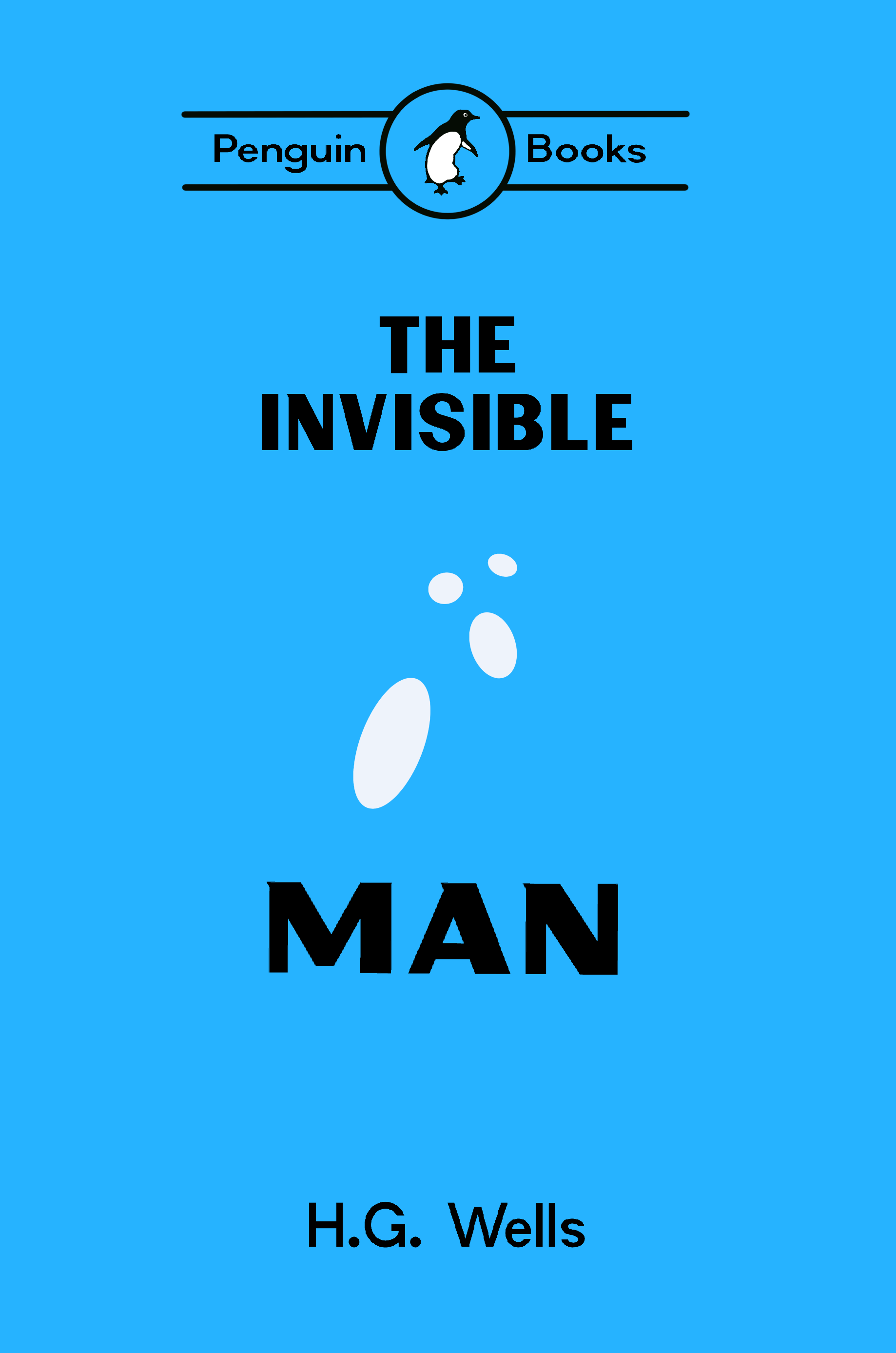
I was really happy with the results. It looks simple enough to fit in my minimalist approach to this series.
I wanted to use blue for this cover, to imply cold, winter and snow. I chose a shade of blue by shifting the hue of the yellow used on my Time Machine cover to achieve a vibrant blue, that goes with the other 2 covers when put side by side.

Conclusion
I really like how my covers turned out, and how they work together as a set. The importance of the mind mapping really solidified for me due to this exercise.
I also though during the work I was doing for this, that maybe I should have started by the research for all 3 books, and see how I could have created something that truly works for all of them, however I also think that might be an unrealistic approach as you may not get access to all of the titles at the same time if you are working on a client project.

One Comment Add yours