
In this exercise I was asked to look at some fonts used in a range of literature such as magazines and flyers and categorise them into broad categories.
I started by writing out quite a few fonts on my computer and classifying them as per the instructions from the exercise. I found this somewhat difficult in some cases as certain fonts seem to display characteristics from multiple categories.

After this I started gathering some stuff laying around the house and photographing these to add to a board where I could scribble my observations over them.

I was trying to both classify the fonts and think about why the designer may have chosen the particular font in each case.
Identify
Next I needed to pick out 5 fonts from my classification and see how they would work in different contexts, such as magazines, books or the web.
I chosen the following fonts:
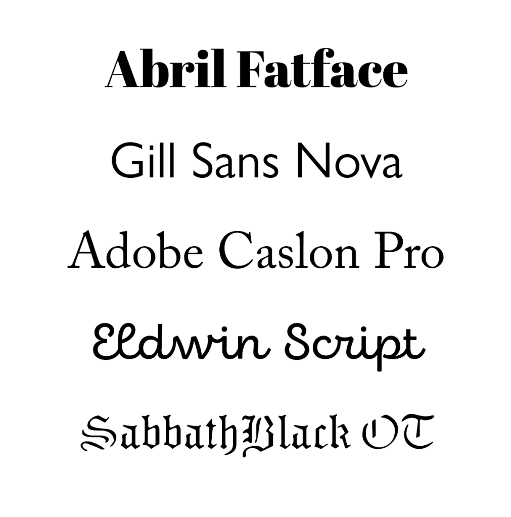
I wanted a nice variety of fonts from different classes to see how they look in various contexts.
Abril Fatface
This modern font is really nice and contrasty. I think it is pretty elegant and I think it will work well as a heading font for a magazine for example, but not so much as body text due to the high contrast.
Using some layouts from an exercise in Graphic Design Core Concepts, I wanted to see how these different fonts would work.

The first one was an interview in a TV magazine. I think this font works well for the title, but pretty horrible as the body text.

Again, I think this works pretty well as a title, but I haven’t even tried the body text as it is pretty apparent that this font doesn’t look good when used as body text due to its high contrast.
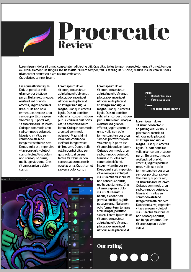
Ordinarily I would say that this font will not be suited for a tech magazine. I think in this instance it seems to work more because the topic here is an art tool rather than a really hardcore techy topic.
In another example of the tech review, it doesn’t seem to work as well. I am not sure, maybe this is because I have capitalised the title, but it seems slightly outdated and feels wrong.
In general I feel like this font works great for most topics in a magazine/news publication setting, but probably slightly dependant on the topic.
Going forward I will just do the same with all my selected fonts and observe whether they work or not but won’t go into so much detail.
Gill Sans Nova
I felt like this font works better in a magazine setting and is sort of inappropriate for use in newspapers. I think this is because we are used to serif fonts in newspapers and sans serif fonts feel out of context. Interestingly, I thought that sans serif fonts will have more utility than serif counterparts, but it seems that they are not as universal as I initially thought.
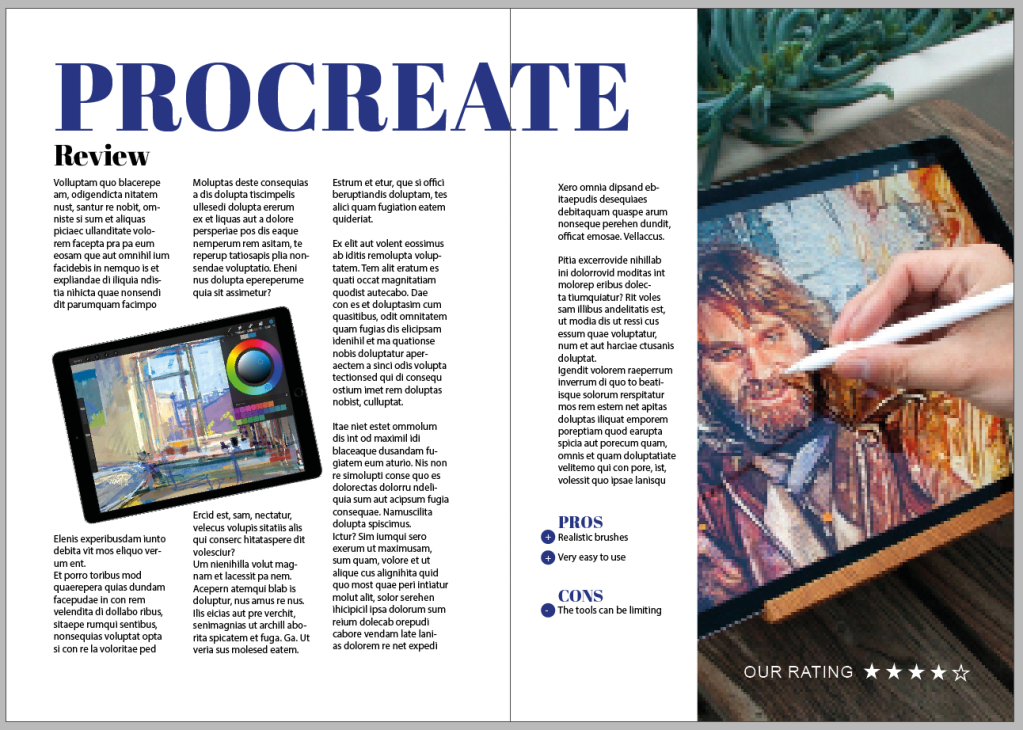
Adobe Caslon Pro
Again, to my surprise this worked pretty well for all 3 use cases. I am beginning to wonder if I was all wring about serif fonts all this time or if this is mostly due to the nature of these examples.
In any case, the same can be observed here as in the case of Abril Fatface, it works really well for the book review and the TV magazine, less so for the tech review.
Eldwin Script
As expected, this font is completely inappropriate to be used for all of these use cases. I feel like it is weirdly almost working for the magazine interview, and I guess if the topic there was slightly more juvenile, it would probably work.
I think this font would work with topics that are more innocent and definitely not a font that can be used for body text, although the colour of it from far away it quite even and it is highly legible, it does feel inappropriate when used for body text.
SabbathBlack OT
I was actually looking forward to using this font and seeing how this looks in these settings. I was surprised how well it worked for the magazine title. Obviously would be totally unusable for the body text but I found it quite interesting to use.
This font works well for things that are quite alternative in nature, or things that have some sort of connection to the occult, or papers that need to be made look super important and slightly archaic.
Tracing

I laid out some letters in quite large formats to be able to understand how they are constructed. This is quite an interesting exercise, I think it definitely gives a better understanding why certain fonts are perceived in certain ways. I was quite surprised to find that for example Gill Sans has so many straight lines, even though the font itself feels quite rounded.
Reflection
I think this exercise was an important reminder that the font choices you make can make a tremendous impact on the final design outcome. I know this really well, but in practice I definitely not trying out enough font combinations before I make my decisions, so this is something that I would like to focus on a little more going forward.
